10,000 search results
(0.021 seconds)
- High Dreaming by Haksen,
$15.00 High Dreaming is a stylish modern and natural handwritten script font with casual chic flair. It is perfect for branding, wedding invites and cards, and maybe for red wine label. High Dreaming includes full set of gorgeous uppercase and lowercase letters, numerals, a large range of punctuation and ligatures. All lowercase letters of High Dreaming Regular include ending swashes, giving realistic hand-lettered style. What you get? You will get: High Dreaming OTF High Dreaming Alternate OTF In order to use the beautiful swashes, you need a program that supports OpenType features such as Adobe Illustrator CS, Adobe Photoshop CC, Adobe Indesign and Corel Draw. but if your software doesn't have Glyphs panel, you can install additional swashes font files: Thanks and have a great day, Haksen
 - Rangen by Letterfreshstudio,
$12.00 Rangen was inspired by Retro style in combination with hand lettering. Rangen has many alternative swashes and ligatures characters and has OpenType features such as alternative styles, ties and swashes so you can mix and match as you wish. Rangen is perfect for logos, posters, badges, book covers, t-shirt designs, handwritten quotes, product packaging, headers, posters, merchandise, social media & greeting cards. Rangen is coded with Unicode PUA, which allows full access to all additional characters without having special design software. Mac users can use the Font Book, and Windows users can use the Character Map to view and copy any of the additional characters to paste into your favorite text editor / application. Let me know if you have any questions.
 - Xenois Super by Linotype,
$29.99Xenois is a sweeping suite of designs that will provide solutions for a multitude of projects. Annual reports, restaurant menus, business correspondence, corporate identity programs, movie credits and advertising campaigns can all be set with various faces from the family. Interrelating perfectly, the sub-families within the series include Xenois Sans, Serif, Semi, Soft, Slab and Super. The designs have a common and obvious design bond, yet each is able to stand on its own as a distinct typestyle. The Xenois typefaces are based on a common underlying model; they have the same cap height, the same lowercase x-height, the same stem weights, and the same basic character shapes. This unity of shape and proportion results in a remarkably complementary set of typeface designs. - Camy by Scholtz Fonts,
$9.50 I wanted to create a "handwriting" font which could be used professionally. I have often needed such a font with a variety of weights and styles for a particular project and have had to resort to mixing fonts, creating a rather messy, amateur job. Camy is named for a little village in South West France where I did much of the initial work on this font. Camy is ideal for contemporary display work, comes in ten styles, and has a contemporary appeal with its casual, easy to read letters. Camy was designed as a total professional package for designers looking for a handwritten font suitable for all kinds of contemporary display work: the idea being that once you have the Camy Professional Pack you don't have to waste time searching for other handwritten fonts. The Family: LIGHT -- NARROW - light weight, condensed width, delicate line -- MEDIUM - light weight, delicate line -- WIDE - light weight, expanded width, delicate line NORMAL WEIGHT -- NARROW - of medium weight and condensed width - perfect for limited space -- MEDIUM - of medium weight -- WIDE - of medium weight and expanded width BLACK - for best readability -- NARROW - condensed width for bolder statements in small areas without losing legibility -- MEDIUM - for bolder statements -- WIDE - expanded width for bolder statements FAT -- WIDE - for maximum impact Use a combination of styles for product branding, book covers, invitations, greeting cards. The Camy combination works well for both headings and body text. Camy contains over 250 characters - (upper and lower case characters, punctuation, numerals, symbols and accented characters are present). It has all the accented characters used in the major European languages.
 - Novelty Script by HiH,
$10.00 Novelty Script is a bold dynamic script, sharply delineated, yet fluid. Most of the lower case letters and many of the upper case letters have joins. The typeface was designed by Nicholas J. Werner and Gustave F. Schroeder and patented in March 1893. The original release was by the Central Type Foundry of St. Louis, Missouri. Although a part of ATF from 1892, the Central Type Foundry continued to operate under its own name until 1895. Novelty Script uses our new encoding, as noted in the All_customer_readme.txt. The Euro symbol has been moved to position 128 and the Zcaron/zcaron have been added at positions 142/158 respectively. Otherwise, Novelty Script has our usual idiosyncratic glyph selection, with the German ch/ck instead of braces, Western European accented letters, lower case “o” and “u” with Hungarian umlaut and our usual Hand-in-Hand symbol. But that is not all. With the takeover of the Central Type Foundry by ATF, a group of special characters appeared. All are included in this font, except the “&Co” and the "'s", for a total of nine in all. The “Ch” and “nd” ligatures are especially interesting because of the impact they have on the color and overall appearance of the page. Download the PDF Type Specimen for locations. This is a fun font to use. Its strength is print, where it gives a page a refreshing look. The joins sometimes have difficulty on the screen, in spite of extensive hinting. Playing around with small changes on the point size can pay dividends. Not for the faint-of-heart. Are you up to the challenge?
 - 99 Names of ALLAH Complete by Islamic Calligraphy75,
$12.00 We have transformed the “99 names of ALLAH” into a font. That means each key on your keyboard represents 1 of the 99 names of ALLAH Aaza Wajal. The fonts work with both the English and Arabic Keyboards. We call this Calligraphy "complete" because this is the only calligraphy where the complete set of decorative letters have been used. The calligraphy is more on the traditional side, letters don't overlap, the "ye" at the end of the names doesn't have the two dots, and a decorative "ye" has been included. The first "Alef" doesn't have a "hamzit wasel" nor a "fatha", this indicates to skip the pronunciation of that first letter. So instead of saying "AR-RAHMAAN" you say "R-RAHMAN". (in the zip file you will find a pdf file explaining the differences in the "harakat", pronunciation and spelling according to the Holy Quran). In other calligraphy you don't usually find the decorative letters: "Dal, Ra & Ye" but we like them and we use them. Decorative letters used in this calligraphy: "Mim, Aain, Sin, HHe, He, Kaf, Tah, Dal, Ra, Alef, Ye & Saad". Purpose & use: - Writers: Highlight the names in your texts in beautiful Islamic calligraphy. - Editors: Use with kinetic typography templates (AE) & editing software. - Designers: The very small details in the names does not affect the quality. Rest assured it is flawless. The MOST IMPORTANT THING about this list is that all the names are 100% ERROR FREE and you can USE THEM WITH YOUR EYES CLOSED. All the “Tachkilat” are 100% ERROR FREE, all the "Spelling" is 100% ERROR FREE, and they all have been written in accordance with the Holy Quran. No names are missing and no names are duplicated. The list is complete "99 names +1". The +1 is the name “ALLAH” 'Aza wajal. Another important thing is how we use the decorative letters. In every font you will see small decorative letters, these letters are used only in accordance with their respective letters to indicate pronunciation & we don't include them randomly. That means "mim" on top or below the letter "mim", "sin" on top or below the letter "sin", and so on and so forth. Included: Pdf file telling you which key is associated with which name. In that same file we have included the transliteration and explication of all 99 names. Pdf file explaining the differences in the harakat and pronunciation according to the Holy Quran. Here is a link to all the extra files you will need: https://drive.google.com/drive/folders/1Xj2Q8hhmfKD7stY6RILhKPiPfePpI9U4?usp=sharing
 - TT Knickerbockers by TypeType,
$29.00 TT Knickerbockers useful links: Specimen PDF | Graphic presentation | Customization options About TT Knickerbockers: TT Knickerbockers is a contrasting pair of fonts that continues our project series dedicated to different cities. The new project is dedicated to New York with its multiculturalism, historicity, creativity, energy, and to its inhabitants. TT Knickerbockers Grotesk symbolizes the monumentality of New York expressed in both its traditional historic architecture and skyscrapers. Energy, constant movement and the round-the-clock life of New York—all this is reflected in our TT Knickerbockers Script. TT Knickerbockers Grotesk is a narrow contrast sans-serif with characteristic elements sending us back to the 19th century. There’s also a reference to antiqua fonts to be noticed in the font: where in traditional antiqua there would be serifs, TT Knickerbockers Grotesk features a straight stroke ending, and traditional drops (finals, tails and ears) are substituted with rounded strokes. In TT Knickerbockers Grotesk you will find unusual characters, stylistic alternatives and ligatures. The following OpenType features are implemented: ordn, case, frac, sups, sinf, numr, dnom, onum, tnum, pnum, liga, dlig, salt, ss01. TT Knickerbockers Script is a bright and at the same time a little restrained brushpen script with a slight touch of aristocracy. TT Knickerbockers Script consists of 967 characters and also contains a huge number of contextual alternatives and ligatures. For all lowercase and uppercase letters of basic Latin and Cyrillic alphabets we have drawn 236 swashes which, depending on the context, can appear both at the beginning and at the end of a letter. Do not forget to enable OpenType support and enjoy all the opportunities that the typeface provides and its built-in features: ordn, frac, case, sups, sinf, numr, dnom, onum, tnum, pnum, calt, swsh, liga. FOLLOW US: Instagram | Facebook | Website TT Knickerbockers language support: Acehnese, Afar, Albanian, Alsatian, Aragonese, Arumanian, Asu, Aymara, Banjar, Basque, Belarusian (cyr), Bemba, Bena, Betawi, Bislama, Boholano, Bosnian (cyr), Bosnian (lat), Breton, Bulgarian (cyr), Cebuano, Chamorro, Chiga, Colognian, Cornish, Corsican, Cree, Croatian, Czech, Danish, Embu, English, Erzya, Estonian, Faroese, Fijian, Filipino, Finnish, French, Friulian, Gaelic, Gagauz (lat), Galician, German, Gusii, Haitian Creole, Hawaiian, Hiri Motu, Hungarian, Icelandic, Ilocano, Indonesian, Innu-aimun, Interlingua, Irish, Italian, Javanese, Judaeo-Spanish, Judaeo-Spanish, Kalenjin, Karachay-Balkar (lat), Karaim (lat), Karakalpak (lat), Kashubian, Khasi, Khvarshi, Kinyarwanda, Kirundi, Kongo, Kumyk, Kurdish (lat), Ladin, Latvian, Laz, Leonese, Lithuanian, Luganda, Luo, Luxembourgish, Luyia, Macedonian, Machame, Makhuwa-Meetto, Makonde, Malay, Manx, Maori, Mauritian Creole, Minangkabau, Moldavian (lat), Montenegrin (lat), Mordvin-moksha, Morisyen, Nahuatl, Nauruan, Ndebele, Nias, Nogai, Norwegian, Nyankole, Occitan, Oromo, Palauan, Polish, Portuguese, Quechua, Rheto-Romance, Rohingya, Romanian, Romansh, Rombo, Rundi, Russian, Rusyn, Rwa, Salar, Samburu, Samoan, Sango, Sangu, Scots, Sena, Serbian (cyr), Serbian (lat), Seychellois Creole, Shambala, Shona, Slovak, Slovenian, Soga, Somali, Sorbian, Sotho, Spanish, Sundanese, Swahili, Swazi, Swedish, Swiss German, Swiss German, Tagalog, Tahitian, Taita, Tatar, Tetum, Tok Pisin, Tongan, Tsonga, Tswana, Turkish, Turkmen (lat), Ukrainian, Uyghur, Vepsian, Volapük, Võro, Vunjo, Xhosa, Zaza, Zulu.
 - Anisette Std Petite by Typofonderie,
$59.00 Geometric font inspired by shop signs in 4 styles Anisette has sprouted as a way to test some ideas of designs. It has started with a simple line construction (not outlines as usual) that can be easily expanded and condensed in its width in Illustrator. Subsequently, this principle of multiple widths and extreme weights permitted to Jean François Porchez to have a better understanding with the limitations associated with the use of MultipleMaster to create intermediate font weights. Anisette built around the idea of two widths capitals can be described as a geometric sanserif typeface influenced by the 30s and the Art Deco movement. Its design relies on multiple sources, from Banjo through Cassandre posters, but especially lettering of Paul Iribe. In France, at that time, the Art Deco spirit is mainly capitals. Gérard Blanchard has pointed to Jean Francois that Art Nouveau typefaces designed by Bellery-Desfontaines was featured before the Banjo with this principle of two widths capitals. The complementarity between the two typefaces are these wide capitals mixed with narrow capitals for the Anisette while the Anisette Petite – in its latest version proposes capitals on a square proportions, intermediate between the two others sets. Of course, the Anisette Petite fonts also includes lowercases too. Anisette Petite, a geometric font inspired by shop signs in 4 styles So, when Jean François Porchez has decided to create lowercases the story became more complicated. His stylistic references couldn’t be restricted anymore to the French Art-déco period but to the shop signs present in our cities throughout the twentieth century. These signs, lettering pieces aren’t the typical foundry typefaces. Simply because the influences of these painted letters are different, not directly connected to foundry roots which generally follow typography history. The outcome is a palette of slightly strange shapes, without strictly not following geometrical, mechanical and historical principles such as those that typically appear in typefaces marketed by foundries. As an example, the Anisette Petite r starts with a small and visible sort of apex that no other similar glyphs such as n or m feature, but present at the end of the l and y. The famous g loop is actually inspired by Chancery scripts, which has nothing to do with the lettering. The goal is of course to mix forms without direct reports, in order to properly celebrate this lettering spirit. This is why the e almost finishes horizontally as the Rotis – and the top a which must logically follow this principle and is drawn more round-curly. This weird choice seemed so odd to its designer that he shared his doubts and asked for advise to Jeremy Tankard who immediately was reassuring: “Oddly, your new top a is fine, it brings roundness to the typeface, when the previous pushes towards Anisette Petite to unwanted austerity.” The Anisette Petite, since its early days, is a mixture of non-consistent but charming shapes. Anisette, an Art Déco typeface Anisette Petite Club des directeurs artistiques, 46e palmarès Bukva:raz 2001
 - TT Ricordi Allegria by TypeType,
$29.00 Please note! If you need OTF versions of the fonts, just email us at commercial@typetype.org TT Ricordi Allegria useful links: Specimen | Graphic presentation | Customization options TT Ricordi Allegria is a sleek and intelligent contemporary Florentine grotesque inspired by the half-erased lettering in Basilica di Santa Croce, Florence. TT Ricordi Allegria was drawn by Antonina Zhulkova and reflects in its graphics the transitional stage between the classic serif with varying proportions, gravitating towards the Roman capital type, and the Florentine sans serif. The font is characterized by variability in the proportions of characters, contrast between strokes, wedge-shaped triangular characters, and the absence of traditional serifs. The main visual feature of the typeface is its diversity and the ability, using different stylistic sets, to completely change the character and perception of the typeface. The drawing of the characters from the main set is strict, thanks to which the font looks stern, as if the inscription in the font was really carved out of stone. And with the help of another set, we can add roundness, or even smoothness, to the font. This is due to the fact that the letters (E R K Q J Y in Latin, and Л К Ж Э in Cyrillic) from the second set have either very noticeable "curls" or smooth, rounded "legs". In addition, the typeface includes a set of beautiful ligatures for use in display inscriptions, such as large headlines. An interesting moment when working on the typeface was the creation of the Cyrillic typeset, since the Cyrillic alphabet does not so easily fit into the concept of the Florentine grotesque and stressed semi-serif. The most difficult thing in working on the Cyrillic alphabet was to create a system of spacing for characters, as it was done in the Latin alphabet, and to make sure that when typing in Cyrillic, the drawing of the text remained beautiful. That is why the letters Д Л У Ы appearing in the font family are somewhat unusual to the eye, and the proportions of other characters in Cyrillic are not quite “classic” either. In general, the Cyrillic set looks more display than its Latin prototype, but at the same time it lacks the sense of historicity or legacy of the Soviet past, which often comes to the foreground when working on the design of the Cyrillic alphabet in this type of serifs. TT Ricordi Allegria consists of two weights (Regular and Bold) and one variable font. Each style includes over 750 characters, as well as 19 OpenType features. Interesting features of the typeface include three stylistic sets that greatly change the perception of the font, a set of bright display ligatures, a few neat icons that are suitable for breaking text and will emphasize the visual language of the font. Please note! If you need OTF versions of the fonts, just email us at commercial@typetype.org FOLLOW US: Instagram | Facebook | Website
 - Costa Std by Typofonderie,
$59.00 A mediterranean style sanserif in 4 styles The original idea of Costa was to create a contemporary mediterranean typeface style. Costa is a synthesis of the purity, as found on Greek capitals, and softness, found in Renaissance scripts. First thing was the design concept that take its roots on the Chancery script. Such writing style appeared during Italian Renaissance. Later few typefaces have been developed from such cursive models. Today most serifed typeface italic take their roots on such triangular structure we can find on gylphs like the n, p, or d. The Costa capitals remains close to pure sanserif models when the lowercases features an ending serif on many letters like the a, n, d, etc. This ending serif being more like a minimal brush effect, creating a visual contrast and referencing the exoticness of the typeface. Knowing that the Costa typeface family began life in the 90s as a bespoke typeface for Costa Crociere, an Italian cruise company — it suddenly makes sense and explains well why Jean François Porchez focused so much on Italian Chancery mixed to a certain exotism. The curvy-pointed terminals of the Costa n can obviously get find on other glyphs, such as the ending of the e, c and some capitals. So, the sanserif looks more soft and appealing, without to be to pudgy or spineless. The general effect, when set for text, remains a sanserif, even not like Rotis Semiserif. Costa is definitly not a classical typeface, or serif typeface which convey past, tradition, historicism as Garamond does beautifully. Because of the Costa crocieres original needs, Costa typeface was designed to be appropriate for any uses. Anytime you’re looking for good mood, qualitative effects, informal tone, cool atmosphere without to be unconvential or blowzy, Costa will convey to your design the required chic and nice atmosphere, from large headlines sizes, brands, to small text sizes. It’s a legible typeface, never boring. A style without neutrality which doesn’t fit comfortably into any typeface classification! Does it proves the novelty of its design and guarantees as well as its originality? Its up to you to be convinced. Barcelona trip Originally not planned, this need appeared because of a trip to Barcelona at the time of the project, where Jean François was giving a lecture. He wanted to pay an homage to that invitation to create something special. So, he designed during his flight some variations of the Spanish Ch, following ideas developed by the Argentinian type designer Rubén Fontana for his typeface called Fontana ND (published by the Barcelona foundry Bauer). Then, he presented during his lecture variations and asked to the audience which design fit the best to their language. They selected the design you can find in the fonts today. Read more about pairing Costa Type Directors Club 2000 Typographica: Our Favourite Typefaces 2004
 - Parkour by Resistenza,
$39.00 Parkour Brush Font takes the repertoire of moves and free spirit of this modern sport and bring it to a graphic definition. Handwritten with authentic dry brush imperfections and a bouncy baseline to evoke the energy of this urban sport discipline which emphasizes the athlete to be strong and flexible as to be able to move quickly and efficiently through any given environment. Sounds like a fun game, right? This font comes with a full set of upper and lower case characters - giving you the extra freedom to turn your text into authentic custom-made hand lettering. Parkour Marker font Includes a large range of glyphs including numerals, punctuation & multilingual support. It comes with a perfectly paired handy set of bonus Swashes and extras perfect to complete and customize your layout. Perfect for branding, social media, stationery, advertising, logos, handwritten quotes, product packaging, header, poster, merchandise & greeting cards. Features: - OTF Font file - Punctuation & numbers - Splashes & Splatters - Alternate letters - Uppercase letters - Multi Language To enable the OpenType Stylistic alternates, you need a program that supports OpenType features such as Adobe Illustrator CS, Adobe Indesign & CorelDraw X6-X7. There are additional ways to access alternates, using Character Map (Windows), Nexus Font (Windows), Font Book (Mac) or a software program such as PopChar (for Windows and Mac).
 - Neck Candy - Unknown license

- TypographerFraktur - Unknown license

- Liquid Sex - Unknown license

- Rodeo Roundup by FontMesa,
$30.00 Four years in the making Rodeo Roundup is a very ornate script font where the letters look like a flowing rope with connecting lowercase letters. Due to the high amount of detail in this and other FontMesa fonts some applications may have difficulty displaying the letters larger than 100 point size.
 - Shiva by Dharma Type,
$19.99 Shiva font family is a very narrow family for text and titling. Even though shiva has very thin strokes, the letterforms give a strong, impactful and dignified image. a, e, f, g & y in Roman and g & y Italic have their alternate glyphs that can be used with OpenType salt feature.
 - Noyr by Sign Studio,
$20.00 Noyr is a font for display that requires a modern/futuristic appearance. Uppercase and Lowercase are available equipped with standard symbols and multilingual characters. This font is designed to be dynamic with today's style. All have been PUA Encoded. You can easily access each character in the software in general.
 - Reach Story by Sronstudio,
$18.00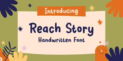 Reach Story is a Handwritten Font, this font Is perfect for product packaging, product designs, label, photography, watermark, special events, or anything. Reach Story comes with uppercase and lowercase letters, multilingual symbols, numerals, punctuation. If you have any questions please don't hesitate to drop me a message :) Thank You, Sronstudio
 - Shirah 25 by LightHouse,
$49.00Shirah 25 started as a freehand study, while experimenting with ink and new nibs. Later on, when David decided to have a digital version, he drew it merely with the tablet, trying to keep the spirit of the ink and the nib. Shirah 25 is an OpenType/TTF Unicode font. - Wild Thing by ITC,
$29.99Wild Thing was created by British designer Martin Wait and appeared in the ITC library in 1995. The forms look as though they are normal alphabet figures viewed through swirling water, wavy and irregular. Wild Thing is a font which is always moving and is perfect for fresh new designs. - Lillie by Fikryal,
$18.00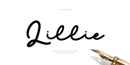 Lillie is an elegant signature font perfect for crafting, branding, invitation, stationery, wedding designs, social media posts, advertisements, product packaging, product designs, label, photography, watermark, special events, or anything. Included : Lillie multilingual support If you have any questions please don’t hesitate to contact me Thank you best regards, Fikryal Studio
 - Cute Easter by Yoga Letter,
$16.00 "Cute Easter" is a unique and playful display font. The letters in this font are so cute because they have been specially designed. This font is equipped with uppercase, lowercase letters, numerals and punctuations, and multilingual support. Can be used for Easter moments, greeting cards, cartoons, comics, movie titles, and more.
 - Mireille by TypeThis!Studio,
$54.00Mireille is a typographic homage to french culture. Your journey through gourmet food, classical music, opera and wine tours over 100 romantic alternates and ligatures that allow you to add outstanding elegance to your typography. Take care: you might have a crush on this typeface – La vie, c’est beau! www.typethis.studio - MaryTodd by TipoType,
$15.00 MaryTodd was created for small texts with a variety of hierarchies. Is condensed to save space. It has a rich set of glyphs: small caps, old style figures, monospaced numbers, numerators and denominators for fractions, etc. It is ideal for organizing and presenting information in a clear and simple way.
 - Santa Gravity by Illushvara,
$14.00 Santa Gravity is a fun display font, featuring an urban style. Fun and casual, this font is ideal for any design you wish to develop for Christmas Season! Features : Uppercase and lowercase Numbers Symbols Multilingual Accent If you have any question, don’t hesitate to contact me. Happy Designing !!! Thank You
 - Presence by Présence Typo,
$36.00Présence is a modern sans serif with a light stroke contrast. The capitals are a bit narrow for a titling use which makes them space-economical without lack of legibility. The lower cases have a normal width for a fluid reading. Its wide range of weights allows it many uses. - Recobant sans by Sulthan Studio,
$12.00 Recobant is a very charming and stylish font, and is designed to resemble engraving. It also features ligatures and multi-language support. I have made this font as smooth as possible, reducing the number of nodes in each glyph to ensure optimal cutting with Circut, Silhouette or other craft machines.
 - Hardiness by Beary,
$14.00 Hardiness is an amazing hand lettered font. Every single letter have been carefully crafted to make your text looks beautiful. This font is suitable for invitations, branding, advertising, classic design, poster design, and more. This font is PUA encoded so you can access extras from character map in most design software.
 - Rigata by Gatype,
$14.00 The newest Rigata Serif is elegant and luxurious perfect for invitations, logos, branding, greetings, social media themes and wedding invitation designs. It is also a great typeface for titles because of its smooth design and attractive appearance. If you have any questions please feel free to contact me! Thank You,
 - Fresh Cocktails by Sronstudio,
$12.00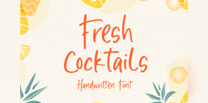 Fresh Cocktails is a handwritten font, this font Is perfect for lproduct packaging, product designs, label, photography, watermark, special events or anything. Fresh Cocktails comes with uppercase and lowercase letters, multilingual symbols, numerals, punctuation. If you have any questions please don't hesitate to drop me a message :) Thank You, Sronstudio
 - Dirty Jab by PizzaDude.dk,
$15.00 Using Dirty Jabfor your graphical adventures is like having brunch when being hungry! The surface of the font is actually kind of grunge. Use the font at large sizes with reveal the authentic worn look. Comes with extensive language support and 6 contextual alternates that automatically cycles as you type!
 - Vaselina by Mevstory Studio,
$20.00 Vaselina – The chic & modern serif font. Vaselina is a modern and chic typeface, best used as a display for headings, logos, branding, magazines, product packaging and invitations. Vaselina comes with clean lines and smooth curves to give any project an extra touch of class. That's it! Have fun using Vaselina Typeface!
 - Oliver Blush by Typetemp Studio,
$20.00 Oliver Blush Modern Calligraphy Font with alternatives and ligatures that create stunning logos, quotes, posts, blog posts. branding projects, magazine imagery, wedding invitations, and much more. Features : Multilanguange PUA Encoded Web Font Included Illustration Include (.Ai) Contact me with an inbox message If you have any question. Thank you! Happy Creating.
 - Bombay Blue by Hanoded,
$15.00 After having finished Pondicherry font, I stayed in the 'Indian Mood' (so to speak) and named this font after another Indian city. Bombay Blue turned out to be a handsome typeface with a flirty air, suburban chic and just enough sleaze to keep everyone happy. Comes with a diacritical pantheon.
 - Hammock by One Fonty Day,
$10.00 Hammock is a chilled and simple handwritten typeface. Having the combination of the large capital letters and the small lowercase enable you to play with the font uniquely and flexibly. Also, its left-slanted letters give a bit of special look to the typeface. Most of the european languages are supported.
 - Chinese Shangai by Nirmana Visual,
$24.00 Chinese Shangai Inspired by China & Japan Calligraphy. Each characters carefully crafted with delight full technique and visual touch to make your design works have oriental and stylish looks. Chinese Sahnagi Perfectly fit for your Chinese / Japanese projects, Logo, Branding, Restaurant, Asia Town decoration, anytime you need an instant vibe of it.
 - PR Hearts Take Wing 01 by PR Fonts,
$10.00 Hearts, and wings are both powerful symbols.The heart represents the seat of the emotions, and Wings represent movement upward, even spiritually, in the case of angel wings. These images have been drawn with a brush, some of them on rough paper, and are available as a black or white version.
 - To Be Continued by Comicraft,
$29.00Trapped in a world they never made, the characters in our Story So Far have been engaged in final battle with their Arch Enemies... the characters known only as ToBeContinued. Will our heroes survive? Will justice prevail? Will the forces of good defeat the forces of darkness...? To Be Continued... - French Marble by Sronstudio,
$23.00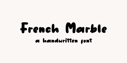 French Marble – Handwritten Font, this font Is perfect for product packaging, product designs, label, photography, watermark, special events, or anything. Features: File OTF, TTF, WOFF Uppercase and lowercase letters Multilingual, numerals, and punctuation If you have any questions feel free to drop me a message Follow Instagram: @sronstudio Thank You!
 - Mere by Josh Grzybowski,
$19.99 Loosely based on a Jan Tschichold specimen, Mere is a clean geometric sans-serif with simple lines that are best viewed as larger print but still have an impact at smaller point sizes. In addition to ligatures and fractions, Mere’s other OpenType features include old style numbers and small caps.


