10,000 search results
(0.02 seconds)
- Standing Stones by Solotype,
$19.95Redrawn from a strange type originally made about 1850, and sold by the Connors Foundry, New York. We cannot guarantee that Connors originated it, since they were among the first to have facilities for pirating other foundries' types. - M Cascade PRC by Monotype HK,
$523.99 M Cascade PRC is a graphic style Simplified Chinese typeface. Graphic font designs have strong personalities and visual impact. Graphic style Simplified Chinese fonts feature decorative elements and pronounced graphics characteristics, suitable for catching attention in display applications.
 - M Stream PRC by Monotype HK,
$523.99 M Stream PRC is a graphic style Simplified Chinese typeface. Graphic font designs have strong personalities and visual impact. Graphic style Simplified Chinese fonts feature decorative elements and pronounced graphics characteristics, suitable for catching attention in display applications.
 - Vienna by Solotype,
$19.95This early 1900s type is from the German foundry of Schelter & Gieseke, and is typical of early twentieth century design. As usual, we have added all the modern necessities, such as monetary signs for the major commercial countries. - M Cascade HK by Monotype HK,
$523.99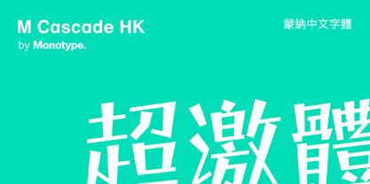 M Cascade HK is a graphic style Traditional Chinese typeface. Graphic font designs have strong personalities and visual impact. Graphic style Traditional Chinese fonts feature decorative elements and pronounced graphics characteristics, suitable for catching attention in display applications.
 - Lanford by Ironbird Creative,
$10.00 Lanford is a powerful display typeface inspired by vintage type with carefully crafted. This typefaces is perfect for people looking for vintage aesthetic. Feature : Uppercase Lowercase Numerals & Punctuations Multilingual If you have any questions, please contact (ironbirdcreative@gmail.com)
 - Construct by Breitenlauf,
$20.00 Construct is a technically based headline font that can also be used as body text. The font has some new ligatures that are automatically applied. Construct particularly suitable for headlines which should have a urban and technical character.
 - Gloriesta Playful by DYSA Studio,
$19.00 Gloriesta Playful is a new playful typeface. This another collection of display is perfect for your next branding project, excellent for your business. Gloriesta Playful have a natural edges, so this font gives an authentic handcrafted feel style.
 - Halloween School by Jehansyah,
$9.00 Halloween School is a font family with various types in it, you can choose according to your needs, with several characters to suit the latest design trends experience, make this your choice and have fun with each character.
 - M Ngai PRC by Monotype HK,
$523.99 M Ngai PRC is a graphic style Simplified Chinese typeface. Graphic font designs have strong personalities and visual impact. Graphic style Simplified Chinese fonts feature decorative elements and pronounced graphics characteristics, suitable for catching attention in display applications.
 - Kutai by Eko Bimantara,
$18.00 Kutai is an explorative typeface that created to pursue unique display typeface fuse with ethnic look. It's consist of three styles or instance; Normal, Tall and Taller which have different height between each other, especially the x-height.
 - Alfrere Banner by Greater Albion Typefounders,
$12.00 Alfrere Banner is a 1950s inspired masthead typeface, designed to complement our ‘Alfrere Sans’ typeface family. These two Banner faces, offered in regular and incised forms, emphasise horizontal lines and have a distinct ’streamline-era’ feel to them.
 - M Yoyo HK by Monotype HK,
$523.99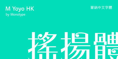 M Yoyo HK is a graphic style Traditional Chinese typeface. Graphic font designs have strong personalities and visual impact. Graphic style Traditional Chinese fonts feature decorative elements and pronounced graphics characteristics, suitable for catching attention in display applications.
 - HU Mois KR by Heummdesign,
$25.00 HU Mois KR is a calligraphy typeface with a sense of speed and a naturally slanted feel as if writing. It also gave a sense of free rhythm of handwriting. Includes Korean from the existing 'HU Mois' font.
 - M Windy PRC by Monotype HK,
$523.99 M Windy PRC is a graphic style Traditional Chinese typeface. Graphic font designs have strong personalities and visual impact. Graphic style Traditional Chinese fonts feature decorative elements and pronounced graphics characteristics, suitable for catching attention in display applications.
 - Skizzors by Fonthead Design,
$19.00Skizzors is a family designed by Ethan Dunham created by cutting letters out of paper. The fonts have an irregular edge but are clean and legible. The bold version is almost black and complements the regular version nicely. - M Stream HK by Monotype HK,
$523.99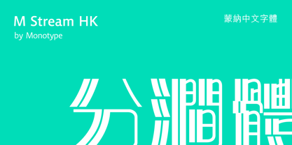 M Stream HK is a graphic style Traditional Chinese typeface. Graphic font designs have strong personalities and visual impact. Graphic style Traditional Chinese fonts feature decorative elements and pronounced graphics characteristics, suitable for catching attention in display applications.
 - Velvet Script by Typadelic,
$19.00A pretty handwriting typeface. Smooth and feminine. You'll find an alternate "r" and "s" (Option 9 and Option 10 on the keyboard) which have a beginning stroke to achieve a finished look. Try it and see for yourself. - Bilhete by Vernacular,
$9.99 Bilhete ('note') is a font for a quick writing. You can write a poem, a shop list or your name in a coffee cup. Any note on your project will have a personal taste with Bilhete by Vernacular. :)
 - HF Monorita by HyFont Studio,
$29.00 HF Monorita is the first monospace we have created. It is perfect for coding, display and design. The subtle curves on the diagonal strokes create a friendly vibe and can create a better reading flow for the users.
 - Nanu by Gustav & Brun,
$20.00 Nanu is a hand drawn font where lower and upper cases have the same cap height. It is multilingual and contains a lot of open type features. When purchasing Nanu you get the Nanu Simple Ornaments for free.
 - Lecory by vuuuds,
$16.00 Introducing Lecory Font! Lecory is modern serif font, every single letters have been carefully crafted. This font including beautiful alternate glyph. You can access the alternate glyph via Font Book (Mac user) or Windows Character Map (Windows user).
 - M Rocky PRC by Monotype HK,
$523.99 M Rocky PRC is a graphic style Simplified Chinese typeface. Graphic font designs have strong personalities and visual impact. Graphic style Simplified Chinese fonts feature decorative elements and pronounced graphics characteristics, suitable for catching attention in display applications.
 - M Circus PRC by Monotype HK,
$523.99 M Circus PRC is a graphic style Simplified Chinese typeface. Graphic font designs have strong personalities and visual impact. Graphic style Simplified Chinese fonts feature decorative elements and pronounced graphics characteristics, suitable for catching attention in display applications.
 - M Rocky HK by Monotype HK,
$523.99 M Rocky HK is a graphic style Traditional Chinese typeface. Graphic font designs have strong personalities and visual impact. Graphic style Traditional Chinese fonts feature decorative elements and pronounced graphics characteristics, suitable for catching attention in display applications.
 - Al Crystasea by Aluyeah Studio,
$119.00 Crystasea, a Dawn Seeker Display Serif Font with Stunning 4 weight Style. Very suitable for magazine, headline, website, ads, product package and all type of design project you have. Features: OpenType support Multilingual support (15 languages) PUA Encoded
 - Conqueror Sans by Letterhead Studio-YG,
$45.00 This sanserif has 18 faces from Light to the Black Italic. Conqueror Sans keeps the vigorous design peculiar to all members of this family, but at the same time it is more neutral, than its having serifs relatives.
 - Talloween by Ingrimayne Type,
$9.00 Talloween is a bizarre typeface in which the letters have a fraktur form, but look as if they had been made of wax that has partially melted. It comes in four styles, regular, oblique, shadow, and oblique shadow.
 - Olifant by Hipopotam Studio,
$25.00 Typeface originally designed as a monospace font (single standard width for all glyphs). We needed that for a project where letters stood directly above each other. Eventually it became proportional, and only the digits have a fixed width.
 - Razzle by Ayca Atalay,
$18.00 Razzle Sans | A Whimsical Sans Serif Razzle Sans is a clean sans serif typeface with a whimsical attitude. Playful yet legible letterforms that have a high x-height makes Razzle Sans an excellent choice as a display typeface.
 - Butterflies by Typadelic,
$-Can one have enough butterflies? I think not, which is why I created these little creatures. Another release of Butterflies, containing more butterflies and perhaps a few other critters thrown in, will be available later in the year. - Poison Ivy by Hanoded,
$15.00 Poison Ivy is a messy, scrawled font. It looks like the glyphs have been etched by an unsteady hand. Poison Ivy is ideal for use in books, albums and posters. Comes with a witches' kettle full of diacritics.
 - M Computer HK by Monotype HK,
$523.99 M Computer HK is a graphic style Traditional Chinese typeface. Graphic font designs have strong personalities and visual impact. Graphic style Traditional Chinese fonts feature decorative elements and pronounced graphics characteristics, suitable for catching attention in display applications.
 - Crypick by Grontype,
$14.00 Crypick is a Modern Serif Font, created with unique design. the parts of the font is simply watery looks inspired by ocean wave. this font comes with some ligatures and alternates, and already PUA encoded for easily accessed into optional Glyphs. Crypick Font is simply designed to ease any design project such as invitational card, logo tagline, attentional flyer, magazine header, and much more Features : Complete standard glyphs ligatures and alternates PUA encoded Numeral and Punctuation Multilingual Support Thankyou for your attention, Regard : Grontype
 - Bunken Tech Sans by Buntype,
$49.00 The Bunken Tech Sans superfamily: A reminiscence of constructed fonts of the modern age designed with considerably cleaner forms. Bunken Tech Sans follows in the best tradition of the straight-lined and somewhat angular structures of its predecessors while offering a much more open and mild design. The shapes of the letters are therefore reduced to the most essential elements: The spurs on a, b, n and other lower case letters occur just as little as decorative or style details, the lightly rounded inside edges are more pleasing to the eye than certain historic role models and make for a harmonic, flowing style. Use In particular Bunken Tech Sans stands out as an easy, distinctive headline font with its straight-lined, technical design. Open counters and large x-height make it equally suited for use in shorter texts. It is also perfectly complemented by Bunken Sans or Bunken Slab in longer texts (available soon). Features Available in 10 styles with widths ranging from Light to ExtraBold with associated Italics. All of the styles are very extensive: Support for at least 58 languages, Small Capitals, 9 number sets (e.g. Lining, Oldstyle, Tabular and Small Cap Figures), ligatures, alternate characters, numerous Opentype functions, and lots of other small features that make it more pleasant to work with the font on a daily basis as well as fulfilling typographic desires. Each style contains more than 870 characters! Each style is available in a professional (Pro) and standard (Std) edition with a reduced range of functions. (Language support, OpenType features and number of glyphs). Details can be found on the respective pages. Bunken Tech Sans is part of the Bunken Tech superfamily and is available in Condensed, Normal and Wide. Also of interest: The slab serif variation Bunken Tech Slab Features in Detail: 12 Weights: -Light -Book -Medium -SemiBold -Bold -ExtraBold and corresponding Italics 3 Widths: -Condensed -Normal -Wide Alternate Characters: A, E, F, L, S, e, f, t, s, y, etc. Small Capitals 5 Sets of Figures: -Lining Figures -Old Style Figures -Tabfigures -Old Style Tabfigures -Small Cap Figures Automatic Ordinals Automatic Fractions Extended Language Support and more...
 - Vinyle by Lián Types,
$37.00 Bold, rounded and super cool. Those are the attributes of my latest font “Vinyle”, french for vinyl. In this epoque where all fields of Design are giving a lot of importance and attention to Typography and Lettering, I felt it was my duty to contribute with something that could really stand alone and ‘say something else’ that just words to be read. I've found that lately in the world, regarding a finished piece of design, the role of Typography (and of letters in general) went from being secondary, (like a minor player or a supporting actor) to the most important one. People are starting to understand the beauty of a well-done letter: they want their storefronts with unique scripts, they want to drink coffee surrounded by lettered blackboards, they want to buy books with astonishing covers with swashes ‘por doquier’. I'm more than happy to be alive in a present where even the most unimaginable friends of mine, (who couldn't spot differences between comic sans and helvetica before) are now conscious of the importance of a letter, or let’s say: Of the ‘voice’ of Typography. With Vinyle I tried to make a font with power. Following the nowadays trend of, let me say, “the vintage sans renaissance”. This time I put my brushes and nibs aside and experimented with something new. It wasn't easy, if you will pardon, for me to see swashes all over the place withouth the classic calligraphic ‘thick and thins’, but with after some weeks of work I started to love them. Like I already showed you in other creations (1) let me finish with the phrase: GEOMETRY IS SEXY! TIPS Vinyle has a lot of attitude, it shouts “here I am!” it really can ‘design an entire piece’ for you with just a word or two: It was designed with a 10 degree slant on purpose so the user may rotate it (like on the posters) that amount of degrees in order to see better results. Use Vinyle with the ‘fi’ standard ligatures activates for better kerning and ligatures! NOTES (1) See my font Selfie , the ‘little sister’ of Vinyle.
 - Cesium by Hoefler & Co.,
$51.99 An inline adaptation of a distinctive slab serif, Cesium is an unusually responsive display face that maintains its high energy across a range of different moods. The Cesium typeface was designed by Jonathan Hoefler in 2020. An energetic inline adaptation of Hoefler’s broad-shouldered Vitesse Black typeface (2000), Cesium is named for the fifty-fifth member of the periodic table of the elements, a volatile liquid metal that presents as a scintillating quicksilver. From the desk of the designer, Jonathan Hoefler: I always felt that our Vitesse typeface, an unusual species of slab serif, would take well to an inline. Vitesse is based not on the circle or the ellipse, but on a less familiar shape that has no common name, a variation on the ‘stadium’ that has two opposing flat edges, and two gently rounded sides. In place of sharp corners, Vitesse uses a continuously flowing stroke to manage the transition between upright and diagonal lines, most apparent on letters like M and N. A year of making this gesture with my wrist, both when drawing letterforms and miming their intentions during design critiques, left me thinking about a reduced version of the typeface, in which letters would be defined not by inside and outside contours, but by a single, fluid raceway. Like most straightforward ideas, this one proved challenging to execute, but its puzzles were immensely satisfying to solve. Adding an inline to a typeface is the quickest way to reveal its secrets. All the furtive adjustments in weight and size that a type designer makes — relieving congestion by thinning the center arm of a bold E, or lightening the intersecting strokes of a W — are instantly exposed with the addition of a centerline. Adapting an existing alphabet to accommodate this inline called for renovating every single character (down to the capital I, the period, and even the space), in some cases making small adjustments to reallocate weight, at other times redesigning whole parts of the character set. The longer we worked on the typeface, the more we discovered opportunities to turn these constraints into advantages, solving stubbornly complex characters like € and § by redefining how an inline should behave, and using these new patterns to reshape the rest of the alphabet. The New Typeface The outcome is a typeface we’re calling Cesium. It shares many of Vitesse’s qualities, its heartbeat an energetic thrum of motorsports and industry, and it will doubtless be welcome in both hardware stores and Hollywood. But we’ve been surprised by Cesium’s more reflective moods, its ability to be alert and softspoken at the same time. Much in the way that vibrant colors can animate a typeface, we’ve found that Cesium’s sensitivity to spacing most effectively changes its voice. Tighter leading and tracking turns up the heat, heightening Cesium’s sporty, high-tech associations, but with the addition of letterspacing it achieves an almost literary repose. This range of voices recommends Cesium not only to logos, book covers, and title sequences, but to projects that regularly must adjust their volume, such as identities, packaging, and editorial design. Read more about how to use Cesium. About the Name Cesium is a chemical element, one of only five metals that’s liquid at room temperature. Resembling quicksilver, cesium is typically stored in a glass ampule, where the tension between a sturdy outer vessel and its volatile contents is scintillating. The Cesium typeface hopes to capture this quality, its bright and insistent inline restrained by a strong and sinuous container. Cesium is one of only three H&Co typefaces whose name comes from the periodic table, a distinction it shares with Mercury and Tungsten. At a time when I considered a more sci-fi name for the typeface, I learned that these three elements have an unusual connection: they’re used together in the propulsion system of nasa’s Deep Space 1, the first interplanetary spacecraft powered by an ion drive. I found the association compelling, and adopted the name at once, with the hope that designers might employ the typeface in the same spirit of discovery, optimism, and invention. —JH Featured in: Best Fonts for Logos
 - Semilla by Sudtipos,
$79.00 I spend a lot of time following two obsessions: packaging and hand lettering. Alongside a few other minor obsessions, those two have been my major ones for so many years now, I've finally reached the point where I can actually claim them as “obsessions” without getting a dramatic reaction from the little voice in the back of my head. When you spend so much time researching and studying a subject, you become very focused, directionally and objectively. But of course some of the research material you run into turns out to be tangential to whatever your focus happens to be at the time, so you absorb what you can from it, then shelf it — like the celebrity bobblehead that amused you for a while, but is now an almost invisible ornament eating dust and feathers somewhere in your environment. And just like the bobblehead may fall off the shelf one day to remind you of its existence, some of my lettering research material unveiled itself in my head one day for no particular reason. Hand lettering is now mostly perceived as an American art. Someone with my historical knowledge about lettering may be snooty enough to go as far as pointing out the British origins of almost everything American, including lettering — but for the most part, the contemporary perspective associates great lettering with America. The same perspective also associates blackletter, gothics and sans serifs with Germany. So you can imagine my simultaneous surprise and impatience when, in my research for one of my American lettering-based fonts, I ran into a German lettering book from 1953, by an artist called Bentele. It was no use for me because it didn't propel my focus at that particular time, but a few months ago I was marveling at what we take for granted — the sky is blue, blackletter is German, lettering is American — and found myself flipping through the pages of that book again. The lettering in that book is upbeat and casual sign making stuff, but it has a slightly strange and youthful experimentation at its heart. I suppose I find it strange because it deviates a lot from the American stuff I'm used to working with for so long now. To make a long story short, what’s inside that German book served as the semilla, which is Spanish for seed, for the typeface you see all over these pages. With Semilla, my normal routine went out the window. My life for a while was all Bezier all the time. No special analog or digital brushes or pens were used in drawing these forms. They're the product of a true Bezier process, all starting with a point creating a curve to another point, which draws a curve to another point, and so on. It’s a very time-consuming process, but at the end I am satisfied that it can get to pretty much the same results easier and more traditional methods accomplish. And as usual with my fonts, the OpenType is plenty and a lot of fun. Experimenting with substitution and automation is still a great pleasure for me. It is the OpenType that always saves me from the seemingly endless work hours every type designer must inevitably have to face at one point in his career. The artful photos used in this booklet are by French photographer and designer Stéphane Giner. He is very deserving of your patronage, so please keep an eye out for his marvelous work. I hope you like Semilla and enjoy using it. I have a feeling that it marks a transition to a more curious and flexible period in my career, but only time will tell.
 - "Sea Dreams" is a font that truly captures the essence of whimsy, fluidity, and the mysterious depths of the ocean, brought into existence by the creative talent of Heather Taylor. Imagine letters th...
- Ah, Bubblii, the font that seems to dance right off the page! Designed by the ever-imaginative Philip Lanier, it's the typographical equivalent of a bubble bath — fun, light, and so effervescent, you...