10,000 search results
(0.061 seconds)
- Lemon Flush by PizzaDude.dk,
$15.00 According to my own knowledge, and the info found around the internet, lemons are good for your health. Not only do I care about my health, I also care for a good dessert! :) And this is where the lemon enters the the arena! I love the sweet and sour taste of the lemon - I love it in drinks (hot or cold) in ice creams, cakes, sweets ... you name it! I just had to name this font something with the word "lemon" in it, because I find it mouth watering! :)
 - ITC Cherie by ITC,
$29.99Some words from the designer... Like long legs walking a runway in stiletto heels, ITC Cherie is both sophisticated and feminine. West coast designer Teri Kahan developed this art nouveau-style font into two distinct all capital alphabets – one with a “high waist”, placed in the capital position, and the other a “low-waist,” placed in the lower case position. They work separately or together, and this dual nature gives a designer the ability to make subtle changes in a logo or line of text. Additional flourished letters round out this versatile headline font. - The Vaguer by Rillatype,
$15.00 The Vaguer is a very special font. because this font takes some time in the manufacturing process because I want to make a font that can adapt to modern design needs and can also look organic with the rounded version. In addition, The Vaguer has tons of Opentype features to choose from, such as alternates characters, ligatures and swashes and is equipped with multilingual support. This font is very able to meet your needs to create designs ranging from logos, quotes, branding, you name it! That's all from me, I really hope you like it!
 - MM Indento by MM Fonts,
$19.00 Indento is a multi-purpose modern geometric slab serif for headlines, posters, branding but fairly legible to be used as longer text. The straight and rounded corners combined with deep cuts and asymmetric serifs gives it a distinctive look while still keeping its rigorousness and legibility. The family consist of three weights, each with a companying italic. The extensive character set—513 glyphs in each font—includes support for Central and Eastern European languages and OpenType features like small caps, ligatures, fractions, slashed zero, stylistic alternates and more.
 - Brightly Stories by Graphicxell,
$20.00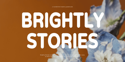 Brightly Stories Rounded Sans Font Typeface inspired by the famous minimalist logo perfect for the purposes of designing templates, brochures, videos, advertising branding, logos, invitation, layout design, elegant crafting, beauty design and other What's Included : + Standard glyphs + International Accent + Works on PC & Mac + Simple installations Accessible in the Adobe Illustrator, Adobe Photoshop, Corel Draw. PUA Encoded Characters - Fully accessible without additional design software. Fonts include multilingual support Image used : All photographs/pictures/vector used in the preview are not included, they are intended for illustration purpose only. Thank You
 - Pleasure Point by Comicraft,
$39.00 Slocals! Check out the action of our radical new font, PLEASURE POINT! It's Bananas, Totally Tubular, Stoked and ready to ride some waves. Back in his grom days, Comicraftsman John JG Roshell could be found down at Pleasure Point, waiting for The Big One, and this is IT! Don't be a criddler, paddle hard and rip this font to your motherboard to keep it real every time you gun, rail or tail. And if you get rag dolled, dude, don't blow out your squeaker. Pleasure Point will hang loose and chillax you to the max.
 - Manifold CF by Connary Fagen,
$35.00 Manifold® CF is a utilitarian typeface inspired by the precision of a computer terminal, softened by contemporary design and rounded corners. Manifold's unified letterforms and tall x-height are great for user interfaces, or track it out for a sophisticated look. Manifold also offers wide language support, including Cyrillic script, Vietnamese, and Pinyin Romanization. Manifold® CF excels as a headline or display typeface, and pairs well with contrasting simple serifs like Artifex CF and Artifex Hand CF. All typefaces from Connary Fagen include free updates, including new features, and free technical support.
 - Julienne by Wiescher Design,
$39.50 Cooks call thinly cut - like matchsticks - vegetables "Julienne". I found that was a fitting name for this very narrow typeface. Julienne Slim is the extreme cut of the two. Personally I do not use narrow typefaces very often, but from time to time they come in handy if there is much text to be crammed into little space. I could make a typeface that was even narrower, but I will not do it. This is as narrow as my typefaces get. Enjoy what I cut for you, Gert Wiescher.
 - Qualux by Asenbayu,
$12.00 Qualux is a versatile high-contrast serif font family. Qualux comes from the words Quality and Luxury. This font has vintage characteristics with a luxurious style in light, but also has a friendly and playful style in bold. Each glyph has a soft, rounded tip. This font is suitable for many various projects such as logos, branding, magazines, signage, fashion and many more. Qualux consists of 8 styles: Light, Light Italic, Regular, Italic, Semibold, Semibold Italic, Bold, and Bold Italic. These fonts feature Kerning, Standard Glyph, Stylistic Alternate & Ligature, Numeral, Symbol, and Multilingual Supports.
 - Carafia by Khoir,
$15.00 Carafia is a bold sans serif font. It has its own uniqueness in its small, bound letters, Supported by several alternative and ligature fonts that make it cute, unique, suitable for all types of projects such as branding, logo design, cover design, web design, packaging, social media, and many more what are you waiting for! What's included? Uppercase Characters Lowercase Characters Support 75+ Language So what are you waiting for? immediately purchase this font, feel free to comment, or send me my PM or email at khoirtypework@gmail.com Thank you for seeing
 - Migaela by Nurrontype,
$15.00 Hi, I'm Migaela. I'm optimistic, inspiring and expressive typeface. My friend told me I'm cheerful, positive and charming. My designer made me with three optional style, Regular, Overlap and Smooth (rounded), each with oblique version. It has unique stylistic and ornament. Don't you see that lowercase I with snow flake. It's so cute isn't it. Before I forget, kindly look my ligature, I know you like it. Buy me know, let me works together in your Christmas project, Holiday card, New Years event, and of course your next Valentine project.
 - Quandary by Winnie Tan,
$39.00 The Quandary Font is created for a horror theme in use with an illustrated book ‘The Predicament’ by Edgar Allan Poe. It is designed as a highly expressive face to accentuate a sense of mystery and the macabre. A comparatively more carefree and free-spirited face, it comes as a uni-case single weight family used exclusively as the main face for the book. The characters are developed from the numeric glyphs found on the astronomical clock-face at Prague Old Town Square, Czech Republic. http://www.behance.net/gallery/Quandary/383204
 - Susan Sans by ParaType,
$30.00 An original text and display type family was designed for ParaType in 2008 by Manvel Shmavonyan to be used together with Susan and Susan Classic, earlier released type families by the same author. This is a low-contrast sans serif font with open letterforms. Its shape is distinguished by rounded upper parts of lower case. Susan, Susan Classic and Susan Sans forms a super family coordinated on weight, style and proportions. Susan Sans is well suited for short and middle range text composing as well as for use in advertising and display typography.
 - ITC Adderville by ITC,
$29.99On a cold winter's night, George Ryan, of Galápagos Design Group, began musing on the possibilities for a “truly original” sans serif typeface. What came out of his musing, and his always-present sketchpad, was ITC Adderville, a typeface whose visual impact is immediate and strong. Ryan explains how he did it: “The rounded ends of its strokes and their skewed baseline contact create an illusion of dancing feet. The tops of lowercase stems emit serif buds, suggesting transition into or out of the serifed form. The spear-like lowercase stroke terminators, along with other distinctive elements such as the stylized reticulation of the lowercase 'g' segments, the salute of that same character's spur, and the bold, non-self-conscious 'i' and 'j' dots, all contribute to the playful and unique nature of this design.” The result is a friendly, lively type family whose graduated weights -- book, medium, and heavy -- lend themselves especially well to use at small display sizes and in short blocks of text. - Merlo by Typoforge Studio,
$25.00 Font Merlo is the younger sister of Cervo. Font Merlo is characterized by eight different varieties – lower and uppercase characters. It is inspired by a You And Me Monthly published by National Magazines Publisher RSW "Prasa” that appeared from May 1960 till December 1973 in Poland.
 - The qoestter by Alit Design,
$19.00 Presenting the ✨The Qostter Retro Serif Font✨ by alitdesign. The Qostter Retro Serif font is inspired by stylish designs from the 80s to 90s. At that time the font style like "The Qotter" had a firm and trendy impression. The Qotter retro font has a wide selection of alternative characters and swashes that make it easy to create bold retro-style designs. The Qostter Retro Serif font is very suitable for making designs with retro concepts, simple and playful designs, for example making magazine cover designs, music covers, YouTube thumbs, text headers, logotypes and so on with an elegant retort theme. Besides that this font is very easy to use both in design and non-design programs because everything changes and glyphs are supported by Unicode (PUA). The Qostter Retro Serif font has a total of 758 glyphs including symbol, multilingual and alternative glyphs. We really enjoyed the process of making The Qostter Retro Serif font, we hope you are also happy when using The Qostter Retro Serif font. Language Support : Latin, Basic, Western European, Central European, South European,Vietnamese. In order to use the beautiful swashes, you need a program that supports OpenType features such as Adobe Illustrator CS, Adobe Photoshop CC, Adobe Indesign and Corel Draw. but if your software doesn't have Glyphs panel, you can install additional swashes font files.
 - Zombie Brush by Ditatype,
$29.00 Zombie Brush is a haunting script font that brings the undead to life with its eerie charm and brush-style appearance. Designed intentionally in large letters, this typeface commands attention and exudes a sense of horror and intrigue. Each letter is meticulously crafted with brush-like strokes, adding a touch of handcrafted artistry to the font. The brush-style appearance of this font evokes a sense of chaos and unpredictability, as if the letters were created by an unsteady hand under the influence of dark forces. The large size of the letters enhances the font's imposing presence, making it impossible to ignore. For the best legibility you can use this font in the bigger text sizes. Enjoy the available features here. Features: Multilingual Supports PUA Encoded Numerals and Punctuations Zombie Brush fits in headlines, logos, movie posters, flyers, branding materials, print media, editorial layouts, headers, and zombie-themed projects. Find out more ways to use this font by taking a look at the font preview. Thanks for purchasing our fonts. Hopefully, you have a great time using our font. Feel free to contact us anytime for further information or when you have trouble with the font. Thanks a lot and happy designing.
 - FS Split Sans by Fontsmith,
$80.00 Quirky and irregular FS Split is no ordinary typeface. Its irregular proportions make it unique, with round letters appearing wide, and straight letters narrow. Other quirks include its eclectic crossbars – the uppercase ‘A’ has an unusually low bar, while the bar on ‘G’ is particularly long. The uppercase has many interesting features in fact, including large counters, closed terminals on certain letters like ‘J’, and a cap-height that lines up with ascenders. The lowercase also holds surprises – the dots on ‘i’ and ‘j’ are unusually large, and some characters, such as ‘g’, feature double-storey counters. An extreme but stylish italic The italic versions of FS Split Sans and Serif are particularly striking. While similar in style to their upright, Roman versions, they take on a larger-than-usual 18-degree angle, making the forward-slant more dramatic. Although the main purpose of any italic is to help words and phrases stand out, this unique execution helps to make the italic variants of FS Split stylish fonts in their own right – they would work brilliantly on magazine covers, in titles and headlines, pull quotes, and even used commercially in logos and corporate branding. Serif and sans: a split personality FS Split Sans and Serif have their differences but also their similarities, contrasting and complementing each other perfectly. This ‘love hate’ relationship inspired the name of the typeface family, and means the two variants provide a versatile, typographic palette for use in graphics and branding. While its proportions are similar to the sans, the serif has a bigger contrast between its weights of bold, regular and light, bracketed serifs, and different styles of terminals, some being straight and others ball-shaped. FS Split Sans has more subtlety and simplicity, with a smaller weight contrast, less flamboyant terminals, and more consistent counter sizes. The two variants are distinct yet alike, so can be used successfully either in isolation or together.
 - FS Split Serif by Fontsmith,
$80.00 Quirky and irregular FS Split is no ordinary typeface. Its irregular proportions make it unique, with round letters appearing wide, and straight letters narrow. Other quirks include its eclectic crossbars – the uppercase ‘A’ has an unusually low bar, while the bar on ‘G’ is particularly long. The uppercase has many interesting features in fact, including large counters, closed terminals on certain letters like ‘J’, and a cap-height that lines up with ascenders. The lowercase also holds surprises – the dots on ‘i’ and ‘j’ are unusually large, and some characters, such as ‘g’, feature double-storey counters. An extreme but stylish italic The italic versions of FS Split Sans and Serif are particularly striking. While similar in style to their upright, Roman versions, they take on a larger-than-usual 18-degree angle, making the forward-slant more dramatic. Although the main purpose of any italic is to help words and phrases stand out, this unique execution helps to make the italic variants of FS Split stylish fonts in their own right – they would work brilliantly on magazine covers, in titles and headlines, pull quotes, and even used commercially in logos and corporate branding. Serif and sans: a split personality FS Split Sans and Serif have their differences but also their similarities, contrasting and complementing each other perfectly. This ‘love hate’ relationship inspired the name of the typeface family, and means the two variants provide a versatile, typographic palette for use in graphics and branding. While its proportions are similar to the sans, the serif has a bigger contrast between its weights of bold, regular and light, bracketed serifs, and different styles of terminals, some being straight and others ball-shaped. FS Split Sans has more subtlety and simplicity, with a smaller weight contrast, less flamboyant terminals, and more consistent counter sizes. The two variants are distinct yet alike, so can be used successfully either in isolation or together.
 - Amarylli Blossom by Balpirick,
$15.00 Amarylli Blossom is a sweet, soft hand-lettered handwritten font. The playful rounded characters make it the perfect font for creating stunning designs. Fall in love with its authentic feel and use it to create gorgeous wedding invitations, beautiful stationary art, eye-catching social media posts, and cute greeting cards.
 - BR Omny by Brink,
$30.00 BR Omny is a rounded geometric sans serif, it is based on a softened geometric framework with a confident and friendly persona. The family contains 7 weights ranging from Thin to Black with corresponding italics. It supports an ‘Extended Latin’ character set that provides support for 200+ latin based languages.
 - Geeeki Soft by Drawwwn,
$15.00 Geeeki Soft is a playful semi serif font, it's cute yet nerdy, stylish but dorky. Bold and chunky, it's a unique headline grabber, so it's the perfect match for style magazines, fashion brands and whimsical websites. Find your inner super-geek! Now softer, rounded and bouncier geeeki is available too!
 - Potamion by Beewest Studio,
$10.00 The Ugaritic alphabet is a script with ancient letters that was used around 1400 BC. Ugarit is an Old Southwest Semitic language and was found in Ugarit, a place in Syria. It has 30 letters. Other languages (especially Hurrian) are sometimes written in the Ugaritic script in the area around Ugarit
 - Bla Bla by S6 Foundry,
$25.00 Bla Bla is a contemporary serif typeface inspired by brutalist forms, featuring large open counters, curved, round forms, creating a modern & elegant glyph set. The organic curves with gentle repetitions create powerful and harmonious forms. Designed to be a stylish modern family it is perfect for communication and branding projects.
 - Elios by ATK Studio,
$15.00 Elios™ is a stencil display typeface with a strong personality. It comes with all caps letters and monospaced with rounded edges. This font come with single weight and character set that covers over 100 latin languages. Elios™ is perfect for poster, headlines, short texts, branding and other display use.
 - Kulacino by Imagi Type,
$15.00 Kulacino is a modern-retro display typeface inspired by the oldtimes factory signages/ plat licenses. Its seemingly rigid form is tempered by the soft, rounded corners, and fine notched details present at acute angles in the glyphs. You can use Kulacinos into anything as far as your creativity carry you!
 - Southville by Rillatype,
$15.00 Introducing, Southville! a bold and fun display font. it's bold characteristic and round at the edges makes this font bold and brave but have soft and fun charm. this font is perfect for books, packaging, branding, make up, novel, label, etc. Features : uppercase & lowercase numbers and punctuation multilingual PUA encoded
 - Lindisfarne Nova BT by Bitstream,
$50.99 Lindisfarne Nova is an uncial-like design based on the script found in the Lindisfarne Gospels. Created by Harry Pears and Margaret Layson, it is available in two weights, regular and bold. Lindisfarne Nova is Harry’s first completed font. There are also two companion styles, Lindisfarne Nova Incised and Lindisfarne Runes.
 - Masantina by Estudio Calderon,
$24.00 A clean, elegant and modern serif that has a strong personality thanks to its soft endings, rounded terminals, inspired from Cheltenham, Belwe and Souvenir. Masantina is equipped for complex, professional typography. The OpenType fonts have an extended character set to support Central and Eastern European as well as Western European languages.
 - Schwung by Hubert Jocham Type,
$29.90 Schwung is a brush script headline typeface. It has round elegant swirls that get stronger in the alternate version. Ideal for food packaging and product branding, it is designed to be clear and self-confident. Schwung does not need very much space to make it work perfectly on food labels.
 - DraftWerk by The Northern Block,
$16.70 A minimal rounded typeface inspired by architecture and furniture detail drawings. The idea was to develop a font that would showcase precise radius corners at large formats and would also downsize to produce stylish body text. Details include 4 weights, a complete character set, manually edited kerning and Euro symbol.
 - Retail Price JNL by Jeff Levine,
$29.00 Redrawn from lettering found on a British publication circa the 1930s, Retail Price JNL is an extra bold display inline sans that’s great for catchy headlines, price cards, banners or any other attention-getters. Retail Price JNL is offered in regular, oblique, solid and solid oblique versions. Caps only Fonts.
 - Darkness Awakening by Ditatype,
$29.00 Darkness Awakening is a chilling display font designed to send shivers down your spine. This uppercase font features eerie details that give it an air of horror and mystery, making it the perfect choice for spine-tingling design projects. Each letter in Darkness Awakening is meticulously crafted with the appearance of brush strokes, evoking a sense of handcrafted artistry. The brush details add a touch of unpredictability and chaos, giving the font a haunted and unsettling vibe. While the font is uppercase, it is not bold, allowing the horror theme and brush details to take center stage. For the best legibility you can use this font in the bigger text sizes. Enjoy the available features here. Features: Multilingual Supports PUA Encoded Numerals and Punctuations Darkness Awakening fits in headlines, logos, movie posters, flyers, invitations, branding materials, print media, editorial layouts, headers, and any horror-themed projects. Find out more ways to use this font by taking a look at the font preview. Thanks for purchasing our fonts. Hopefully, you have a great time using our font. Feel free to contact us anytime for further information or when you have trouble with the font. Thanks a lot and happy designing.
 - Mistery Brush by Ditatype,
$29.00 Mistery Brush is a captivating script font that exudes an air of intrigue and enigma. Designed in large letters with a thick weight, this typeface commands attention and makes a powerful statement. Each letter is meticulously crafted with brush-like strokes, adding a touch of handcrafted artistry to the font. The brush details in Mystery Brush lend the font an organic and dynamic feel, as if the letters were painted with the strokes of an enigmatic artist. These artistic details add depth and character, making every word a work of art. For the best legibility you can use this font in the bigger text sizes. Enjoy the available features here. Features: Multilingual Supports PUA Encoded Numerals and Punctuations Mistery Brush fits in headlines, logos, movie posters, flyers, invitations, greeting cards, branding materials, print media, editorial layouts, headers, and many more. Find out more ways to use this font by taking a look at the font preview. Thanks for purchasing our fonts. Hopefully, you have a great time using our font. Feel free to contact us anytime for further information or when you have trouble with the font. Thanks a lot and happy designing.
 - Windgard by Runsell Type,
$17.00 Introducing Windgard - A Clean Brush Script Windgard inspired by hand lettering brush style that moves in clean, make with perfectly horizontal vertical bezier handles. Each glyph has its own uniqueness and when meeting with others will provide a dynamic and playfully. Alternate characters has 6 set (Contextual Alternates, Stylistic Alternates, and ss01-ss04). In addition to the purposes of logotype Windgard Font can also be applied in the esport logo, sticker, apparel, bag, magazine, website headlines, packaging, branding, quotes, business cards, and more. We hope this can make inspire for your work.
 - Blanquotey by Sartstudio,
$10.00 Blanquotey is a simple and modern font. Whether it�s for web, print, moving images or anything else � Blanquotey will look spectacular. This font is very suitable for the needs of branding, logos, technology themes and others. very easy to use and can be installed on any graphics software such as Adobe illustrator, photoshop, Microsoft Office and others. Works on PC & Mac Simple installation Can be accessed in Adobe Illustrator, Adobe Photoshop, Adobe InDesign, and even works in Microsoft Word. Long-term support, Can be accessed completely without additional design software.
 - Ollivette Elite by Chank,
$59.00Fly your inner geek flag with this cool new "Eleet" typewriter font. It's kinda like a wonky internet translator that converts normal text into leet-speak, so you can exchange encoded love notes with cyber-hackers and goofy-gamers. The actual glyphs in this font are interchangeable with the more logical Ollivette typewriter font, but here the characters have all been moved around to create stylized interpretation of similar glyphs. So "ELEET" could also be typed "31337". Except you don't have to think about it. Get it? Got it? Good! 3NJ0¥ TH15 ƒØÑ+ & U53 !† 0FT3N. - Flaminia by Andinistas,
$39.95 Flaminia is a typeface family of 4 members designed by Carlos Fabián Camargo G. The central idea started as Dingbats and titles labeled with fine-tipped brushes and flat tip for graphic design related restaurant menus, instructions, packaging, food containers and labels. Thus began the process of drawings and letters integrated by shapes and counterblocks that seem inaccurate yet but at the same time clean and attractive. For this reason each variable suggests fresh brushstrokes that combine ideas from Roman and italic calligraphy. Flaminia members work separately or together by solving needs in different scenarios. This will enhance its properties in order to control and diagram titles, subtitles and short paragraphs with an effusive and manuscript character. Flaminia is useful for generating a flavor of "hand lettered by skilled artists lettering." In conclusion, Flaminia Regular and Italic are used to write short paragraphs. His ascending and downs are lower that the X height. Its width is imperceptibly condensed to save horizontal space. Its smooth lines and finishes simulating a crescent moon have been made with fine-tipped brush. The contrast between thick and thin has medium intensity. Its complement is an ideal italic to emphasize words and phrases. Its conceptual characteristics are similar with foundation's handwriting, except for his companion who takes ideas from the ornamental italic calligraphy. Flaminia Black is compact and ideal for ranking information such as words and titles. Its personality is based on ornamental penmanship italics mixed with humanistic ideas outlined with contrast-type, flat-tipped brush thickness. Its overall width is slightly condensed, rising and falling are short compared to an exaggerated X height. Its smooth lines and terminations as in a crescent moon simulate the path of a broad brush. Its amount of contrast between strokes have average intensity. In brief, push to the limit parameters such as the type and amount of contrast, size, backward, forward, overall width, etc. And finally, Flaminia Dingbats offers three sets of different illustrations, a total of almost 90 drawings useful in communications related to: Food, Clothes and Sketchy. Each carefully wrought through research, testing, analytical design, visual strategy and high-definition of Bezier paths, optimizing time and work to their users. And in conclusion, I have plans to continue expanding the family with more complete versions in the future.
 - MFC Westport Monogram by Monogram Fonts Co.,
$19.95 The inspiration for MFC Westport Monogram was a heavily soiled vintage lettering & penmanship book which only listed this alphabet specimen as "Banker Tilted". The look and feel of this typestyle is reminiscent of old checks and cartography lettering styles, lending itself a wonderful sense of antiquity for any monogram or headline typeset with it. Download and view the MFC Westport Monogram Guidebook if you would like to learn a little more.
 - KG What Does The Fox Say by Kimberly Geswein,
$5.00 Kid-friendly left-tilted ball and stick handwriting.