10,000 search results
(0.069 seconds)
- Finador Slab by Julien Fincker,
$24.00 Finador Slab is a soft slab-serif family. It has a strong character and can be used for a lot of cases, especially for editorial, branding, packaging and logos. The Slab version is based on the Finador Sans version. It matches perfectly and can be used easily together. The Finador Slab family includes 8 weights, from thin to heavy + their matching italics. With 900+ glyphs per style it supports over 200+ latin based languages, includes an extended currency symbol set and a lot of Open Type Features like small caps, ligatures, fractions, alternates and many more. The lightest and boldest weights are good for display usage, while the middle weights can be also used for body text. Finador Slab supports almost every of your needs. It meets all the requirements to become your next favorite workhorse family. So just give it a try. The Medium weight is for free.
 - Blue Goblet Christmas Ornaments by insigne,
$32.00 insigne is pleased to present new Christmas ornaments as the latest in the Blue Goblet series, a series of fonts and ornaments by artist Cory Godbey. This best-selling series has now been extended to include a new Christmas-themed member. Hand drawn by the artist, the Blue Goblet additions are a fun and lively take on Christmas ornaments. Expressive and spontaneous, these ornaments seem to dance their way across the page. They can be used in conjunction with the original Blue Goblet Ornaments and the Blue Goblet fonts, which include both a sans serif and serif member. Combine them to form interesting compositions, or insert them directly into your layout as chapter headings or illustrations. There are over 60 of the Christmas-themed ornaments, including Christmas trees, bows, ivy and more. Check out the .pdf or the promotional graphics to see all of these great options.
 - CA Spy Royal by Cape Arcona Type Foundry,
$19.00 Spy Royal is a junctionless script typeface and comes in 6 styles. It’s a hybrid between script and so called streamline fonts. The origins are based on an advertising by Japan Airlines, dated around 1954, offering flights to San Francisco, Honolulu and Okinawa in the new DC-6B “Pacific Courier” airplane. Only the letters for the words “JAPAN AIR LINES” were used, so that the creative part was to reimagine a full font out of just a handful of uppercase letters. Originally released in 2004, Spy Royal was now undergoing a major rework and is now republished with additional styles like shadow-lines and 3D-shadow. Its charm is manifold, we think everything related to cars, racing, hot rod, vintage, cocktails, retro, restaurants, gasoline and of course airlines will look great in Spy Royal. Spy Royal includes alternate characters, ligatures and West European diacritics.
 - Big Stripes Mono by Ingrimayne Type,
$9.00 BigStripesMono is another typeface family from IngrimayneType that explores the possibilities of alternating letters sets. The family is monospaced with four fonts: a base or solid style, an outlined style, and two styles in which each character is cut diagonally and the halves are separated to form two characters. These split styles are not designed to be used alone but layered with the base style, outlined style, or both to form colorful lettering with an unusual striped appearance. The stripe is not apparent in single letters but only in words or lines of text. For best results use an application that supports the OpenType feature Contextual Alternatives (calt) to alternate the letters of the split styles. The four styles can be combined in several ways to create unusual lettering appropriate for titles, headlines, and similar uses. And if one wants a bold, monospaced, sans-serif face, BigStripesMono has that too.
 - Kilau by Majestype,
$25.00 Introductory offer 50% Off for a limited time. A collaboration between Coldiac (a four-piece pop band from Indonesia) & Majestype (typefoundry from Makassar Indonesia) with the help of Erwin Indrawan (lettering artist from Bandung) as the font designer. Kilau font is the official font that we’ve been using for Coldiac the newest single artwork (kilau) & branding material. Kilau comes with 250+ Glyphs and has a kerning feature to make it legible and OpenType (Alternative Character), which is very useful for today's design software as it provides a lot of options. One of the most frequently used is to change certain characters according to your taste. Now you can get the font including the commercial usage for your works. We'd be happy if you guys can use it & feel the experience while listen to Coldiac’s song. *it would be much appreciated if you could credit us.
 - Marseillette NB by No Bodoni,
$39.00 These four typefaces, Berlinette NB, Lyonette NB, Marseillette NB and Parisette NB, were designed from the same basic shape, a fanciful geometric form that avoids strict horizontals and uses more offbeat triangular shapes. Marseillette is the nasty one, with sharp hook terminations that require careful use. Don�t slip and accidentally stick one in your hand � it will hurt pretty bad and make you blubber like a baby. It�s good for surreal warning signs on dark, forbidding docks where gooey monsters live.
 - Aljaraz by Cuchi, qué tipo,
$9.95 Aljaraz (meaning “small bell” in english) is a curvy typeface inspired on the “Fat face" letters with an extremely bold design from the early 19th century, but with an insolent touch of brave and psychedelic distortions. Aljaraz has a regular and italic variable, and in both styles the capital letters have a swash alternative where the naughty touch reaches its maximum expression. It is ideal to recall the lysergic era of the 60s, write funny words, or simply to express small texts in a display way that powerfully attracts attention. Let Aljaraz inspire you groovy kind of love! Designed by Carlos Campos cuchi@cuchiquetipo.com Secondary typeface: 'Escuela', also by Carlos Campos _ Aljaraz (“campanita”) es una tipografía curvy inspirada en las letras con un diseño extremadamente grueso y atrevido de principios del siglo XIX (las “Fat face”), pero con un toque insolente de valientes distorsiones psicodélicas. Aljaraz tiene una variable regular y cursiva, y en ambos estilos las mayúsculas tienen una alternativa súper decorada donde el toque travieso alcanza su máxima expresión. Es ideal para rememorar la época lisérgica de los años 60, escribir palabras graciosas, o simplemente expresar textos graciosos de una forma visual que llame poderosamente la atención. ¡Deja que Aljaraz te inspire su maravilloso amor!
 - Axalp Grotesk by ROHH,
$39.00 Axalp Grotesk™ is a post-Swiss-Style modernist sans serif type family characterized by the play between elegant rounded shapes and sharp angular details. It is minimal, legible, well balanced and charismatic. Its heavy weights deliver powerful yet friendly impact. Thin ones emanate elegance, fine lines and precision. The family has very versatile proportions and generous x-height allowing a successful use for user interfaces, all sorts of display and branding scenarios, as well as a paragraph text typeface. Contemporary minimalistic approach makes Axalp Grotesk an outstanding design tool for creating modern visual identities and user interfaces. A truly universal sans serif family where beautiful forms and proportion work together with careful spacing, kerning and hand-hinting. Axalp Grotesk is an attractive contemporary alternative to the classics of Swiss Design School such as Akzidenz-Grotesk, Univers and Helvetica. It is bright, crisp, modern and friendly in character, and features an alternative stylistic set for more minimalistic and neutral look, simplifying such characters as “Q”, “J”, “a” and “y”. The family has extended latin language support, as well as broad number of OpenType features, such as stylistic alternates, case sensitive forms, ligatures, contextual alternates, lining, oldstyle, tabular and circled figures, slashed zero, fractions, superscript and subscript, ordinals, currencies and symbols.
 - Orlock by Scriptorium,
$18.00Orlock was developed by Michael Scarpitti from a sample of hand lettering on the poster of the classic silent film Nosferatu. It is a bit different from the types of fonts Mike has done for us previously. The style of the letters is characteristic of graphic design of the German Expressionist movement of the 1920s. The name of the character is borrowed from the Vampire villain of the film. - Turban Hey NF by Nick's Fonts,
$10.00The “Moorish arch” treatment of certain letters on a 2001 book on Dutch design, executed by René Knip, provided the inspiration for this exotic unicase typeface. The font also includes arabesque designs in the brace, florin and section mark positions. Both versions of the font include 1252 Latin and 1250 CE (with localization for Romanian and Moldovan) character sets. - Tape Font by Vladimir & vladimir,
$- Although this condensed type is ideal for titles and headlines, it has small caps and letters with diacritical marks included as well. It keeps readability at mind, while trying to be as much "done-by-hand" as it can. It has unique tears on each edge of each letter and tilting on certain "slices of tape".
 - Art Exhibit JNL by Jeff Levine,
$29.00 In the 1930s the WPA (Works Progress Administration) was involved with getting a number of Americans back to work during the Great Depression. One faction of the WPA's efforts was the Federal Art Project. Thin, condensed hand lettering on a poster for an Art Exhibition at the New Bedford Free Public Library is the inspiration for Art Exhibit JNL.
 - Fillippo by Stefani Letter,
$12.00 Fillippo is a stunning monoline style script font with authentic and casual vibes. It looks beautiful on a variety of designs requiring a personalized style, such as wedding invitations, thank you cards, advertising, poster, greeting cards, logos and so on. Fillippo is PUA encoded which means you can access all of the glyphs and swashes with ease!
 - Christmas letter by Stefani Letter,
$12.00 Christmas letter is a stunning monoline style script font with authentic and casual vibes. It looks beautiful on a variety of designs requiring a personalized style, such as wedding invitations, thank you cards, weddings, greeting cards, logos and so on. Christmas letter is PUA encoded which means you can access all of the glyphs and swashes with ease!
 - Rail Route Stencil JNL by Jeff Levine,
$29.00 Rail Route Stencil JNL is based on a hand-cut paper stencil depicting a logo for the Baltimore and Ohio (B&O) Railroad. The lettering is from the motto encircling an image of the Capitol dome: "Linking 13 Great States with the Nation". This motto was not present on some other versions of the B&O logo.
 - Vellay by Stefani Letter,
$12.00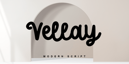 Vellay is a stunning monoline-style script font with authentic and casual vibes. It looks beautiful on a variety of designs requiring a personalized style, such as wedding invitations, thank you cards, advertising, poster, greeting cards, logos, and so on. Vellay is PUA encoded which means you can access all of the glyphs and swashes with ease!
 - Handmade Font by Ingrimayne Type,
$14.95 In Handmade Font the letters are made of hands or handprints, something children sometimes do when they are set free with paint. It is caps only but the letters on the lower-case keys differ from those on the upper-case keys. It comes with a large assortment of accented letters to support most European languages.
 - Griezelig by Hanoded,
$15.00 I love creating fairytale fonts, but for some reason I haven’t made one for quite a while. So, without further ado, I present Griezelig! Griezelig in Dutch means ‘scary’ or ‘creepy’. The word itself even looks kind of creepy! Griezelig was loosely based on two of my favourite (but unfortunately rather inconspicuous) fonts called Hexenhammer and Bronwen.
 - Chuck by Parkinson,
$20.00 Chuck. Designed in 2004 by Jim Parkinson. Originally released as a Type 1 font, Chuck was refreshed (version2) and re-released as simple Open Type in 2012. The models for this massive Deco typeface appear on a bronze plaque on the South Tower of the Golden Gate Bridge. The plaque commemorates the builders of the bridge.
 - Sabrina Zaftig NF by Nick's Fonts,
$10.00This charming, disarming, roly-poly typeface is based on handlettering discovered on a Sabena Airlines travel brochure of the 1930s. Include it in your next project, and a good time will be had by all. Both versions of this font contain complete Unicode 1252 (Latin) and Unicode 1250 (Central European) character sets, with localization for Romanian and Moldovan. - P22 Salon by IHOF,
$24.95 P22 Salon was originally inspired by Art Nouveau lettering. In the development of the three fonts (P22 Salon Full, P22 Salon Inner and P22 Salon Shadow) they began taking on a slightly more modern feel. All three variations were designed to be completely interchangeable with one another, and can be layered to achieve a variety of effects.
 - Unio by Wilton Foundry,
$29.00 Unio is a fresh new friendly typeface with a little calligraphic touch - this gives Unio a very pleasing rhythm. One of the key features of Unio is its emphasis on legibility. Several ligatures are also included. It is pretty versatile in its application including advertising, packaging and logotypes. Unio is available in Opentype for Mac and Windows - Enjoy!
 - Pabean Market by Nasir Udin,
$24.00 Pabean Market is an interpretation of the incription on the oldest market in Surabaya, Indonesia, which was established on 1849. The unique character inspired me to make a complete set of typeface. It’s a retro typeface but has a futuristic aura yet a festive vibes. This font comes in single style and has several Discretional Ligatures. -- Uppercase
 - Nanki Poo NF by Nick's Fonts,
$10.00This little gem is based on a typeface discovered in a Boston Type Foundry catalog from the late 1800s, originally called "Mikado". This font gets its name from one of the more memorable characters in Gilbert and Sullivan’s operetta. Both versions of this font include the complete Unicode Latin 1252 and Central European 1250 character sets. - Arakne by Scriptorium,
$12.00While working on a font based on Spencerian Script (a popular late 19th century handwriting style) we did some experimenting with original designs which created the general feel of Spencerian and brought to mind the spidery handwriting of old ladies and Dickensian clerks. The result was Arakne, a spidery script font with a really striking look. - Hungry Zombie by Hanoded,
$15.00 I’ve never been one for zombies and all that. I did watch a couple of seasons of The Walking Dead, but after the 2.000.000th zombie got whacked, I had enough. When I made this font, it gave me a zombie feeling. One thing I learned from watching TWD was that zombies are always hungry. There you have it!
 - Tacky Font by Ingrimayne Type,
$14.95 Four letters for this font came from a puzzle in a 1983 Games magazine. After seeing them, I could not resist the temptation to do a complete set of letters made from push pins or tacks, a truly tacky font. Most of the letters on the lower case keys are alternatives--choose the one works best for your purposes.
 - Marrakesh Express NF by Nick's Fonts,
$10.00This unusual headline font is based on lettering found on a travel poster, advertising passage to Morocco on the Paris-Lyon-Méditerranée line, designer unknown, circa 1930. Both versions of this font include the complete Unicode Latin 1252 and Central European 1250 character sets. - Wall Sign JNL by Jeff Levine,
$29.00 Wall Sign JNL is a sign painter's chamfered sanserif found in an instructional manual from 1905. A popular lettering style of the day, it features an abridged vertical on the G, a flattened right side on the Q and a truncated horizontal on the 3.
 - Cesium by Hoefler & Co.,
$51.99 An inline adaptation of a distinctive slab serif, Cesium is an unusually responsive display face that maintains its high energy across a range of different moods. The Cesium typeface was designed by Jonathan Hoefler in 2020. An energetic inline adaptation of Hoefler’s broad-shouldered Vitesse Black typeface (2000), Cesium is named for the fifty-fifth member of the periodic table of the elements, a volatile liquid metal that presents as a scintillating quicksilver. From the desk of the designer, Jonathan Hoefler: I always felt that our Vitesse typeface, an unusual species of slab serif, would take well to an inline. Vitesse is based not on the circle or the ellipse, but on a less familiar shape that has no common name, a variation on the ‘stadium’ that has two opposing flat edges, and two gently rounded sides. In place of sharp corners, Vitesse uses a continuously flowing stroke to manage the transition between upright and diagonal lines, most apparent on letters like M and N. A year of making this gesture with my wrist, both when drawing letterforms and miming their intentions during design critiques, left me thinking about a reduced version of the typeface, in which letters would be defined not by inside and outside contours, but by a single, fluid raceway. Like most straightforward ideas, this one proved challenging to execute, but its puzzles were immensely satisfying to solve. Adding an inline to a typeface is the quickest way to reveal its secrets. All the furtive adjustments in weight and size that a type designer makes — relieving congestion by thinning the center arm of a bold E, or lightening the intersecting strokes of a W — are instantly exposed with the addition of a centerline. Adapting an existing alphabet to accommodate this inline called for renovating every single character (down to the capital I, the period, and even the space), in some cases making small adjustments to reallocate weight, at other times redesigning whole parts of the character set. The longer we worked on the typeface, the more we discovered opportunities to turn these constraints into advantages, solving stubbornly complex characters like € and § by redefining how an inline should behave, and using these new patterns to reshape the rest of the alphabet. The New Typeface The outcome is a typeface we’re calling Cesium. It shares many of Vitesse’s qualities, its heartbeat an energetic thrum of motorsports and industry, and it will doubtless be welcome in both hardware stores and Hollywood. But we’ve been surprised by Cesium’s more reflective moods, its ability to be alert and softspoken at the same time. Much in the way that vibrant colors can animate a typeface, we’ve found that Cesium’s sensitivity to spacing most effectively changes its voice. Tighter leading and tracking turns up the heat, heightening Cesium’s sporty, high-tech associations, but with the addition of letterspacing it achieves an almost literary repose. This range of voices recommends Cesium not only to logos, book covers, and title sequences, but to projects that regularly must adjust their volume, such as identities, packaging, and editorial design. Read more about how to use Cesium. About the Name Cesium is a chemical element, one of only five metals that’s liquid at room temperature. Resembling quicksilver, cesium is typically stored in a glass ampule, where the tension between a sturdy outer vessel and its volatile contents is scintillating. The Cesium typeface hopes to capture this quality, its bright and insistent inline restrained by a strong and sinuous container. Cesium is one of only three H&Co typefaces whose name comes from the periodic table, a distinction it shares with Mercury and Tungsten. At a time when I considered a more sci-fi name for the typeface, I learned that these three elements have an unusual connection: they’re used together in the propulsion system of nasa’s Deep Space 1, the first interplanetary spacecraft powered by an ion drive. I found the association compelling, and adopted the name at once, with the hope that designers might employ the typeface in the same spirit of discovery, optimism, and invention. —JH Featured in: Best Fonts for Logos
 - Emy Slab by Latinotype,
$29.00 Emy Slab is a slab serif based on the classical proportions of Egyptian typefaces but with soft terminals that give the font a more friendly and modern look. Emy Slab consists of two subfamilies of 7 weights, ranging from Thin to Black with matching italics, resulting in a total of 28 fonts. The standard version is ideal for editorial design, tiles, books, magazines, corporate design and all types of publications. The Alt version—due to its display features, asymmetric shapes and contemporary appearance—is well suited for logotypes, branding, packaging, and use on web and Tv. Emy Slab contains a set of 440 characters that support 208 different languages.
 - Fungis by Ivan Petrov,
$30.00 Fungis is a somewhat �brother� of Fungia. These two typefaces were conceived simultaneously as an experiment on designing typeface based on natural shapes. In both cases it was mushrooms. Of course the main theme of these typefaces is not mushrooms itself (it was just a start point) but the interaction between form and counterform. In spite of unquestioning individuality the font has some associations with wood typefaces from wild west, typefaces from circus posters of 19th century and even slight feeling of gothic. The font can be useful in different cases: posters, titles, book covers, billboards, street signs, magazine spreads and all situations that demand expressive typography.
 - Birch by Adobe,
$29.00Birch was designed in 1990 by Kim Buker Chansler, who based her forms on the designs of the turn of the 20th century. The new age needed new typefaces for an ever-increasing commerce and its advertisements. This time period therefore saw a profusion of new typefaces, all of which were meant first and foremost to catch the eye of consumers. To this end, style elements of past ages were reused, changed, and combined. Birch is modelled after a woodtype, a style made famous by its use on wanted posters in western movies. The narrow and space-saving Birch is perfect for headlines in display point sizes. - Stamped Brass Stencil JNL by Jeff Levine,
$29.00 Up until the advent of modern packing and shipping methods, the common way to mark merchandise or other items to be transported was through the use of a brass stencil. These marking devices were hand stamped (or punched) using metal dies that were struck against sheets of brass to create the letters, numbers and other symbols [unlike the steel rule die cutting method used for manufacturing paper stencils]. One such example of an antique marking stencil had letters and numbers approximately one quarter of an inch in height, and Stamped Brass Stencil JNL recreates the design complete with the unusual variations of character shapes and widths.
 - Mystery Writer JNL by Jeff Levine,
$29.00 Mystery Writer JNL is based on the hand lettered title from the cover of a 1947 issue of “Ellery Queen’s Mystery Magazine”, and is available in both regular and oblique versions.
 - Harleyquin by Letterara,
$12.00 Sweet, charming and full of authenticity: Harleyquin is a one-of-a-kind typeface with a personal feel. Use titling to give different letter effects, making your project even more elegant!
 - Holiday Penguins by Deniart Systems,
$24.00 It's always holiday time with this frolicking bunch of penguins. Whether celebrating the end of year holidays or prancing around on vacation, these 52 Holiday Penguins are always having a blast.
 - Opz Popz JNL by Jeff Levine,
$29.00 Opz Popz JNL is a collection of fifty-two designs based on geometric designs and pop art (reminiscent of the 1960s). These images are perfect embellishments for retro-themed work projects.
 - Timelord by Comicraft,
$19.00 VWORP! VWORP! This font will travel through the four dimensions of time and space to materialise on your hard drive. TIMELORD was created for Telos publishing's line of DOCTOR WHO novellas.
 - FloriGlyphos by Sea Types,
$15.00 Built from the petroglyphs found on the island of Santa Catarina - Brazil. With elemental geometric signs and figurative human representations. It is a printer with a decorative characteristics of Art Deco.