6,970 search results
(0.024 seconds)
- Daytona Variable by Monotype,
$209.99The Daytona™ typeface family grew out Jim Wasco’s desire to design a readable and legible typeface for video and on screen use. Because of its high levels of legibility, the Daytona family is additionally an ideal design for display usage in digital user interfaces and a wide range of print applications. Wasco drew each character with legibility as a primary goal, some of the letters having unique attributes to minimize the ambiguity. Daytona Variables are font files which are featuring two width axes and have a preset instance from Thin to Fat. - Radar by Type-Ø-Tones,
$60.00 Radar is a revival of the sans serif typeface “Grotesca Radio”, from the Spanish foundry Richard Gans, which existed from 1888 to 1975. His authorship is attributed to the German type designer and master punchcutter Carl Winkow. Although the new version of this font has always tried to keep accurate similarities with the original typeface, Radar is not intended as a strict revival, but as a contemporary interpretation. In this new version the user can find some alternate characters that give the typeface a more art-déco or neutral flair.
 - Earth Encounters by Scrowleyfonts,
$24.00 When my Taiji teacher gave all of his students a handwritten card with their name on I noticed that he had an unusual and beautiful handwriting. I persuaded him to write out each of the standard glyphs for me in return for me doing some repairs to his trousers! Earth Encounters Family is the result. The regular font and the light version include OpenType coding to offer the option of different versions of the same letter in words, giving the effect of real handwriting. Earth Encounters also comes with a Shadow style.
 - Tremendous by PintassilgoPrints,
$20.00 Strong and somewhat rough but absolutely warm-hearted, this Tremendous family is quite versatile and will find the right tone to deliver your message in a nice way. It can be friendly, it can speak out loud, it can be almost serious. It just cannot go unnoticed! Each font weight brings 2 slightly different options for each letter , which is cool for a more uneven look. Pick your choices through the keyboard or just turn on the OpenType ‘contextual alternates’ feature to instantly cycle these alternates. For tremendous people.
 - Granz by PintassilgoPrints,
$26.00 With a swinging handcut look and fanciful letterforms, Granz is inspired by the iconic Oscar Peterson’s Porgy & Bess album cover by David Stone Martin – the prolific american illustrator who created more than 400 album covers, mostly for the jazz greats of the 1940s and beyond. Granz font is loaded with interlocking pairs, swashes, contextual and stylistic alternates, making it highly flexible, just perfect to jazz up your designs.Great for book covers, titling, headlines, t-shirts and many other applications, this is a font that loves to be seen. Use it big!
 - LeakorLeach by Ingrimayne Type,
$9.95 An early drawing tablet was largely responsible for the LeakorLeach typefaces. They resemble hand lettering using cake icing or done with an ink pen that leaves lots of ink blobs or ink blots. The family has two widths, plain and condensed, and in addition to each having an oblique style, each also has a leftward-inclined style. There may not be many uses for a leftward-inclined typeface, but for those needing one, the LeakorLeach family offers two. The LeakorLeach typefaces are unlike any other faces from IngrimayneType.
 - Side Black by Zamjump,
$19.00 Side Back is a brush handwriting font following the correct writing rules in making brush letters. This font is a bit more unique because the lowercase style uses uppercase but there are some with lowercase style. Equipped with a ligature, and a wash to be used as a complement or sweetener to the design you make. very suitable for use in various designs, such as headers, websites, clothing, products, even for writing quotes. Congratulations on exploring your design using black side fonts. Included : - Multilingual support - Ligatures - Swash -character symbols
 - Destructive Decisions by Chank,
$99.00 Destructive Decisions is a font based upon the inherent flaws of human nature—presented under the guise of complete legibility. At first impression this font is very readable, but upon closer examination you'll notice the edges are fuzzy and some of the lines are off-kilter. You can read it, but it is also a bit foggy. No matter how hard it strives for perfection. This font was originally designed for a cable tv show about substance abuse, but is now available for use in your web and print designs, too.
 - Too Much by Comicraft,
$19.00If you've had too much coffee but not enough of Too Much Coffee Man you can now indulge in an excess of characters created by the hand of Too Much Coffee Man's creator, Mister Shannon Wheeler. Don't worry, in our efforts to ensure clean and confident lettering samples, we kept Shannon on decaf until he was done. Dip this font in your system folder and your hard drive will get a caffeine and sugar rush guaranteed to increase its memory partition and bring the images on your monitor into sharper focus. - Finocchio by The Ampersand Forest,
$45.00 Finocchio (yes, we know — wink) has the playful, round shapes of a French Ronde with the sharp angles of Italian Futurism. It's a bold, fun, excellent branding face — wherever you need some gusto or brio or forza! Finocchio comes with a large number of ligatures for fluidity. It also comes with a solid, readable set of non-script small caps, so all you need for that sign is one coordinated font! It also comes with loads of fun alternates! Finocchio is made with love in The Ampersand Forest.
 - Ball Game JNL by Jeff Levine,
$29.00 What has become a rite of passage at baseball games got its start in 1908 when lyricist Jack Norworth and music composer Albert Von Tilzer wrote "Take Me Out to the Ball-Game" (which was published by Von Tilzer's York Music Company). The Art Nouveau hand lettered title on the cover of the sheet music was eccentric and attractive enough to warrant being turned into a digital type face, and in honor of its namesake song is called Ball Game JNL; available in both regular and oblique versions.
 - Jasmine Sheffield by Haksen,
$13.00 Introducing the elegant Jasmine Sheffield Script Font! If you are needing a touch of casual chic calligraphy for your designs, this font was created for you! What's Included: Uppercase and Lowercase Ligatures Number and Punctuation Support Language This font works best in a program that supports OpenType features such as Adobe Indesign, Adobe Illustrator CC and CS, or Adobe Photoshop CC and CS also CorelDraw More Questions? Here are some (potential) answers! You are not permitted to resell this font in any way. Multilingual Support is included for Western European Languages Cheers!
 - Diorite by Three Islands Press,
$24.00Diorite is modern face built on classical letterforms -- but left with a bit of residual roughness. Some might call Diorite forthright, others brutal. (It reminded the designer of the dark, hard igneous rock of the same name, treasured by the ancient Egyptians for statuary.) The typeface has a relatively chunky, four-style family; the italics are true cancellaresca corsiva, also writ heavy. "The cancellaresca is of course a Gothic design," notes the designer. "Just use a broader pen, and you'll see!" Has four styles: regular, bold, cursive, and cursive bold. - Madame Karoline by Raditya Type,
$25.00 This time, I would like to introduce a bold typeface called "Madame Karoline", which has an attractive retro atmosphere. This font looks interesting too, as I've added some alternatives that you can use. Don't forget to add an extruded style to make your design look more appealing. This font is suitable for those who want a design that shows an old-school side but still relates to a modern look that is attractive . No problem if you have experience using this font in your designs. Make this font one of your computer's font collection.
 - Maiden Orange Inline Pro by Stiggy & Sands,
$29.00 A festive spin off our Maiden Orange Pro typeface, Maiden Orange Inline Pro comes packed with all of the features of the original Maiden Orange Pro typeface, but adds a little more visual flavor with hand drawn inline cuts, leaning even more towards the custom hand lettered 1950’s advertisements that inspired the original. Clean and legible, while also being offbeat and friendly, this font lends itself to a wide variety of uses. The SmallCaps and extensive figure sets offer a slightly more serious tone as well as a wider range of design use.
 - WL Rasteroids by Writ Large,
$5.00 Rasteroids is a typographic flashback to computing of the mid 1980s, when 9-pin dot-matrix printers were the state of the art, and most home computer displays were TVs hooked up to RF modulators. Rasteroids not only captures the dot-matrix printer look, but recreates the rasterized appearance of text on those lower-resolution monitors. Unlike that dot matrix type of yore, Rasteroids does have some variation in character width, and is legible in small blocks of copy. Still, it is best used sparingly, or as a special effect.
 - Brock Pro by Stawix,
$49.00 Brock Pro celebrate the essence of the famous 19th century wooden letterpress type, Block Berthold by bringing out its remarkable features and explicate them in relation to the modern day trend. Brock Pro is a conventional font with a twist, fun, easy to use and has a very particular tone of voice that suits numerous design purposes. Brock pro comes in 10 weights and 20 styles to support a wide range of usage, every needs and great building brands, Brock Pro also available in both ttf. and otf.
 - Atrium by Alex Jacque,
$20.00 Atrium, designed by Alex Jacque, is a strong, linear, geometric sans-serif display typeface based off century-old pen art by W.E. Dennis. Atrium's stubbornly geometric letterforms are set off with a few softening flourishes on a few glyphs. It's sharp corners, straight verticals and horizontals make Atrium pack some punch when used in headlines, pull quotes, and logotypes. Atrium was released in 2012 in OpenType format and comes in three different weights: light, regular, and bold, with a regular and oblique version of each for a total of 6 styles in the family.
 - Horst by PintassilgoPrints,
$29.00 Inspired by Laatzen’s Bilderbogen etchings by the extraordinary artist and printmaker Horst Janssen, this font is packed with Open Type features that allow the creation of unique typographic pieces. Besides the set of automatic discretionary ligatures, this all-caps font also comes with two extra stylistic sets, so there are 4 versions for each letter (plus the variations contained in the ligatures). When working with ligatures turned on, the carefully handcrafted kerning table takes advantage of overlapping some ligatures with its neighbor letters, multiplying ligatures performance. An unmistakable original font to create outstanding design works!
 - Ruth Pro by David Engelby Foundry,
$25.00 Ruth Pro is a creative work horse primarily designed to be used for typographic design of magazines, posters and books. Though roughly inspired by fonts like Mendoza and Stone Serif, it has its own distinctive look, carefully crafted following all the classic ideals of typography. If you are also looking for that special display font, you will be surprised by all the great details of Ruth Pro, including dingbats, arrows, alternative characters, special designed ligatures and small caps characters—and much more! Ruth Pro also includes a vast selection of Slavic and Scandinavian characters.
 - Stubby by Tipos Pereira,
$12.00 Stubby is a display type family with 11 styles, was made for titles, headlines and also packages, posters and everything that provide space for a rude, fat and widish type. You should try Stubby in your text blocks if you're looking for an informal shape with some handwriting taste, there are eleven styles mixing from a narrowed thin to a sloppy ultrabold. Stubby has a tight spacing made to fit in squeeze places, not so elegant or clean but definitely an original choice for your real life project.
 - Borden by La Boîte Graphique,
$25.00 Borden is a rounded hand-printed caps font ideal for your graphic project. Usage recommendations : Title, short text, children’s book, poster, book cover, brochure, label, magazine. "The friendly hand-drawn charms of the Borden family […] Designed by Ewen Prigent, the Borden family is a hand rendered, all-caps design ideal for all sorts of playful settings. With its narrow condensed letterforms and rough rendering, this family is a good fit when space is limited in your design but you don’t want to compromise its friendly tone." www.fonts.com - newsletter - march 2014
 - AggressIan by Hackberry Font Foundry,
$13.95 AggressIan is the release of the first font I ever drew. It was done by hand with triangle and parallel rule back in the mid-1980s. I originally called it Aggressor, but I never liked it. My local type designer friend, Ian Roberts, really likes this type of drawing and told me I had to release it. So I named it after him. The small caps should work well if you need a bolder version. It has oldstyle and lining figures, plus the small cap figures. I hope you like it.
 - Marketing Strategy JNL by Jeff Levine,
$29.00 Marketing Strategy JNL was inspired by some display signage used in an episode of the classic "Alfred Hitchcock Hour". Evoking the early-60s feel of kitchy advertising, this display font has a limited character set and is specifically designed for creating retro ad banners and point-of-sale attention getters as well as period piece signage. For those preferring a blank hexagon for spaces between words, one is located on the equal key. Marketing Strategy JNL is available in both regular (outline) and solid (white letters on black) versions.
 - Puzzle Face by Jonahfonts,
$15.00 Puzzle Face is a novelty six-tiered overlay font with a range of possibilities. With the use of your graphic application* your artwork can have special color effects. Ideal for concepts involving problems such as solutions, mysteries and of course puzzles. Ideal for a range of logos, posters, headings and bookjackets using ALL or SOME of the six layers. For Layer-info there is a pdf file in the graphics section for you to download and print. Have fun! *Each layer contains Opentype ‘Contextual Alternates’ and may only be accessible via Opentype-aware applications.
 - Linotype BioPlasm by Linotype,
$29.99Linotype BioPlasm is a display face created by Italian design Mauro Carichini in 2002. It distorts and deletes parts of letters, creating the appearance of a living, typographic organism in pages of text. Lines set in Linotype BioPlasm seems bubble to the surface, and always hints at some sort of unrevealed secret. Although only parts of most letterforms are visible, the high x-heights of Linotype BioPlasm's letters make its text surprisingly legible for such a concept-font. For usage in products ranging from Sonic to Science, Linotype BioPlasm may be the font for you! - Redig by Great Scott,
$16.00 Redig is a bold condensed display typeface with an assertive and athletic aesthetic. Inspired by newspaper headline typefaces from early 1900s it has chamfered corners with rounded edges that smooths out some harshness and generous x-height to its lower case characters. Redig will shine when used big. And I mean BIG. This is certainly a case when “bigger is better” really is the truth. Redig comes with an oblique style and ligatures and works best in headlines, logos, branding, social media or any display type use. Use it big.
 - Selomita by Thanoestd,
$15.00 Selomita is a magical handwritten font carefully created with a touch of elegance. This is a beautiful combination of timeless elegance and authentic calligraphy. It features an incredibly classic style, while still keeping a friendly feel. This font is the perfect font for making original and outstanding designs. To keep maximum real hand lettered effect, there were created 65 ligatures. Selomita also includes full set of uppercase and lowercase letters, full uppercase alternate and some lowercase alternate letters, swash, numerals, punctuation. I hope you like with this font. Thanks.
 - Chunkie by Hackberry Font Foundry,
$24.95 Chunkie is a simple serif experiment going for minimal width and maximum height. I made it into my display version of OpenType Pro, but mainly it was a vehicle for me to try out some more extreme serif ideas and glyph shapes. The solutions for the lowercase a and e are unique, for example. The double g ligature is a fun solution. I like the solution for the @, but I’m not sure how it will be received. That being said, it turned into a useful dark display face with a small x-height.
 - Shine Coasty by HansCo,
$15.00 Shine Coasty font is a retro serif and bold display font. You will get alternate characters such as swash on some characters. Use this display font to add that special retro touch to any design idea you can think of!. Masterfully designed to become a true favorite, this font has the potential to bring each of your creative ideas to the highest level! Very suitable for logotype, Stickers, Packaging design, Cricut Project, headlines, brand identity, t shirt or apparel industry, posters, magazines, books, YouTube, Instagram, websites, or any of your creative design projects. Enjoy!
 - F2F Whale Tree by Linotype,
$29.99Heavy techno music, a personal computer, a font creation program and some inspiration had been the sources to the Face 2 Face font series. Thomas Nagel and his friends had the demand to create new unusual faces that should be used in the leading german techno magazine Frontpage" Even typeset in 6 point to nearly unreadability it was a pleasure for the kids to read and decrypt the messages. WhaleTree is a hommage to Walbaum. The word is a gemanized translation where Wal means Whale and Baum means Tree. :-)" - Ehrhardt MT by Monotype,
$29.99 The Ehrhardt name indicates that this typeface is derived from the roman and italic typefaces of stout Dutch character that the Ehrhardt foundry in Leipzig showed in a late-seventeenth-century specimen book. The designer is unknown, although some historians believe it was the Hungarian Nicholas Kis. Monotype recut the typeface for modern publishers in 1937 to 1938. Ehrhardt has a clean regularity and smooth finish that promote readability, as well as a slight degree of condensation, especially in the italic, that conserves space. Ehrhardt is a fine text face, especially for books.
 - Stage Invader by Hanoded,
$16.00 There was a big climate protest in Amsterdam a couple of days ago. During Greta’s speech, a man jumped onto the stage and grabbed her microphone, because he didn’t approve of what she was saying. Some English media referred to him as ‘the stage invader’, which I really liked. Long story short: I made a ‘protest-ish’ font, using cheap black finger paint from the local store and a brush from my kids. The result is a rather unique font called Stage Invader. And yes, you can use it for your protest signs too!
 - Respect by Resistenza,
$39.00 Respect! Our tribute to hand lettering culture. This exuberant new script font family draws inspiration from the traditional craftsmanship of sign painting and brush pen calligraphy techniques. Our aim was to create a modern interpretation of brush script, which referenced old-school hand lettering but also adds some contemporary forms, terminations and swashes you might expect to find in street art. The slanted angles and curved steams are designed to give this font an active energy, plenty of attitude and a courageous/brave character. We recommend to combine Timberline with: Turquoise
 - Personalization by Jeff Levine,
$29.00 In the 1960s it was a popular trend to personalize one’s possessions with your initials. From wallets and handbags to eyeglasses; from luggage to even cars, initial personalization was the fad of the time. The British division of Gulf Oil offered for sale a set of gold metallic stick-on initials for 25 pence, complete with two Gulf logos so the company could get some extra advertising mileage out of the promotion. These extra-wide, bold initials served as the idea model for Personalization JNL, which is available in both regular and oblique versions.
 - Nimbusant Bresslo by DePlictis Types,
$31.00 Nimbussant Bresslo is a contemporary sans and attipic unicase were lowercase alternates with smallcaps creating an unusual look that can be used in posters, logo design and headings or small bold plain texts. This grotesque typeface supports most of the latin based languages and also kyrillic and greek alphabets. For a plus of a modern and young appeal, some of the letters have a very sharp, straight and minimalist body design but you may find also their stylistic alternates to better emulate the look you find more appropiate for your design.
 - College Nouveau JNL by Jeff Levine,
$29.00 By the late 1920s, lettering and design had already begun to feel the influences of what would become the Art Deco Movement. The sheet music for the 1927 song "Without You Sweetheart" had its title hand lettered in a block style letter with rounded corners – with the exception of the 'S' and 'R' in "Sweetheart"; reflecting design elements of both styles. For consistency, those letters were changed to fit the rest of the design, and the result is the digital font College Nouveau JNL, available in both regular and oblique versions.
 - Force Of Habit by Kitchen Table Type Foundry,
$15.00 I am not really a creature of habit, but when I start working on a new font, I make myself a cup of coffee first. I guess you can call that a habit, so I decided to name this font Force Of Habit. Force Of Habit is a nice brush font - made with a cheap pencil that I borrowed from the kids’ colouring box and my trusted (and seemingly ever flowing) Chinese ink. Force Of Habit comes with extensive language support, some alternates and - quite possibly - a faint smell of freshly roasted coffee..
 - Alphaluxe by Poole,
$48.00Alphaluxe is a distinctive new typeface from Wesley Poole of Hawai’i. This vertical script packs a velvet punch. It compels attention like the best of the futuristic Moderne scripts from the 1930s, (refined by the 1950s) with none of the bulk. The shapes are strong, their rendering light. Fortunately, Mr. Poole can't break his addiction to elegance and sophistication. It's a classy alphabet. but not self-conscious or stereotypical. Contributing mightily to this effort is Rod Cavazos (Psy/Ops, San Francisco). Among today's typefaces, Alphaluxe is a rare achievement. - Central Point by Great Studio,
$19.00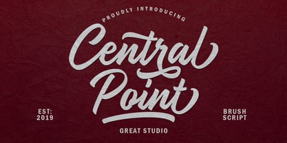 Central Point is a bold script font and a combination of original handwriting styles inspired by hand lettering. This versatile script includes many different alternatives for each lowercase letter, you can see some examples of design results in the preview image. This typeface works very well for logo design, clothing, handwritten quotes, product packaging, headers, posters, merchandise, social media, greeting cards and all your artwork. Central Point is equipped with uppercase and lowercase letters, numbers, punctuation and symbols, swash and ligature. It has Multilingual support. Thank you for purchasing our products and enjoy.