10,000 search results
(0.047 seconds)
- Isard by Letterjuice,
$52.00 Isard is a very agile typeface, honoring its name, which is the name of a type of mountain goat from the Catalan Pyrenees. It is a multipurpose sans serif typeface with a down-to-earht elegance, thought for information design as well as branding. Isard is warm and friendly which also makes it suitable for advertising, packaging, and magazine. It has a contemporary feel to it with its squarish curves, it has being built with legibility in mind, bearing a considerably large x-height. The family covers two scripts, Hebrew and Latin. It has seven weights, from the very sturdy Black to the delicacy of the Thin, with its italics.
 - DeDisplay by Ingo,
$24.99 A type designed in a grid, like on display panels Type is not only printed. There were always and still are a number of forms of type versions which function completely differently. Even very early in the history of script there were attempts to combine a few single elements into the diverse forms of individual characters and also efforts to construct the forms of letters within a geometric grid system. The “instructions” of Albrecht Dürer are probably most well-known. But although designers of past centuries assumed the ideal to basically be an artist’s handwritten script, the idea which developed in the course of mechanization was to “build” characters in a building block system only by stringing together one basic element — the so-called grid type was discovered, represented most commonly today by »pixel types.« But even before computers, there were display systems which presented types with the help of a mechanical grid display, like the display panels in public transportation (bus, train) or at airports and train stations. In a streetcar, I met up with a modern variation of this display which reveals the name of each tram stop as it is approached. This system was based on a customary coarse square grid, but the individual squares were also divided again diagonally in four triangles. In this way it is possible to display slants and to simulate round forms more accurately as with only squares. The displayed characters still aren’t comparable to a decent typeface — on the contrary, the lower case letters are surprisingly ugly — but they form a much more legible type than that of ordinary [quadrate] grid types. DeDisplay from ingoFonts is this kind of type, constructed from tiny triangles which are in turn grouped in small squares. The stem widths are formed by two squares; the height of upper case characters is 10, the x-height 7 squares. DeDisplay is available in three versions: DeDisplay 1 is the complex original with spaces between the triangles, DeDisplay 2 forgoes dividing the triangles and thus appears somewhat darker or “bold,” and DeDisplay 3 is to some extent the “black” and doesn’t even include spaces between the individual squares.
 - Broadside Text by Device,
$39.00 Broadside Text is a companion to Broadside, and is optimised for use at smaller sizes. More open counters, more generous letter-spacing and additional fractions increase legibility. The original Broadside family is suitable for headlines and larger sizes, and also comes with condensed and extended versions. Broadside is a versatile, authoritative and functional family inspired by the sans serifs seen on ’40s and ’50s patriotic posters and period advertising. It is available in seven weights across condensed, normal and extended widths, each with reweighed italics. The type from this period was very often hand-drawn, and so differs considerably from poster to poster. Many American examples of this period use a Photo-Lettering style called Murray Hill and its derivatives, although their UK counterparts, designed by such luminaries as Abram Games or Tom Eckersley, are more stylistically diverse. Even though no single model is available to base a digitisation on, there are certain recurring stylistic quirks that give the type its unique flavour, and so the most interesting examples from several sources were be combined for the final family. Alternate short descenders, allowing for tighter line spacing, can be toggled on or off in the Opentype panel of Indesign or Illustrator. Tabular and lining numerals and a single-story ‘a’ are also available in all weights and styles.
 - Sicret by Mans Greback,
$29.00 Sicret is a perfectly geometric typeface family. It was drawn by Måns Grebäck in 2020, and each one of its glyphs was manually created by following a strict mathematical pattern consisting of only two basic shapes, in four different combinations, set on a three units tall grid. The resulting product is a true monoline font with a solid character, with an official look while yet going towards sci-fi because of its digital nature. The family consists of nine weights: Thin, Extra Light, Light, Regular, Medium, Semi Bold, Bold, Extra Bold and Black. The range of weights makes it very adaptable, and all the weights works very well together to give a sentence or graphic tone and emphasization. As Sicret is a font with over 850 glyphs, it is guaranteed to contain all characters you'll ever need, including all punctuation and numbers. It has a very extensive lingual support, covering Greek, Cyrillic, Hebrew as well as European and American languages.
 - Permanent Park by Wing's Art Studio,
$16.00 Permanent Park - 1990s Graffiti Inspired Marker Pen Font A hand-drawn marker pen font inspired by graffiti tags and 1990s Hip Hop. Permanent Park is a marker pen font with a graffiti tag aesthetic inspired by the golden-age of Hip Hop and 1990s TV shows. It’s 100% hand-drawn and comes packed with alternative characters for creating truly natural looking type treatments. No repeated oo’s, ee’s and ll’s that are a dead give-away of lazy lettering! Permanent Park is a highly customisable all-caps design featuring a complete set of uppercase and lowercase characters, along with numerals, punctuation and language support. It also features a complete set of alternatives with additional lowercase characters (for mixing things up even more), and a selection of underlines and symbols for an illustrative flourish. It’s a uniquely fun, urban looking font, typical of 90s music videos and TV shows, and equally suited to sports, travel and food themes. Check out my visuals for ideas on how you might use it on posters, movie titles, product packaging, broadcast and advertising.
 - Blackthorn by Scriptorium,
$24.00Blackthorn draws on the tradition of Art Nouveau font design with some elements of western or circus style fonts, but an overall effect which may have more in common with the psychedelic era than anything else. It has a feel somewhat akin to some of the lettering of Alphons Mucha particularly the Abaddon and Gehenna fonts. It's very stylized and kind of wicked looking. You can see where the name comes from if you note the thorn-like spurs on the upper part of each character. - DearJoe 6 by JOEBOB graphics,
$29.00 The dearJoe series of fonts had it’s origin somewhere around 1999, the year I created dearJoe 1, which was a first (and half-assed) attempt at converting my own handwriting into a working font. Being able to type in my own handwriting had always been a childhood fantasy, and even though I only partly understood the software, a working font was generated and I decided to put it on the internet for people to use. And that’s what they did: at this moment the dearJoe 1 font has been downloaded millions of times and can be found on just about anything, ranging from Vietnamese riksjas, a Tasmanian gym to a fancy chocolate store on 5th Avenue. The font is not something I am particularly proud of, but it started me of in building what later became the JOEBOB graphics font foundry. Inbetween creating other fonts, the dearJoe series has become a theme I revisit every once in a while, trying to create an update on how my handwriting evolved, along with my abilities in creating fonts that mimic actual handwriting. In the last decade or so I started implementing ligatures and alternate characters, which helped a lot in making something that can almost pass for actual handwriting.
 - Marguerita by ITC,
$29.00Marguerita is the work of designer David Quay, a pseudo-Latin, 1950s concept based on a copperplate script. The capitals are meant as initials only. Marguerita is idea when a cheerful, light-hearted effect is desired. - Patched by Mans Greback,
$39.00 Patches is a multi-faceted, victorian-era serif typeface for when you need something more than plain text. Get that extra attention while adding a genuine, original appearance to your message. Patches was designed from scratch to give a sense quality and depth. Its designer Mans Greback has created a typeface with a complex structure, yet one that will be easy to master. This work will suit every style, taste and skill level. It is a decorative and completely hand-drawn design in vintage lettering, with the perks and flexibility of present-day technology, which is exactly what you'd expect from a modern typeface. Whether you are making a decorative floral headline, drawing a cowboy logo, or creating a unique design based on this ornamental font, the hopes are that Patches can give you a set of tools and inspiration to bring out the best of your artistry. Standing on the shoulders of giants, it was inspired by a wide range of works, and will hopefully be able to continue to teach and inspire future artists. Or at least help you become a better designer when you're designing an elegant and classic headline. Set the coloring of Patches to light gold and cream tones to apply a luxurious look, or in dark tones for a more rugged impression. Bold, bright colors will make it appear In the mid-1800s, decorative design flourished in the Western major cities. Victorian style thrived and encouraged techniques such as enamelling, embroidery and calligraphy. From the 1880s onwards, there were a series of reactions to higher Victorian tastes, with Art Deco reaching the heights of the 20th century. However, the Victorian art persisted popularity, as it changed to more sophisticated designs which made it more attractive to specific professions and groups. The evolution of the Victorian style in the mid-20th century was a key factor in the succession of the movement. Classic shops and salons, sport designs and traditional festivals, and later Rock'n'Roll and Harley Davidson-themed graphics inspired the continued development of the art. Aspiring to carry on this tradition, this typeface family consists twelve different high-quality variations. The main ones are Patched and Patched In – an outlined variation – and each one provided in five weights: Thin, Light, Medium, Bold and Black. Additionally, the two rough fonts Hangaround and Prospects, that tries to grasp the rough, earthy atmosphere of a shady motorcycle club. The font is built with advanced OpenType functionality and has a guaranteed top-notch quality, containing stylistic and contextual alternates, ligatures and more features; all to give you full control and customizability. It has extensive lingual support, covering all Latin-based languages, from North Europa to South Africa, from America to South-East Asia. It contains all characters and symbols you'll ever need, including all punctuation and numbers.
 - Vaccine by ParaType,
$30.00 Vaccine is a slab serif font family with a mixture of the usual and one-sided serifs. We call it ‘semi semi slab serif’. Serifs and terminals have soft rounded shapes, but stem junctions on the contrary use hard constructions. Such combination of basic design features makes the font distinct and strong in a setting and delicate and soft in appearance. This design peculiarity, together with low contrast and strong serifs, produces the qualities needed for using the font in small sizes, in low quality print, and in bad reading conditions. Vaccine got modern stylish design and has a prominent place in the set of popular faces. The family consists of 10 members - five weights with the corresponding italics. It can be used in a wide range of applications - magazines, advertising, corporate identity, urban navigation, packaging, children books, etc. Design by Manvel Shmavonyan with the help of Gayane Bagdasaryan as a consultant. Released by ParaType in 2013.
 - Wanderer by FontMesa,
$25.00This font was inspired by the title logo of the TV show The Wild Wild West (season two). The font was named after the train in the TV show. Wanderer is a combination of my Classic Tuscan Rodeo Clown font and a Robust Slab Serif font. Wanderer is available as a stand alone font or with the optional fill fonts. Caution: Use of this font may cause the Wild Wild West theme song to play over and over in your head. Solution: Try temporarily using another FontMesa font such as Rough Riders. - Blooming Bluster by Letterhend,
$19.00 Blooming Bluster is a textured Sans Serif typeface. This type of font perfectly made to be applied especially in headlines which is need a standout font, and the other various formal forms such as invitations, labels, logos, magazines, books, greeting / wedding cards, packaging, fashion, make up, stationery, novels, labels or any type of advertising purpose. Features : Solid version numbers and punctuation multilingual ligatures PUA encoded We highly recommend using a program that supports OpenType features and Glyphs panels like many of Adobe apps and Corel Draw, so you can see and access all Glyph variations.
 - Breakshot by Letterhend,
$14.00 Break Shot is a bold display sans font. This type of font perfectly made which is need a standout font, and the other various formal forms such as invitations, labels, logos, magazines, books, greeting / wedding cards, packaging, fashion, make up, stationery, novels, labels or any type of advertising purpose. Features : regular & stamp numbers and punctuation multilingual ligatures PUA encoded We highly recommend using a program that supports OpenType features and Glyphs panels like many of Adobe apps and Corel Draw, so you can see and access all Glyph variations.
 - Geometric Slabserif 712 by ParaType,
$30.00 The Bitstream version of Monotype Rockwell, 1934. Twentieth-century design influence is revealed in strokes of more even weight than in the original nineteenth-century Egyptians or Slab Serifs. Rockwell is a prime example of this twentieth-century approach. It seems to be a simple Constructivist geometric sans with strong square slab serifs added to. Angular terminals make its sturdy design particular sparkling. It is a strong face for headlines and posters, and is legible in very short text blocks. Cyrillic version was developed at ParaType in 2000 by Isay Slutsker and Manvel Shmavonyan.
 - Wild Bunch by Hanoded,
$15.00 The Wild Bunch, also known as the Doolin–Dalton Gang, was a gang of outlaws that terrorized Kansas, Missouri, Arkansas, and Oklahoma Territory during the 1890s. They robbed banks, killed lawmen and held up trains. Of course its members were hunted down and 'wanted' posters, with that typical 'Wild West' font, appeared all over. Wild Bunch is a 'wanted poster' type font. It is an all caps font, but upper and lower case differ slightly. A set of alternate, non-eroded, glyphs for the lower case (including alternate numbers) completes this font.
 - Bandera Pro by AndrijType,
$45.00 This square serif typeface is a real workhorse. It is a modern tool for text design: extremely legible, pan-european multilingual (Latin, Greek and Cyrillic), well shaped. Bandera Pro has six weights with original italics, alternatives, small capitals and three sets of digits. It catches attention in headlines of posters and magazines or makes reading comfortable in plain texts. Bandera Pro shares main proportions with sans serif Osnova Pro typefamily so ideally can pair it. Bandera is Spanish for ‘flag’. And Bandera is a symbol of Ukrainian fighting for freedom for many years.
 - Flounder Pro by Dominik Krotscheck,
$10.00 The Flounder Pro is a simple and clean condensed all-caps sans serif font. It is a close relative of the Floz, but has rounded edges. It comes with Cyrillic, Greek and Latin alphabets, the latter including loads of accented characters. It is also equipped with a bunch of ligatures, as well as alternates for the letters J, W, Q, Z, Ω and Ξ. Those features are easily accessible via opentype features. This family includes three weights with their respective italics and backslanted versions. The Flounder works well for Logos, Headlines, or short texts.
 - Noytur by Product Type,
$15.00 Introducing the new font Noytur is a simple, beautifully crafted typeface that combines the ethnic look of the Arabic symbols with the solidity of a sans-serif font. Its readability is exceptional while keeping its Middle East vibe. The Noytur typeface looks great for headline products, Branding, greeting, poster art, religious event, and more. of course, your various design projects will be perfect and extraordinary if you use this font because this font is equipped with a font family, both for titles and subtitles and sentence text, start using our fonts for your extraordinary projects.
 - Center Voyage by Letterhend,
$19.00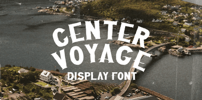 Introducing, Center Voyage - a Sans Serif typeface. This type of font perfectly made to be applied especially in headlines which is need a standout font, and the other various formal forms such as invitations, labels, logos, magazines, books, greeting / wedding cards, packaging, fashion, make up, stationery, novels, labels or any type of advertising purpose. Features : numbers and punctuation multilingual ligatures PUA encoded We highly recommend using a program that supports OpenType features and Glyphs panels like many of Adobe apps and Corel Draw, so you can see and access all Glyph variations.
 - Modern Elvish by Typelove Fontworks,
$9.00 Modern Elvish is a humanist sans serif typeface created for the Tengwar “English” mode as popularized in the Lord of the Rings books and films. I imagined the famous elves of this lore living in contemporary times and needing a no nonsense modern typeface for their branding, communications and UX design. Use this typeface for your RPG, LARPing or Cosplay needs. This typeface uses advanced font features such as ligatures and contextual alternates to convert any English text. I would recommend typing in English first, then converting to a font of this typeface.
 - Sassy by Just Bia,
$10.00 Introducing Sassy: a sans serif font! Sassy is a cute handwritten font. It maintains its classy calligraphic influences while feeling contemporary and fresh. This versatility will appeal to a wide range of crafty ideas, from letterheads and titles, to stationery. This font is perfect for: • greeting cards • packaging • social media and more! As the nature of the characters is hand-drawn some "wonky" lines might be found which helps to add another touch of organic in the font! Don't hesitate to reach out if you need any further information. Bia
 - Cailyne by Reyrey Blue Std,
$18.00 Introducing, Cailyne Typeface. A modern and elegant San serif with an italic version. It is designed with a touch of modern look and feel, making it ideal for projects that demand a touch of class. This type of font is perfectly made to be applied especially in logos, headlines, signage, and the other various formal forms such as invitations, labels, logos, magazines, books, greeting/wedding cards, packaging, fashion, makeup, stationery, novels, labels or any advertising purpose. Features : All Uppercase and Lowercase Number & Symbol Supported Languages Ligatures PUA Encoded Hope you enjoy our font!
 - Munika by Gravitype,
$24.90 Munika is a modern sans serif born from the equilibrium between geometric shapes and humanist details. Its lines were forged with the concept of clarity in mind, to make it the perfectly accessible typeface. This global family comes in 9 weights plus matching italics, with ligatures that facilitate readability and the alternative letter “a” in both versions. These features were conceived to further expand the range of use of the type system, to offer multiple aesthetic and technical options. Munika’s unique personality and fresh style make it perfect for a rebrand. Multilingual support is available.
 - Just Because by Letterhend,
$19.00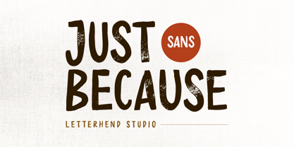 Introducing, Just Because - a Sans Serif typeface. This type of font perfectly made to be applied especially in headlines which is need a standout font, and the other various formal forms such as invitations, labels, logos, magazines, books, greeting / wedding cards, packaging, fashion, make up, stationery, novels, labels or any type of advertising purpose.Caps only fonts. Features : numbers and punctuation multilingual ligatures PUA encoded We highly recommend using a program that supports OpenType features and Glyphs panels like many of Adobe apps and Corel Draw, so you can see and access all Glyph variations.
 - Solidus by Brown Type,
$40.00 Inspired by the heuristic typography of the Concrete Poetry movement, Solidus is a hardworking and unobtrusive sans in the Neo-grotesque style. Its simplified features, generous spacing and squarish curves imbue a sense of sobriety and allow the textual information to take centre stage, whether in body copy or at display sizes. Solidus is available in nine distinctive weights from wafer-thin Hairline to a hefty Black, each with accompanying italics. Typical of the Neo-grotesque style the italics are slanted in construction and have the same advance width as the uprights.
 - Neugen by Minor Praxis,
$20.00 Inspired by retro movies and theatre display design. A very condensed font made by Minor Praxis. Perfect for headlines, tall-format prints, posters, and displays which can utilize space of a medium. Neugen is a condensed type of font with a very dense kern. Give a strong impression which can be matched with basic sans serif fonts as a body copy that can make it more casual and modern looks. Available in medium and medium-rounded style with multi languages support. Ligatures, alternates, and stuff like icons and symbols.
 - South Island by Rook Supply,
$14.00 The goal with South Island was to make a font that looked authentically handwritten. Each character had to perfectly flow into the next and maintain a nice balance between variation and legibility. The typeface retains all the texture and grit of the original handwritten characters, making it especially powerful when used for large headers. South Island comes in a regular version, and a second version which contains alternate versions of each letter A-Z (both upper and lowercase). Try pairing it up with a more traditional serif or sans serif font for endless possibilities.
 - CP Company by FSD,
$23.37 C.P. Company is a group of types including 4 different forms and it is a complementary sign of communication for the C.P. Company clothes maker. C.P. Company communication makes use of media such as the press and the web and that’s the reason why we have always felt the need for a font that would not show incongruities through the monitor. Therefore we have decided to change the structure of glyphs like a, e, g, s… in the most contrasted versions to prevent the serifs from touching the internal parts of the letters and in this manner we have made a really unusual stylistic choice for a group of types. The difference between the height of caps and smalls is very low (about 20%) so that the smalls are easy to read even when their dimensions are on a very small scale. Moreover this stylistic solution gives the possibility to avoid using the small capitals in case of charts and catalogue codes (i.e. Tricot M5) and provides more vertical compactness between the lines. Even a sentence written in capital letters next to another one written in smalls does not look so much contrasted from a typographical point of view and then it is not unpleasant. The limits due to different constructive principles have been overcome by means of a grid based on the automatic division of EM square of 9-point type and in this manner the letters have a wider face. The font is even more unusual owing to the style chosen that belongs to the classical tradition of hair-lined types for glyphs like e and also thanks to ligatures like ? in the characters set. CP Company is a geometrical font whose alphabet makes use of the style of types that preceded the Helvetica, matched with more experimental and updated solutions. Numbering is monospaced. The bending of number 2, the slight raising of the oblique serif of number 4 and the presence of a hair-line in number 7 are the solutions adopted to make the types match in a more balanced manner.
 - Ghitta Bodoni Cancellaresca by Spurnej Type Foundry,
$39.00 Giambattista Bodoni was an Italian engraver, printer, and publisher who was one of the best typographers of the 18th century and became known worldwide for his iconic serif typeface. In the posthumous edition of Bodoni’s “Manual of Typography” published in 1818 by his widow Margherita “Ghitta” Dall’Aglio may also be found, among the other treasures, the Cancellaresca (Chancery). Ghitta is a redesign of this typeface in its finest form. With strong stroke contrast in 4 optical grades, 850 glyphs with wide range of language support, accented ligatures, oldstyle figures, 8 stylistic sets, and unique way of letter connection, Ghitta Bodoni Cancellaresca follows and builds on the best of Bodoni’s historical prototype and shifts further to a contemporary script typeface full of grace, neatness, and beauty. *** This font is powered by OpenType feature “Ligatures”, so it is necessary to have this function turned on. If you need support or more information, please kindly contact me: spurnej@email.cz
 - Palms & Chill by Ardian Nuvianto,
$19.00 Palms & Chill is a laid-back and stylish script font that effortlessly captures the essence of tropical vibes and relaxation. With its fluid strokes and casual letterforms, this font transports your designs to a sun-soaked paradise, making it the perfect choice for projects that exude a carefree and easygoing aesthetic. Inspired by the leisurely swaying of palm trees and the warmth of a tropical breeze, Palm & Chill is an invitation to infuse your designs with a touch of coastal charm. Its versatility makes it suitable for a range of applications, from beach party invitations to vacation-themed branding and social media graphics. The breezy, handwritten quality of Palm & Chill adds a personal touch to your designs, making them feel approachable and inviting. Whether you're creating logos for beachside cafes or designing laid-back apparel, this font brings a sense of relaxed sophistication to your projects. Embrace the chill vibes of Palm & Chill script font and let your creativity flow as you craft designs that transport your audience to a world where every day feels like a beach day."
 - Alumni by TypeSETit,
$29.00 At first glance, there is something familiar about this font, but one may not be sure... “Where have I seen this font before?” Known for his diverse portfolio of script style display fonts, typographic designer and lettering artist Rob Leuschke has taken a step back in time with Alumni™. A true departure from present trends, this font resurrects the clean and simple forms made popular in the 1950s. Originally inspired by the black face Impact™, it soon evolved to include numerous weights from the Black flavor of its progenitor to a super thin Pinstripe. The extreme weights (Pinstripe, Hairline and Black) are designed for display situations while the remaining weights may be used for more traditional textual design applications. The Inline and Collegiate flavors offer added display options. Alumni™ is available in Roman and Italic versions of each weight. Extensive kerning and OpenType programming have been applied to give it optimal functionality.
 - Keratine by Zetafonts,
$39.00 The letterforms that we now accept as the historical standard for printing latin alphabets were developed in Italy around the end of 1400. Deriving from Roman capitals and from italic handwriting, they soon replaced the blackletter letterforms that were used a few years before by Gutenberg for his first moveable types. Between these two typographical traditions there's an interesting and obscure middle ground of historical oddballs, like the Pannartz-Sweynheym Subiaco types, cut in Italy in 1462. Keratine is the result of Cosimo Lorenzo Pancini's exploration of that territory. Like our Kitsch by Francesco Canovaro it explores the impossible territory between antiqua and blackletter, not as a mere historical research, but rather as a way to re-discover and empower an unexpected and contemporary dynamism. Using contemporary digital aesthetics to combine the proportions of humanistic type with the gestural energy of Fraktur letterforms, Keratine develops a "digitally carved", quasi-pixelated appearance (clearly stressed in Keratine's italics) that allows an unexpected balance between small-size readability and display-size personality. Keratine also relies heavily on a variable identity as the letterforms change dynamically with weight, developing from a contrasted, text-oriented light range to more expressive and darker display range, for a total of 8 weights with italics. Open type features and glyph alternates further enrich the usage possibility of this typeface that embodies our contemporary swap culture by embracing the contradictory complexity at the crossroads between Gothic and Humanist styles, while playfully empathising with a digital, brutalist spirit.
 - Arrow Callouts JNL by Jeff Levine,
$29.00 Here’s a set of arrow shaped callouts in two varieties within one font. The black-on-white letters are on the upper case keys, and the white-on-black characters are on the lower case keys. The numerals 1 thru 10 in black-on-white are in the standard key positions, while the white-on-black numbers are on the same keys when engaging the “shift” key. The 'zero' key houses the number '10'. For a more dynamic look, the font is also available in an oblique version.
 - Stempel by Linotype,
$29.99The Stempel family consists of two fonts; each made to look like a set of block stamps. Each letter appears inside its own roughly drawn square. Stempel One's letters are very simple form/counterform objects. Stempel Two's forms are more ornate: each square stamp has a thin border inside of it, and then the individual letterforms have been knocked-out, so that the colored area depicts the counters around the letters rather than the letters themselves. As a line of text is typed, a box appears for each letter entered, and all of the boxes slightly nudge against each other to form the line. The Stempel fonts have the appearance of a hand-made quality to them. Their forms appear too random, too delicate, and too thought out to have been made on a machine. Using these fonts will add a nice warm, linoleum-cut touch to your work. Both Stempel One and Stempel Two were designed by German designer Martina Balke in 2002, and are part of the Take Type 5 collection from Linotype GmbH." - RB Monsters by RockBee,
$15.00 This typeface was drawn to create short headlines (quickly) for one of my projects (a set of illustrations featuring The Evil Rat, imagined character). Each character (here I mean "glyph") has it's own personality, mostly evil one (jokingly) — that is why the font is called "The Monsters". The font was drawn on paper, then scanned and traced. It has both Latin and Cyrillic sets, since it was used with both. Monsters are good for short notes of comic or ironic style.
 - Rosemont by Scriptorium,
$24.00Rosemont is a playful new font which hovers on the bordeline between Arts and Crafts style and Art Nouveau style. It has the narrowness of Art Nouveau fonts like Adresack, Spoonbill and Coloma, with the curls and unique character forms of Art Nouveau fonts like Beauvoir or Acadian. The result is an interesting looking font which could be at home in either design environment. Rosemont features two sets of upper case characters, one with more decoration and one which is more plain. - FreeSet by ParaType,
$30.00 The type family in four basic styles was designed in ParaType (ParaGraph) in 1992 by Tagir Safayev. Based on Frutiger, of Mergenthaler Linotype, 1976 by Adrian Frutiger. Frutiger font was originally designed for use on signs at the new Charles de Gaulle Airport at Roissy. The straightforward sans serif shapes are suited well for both text and display setting. Six additional styles were added in 1998-2000. Multilingual versions of 6 styles (Light, Demi and Extrabold) include Armenian alphabet designed by Manvel Shmavonyan in 1997. Two condensed Cyrillic styles (Demi Condensed and Bold Condensed) designed by Manvel Shmavonyan in 2005.
 - Parchemin by Scholtz Fonts,
$19.95 The name “Parchemin” is derived from the word in old English for “parchment.” Our modern word “parchment” changed its spelling to conform with French spelling practices during the French occupation of England. The font was created to suggest an informal but antique form of handwriting written on parchment with a quill pen. The scratchiness of the old quill pen is conveyed in the roughness of the characters. The font was loosely based on the font Queen. Use this font whenever you want to suggest rough informality or antique handwriting. The characters have been letter-spaced and kerned in such a way that they join perfectly with one another giving a completely convincing imitation of genuine handwriting. The font is fully professional in terms of its character set. It contains more than 235 characters — (upper and lower case characters, punctuation, numerals, symbols and accented characters are present). In fact, it has all the accented characters used in the major European languages.
 - Lido STF - Personal use only

- Navarone by Stiggy & Sands,
$24.00 A Roman Stylized Font of War. Navarone is a display sans typestyle that was inspired by the movie titling sequence from the 1962 movie "The Guns of Navarone". It's an all capitals typeface that has alternate caps in the lowercase slots to convey all of the roman stylized lettering of the original inspiration. See the 5th graphic for a comprehensive character map preview. Navarone comes with features for customisation options: - An all capitals typeface with alternate capitals in the lowercase slots - A Basic Ligatures feature that swaps out FI and FL ligatures. Approx. 386 Character Glyph Set: Navarone comes with a glyphset that includes standard & punctuation, international language support, and basic ligatures.
