10,000 search results
(0.079 seconds)
- Rilo by Michael Prewitt,
$20.00 Rilo is an 18 style semi-condensed sans-serif with 9 weights + Italics. This unique OpenType typeface has a handful of unique glyphs with conservative stylistic alternatives. • 18 Styles (9 weights + italics) • OpenType alternates • Western European language
 - Depot New Condensed by moretype,
$35.00 Depot New Condensed is the space-saving complement to Depot New. With a narrower footprint it still contains all the non nonsense sturdy appeal of Depot New, making it an ideal addition to any Designers font collection.
 - Beat Poet JNL by Jeff Levine,
$29.00 Beat Poet JNL is a throwback to the late 50s and early 60s when Beatniks hung out at coffee houses to listen to poetry and folk songs and live the Bohemian lifestyle of the Pre-Hippie generation.
 - Paksa by Jipatype,
$17.00 Paksa is a decorative sans-serif typeface. The name of this typeface is derived from the Thai word that means “bird.” It is suitable for use in text headlines, sub-headlines, packaging, posters, and other print media.
 - Norberto by CastleType,
$59.00 Norberto, a CastleType original, is based on a Russian design from the late 19th century that in turn appears to be based on Bodoni. However, Norberto is a much warmer design than most Bodonis, with many soft touches such as very gentle curves from the serif at the top of B, D, P, and R; a jaunty cap on the ‘A’ (and Cyrillic ‘El’, ‘De’, etc); charmingly quaint numerals; hairline accents, and other subtleties that make it a wonderful addition to the Modern typefaces. In addition to several useful OpenType features, Norberto also offers extensive language support, including modern Greek and most languages that use the Cyrillic alphabet, as well as built-in keyboard support for Esperanto and Yoruba. Norberto now has a stencil version which combines the elegance of the original with the informality of a stencil cut. As one enthusiast says, "As a die-cut companion to his compact Norberto, Jason Castle's Norberto Stencil hits us right where we live with its svelte stature and sexy, Bodoni-esque bones." — Typedia
 - High Class by Redy Studio,
$19.00 High Class – Handwritten Font High Class is a handwritten font, with high-end style and embodies the most desirable elements of fashion, setting an impression of classiness. This font truly brings on the vibe of high society. While this font comes with over 122 hand-drawn ligatures, it has been carefully kerned to give results as if they were all handwritten. It comes with a clean base look and all over the place forms with imperfect letters, messy style ligatures, and ampersands that make it complete. Easy to use, you can create a great impact on your work. High Class font is perfect for branding projects, logos, wedding designs, social media posts, advertisements, product packaging, product designs, label, photography, watermark, invitation, stationery, and any projects that need handwriting taste. High Class features: A full set of upper & lowercase characters Numbers & punctuation 122 Gorgeous ligatures A full set of alternate upper & lowercase characters Multilingual symbols PUA Encoded Characters – Fully accessible without additional design software. Feel free to give me a message if you have a problem or question. Thank you so much for taking the time to look at one of our products.
 - Surfside Paradise by Shakira Studio,
$15.00 Say hello to new serif font, Surfside Paradise! Introducing Surfside Paradise, a classic, stylish, and luxury serif font that will transport you to a world of sophistication and elegance. With Surfside Paradise, you'll experience the epitome of luxury in typography. Each character is meticulously designed to exude an air of exclusivity and opulence, making every word a masterpiece. Whether used in headings, invitations, luxury branding, or editorial layouts, Surfside Paradise will leave a lasting impression on your audience. Its classic, stylish, and luxury features will effortlessly elevate your designs and evoke a sense of timeless beauty and refinement. Prepare to embark on a typographic journey to a paradise of elegance. Here's what you get: Surfside Paradise Regular, Italic All Multilingual symbol Opentype features ( ligature, alternate ) Accessible in the Adobe Illustrator, Adobe Photoshop, Adobe InDesign, even work on Microsoft Word. PUA Encoded Characters - Fully accessible without additional design software. Multilingual character supports : (Afrikaans, Albanian, Catalan, Croatian, Czech, Danish, Dutch, English, Estonian, Finnish, French, German, Hungarian, Icelandic, Italian, Lithuanian, Maltese, Norwegian, Polish, Portuguese, Slovenian, Spanish, Swedish, Turkish, Zulu) Follow my shop for upcoming updates, and for more of my work, Thank you!
 - Andaluz by Storm Type Foundry,
$38.00 The land of beauteous angels, Andalucia, connects different cultures with a curved arch. Almond trees bloom there in February, and orange trees grow in the heavenly courtyards of Gothic churches. A Catholic cathedral stands in a mosque, Moorish fountains gush with water, and ornate arcades are reflected in the mirrors of the Alhambra pools. Fishing villages have long been busy with tourism, but there are remote pubs where only locals go for fresh fish. Beer is served in wine glasses, and with each one you get a piece of cheese, shrimp, or a few slices of specially smoked ham, sitting on the bar counter. Here, in the off-season, it is possible to gaze into the distance towards the African shores and sketch watercolors for the diary completely undisturbed.
 - Omnibus by Linotype,
$29.99Omnibus is one of my absolute favourites. My intention was to design a typeface as easy to read as Baskerville, without being a copy of it. It is easy to see that I was influenced by Baskerville, e.g. in the open lowercase g. I had in mind to design a Baskerville with the looks of the Baskervilles used in earlier typesetting. I put aside those plans for a while (but fulfilled them later on) and dedicated myself to Omnibus. In both cases my aim was to achieve a typeface with darker looks than the most used Baskerville. The name has nothing to do with buses, it is Latin with the meaning of for all". It is also in the name of Omnibus Typografi. Omnibus was released in 1993. - VLNL Wasabi Turbo by VetteLetters,
$35.00 Wasabi is one of the key ingredients in the Japanese kitchen. Also known as japanese horseradish, it is an extremely spicy condiment made out of the graded root of the Wasabi plant. Its spiciness is different than that of a chili pepper though, more like a hot mustard. The spicy taste shoots right through your nose, but does not last for long. Wasabi is traditionally used in sushi and sashimi dishes, soba noodles, and in a number of Japanese snack foods. Equally sharp and stingy, VLNL Wasabi Turbo was designed by Donald Roos. Despite its japanese outward appearance, the font has its origin in lettering found on a German book. It is hot, and edgy like a samurai sword. Wasabi Turbo will stand out as headline and logo!
 - DEADman by Volcano Type,
$29.00The font family "DEADman" is mostly inspired by the weird style of the British illustrator Ralph Steadman. He had a long partnership with the American journalist Hunter S. Thompson, drawing pictures for several of his articles and books e.g. "Fear and Loathing in Las Vegas." Like Steadman's artwork all the letters are painted with ink. The best ones were selected out of hundreds of variations to get the whole character set complete and look uniform. By combining the regular weight with one (or both) of the additional weights "Blotting" and "Squirting" you can achieve a more freaky and psychadelic look. - Rogliano by TipoType,
$25.00 Rogliano is an affable Slab Serif. On one hand it responds to the classic tenet of strong and direct alphabets of the Industrial Revolution period. While nourishing the text of a warm environment, it takes the freedom to flirt with lettering and lithographic posters of the Victorian era: due to its multiple stylistic alternatives, borders and decorative ornaments. This wide range of voices makes Rogliano a versatile typeface that can move from the mechanical to humanistic with absolute ease, and perform efficiently from branding to editorial design. Rogliano offers 14 weights with support for more than 200 latin languages.
 - Social Gothic by Canada Type,
$29.95When Social Gothic first launched in 2007 as a basic single font, it became an instant branding and advertising favourite. It was used widely by a few major fashion outlets and department stores, then soared to new heights of exposure when it became the billboard-cause standard face for a few charity outfits and political organizations throughout Canada’s major urban centres. Social Gothic is a unicase font that combines standard sans serif elements with some distinct “wooden” shapes and oval lowercase components, to make for a totality that achieves a handmade look while maintaining a clean, legible, understated and easy message delivery. It is a gothic with quite a few humanist leanings, something seldom found in the sans serif genre. This retail Social Gothic family is the re-conceptualized, refined and optimized redux of the many bespoke versions that were commissioned and customized for various proprietary brands and projects over the years. The remastered set consists of four multi-script weights, rough and soft variations, and a very unique stencil treatment. Each of the Social Gothic fonts contains over 550 glyphs and support for Latin, Greek and Cyrillic languages. - Shentox by Emtype Foundry,
$69.00 During a visit to London in 2008 I fell in love with the square font used on the British car number plates. I was immediately inspired to start working on this font and have been developing it intermittently ever since. Several more trips to London and the project evolved before it finally took off and became Shentox. Despite the starting point being inspired by simple, everyday car plates, the font soon evolved into something fine and very rich in detail. Even though the square genre is very restrictive, Shentox is a highly legible contemporary font with a full range of weights, useable not only as a display family for headlines and posters, but as a distinct, clean font family for branding and general editorial use (Especially magazines). It has been carefully drawn paying extra attention to the details, high end finishes that makes Shentox a safe font for use in large scale work. For example, the curves of every individual corner have been adjusted character by character to avoid the common problems encountered with square fonts (Eg. darker corners between weights or a visually inconsistent radius between the Upper and Lowercases as a result of copy/paste). Shentox italic, which has a 12 degree slant, has been corrected to avoid distortion when slanted. The radius of the upper-right and lower-left corners are more pronounced, giving it a more fluid Italic feel. Shentox is available in Open Type format and includes ligatures, tabular figures, fractions, numerators, denominators, superiors and inferiors. It supports Central and Eastern European languages. This type family consists of 14 styles, 7 weights (Thin, UltraLight, Light, Regular, Medium, SemiBold and Bold) plus italics. Shentox PDF
 - Elpy by Wordshape,
$25.00 Elpy is a friendly rounded sans serif workhorse family inspired by all things music! Spanning 22 Condensed and Regular weights with true italics, Elpy will fit right in with your record collection and your font collection! The Elpy family includes language support for Western and Eastern European languages, Greek and Cyrillic. Ian Lynam dreamt up Elpy one day when he visited a record pressing plant outside Tokyo, watching vinyl pellets being melted down and a fresh batch of 7-inch records get pressed. Despite the smell, a seed was planted that would be extruded into Elpy's rounded forms half a year later... Elpy Light and Regular function as highly readable text typefaces, while the bolder and lighter weights are perfect for display work. Elpy's rounded terminals make the family perfect for screen-based work, as well as for print conditions of any resolution—from offset to Risograph.
 - Sortie Super by Lewis McGuffie Type,
$40.00 Sortie Super is a take on one of the kings of display lettering - Caslon's high-contrast, reversed stress 'Italian' style. It looks great at big sizes and in short flurries... and shouldn't be used in confined spaces. When compared with the original face, the weight and contrast of Sortie Super has been exaggerated. To add gravity to the letters I've increased their width overall and reduced the spacing to a hair-line fracture for added visual impact. Characters like 'S', 'E','O' and 'Z' are relatively close to their historical precedents - however the terminals on the 'C-G-S-З-Є', which have been drawn so to be more consistent. Other aspects, such as the leg of the 'R' and 'Я', the apex of the 'A' and the spur of the 'G' are revised and simplified, to help spacing and optical weight across the alphabet. Also, to reduce visual noise terminals in characters like 'C', 'J' and 'R'' are horizontally aligned. Meanwhile, the central horizontal strokes in the 'B', 'P' and 'R' etc are reduced to a hairline, so as to create a more simplified system of thick-to-thin. The temptation when drawing this kind of esoteric display alphabet is to start to rely on modular components. Which, while copy-paste-repeat is a sure-fire way to make the face more visually consistent, it's a lazy method that risks allowing the font become soulless and mechanical. An early experiment I made was making a monospaced version, which was useful in headlines, but it lost that loving feeling. So, by maintaining a handful of flourishes – the tail of the '?', the inky drop of the '!', the bulbous gloop of arms of the 'Ж' and 'К', the swirling legs in the 'R', 'Я' and 'Л', the big-bowling weight of the 'J' and 'U' – plus a few in-built inconsistencies and a bit of its own silliness, Sortie Super retains some of the organic warmth of its ancestor. Conversely, the counters, apertures and negative space are largely rigidly geometric, which helps give the revival font a bit of a modern touch. Sortie Super is an uppercase-only display font that comes with Western, Central and East European Latin, extended Cyrillic, Pinyin, as well as a set of hairline graphic features and symbols.
 - Bristles by Typodermic,
$11.95 Step right up folks and feast your eyes on the most authentic and pure font to ever grace the pages of your ad campaign. Bristles is the name, and it’s a font that speaks volumes of homegrown authenticity with every brushstroke. As you gaze upon this sun-bleached and weathered sans-serif, you’ll notice how the paint barely holds onto the substrate. It’s as if the letters themselves are just barely hanging on, like they were painted decades ago and left to weather the storm. But that’s what makes Bristles so special. Its wispy, textured lettering gives your message a voice of purity that simply can’t be replicated by other fonts. Each letter has its own unique character, telling a story that only a sign painter’s hand could convey. And with its letter pair ligatures, Bristles breaks up the monotony of blatantly repeating characters in OpenType-savvy apps. It’s a font that’s as versatile as it is beautiful, perfect for any project that needs a touch of old-school authenticity. So what are you waiting for? Give your message the voice it deserves with Bristles, the font that speaks volumes of homegrown authenticity. Most Latin-based European writing systems are supported, including the following languages. Afaan Oromo, Afar, Afrikaans, Albanian, Alsatian, Aromanian, Aymara, Bashkir (Latin), Basque, Belarusian (Latin), Bemba, Bikol, Bosnian, Breton, Cape Verdean, Creole, Catalan, Cebuano, Chamorro, Chavacano, Chichewa, Crimean Tatar (Latin), Croatian, Czech, Danish, Dawan, Dholuo, Dutch, English, Estonian, Faroese, Fijian, Filipino, Finnish, French, Frisian, Friulian, Gagauz (Latin), Galician, Ganda, Genoese, German, Greenlandic, Guadeloupean Creole, Haitian Creole, Hawaiian, Hiligaynon, Hungarian, Icelandic, Ilocano, Indonesian, Irish, Italian, Jamaican, Kaqchikel, Karakalpak (Latin), Kashubian, Kikongo, Kinyarwanda, Kirundi, Kurdish (Latin), Latvian, Lithuanian, Lombard, Low Saxon, Luxembourgish, Maasai, Makhuwa, Malay, Maltese, Māori, Moldovan, Montenegrin, Ndebele, Neapolitan, Norwegian, Novial, Occitan, Ossetian (Latin), Papiamento, Piedmontese, Polish, Portuguese, Quechua, Rarotongan, Romanian, Romansh, Sami, Sango, Saramaccan, Sardinian, Scottish Gaelic, Serbian (Latin), Shona, Sicilian, Silesian, Slovak, Slovenian, Somali, Sorbian, Sotho, Spanish, Swahili, Swazi, Swedish, Tagalog, Tahitian, Tetum, Tongan, Tshiluba, Tsonga, Tswana, Tumbuka, Turkish, Turkmen (Latin), Tuvaluan, Uzbek (Latin), Venetian, Vepsian, Võro, Walloon, Waray-Waray, Wayuu, Welsh, Wolof, Xhosa, Yapese, Zapotec Zulu and Zuni.
 - Tulip Algarve by Brenners Template,
$19.00 Tulip Algarve font family showcases elegant and trendy glamour through a bold contrast between horizontal and vertical stems. The basic glyph design was inspired by the beautiful silhouette of a tulip flower, and a classical beauty was added to the typeface system. With a modern display sans serif personality, this type system will interact well with any layout design.
 - Freud by Juraj Chrastina,
$29.00 Freud is a sans family of 9 weights ranging from hairline to extra bold (also available as a 5 styles Economy Pack). It’s a legible face with straightforward geometry spiced with lovely humanist terminals. Some strokes are cut at an angle to enhance its identity. Freud provides a strong partner both for screen and print projects.
 - Balboat by Ingrimayne Type,
$9.95 Balboat is a plain calligraphic face with a very small x-height, long descenders, and tall ascenders. Having the appearance of a pen-drawn sans serif, it has four styles: regular, bold, italic, and bold italic. Although Balboat is quite legible, it is condensed and may need to be printed at a larger point size than other typefaces.
 - Akerley by Surplus Type Co,
$18.00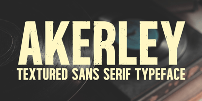 Introducing Akerley, a vintage-inspired textured sans serif font that's perfect for apparel, branding, titles, and headlines. This striking font combines a gritty, handcrafted texture with excellent legibility, making it a versatile choice for your creative projects. Akerley offers a full character set with multilingual support. Elevate your work with the bold and captivating charm of Akerley today!
 - Radugo by Twinletter,
$10.00 Radugo is a san serif font family designed with light strokes that make up a vintage style with a rustic touch and a stamp with 2 fonts, as the ribs in your design work, and able to beautify and strengthen your work in the form of logotypes, typography, hand lettering, packaging, t-shirts, labels, and many more.
 - Bionca by Zeenesia Studio,
$15.00 BIONCA is a bold modern display font with sans serif style. It's modern and classic font with a unique and deference look . Perfect if you need a dose of fun in your project. Perfect for editorial projects, Logo design, web font, clothing branding, product packaging, magazine headers, or simply as a stylish text overlay to any background image.
 - FS Siena for Walbusch by Fontsmith,
$80.00Siena is a luxurious type. A modern contrasted sans serif. Over 25 years in the making, FS Siena is tailor made for high-end brands. Sumptuous, elegant and eclectic, a nonconformist typeface with classical roots. It’s been a long time coming, but with its heady mix of elegance and quirky charm, FS Siena is worth the wait. - Insecticide by Arkalandara,
$110.00 Insecticide Infused with a laid-back charm, our casual handwriting captures the essence of relaxed authenticity. Effortlessly stylish, each stroke exudes approachable warmth, making it the perfect choice to connect with your audience on a personal level. Embrace a brand identity that feels as comfortable as your favorite pair of jeans
 - Sea Gate JNL by Jeff Levine,
$29.00 Sea Gate JNL is a hybrid font creation based in part on a 1930s-era WPA (Works Progress Administration) poster and the addition of slab serifs as well as a few modifications to some of the characters in the original design. The typeface is available in both regular and oblique versions.
 - Phi Caps by Cas van de Goor,
$7.00 Phi Caps is a geometric all caps typeface designed on the basis of the golden ratio. Its simple monoline letters come together in a solid font. Note: There is a new and improved version of this typeface called Phi. It includes lowercase letters and supports Central, Eastern and Western European languages.
 - French Bistro JNL by Jeff Levine,
$29.00 The 1930s French publication L'Art du Tracé Rationnel de la Lettre was a treasure trove of font revival ideas from the Art Deco era. One example featured a serif typeface with a number of stylized characters. This is now available as French Bistro JNL, in both regular and oblique versions.
 - Hatchery JNL by Jeff Levine,
$29.00 A photo from Gene Gable (a regular contributor of ideas to Jeff Levine Fonts) shows the vintage signage for the Lasher Hatchery in a slightly different take on the classic Art Deco solid letter style. Since good ideas, like eggs can be hatched, thus the font's name of Hatchery JNL.
 - Brevet by Solotype,
$19.95Authentic copy of the original, with a couple of minor changes to the caps, making them fit better. Although made for the American market by an American typefounder, we found this font in a York, England printshop when we went on a second visit to the famous DeLittle Wood Type factory. - Shakila by Alifinart Studio,
$17.00 Shakila Script is a handwritten font created at the end of March 2021. It is a unique bold font with a pretty and charming casual style with many variants of beautiful swashes, as well as an alternative to capital letters. Shakila is a lovely and delicate font duo (script and sans serif), that exudes elegance and class. This font was particularly crafted for those who need a beautiful and refreshing look to their designs. Also, this font is perfect for branding projects, logo, product designs, invitation cards, wedding cards, stationery designs, advertisements, label, photography, blogging, social media or watermark. Key Features: - Multilingual Accents - Alternative capital letters - Stylistic Alternates up to 20 choices - Has a heart connected feature for a-z and A-Z letters - Available shortcut for Stylistic Alternate by simply adding "period" (.) and “number” (1-20) to each letter. - Has lots of ligatures so the letters connect well together - Has OpenType and PUA Encodes features. This font has a total of 885 glyphs, including capital letters, uppercase alternates, lowercase, numeral and punctuation, multilingual accents, beginning and ending swashes for lowercase, and includes a large number of stylistic alternates and heart swashes (for lowercase-lowercase and uppercase-uppercase). The advantage of the Shakila Script font compared to other fonts is that the alternative capital characters are in 1 font file, so it will make it easier for you to work. Therefore, you are free to choose it as you like, especially this font has the OpenType and PUA Encodes features which means you can access all of the glyphs and swashes with ease. As I mentioned earlier, Shakila Script has a large number of Stylistic Alternates features, up to 14 options for letter a-z and up to 20 options for letter b d h k l. In fact, there is also a swash feature in the form of a connected for the combination of each lowercase-lowercase and uppercase-uppercase letters. Interestingly, you can activate all Stylistic Alternates that are owned by each letter, just by typing; letter + period + number. For example: a.1 a.2 a.3 or b.1 b.2 b.3 and so on. As for activating the heart connected for each letter a-z or A-Z is quite easy. Namely by simply typing; letter + underscore + underscore + letter. For example: a__a or A__A and so on. Shakila Script is a Font Duo pack that pairs with Shakila Sans. The two were created at about the same time, but made in separate file packages. The reason I created this font duo is to make your projects more harmonious and unique. At the end of the sentence, Shakila Font Duo is a very authentic and amazing. If there are things you want to ask, don't hesitate to contact my email. For complete details, please visit my Behance profile. Alifinart Studio alifinart@gmail.com Thank you.
 - Circumulus by HakanPolatovic,
$15.00 CIRCUMULUS is a font that designed based on a single circle SOFT AND CURVY Circumulus has soft appearance and curvy lines, which gives it's nice look GEOMETRICALLY RATIONAL Every glyph has a ratio to one another, which makes this font can be used in any kind of rational system like repeating patterns
 - Muisca by JVB Fonts,
$25.00 Muisca, that in its early edition was named as «Muisca Sans», was developed in mid-1997 and based on the graphic concept of pre-Columbian characteristics figures within some of the very few visual elements recovered from the Muisca culture. This ancient pre-Columbian tribe disappeared since the arrival of the Spanish 500 years ago, in what is now the center of Colombia. In fact, the name of the capital Bogotá goes back to Bacatá as primary or village downtown of what was once the imperial capital of the Muisca tribe. This typographic project was submitted as my work for the degree in Graphic Design, obtained in September of that year (at the Universidad Nacional de Colombia), under the creative concept of vindicating the ancient culture and identity through a functional typeface, into a fact without precedent in the country. Muisca was recently edited, arranged and completed, including multilingual diacritic glyphs to be versatile in several languages. Related and inspired by Latin America, Ethnic, Native, Tribal, Mysthical, Handmade, Aboriginal, Pre-Hispanic, Pre-Columbian, Textured, Fantasy. Ideal to be used in logos, display text & titles, games and other design applications that reminds of the Pre-Hispanic art.
 - Quartal by ParaType,
$25.00 Quartal is a family of stylish sans serif typefaces of condensed proportions. The family consists of 5 regular weights, 4 condensed ones and 13 extended styles (7 upright and 6 italic). At first there was intention to release just 4 condensed weights for headlines and advertising texts, but later 5 styles of wider proportions were added. As the result the area of applications becomes much wider due to possibility to use the font for smaller point sizes. The name "Quartal", which in this case means city quarter, according to author's associations emphasizes the advertising nature of the design most suitable to the urban environment. Character set of the fonts covers alphabets of Western Europe and basic Cyrillic languages. In addition, it includes a range of alternatives, especially in Cyrillic part. Design was done by Oleg Karpinsky. Released by ParaType in 2010. In 2011 13 new styles of extended proportions were added to Quartal family by the same author. 7 new weights and 6 corresponding italics make Quartal useful for setting not very long texts in advertising and display matter, and for magazines as well.
 - Nextir by Ditatype,
$25.00 Nextir is an extraordinary brush sans serif font that commands attention and redefines modern typography. Designed with large letters and a thick weight, its distinctive square letter shapes are the epitome of strength and contemporary style. What sets Nextir apart from the ordinary is its brush detailing. This unique blend of brush strokes and sans serif elements adds a layer of organic texture to the font. The combination of large letters, thick weight, square shapes, and brush detailing creates a font that makes a striking statement with a contemporary edge. When you need a typeface that combines strength with artistic expression, Nextir is the perfect choice to infuse your designs with boldness, modernity, and a touch of handcrafted elegance. You can also enjoy the features here. Features: Multilingual Supports PUA Encoded Numerals and Punctuations Nextir fits in headlines, logos, posters, flyers, branding materials, print media, editorial layouts, and many more designs. Find out more ways to use this font by taking a look at the font preview. Thanks for purchasing our fonts. Hopefully, you have a great time using our font. Feel free to contact us anytime for further information or when you have trouble with the font. Thanks a lot and happy designing.
 - Directors Cut Pro by Type Innovations,
$39.00 Directors Cut Pro is a compelling new font series designed by Alex Kaczun. It recently won the second place—a commendation in the Canberra Typeface Competition. This handsome Geometric Antique serif design is based on the early 19-century Moderns and Scotch styles, infused with the warm charm of traditional antique, added for interest. Capturing the best of both ages: it's warm, comforting and persuasive. Directors Cut Pro's graceful aspects naturally invite uses at large sizes, for which we have created a stunning and elegant lighter weight. But, this workhorse typeface series incorporates a solid regular weight, along with its italic—ideal for a multitude of text purposes, at varying point sizes. A robust Bold weight is available for headlines and emphasis. Director Cut Pro comes with proportional as well as tabular lining figures for quickly setting up charts and tables. It also contains an extended character set—including most Central European languages. Alex Kaczun is in the process of expanding this typeface series to include additional weights, styles and proportions. Stay tuned! The large Pro font character set supports most Central European and many Eastern European languages.
 - Bivoac by Sabrcreative,
$15.00 Discover Bivoac, a versatile layered display sans font that offers easy usability and is perfect for creating stunning 3D and vintage designs. We present this unique font, designed to add depth and character to your projects. With its layered system, Bivoac allows you to effortlessly create multi-dimensional typographic compositions. Whether you're working on a vintage poster project or aiming for eye-catching 3D effects, this font provides the tools you need to bring your vision to life. Bivoac features both uppercase and lowercase letterforms, ensuring versatility and allowing for creative combinations. It also includes numbers, punctuation marks, and comprehensive multilingual support, enabling you to cater to a wide range of audiences in various languages. When you purchase Bivoac, you receive the complete set of font variations: Bivoac Regular: Perfect for the base layer Bivoac Outline: Adds an outline effect Bivoac Shadow: Creates a shadow effect Bivoac Dark: Provides a bold and dark variation Bivoac Drop Shadow: Adds depth with a drop shadow effect Unlock your creativity and enjoy the layered features of Bivoac. Enhance your designs with its diverse options and explore the possibilities of captivating 3D and vintage visuals.
 - Al Stagen by Aluyeah Studio,
$120.00 Stagen is a cloth with a length ranging from 5-10 meters and a width of about 15 cm which is usually used by traditional Javanese women as part of the traditional kebaya dress. The stagen is wrapped around the stomach to help maintain posture and "lock" the jarik cloth on the kebaya. Stagen existed before World War II in Indonesia and became an elegance in the harsh world at that time. Inspired by the rich culture, Stagen is a modern sans serif typeface that has an upright and sturdy impression, with unique curves in it. A simple, yet distinctive, elegant font that can be applied to many areas of design. Coming with 130+ stunning and super easy to use alternates and ligatures. Very suitable for magazine, headline, website, ads, product package and all type of design project you have. Features: OpenType support Multilingual support (15 languages) PUA Encoded Super Easy to Use alternates - It's OpenType support but you can easly call alternates character using special combination like A.2 R.3 L.A L.a etc so you don't need special software. To get results like the preview just type Sta.gen.
 - Tahoma by Microsoft Corporation,
$49.00Tahoma™ Family is one of Microsoft's most popular sans serif typeface families. The original Tahoma™ Family consisted of two Windows TrueType fonts (regular and bold), and was created to address the challenges of on-screen display, particularly at small sizes in dialog boxes and menus. In 2010 Ascender Corporation added italics, so now the Tahoma font family contains 4 fonts in total: Tahoma regular, italic, bold and bold italic. The Latin, Greek and Cyrillic characters were designed by world renowned type designer Matthew Carter, and hand-instructed by leading hinting expert, Tom Rickner. The Tahoma fonts set new standards in system font design. Tahoma is ideal for use in User Interface scenarios and other situations requiring the presentation of information on the screen. Character Set: Latin-1, WGL Pan-European (Eastern Europe, Cyrillic, Greek and Turkish). - Sunshine Delivery by Hanoded,
$15.00 After a long period of wind, rain and cold, summer has finally arrived. It almost felt as if the sunny weather came as a special delivery! Sunshine Delivery is a handmade display font. It comes in a regular, angular version and a rounded one. Need Vietnamese support? Check! Want some Sami? Got it! Feel like a bit of Greek? Dive right in!