10,000 search results
(0.067 seconds)
- LHF Asylum by Letterhead Fonts,
$43.00 A ragged jagged experiment that's sure to fit the needs of any mad scientist or extreme skier dude (you know the type). Features two sets of variations: one set on the uppercase keys and a different set on the lowercase keys. Mix and match them for best effect. No twisted or mangled points in this font. All paths guaranteed technically sound.
 - Maximillian CT by CastleType,
$19.00 Another one of those faces that caught my eye in one of my art deco type books, and I wanted it. After I finished the face, I noticed that there is a more clean-cut version of this face in digital format, but my version retains more of the funkiness of the original drawings.
 - Dutch Courage by Comicraft,
$29.00Developed by Comicraft's Dutch Masters to give DC's BATMAN & ROBIN ADVENTURES a crisp, clean, Art Deco look, all four pints of DUTCH COURAGE are available as one font family. Please refrain from operating heavy machinery within one hour of partaking of these intoxicating fonts. - Retro Head by 50Fox,
$20.00 “Everything old is new again,” as they say. Introducing "Retro Head" - A retro-modern inspired typeface with a bold, charming and versatile look. This font is also equipped with an opentype feature to support your creations. You will get : Retro Head Regular Retro Head Italic Ton of glyphs Ligatures & Alternates Works on PC & Mac Simple installations Accessible in Adobe Illustrator, Adobe Photoshop, Adobe InDesign, even work on Microsoft Word. PUA Encoded Characters – Fully accessible without additional design software. Language Support: Afrikaans, Albanian, Czech, Danish, Dutch, English, Estonian, Finnish, French, German, Hungarian, Italian, Latvian, Lithuanian, Norwegian, Polish, Portuguese, Slovak, Slovenian, Spanish, Swedish, & much more.. Thank you for looking.
 - Marmellata Jar 01 by Fontscafe,
$39.00 When you think of marmalade or jam (that’s Marmellata in Italian), images of a happy breakfast table are conjured up into the mind, with of course the unforgettable emotive response accompanied. These emotions are exactly what our Marmellata fonts can conjure up for your designs as well (we agree, nothing can beat marmalade on a hot toast)! Our Jar 1 is ideal for all designs where you need to send across a feeling of care, childhood, comfort, motherhood or friendship...amongst all those ideas you will get on your own! With that classic breakfast table feel, you are sure to connect on a very comforting level with all those who view your designs using these fonts. May we suggest, these fonts go very well with unusually dull colours, and can add a spark of life to the most mundane of words! Try getting a taste of our Jar 2 if you want even more of the classic taste (sorry, touch!).
 - BR Nebula by Brink,
$30.00 BR Nebula is a geometric sans serif that builds on the foundations of early geometric designs such as Paul Renner’s Futura, and later works such as Avant Guarde. BR Nebula takes inspiration from these early explorations in sans serif design and re-imagines them for the modern age. Distinctive geometric letterforms have been refined and simplified with opened terminals to achieve a clear, legible and modern aesthetic. BR Nebula is available in 20 contemporary styles, with weights ranging from Hairline to Super. The fonts also provide advanced typographic support with OpenType features such as case sensitive forms, stylistic alternates, slashed zeros and multiple figure sets. Also containing advanced language support as standard. For custom enquiries please contact: mail@brinktype.com
 - Caligari Pro by Elsner+Flake,
$99.00 The silent film »The Cabinet of Dr. Caligari« (1920) is undoubtedly one of the breathtaking milestones within the German Expressionist Movement, a time of extraordinarily creative works of art as a reaction to a world in rapid change. The original intertitles of Caligari were worked out by the set designers (and painters) Walter Reimann, Walter Röhrig, and Hermann Warm, using a unique expressionistic language of form for dramatic and iconic lettering. When in 2010 KOMA AMOK’s Joerg Ewald Meißner and Gerd Sebastian Jakob were commissioned by the Institut Mathildenhöhe Darmstadt and publisher Hatje Cantz to design the catalog for the exhibition »The Total Artwork in Expressionism«—showing works of art, architecture, film, literature, theater, and dance—it was soon perfectly clear that a new typeface, inspired by the Caligari intertitles, should speak for all the expressionistic arts. An intense process of research and analysis began. The original letters of the Caligari intertitles were individuals on their own. Furthermore, each of the three title designers had added his specific approach to the basic Caligari type style. From hundreds of different As to Zs a choice had to be made, which should be THE characteristic Caligari letter for a digital typesetting font. Finally the chosen letters were cut and drawn again, missing letters were added according to the formal priniciples, all-in-all 1000 glyphs were digitised to complete a usefull OpenType font ready for use. When in the autumn of 2010 the exhibition started successfully with great media interest, the posters all over Darmstadt announced »You must become Caligari!« – set in the brandnew typeface. The font Caligari Pro offers alternative forms for every letter and a whole bunch of ligatures, thus creating an expressive, individual image of headlines and text. By using included Stylistic Alternates the image will get even more vivid. Caligari comes with a complete set of expressionist ornaments and true old style figures—thus the heyday of the Expressionist Movement and the era of the silent films can be revived typographically by the means of today: »Express Yourself!«.
 - Fette Fraktur by Linotype,
$29.99 This font is one of the most used broken letter fonts today. Fette Fraktur is used to invoke a nostalgic or rustic feeling and found often on restaurants with hearty homemade food’ or breweries who use the good old recipes’ of the founder. The font was designed in the 19th century and from the beginning intended as an advertisement typeface. The lower case letters have a gothic character with only the ornamental flourishes making them broken letters, while the capital letters are more characteristic of broken letter typefaces. One could say Fette Fraktur is a true mix of styles, not unusual for typefaces created at the turn of the 19th century.
 - Syncopate Pro by Stiggy & Sands,
$29.00 The Syncopate Pro Family is a unicase design where the traditional lowercase x-height has been abandoned and a single uppercase height rules the design of all of the alpha and numeric glyphs. Some uppercase glyphs are copied to their lowercase slots, where other lowercase glyphs such as the a, e, and r, are scaled up to uppercase heights. This motif allows for a vast array of typesetting possibilities. A modern and stylish sans inspired by the many trendy sans serif typefaces that are prevalent today, the Syncopate Pro Family, primarily intended for display and headline use, also works well for limited text runs. The thin and regular weights and wide body impart a certain level of elegance, while the unicase approach keeps the look lively and fresh. The bold weight imparts a powerful substantiality, lending a strong corporate presence to any design. Opentype features include: - Stylistic Alternates for a collection of alternate Small Caps - Full set of Inferiors and Superiors for limitless fractions - Lining and Proportional figure sets
 - Titul by ParaType,
$30.00 Titul is a display typeface with strong historical connotations. It is based on a series of stylish lettering for book covers, designed by Russian graphic artist Alexander Leo in the 1920s. The historical reference for him was book design of the 1st half of the 19th century. Type family consists of four ornamented and three basic styles: one solid, one inline and one striped. All seven faces have corresponding oblique styles. Also, there is a beautiful vignette font and a style for constructing ornamental borders. Titul suits best for vintage spirited typography, from the 19th to early 20th century. It is perfect for book covers, theater posters, packaging and greeting cards. Typeface was created by Isabella Chaeva and released by Paratype in 2020.
 - Teutonic by Wooden Type Fonts,
$15.00 A revival of one of the popular wooden type fonts of the 19th century. Suitable for text or display, Teutonic features short descenders, and rounded, curved serifs.
 - Sign Writer JNL by Jeff Levine,
$29.00 Sign Writer JNL was found within the pages of an early 1900s manual on the art of sign lettering and is a style typical of those times.
 - FF Kaytek Rounded by FontFont,
$50.99 Kaytek™ Rounded completes the Kaytek typeface family with seven carefully rounded weights. Every style of the typeface takes up exactly the same amount of space, thanks to the careful creation by Radek Łukasiewicz. This means designers can switch between styles without the text being reflowed, making it particularly useful in magazines, where space might be limited, and also on the internet, where hover links appear in a different style. Kaytek Rounded comes in seven weights, from Thin to Black. It pairs also with Kaytek Sans, Kaytek Slab, and Kaytek Headline.
 - Pandtos by dayflash,
$31.99 Pandtos is a clear sans serif typeface based on geometric shapes. Precise lines and accurate curves are the main characteristics of this fresh and modern font family. While unique letterforms constitute Pandtos’ distinctive appearance, extended widths, tall x-heights and clear shapes provide good legibility and nice readability even at smaller sizes. With its contemporary feel, Pandtos is suitable for almost any type of analogue and digital application. The Pandtos font family includes unique letterforms, exclusive ligatures and extensive OpenType features. Pandtos comes in four weights with matching italics.
 - Nordique Pro by Leksen Design,
$29.00 Inspired by her Swedish and Norwegian heritage, Andrea Leksen created this modern geometric sans serif reminiscent of Scandinavian design and typography. With its tall x-height, Nordique will be best showcased at large sizes, in headlines and other display uses. The Light, Regular, Semibold and Bold versions each contain over 50 ornaments, swashes, alternates and borders to play with—a modern take on the traditional rosemåling and kurbits painting styles. See some of the creative and beautiful ways Nordique Pro can be used in this YouTube clip! Check out Nordique's cousin Nordeco!
 - Wicked Culture by Sarid Ezra,
$17.00 Introducing, Wicked Culture, an eccentric font with sans and handwritten in one font! Wicked Culture is a modern and quirky font that combined sans and handwritten typeface in one font. With sans as uppercase dan handwritten as lowercase. You can use the lowercase and uppercase in the same word that will make your text more stunning and special! You can use this font for the magazine, poster, and suitable for quotes. This font also support multi language. What you will get: All Caps Font with different uppercase and lowercase Well Kerned.
 - Harietta by Gleb Guralnyk,
$12.00 Harietta is a decorative, smooth font with rounded shapes and lot's of OpenType features. Harietta has lot's of additional glyphs (Ligatures, Stylistic Alternates, Swashes), that will help you to create a unique lettering composition. To create a swash in the end of the word just type one or two underscore symbols and number from 1 to 9 and it will be replaced with one of the swashes (check out that “Standard Ligatures” feature is enabled in OpenType panel). Thank you and have a nice day!
 - Artigo by Nova Type Foundry,
$42.00 Artigo is an old style inspired typeface system for text. It was inspired by the handwriting aspect of the first roman types but it intends to be a contemporary interpretation. Its abilities are in small text with personality. The italics capture a lot of its dynamic feeling even more expressive on the display version that stands as the most handwritten one. It gives text a lot of personality and great readability.
 - Houseplant by PizzaDude.dk,
$20.00 Houseplants are commonly grown for decorative purposes, positive psychological effects, keeping fresh or health reasons such as indoor air purification. Actually, just like this font has a positive effect on your artwork! This font comes with a heavy load of diacritics! On top of that, it has contextual alternates, which means your text cycles through 6 different versions of each letter! Hard to tell that this is actually a font!
 - Taku by Thinkdust,
$10.00 Taku comes in two styles, Taku regular and Taku Solid. As one of the most creative faces to date, this is a beautiful piece aimed at a whole range of markets for print and digital work. Super creative, extremely eye catching, and almost obsessively accurate. Taku is a typographers dream, over 300 hours of work on aesthetics and technical details, so you can expect the most high quality typeface around.
 - Eastman Condensed by Zetafonts,
$39.00 Discover here the Eastman Roman Family See the Eastman Grotesque Family Designed in 2020 for Zetafonts by Francesco Canovaro and Andrea Tartarelli with help from Solenn Bordeau and Cosimo Lorenzo Pancini, the original Eastman typeface family was conceived as a geometric sans workhorse family developed for maximum versatility both in display and text use. The original wide weight range has been complemented with three more additional widths, to give you maximum control over the appearance of text in your page. While Eastman Compressed and Eastman Condensed behave as space-saving condensed families, Eastman Grotesque adapts the family design style to humanist proportions. All share a solid monolinear design and a tall x-height that makes body text set in Eastman extremely readable on paper and on the screen. Influenced by Bauhaus ideals and contemporary minimalism, but with a nod to the pragmatic nature 19th century grotesques, Eastman has been developed as a highly reliable tool for design problem solving, and given all the features a graphic designer needs - from a wide language coverage (thanks to over one thousand and two hundred latin, Cyrillic and greek characters) to a complete set of open type features (including small capitals, positional numbers, case sensitive forms). The most impressive feature of all Eastman fonts remains the huge choice of alternate characters and stylistic sets that allows you to fine-tune your editorial and branding design by choosing unique, logo-ready variant letter shapes. Don’t want to lose too much time with the glyphs palette? Use the Eastman Alternate weights, thought for display use and presenting a selection of some of the more eye catching & unusual letter shapes available for the family.
 - Eastman Grotesque by Zetafonts,
$39.00 Designed in 2020 for Zetafonts by Francesco Canovaro and Andrea Tartarelli with help from Solenn Bordeau and Cosimo Lorenzo Pancini, the original Eastman typeface family was conceived as a geometric sans workhorse family developed for maximum versatility both in display and text use. The original wide weight range has been complemented with three more additional widths, to give you maximum control over the appearance of text in your page. While Eastman Compressed and Eastman Condensed behave as space-saving condensed families, Eastman Grotesque adapts the family design style to humanist proportions. All share a solid monolinear design and a tall x-height that makes body text set in Eastman extremely readable on paper and on the screen. Influenced by Bauhaus ideals and contemporary minimalism, but with a nod to the pragmatic nature 19th century grotesques, Eastman has been developed as a highly reliable tool for design problem solving, and given all the features a graphic designer needs - from a wide language coverage (thanks to over one thousand and two hundred latin, cyrillic and greek characters) to a complete set of open type features (including small capitals, positional numbers, case sensitive forms). The most impressive feature of all Eastman fonts remains the huge choice of alternate characters and stylistic sets that allows you to fine-tune your editorial and branding design by choosing unique, logo-ready variant letter shapes. Don’t want to lose too much time with the glyphs palette? Use the Eastman Alternate weights, thought for display use and presenting a selection of some of the more eye catching & unusual letter shapes available for the family.
 - Eastman by Zetafonts,
$39.00 Discover the complete Eastman type family: Eastman Grotesque and Eastman Condensed! Designed in 2020 for Zetafonts by Francesco Canovaro and Andrea Tartarelli with help from Solenn Bordeau and Cosimo Lorenzo Pancini, the original Eastman typeface family was conceived as a geometric sans workhorse family developed for maximum versatility both in display and text use. The original wide weight range has been complemented with three more additional widths, to give you maximum control over the appearance of text in your page. While Eastman Compressed and Eastman Condensed behave as space-saving condensed families, Eastman Grotesque adapts the family design style to humanist proportions. All share a solid monolinear design and a tall x-height that makes body text set in Eastman extremely readable on paper and on the screen. Influenced by Bauhaus ideals and contemporary minimalism, but with a nod to the pragmatic nature 19th century grotesques, Eastman has been developed as a highly reliable tool for design problem solving, and given all the features a graphic designer needs - from a wide language coverage (thanks to over one thousand and two hundred latin, cyrillic and greek characters) to a complete set of open type features (including small capitals, positional numbers, case sensitive forms). The most impressive feature of all Eastman fonts remains the huge choice of alternate characters and stylistic sets that allows you to fine-tune your editorial and branding design by choosing unique, logo-ready variant letter shapes. Don’t want to lose too much time with the glyphs palette? Use the Eastman Alternate weights, thought for display use and presenting a selection of some of the more eye catching & unusual letter shapes available for the family.
 - Londrina Serif by Tipos Pereira,
$10.00 Londrina Serif is based on my font Londrina. It's a vernacular typeface with a lot of weights and personality.
 - Yzerfontein by Vic Fieger,
$11.99Yzerfontein is an angular variation on the classic German blackletter that started with a sketch of a lowercase 'g'. - Lockup JNL by Jeff Levine,
$29.00Lockup JNL is a more condensed version of Jeff Levine's Hoosegow JNL - based on a classic wood type design. - Fillippo by Stefani Letter,
$12.00 Fillippo is a stunning monoline style script font with authentic and casual vibes. It looks beautiful on a variety of designs requiring a personalized style, such as wedding invitations, thank you cards, advertising, poster, greeting cards, logos and so on. Fillippo is PUA encoded which means you can access all of the glyphs and swashes with ease!
 - Christmas letter by Stefani Letter,
$12.00 Christmas letter is a stunning monoline style script font with authentic and casual vibes. It looks beautiful on a variety of designs requiring a personalized style, such as wedding invitations, thank you cards, weddings, greeting cards, logos and so on. Christmas letter is PUA encoded which means you can access all of the glyphs and swashes with ease!
 - Vellay by Stefani Letter,
$12.00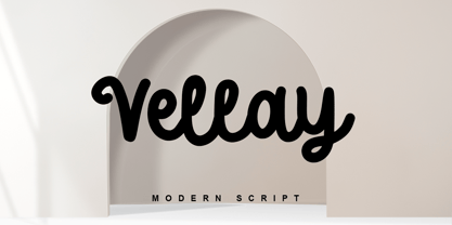 Vellay is a stunning monoline-style script font with authentic and casual vibes. It looks beautiful on a variety of designs requiring a personalized style, such as wedding invitations, thank you cards, advertising, poster, greeting cards, logos, and so on. Vellay is PUA encoded which means you can access all of the glyphs and swashes with ease!
 - Unio by Wilton Foundry,
$29.00 Unio is a fresh new friendly typeface with a little calligraphic touch - this gives Unio a very pleasing rhythm. One of the key features of Unio is its emphasis on legibility. Several ligatures are also included. It is pretty versatile in its application including advertising, packaging and logotypes. Unio is available in Opentype for Mac and Windows - Enjoy!
 - Nauplia by Eurotypo,
$48.00 Nauplia is an organic script font, specially designed for use in logotypes, advertising and packaging. It is interesting to note the use of free-flowing lettering to perform its own eye-catching, connected and unconnected. Nauplia contain 450 glyphs with full OpenType features: swashes, ligatures, stylistics alternates and much more. Nauplia is a Greek city, its name according to Strabo, derives from the mythological character Nauplio, the son of Poseidon and Amimone.
 - Kokomo Breeze by Nicky Laatz,
$35.00 Say hello to Kokomo Breeze - A deliciously bold and nonchalant casual marker font. Kokomo Breeze was designed to keep a naturally handwritten marker-style look , while still maintaining some subtle inky marker imperfections on its edges , to keep in line with a more realistic, yet very legible look. Great for headlines, bold branding, classy packaging, eye-catching callouts and stand-out advertising, Kokomo Breeze is designed to be your jack of many trades. Be sure to turn on your OpenType features when type with Kokomo Breeze - it’s packed with natural-looking ligatures and alternate characters for both upper and lower case - all of these opentype extras make your type design look mush less mechanical, and much more like naturally formed words as you type. Pair it with a bold tall sans serif font, or a classy serif to add another whole new dimension to this very versatile marker font. Great as large and small sizes, Kokomo Breeze is perfect for any size design.
 - Winning Team JNL by Jeff Levine,
$29.00 The second volume of the Robbins Music Corporation's "Hollywood Song Folio" features the word "Hollywood" lettered in a condensed block style with inline, strongly reminiscent of sports or college-themed typography. This was the inspiration for Winning Team JNL.
 - Angeletta by Monotype,
$50.99 Despite being drawn digitally, Angeletta is a typeface in the hand-lettering tradition. It draws on designer Rob Leuschke's three decades of experience with pen and ink, including his time creating scripts for Hallmark Cards. Spontaneous and energetic, Angeletta is satisfyingly inky – with strokes almost spilling into one another. Its quirky personality and titling version makes it a good choice for packaging and social expression, while its distinctive character could work well in branding, perhaps paired with a more sedate sans serif. The Angeletta typeface is a calligraphic script designed by Robert E. Leuschke exclusively for Monotype. It is available in OpenType OTF and TTF fonts formats. Angeletta has 900 glyphs with OpenType typographic features like contextual and stylistic alternatives, swashes, ligatures and fractions.
 - Rufina Stencil by TipoType,
$14.00 Simplicity, delicacy and elegance are the words that best characterize Rufina. Based on an idea that was conceived long before its “birth”, Rufina was created from dark-text on light-background combinations. Refined and at the same time distant, Rufina seduces the viewer in a subtle and elegant manner. Blending of contrasty, Bodoni-influenced forms with the emotive touch of the calligraphers pen. This family consists of two weights, their italic counterparts, plus a set of alternate cuts — each containing a selection of illustrative ornaments.
 - Ethos Nova by Designova,
$15.00 Ethos Nova is a minimalist neo-geometric sans-serif typeface family of 12 fonts featuring the finest design inspired by the simple and clean design approach of the modern era. The typeface is made with a special focus on minimalism and simplicity in typography, this typeface can transform your design projects to another level of visual appeal. Handcrafted and designed with powerful OpenType features in mind, each weight includes extended language support including Western European & Central European sets. A total of 312 glyphs are included. Ethos Nova is a perfect choice for graphic design, text presentation, web design, print and display use. The typeface can be an amazing option for branding, logo / logotype design projects, marketing graphics, banners, posters, signage, corporate identities as well as editorial design. Adding extra letter-spacing for the Caps will make this font perfect for minimal headlines and logotypes, as shown in promo images here.
 - Korolev by Device,
$39.00 DF Korolev is a 72 weight geometric sans serif family based on lettering by an anonymous Soviet graphic designer from the propaganda displays at the Communist Red Square parade in 1937. It has been named in honor of Sergey Pavlovich Korolyov, or Korolev, considered by many to be the father of practical astronomics. Rational and robust, it is also elegant and refined. Tracings done in Illustrator over a photograph featuring this type pinned down some of the basic character shapes. These were then imported into FontLab, where the full glyph complement was developed. The lower-case has been designed from scratch, and adheres to the structural logic of the uppercase as closely as possible. The complete Korolev super-family includes standard, italic, condensed, and compressed versions, each in five weights. Try the ‘rounded’ and ‘rough’ companion families. The Alternate families come with a double-story “a”.
 - Mayberry by Ascender,
$92.99The Mayberry® is an extensive family of 14 OpenType fonts. Mayberry was initially designed by Steve Matteson to emulate the technical behavior of a font family called Tiresias™ for use in set top TV devices and user interfaces. Mayberry is a significant improvement in aesthetics and functionality over Tiresias. Mayberry includes true italics and a wide range of weights to provide the highest quality and readability on low resolution devices, while also featuring a range of OpenType features that will appeal to creative professionals. Mayberry is a slightly condensed humanist sans serif which allows for more readable text in a narrower column. Open counters and upright stress help keep the design of Mayberry readable at low resolutions. A significant amount of care has been given to design subtleties allowing the design to function well at large sizes. The Mayberry character set supports Cyrillic, Greek, Central and Eastern European, Turkish and Baltic, Mayberry also includes a slashed zero for use where absolute distinction between 'O' and zero is a concern. Also included are typographic features such as old-style figures, fractions, superior and inferior numbers for use with applications that provide advanced OpenType typographic support. A set of closed captioning symbols and arrows add to the font's versatility in interface design. - Tekanan by San Studio,
$10.00 Tekanan Typeface is an experiment and designed by Zainul Faozi. Tekanan Typeface looks futuristic and it's a great choice to use on your designs, such as a shop sign, poster, cover, headline, and more. Designer: Zainul Faozi Publisher: San Studio
 - Embryo by HVD Fonts,
$30.00 Typedesigner Hannes von Döhren created a display typeface called "Embryo". A superblack, sweet font with filled counters. Perfect for use in big sizes on posters or flyers. Embryo has an extended character set to support Western, Central and Eastern European languages.