10,000 search results
(0.132 seconds)
- Singolare by Latinotype,
$29.00 Singolare is a contemporary geometric Sans Serif with angular terminals and a great x height. Its main feature is the style difference between the lighter and heavier weights. The more weight it gains, the higher its singularity. With its weights, styles and layers variety, it's perfect for display use and short texts that require a visual impact. Singolare is composed by five weights, from Ultralight to Black. Every weight has its own stencil variation with expressive cuts and four decorative versions: three outline and one inline version, that can work on it’s own or overlapped to the black normal version (changing the colors of each layer) in order to amplify its usage possibilities.
 - Geometria by Brownfox,
$44.99 Although geometric Sans Serifs have been in vogue for nearly a century, they have never been as ubiquitous. It is not improbable that the old adage would be phrased: “When in doubt, set it in geometric sans”, had it been composed today. Have we not had enough? We think, not. Postmodern times demand a variety of expressions. The vision behind Geometria was to revisit the perennial favorite to lend subtle individuality to its tried and true forms. Geometria stands out in the crowd of similar fonts thanks to its complicated nature. It combines dynamic elements with a certain degree of stability. A slightly higher waistline of the capitals contributes to their distinctive appearance. If the upper case refers to the American grotesques of the 19th century, the lower case tends toward the forms of the Renaissance in its proportions. Geometria is a typeface of clean shapes that is well-suited for continuous reading, and it sets remarkably well. At the same time, it can be friendly, even flirtatious. Its distinct personality combines seeming opposites. At times it may appear serious, at times playful. On occasion, it may be deliberate, other times dynamic. It could seem rigid, then elegant. It is a typeface that could be perceived either as cutting-edge, or as nostalgic. A careful and discerning typographer will bring out and emphasize those aspects of its multifaceted personality that are needed to solve the problem at hand. Geometria consists of 24 fonts — eight weights with matching italics and narrow styles. The font includes multiple sets of figures and currency signs, alternate glyphs, a variety of experimental ligatures, and punctuation marks for the two cases. The 835 glyphs support 72 languages. Granshan 2013 award.
 - Basco Std by Typofonderie,
$59.00 A mix of Renaissance & tropical atmosphere Basco is an exploration of the Renaissance style, a period in which letterforms were informed primarily by hand writing. It is clearly a contemporary interpretation of calligraphic shapes forms. The serifs are subtly asymmetrical. Slightly curved arches on the n, m and u are noticeable, creating an interesting tension in the text. Bruno Mello’s distinctive style is most obvious in his mastery of super fluid curves. It is a result of his extensive exploration of calligraphic forms, their tensions and dynamics, mixing angularities with curves. The roman weights include alternate swashes, as well as initial and terminal glyphs. The italics, based on chancellery script, feature simple stroke endings, most visible on the s and c. ➼ Basco minisite
 - Imperfection by LIGHTDESIGNS,
$9.00 IMPERFECTION Is a hand-written san-serif font inspired by human imperfections (mistakes). This is the first font created by LIGHTDESIGNS. It has no consistency in it's design which made the font looks like a lot of mistakes has been made. But this is done with purpose. With these characteristics, the font is given the name "IMPERFECTION', With surprising font and glyph designs, the intent of this font design is to pass a message that says, "SUCCESS IS NOT THE ACHIEVEMENT OF PERFECTION, BUT THE ACCOMMODATION OF IMPERFECTION™ This font design will be a fit in every design project it is utilised like logos, posters, flyers, magazine, card designs e.t.c. This font can be nicely pairs with script fonts & San serif font.
 - Natalie Caydence by Grezline Studio,
$12.00 Natalie Caydence is an incredibly distinct, delicate and timeless script font. It looks stunning on wedding invitations, thank you cards, quotes, greeting cards, logos, business cards and every other design which needs a handwritten touch. Feature : - A lot of Alternates ( With a Total of 620+ Glyphs ) - Multilingual Language - Works on PC & Mac - Simple installations - Accessible in the Adobe Illustrator, Adobe Photoshop, Adobe InDesign, even works on Microsoft Word.
 - Cupid Hearts by OzType.,
$16.00 Cupid Hearts is a hand written script, first drawn on paper and then remastered on the computer to give a smooth free flowing script,that looks perfect over the top of photos or as a logo. With 20 alternate style sets this lovely and friendly typeface take the stress out of finding fonts that match together so you can focus on what you want to do which is designing beauty work.
 - Zoom by MDS,
$9.00 This font is fast. Carving apexes, drafting competitors, and breaking away for the finish line. This is a sleek and extended font family designed for top speed while squeezing into tight places. Zoom is intended for display and would be right at home, nested gently on a carbon fiber bike frame, forged as the nameplate on the back of a vehicle, or printed stoutly on any number of sporting products.
 - Dance Routine by Jeff Levine,
$29.00 The hand lettered title on the cover of the 1932 sheet music for “I Wish We Could Dance Forever” was the inspiration for Dance Routine JNL. This bold Art Deco sans serif design is now available in both regular and oblique versions.
 - Boris Brush by Hanoded,
$20.00 Boris is my son: he was born on January 7th and he is as cute as can be. Boris Brush font is a very loud, very useful brush typeface, which I created using some fine-haired brushes and black paint. It is all caps, but lower and upper case are different and can be freely interchanged. Comes with all the diacritics you need.
 - Rusch by Proportional Lime,
$9.99 Adolf Rusch von Ingweiler, was in the 19 th century known mysteriously as the “R'' printer. He was the first printer North of the Alps to introduce the new Roman style of type known now as Antiqua. He was active in the city of Strasbourg from around the early 1460's to 1489. One wonders if the unusual form of “R'' was a personal conceit. This font is, therefore, an Antiqua style font and has over a 1000 defined glyphs with wide support for medieval characters that have since fallen out of use. The baseline was slightly tidied up in order to give the printed text an even cleaner look than the original. The letters are very close approximations of the original type catalogued by the “Veröffentlichungen der Gesellschaft für Typenkunde des 15. Jahrhunderts” as Typ.1:103R GfT1197.
 - Matamadina by IbraCreative,
$17.00 Matamadina – A black sans-serif Typeface Matamadina is a sleek and sophisticated black sans-serif typeface that effortlessly combines modern aesthetics with timeless simplicity. The characters exude a sense of boldness and clarity, with sharp edges and a uniform stroke width that enhance legibility. The deep black hue of Matamadina lends it a commanding presence, making it an ideal choice for conveying a sense of strength and professionalism in various design applications. The clean and minimalist design of this typeface ensures versatility, allowing it to seamlessly integrate into a wide range of contexts, from editorial layouts to branding materials, providing a contemporary and refined typographic solution. Matamadina is perfect for branding projects, logo, wedding designs, social media posts, advertisements, product packaging, product designs, label, photography, watermark, invitation, stationery, game, fashion and any projects. Fonts include multilingual support for; Afrikaans, Albanian, Czech, Danish, Dutch, English, Estonian, Finnish, French, German, Hungarian, Italian, Latvian, Lithuanian, Norwegian, Polish, Portuguese, Slovak, Slovenian, Spanish, Swedish.
 - Mailbox Letters JNL by Jeff Levine,
$29.00Many items we use in our day-to-day lives offer wonderful source material for font designs. Mailbox Letters JNL was inspired by a set of self-stick adhesive letters used on mailboxes, doors and other areas of identification at home or in business. Each letter, number and punctuation mark is centered on a black rectangle - just as the actual model for this font. Use it as spaced, or hand set it tighter to form a ribbon with white-on-black text. To provide continuity for the ribbon effect, a blank rectangle is provided on the vertical bar key (the shift position of the backslash key). Limited character set. - Roundabout by URW Type Foundry,
$35.99 Roundabout is a typeface that is extracted from an ellipse shape. Each and every character started at the same geometrical figure. By cutting it up in sections, twist and rotate the separate characters could be build. The ellipse provides this typeface with evident and smooth looking features. The name Roundabout is misleading, an ellipse is not round. But the word Roundabout has a nice ring to it and it seems to fit this typeface perfectly. The Roundabout as we know it is a place where the traffic circles. Sometimes in the greater metropoles it jams like clotting veins. Various exits are presented for those who know which way to go, for those who don’t it seems an eternal treadmill. Unlike my typeface, that seems rather careless, light weighted and knows her way around. A roundabout in a child’s mind is a playful carrousel or a merry go round. Merry go round has the sweetest sound and a match is found. My Roundabout is a joyful, optimistic and open typeface, which can be used over and over and over again for many or any purposes. ----- Roundabout ist eine Schrift die aus der Form einer Ellipse entstand. So teilen alle einzelnen Zeichen denselben geometrischen Ursprung. Durch das zerteilen, verdrehen und verflechten der elliptischen Grundform konnten die separaten Zeichen so geformt werden, dass sie einen klaren und weichen Charakter erhielten. Der Name Roundabout scheint auf den ersten Blick etwas irreleitend - ist eine Ellipse ja nicht wirklich rund. Er hat aber einen schönen Klang und doch eine tiefe Verbindung zu dieser Schrift. In unseren Gedanken ist Roundabout ein Kreisverkehr: Manchmal, in großen Städten, kann er blockieren, so wie eine verstopfte Ader. Verschiedenste Auswege zeigen sich denen, die ihr Ziel kennen; für alle anderen erscheint dieser Ort wie eine endlose Schlaufe. Dieses Bild widerspricht dem Auftreten meiner Schrift, welche eher sorglos und leichtfüßig ist; sie kennt ihren Weg. In dem Kopf eines Kindes jedoch ist ein Roundabout ein verspieltes Karussell, ein „merry go round“. ,,Merry go round“ klingt bezaubernd und so fiel die Entscheidung. Meine Roundabout ist eine fröhliche, optimistische und offene Schrift, die immer und immer wieder genutzt werden kann, zu jedem erdenklichen Zweck.
 - Rare Bird Specimen IV by Rare Bird Font Foundry,
$50.00 This unassuming sans serif, lettered by Toronto based artist Lisa Mavian of Post Calligraphy, is loaded with robust and charming features and illustrations. OBSERVATIONS Specimen IV is a clean, hand-lettered sans with a quirky personality that does not take itself too seriously. These humble and winsome characters are sure to be a winning addition to your flock of fonts! DEFINING CHARACTERISTICS OpenType programming, formal title & preposition word art, Roman numerals, old-style numerals, realistic double-letter ligatures, complete set of swashed uppercase alternates, select swashed lowercase alternates, complete set of swashed numerals, select swooping descender alternates, 7 complete sets of alternate uppercase letters, 52 graphic iconography alternates. POTENTIAL SIGHTINGS Wedding menus, signage, logo design, chocolate packaging, children's literature, mobile apps.
 - Just Great JNL by Jeff Levine,
$29.00 A 1940s British music collection of classical music piano pieces entitled "The Great Masters Series" had its title hand-lettered in a free form, casual sans serif with a cartoon style. This is now available as Just Great JNL.
 - Mercury Script by Fenotype,
$35.00 Mercury Script is an action packed type family of three weights. Click on Swash, Contextual or Stylistic alternates in any Open type savvy application for plenty of extra grooviness and combine with Mercury Ornaments for superb results. Turn on Small Caps to activate a complete set of block capitals designed to go with the font. Mercury Script is based loosely on hand lettering found in a vintage lingerie advertisement, only containing the words “light control”.
 - Satron by Aah Yes,
$3.95A reminder of the days of flower power, Satron is quite a bit different, slightly hippy and slightly grungy. Although it is not in any way an attempt to emulate the fonts used in that era, it evokes the mood of the time. There's two different shapes making up each character, with a grungy black one in front of a hippy white one. The combined effect however is quite novel and modern. There's also a jumbled version with the letters rotated and whacked around, in case you want it funky-flavored. There's all the main characters plus lots of extra accented letters as well. The package contains both OTF and TTF versions - install either OTF or TTF, not both versions on the same machine. - Mak by Tkachenko design,
$21.00 Mak is a display font with a Ukrainian feeling inspired by Ukrainian music. This is a big update of the first free two styles of Mak (SemiBold High & Black High) that were created in 2019 and become widespread among free display fonts. The big update wasn't been only adding more weights and contrasts but also changing a lot of glyphs and adding new ones. Now Mak supports all Latin-based languages and European Cyrillic. Experiments with historical forms, contrasts, and daring shapes to create a new image of Ukrainian Cyrillic and Latin based on it.
 - Narrow Minded JNL by Jeff Levine,
$29.00 In the days of hand lettering, a common philosophy was "the problem creates the solution". Often times the layout artist would have to adapt the lettering style to fit the amount of copy on a line. A perfect example is during the early 1900s, when popular sheet music of the time almost seemed to be competing for how many words could be used within a song's a title. One such piece of sheet music offered up the tall, condensed and variable-width lettering found within Narrow Minded JNL.
 - Smiling Cat by Hanoded,
$15.00 Smiling Cat is a cute little font. It is an adaptation of and older font of mine: Harimau Dua. I have had many requests for a bold version of Harimau, so I started working on it, changed a few glyphs, redid the kerning and cleaned it up. Rather than adding it as an extra bold style to my existing font, I thought it’d be better to launch it as a new one. Smiling Cat is handmade, cute and quirky, it would be ideal for Children’s Book Covers. Comes with a litter of diacritics.
 - Brefa by Twinletter,
$10.00 Brefa is a san serif font family that carries a modern classic theme with a variety of designed fonts with light strokes that make up a vintage style with a rustic touch and a stamp With this font, you can beautify your work as well as strengthen your work in the form of storytelling, logos, typography, hand-lettering, packaging, t-shirts, labels, and much more.
 - Intimate Summer by Get Studio,
$15.00 Introducing Intimate Summer Font Duo, featuring a strong and bold sans font alongside a casual handwriting-inspired script font. This duo is a perfect combination that brings harmony and versatility to your creative projects. The bold sans font exudes strength and confidence with its clean lines and thick letterforms. It commands attention and adds a modern and retro touch to any design. Complementing the bold sans is the casual script font, which mimics the relaxed style of handwritten text. This script font brings a unique and free-spirited atmosphere to your typographic compositions. Together, this font duo offers an ideal balance between strength and casualness, making it a versatile choice for a variety of design applications. Whether you're designing logos, branding materials, invitations, or editorial layouts, this font duo is a captivating combination that adds an irreplaceable casual touch to your projects.
 - Boho by Latinotype,
$39.00 Boho is inspired by a bohemian girl who is a free soul and creative spirit. She is a city girl, but she loves spending a lot of time outdoors and being close to nature. She loves art and going to the antiques and organic food markets. She is a wild and free spirit who knows no bounds. Boho is Coto Mendoza’s first Script font family, which is based on gestual calligraphy with Cola pen. A first exposure to gestual strokes applied to font design can be seen in her previous work, Macarons. Boho consists of 4 subfamilies: Script, Line, Sans and Serif. Each subfamily comes in 4 weights: Regular, Bold, Italic and Bold Italic. Script and Line versions include a teardrop terminal variant. Dingbats and ornaments are also included. Boho. Love and creative spirit!
 - Typist Slab Mono by VanderKeur,
$25.00 The typeface Typist originated during an extensive research on the origin and development of typewriter typestyles. The first commercially manufactured typewriter came on the market in 1878 by Remington. The typestyles on these machines were only possible in capitals, the combination of capitals and lowercase came available around the end of the nineteenth century. Apart from a few exceptions, most typestyles had a fixed letter width and a more or less unambiguous design that resembled a thread-like structure. A lot of this mechanical structure was due to the method the typestyles were produced. Looking at type-specimens for print before the first typewriters were good enough to came on the market we can see that in 1853 and in 1882 Bruce’s Type Foundry already had printing type that had a structure of the typewriter typestyles. Of course printing types were proportional designed as typewriter typestyles had a fixed width. So it is possible that except from the method of production for typewriter typestyles, the design of printing types were copied. In the design of the Typist, the purpose was – next to the monospace feature – to include some of the features of the early typewriter typestyles. Features such as the ball terminals and the remarkable design of the letter Q. This new typeface lacks the mechanical and cold look of the early typewriter typestyles. The Typist comes in six weights with matching italics in two versions. One that resembled the early typewriter typestyles (Typist Slab) and a version designed with coding programmers in mind (Typist Code).
 - Typist Code Mono by VanderKeur,
$25.00 The typeface Typist originated during an extensive research on the origin and development of typewriter typestyles. The first commercially manufactured typewriter came on the market in 1878 by Remington. The typestyles on these machines were only possible in capitals, the combination of capitals and lowercase came available around the end of the nineteenth century. Apart from a few exceptions, most typestyles had a fixed letter width and a more or less unambiguous design that resembled a thread-like structure. A lot of this mechanical structure was due to the method the typestyles were produced. Looking at type-specimens for print before the first typewriters were good enough to came on the market we can see that in 1853 and in 1882 Bruce’s Type Foundry already had printing type that had a structure of the typewriter typestyles. Of course printing types were proportional designed as typewriter typestyles had a fixed width. So it is possible that except from the method of production for typewriter typestyles, the design of printing types were copied. In the design of the Typist, the purpose was – next to the monospace feature – to include some of the features of the early typewriter typestyles. Features such as the ball terminals and the remarkable design of the letter Q. This new typeface laks the mechanical and cold look of the early typewriter typestyles. The Typist comes in six weights with matching italics in two versions. One that resembled the early typewriter typestyles (Typist Slab) and a version designed with coding programmers in mind (Typist Code).
 - Arco Perpetuo Pro by Hanken Design Co.,
$25.00 Arco Perpetuo Pro is a sans serif typeface with subtle rounded corners for the display stability on screen. Arco Perpetuo Pro may be used as small text or as big headlines.
 - Stencil Merchandise JNL by Jeff Levine,
$29.00 Inspired by hand lettering on the 1950s packaging for E-Z Letter stencils, Stencil Merchandise JNL is a bold sans serif stencil, and is available in both regular and oblique versions.
 - Planta by Monotype,
$25.00 Planta is a bold sans serif with inverted contrast. It was inspired by brutalist architecture. One weight only, 4 widths and more than 350 glyphs. Planta supports most latin based languages.
 - Cloudbusting by Ana's Fonts,
$15.00 Cloudbusting is a playful sans serif font with a bubble letters look, lots of variations and an extra set of drawings. Perfect for any design that needs a bold font, such as logotypes, quotes and social media posts, website and magazine layouts, and poster designs. Cloudbusting includes: An outline font A filled font A set of 62 outline drawings A set of 62 filled drawings Cloudbusting is an all caps font, with two versions for each letter, which makes it fun to use in animations and designs with a handmade look.
 - Carmina BT by Bitstream,
$29.99A personal calligraphic series commissioned by Bitstream from Gudrun Zapf von Hesse. Although Carmina BT is a neutral design, optimized for use in digital publishing, Zapf von Hesse’s unique calligraphic spirit is still quite visible in the family’s letterforms. This is not surprising, as all of Zapf von Hesse’s typefaces are calligraphic in nature. Yet Carmina BT is suitable for almost any conceivable digital text application, from book design up through signage use. - Nickels by Maulana Creative,
$15.00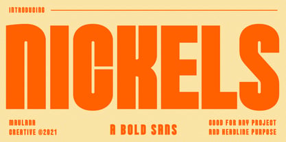 Nickels is a Fancy Bold Sans Serif font. fun character with a bit of ligatures. To give you an extra creative work. Nickels font support multilingual more than 100+ language. This font is good for Headline, logo design, Social media, Movie Titles, Books Titles, a short text even a long text letter and good for your secondary text font with sans or serif. Make a stunning work with Nickels font. Cheers, MaulanaCreative
 - Boscha by Maulana Creative,
$17.00 Boscha is a condensed sans serif font. With medium tall stroke, fun character with a bit of ligatures. To give you an extra creative work. Boscha font support multilingual more than 100+ language. This font is good for logo design, Social media, Movie Titles, Books Titles, a short text even a long text letter and good for your secondary text font with sans or serif. Make a stunning work with Boscha font. Cheers, Maulana Creative
 - Migo by Maulana Creative,
$29.00 Migo is a modern sans display font. With three weight stroke, fun character with a bit of ligatures. To give you an extra creative work. Migo font support multilingual more than 100+ language. This font is good for logo design, Social media, Movie Titles, Books Titles, a short text even a long text letter and good for your secondary text font with sans or serif. Make a stunning work with Migo font. Cheers, Maulana Creative
 - Choegs by Maulana Creative,
$16.00 Choegs is a distressed sans font. With bold stroke, fun character with a bit of ligatures and alternates. To give you an extra creative work. Choegs font support multilingual more than 100+ language. This font is good for logo design, Social media, Movie Titles, Books Titles, a short text even a long text letter and good for your secondary text font with sans or serif. Make a stunning work with Choegs font. Cheers, Maulana Creative
 - FDI Tierra Nueva by FDI,
$25.00 Four fonts — found on a map of America, created by the spanish cartographer Diego Gutiérrez and the dutch engraver Hieronymus Cock anno 1562. From the start of the digitization by Sebastian Nagel in 2005, Tierra Nueva has gone a long way. On its journey of exploration it has grown to four members of a family (regular, bold, italic and script) with an overall count of almost 3.700 characters for different languages and purposes, extensively featured with useful typographic options. Over six years after the start of the expedition, it shall be launched. Land ahoy!
 - Piccadilly by ITC,
$29.99Christopher Matthews originally drew Piccadilly for Letraset in 1973. Piccadilly is a decorative, all caps display typeface with a high degree of stroke contrast. All of Piccadilly's letterforms are made up of a single, curvy line. The thick" elements of each letter are five lives, while thin elements are made from one or two. In order for all of this detail to be clear, Piccadilly should be used in large point sizes, i.e., from 36-point on upward. Piccadilly's style is reminiscent of both the Art Deco and Disco eras." - Kal08 by Solokarir,
$15.00 Kal08 is a Sans Serif Font, this font consists of Uppercase, Lowercase Letters & multilingual support. Kal08 is perfect for Logotype, Print Design, labels, Products, Text, and more.
 - Aborm by Nirmana Visual,
$19.00 Aborm a classy, contemporary of Sans Serif font, Inspired by 1980’s. Ideally suited for advertising and packaging, festive occasions, editorial and publishing, creative industries and posters.
 - FunFont by John Moore Type Foundry,
$18.00 Funfont is a sans serif fantasy font with funny spirit designed to recreate an style of good humor. FunFont comes in three styles: Normal, Outline and Shade.
 - Acceptable JNL by Jeff Levine,
$29.00 Acceptable JNL is a typeface modeled from hand lettering on a piece of 1940s sheet music, and has a distinctly casual, yet Art Deco flair. It's name can also be mischievous, for when you're asked "which font should I use for the job" you can answer "the Acceptable font". This may well start a dialogue reminiscent of Abbott and Costello's "Who's On First?"