10,000 search results
(0.029 seconds)
- Rather Both by PintassilgoPrints,
$24.00 Rather Jazzy, Rather Loud: a family of two quite distinct fonts that perform together handsomely well. Both fonts include 2 versions for each letter, easily reachable through keyboard upper and lower keys. They also come packed with Contextual Alternates functionality to instantly cycle the alternates, providing a realistic handcrafted feel: just turn on the feature in any OpenType savvy application and let the music sound. Rather Loud brings yet another cool feature: lots of interlocking pairs that will add that nice extra twist your projects sometimes ask for. Trigger the discretionary ligatures feature button (OpenType savvy applications needed!) or pick up your choices through a glyphs palette or character map. Jazzy? Loud? I'd Rather Both, for sure!
 - Lemonilla by Raditya Type,
$14.00 Lemonilla | Quirky Display Font Lemonilla a bold, quirky display font with a fun, trendy street style vibe. From posters designs to t-shirts and packaging, Lemonilla will give your designs that alternative minimal look and make your creative work look supercharged. Lemonilla was hand-drawn, making its outlines somewhat irregular and quirky. It has an almost hand-lettered look; the characters jump around the baseline giving it a charming but urban look and feel. The modern bold sans serif typeface has a host of alternatives and ligatures included. Combine its bold shapes to give your work a more unique, hipster attitude. Easily create professional cool type lockups that look like hand lettering.
 - Gerolinda by RM&WD,
$95.00 Gerolinda has almost 1900 glyphs per weight; with its OpenType features it recreates the feeling of a mid-19th century Italian gentlewoman's handwriting. There are more than 1900 glyphs each weight with 250 variants covering all European accents and a broad choice of numbers: lined, tabular, ordinal, old style, etc. Also ligatures, discretional ligatures, contextual and stylistic alternates, smashes, contestual swashes, stylistic sets and ornaments. (la terminologia la do per buona!) This is a complete font for both editorial and graphic design. Gerolinda font is complemented by Gerolinda Design, dedicated exclusively to upper case letters: around 1,600 glyphs with all the accents. For best results, use of OpenType features is strongly recommend.
 - Hot Salsa by Sudtipos,
$59.00 Hot Salsa is a calligraphic script font inspired by the classic, fairly well-made brush letters from the casual sign painting style, mixed with the fast and gestural tags you can find on walls all around the world. This is a fresh font that allows you to play with its numerous swashes, alternates and ligatures to make it feel more sober or a little flirty depending on your needs. Hot Salsa started with a brush pen and a lot of paper. These were later re-traced onto many layers of tracing paper with the intention of maintaining the brush pen and handmade feeling while making the structure consistent to ensure its readability and performance.
 - Mars Model by Kustomtype,
$25.00 Mars Model is a font that's originated from a concept for a rock band. With its 5 fun styles, Mars Model gives your graphic work a futuristic look that is reminiscent of the warm look and touch of Arts & Crafts. This style of type is instantly associated with advertising and design for high-end products. Mars Model is an entirely hand-drawn font, perfectly vectorized and meticulously digitized for quality and readability. Also, the font can be used for a refined vintage feeling or an industrial and futuristic atmosphere. Mars Model is great for display, logos, branding, packaging, advertising, food, sports, titles, film, TV, and much more. Doesn't that sound perfect to you?
 - Economica Next by Underground,
$19.90 Economica Next is a redesign and expansion of the classic Economica typeface celebrating its tenth anniversary. This new version has a wider range of weights and was adapted to work in new digital environments. It was carefully designed to save space without loosing its legibility, it is used in several publications around the world and many important websites. It includes sixteen weights and a comprehensive set of characters that allows you to write in several languages. Economica Next is a typeface especially developed for web and app design in complex situations. It has been tested successfully for use in small sizes improving legibility. It is an ideal font for menus, tables, charts, etc.
 - Fellbaum Grotesk by Vintage Type Company,
$15.00 Fellbaum Grotesk is a condensed typeface with both grotesque and cursive/humanist attributes. Fellbaum Grotesk Regular presents a clean, “grotesk” exterior, while the Italic version features faint slab-style flourishes. These characteristics, combined with a subtle stroke contrast and slightly extended x-height make for a distinct, and artisanal appearance. The family was inspired by the condensed & sterile, yet quirky, sans serifs found on a lot of vintage apothecary labels & municipal street signage. Both styles in the family are modest enough to work as secondary fonts, but also sport enough character to work as a primary sans face for wordmarks, logos, headers, etc. Fellbaum Grotesk Features: • 14 Fonts, 7 Weights, 2 Styles • OpenType Support • Adobe CE Language Support • Dingbats
 - Big Clyde by Galapagos,
$39.00In designing an advertising poster to show off the unconventional Safefont typeface, Steve drew what appeared as relatively traditional letterforms for the expository text. When these characters were as well received as the typeface which was the subject of the poster, Steve decided to expand them into a full-fledged graffiti style typeface of their own. While exploring where this new design might lead, Steve worked to elaborate the poster segment which had inspired it. He soon found himself staring at a drawing of a weapons-wielding Bonnie and Clyde. The desperate duo resonated with the graphic elements of the drawn letters; thus leading to the effortless fleshing out of the design, and to its name, Big Clyde. - Novecento Carved by Synthview,
$22.00 Novecento Carved is a layered font family. It is designed to be paired with the 2013 version of Novecento Sans , used as base layer. Each glyph of each style of Novecento Carved (around 18.000) was manually reviewed and adjusted to overcome the limitations of an automatic interpolation algorithm. The minimalism of its construction makes it super easy to achieve a bas-relief or engraving effect just switching luminosity values among the two layers (carved and sans). Novecento Carved was selected and displaying on Typodarium 2018, the 18th of June. Webfont usage: to make Novecento Sans and Carved to align properly, please apply these settings when generating your webfonts: Hinting = native; Line Height Adjustments = native.
 - Signature Zetterd by Aminmario Studio,
$20.00 This font was created to look as close to a natural handwritten script as possible by including lowercase swash, ligature and underlines. Perfect for any awesome projects that need hand writing taste. Comes with regular and italic. Built in Opentype features, this script comes to life as if you were writing it yourself. Also support multilingual. It's highly recommended to use it in opentype capable software - there are plenty out there nowadays as technology catches up with design ... Other than Photoshop, Illustrator and Indesign, many standard simple programs now come with Opentype capabilities - even the most basic ones such as Apple's Text Edit, Pages, Keynote, iBooks Author, etc. Even Word has found ways to incorporate it.
 - Orange Glos by Gatype,
$10.00 aIntroducing Orange Glos - a bold classic serif with more hand-illustrated alternatives, and preserved textures, for a unique, yet modern vintage feel. Each letterform has a slightly grainy exterior that works beautifully to enhance the conventional and soft details of the Orange Glos. This versatile display typeface has enough character for logos and branding, as well as headlines, apparel, bridal and more. Keep it classic, or decorate it with ornate alternatives to uppercase and lowercase glyphs! To access the alternatives, you must have access to an older version of Photoshop to copy/paste the glyphs from the included PSD, OR the Glyphs Panel, which can be found in Photoshop CC or any Version of Adobe Illustrator. Enjoy!
 - Ghostly Guffaws by Putracetol,
$22.00 Introducing Ghostly Guffaws, a Halloween Funny Theme Font that encapsulates the spooky yet playful spirit of Halloween. This unique display font, crafted with precision. Ghostly Guffaws is characterized by its all caps lettering, making it a perfect choice for bold and eye-catching headlines. With seven distinct variations tailored to fit the eerie theme, this font is versatile and adaptable. Whether you’re designing logos or branding materials, Ghostly Guffaws adds a touch of whimsy and horror that’s bound to captivate your audience. It’s not just limited to Halloween; use it for children’s themes, crafting projects, invitations cards, packaging designs, posters titles, business signage, greeting cards stickers books magazines or any design needing a dash of creepy charm.
 - AI Wood by Alphabets,
$17.95These six faces are interpreted from examples shown in Rob Roy Kelly's "American Wood Types" They are not merely scanned copies, but have been redrawn from scratch with various optical adjustments. Kelly points out that the true glory of the American Wood Types are the negative spaces, which are, in their dynamic active forms, the antithesis of the anemic flimsy letters produced by type foundries in the 19th century. The Alphabets Wood Types are designed with digital manipulation in mind. Stretch, curve and distort at will! These designs were released prior to similar revivals from Adobe. Each font has two full alphabets (one full height, one smaller) and numerals. However, certain points and accents will not be found. - YLab by Par Défaut,
$30.00 yLab is geometric typeface compose of 10 fonts (5 weights and oblique declination) Perfect for titles and text, yLab supports many languages (Latin pro..). 11 OpenType Features (Alternative; Fraction; Numerator; Denominator; Superior; Inferior; Tabular figure; Ordinals; Discretionary Ligature; Stylistic Set; Case Sensitive Forms). • Ordinal feature includes the Latin alphabet (Uppercase & Lowercase). • Five Stylistic set for “a”, “g”, "i" and "l", includes accents. • Discretionary Ligature includes “AE”, “IJ”, “OE”, available in lowercase. • Contextual Alternate includes ligatures for arrows : <- -> ^| v| <-> v^| Add parentheses around period, numbers or arrows, add n or d for numerator, denominator. Add n, d or +, for numerator, denominator or case arrows. All Case sensitive characters become after the uppercase and number.
 - Ongunkan Sweden Futhark by Runic World Tamgacı,
$40.00 Prior to 500 AD the 24-rune Elder Futhark was used in Sweden. From 500 AD until 800 AD there were many Futharks which were transitions from the 24-rune Futhark to one of the 16-rune Futharks. By the end of this period the 24-rune Futhark was completely out of use , and only 16-runes Futharks were in use. By 900 AD two different types of Shorttwigs-Futharks had been born. One was popularized in Norway and the other was used in the west (the British islands). By 1000 AD the adjustment of the runes to the Latin alphabet had begun, and several versions are found up until the Dalrunes, about 1700-1800 AD.
 - dT Jakob by dooType,
$30.00 dT Jakob started as a revival by Gustavo Soares for Paul van der Laan’s class at the Type and Media Masters, in The Hague, NL – back in 2007. There are quite a few excellent geometric sans typefaces available, but we did want to make our contribution and have a fine geometric face to offer. dT Jakob was born out of Erbar, by Jakob Erbar, one of the very first geometric sans, released in metal around 1926. Our goal was to make a versatile typeface, that handles display and text typography beautifully. To achieve that we designed a complete range of weights, matching italics and lots of OpenType Features. Hope you enjoy it :D
 - Splendor by profonts,
$41.99 Splendor was originally produced and released in 1930 by Schriftgu� AG, Dresden. The typeface was designed by Berlin designer Wilhelm Berg. Ralph M. Unger, who in the last few years has created a whole series of revivals and redesigns from the hot metal era, ?retrieved? this jewel of a typeface design, redesigning, complementing and digitally remastering it for profonts. Splendor is a broad nip, non-connecting handwriting script of timeless elegance, charm and beauty. It needs tight setting with plenty of space around it. The font contains a number of alternate characters: Two uppercase As, Ss (with descender); in addition, two uppercase Ms, Ns and Zs as well as two lowercase zs.
 - Candida by Linotype,
$50.99Candida roman was designed by Jakob Erbar and appeared after his death with the typeface foundry Ludwig & Mayer in Frankfurt am Main in 1936. Due to the original designer’s death, the italic was designed by Walter Höhnisch shortly thereafter. In 1945 the roman was reworked, the breadth of the figures was reduced and the strokes made heavier. The bold weight followed in 1951. Later the typeface was expanded with further weights, which have for the most part fallen out of use. Three weights can still be found in catalogues, available as early as 1937 for the Linotype machine. Candida is a modest text font which retains its legibility even in smaller point sizes. - Gitchhand by Monotype,
$29.99By day, Ken Gitschier is one of Monotype Imaging's in-house type designers, busy creating fonts for on-screen typography - a demanding undertaking that requires meticulously editing fonts on a pixel-by-pixel basis. His tools are Fontographer software, a Wacom digital tablet, a high-resolution monitor and a keen understanding of typographic forms. But by night, Gitschier uses the same tools to indulge his passion for experimental typeface designs. GitchHand is one of Gitschier's nocturnal projects. The design has an almost painterly quality. Depth, texture and even a sense of color are found in the lettershapes. Edgy, iconoclastic, and not for the typographically faint of heart, GitchHand makes a strong visual statement. - Spirits by Latinotype,
$29.00 Spirits design was initially based on Hermann Ihlenburg's Schoeffer Old Style from the 1912 ATF catalog. Soft is the closest version to the printed original typeface. Neutral, with more formal serifs, is ideal for editorial design, for example newspaper headlines. Sharp, more contemporary, is the best choice for meeting today's design needs. Condensed proportions and large x-height, features found in the original font, make Spirits ideally suited for headlines and branding design. As you would expect from Latinotype, this font comes with a standard character set that supports over 200 languages. Each version includes its own alternates and comes in 4 weights, ranging from Light to Black, resulting in a total of 12 font styles.
 - Candy Design by Typophobia,
$20.00 Candy Design is a display font containing 265 glyphs. It was designed during a stay in Tanzania, Zanzibar in 2022. The main idea was to combine a sans-serif modernist, grotesque typeface with the addition of delicate Arabic accents. Its main assumption of use is posters, product design and branding. Unusual, dynamic and unpredictable accents that are found in practically every letter give the character of a very custom font, also completely not intended for typesetting, which, contrary to the features mentioned above, remains legible. Usually all letters are of the same size - however, as we used to when designing, hide small flavors in the whole sequence of numbers / letters and characters.
 - Argyle Rough by Type Associates,
$24.95 Argyle Rough was originally developed for a packaging campaign in the late 80s in my studio and sat around in various stages of completion until I decided to autotrace my original drawings. I liked the quirky roughness and decided that it did not detract from the charm of the original, in fact it improved it and saved me a whole lot of work. The original campaign called for a few additional alternate characters for use at either end and double in the middle of words, ee, ff, ll, ss etc and a stylized Th, always useful. I hope you enjoy Argyle Rough, named after the world’s largest diamond mine – a rough diamond, get it?
 - Conserta by Konstantine Studio,
$15.00 Inspired by the vintage label and packaging design, we do a very fun research about the typeworks in the old era. We drown too deep in every single reference that we found. Super mesmerized with how each letters flow so uniquely in every brand's packaging display. We sum up every idea, build the characters one by one, carefully crafting in every single click, till the day that we've been waiting for finally come. Proudly present, CONSERTA. A beautiful vintage display serif typeface. Packed up with a bunch of features like Stylistic Alternates, Ligatures, and Oldstyle Numbering, To expand the flow and characteristic in every single letters. Perfectly fit for any of your vintage touch of branding and visual content.
 - Armchair Modern by PSY/OPS,
$36.00 “Growing up in Iceland, I was exposed to Scandinavian modernism from an early age. My parents had Arne Jacobsen furniture around the house and I was always enticed by the fun shapes and colors...."—SK Armchair Modern is derived from the logo created for Armchair Media Group by Stefan Kjartansson. The design is unabashedly ultra-modern, reminiscent of work by Mark Newson and the aforementioned Jacobsen. Armchair Media is a consulting company, working with clients from the Web and interactive TV, so the super-elliptical letterforms are also intended to evoke a traditional TV screen or CRT display. The complete family of five weights was co-produced by PSY/OPS in 2001.
 - Mushmouth PB by Pink Broccoli,
$14.00 If your looking for a vintage animated typestyle that still feels current today, you've just found it! Mushmouth PB started as a digitization of a film typeface called "Albert" by LetterGraphics. This all capitals font has a super subtle bounce and a playful heavy weight. An extruded film variation of this typeface was used back in the day on Post's Frosted Rice Krinkles cereal. Named in tribute to the original font name "Albert", we picked a fellow member of Fat Albert's gang for the name of this font. We think it is fitting, even though the original film font naming had nothing to do with the cartoon at all. Give Mushmouth a spin and pick it up today!
 - Acustica by Andinistas,
$49.67 Acústica is a display font family designed by Carlos Fabian Camargo G. Its styles were designed to form words and phrases related to delicate and feminine contexts. Acústica Caps, Italic, Swashes and Ornaments are drawn investigations with flexible tip pen inspired by Didot capitals. All ideal for mixing with Acústica Script whose idea represents the volatile sound of a fine tip brush against rapid tracing paper. Its script path in width condensed lowercase and uppercase letters in loose horizontal proportions are generous between letters laced with long, agile and thin connecting strokes. Its script sensitivity is in Italian calligraphy with uninterrupted lines of cursive English. Acústica was selected at the Bienal Tipos Latinos 2014. Photos by http://www.desdeesteladodemimundo.blogspot.com
 - Eixample Villa by Type-Ø-Tones,
$55.00 The Eixample project is inspired by modernist signage of various examples found in the Eixample neighbourhood in Barcelona. The name of each subfamily is related to its location or to specific elements of the original sign. Villa is the abbreviation for Carrer Villarroel (Villarroel Street), where the Villarroel Pharmacy has been displaying this sign since the first quarter of the twentieth century. The Eixample Villa typeface system consists of sturdy letters free of ornaments with an industrial aspect. Only the treatment of the curves borrows modernist features. Like the rest of the families in the Eixample series, Villa shows its origin as a display font, but it has been engineered to give good results at small sizes as well.
 - TyfoonSans by Fontforecast,
$18.00 TyfoonSans is a clear, modern, versatile font family of six weights plus matching italics, excellently suited for both display and text. It is designed by Fontforecast in 2013. A very complete character set supports a wide range of languages. OpenType features such as five numeral styles, fractions and both standard and discretionary ligatures, make TyfoonSans well equipped for professional typography. In addition to the design possibilities of TyfoonSans, there is TyfoonScript, a handwritten family of three weights built on the same metrics. When combining TyfoonSans and TyfoonScript, design possibilities become endless. Two font families that blend perfectly and are always found in successive order in your font list thanks to their family name.
 - Della Brian by Letterhend,
$19.00 Introducing, Della Brian - a lovely wedding typeface. This font has many stylistic alternates, ligatures, swashes so you can play around with them using opentype features and creates lettering with natural touch. This type of font perfectly made to be applied especially in logo, and the other various formal forms such as invitations, labels, logos, magazines, books, greeting / wedding cards, packaging, fashion, make up, stationery, novels, labels or any type of advertising purpose. Features : uppercase & lowercase numbers and punctuation multilingual alternates and ligatures swashes PUA encoded We highly recommend using a program that supports OpenType features and Glyphs panels like many of Adobe apps and Corel Draw, so you can see and access all Glyph variations.
 - Cesium by Hoefler & Co.,
$51.99 An inline adaptation of a distinctive slab serif, Cesium is an unusually responsive display face that maintains its high energy across a range of different moods. The Cesium typeface was designed by Jonathan Hoefler in 2020. An energetic inline adaptation of Hoefler’s broad-shouldered Vitesse Black typeface (2000), Cesium is named for the fifty-fifth member of the periodic table of the elements, a volatile liquid metal that presents as a scintillating quicksilver. From the desk of the designer, Jonathan Hoefler: I always felt that our Vitesse typeface, an unusual species of slab serif, would take well to an inline. Vitesse is based not on the circle or the ellipse, but on a less familiar shape that has no common name, a variation on the ‘stadium’ that has two opposing flat edges, and two gently rounded sides. In place of sharp corners, Vitesse uses a continuously flowing stroke to manage the transition between upright and diagonal lines, most apparent on letters like M and N. A year of making this gesture with my wrist, both when drawing letterforms and miming their intentions during design critiques, left me thinking about a reduced version of the typeface, in which letters would be defined not by inside and outside contours, but by a single, fluid raceway. Like most straightforward ideas, this one proved challenging to execute, but its puzzles were immensely satisfying to solve. Adding an inline to a typeface is the quickest way to reveal its secrets. All the furtive adjustments in weight and size that a type designer makes — relieving congestion by thinning the center arm of a bold E, or lightening the intersecting strokes of a W — are instantly exposed with the addition of a centerline. Adapting an existing alphabet to accommodate this inline called for renovating every single character (down to the capital I, the period, and even the space), in some cases making small adjustments to reallocate weight, at other times redesigning whole parts of the character set. The longer we worked on the typeface, the more we discovered opportunities to turn these constraints into advantages, solving stubbornly complex characters like € and § by redefining how an inline should behave, and using these new patterns to reshape the rest of the alphabet. The New Typeface The outcome is a typeface we’re calling Cesium. It shares many of Vitesse’s qualities, its heartbeat an energetic thrum of motorsports and industry, and it will doubtless be welcome in both hardware stores and Hollywood. But we’ve been surprised by Cesium’s more reflective moods, its ability to be alert and softspoken at the same time. Much in the way that vibrant colors can animate a typeface, we’ve found that Cesium’s sensitivity to spacing most effectively changes its voice. Tighter leading and tracking turns up the heat, heightening Cesium’s sporty, high-tech associations, but with the addition of letterspacing it achieves an almost literary repose. This range of voices recommends Cesium not only to logos, book covers, and title sequences, but to projects that regularly must adjust their volume, such as identities, packaging, and editorial design. Read more about how to use Cesium. About the Name Cesium is a chemical element, one of only five metals that’s liquid at room temperature. Resembling quicksilver, cesium is typically stored in a glass ampule, where the tension between a sturdy outer vessel and its volatile contents is scintillating. The Cesium typeface hopes to capture this quality, its bright and insistent inline restrained by a strong and sinuous container. Cesium is one of only three H&Co typefaces whose name comes from the periodic table, a distinction it shares with Mercury and Tungsten. At a time when I considered a more sci-fi name for the typeface, I learned that these three elements have an unusual connection: they’re used together in the propulsion system of nasa’s Deep Space 1, the first interplanetary spacecraft powered by an ion drive. I found the association compelling, and adopted the name at once, with the hope that designers might employ the typeface in the same spirit of discovery, optimism, and invention. —JH Featured in: Best Fonts for Logos
 - Coffee Beans Time by TypoGraphicDesign,
$9.00 The typeface Coffee Beans Time is designed from 2018–2022 for the font foundry Typo Graphic Design by Manuel Viergutz and Annelena Grascht as a graphic design and photography project. The display font based on the original coffee beans and create a dingbat pattern. 3 font-styles (Dingbats, Mix, Coffee Ground) with 304 glyphs (Adobe Latin 2) incl. decorative extras like icons, arrows, dingbats, emojis, symbols, geometric shapes (type the word #LOVE for ♥︎ or #SMILE for ☺ as OpenType-Feature dlig) and stylistic alternates (2 stylistic sets). For use in logos, magazines, posters, advertisement plus as webfont for decorative headlines. The font works best for display size. Have fun with this font & use the DEMO-FONT (with reduced glyph-set) FOR FREE! ■ Font Name: Coffee Beans Time ■ Font Styles: 3 (Dingbats, Mix, Ground) + DEMO (with reduced glyph-set) ■ Font Category: Display for headline size ■ Glyph Set: 304 glyphs (Adobe Latin 2) incl. extras like icons (decorative extras like arrows, dingbats, emojis, symbols) ■ 93 languages: Afrikaans Albanian Asu Basque Bemba Bena Breton Catalan Chiga Cornish Danish Dutch English Estonian Faroese Filipino Finnish French Friulian Galician German Gusii Indonesian Irish Italian Kabuverdianu Kalenjin Kinyarwanda Luo Luxembourgish Luyia Machame Makhuwa-Meetto Makonde Malagasy Manx Morisyen North Ndebele Norwegian Bokmål Norwegian Nynorsk Nyankole Oromo Portuguese Quechua Romansh Rombo Rundi Rwa Samburu Sango Sangu Scottish Gaelic Sena Shambala Shona Soga Somali Spanish Swahili Swedish Swiss German Taita Teso Uzbek (Latin) Volapük Vunjo Welsh Western Frisian Zulu ■ Design Date: 2018–2022 ■ Type Designer: Manuel Viergutz und Annelena Grascht
 - Deadfall by Mofr24,
$11.00 Discover Deadfall, the ultimate horror display font that will send shivers down your spine! What sets Deadfall apart is its unique blend of fear-inducing aesthetics and multilingual capabilities. This Monospace typeface exudes a captivating dripped and splash style, adding an extra layer of terror to your designs. Notably, Deadfall supports the Cyrillic alphabet, making it an ideal choice for a global audience. Deadfall offers both regular and italic variations, granting you even more creative possibilities. Whether you're designing posters, crafting marketing materials, conjuring chilling movie titles, creating Death metal logotypes, or working on Halloween-themed crafts, Deadfall will infuse your projects with a bone-chilling atmosphere. To ensure versatility, consider pairing Deadfall with related font families or other typefaces that complement its macabre charm. Its functional aspects include an extensive character set and special features, making it suitable for a wide range of applications. The design concept behind Deadfall revolves around the idea of capturing the essence of horror. The font's distinctive dripped and splash style adds a sense of chaos and unease to any composition, immersing the viewer in a world of terror. The inclusion of the Cyrillic alphabet reflects our commitment to providing a font that caters to diverse audiences, bringing fear to every corner of the globe. We created Deadfall to meet the demand for a truly spine-tingling font that conveys a sense of horror and foreboding. Whether you're a graphic designer looking to evoke fear or a Halloween enthusiast seeking to amplify the spooky atmosphere, Deadfall is here to unleash terror in your designs. Get ready to embrace the darkness with Deadfall - the ultimate font for all things haunting and macabre!
 - Mogan by Flawlessandco,
$9.00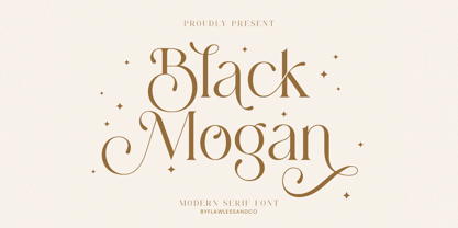 Mogan is a modern serif, with some alternates and ligatures that are perfect for branding materials, t-shirt, logo, poster, photography, quotes, and many more. An Original typeface that suitable for any graphic designs such as branding materials, t-shirt, print, business cards, logo, poster, t-shirt, photography, quotes .etc This font support for some multilingual. Modern Sweet Retro that contains uppercase A-Z and lowercase a-z, alternate character, numbers 0-9, and some punctuation. If you need help, just write me! Thanks so much for checking out my shop
 - Peanuts - Unknown license

- Richela by Balpirick,
$15.00 Richela is a Beautiful Lovely Modern Script Font. Richela is perfect for product packaging, branding project, megazine, social media, wedding, or just used to express words above the background. Richela also multilingual support. Alternates & Lowercase Ending Swashes. Enjoy the font, feel free to comment or feedback, send me PM or email. Thank you!
 - Ganghoods by Allouse Studio,
$16.00 Proudly Presenting, Ganghoods a Gothic Fraktur Handwritten Font. Ganghoods is perfect for product packaging, branding project, megazine, social media, wedding, or just used to express words above the background. Ganghoods also come with Multi-Lingual Support. Enjoy the font, feel free to comment or feedback, send me PM or email. Thank You!
 - Stonefloral by Allouse Studio,
$16.00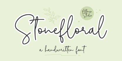 Proudly Presenting, Stonefloral A Handwritten Font. Stonefloral is perfect for any titles, logo, product packaging, branding project, megazine, social media, wedding, or just used to express words above the background. Stonefloral also come with Multi-Lingual Support. Enjoy the font, feel free to comment or feedback, send me PM or email. Thank You!
 - Bankai by Allouse Studio,
$16.00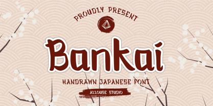 Bankai a Handdrawn Japanese Font. Bankai is perfect for any tittles, logo, product packaging, branding project, megazine, social media, wedding, or just used to express words above the background. Bankai also come with Multi-Lingual Support. Enjoy the font, feel free to comment or feedback, send me PM or email. Thank You!
 - Anzura by Mightyfire,
$10.00 Anzura is a decorative font that can be used for book title, logo brand, poster and many more. The looks is vintage classic yet clean, with a little decoration on each letter. We have two styles, Anzura Regular and Anzura Shadow. Both are beautiful! Enjoy in cooking something creative with Anzura font! :)
 - Youth Richfield by Allouse Studio,
$16.00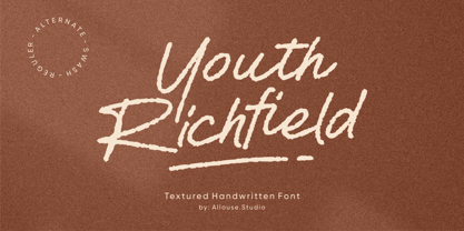 Proudly Presenting, Youth Richfield a Textured Handwritten Font. Youth Richfield is perfect for product packaging, branding project, megazine, social media, wedding, or just used to express words above the background. Youth Richfield also come with MultiLingual Support. Enjoy the font, feel free to comment or feedback, send me PM or email. Thank You!
