10,000 search results
(0.029 seconds)
- Golden Cosmic by Flawlessandco,
$9.00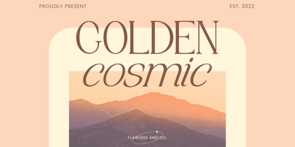 Golden Cosmic is a Serif Italic Font with a classy and elegant style in each character, so it's fitted for some wedding invitation display. There's some connected letters and some alternates that suitable for any graphic designs such as branding materials, t-shirt, print, business cards, logo, poster, t-shirt, photography, quotes .etc This font support for some multilingual. Also contains uppercase A-Z and lowercase a-z, alternate character, numbers 0-9, and some punctuation. If you need help, just write me! Thanks so much for checking out my shop!
 - Mondrake by Flawlessandco,
$9.00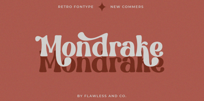 Mondrake is a modern retro with a fun and bold style that perfect for your retro-themed projects. Try out some alternate characters for another visual result! There's some connected letters and some alternates that suitable for any graphic designs such as branding materials, t-shirt, print, business cards, logo, poster, t-shirt, photography, quotes .etc This font support for some multilingual. Also contains uppercase A-Z and lowercase a-z, alternate character, numbers 0-9, and some punctuation. If you need help, just write me! Thanks so much for checking out my shop!
 - Mondice by Flawlessandco,
$9.00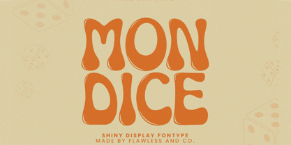 Mondice is a Groovy Retro Font that made with an additional shiny mode in each character, so it's fitted for some retro project. There's some connected letters and some alternates that suitable for any graphic designs such as branding materials, t-shirt, print, business cards, logo, poster, t-shirt, photography, quotes .etc This font support for some multilingual. Also contains uppercase A-Z and lowercase a-z, alternate character, numbers 0-9, and some punctuation. If you need help, just write me! Thanks so much for checking out my shop!
 - Dominic by Flawlessandco,
$9.00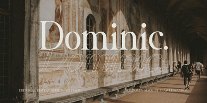 Dominic is a Serif Italic Font with a classy and elegant style in each character, so it's fitted for some wedding invitation display. There's some connected letters and some alternates that suitable for any graphic designs such as branding materials, t-shirt, print, business cards, logo, poster, t-shirt, photography, quotes .etc This font support for some multilingual. Also contains uppercase A-Z and lowercase a-z, alternate character, numbers 0-9, and some punctuation. If you need help, just write me! Thanks so much for checking out my shop!
 - Mothern by Flawlessandco,
$9.00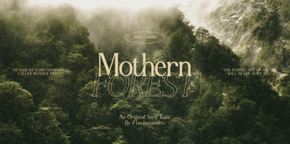 Mothern is a Serif Italic Font with a classy and elegant style in each character, so it's fitted for some wedding invitation display. There's some connected letters and some alternates that suitable for any graphic designs such as branding materials, t-shirt, print, business cards, logo, poster, t-shirt, photography, quotes .etc This font support for some multilingual. Also contains uppercase A-Z and lowercase a-z, alternate character, numbers 0-9, and some punctuation. If you need help, just write me! Thanks so much for checking out my shop!
 - Benogi by Flawlessandco,
$9.00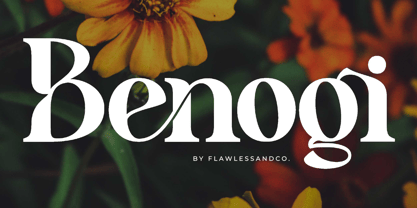 Benogi is a Modern Retro Font with a classy and unique style in each character, so it's fitted for some wedding invitation display. There's some connected letters and some alternates that suitable for any graphic designs such as branding materials, t-shirt, print, business cards, logo, poster, t-shirt, photography, quotes .etc This font support for some multilingual. Also contains uppercase A-Z and lowercase a-z, alternate character, numbers 0-9, and some punctuation. If you need help, just write me! Thanks so much for checking out my shop!
 - Croist by Flawlessandco,
$9.00 Croist is a modern retro with a fun and bold style that perfect for your retro-themed projects. Try out some alternate characters for another visual result! There's some connected letters and some alternates that suitable for any graphic designs such as branding materials, t-shirt, print, business cards, logo, poster, t-shirt, photography, quotes .etc This font support for some multilingual. Also contains uppercase A-Z and lowercase a-z, alternate character, numbers 0-9, and some punctuation. If you need help, just write me! Thanks so much for checking out my shop!
 - Helios Retro by Flawlessandco,
$9.00 Helios Retro is a modern retro with a fun and bold style that perfect for your boho-themed projects. Try out some alternate characters for another visual result! There's some connected letters and some alternates that suitable for any graphic designs such as branding materials, t-shirt, print, business cards, logo, poster, t-shirt, photography, quotes .etc This font support for some multilingual. Also contains uppercase A-Z and lowercase a-z, alternate character, numbers 0-9, and some punctuation. If you need help, just write me! Thanks so much for checking out my shop!
 - Brahmasta by Flawlessandco,
$9.00 Brahmasta is a modern serif with a classic retro style that perfect for your retro-themed projects. Try out some alternate characters for another visual result! There's some connected letters and some alternates that suitable for any graphic designs such as branding materials, t-shirt, print, business cards, logo, poster, t-shirt, photography, quotes .etc This font support for some multilingual. Also contains uppercase A-Z and lowercase a-z, alternate character, numbers 0-9, and some punctuation. If you need help, just write me! Thanks so much for checking out my shop!
 - Nadier by Flawlessandco,
$9.00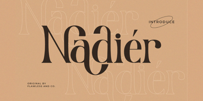 Nadier is a Modern Serif Font that made with a classic style in each character, so it's fitted for some wedding invitation display. There's some connected letters and some alternates that suitable for any graphic designs such as branding materials, t-shirt, print, business cards, logo, poster, t-shirt, photography, quotes .etc This font support for some multilingual. Also contains uppercase A-Z and lowercase a-z, alternate character, numbers 0-9, and some punctuation. If you need help, just write me! Thanks so much for checking out my shop!
 - Renaf by Flawlessandco,
$9.00 Renaf is a Groovy Retro Font that made with an additional shiny mode in each character, so it's fitted for some retro project. There's some connected letters and some alternates that suitable for any graphic designs such as branding materials, t-shirt, print, business cards, logo, poster, t-shirt, photography, quotes .etc This font support for some multilingual. Also contains uppercase A-Z and lowercase a-z, alternate character, numbers 0-9, and some punctuation. If you need help, just write me! Thanks so much for checking out my shop!
 - Croasian by MKGD,
$13.00 The main reason I wanted to design this font was because I really didn’t like how poorly some fonts tried to mimic an Oriental appearance. Trying to make western words appear Asian with a font composed of brush strokes is almost always doomed to failure. However, I find Croasian works extremely well with one syllable words that are Asian sounding. A good font to have if you want to express an Asian name or business phonetically in a western alphabet while still retaining an Asiatic feel. Croasian has a glyph count of 397 and supports the following languages Afrikaans, Albanian, Asu, Basque, Bemba, Bena, Bosnian, Catalan, Chiga, Colognian, Cornish, Croatian, Czech, Danish, Embu, English, Esperanto, Estonian, Faroese, Filipino, Finnish, French, Friulian, Galician, German, Gusii, Hungarian, Icelandic, Indonesian, Irish, Italian, Kabuverdianu, Kalaallisut, Kalenjin, Kamba, Kikuyu, Kinyarwanda, Latvian, Lithuanian, Low German, Lower Sorbian, Luo, Luxembourgish, Luyia, Machame, Makhuwa-Meetto, Makonde, Malagasy, Malay, Maltese, Manx, Meru, Morisyen, North Ndebele, Norwegian Bokmål, Norwegian Nynorsk, Nyankole, Oromo, Polish, Portuguese, Romanian, Romansh, Rombo, Rundi, Rwa, Samburu, Sango, Sangu, Scottish Gaelic, Sena, Shambala, Shona, Slovak, Slovenian, Soga, Somali, Spanish, Swahili, Swedish, Swiss German, Taita, Teso, Turkmen, Upper Sorbian, Vunjo, Walser, Zulu
 - Cora by TypeTogether,
$49.00 Cora is a sans serif with an experimental bent, offering a large x-height, some contrast of stroke weight, and capitals inspired by classical lettering. The large x-height gives it a voice with a little more volume so that those in the back of the room have no trouble hearing. Because the letters seem slightly large, Cora remains clear at smaller point sizes. It is a typeface intended to perform well on screen without losing its attraction in print and the nature of its shapes allows for condensation or expansion without becoming severely distorted. The uppercase exhibits classical proportions found in ancient Roman inscriptions, which provides opportunities for setting titles in all caps. Cora Opentype Pro has a full range of numerals for every use, small caps, the most common open type features and supports many languages that use the latin extended alphabet. It is available in a range of three weights plus Italics. CoraBasic is a reduced version of Cora. It is still an OT-font but without any particular features except of a set of ligatures, class-kerning and language support including CE and Baltic.
 - Mah Jongg by Bogusky 2,
$10.00No, it's not the complete set but a great way to send out invitations for Mah Jongg Parties, Notices, Posters, Banners and Flyers. Here's a menu of what's contained and take a look at the Character Chart for some close-ups. It may seem complicated but not really. Shift, Alphabet keys will give you caps Mah Jongg characters, tiles beside a letter of the alphabet. The "lower case" alphabet is the same letter font used in the caps but without a tile. The regular keys "1 through 9" are the actual Crack tiles with the correct oriental glyph. Numerals to match the "lower case" are found using Shift and the Number keys. The $ sign is the Forward Slash and the "¢" sign is the Back Slash Dragons: Left & Right brackets Nice One Bam symbols: Shift, Left & Right brackets Hitting Option & the keys, "A,S,F & C" will reveal attractive flower designs. Punctuation, period, comma, quotes, etc. are in their usual locations. You may want to print this menu as a handy guide. The license agreement stipulates that you may disassemble and use elements from this font to create colorful art as in the illustration shown with the font listing. - Ongunkan Linear B Syllabary by Runic World Tamgacı,
$100.00 This font is based on the Latin-based font for Linear B syllable writing. It contains all the characters. To see some full characters, you can use Turkish characters by selecting the font from the add character section of the word program. Linear B was a syllabic script that was used for writing in Mycenaean Greek, the earliest attested form of Greek. The script predates the Greek alphabet by several centuries. The oldest Mycenaean writing dates to about 1400 BC. It is descended from the older Linear A, an undeciphered earlier script used for writing the Minoan language, as is the later Cypriot syllabary, which also recorded Greek. Linear B, found mainly in the palace archives at Knossos, Cydonia, Pylos, Thebes and Mycenae, disappeared with the fall of Mycenaean civilization during the Late Bronze Age collapse. The succeeding period, known as the Greek Dark Ages, provides no evidence of the use of writing. Linear B, deciphered by English architect and self-taught linguist Michael Ventris based on the research of American classicist Alice Kober[5] is the only Bronze Age Aegean script to have thus far been deciphered.
 - Undergrad by Thomas Käding,
$10.00 This font began its life as a project to design a T-shirt for a student group on a large midwestern university. It has now grown up into a unicode font, including Greek and Cyrillic. It has that look and feel of the T-shirts that are ubiquitous on the campuses of colleges and universities over the world. It would make an ideal tool for designing them, as well as posters and banners. Characters in these fonts include Latin, for English and other European languages; small a and c for names like MacDonald; many fractions, including 0/3 needed in baseball; Latin with diacritical marks for Eastern and Western European, Turkish, and Baltic languages; thorn, eth, cedilla, AE, OE, and sharp S for French, German, Icelandic; Latin extensions for clicks of some African languages; Greek (with tonos); Cyrillic for Russian and many other Slavic and Asian languages that use it; most Runes (the full Futhark plus a few more); six-point Brialle; currency symbols for dollar, cent, pound, yen, euro; and a few other extras like the peace sign. Available styles are regular block letters, outlines, and bold.
 - Axia by Kontour Type,
$50.00 Axia is a robust sans serif of concise letter forms. It comes in ten weights from Light to Black with extended language support, a host of OpenType features including Small Caps, multiple figure styles, and more. Each, the roman and italic weights harmonize perfectly in line width. Text set in Light or Black results in the same fit. Stencil display weights with a unique aesthetic and perfect for captivating type sizes add further distinctive options to the typographic palette. The stencil display weights consist of abstract floating parts that seduce the eye and form nicely proportioned type when united. Originally designed for the Rice University School of Architecture in 2011, this contemporary sans found some inspiration in the TwinCities™ typeface family created by Sibylle Hagmann for the University of Minnesota in 2003. Orchestrated from scratch, the inner arched strokes off the stem on the lowercases 'n' or 'd', for example, progressively open the letter forms and express conceptual clarity throughout the system. A feature doing double duty that contributes to great legibility in the heavier weights and attributes to the versatility of individual weights.
 - EraMax 123 by Our House Graphics,
$15.00 EraMax 123 is a multi-layered display geometric sans serif, meant to be set BIG, for large, colourful statements. It's the perfect face for packaging, posters & branding, where a strong, colourful voice is needed... Did I mention posters? The "Max" in EraMax comes from the ultra bold weight, but also, and mainly as a tip of the hat to Peter Max, the designer and artist, known for creating so many images which have come to be emblematic of the sixties and seventies. The bold gradient effects in some of his posters were the inspiration behind the dotted and striped layers. This font's vintage flavour truly stand out in a retro setting, but also has a modern flavour that lends it the flexibility to work well in a more contemporary context. This is the second of what is to be an extended family of typefaces based on the original hand painted signage found in the T. H. & B Railway station in Hamilton Ontario, a classic Art Moderne building, designed by the New York architectural firm of Fellheimer and Wagner for the Toronto Hamilton and Buffalo Railway line and completed in 1933.
 - Katastrofe by PizzaDude.dk,
$20.00 Katastrofe is danish for … well, catastrophe - you may have guessed that! This font was almost a catastrophe to make! I cut out all the letters in a cardboard, and went outside to spray the letters with a spraycan. Everything went smooth as planned, but suddenly the wind started to blow and the papers started to fly away! Luckily I found some stones I used to make the papers stay in place. Lucky for me - otherwise it would have been a catastrophe! Seconds after finishing this font project, it started to rain…I just avoided a catastrophe! But is this font really a catastrophe, or does it just mimic punk/spray/grunge/riot? Make your own statements using Katastrofe, or perhaps your very own punk sayings like “Punk is not dead”, “Anarchy Rebel” or what suits you the best. Whatever you choose to write, you will definitely get that real punk look! Perhaps you could even do a t-shirt print that says “Katastrofe” :) Comes with different upper and lowercase letters along with alternate versions of each letter - and of course a lot of foreign letters, because punk is not dead and punk is universal!
 - DIN Next Arabic by Monotype,
$155.99 DIN Next is a typeface family inspired by the classic industrial German engineering designs, DIN 1451 Engschrift and Mittelschrift. Akira Kobayashi began by revising these two faces-who names just mean ""condensed"" and ""regular"" before expanding them into a new family with seven weights (Light to Black). Each weight ships in three varieties: Regular, Italic, and Condensed, bringing the total number of fonts in the DIN Next family to 21. DIN Next is part of Linotype's Platinum Collection. Linotype has been supplying its customers with the two DIN 1451 fonts since 1980. Recently, they have become more popular than ever, with designers regularly asking for additional weights. The abbreviation ""DIN"" stands for ""Deutsches Institut für Normung e.V."", which is the German Institute for Industrial Standardization. In 1936 the German Standard Committee settled upon DIN 1451 as the standard font for the areas of technology, traffic, administration and business. The design was to be used on German street signs and house numbers. The committee wanted a sans serif, thinking it would be more legible, straightforward, and easy to reproduce. They did not intend for the design to be used for advertisements and other artistically oriented purposes. Nevertheless, because DIN 1451 was seen all over Germany on signs for town names and traffic directions, it became familiar enough to make its way onto the palettes of graphic designers and advertising art directors. The digital version of DIN 1451 would go on to be adopted and used by designers in other countries as well, solidifying its worldwide design reputation. There are many subtle differences in DIN Next's letters when compared with DIN 1451 original. These were added by Kobayashi to make the new family even more versatile in 21st-century media. For instance, although DIN 1451's corners are all pointed angles, DIN Next has rounded them all slightly. Even this softening is a nod to part of DIN 1451's past, however. Many of the signs that use DIN 1451 are cut with routers, which cannot make perfect corners; their rounded heads cut rounded corners best. Linotype's DIN 1451 Engschrift and Mittelschrift are certified by the German DIN Institute for use on official signage projects. Since DIN Next is a new design, these applications within Germany are not possible with it. However, DIN Next may be used for any other project, and it may be used for industrial signage in any other country! DIN Next has been tailored especially for graphic designers, but its industrial heritage makes it surprisingly functional in just about any application. The DIN Next family has been extended with seven Arabic weights and five Devanagari weights. The display of the Devanagari fonts on the website does not show all features of the font and therefore not all language features may be displayed correctly.
 - DIN Next Devanagari by Monotype,
$103.99DIN Next is a typeface family inspired by the classic industrial German engineering designs, DIN 1451 Engschrift and Mittelschrift. Akira Kobayashi began by revising these two faces-who names just mean ""condensed"" and ""regular"" before expanding them into a new family with seven weights (Light to Black). Each weight ships in three varieties: Regular, Italic, and Condensed, bringing the total number of fonts in the DIN Next family to 21. DIN Next is part of Linotype's Platinum Collection. Linotype has been supplying its customers with the two DIN 1451 fonts since 1980. Recently, they have become more popular than ever, with designers regularly asking for additional weights. The abbreviation ""DIN"" stands for ""Deutsches Institut für Normung e.V."", which is the German Institute for Industrial Standardization. In 1936 the German Standard Committee settled upon DIN 1451 as the standard font for the areas of technology, traffic, administration and business. The design was to be used on German street signs and house numbers. The committee wanted a sans serif, thinking it would be more legible, straightforward, and easy to reproduce. They did not intend for the design to be used for advertisements and other artistically oriented purposes. Nevertheless, because DIN 1451 was seen all over Germany on signs for town names and traffic directions, it became familiar enough to make its way onto the palettes of graphic designers and advertising art directors. The digital version of DIN 1451 would go on to be adopted and used by designers in other countries as well, solidifying its worldwide design reputation. There are many subtle differences in DIN Next's letters when compared with DIN 1451 original. These were added by Kobayashi to make the new family even more versatile in 21st-century media. For instance, although DIN 1451's corners are all pointed angles, DIN Next has rounded them all slightly. Even this softening is a nod to part of DIN 1451's past, however. Many of the signs that use DIN 1451 are cut with routers, which cannot make perfect corners; their rounded heads cut rounded corners best. Linotype's DIN 1451 Engschrift and Mittelschrift are certified by the German DIN Institute for use on official signage projects. Since DIN Next is a new design, these applications within Germany are not possible with it. However, DIN Next may be used for any other project, and it may be used for industrial signage in any other country! DIN Next has been tailored especially for graphic designers, but its industrial heritage makes it surprisingly functional in just about any application. The DIN Next family has been extended with seven Arabic weights and five Devanagari weights. The display of the Devanagari fonts on the website does not show all features of the font and therefore not all language features may be displayed correctly. - DIN Next Cyrillic by Monotype,
$65.00DIN Next is a typeface family inspired by the classic industrial German engineering designs, DIN 1451 Engschrift and Mittelschrift. Akira Kobayashi began by revising these two faces-who names just mean ""condensed"" and ""regular"" before expanding them into a new family with seven weights (Light to Black). Each weight ships in three varieties: Regular, Italic, and Condensed, bringing the total number of fonts in the DIN Next family to 21. DIN Next is part of Linotype's Platinum Collection. Linotype has been supplying its customers with the two DIN 1451 fonts since 1980. Recently, they have become more popular than ever, with designers regularly asking for additional weights. The abbreviation ""DIN"" stands for ""Deutsches Institut für Normung e.V."", which is the German Institute for Industrial Standardization. In 1936 the German Standard Committee settled upon DIN 1451 as the standard font for the areas of technology, traffic, administration and business. The design was to be used on German street signs and house numbers. The committee wanted a sans serif, thinking it would be more legible, straightforward, and easy to reproduce. They did not intend for the design to be used for advertisements and other artistically oriented purposes. Nevertheless, because DIN 1451 was seen all over Germany on signs for town names and traffic directions, it became familiar enough to make its way onto the palettes of graphic designers and advertising art directors. The digital version of DIN 1451 would go on to be adopted and used by designers in other countries as well, solidifying its worldwide design reputation. There are many subtle differences in DIN Next's letters when compared with DIN 1451 original. These were added by Kobayashi to make the new family even more versatile in 21st-century media. For instance, although DIN 1451's corners are all pointed angles, DIN Next has rounded them all slightly. Even this softening is a nod to part of DIN 1451's past, however. Many of the signs that use DIN 1451 are cut with routers, which cannot make perfect corners; their rounded heads cut rounded corners best. Linotype's DIN 1451 Engschrift and Mittelschrift are certified by the German DIN Institute for use on official signage projects. Since DIN Next is a new design, these applications within Germany are not possible with it. However, DIN Next may be used for any other project, and it may be used for industrial signage in any other country! DIN Next has been tailored especially for graphic designers, but its industrial heritage makes it surprisingly functional in just about any application. The DIN Next family has been extended with seven Arabic weights and five Devanagari weights. The display of the Devanagari fonts on the website does not show all features of the font and therefore not all language features may be displayed correctly. - DIN Next Paneuropean by Monotype,
$92.99DIN Next is a typeface family inspired by the classic industrial German engineering designs, DIN 1451 Engschrift and Mittelschrift. Akira Kobayashi began by revising these two faces-who names just mean ""condensed"" and ""regular"" before expanding them into a new family with seven weights (Light to Black). Each weight ships in three varieties: Regular, Italic, and Condensed, bringing the total number of fonts in the DIN Next family to 21. DIN Next is part of Linotype's Platinum Collection. Linotype has been supplying its customers with the two DIN 1451 fonts since 1980. Recently, they have become more popular than ever, with designers regularly asking for additional weights. The abbreviation ""DIN"" stands for ""Deutsches Institut für Normung e.V."", which is the German Institute for Industrial Standardization. In 1936 the German Standard Committee settled upon DIN 1451 as the standard font for the areas of technology, traffic, administration and business. The design was to be used on German street signs and house numbers. The committee wanted a sans serif, thinking it would be more legible, straightforward, and easy to reproduce. They did not intend for the design to be used for advertisements and other artistically oriented purposes. Nevertheless, because DIN 1451 was seen all over Germany on signs for town names and traffic directions, it became familiar enough to make its way onto the palettes of graphic designers and advertising art directors. The digital version of DIN 1451 would go on to be adopted and used by designers in other countries as well, solidifying its worldwide design reputation. There are many subtle differences in DIN Next's letters when compared with DIN 1451 original. These were added by Kobayashi to make the new family even more versatile in 21st-century media. For instance, although DIN 1451's corners are all pointed angles, DIN Next has rounded them all slightly. Even this softening is a nod to part of DIN 1451's past, however. Many of the signs that use DIN 1451 are cut with routers, which cannot make perfect corners; their rounded heads cut rounded corners best. Linotype's DIN 1451 Engschrift and Mittelschrift are certified by the German DIN Institute for use on official signage projects. Since DIN Next is a new design, these applications within Germany are not possible with it. However, DIN Next may be used for any other project, and it may be used for industrial signage in any other country! DIN Next has been tailored especially for graphic designers, but its industrial heritage makes it surprisingly functional in just about any application. The DIN Next family has been extended with seven Arabic weights and five Devanagari weights. The display of the Devanagari fonts on the website does not show all features of the font and therefore not all language features may be displayed correctly. - Jeles by Tour De Force,
$25.00 Inheriting the beauty and style of old type classics from this genre, Jeles is blended with very elegant modern approach featuring soft corners, round slab serifs and tasty ball terminals. Jeles is designed mostly for display use and it is highly recommended to get the whole family if you want to get the best result. It is designed in two styles Condensed and Normal. The Condensed version is developed in two weights each coming with corresponding italics. While the Normal styles are three ranging from Regular, Bold and Black. The total of 7 separate fonts inside the family are quite enough if you look for diversity and flexibility at one place. You could use the uprights for more serious and strong headlines while the Italics work perfectly for more fresh and live subheads. Of course editorial design is only one of the many directions where Jeles family could be used successfully as we all know typefaces with so visible contrast between thin and thick and combined with classic elegance, could be easily used in every design of cosmetic industry, fashion, food, jewelry, etc. Try to design a stylish boutique shop signboard and you will surely discover its beauty and potential. Easy-to-read, it is good for print design, revealing its authentic letterpress-like character as well as perfect for screen use note that the thin strokes and serifs are not that thin to vanish on a low resolution monitor. Professionally designed, they are solid enough yet very elegant and even gentle making Jeles a desired family design of attractive web banners, web sites, apps and e-books.
 - ST Agitaciya by ShimanovTypes,
$9.00 Introducing a retro narrow grotesque called "Agitaciya" (Agitation). Bring back to the Soviet Era Agitation inspired by Soviet posters, movie titles and book covers. The letterforms are straight and condensed and come in 2 styles: uppercase and small caps alternatives. It has Extended LATIN and Extended CYRILLIC letters. "Agitaciya"created for titles, poster design, web design, branding and packaging works, illustrations, badges and other typography works. *ST Agitaciya supports 15+ languages: English, German, Spanish, Belarusian, Bosnian, Bulgarian, Croatian, Dutch, Norsk, Dannish, Macedonian, Polish, Russian, Serbian, Slovenian, Swedish, Ukrainian, Kazakh, and probably others )
 - The Quiz Script by Siwox Studios,
$95.00 The Quiz Script is an handwriting typeface. For designers, instagramers, bloggers, youtubers, fashion lovers or somebody who loves fresh design. Every creative loves something new. Thats why we love handmade and freestyle designs, because it will make something unique, fresh and natural. So here we are, The Quiz Script fonts are ready to work with your creativity. The Quiz Script is suitable for any modern design such as for ad banner, modern card, invitation, announcement, seasonal design, social media promotion, web design, branding and logo stylist and many more.
 - Poeta Color by Tarallo Design,
$14.99 Poeta Color is an ornamental font for making patterns and decorating text. It contains floral and nature motifs. The symbols are versatile enough for simple decoration or thematic seasonal and holiday moods. Designers can use Poeta to make unique lines, fields, borders, or ornamentation within or around text. Try replacing a basic straight line with repeated symbols. Make a background to add visual interest to a design. Use the forms to decorate a chapter title or to mark the end of a magazine article. Replace a letter in a word with a symbol to create a memorable statement. This font began with sketches of patterns seen in ceramic tiles around Sicily. It is named Poeta because Sicily is an island rich in poetry traditions. Below is some helpful technical information. Using this font is simple. Install it and type. Symbols will appear instead of letters. Choose the precise symbols through a software’s glyph palette. Use the type/character menu controls to vary the spacing and density of patterns. All fonts are vector-based, OpenType, and fully scalable. Six of the fonts have different color or grey combinations. One of the fonts (solid) is a standard font. The font previews on this website will only display the font in black. See the slides to get an idea of the colors. Be assured that the colors are present in the files and will appear when loaded on the computer. The colors that are in each font: Primary: red, yellow, blue Secondary: orange, green, purple Tertiary: red-orange, yellow-orange, yellow-green, blue-green, blue-violet, red-violet Diverse: many different warm and cool colors Grey: three different greys from light to dark Gradient: a greyscale gradient Solid: standard font and can be colored normally Software that supports color SVG fonts: Photoshop, since 2017 llustrator, since 2018 InDesign, since 2019 QuarkXPress, since 2018 Pixelmator Sketch
 - ST Gaidar by ShimanovTypes,
$9.00 The font "Gaidar" named in the honour of Arkady Gaidar. He was a Soviet writer, whose stories were very popular among Soviet children, and a Red Army commander. He died in combat fighting with German nazis in 1941. Few generations of Soviet kids are raised on his books and a number of films were made based on his stories. This font inspired by posters, movie titles and book covers of this writer. The letterforms are bold and gnarly and comes in 2 styles: uppercase and small caps. It has LATIN and Extended Eastern Europe CYRILLIC letters. "ST-Gaidar" created for titles, poster design, web design, branding and packaging works, illustrations, badges and other typography works. Pls, don't use it for for typing large arrays of text. ST Gaidar supports 15+ languages: Belarusian, Bosnian, Bulgarian, Croatian, Dutch, English, German, Macedonian, Norwegian, Russian, Serbian, Swedish, Spanish, Slovenian, Ukrainian and probably others
 - Pariphoom by Jipatype,
$27.00 ขอแนะนำ Pariphoom แบบอักษรอันโฉบเฉี่ยวและทันสมัย เหมาะสำหรับงานออกแบบหลากหลายประเภท ด้วยอักษรแบบ sans-serif condensed และมุมโค้งมน แบบอักษรนี้ให้ความสมดุลที่ระหว่างความเป็นทางการและความเข้าถึงได้ง่าย ชื่อปริภูมิมาจากภาษาไทย แปลว่า “Space” และเช่นเดียวกับชื่อของมัน ฟอนต์นี้สามารถให้พื้นที่มากขึ้นในงานออกแบบของคุณ ไม่ว่าคุณกำลังสร้างสื่อสำหรับสร้างแบรนด์ พัฒนาแคมเปญการตลาด หรือออกแบบเว็บไซต์ Pariphoom มอบความยืดหยุ่นและความอเนกประสงค์เพื่อให้ได้รูปลักษณ์ที่คุณต้องการ Pariphoom มาพร้อมกับรูปแบบที่แตกต่างกันถึง 18 รูปแบบ สิ่งนี้ทำให้คุณมีตัวเลือกมากมายและมีความยืดหยุ่นในการใช้งานในหลากหลายบริบท นอกจากนี้ ฟอนต์นี้รองรับหลายภาษาสำหรับภาษาต่างๆ มากมาย แต่นั่นไม่ใช่ทั้งหมด Pariphoom มาพร้อมกับฟีเจอร์ Opentype เจ๋ง ๆ เช่น Small Caps และ Tabular ซึ่ง Small Caps เป็นวิธีที่ยอดเยี่ยมในการเพิ่มความหลากหลายให้กับงานออกแบบของคุณโดยใช้ตัวพิมพ์ใหญ่แทนตัวพิมพ์เล็ก ในขณะเดียวกัน Tabular ก็สมบูรณ์แบบสำหรับการสร้างตารางและจัดตำแหน่งตัวเลขเพื่อให้ดูเป็นระเบียบมากขึ้น โดยรวมแล้ว Pariphoom ทำให้เป็นตัวเลือกที่ยอดเยี่ยมสำหรับนักออกแบบที่ต้องการสร้างผลงานการออกแบบที่น่าจดจำและมีประสิทธิภาพ Introducing Pariphoom, a sleek and modern typeface that is perfect for a wide range of design projects. With its condensed sans-serif design and rounded corners, this font offers a unique balance of professionalism and approachability. Derived from the Thai language, the name Pariphoom means "Space" and just like its name suggests, this font can give you more space in your design. Whether you're creating branding materials, developing marketing campaigns, or designing websites, Pariphoom offers the flexibility and versatility you need to achieve your desired look. Pariphoom comes with 18 different styles. This gives you plenty of options to choose from and the flexibility to use it in various design contexts. Additionally, this font offers multi-language support for a wide range of languages. But that's not all – Pariphoom comes with some cool Opentype features such as Small Caps and Tabular. Small Caps are a great way to add variety to your design by using small capital letters instead of lowercase letters. Meanwhile, Tabular is perfect for creating tables and aligning numbers for a more organized look. Overall, Pariphoom making it a great choice for designers who want to create memorable and effective design projects.
 - JT Olifer by Jolicia Type,
$17.00 JT Olifer is family font of Jolicia Type designed by Laire Banyu Sandi Pawenang in October 2021, JT Olifer inspired by Modern Typography developed by us in our perspective, with a typeface detail in every corner we make more rounded, and give an inktrap accent to make unique impression special in every glyph, we really consider about aspect legibility, therefore we make family font amount 40 to assist the selection according to visual needs. Font type of JT Olifer contains several nuances that combain aesthetic, contemporary and modern, furthermore we make some alternates glyph that have a friendly and subtle impression, for example ‘f’ the alternate of this name our font we designed is more circular and smooth. JT Olifer has a total of 465 letters with regular, slanted and condensed styles support in 90 languages : Afrikaans Albanian Asu Basque Bemba Bena Breton Catalan Chiga Colognian Cornish Croatian Czech Danish Dutch Embu English Esperanto Estonian Faroese Filipino Finnish French Friulian GalicianGanda German Gusii Hungarian Inari Sami Indonesian Irish Italian Jola-Fonyi Kabuverdianu Kalaallisut Kalenjin Kamba Kikuyu Kinyarwanda Latvian Lithuanian Lower Sorbian Luo Luxembourgish Luyia Machame Makhuwa-Meetto Makonde Malagasy Maltese Manx Meru Morisyen Northern Sami North Ndebele Norwegian Bokmål Norwegian Nynorsk Nyankole Oromo Polish Portuguese Quechua Romanian Romansh Rombo Rundi Rwa Samburu Sango Sangu Scottish Gaelic Sena Serbian Shambala Shona Slovak Soga Somali Spanish Swahili Swedish Swiss German Taita Teso Turkish Upper Sorbian Uzbek (Latin) Volapük Vunjo Walser Zulu
 - FS Albert Arabic by Fontsmith,
$150.00 Brother To create a truly global font family, FS Albert needed an Arabic script sibling. Emanuela Conidi set about the delicate task of creating an alphabet to harmonise visually with its Latin sans serif counterpart so that the two could be used side-by-side in bilingual publications. Working with the Kufic style of script, with its simpler, geometric forms, Emanuela sculpted letters with the a similar optical size, weight and rhythm as FS Albert, with open counters and monolinear strokes. It never hurts to Naskh But there’s more to FS Albert than a simple, geometric structure. To match Albert’s cheery, charming character, FS Albert Arabic needed an injection of warmth and informality. Emanuela incorporated some of the more expressive, calligraphic shapes of the Naskh script style, which lent the letterforms a looser, softer, more handwritten quality, while remaining functional and structured. The Naskh influence is most noticeable in the bowl of characters such as Jim, Qaf and Nun, in the curved tail of Waw and Reh, and the deep joining of Tah. Follow the script The end result is an Arabic script that’s the perfect partner to FS Albert: open counters, monolinear strokes and a friendly, rounded appearance. FS Albert Arabic is available in Opentype format, in five weights from Thin to ExtraBold. It supports Persian and Urdu, with proportional and tabular numerals for both, plus full vocalisation and the Hijra feature.
 - Hassan by Linotype,
$187.99Hassan is a traditional-style Arabic text face designed by Hassan Sobhi Mourad, an experienced calligrapher and teacher of the art and first produced by the Linotype Design Studio (U.K.) as a PostScript font in 1993. An individual Naskh style, Hassan cleverly combines elegant proportions, echoing an inscriptional Thuluth in its tall vertical stems and deeply rounded final jim and ain. The effect of verticality is enhanced by the tense, reined-in kerning strokes of ra and waw, the well-poised lam-alif, and the compactly drawn ligatures. The broad-band strokes of Hassan Bold smooth some of the angularity and relax the tension apparent in the Light. The traditional-style ligatures are rendered with an easy flow. Because of the economical character count, Hassan Light and Bold text may be headed by the compact titling styles (Hisham, Mariam) as well as designs like Ahmed or Kufi which answer to the inscriptional qualities of Hassan. In addition to other uses, Hassan would be particularly suited to document text-setting. Hassan’s two OpenType weights include Latin glyphs from Janson Text Roman, and Janson Text Bold, respectively, inside the font files, allowing a single font to set text in both most Western European and Arabic languages. The OpenType glyph ranges incorporate Basic Latin and the Arabic character set, which supports Arabic, Persian, and Urdu. The fonts include tabular and proportional Arabic, Persian, and Urdu numerals, as well as a set of tabular European (Latin) numerals. - Thaun by Scholtz Fonts,
$19.00 I can best describe the Thaun family as a general purpose display family, inspired by Scholtz Fonts' " "Delikat". I wanted to produce a display font that was more robust than Delikat, without losing the delicacy of the original. In order to do this I thinned solid, curved strokes toward the baseline, and let them dwindle to gently rounded points. As a graphic designer I became aware that designs that used a number of styles from the same family seemed to work well. This was easily done using a standard sans serif font such as Arial or Helvetica. However, when a different look is needed, display fonts do not always have a the variety of different styles that are necessary to produce a coherent design. Thus with Thaun, the challenge was to create a coherent family based on a display font. The archetype of this family is Thaun Regular with six different widths forming closely related styles. There are also two variants of the archetype i.e. Thaun Black & Thaun Rough to add variety to the primary style. An additional sub-family, Thaun Accord, appears in two widths. Thaun Jazz is a wide three dimensional variation. Thaun has all the features usually included in a fully professional font. Language support includes all European character sets, Greek symbols and all punctuation. Opentype features include automatic replacement of some characters and discretionary replacement of stylistic alternatives.
 - Yafferbuddle by Aah Yes,
$7.00 Yafferbuddle comes in the category of 'a funky fun font' with a pleasing rounded shape, but it still has the extensive range of features you'd expect in a modern OpenType font. It's especially useful for posters, headlines and comics. There's 5 weights and a Shadow version in Regular and Italic, making 12 fonts in all. To let you know what's in the font that you might otherwise not suspect . . . With Discretionary Ligatures on, you get special characters if you type Mc St. Rd. Bd. Ave. c/o No. (p) (P) - include the full-stop/period where given. With Stylistic Alternates switched on, you get plenty of extra characters - including a WiFi symbol (type Wifi or WiFi) / bullet numbers instead of ordinary numbers / that different U-dieresis / special characters for c/o No. Mc / an upside down ~ / a huge bullet, and different forms for cent, dollar, percent, per-thousand. As you'd expect, there's all the accented characters for all Western European scripts using Latin letters, and standard ligatures, plus other Open Type features including Class Kerning, Slashed-Zero, Historical Forms, Sub- and Superscript numbers, fractions for halves, thirds and quarters, Ornamental forms giving bullet numbers, etc. There's even some of the more obscure stuff like the main mathematical operators, symbols like card-suits and male/female signs and so on, schwa, U-horn O-horn, and there's more if you can Access All Alternates. Much will depend on what features your software recognises.
 - Super Retro by RagamKata,
$14.00 Super Retro is a font that offers a classic groovy retro style with a unique hand-drawn sketch touch. It draws inspiration from the retro era, filled with vibrant colors and a sense of fun. Each uppercase letter has its own distinctiveness compared to the lowercase letters, providing an interesting visual variation. Super Retro features chubby and rounded letterforms, creating an impression that embodies cheerful and joyful characters. Each capital letter is written with winding and wavy lines, adding an artistic effect reminiscent of trendy hand-drawn art. The font showcases a style inspired by the energetic music scene of the retro era, characterized by freedom of expression. The letters appear to sway and move dynamically, as if they are dancing on stage. Rough lines and details add an authentic touch, capturing a strong vintage aura. Super Retro highlights each letter with its unique qualities and characteristics. Every uppercase letter has a special touch that sets it apart from the lowercase letters. Some letters may have extra extensions at the top or bottom, providing distinctive decorative elements. There are also letters written in a more eccentric style, with slightly elongated or condensed proportions, creating intriguing and refreshing differences. This font is ideal for designing posters, logos, titles, and various designs that require a strong retro impression. With its ability to adapt to different letter characteristics, Super Retro offers limitless variations in your design creativity.
 - Legnano by Nick's Fonts,
$10.00 Here's something you don't see every day—Italian Art Deco woodtype. It's suave but unsophisicated, an unpretentious charmer. Both versions support the Latin 1252, Central European 1250, Turkish 1254 and Baltic 1257 codepages.
 - Pillow Puff JNL by Jeff Levine,
$29.00 Pillow Puff JNL is a cottony-soft, fluffy, lighter-than-air display font for novelty applications. Use it for advertising fabrics, bath tissue, baby items or anything that conveys something soft and gentle.
 - Cabana Club JNL by Jeff Levine,
$29.00Bring back the glory of winters in Miami Beach, exotic summer vacations or Deco-era night spots with Cabana Club JNL - a retro-Deco font, complete with contour outline and solid black characters. - Hola by Cuda Wianki,
$35.00 Hola! This is our new handwritten font. It's casual, young and pretty, perfect for logotypes, magazines, writing notes and comments. Thanks to many ligatures and alternate characters it is varied handwriting font. Enjoy!
 - Courtold Shadow by Greater Albion Typefounders,
$20.00 Courtold Shadow is another of our June 2017 ‘Wood Type’ collection. There is something alive and energetic about these ‘rushing’ oblique letter forms with their diagonal shadow. Ideal for signage and poster work.