7,672 search results
(0.017 seconds)
- Gentry by Device,
$29.00 With its strong diagonal emphasis, Gentry is a humanised techno face that manages to also incorporate some strong calligraphic touches. Powerful in short and single-word settings.
 - Hiew by Okaycat,
$29.95 Okaycat presents "Hiew". Hiew is a connected font with serif, some bold personality making your message clear. Includes European accents and extra characters to meet publication needs.
 - Terrace JNL by Jeff Levine,
$29.00 Terrace JNL is a bold, sturdy Art Deco titling face based on hand lettering found on the cover of some 1940s-vintage sheet music for the organ.
 - Forward Passed JNL by Jeff Levine,
$29.00 Some Impko decal letters and numbers with a "college look" from the 1960s were the inspiration for designing "Forward Passed JNL"; Jeff Levine's second sports-themed font.
 - Fazeta by Adtypo,
$38.00 Fazeta is a type family that uses the optical sections. It is a modern static antiqua (it has not obliqued axis, serifs without slopes) but distant from ceremonious and rigid look of this type category. Inspiration was typeproduction from Czechoslovakia 60’s - J. Týfa, V. Preissig, J. Linzboth or A. Krátky. Common factor of this typefaces is vivid and sharp design with stable serifs, tend to rational construction rather than calligraphy and some sophisticated small details vitalized general impression. In this case are facetted asymmetrical arches (some abbreviation). Specific of this typeface is a short arch of glyph “f” that allows comfortable typesetting without ligatures obligation. In character set are besides classical ligatures discretionary ligatures for special occasions. Another surprising element is that all vertical strokes are slightly expanded upwards. These details become invisible in small text but in larger sizes impressed the eye and fix attention to headline. For traditional text feeling are here alternative glyphs “a, c, f, j, k, r, y, K, R” terminated with typical serif. Typeface is graded by optical size into 3 variants - caption (robust structure with low contrast, suitable for size 6 - 9 pt), text (medium contrast, suitable for ordinary text about 10 pt) and display (high contrast and subtle details for 20 pt and higher). Every variant has 5 weights (light, regular, medium, bold and black) with italics. Typeface is with their naked cold expression suitable for neutral text without emotional feelings. In contrast with most antique typefaces this is intended for modern glossy white paper where crisp details can excelled. Every font contains 1140 glyphs, between them original small capitals, various digits, fractions, indexes, matematical symbols, arrows, borders and many alternative glyphs. To see more please check the PDF specimen.
 - PF Bodoni Script Pro by Parachute,
$79.00 Always intrigued by Bodoni's original work, I was set out—back in 2000—to examine his work and study Manuale Tipografico, one of the greatest specimen books ever printed. Issued in 1818 at Parma, Italy by Bodoni's widow, the two-volume work shows an impressive array of 142 roman alphabets and some foreign ones such as Greek and Cyrillic. After a careful examination of all characters, I decided to create a typeface based on the distinct script capitals presented in the book. Matching lowercase italics were later selected and designed to complete the series. Since my intention was not to create simply a digital version of Bodoni's work, this typeface was designed with connected characters and capitals with extra calligraphic elements. The result was released in 2002 and published in our award-winning catalog/book IDEA/Trendsetting Typography vol.1. Later in 2005 we revived a large number of ornaments and borders (credit goes to designer George Lygas). All this work was left behind till recently when it was revisited to create a complete 'Pro' family. Several new uppercase and lowercase glyphs were designed in order to create a distinct typeface, which is based on Bodoni but yet it stands out on its own. The new version also takes care of conflicts between neigbouring letters, something that was not included in the first version. Bodoni Script Pro is a 3-weight superfamily. It supports 10 special opentype features including 'contextual alternates' as well as support for both Latin and Greek. Each font comes with 725 glyphs including a large number of alternates as well as 144 ornaments. Furthermore, when you purchase the whole package you get a bonus font which contains 120 frame parts. These parts, when put together, create some truly amazing borders. -Panos Vassiliou
 - Open Book ING by Ingrimayne Type,
$9.00 OpenBookING is a gimmick or novelty font that has letters on pages of a book. It is caps only and monospaced. The letters on the upper-case keys are on the left-handed pages of an open book and the letters on the lower-case keys are the same letters but on the right-handed pages of an open book. One could alternate upper and lower case keys to get letters on complete books, but the Opentype feature of contextual alternatives (calt) does this automatically. Several previous typefaces from IngrimayneType used the calt feature to alternate shapes that fit together in an interlocking pattern, such as alternating concave and convex shapes. OpenBookING uses the calt feature in a different way, to alternate two halves of a symmetrical shape. To provide two copies of numbers and common symbols, some non-alphabetical characters are unavailable because their slots were taken by the second form of the number or common symbol. If stylistic set one (ss01) is turned on, spaces are replaced with empty pages. This may leave you with unwanted spaces at the end of lines, and to eliminate them, turn off the feature (or change the font) for these spaces. The empty pages can be used in a layer to add color to the text. There is also a second set of empty pages with a filled page that can also be used in layers. (See poster for examples.) These pages are on the (logicalnot multiply) and (register divide) characters for the first set and on the (ordmasculine ellipsis) and (macron trademark) keys for the second set. Finally, OpenBookING has a large set of accented characters if anyone should need them. The letters used on the books were derived from the font Myhota-Bold. For a related typeface of letters on book covers, see NewLibrary. OpenBookING has limited uses and is priced accordingly.
 - Beauty Style by Cultivated Mind,
$14.00 Beauty Style is a luxurious font collection that includes both a signature script and a sans serif typeface. Beauty Style scripts come in four weights including 12 alternates and 56 ligatures. Programming has been added to the scripts for flow and elegance. Use Beauty Style for sophisticated designing. Fonts designed by Cindy Kinash. See font details below. SANS FEATURES: All caps letters Condensed Sans OpenType Common ff fi fl ffi ffl ligatures Available in Extended Latin Pro (Standard) or American (US) version. SCRIPT FEATURES: Signature style OpenType Common ff fi fl ffi ffl ligatures Available in Extended Latin Pro (Standard) or American (US) version. 12 alternates and 56 ligatures Programmed ligature feature for optimization. Every time you type specific pairs, ligatures are programmed to pop up to avoid letter pair collisions. Programming ligatures gives the script a more elegant and pretty flow. Make sure to turn on the feature in your preferred program that supports ligatures. FREE WORDS FEATURES: 52 free words useful for beauty and sales promoting. Keyword examples include you, sale, and beautiful. Intended use for beauty, fashion, newsletters, websites, magazines, sales, commercials and packaging. VERSIONS: American and Extended Latin Pro AMERICAN (US) Shorter version 12 alternates and 56 ligatures (scripts only) Common ff fi fl ffi ffl ligatures OpenType Includes the common alphabet, numbers, American symbols and punctuation. EXTENDED LATIN PRO (Standard) Extended version of the American. 12 alternates and 56 ligatures (scripts only) Common ff fi fl ffi ffl ligatures OpenType Includes characters for Albanian, Basque, Catalan, Cornish, Croatian, Czech, Danish, Dutch, English, Esperanto, Estonian, Feroese, Finnish Scots, French, Gaelic, Galician, German, Greek Transliterated, Hawaiian, Hungarian, Icelandic, Indonesian, Irish, Italian, Latvian, Lithuanian, Maltese, Nynorsk Bokmal Norwegian, Polish, Portuguese, Romanian, Slovak, Slovenian, Spanish, Swedish, Turkish, Welsh. TIPS: Try the OpenType ligatures by turning on the feature in your preferred program that supports ligatures. FONT LAYERING — Layer the script over the sans to give a cool retro effect. There are so many fun and creative possibilities. FONT CONNECTING — Interconnect the sans and script letters together creating TYPE ART. All you need to do is convert the font into an object and have fun! (Watch the upcoming tutorials on the cultivatedmindtype Instagram) SANS — When sans text is small, widen the text tracking for legibility and style variety. Sans is diverse and can work as tight or loose tracking. Use Beauty and Style for type art, beauty marketing, fashion, apparel, product design, music, websites, promotions and film. Last tip…Always have fun when creating. This isn’t a race. Creating should always be enjoyed. TUTORIALS: For more Beauty Style font tips including font layering, vlogs and tutorials, check out @cultivatedmindtype on Instagram.
 - 112 Hours by Device,
$9.00 Rian Hughes’ 15th collection of fonts, “112 Hours”, is entirely dedicated to numbers. Culled from a myriad of sources – clock faces, tickets, watches house numbers – it is an eclectic and wide-ranging set. Each font contains only numerals and related punctuation – no letters. A new book has been designed by Hughes to show the collection, and includes sample settings, complete character sets, source material and an introduction. This is available print-to-order on Blurb in paperback and hardback: http://www.blurb.com/b/5539073-112-hours-hardback http://www.blurb.com/b/5539045-112-hours-paperback From the introduction: The idea for this, the fifteenth Device Fonts collection, began when I came across an online auction site dedicated to antique clocks. I was mesmerized by the inventive and bizarre numerals on their faces. Shorn of the need to extend the internal logic of a typeface through the entire alphabet, the designers of these treasures were free to explore interesting forms and shapes that would otherwise be denied them. Given this horological starting point, I decided to produce 12 fonts, each featuring just the numbers from 1 to 12 and, where appropriate, a small set of supporting characters — in most cases, the international currency symbols, a colon, full stop, hyphen, slash and the number sign. 10, 11 and 12 I opted to place in the capital A, B and C slots. Each font is shown in its entirety here. I soon passed 12, so the next logical finish line was 24. Like a typographic Jack Bauer, I soon passed that too -— the more I researched, the more I came across interesting and unique examples that insisted on digitization, or that inspired me to explore some new design direction. The sources broadened to include tickets, numbering machines, ecclesiastical brass plates and more. Though not derived from clock faces, I opted to keep the 1-12 conceit for consistency, which allowed me to design what are effectively numerical ligatures. I finally concluded one hundred fonts over my original estimate at 112. Even though it’s not strictly divisible by 12, the number has a certain symmetry, I reasoned, and was as good a place as any to round off the project. An overview reveals a broad range that nonetheless fall into several loose categories. There are fairly faithful revivals, only diverging from their source material to even out inconsistencies and regularize weighting or shape to make them more functional in a modern context; designs taken directly from the source material, preserving all the inky grit and character of the original; designs that are loosely based on a couple of numbers from the source material but diverge dramatically for reasons of improved aesthetics or mere whim; and entirely new designs with no historical precedent. As projects like this evolve (and, to be frank, get out of hand), they can take you in directions and to places you didn’t envisage when you first set out. Along the way, I corresponded with experts in railway livery, and now know about the history of cab side and smokebox plates; I travelled to the Musée de l’imprimerie in Nantes, France, to examine their numbering machines; I photographed house numbers in Paris, Florence, Venice, Amsterdam and here in the UK; I delved into my collection of tickets, passes and printed ephemera; I visited the Science Museum in London, the Royal Signals Museum in Dorset, and the Museum of London to source early adding machines, war-time telegraphs and post-war ration books. I photographed watches at Worthing Museum, weighing scales large enough to stand on in a Brick Lane pub, and digital station clocks at Baker Street tube station. I went to the London Under-ground archive at Acton Depot, where you can see all manner of vintage enamel signs and woodblock type; I photographed grocer’s stalls in East End street markets; I dug out old clocks I recalled from childhood at my parents’ place, examined old manual typewriters and cash tills, and crouched down with a torch to look at my electricity meter. I found out that Jane Fonda kicked a policeman, and unusually for someone with a lifelong aversion to sport, picked up some horse-racing jargon. I share some of that research here. In many cases I have not been slavish about staying close to the source material if I didn’t think it warranted it, so a close comparison will reveal differences. These changes could be made for aesthetic reasons, functional reasons (the originals didn’t need to be set in any combination, for example), or just reasons of personal taste. Where reference for the additional characters were not available — which was always the case with fonts derived from clock faces — I have endeavored to design them in a sympathetic style. I may even extend some of these to the full alphabet in the future. If I do, these number-only fonts could be considered as experimental design exercises: forays into form to probe interesting new graphic possibilities.
 - KleinsFirstScript - Unknown license

- Persimmon by Typadelic,
$19.00 Persimmon is elegant and semi-formal with some very unusual letter shapes. Calligraphic in nature, Persimmon can be used where you want a distinctive and unique lettering style.
 - High Intensity by BA Graphics,
$45.00A solid powerful Bold condensed face great for headlines and sub heads and in some cases even as a text face. High Intensity will definitely get your attention. - Sideron by Fontron,
$35.00Sideron is a first release and has some minor similarities to Broadway in its thick and thin strokes but is much squarer. There is also an Italic version. - Uncut Madness by Mirco Zett,
$15.00 Uncut Madness is a another horror genre font, inspired by vintage movie posters, books and vinyl covers. Including some bloody extras... ;) Made for logos, headlines, apparel design etc.
 - Danu by Phoenix Group,
$12.00 Danu font is a font with a traditional style with a minimalist approach, this font is inspired by Javanese script with curved letters and some dots in it.
 - Kids Activities JNL by Jeff Levine,
$29.00 Kids Activities JNL is based on the hand lettering found on the covers of some 1955 Cub Scouts activity books. It's available in both regular and oblique versions.
 - Skulduggery by Hanoded,
$15.00 I was playing around with some brushes and ink, and out came Skulduggery. Use it for any project you can apply the term ‘skulduggery’ to. Or not. Whatever.
 - Niks by dooType,
$20.00 Niks is the first sans serif created by dooType. It has 4 weights with corresponding italics. The character set supports more than 30 languages and some Opentype Features.
 - Pleinair by Gaslight,
$15.00 Pleinair - all caps serif font with alternatives on lower case. Besides Pleinair have two Stylistic sets for two-tier typesetting. Also Pleinair have some decoratives and swashes characters.
 - Pig Scratch by KTEN Fonts,
$10.00 Need some Pig Scratch to go with your chicken scratch? This is a full fat font with a side of delicious glyphs. Perfect for merch, school lessons, invitations.
 - Window Sign JNL by Jeff Levine,
$29.00 Window Sign JNL is a solidified re-working of Sign Stencil JNL; originally modeled from some vintage lettering stencils that were part of a store sign making kit.
 - Abaddon by Scriptorium,
$18.00Abaddon has been one of our most popular fonts since it was first released in the mid-90s. It's based on lettering by Alphons Mucha with some modernization. - Palazzo by Jonahfonts,
$35.00 An oval-brush-script with some opentype discretionary ligatures along with other ligatures and fractions. Palazzo Solo is the same as Palazzo Regular but is an unconnected version.
 - Supermarket by Intellecta Design,
$19.90Supermarket was inspired by a particular naïf Brazilian hand-lettering alphabet used in commercial advertising posters (promotions, offers, discount price, etc) used in some supermarkets at Recife, Brazil. - Hanah Hebrew by Jonahfonts,
$42.00 Hanah Hebrew without cantillation marks, very much used in everyday modern Hebrew. I have added Alternate Stylistics with just some additional cantillation marks which in some cases may be necessary. Use the Character Map (Windows) or Character Viewer (Mac) to access these characters. Unlimited Fractions can be obtained. You may be interested in these Hebrew fonts as well, NEWMARK HEBREW, HEBRON HEBREW,YOM TOV HEBREW, KOMUNIDAD HEBREW SCRIPT and PAGEANTRY HEBREW. Check them out! These fonts require OpenType-aware software.
 - Kloi BT by Bitstream,
$50.99Boris Mahovac has adapted a friend’s handwriting in this new font called Kloi (pronounced Chlo – ee). It has a very casual feel and includes alternative swash glyphs of some key characters as well as some extra ligatures. Taking advantage of the ligature and contextual swash features in OpenType, the alternate glyphs automatically replace the standard glyphs when appropriate, creating a very unique look. Available in PostScript OpenType format, Kloi’s extended glyph set covers the Western and Central European, Baltic and Turkish languages. - Bonzeir by Flawlessandco,
$9.00 Bonzeir is a Retrotype with various alternates and ligatures, an updated blend of bohemian style. An Original typeface that suitable for any graphic designs such as branding materials, t-shirt, print, business cards, logo, poster, t-shirt, photography, quotes .etc This font support for some multilingual. Modern Boho Retro Font that contains uppercase A-Z and lowercase a-z, alternate character, numbers 0-9, and some punctuation. If you need help, just write me! Thanks so much for checking out my shop!
 - Hockeynight Sans by XTOPH,
$20.00 Hockeynight Sans with its round corners is the smoothest sports-font you will find. Its the helvetica under the college fonts. Spice it up and mix some of the alternative glyphs in! Hockeynight comes in 7 Weights and each one available as an Italic. Use it big and bold on your sports-poster, space it up to get that dirty look or use some alternate glyphs for your logodesign. Look out for the Brush Versions and the Slab Version of Hockeynight
 - Moura by Flawlessandco,
$9.00 Moura is a handcrafted script, this style gives a feel of girly and Modern font type. An Original typeface that suitable for any graphic designs such as branding materials, t-shirt, print, business cards, logo, poster, t-shirt, photography, quotes .etc This font support for some multilingual. Modern script that contains uppercase A-Z and lowercase a-z, alternate character, numbers 0-9, and some punctuation. If you need help, just write me! Thanks so much for checking out my shop!
 - Gliven by Flawlessandco,
$9.00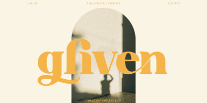 Gliven is a Modern Serif with various alternates and ligatures, an updated blend of bohemian style. An Original typeface that suitable for any graphic designs such as branding materials, t-shirt, print, business cards, logo, poster, t-shirt, photography, quotes .etc This font support for some multilingual. Handcrafted Script that contains uppercase A-Z and lowercase a-z, alternate character, numbers 0-9, and some punctuation. If you need help, just write me! Thanks so much for checking out my shop!
 - Chalfont Roman by Alan Meeks,
$45.00 Some years ago I designed Chalfont as a sans face. All the characters have a top heavy look when viewed straight on, however, as most type is read at an angle with the top further away than the bottom, this top heavy look is diminished. Chalfont Roman, although re-drawn with some alterations, is still basically the same face but with a top left serif giving more emphasis to the top heavy characteristics. I have also added a set of non ranging numerals.
 - Fox Grotesque by TipografiaRamis,
$29.00 Fox Grotesque is another member of the Fox Family and stylistically finds itself between Fox TRF (with some extreme curly lowercase letters), and Fox Sans (a cold geometric sans-serif). While the typeface is intended for use in display sizes, it is also quite legible in text and is well suited for editorials. Fox Grotesque is released in OpenType format with extended support for most Latin languages and includes some opentype features – proportional/tabular, lining/oldstyle figures, slashed zero, ligatures, fractions.
 - Aesthetic by Figuree Studio,
$12.00 Aesthetic Typeface is a handmade vintage lettering, which is combining modern and classic typography with some awesome features. Aesthetic Features - Uppercase - Lowercase - Numerals & Punctuations - Accents (Multilingual characters) OpenType features -Ligatures - Stylistic Alternates - ss01 - ss02 - ss03 - swosh There are more than 310 glyphs in the font including Stylistic Alternates, Ligatures, Stylistic sets etc. OpenType features with Stylistic Alternates, Contextual Alternate in some characters that allow making an awesome vintage look. this is suit for: labeling, logo, classic shop, coffee shop, movie title, etc
 - Broca by Flawlessandco,
$9.00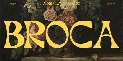 Broca is a Modern Retrotype with various connected letters, an updated blend of bohemian style. An Original typeface that suitable for any graphic designs such as branding materials, t-shirt, print, business cards, logo, poster, t-shirt, photography, quotes .etc This font support for some multilingual. Display Typeface that contains uppercase A-Z and lowercase a-z, alternate character, numbers 0-9, and some punctuation. If you need help, just write me! Thanks so much for checking out my shop!
 - Kattys by Flawlessandco,
$9.00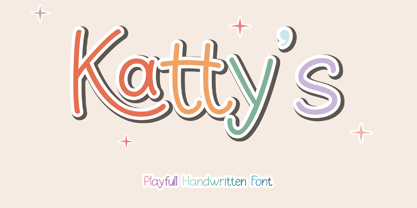 Introducing "Kattys" - a delightful and playful handwritten font that adds a touch of whimsy to any project. An Original typeface that suitable for any graphic designs such as branding materials, t-shirt, print, business cards, logo, poster, t-shirt, photography, quotes .etc This font support for some multilingual. Modern Sweet Retro that contains uppercase A-Z and lowercase a-z, alternate character, numbers 0-9, and some punctuation. If you need help, just write me! Thanks so much for checking out my shop!
 - Moenstram by Flawlessandco,
$9.00 Moenstram is an authentic and unique blackletter font that made with bold and striking style. An Original typeface that suitable for any graphic designs such as branding materials, t-shirt, print, business cards, logo, poster, t-shirt, photography, quotes .etc This font support for some multilingual. Modern Sweet Retro that contains uppercase A-Z and lowercase a-z, alternate character, numbers 0-9, and some punctuation. If you need help, just write me! Thanks so much for checking out my shop!
 - Rosyid by Flawlessandco,
$9.00 Rosyid is a beautifully crafted Ramadan Arabic font style that is perfect for your creative projects. An Original typeface that suitable for any graphic designs such as branding materials, t-shirt, print, business cards, logo, poster, t-shirt, photography, quotes .etc This font support for some multilingual. Modern Sweet Retro that contains uppercase A-Z and lowercase a-z, alternate character, numbers 0-9, and some punctuation. If you need help, just write me! Thanks so much for checking out my shop!
 - ZionTrain by AndrijType,
$33.00 Originally ZionTrain was built as a Cyrillic typeface for public transport navigation system. We wanted comprehensible, distinctive letterforms, that can help everybody on the way from Babylon to Zion. Here, on MyFonts, we present the ZionTrain STD versions with western latin including smallcaps and oldstyle figures in some faces in TrueType format; also western, central, baltic and turkish latin charsets, smallcaps, oldstyle numerals, few alternates, some arrows and fractions in ZionTrain OT OpenType format. Look how people use it: http://use.type.org.ua/tagged/ziontrain
 - PiS Wanderlust by PiS,
$36.00 PiS Wanderlust is inspired by specimens from the book „Die Schriften des Malers“ from 1950 and by vintage hand painted signposts and guides found on hikes in the outskirts of Vienna and rural Austria, hence the name Wanderlust! Although classic, constructed modernist it features some charmingly unfashionable quirks and is available in rounded for a smooth and warm feel. Lace up those hiking boots, don't forget to pack some Landjäger and cool drinks and enjoy the view from above the treeline!
 - BD Roylac by Typedifferent,
$30.00 The BD Roylac typeface has its roots in some lowercase glyphs drawn by Jacques Loison in 1972. Some of these characters are included in the use of stylistic alternates. Filed under a retro-futuristic design the font separates two filled shapes by a thin and curvy line; sometimes following to the path leaning readability and sometimes interfere with it. The font is dedicated to the BD fanboy Monsieur «Eric de Broche des Combes» aka «Roy La Combe» to his fiftieth anniversary.
