10,000 search results
(0.02 seconds)
- Nimbo TTW by Talavera,
$10.00 This is a playful collection of 135 diagrams based on letterforms from different styles. You can use this symbols as bullets, ornaments, but also to make your own mandala-like exercises and release some stress out! Nimbo, by the way, is the word for "halo" in spanish.
 - Pine Nuts United by Jonahfonts,
$35.00 Pine Nuts-United is the little sister of the popular "Pine Nuts" and "Pony Tale" family fonts. It's a connected (United) version with some new ligatures, stylistic alternates and alternate glyphs, small-caps are also included. See the 'Pine Nuts', 'Pony Tale' and 'Pony Tale Pro' versions.
 - P22 BlancoNeg by IHOF,
$24.95 BlancoNeg was inspired by the lettering of Saul Bass with some thoughts of Op-Art. Each character relies on the positive and negative spaces of its neighboring letters to help define its own shape. This font is casual with the look of cut out paper forms.
 - Trailer Park Numerals by Coniglio Type,
$9.95Trailerpark numbers 0-9 were rather old fashioned 1950's cut aluminum numbers, you've seen digitized nowhere else but here! Part of Market LTD, a collection of limited faces, mostly alpha-numeric and some just plain numeric, used primarily in retail and display situations and titling. - Bataler by Eldertype Studio,
$13.00 Introducing Bataler Vintage Font with elegent and professional style, perfect for adding some romance and charm to your designs. This script functions most strongly as a display or headline font. suitable for logo, logotype, branding,wedding, fashion, label, book cover, t-shirt, instagram post, and other
 - Alaska by Solotype,
$19.95This interesting type was introduced by the Chicago firm of Marder, Luse & Company in 1890, about the time designers were beginning to lose some of the excessive ruffles and flourishes that characterized the Victorian age. Originally a caps-only font, we have added a lowercase to match. - Geotype by Say Studio,
$10.00 Geotype is typeface inspired by circle shapes simple but significant, and defined by its crisp edges and modern touches. It is designed for optimal legibility. An lowercase is unique with some alternates, Geotyface makes a statement without making a scene. Three weights, four very different personalities.
 - Wondar Quason by Maulana Creative,
$22.00 Introducing Wondar Quason Classic Serif Typeface. Wondar Quason Classic Serif Typeface is a handmade Modern Victorian handlettering, which is combining modern and classic typography with some awesome alternates. Yes we back to early 1800s, bring classic touch on this decade. Thanks for use this font. MaulanaCreative.
 - Linger On by Gustav & Brun,
$16.00 Linger On is a handwritten fairly rough brush script. It’s equipped with some Open Type features and an extra set of the most common used letters. It also includes lines and endings for you to have more fun with and make Linger On even more unique.
 - Expreso by JVB Fonts,
$19.00 EXPRESO was inspired by the extinct art and craft of urban Lettering applied to buses and other kind of cars for public service of transportation. Since the mid of last century, main cities of Colombia - as Bogotá, Medellín and others - were growing in population and brought urban area expansion with it and serious traffic problems due to the lack of political will and urban planning. The problem of urban transport in Colombia's largest cities has not yet been resolved, despite adopting some examples of mass transit system in other cities in the region. Before these actions, public transport in cities such as Bogotá was quite varied, leaving space for popular culture that survived for a couple of decades, until the massive dieback of these old buses early this decade, either by practices associated with Lettering it was displaced by some technological, some expressions of art street and city that evolved or disappeared. EXPRESO can be used mainly in titles and display texts. You have a multitude of options using combination of layers from the basics of the font family to the various textures and shades. Supports East Europe languages.
 - Krizi Amo Pro by CheapProFonts,
$10.00 Inspired by the lettering on a perfume, Halmos extrapolated a complete uppercase alphabet, and he also created a matching lowercase. Now the character set has been expanded completely, and this stylish Art Deco font is ready to create some headlines, new logos and wordmarks in many more languages. ALL fonts from CheapProFonts have very extensive language support: They contain some unusual diacritic letters (some of which are contained in the Latin Extended-B Unicode block) supporting: Cornish, Filipino (Tagalog), Guarani, Luxembourgian, Malagasy, Romanian, Ulithian and Welsh. They also contain all glyphs in the Latin Extended-A Unicode block (which among others cover the Central European and Baltic areas) supporting: Afrikaans, Belarusian (Lacinka), Bosnian, Catalan, Chichewa, Croatian, Czech, Dutch, Esperanto, Greenlandic, Hungarian, Kashubian, Kurdish (Kurmanji), Latvian, Lithuanian, Maltese, Maori, Polish, Saami (Inari), Saami (North), Serbian (latin), Slovak(ian), Slovene, Sorbian (Lower), Sorbian (Upper), Turkish and Turkmen. And they of course contain all the usual "western" glyphs supporting: Albanian, Basque, Breton, Chamorro, Danish, Estonian, Faroese, Finnish, French, Frisian, Galican, German, Icelandic, Indonesian, Irish (Gaelic), Italian, Northern Sotho, Norwegian, Occitan, Portuguese, Rhaeto-Romance, Sami (Lule), Sami (South), Scots (Gaelic), Spanish, Swedish, Tswana, Walloon and Yapese.
 - Inked God Pro by CheapProFonts,
$10.00 This font has that grungy, gritty look, and combines it with some elegant swirls. Weird and wonderful. I have added swirls and decorations to ALL the uppercase letters that did not have them, so there are now wider possibilities to add interesting decorations to your composition. In addition to the expanded language support, of course. ALL fonts from CheapProFonts have very extensive language support: They contain some unusual diacritic letters (some of which are contained in the Latin Extended-B Unicode block) supporting: Cornish, Filipino (Tagalog), Guarani, Luxembourgian, Malagasy, Romanian, Ulithian and Welsh. They also contain all glyphs in the Latin Extended-A Unicode block (which among others cover the Central European and Baltic areas) supporting: Afrikaans, Belarusian (Lacinka), Bosnian, Catalan, Chichewa, Croatian, Czech, Dutch, Esperanto, Greenlandic, Hungarian, Kashubian, Kurdish (Kurmanji), Latvian, Lithuanian, Maltese, Maori, Polish, Saami (Inari), Saami (North), Serbian (latin), Slovak(ian), Slovene, Sorbian (Lower), Sorbian (Upper), Turkish and Turkmen. And they of course contain all the usual "western" glyphs supporting: Albanian, Basque, Breton, Chamorro, Danish, Estonian, Faroese, Finnish, French, Frisian, Galican, German, Icelandic, Indonesian, Irish (Gaelic), Italian, Northern Sotho, Norwegian, Occitan, Portuguese, Rhaeto-Romance, Sami (Lule), Sami (South), Scots (Gaelic), Spanish, Swedish, Tswana, Walloon and Yapese.
 - Shelflife by Aah Yes,
$6.95 Shelflife is a display typeface with some extras under the lid. It features all the Standard Open-Type features you'd expect, like Class Kerning and Ligatures, plus some other useful additions and of course accented characters for most European languages and others. In essence it's an easy-to-read headline font with clean lines and a bit of character. There's an outline version that can be layered with the standard version to give the shadow effect seen in the accompanying graphics, simplicity itself to do. There's boxed headlines for SALE, SPECIAL, DISCOUNT (20 in total) all ready-made, plus some which can be tilted at an angle, and done automatically - just easily typed in; easy-to-do bullet numbers; a choice of square or rounded dots on j,ffi, and so on in Stylistic Alternatives; and shorter alternatives for U and N with accents. Details are included in the zip files. The zip file will contain both the OTF and TTF versions of the font. Install only one version, either the OTF or TTF, but not both - otherwise you will get all sorts of incompatibility issues and problems.
 - Petale by LomoHiber,
$15.00 Petale is my new elegant experimental typeface I'd love to present. At the beginning, I was intended to create a bold wide font, I started sketching options and came out with the letter 'M' design first. I thought it may be interesting and had continued developing the style with letters N, O, etc., spending hours on some letters to match the design and my vision. I liked how it looked (especially digits) and added different weighs. And it came out pretty stylish. You may like it to use in magazine designs, posters, websites, packaging, branding, logo, and so on. Petale can grant your work some graceful modern touch with a brutalist-feminine note. Works well with elegant and strict serif fonts. Also try to experiment with script fonts. I used my Stormy Youth font: https://www.myfonts.com/fonts/lomohiber/stormy-youth and Bodoni 72 Smallcaps If you have some issues or questions, please let me know: lhfonts@gmail.com Hope you'll enjoy using Petale! Language support: Afrikaans, Albanian, Bulgarian, Catalan, Croatian, Czech, Danish, Dutch, English, Estonian, Finnish, French, German, Hungarian, Icelandic, Italian, Latvian, Lithuanian, Maltese, Norwegian, Polish, Portuguese, Romanian, Russian (Русский), Slovak, Slovenian, Spanisch, Swedish, Turkish, Ukrainian (Украинский), Zulu
 - Tescellations by Ingrimayne Type,
$9.95 Though there are many thousands of digital typefaces available, none seem to be made exclusively of letters that tessellate, a complete tessellating alphabet. This void is now filled with not one typeface, but a group of typefaces, the Tescellations kinship group. Even though I am aware of only one use for this typeface--writing about tessellations--that does not mean there are not hundreds or perhaps thousands of other uses. These typefaces are a byproduct of two maze books I designed, Puzzling Typography and Puzzling Typography A Sequel. I found the challenge of making mazes from tessellations, including letter tessellations, intriguing and these typefaces are a byproduct that endeavor. There are seven members of this typeface kinship group. I tried to select the the glyphs that fit together best to form Tescellations; it is the most readable of the lot. The reason for an Italics version is that I needed one for the maze project. In constructing it, I tried to include as many different lower-case glyphs as I could rather than just skew the regular version. A purist might insist that the tessellation deal with the counters. My approach was to worry only about the exterior of any letter that has an interior, but for anyone who who might object to the counters, versions with filled counters are included. What did not fit into Tescellations was dumped into Tescellations Two, which is somewhat of a ransom-note type of face. It comes in two styles, a regular version and a version in which the counters are removed. TescellationPatterns shows how many of the characters in these typefaces tessellate. It has over 100 tessellation patterns, each on only one character. Simply type several lines with any character and make sure the leading is the same as the font size, and you have an instant tessellation pattern of a letter.
 - Winter Glows by Fargun Studio,
$14.00 Thanks for checking out Winter Glows! A fabulously fun yet elegant script font with tons of energy, allowing you to create beautiful hand-made typography in an instant. With extra bouncy curves & loops, Winter Glows is guaranteed to make your text stand out - perfect for logos, printed quotes, invitations, cards, product packaging, headers and whatever your imagination holds. What's really awesome is that Winter Glows comes with a complete set of lowercase alternates, which allows you to create even more authentic custom-feel text. Another great feature is the bonus ornaments font, which allows you to add some really unique and elegant finishing touches to your script text. Winter Glows Family includes 5 font files; Winter Glows • A handwritten script font containing upper & lowercase characters, numerals and a large range of punctuation. Winter Glows Alt 1 • This is a second version Winter Glows, with a completely new set of both lower and uppercase characters. this versions do not contain as many glyphs as the Regular style. If you wanted to avoid letters looking the same each time to recreate a custom-made style, or try a different word shape, simply switch to this font for an additional layout option. Winter Glows Alt 2 • This is a second version Winter Glows, with a completely new set of both lower and uppercase characters. this versions do not contain as many glyphs as the Regular style. If you wanted to avoid letters looking the same each time to recreate a custom-made style, or try a different word shape, simply switch to this font for an additional layout option. Winter Glows Alt 3 • This is a second version Winter Glows, with a completely new set of both lower and uppercase characters. this versions do not contain as many glyphs as the Regular style. If you wanted to avoid letters looking the same each time to recreate a custom-made style, or try a different word shape, simply switch to this font for an additional layout option. Winter Glows Extras • A set of hand-drawn swashes & doodles, the perfect finishing touch to underline your Winter Glows text & doodles for perfect lettering logos. Simply install this as a separate font, select it from your font menu and type any A-Z, a-z & 0-9 character to create a swash & Doodles. Standard Ligatures • Are also available for several lowercase characters (double-letters which flow more naturally). Ligatures will automatically replace the standard letter pairs whenever available, when using any OpenType capable software.
 - Eleckatrical Banana JNL by Jeff Levine,
$29.00 From the same page of a vintage German lettering textbook entitled “50 Alphabete fur Technikur und Fachschulen” (loosely translated to “50 Alphabets for Technicians and Specialized Schools”) that inspired Trippy Hippy JNL comes Eleckatrical Banana JNL. It’s another novelty, free form Art Nouveau hand lettered alphabet that works well in recreating 1920s period pieces or for designing a retro-inspired rock and roll concert poster reminiscent of the 1960s. The name of the typeface is from a line in the 1966 pop hit “Mellow Yellow by Donovan (Leitch), and his extended pronunciation of ‘electrical’: “…E-lec-a-tric-cal’ banana is going to be the very next craze…” Caps only Fonts. Eleckatrical Banana JNL is available in both regular and oblique versions.
 - Mouser by Sharkshock,
$100.00 Mouser has been an ongoing project that originated as a geometric sans of the same name before morphing into a similar, but entirely different family called TypoGraphica. It retains much of its earlier character such as limited contrast, high legibility, and tight spacing. Major changes were made for a simplistic, more cohesive look. This was done to maximize its usefulness for body text while keeping characteristics used for display purposes. Slices to top strokes are much more subtle with styling dialed down to a minimum. This family comes in 6 different versions to meet a variety of needs. Mouser is equipped with Basic and Extended Latin/diacritics, Cyrillic, kerning, ligatures, and fractions. Try it for website text, applications, or headlines.
 - Apocalypso by Barnbrook Fonts,
$30.00 Apocalypso is a pictogram font for the end of the world. The name Apocalypso is a portmanteau of the words apocalypse (end of the world) and calypso (joyful improvised music), with a meaning analogous to the idiom ‘fiddling while Rome burns’. The Apocalypso family is more of an art project than a practical font and contains a series of crosses and pictograms. The crosses add decorative detailing to typographic layouts, whilst the pictograms can be deployed to express the forthcoming apocalypse. Apocalypso was originally published in 1997, a few years before the turn of the millennium. It is both a document of the ideas of the time and a scarily prophetic vision of a possible world that has now largely come to pass.
 - Alterhard by Popskraft,
$19.00 The Alterhard typeface combines the inimitable craftsmanship of the great condensed styles of the early twentieth century and at the same time looks organic and even unusual among modern ones. A distinctive feature of the Alterhard typeface is the smooth transition from the geometrically strict extremely compressed shapes of the bold typefaces to the classic sparse shape of the compressed typeface in light weights. Also unusual for vertical fonts are oblique elements in lowercase letters, which give uniqueness, liveliness and originality to the classic type of font. This allows the Alterhard typeface to be used in any design field such as corporate identity, typography, posters, web design, and other design areas. The set comes in 9 font sizes for rich typography.
 - Equipage by Kitchen Table Type Foundry,
$16.00 Équipage is a French word meaning ‘crew’. It is used for the crew on boats, airplanes, but it also applies to horse-drawn carriages and all that goes with it. Originally the word means ‘to fit out’ and it is probably derived from the Norse word ‘skipa’, which means ‘arrange, fit out a ship’. Then, if you’re really interested, the word ‘ship’ hails from this same word, just like the Danish ‘skib’, Middle Dutch ‘ship’, Dutch ‘schip’ and German ‘Schiff’. See? You learn something every day! Équipage is a really nice, handmade serif font. It is quite elegant and would look fantastic on labels, postcards and book covers. Comes with extensive language support and a set of alternates for the lower case glyphs.
 - Isle Body by Mans Greback,
$19.00 Isle Body is a high-quality serif typeface family, drawn by Måns Grebäck during 2018 and 2019. It is a sweet font with a casual and calm look, with generous spacing and an even weight, adapted for body texts and small sized type settings. It comes in four weights, each one as italic, totaling in eight styles: Light and Light Italic, Medium and Medium Italic, Bold and Bold Italic, Black and Black Italic. The font family can be used in a combination with a font of a different style, or together with its sister font Isle Headline, also a serif font, which has the same basic structure but more distinct weights and a sharper look. Each style contains ligatures and support for a wide range of languages.
 - Aloha Script by Borges Lettering,
$49.95 Aloha! Veteran Sign Painter Pierre Tardif and Lettering Artist Charles Borges de Oliveria have teamed up to bring you these fun to use brush fonts. Aloha Script comes in two flavors: Aloha Script and Aloha Script Casual. Both fonts contain the same lowercase, alternates, and ligatures – the difference is in the capitals. By mixing both fonts you can create a variety of unique logos. Aloha Scripts Casual can be set in all caps for greater emphasis on captions. Both fonts contains over 100 alternate characters, as well as an assortment of ligatures, swashes and underlines. With over a year and a half in development, Aloha is bound to please. Great for logo design, signs, posters, culinary food packaging and so much more. Aloha!
 - Boboli by Stefano Tonti,
$35.00 The Boboli garden in Florence (16th century) is one of the first examples of Italian renaissance garden, where nature was shaped into geometric beauty; the Boboli font was designed in the same spirit, filtered by a Modernist view. It comes in two sets, Autumn/Winter and Spring/Summer: by mixing them you can compose the typographic season of your choice. From the geometric, minimal Fall/Winter set stem the leaves of the baroque-esque Spring/Summer set, with many stylistic alternatives that allow perfect matching. The two opposite styles merge perfectly, because the leaves are not mere decorations but organic part of the structure, achieved by sampling the curves of the basic glyphs. With Boboli design meets nature, Bauhaus goes greenhouse.
 - Blazing Furnace by Kitchen Table Type Foundry,
$16.00 At home we have a wood stove. Last year, I bought a whole bunch of tree trunks, which I cut up with a chainsaw and then chopped with my Swedish axe. In Holland we have a saying that firewood keeps you warm three times: when you cut the tree, when you chop the wood and when you burn it in the stove. Our stove is rather small, so it is not exactly a blazing furnace, but I liked the name because it seems to fit this font. Blazing Furnace was made with ink and a brush. It is a bit messy and rough, but it comes with multilingual support and a nice set of alternates for the lower case letters.
 - Agilo Handwriting Pro by SoftMaker,
$15.99 Digitized handwriting fonts are a perfect way to give documents the “very special touch”. Invitations look simply better when handwritten than when printed in bland Arial or Times New Roman. Short handwritten notes look authentic and appealing. There are numerous occasions where handwritten text makes a better impression. Agilo Handwriting Pro is an upright, medium weight handwriting font with a simplified, slightly sloped print (non-connecting) style that mimics true handwriting closely. Use Agilo Handwriting Pro to create stunningly beautiful designs easily. This typeface comes with many pre-made ligatures and alternative characters for sophisticated typography – all easily accessible as OpenType features. A “random” feature even allows for automated random switching between variations of the same character, resulting in type that looks authentically handwritten.
 - Surfbird by Vintage Voyage Design Supply,
$15.00 Summer vibes are here with Surfbird! • A playful Display family with large variety options. Four styles comes with seven widths & two graphic fonts. The point of this family is getting more modern moods into a classical cowboy-western typographic. The result is a playful western slab which can be used for any design project. Home decor / mugs / t-shirts / stickers / music or podcast covers / menu's / logo's / posters. It can be playful with "western cut" and smooth styles or more serious with the sharp styles. • The Surfbird has two graphic styles. 82 decor graphic elements to add more fancy style to your design. The first one is a contour and the second is a fill for them, to get full color elements.
 - Nidex by Aah Yes,
$10.50Nidex is a caps-only industrial distressed font, ideal for titles, display and headlines, rough and ready, and coming with all the usual accented characters and an extensive set of punctuation. The misprinted effect is central to the font’s design and is built-in, simplifying the work for posters and flyers, and the example above is made with Regular and Condensed. Upper and Lower Case present 2 different sets of characters, and just a few letters are distinguishably more misprinted. Also there’s a full set of ligatures to make double-letter combinations print two different letters rather than the same one twice, from upper case A to lower case z. The zips contain both OTF and TTF versions - install either OTF or TTF, not both. - Isle Headline by Mans Greback,
$19.00 Isle Headline is a high-quality serif typeface family, drawn by Måns Grebäck during 2018 and 2019. It is a sharp font with a clear and attentive look, adapted for headlines, titles and large type settings. It comes in four weights, each one as italic, totaling in eight styles: Light and Light Italic, Medium and Medium Italic, Bold and Bold Italic, Black and Black Italic. The font family can be used in a combination with a font of a different style, or together with its sister font Isle Body, also a serif font, which has the same basic structure but with a softer look and adapted for body text and smaller type. Each style contains ligatures and support for a wide range of languages.
 - Dulcinea by Re-Type,
$79.00 Dulcinea is the title of Ramiro Espinoza’s in-depth look at Spanish Baroque calligraphy’s most extreme tendencies, and especially at some of those produced by the writing masters Pedro Díaz Morante and Juan Claudio Aznar de Polanco. These 17th and 18th centuries alphabets with their plentiful calligraphic flourishes represented a marked break with the harmonic and angular Renaissance Cancellaresca style. It was Morante who first introduced and popularized the use of the pointed quill in Spain, and although his famous text entitled “Arte Nueva de escribir” – first volume published in 1616 – contains alphabets that have much in common with traditional broad nib Cancellaresca calligraphy, most of the examples therein are outgrowths of the new models put forward by the Italian master Gianfrancesco Cresci. The writing’s swashes are complex and intricate, but at the same time they feature a profusion of defects. Many of them sometimes come close to ugliness. However, these pages contain an artistic essence that bears a relationship to the ironic and sometimes somber character of Spanish Baroque. That’s why the name of the font pays homage to “Dulcinea del Toboso”, the fictional beauty from Miguel de Cervantes’s ‘Don Quixote’, a work that reveals many of the period’s conflicts, such as the contrast between utopian ideals and reality, uncertainty and madness. But Dulcinea is far from being just a revival. Its forms are not careful tracings of the outlines of Morante and Polanco’s letters, nor are they attempts to reproduce them digitally. In fact, the author of the letters says that had the font been created that way it would have been too archaic to serve as acceptable contemporary typography. However, he believes that there are myriad interesting details that can be rescued and preserved, along with the playful spirit of the original. The work of designing Dulcinea consisted of combining original historical elements with the creativity and calligraphy of the font’s author in order to produce a modern typography that isn’t based on the same traditional sources as many recently created scripts fonts. Dulcinea offers attractive options for the setting of texts and headlines: abundant ligatures and swashes along with intricate alternate characters. It sophisticated forms make it an ideal option for women’s magazines, recipe books, lingerie products or perfume packaging.
 - Arrevederci JNL by Jeff Levine,
$29.00 The 1954 sheet music for the song "Arrevederci Roma (Goodbye to Rome)" [from the MGM film "The Seven Hills of Rome"] was hand lettered in a medium-wide sans serif. This design is now available digitally as Arrevederci JNL in both regular and oblique versions.
 - Raimoo by Tama Putra,
$12.00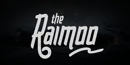 Raimoo is a handwritten typeface. It is suitable for any design needs, branding, cover title, t-shirts, posters and more. The Raimoo typeface includes multi-lingual and currency support, numerals, and punctuations. It comes comes with standard ligatures, stylistic alternates and 3 stylistic sets.
 - Montague Script by Stephen Rapp,
$59.00 Montague Script takes its name from a small hilltown of western Massachusetts rich in culture and history. I lived in this beloved community for a number of years and it’s where I first began my study of calligraphy and lettering. While most brush scripts take their cue from mid-twentieth century samples, Montague Script is a fresh, contemporary alternative. It comes directly from lettering written with a #3 sable brush on smooth vellum and is digitized with the same sensibility a lettering artist writes with. Montague reflects a dynamic interplay between form and rhythm not usually associated with type. Words suggest a baseline, yet are not bound by it. Beginnings, endings, alternates and ligatures come in as needed while you type. Many more alternates are available in the glyph palette of most current graphic software. Exuberant swash versions of upper and lowercase letters, as well as ligatures can be accessed through both the type and glyph palettes. Montague Script is a natural for advertising, point of purchase displays, packaging and logo design, cards, invitations, journals and much more. You will be delighted at how well it can dress up a project and how easily it sets.
 - Alright, picture this: Budmo Jiggler is like the life of a design party, a font that truly knows how to have a good time. Crafted by the talented Ray Larabie, a name synonymous with typeface innovati...
- Negro by Storm Type Foundry,
$32.00 Dark, spicy & distinctive display typefaces from the nineteenth century I had in mind when creating this font family. Extreme contrasts and sharp endings may remotely remind some blackletters, especially in narrowed styles. The range of interpolated widths is useful for designing a provoking poster, magazine, music or book cover.
 - Eilis by Agnieszka Ewa Olszewska,
$25.00 Another modern, fun, and experimental display font in my library. Looks like made with a strong gesture. A bit constructive with cursive elements. Contains 2 uppercase sets, and some extra characters. You can play with them and mix them at your will. Contains European languages diacritics and punctuation signs.
 - Rapazola by César Modesto,
$29.95 Rapazola is a new geometrical typeface, it was inspired by the moments of childhood and it's play. This typeface contains five different weights, Extra Light, Light, Regular, Bold and Extra Bold, all with the completed alphabet A to Z, upper and lower case, all numbers and some symbols.
 - Evening Initials JNL by Jeff Levine,
$29.00 Evening Initials JNL are based on a few random examples of some unusual Art Deco initials found within the pages of an old Dover clip art book. A complete set of letters was redrawn from scratch and are offered for your creative endeavors as a digital type font.
 - Showpiece JNL by Jeff Levine,
$29.00 Showpiece JNL was redrawn from the hand lettering for the name and address of a music publisher found on some 1930s-era sheet music. The lettering style has features influenced a bit by both the end of the Art Nouveau period and the beginning of the Art Deco movement.
 - Decano by Rex Face,
$19.99 Decano is a modern sans serif, ALL-CAPS, display font. Using a ten-sided polygon, or decagon for the usually circular characters and employing similar angles for the rest of the character set gives us some strong and interesting word forms. It’s great for branding, headlines, and signage.