10,000 search results
(0.023 seconds)
- Sho by Linotype,
$29.99Karl Georg Hoefer’s Sho first appeared in 1992 with Linotype-Hell. The font is a part of the package Calligraphy for Print, which also contains Ruling Script and Wiesbaden Swing. Calligraphy for Print 2 completes the set. These packages offer modern calligraphy fonts particularly well-suited to use in posters, magazines and advertisements. Sho distinguishes itself in the extreme contrast between the strokes. A unique characteristic of the font is the way it uses simple round forms in some of its letters, giving it a peppy and playful feel. - Classike by Emtype Foundry,
$69.00 Classike is a high contrast squarish display typeface. Inspired by the Art Déco period from a modern perspective. Refined and elegant yet with a mechanical vibe, it is ideal for pairing with any functional font, it works especially well with Geogrotesque, from which it inherited its proportions and soul. Classike adds an exclusive touch and helps enrich your graphic voice. A Variable Font version is included with the family or as a separate style. Read some thoughts about the design process at the Emtype's blog. For more details see the PDF.
 - F2F Al Retto by Linotype,
$29.99The Techno sound of the 1990s, a personal computer, a font creation software and some inspiration had been the sources to the F2F (Face2Face) font series. Alessio Leonardi and his friends had the demand to create new unusual faces that should be used in the leading german techno magazine "Frontpage". Even typeset in 6 point to nearly unreadability it was a pleasure for the kids to read and decrypt the messages. About Al Retto: "Al" means "Alessio Leonardi" and Retto "straight", but if you read it as an italian world means "in the a**". - Donna Bodoni by Wiescher Design,
$39.50 DonnaBodoni was inspired by David Farey. He once wrote, somebody should honor the widow of Giambattista Bodoni the brave Signora Paola Margherita Dall 'Aglio for her effort to have the Manuale tipografico di Giambattista Bodoni published after his death. Since I have redesigned a good deal of Bodoni’s work and added some of my own, I thought it was my duty to do at least this for Bodoni’s unknown widow. Here is my 3-cut script in her honor. The design is remotely based on Bodoni’s English-Initials. Your honorable Gert Wiescher
 - Supaduper PB by Pink Broccoli,
$16.00 Supaduper PB is a font inspired by some wonderfully funky hand-lettered greeting cards from the 1980's. The delightfully awkward and animated playfulness of this lettering style was maintained throughout the fleshing out from the original specimens - and I think you're going to have a lot of fun typing with this. Even if you haven't seen these old greeting cards, the lettering style has a familiar visual to it. Bring back a little nostalgia, add a little wonkiness, or just have fun typing with Supaduper PB today!
 - 1634 René Descartes by GLC,
$38.00 This font was inspired by the well-known philosopher René Descartes' hand writing. In 1634, from Amsterdam, he wrote a famous letter to his friend Mersenne, a great scientist monk, in which he spoke about Gallileus works. The greatest part of our glyphs is based on this document. We have added some letters Descartes himself didn't use, like modern s and j (he used exclusively s long and i instead of j). A lot of ligatures and alternates are enriching the font, giving a better appearance of real handwriting.
 - Biscayne by JVB Fonts,
$39.00 Biscayne is inspired by the old and classic Art Deco art and architecture found in some building ads from the 1930's in the Art Deco District of Miami. The name of the font family is one of the most emblematic and representative places in Miami City. Biscayne can be used mainly in titles, display and short texts. This typeface family supports East Europe languages. It also includes standard and discretionary ligatures, alternative style of uppercase, fractions, numerators and denominators, end and/or terminal forms and other OpenType features.
 - Leksa Sans by Alexandra Korolkova,
$50.00Leksa Sans is a humanist sans-serif face with some contrast. The family consists of 14 faces (upright & true italic in seven weights from Extralight to Black). Designed as a sans-serif companion for Leksa, Leksa Sans works perfectly either with it or alone. It is suitable both for text setting and for short inscriptions. One of the main features of the typeface is its professionally-designed Cyrillic which (together with serif companion Leksa) was awarded for excellence in type design at Modern Cyrillic competition in Superfamilies category. - Brown Fox by Wilton Foundry,
$29.00BrownFox was created because I saw a need for a condensed, loose handwriting - I used my trusty nylon marker to create this font - it is rough, yet thin and elegant. BrownFox has a few surprises like some serious ascenders and descenders with an exaggerated x-height. Caps are intentionally simple to maintain an even rhythm. BrownFox works very well in caps, upper-lowercase, lowercase only, small and large. This font will be useful in many applications from invitations through CD album covers. The name was inspired by the other ipsum lorem.:-) - Epic Story by Olivetype,
$18.00 Introducing Epic Story, the perfect typeface for your next big project. This fun, playful font is the right choice for creating bold headlines. With its unique character, Epic Story is sure to make a statement. And it's great for logotypes and branding too. So if you're looking to add some personality to your next project, look no further than Epic Story. Epic Story font includes : Standard Latin All Caps Numbers, symbols, and punctuations Multilingual Support. Fully accessible without additional design software Simple Installations Works on PC & Mac Thank You.
 - Bleheri by Gatra Std,
$15.00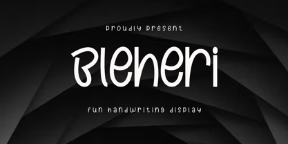 Introducing a cute handwriting "Bleheri" display font If you are needing a touch of casual modern calligraphy for your designs, this font was created for you! What's Included: - Uppercase and Lowercase - Number and Punctuation - Support Language This font works best in a program that supports OpenType features such as Adobe Indesign, Adobe Illustrator CC and CS, or Adobe Photoshop CC and CS also CorelDraw More Questions? Here are some (potential) answers! Do not to resell this font in any way. Multilingual Support is included for Western European Languages Have a Wonderful Day!
 - Klepon by Gatra Std,
$15.00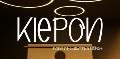 Introducing a cute handwriting "Klepon" display font If you are needing a touch of casual modern calligraphy for your designs, this font was created for you! What's Included: - Uppercase and Lowercase - Number and Punctuation - Support Language This font works best in a program that supports OpenType features such as Adobe Indesign, Adobe Illustrator CC and CS, or Adobe Photoshop CC and CS also CorelDraw More Questions? Here are some (potential) answers! Do not to resell this font in any way. Multilingual Support is included for Western European Languages Have a Wonderful Day, Gatra Std
 - Goldenside by Runsell Type,
$16.00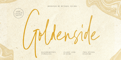 Goldenside is a classy handwriting font with a distinctive curve, inside with some interesting features that are perfect for an authentic-style project . Goldenside is perfectly suited to signature, stationery, logo, typography quotes, magazine or book cover, website header, clothing, branding, packaging design and more. A handwritten script font containing upper and lowercase characters, numerals and a large range of punctuation. This font including alternate glyph. To access the alternate glyphs, you need a program that supports OpenType features such as Adobe Illustrator CS, Adobe Photoshop CC, Adobe Indesign and Corel Draw.
 - Bulbia by Typogama,
$25.00 Bulbia is a single weight, display typeface inspired by the teardrop shape featured in some middle eastern design. With a bold stroke and high contrast, this font conveys a strong, unique voice that can be further enhanced through the use of it’s extensive Opentype features. Through Swash letters, decorative Titling forms or even a range of precomposed word marks, this single weight font expands into a complete design toolkit with multiple applications and possibilities. Bulbia includes an extended Latin character set and is available as an OTF font.
 - FHA Modernized Ideal Classic by Fontry West,
$25.00 Frank H. Atkinson's book Atkinson Sign Painting was published in 1909. For decades, this book served as the manual for sign painters - a handbook for hand lettering. Atkinson’s book described techniques, layouts and several sample alphabets. Modernized Ideal Classic was inspired by one of these demonstration alphabets. Although Classic has its beginnings in art deco, it is very comfortable in any period or style of design. It is most appropriate in headline and display text, poster copy and signs. We've included some nice stylistic alternates and an interesting array of ligatures.
 - Surf And Turf JNL by Jeff Levine,
$29.00 Surf and Turf JNL was redrawn from hand-lettering on a souvenir folder for an event believed to be sponsored by Miami Beach's exclusive Surf Club on March 19, 1938. Entitled "Steeplechase Pier March 19 Surf Club Stroller", it's now lost to time whether the event recreated some of the fun and games of Atlantic City's famed Steeplechase Pier at the Surf Club, or if this was a special event trip to the New Jersey venue. It's also highly possible that the Steeplechase Pier referred to in the title was the one at Coney Island.
 - Hesperides by Scriptorium,
$18.00Hesperides is based on samples of Colonial period calligraphy. Rather than being directly derived from any one sample, some common characteristics have been emphasized to give it a more coherent and distinctive look, with the accentuated single-looped strokes on many of the characters suggesting a fully flourished style, but showing a bit of restraint. The ultimate effect is really striking, in the tradition of our Queensland and Allegheny fonts, but even more distinctive. The full version includes alternate versions of many of the key characters designed to reduce loop interference and add variety. - Limboek by Gatra Std,
$10.00 Introducing a cute handwriting "Limboek" Handwritten Display Font! If you are needing a touch of casual modern display for your designs, this font was created for you! What's Included: Uppercase and Lowercase Number and Punctuation Support Language This font works best in a program that supports OpenType features such as Adobe Indesign, Adobe Illustrator CC and CS, or Adobe Photoshop CC and CS also CorelDraw More Questions? Here are some (potential) answers! Do not to resell this font in any way. Multilingual Support is included for Western European Languages Have a Wonderful Day, Gatra Std
 - Klamp 105 by Talbot Type,
$19.50 Talbot Type Klamp 105 is an elegant and streamlined, geometric sans-serif. A legible text font, its narrow proportions mean it’s economical with space; while at larger sizes it makes a confident, modern display face. Klamp 105 is available in a comprehensive family of seven weights, featuring an extended character set to include old style numerals, as well as accented characters for Central European languages. It is also available with some character variations as Klamp 205, most notably featuring a traditional, double-storey lower case a and g.
 - Frank Flowers by Wiescher Design,
$15.00 Frank Flowers are fonts with flowery embellishments. They are useful for all kinds of celebrations, but they also have lots of impact. There are only uppercase letters even on the lowercase keys. Uppercase and lowercase look different, so you can mix them. You can even mix the two sets, it'll look great. I had a lot of fun doing these fonts and I want you to have some fun as well. That's why I sell them very, very cheap, even cheaper if you buy the pair! -Your typedesigner for unusual solutions Gert Wiescher
 - Rantang by Gatra Std,
$12.00 Introducing a modern&elegant "Rantang" signature script If you are needing a touch of casual elegant signature script for your designs, this font was created for you! What's Included: Uppercase and Lowercase Ligatures Alternates Number and Punctuation Support Language This font works best in a program that supports OpenType features such as Adobe Indesign, Adobe Illustrator CC and CS, or Adobe Photoshop CC and CS also CorelDraw More Questions? Here are some (potential) answers! Do not to resell this font in any way. Multilingual Support is included for Western European Languages
 - PAG Trust by Prop-a-ganda,
$19.99Prop-a-ganda offers retro-flavored fonts inspired by lettering on retro propaganda posters, retro advertising posters, retro packages all the world over. This is perfect font for your retrospective project. Almost all the letters of PAG Trust are drawn by bold line, but some bars are very thin line and counters are extremely small. With this font, regular typed text transformed into unique typography. We can’t decide the impression of PAG Trust, depending on how to use it, it can be cute package, retro book cover or propaganda poster of Cuba. - Straider by Hikhcreative,
$23.00 Specialized for the "speed typeface" and "adrenaline seeker" soul, we got you packed up. A nitro boost for your visual needs. Please welcome, STRAIDER. The racing typeface. Inspired by the mid era of vintage and modern automotive visual branding. We build the bold and strong font with total aim to the speed, cars, vehicles, and automotive vibes. Will be a perfect match for the automotive events, branding, logo, cars and motorcycle posters, advertising, anytime you want some more "speed" in your visual project. FEATURES : Uppercase & Lowercase letters Numbers & Punctuation Ligatures Multilanguage Support Thank you.
 - Mayonaise by Hanoded,
$8.00 Ah, so you've noticed a typo! Mayonnaise - the sauce, is written with double 'n'! I know. This font was named after a Smashing Pumpkins song that I like very much. Mayonaise is a bit of an ugly duckling. It is strange, open and messy, and might not be love at first sight. BUT, when you spend some time with Mayonaise and get to know her, you might actually fall in love. Just like that song I mentioned earlier. Go on then, give it a try! At this price, you can't go wrong!
 - Killarney by Fontdation,
$15.00 Introducing our new font Killarney. A bold and heavy display font that inspired by the vintage/classic letterforms used in old-advertisements. Mouse-crafted with high attention to details; clean lines, sharp edges and tempting curves. Its square and blocky letterforms make Killarney a great for headlines and space killer. Packed with 500+ glyphs, Killarney composed of slanted version, standard upper/lower case characters, numerals, punctuations, some multilingual letters, alternate characters, stylistic sets, ligatures, etc. This font is a must have item for your designing arsenal. Go get yours now while it's hot. :D
 - Charlonka by PleasureFonts,
$22.00 I‘d like to introduce “Charlonka“ to you. When my daughter finished high school, she wanted to get rid of her entire school stuff. So I saved a few sheets of her beautiful handwriting and promised her to create a typeface out of it. That‘s how the idea of Charlonka was born, a typeface family out of Charlotte‘s handwriting (by the way: that‘s her name). Some characters of Charlonka have extended crossbars, like in upper case A or H, and reduced descenders, like in lower case g or y.
 - Klamp 205 by Talbot Type,
$19.50 Talbot Type Klamp 205 is an elegant and streamlined, geometric sans-serif. A legible text font, its narrow proportions mean it’s economical with space; while at larger sizes it makes a confident, modern display face. Klamp 205 is available in a comprehensive family of seven weights, featuring an extended character set to include old style numerals, as well as accented characters for Central European languages. It is also available with some character variations as Klamp 105, most notably featuring a more modern, single-storey lower case a and g.
 - Gazeta by Vanarchiv,
$21.00 This typeface was designed for editorial purposes (text sizes), where the letterforms contain short serifs (more economical). This font family contains different weights (from Extra Light until to Extra Bold) to create an simple and sequential typographic hierarchy scale. There are two different weights and options designed specifically for text sizes (Regular and Text). The design is classical but contain some contemporary details, which are not distractive for reading, it's simple and clean at small sizes. This font family include italics, small caps, ligatures, old style and tabular figures.
 - Sinffonia by Corradine Fonts,
$39.95 Sinffonia is a beautiful ornamental font family. Its thin weight and roman style makes very elegant and ideal for any high quality project. The Open Type version, plenty of ligatures, alternative Characters and ornamental characters, is carefully programmed to replace automatically the glyphs accord to the feature and context so you can modify the aspect of the text easily without any incoherence in the design (i.e. overlaps and collisions). Non Open Type users can try the four plain versions of Sinffonia, which includes some of the beautiful ornamental characters of the OT version.
 - Fino by TypeTogether,
$35.00 Tall, stately, and refined, with a showy contrast between thick and thin, a certain kind of titling Didone has become synonymous with fashion. Ermin Međedović’s latest type system amplifies the most theatrical aspects of this genre while bringing an uncommon flexibility of style and variation to any type palette — particularly those required for editorial design. Fino is a Rational (or Modern) display serif with sharp details. Its fairly Title proportions produce a regular beat of bold stems at frequent intervals. One can add an unexpected twist to this plot line by introducing the alternate ‘C, D, G, O, and Q’ (found in the uppercase); these replace the standard, Title oval shapes with big, full, show-stopping round ones. Other alternate forms, along with a grand ensemble cast of ligatures, lets the director continually flip the script. This stage is set in three acts: Fino, Fino, and Fino Stencil. Each of these offer six weights and italics, and each actor is comfortable speaking any Latin-based language, from standard Hollywood English to the many accents of Eastern Europe. Finally, every style comes in two optical sizes, with Title having the finest hairlines for the biggest parts. This lets you put Fino to work in a variety of productions, from short texts (24pt–48pt settings) to epic titles. The complete Fino family, along with our entire catalogue, has been optimised for today’s varied screen uses. All these talents let Fino perform a range of roles far broader than your typical Bodoni or Didot.
 - BD Megalona by Balibilly Design,
$25.00 The fundamental in creating this typeface is the implementation of our interest in typography over the past year. Inspired by the elegance, consistency, and hard work of Times New Roman pull up our minds to a daunting blank canvas and began to think about what we had to do to take this idea even further. Whatever comes to our mind and when it is poured out, it will certainly remain within the rules of the letterforms. This typeface is created by a careful approach, consisting of 28 fonts 13 weights with matching true italics forms. Feature an extended charset of over 1800 glyphs, covering 219 languages using Latin, Cyrillic (basic to extended), and Greek alphabets. Included advanced open type features like stylistic alternates, terminal form, swash, discretionary ligatures, ordinals, small caps, positional numbers, fractions, and case-sensitive forms. BD Megalona provides a range of choices that will give luxury vibes in symmetrical layouts with selective deviations, and work well in a stylish look for your typographic project. This is a complete package of problem solvers perfectly suited for body text and high-impact headlines. Advance open-type features definitely stunning on logos, branding, magazines, website, etc. BD Megalona is our ego in expression that aims to supply the necessity of design nowadays while still in the corridors of the glory of past traditions as a source of our inspiration. We would like to show you a SHORT FILM about the process of designing BD Megalona Font Family, Click Here!!!
 - Geo Deco by Tipo Pèpel,
$28.00 Geodeco font family brings to you the recovery of the typographic forms from the beginning of the 20th century, with a strong ArtDecó flavour but from a new point of view: modernity and geometry. Modernity in the visual contrast between lowercase and capital letters, where rounded shapes are opposed to the breaks and graphic tensions of the strokes of the capital letters. which gives it an enormous originality. Generous doses of internal whites, assure a powerful legibility even with the spite of its short ascending and descending strokes. What we get is a coherent and martial look where fluidity and homogeneity is the main note. Soft and rounded minuscule, with large internal whites for super legibility, bombproof, especially on screens, where Geodeco lives with an astonishing naturalness. The capital letters, used alone as display, or as companions of the minuscule characters, give the family a touch of originality and exotic flavor. Like the spices in the food; a brief but intense note. Breaking the rectangular shapes so that the appearance of the letter comes out benefits from enlarging the internal whites and making them consistent with the white of the lower case. GeoDeco works very well in plain text with the obvious limitation that it is not a type for small bodies, but exceptionality weldon for plain text and signage. Maximum visibility, total beauty on screens. A family of this new century with the flavour of that epoch of experimentation that were the years 20. Extensive multilanguage support and almost all Opentype functionalities. Try it and it will convince you - for sure!
 - Akoodi by Product Type,
$17.00 Introducing Akoodi, the ultimate superhero font for all your design projects! This bold and stylish serif font features a superhero theme that’s perfect for creating eye-catching titles and headlines for movie posters and graphic design projects. With its strong, prominent serifs and unique character design, Akoodi is a versatile font that can be used for a wide range of projects, from branding and marketing materials to book covers and packaging designs. The font includes a full set of upper and lowercase letters, punctuation, and numerals, making it a complete solution for all your design needs. With its superhero theme and stylish serifs, Akoodi is a font that will make your projects stand out from the crowd. So why wait? Grab your copy of Akoodi today and start creating designs that are as bold and daring as a superhero! Furthermore, Akoodi is equipped with advanced features that make it easy to use and customize. The font comes with a full set of alternate characters, including a range of ligatures and swashes, which add an extra touch of style to your designs. Additionally, the font is fully compatible with a wide range of design software, making it simple to use no matter what your design process looks like. What’s Included : - File font - All glyphs Iso Latin 1 - Ligature, Alternate - We highly recommend using a program that supports OpenType features and Glyphs panels like many Adobe apps and Corel Draw, so you can see and access all Glyph variations. - PUA Encoded Characters – Fully accessible without additional design software. - Fonts include Multilingual support
 - Fino Sans by TypeTogether,
$35.00 Tall, stately, and refined, with a showy contrast between thick and thin, a certain kind of titling Didone has become synonymous with fashion. Ermin Međedović’s latest type system amplifies the most theatrical aspects of this genre while bringing an uncommon flexibility of style and variation to any type palette — particularly those required for editorial design. Fino Sans is a Rational (or Modern) display serif with sharp details. Its fairly Title proportions produce a regular beat of bold stems at frequent intervals. One can add an unexpected twist to this plot line by introducing the alternate ‘C, D, G, O, and Q’ (found in the uppercase); these replace the standard, Title oval shapes with big, full, show-stopping round ones. Other alternate forms, along with a grand ensemble cast of ligatures, lets the director continually flip the script. This stage is set in three acts: Fino Sans, Fino Sans, and Fino Sans Stencil. Each of these offer six weights and italics, and each actor is comfortable speaking any Latin-based language, from standard Hollywood English to the many accents of Eastern Europe. Finally, every style comes in two optical sizes, with Title having the finest hairlines for the biggest parts. This lets you put Fino Sans to work in a variety of productions, from short texts (24pt–48pt settings) to epic titles. The complete Fino Sans family, along with our entire catalogue, has been optimised for today’s varied screen uses. All these talents let Fino Sans perform a range of roles far broader than your typical Bodoni or Didot.
 - Sherbrooke by Eyad Al-Samman,
$- Sherbrooke is a simple and sans serif font. I have chosen the name of this typeface after the "Sherbrooke" Street in Montreal, Canada, that I daily walked in for several months in the late 2005 while I was studying in Montreal, Quebec, Canada. I do adore this street and also I adore the whole city of Montreal. This font comes in two different weights. "Sherbrooke" can be used in wide fields of publications such as the titles of novels, literary texts, short stories, dictionaries, books, newspapers, websites, and magazines. It is suitable for T-shirts, mugs, advertisement light boards in malls, subtitles of movies, logos, cans of foods, and medicines' names. The font is more attractive when it is printed in calendars and for displaying the contents and paragraphs of electronic encyclopedias and different online websites. "Sherbrooke" is specifically designed for educational, journalistic, literary, and social purposes. The main characteristics of "Sherbrooke" Typeface are in its sans serif new designed letters and also in its lowercase special numerals. I think that these characteristics have made "Sherbrooke" exceptionally unique with its alphanumeric combinations. You can enjoy this typeface and use it anywhere at any product or service. It is simply gratuitous for all. The word "Sherbrooke" is a person's name. Sherbrooke Street - officially Rue Sherbrooke - is a major east-west artery at 31.3 kilometers in length and it is the second longest street on the Island of Montreal in Canada. The street is named for John Coape Sherbrooke, the Governor General of British North America from 1816 to 1818.
 - Fino Stencil by TypeTogether,
$35.00 Tall, stately, and refined, with a showy contrast between thick and thin, a certain kind of titling Didone has become synonymous with fashion. Ermin Međedović’s latest type system amplifies the most theatrical aspects of this genre while bringing an uncommon flexibility of style and variation to any type palette — particularly those required for editorial design. Fino Stencil is a Rational (or Modern) display serif with sharp details. Its fairly Title proportions produce a regular beat of bold stems at frequent intervals. One can add an unexpected twist to this plot line by introducing the alternate ‘C, D, G, O, and Q’ (found in the uppercase); these replace the standard, Title oval shapes with big, full, show-stopping round ones. Other alternate forms, along with a grand ensemble cast of ligatures, lets the director continually flip the script. This stage is set in three acts: Fino Stencil, Fino Stencil, and Fino Stencil Stencil. Each of these offer six weights and italics, and each actor is comfortable speaking any Latin-based language, from standard Hollywood English to the many accents of Eastern Europe. Finally, every style comes in two optical sizes, with Title having the finest hairlines for the biggest parts. This lets you put Fino Stencil to work in a variety of productions, from short texts (24pt–48pt settings) to epic titles. The complete Fino Stencil family, along with our entire catalogue, has been optimized for today’s varied screen uses. All these talents let Fino Stencil perform a range of roles far broader than your typical Bodoni or Didot.
 - Haarlemmer by Monotype,
$29.00 Haarlemmer is a recreation of a never-produced Jan Van Krimpen typeface that goes one step beyond authentic: it shows how he wanted it to be designed in the first place. The original, drawn in the late 1930s, was created for the Dutch Society for the Art of Printing and Books and was to be used to set a new edition of the Bible, using Monotype typesetting. Hence the problem: fonts for metal typesetting machines like the Linotype and Monotype had to be created within a crude system of predetermined character width values. Every letter had to fit within and have its spacing determined by a grid of only 18 units. Often, the italic characters had to share the same widths as those in the roman design. Van Krimpen believed this severely impaired the design process. The invasion of Holland in World War II halted all work on the Bible project, and the original Haarlemmer never went into production. Flash forward about sixty years. Frank E. Blokland, of The Dutch Type Library, wanted to revive the original Haarlemmer, but this time as Van Krimpen would have intended. Blokland reinterpreted the original drawings and created a typeface that matched, as much as possible, Van Krimpen's initial concept. While Van Krimpen's hand could no longer be on the tiller, a thorough study of his work made up for his absence. The result is an exceptional text family of three weights, with complementary italic designs and a full suite of small caps and old style figures. Van Krimpen would be proud.
 - Credit Crunch by Comicraft,
$29.00 Here in the heart of Santa Monica, in the disused 1940s aircraft hangar we like to call the Comicraft Studios, we know that times are tough. As we were driving to “work” in the back of our chauffeur driven Humvee limo, sipping martinis out of the navels of Playboy bunnies and wondering what font we should release next, we decided it was time to reach out to the poor people. Yes, we felt it was time to create a font for the huddled masses yearning to breathe free, for the wretched refuse of our teeming shores. A font, if you will, for the tempest-tossed. It’s a little skinny and might be described as pinched and starved, but it’s guaranteed to see you through this current economic crisis as only the 26 letters of the alphabet can. It was a tall order, but Jazzy JG Roshell created this one while he was in line at the bank, waiting for his personal bailout. Meticulously crafted using one of those ballpoint pens attached to the cashier’s station by elastic, Credit Crunch is the Hamburger Helper of comic book fonts. It’s kind of a hybrid -- just like the Priuses our trophy wives drive to their personal plastic surgeons -- and it’s solar powered and also comes with a tank full of good old fashioned Biro ink. The Recession, Climate Change AND Global Hunger will probably end mere minutes after you crack open your life’s savings to buy this font. How can you afford NOT to...? See the families related to Credit Crunch: Credit Extension.
 - Chordette for Guitar by Ukefarm,
$10.00 Description Chordette for Guitar Chord Fonts are tuned EADGBE. Create a guitar chord chart or chord sheets quickly and easily. Guitar Chord Fonts Chordette contains high quality guitar chord fonts. Each guitar chord is mapped to a specific key on the keyboard, so you can type out chords. It’s a lot easier than dealing with images to create a guitar chord chart or song sheet. It’s a favorite tool for teachers, music therapists, and musicians. What instruments are supported? Chordette for Guitar is tuned EADGBE and supports Guitar. Chordette is available in multiple tunings for most stringed instruments. Most versions of Chordette support multiple instruments. App / Instruments Supported / Tuning Chordette for Guitalele / Guitalele, Baritone Guitar / ADGCEA Chordette for Ukulele / Concert Ukulele, Banjolele / GCEA Chordette for Soprano Uke Soprano Ukulele ADF#B Chordette for Baritone Uke / Baritone Ukulele / DGBE Chordette for Mandolin / Mandolin, Irish Tenor Banjo, Irish Bouzouki / GDAE Chordette for Banjo / Banjo /gDGBD Chordette for Tenor Banjo / Tenor Banjo, Tenor Guitar, Mandola / CGDA Chordette for Guitar / Guitar / EADGBE Each version of the Chordette font uses the same chord sets and keyboard mappings. If you play multiple instruments, you can create a chord sheet for one, then use another Chordette font to transpose the song to another. For example, you can create a song for Mandolin, then instantly transpose it for Guitar and Ukulele - just by changing fonts! Chordette for Guitar is priced at $10, which includes the guitar chord font sets for both Mac and Windows. For help and support, please visit http://ukefarm.com/chordette/help.html
 - Airosol by Firstype Studio,
$15.00 Airosol is an edgy and expressive graffiti font that captures the essence of street art with a style that's undeniably urban. It's the perfect choice for designers and artists looking to infuse their projects with a raw and rebellious vibe, complete with striking swashes for added flair. Gritty Street Art Aesthetics: Airosol is a graffiti font that channels the raw energy and aesthetics of street art. Its bold and expressive letterforms showcase the essence of rebellious creativity, making it a standout choice for projects that demand an urban edge. Street Art Style: What sets Airosol apart is its authentic street art style. Every character exudes a sense of authenticity, as if it were lifted directly from a city wall, ready to make a statement. Swashes for Added Impact: Airosol comes with dynamic swashes, allowing you to accentuate your text with unique and artistic flourishes. These swashes are your tool for adding that extra touch of graffiti-inspired artistry to your designs. Versatile Expression: Airosol is more than just a font; it's a versatile form of expression. Whether you're working on urban branding, event posters, or any project that demands a street-smart aesthetic, Airosol will be your creative companion. Unleash Your Inner Rebel: With Airosol, you're not just selecting a font; you're unleashing your inner rebel and embracing the power of street art in your designs. Choose Airosol for Your Urban Adventures: Explore the creative possibilities with Airosol, and experience how its graffiti-inspired aesthetics and swashes breathe life into your projects, from the streets to the screen.