10,000 search results
(0.034 seconds)
- Links by HouseOfBurvo,
$36.00 Links was built adhering to a strict grid of 'linked' squares; and comes with special "Grid Glyphs" that line up perfectly with all characters. These Grid Glyphs can be used to create an invisible grid for your layout or as a background to enhance your design. Perfect for posters, logos and headlines, this font is available in four styles; Round and Square with accompanying obliques. This font was inspired by much of the lettering from the Dutch movement, or Functionalism which in turn was a descendant of the International Style pioneered by the Swiss. In keeping with these traditions, Links was build adhering to a strict grid of linked squares, taking a clear scientific approach to construct each character. One of the main features of International Style is the implementation of a Grid. This font has built in special characters that I call 'Grid Glyphs'; these Grid Glyphs line up perfectly with every character, enabling you to construct your own grid that echoes the form of the characters. These glyphs can also be used to create a background for your layout, as can be seen in the gallery pictures.
 - Ethnocentric by Typodermic,
$11.95 Introducing Ethnocentric, the typeface of the future. With its sleek, ultramodern design, Ethnocentric is perfect for those looking to inject a high-tech feel into their projects. The outstretched pod forms of this accelerated font suggest rapid horizontal movement, making it the ideal choice for anything from tech blogs to cutting-edge product labels. But what sets Ethnocentric apart from other typefaces is its non-traditional, scientific sensibility. Sharp diagonal cuts and anomalistic gaps inject your words with a sense of experimentation and innovation, perfect for companies on the cutting edge of technology. If you prefer a more rounded style, be sure to check out Ethnocentric’s sister typeface, Quadrillion. But if you’re looking for something with a bit more edge, Ethnocentric is the perfect choice. With six weights and italics available, you’ll have all the versatility you need to make your project stand out from the crowd. Don’t settle for anything less than the best. Choose Ethnocentric, and take your designs to the next level. Most Latin-based European writing systems are supported, including the following languages. Afaan Oromo, Afar, Afrikaans, Albanian, Alsatian, Aromanian, Aymara, Bashkir (Latin), Basque, Belarusian (Latin), Bemba, Bikol, Bosnian, Breton, Cape Verdean, Creole, Catalan, Cebuano, Chamorro, Chavacano, Chichewa, Crimean Tatar (Latin), Croatian, Czech, Danish, Dawan, Dholuo, Dutch, English, Estonian, Faroese, Fijian, Filipino, Finnish, French, Frisian, Friulian, Gagauz (Latin), Galician, Ganda, Genoese, German, Greenlandic, Guadeloupean Creole, Haitian Creole, Hawaiian, Hiligaynon, Hungarian, Icelandic, Ilocano, Indonesian, Irish, Italian, Jamaican, Kaqchikel, Karakalpak (Latin), Kashubian, Kikongo, Kinyarwanda, Kirundi, Kurdish (Latin), Latvian, Lithuanian, Lombard, Low Saxon, Luxembourgish, Maasai, Makhuwa, Malay, Maltese, Māori, Moldovan, Montenegrin, Ndebele, Neapolitan, Norwegian, Novial, Occitan, Ossetian (Latin), Papiamento, Piedmontese, Polish, Portuguese, Quechua, Rarotongan, Romanian, Romansh, Sami, Sango, Saramaccan, Sardinian, Scottish Gaelic, Serbian (Latin), Shona, Sicilian, Silesian, Slovak, Slovenian, Somali, Sorbian, Sotho, Spanish, Swahili, Swazi, Swedish, Tagalog, Tahitian, Tetum, Tongan, Tshiluba, Tsonga, Tswana, Tumbuka, Turkish, Turkmen (Latin), Tuvaluan, Uzbek (Latin), Venetian, Vepsian, Võro, Walloon, Waray-Waray, Wayuu, Welsh, Wolof, Xhosa, Yapese, Zapotec Zulu and Zuni.
 - Garamond Premier by Adobe,
$35.00Claude Garamond (ca. 1480-1561) cut types for the Parisian scholar-printer Robert Estienne in the first part of the sixteenth century, basing his romans on the types cut by Francesco Griffo for Venetian printer Aldus Manutius in 1495. Garamond refined his romans in later versions, adding his own concepts as he developed his skills as a punchcutter. After his death in 1561, the Garamond punches made their way to the printing office of Christoph Plantin in Antwerp, where they were used by Plantin for many decades, and still exist in the Plantin-Moretus museum. Other Garamond punches went to the Frankfurt foundry of Egenolff-Berner, who issued a specimen in 1592 that became an important source of information about the Garamond types for later scholars and designers. In 1621, sixty years after Garamond's death, the French printer Jean Jannon (1580-1635) issued a specimen of typefaces that had some characteristics similar to the Garamond designs, though his letters were more asymmetrical and irregular in slope and axis. Jannon's types disappeared from use for about two hundred years, but were re-discovered in the French national printing office in 1825, when they were wrongly attributed to Claude Garamond. Their true origin was not to be revealed until the 1927 research of Beatrice Warde. In the early 1900s, Jannon's types were used to print a history of printing in France, which brought new attention to French typography and the Garamond" types. This sparked the beginning of modern revivals; some based on the mistaken model from Jannon's types, and others on the original Garamond types. Italics for Garamond fonts have sometimes been based on those cut by Robert Granjon (1513-1589), who worked for Plantin and whose types are also on the Egenolff-Berner specimen. Linotype has several versions of the Garamond typefaces. Though they vary in design and model of origin, they are all considered to be distinctive representations of French Renaissance style; easily recognizable by their elegance and readability. Garamond Pemiere Pro was designed by Robert Slimbach, and released in 2005." - Ravenholm by NREY,
$19.00 Hello, Friends! Introducing Ravenholm -a new modern gothic font family. Font looks amazing as single words and as full text blocks. It has support for many languages as: Czech, Danish and Norwegian, Deutsch, English, Espanol, French, Italiano, Magyar, Nederlands, Portuguese, Finnish, Swedish, Turkish, Russian etc. Ravenholm font family cast: - Ravenholm Color (color OTF font) - Ravenholm Bold - Ravenholm Inline - Ravenholm Thin - Ravenhol Slant WARNING #1 Color fonts are pretty new technology - they currently show up in Photoshop CC 2017+, Illustrator CC 2018 and some Mac apps. Learn more about color font support on third-party apps here: https://www.colorfonts.wtf/ Enjoy it on your best projects! For any help regarding this font, please feel free to contact me through my profile page and I’ll be glad to offer support. Thanks for buying!
 - Retrolife by Nathatype,
$29.00 Looking for a font that will make your branding stand out? Do you sometimes have an appetite for a bit more wholesome typography? Looking for a fabulous, stylish, and adventure font? We've got what you want. Retrolife- AScript Font Retrolife is a interesting blend of retro and a bit of modern style script font. This font is very easy to read, because there are many fancy letter joints. Perfect to be applied in various formal forms such as invitations, labels, restaurant menus, logos, fashion, make up, stationery, novels, magazines, books, greeting / wedding cards, packaging, labels or all kinds of advertising purposes. Our font always includes Multilingual Support to make your branding reach a global audience. Features: Ligatures Stylistic Set Swashes PUA Encoded Numerals and Punctuation Thank you for downloading premium fonts from Natha Studio
 - Strokes by Favorite Fonts,
$17.00 The "Strokes" font family presented here has several styles: regular, italic, bold and bold italic. The font supports the alphabet consisting of Latin letters and symbols, Cyrillic, Tatar. The composition of the font "Strokes" includes graphemes from uppercase and lowercase letters, numbers, standard characters. The originality of the font lies in its name. The "Strokes" font is made up of many intersecting lines, forming rounded sans-serif letters, but at the same time smooth and easy to read, which will fit perfectly into your composition. The unusualness and attractiveness of the font makes it noticeable among the texts that surround us everywhere. This property is convenient to use on signs, logos, corporate identity, product packaging. The decorativeness of the font is eye-catching and will add important accents to your work.
 - Satero Serif by Linotype,
$29.99 Satero was designed by Prof. Werner Schneider in 2007. Never before have we had so much written material to consume; this is the age of mass-communication. Unfortunately, the decision of which typeface to use is too often made lightly. The typeface is one of the most elementary means of language, and it can play a major role in a text's legibility and the amount of time the reader needs for it. The Satero Type System offers a high degree of legibility due to its dynamic and forms. The individual characters have been based on classical concepts. They are clearly made, and leave all unnecessary elements behind. The type works to create an environment of extreme legibility. Essential parts of the a, c, e, s, and r are to be found at the x-height line, which is the most important area of a line of text in determining legibility. The Satero Type System includes two members whose basic forms are the same. The Sans Serif members are more horizontally differentiated than common grotesques, which aides their legibility. The Serif design employs asymmetrical serifs, avoiding elephant feet" altogether. Their dynamic is progressive. The condensed nature of the seriffed counterparts is optimal for newspaper and magazine applications, where space is at a premium and paper must be saved. All fonts in the Satero Type System include a number of alternate glyphs, as well as ligatures and proportional lining figures; all weights except the Heavy and Heavy Italic fonts are also equipped with small caps, small cap figures, and oldstyle figures as OpenType features. "
 - Satero Sans by Linotype,
$29.99 Satero was designed by Prof. Werner Schneider in 2007. Never before have we had so much written material to consume; this is the age of mass-communication. Unfortunately, the decision of which typeface to use is too often made lightly. The typeface is one of the most elementary means of language, and it can play a major role in a text's legibility and the amount of time the reader needs for it. The Satero Type System offers a high degree of legibility due to its dynamic and forms. The individual characters have been based on classical concepts. They are clearly made, and leave all unnecessary elements behind. The type works to create an environment of extreme legibility. Essential parts of the a, c, e, s, and r are to be found at the x-height line, which is the most important area of a line of text in determining legibility. The Satero Type System includes two members whose basic forms are the same. The Sans Serif members are more horizontally differentiated than common grotesques, which aides their legibility. The Serif design employs asymmetrical serifs, avoiding elephant feet" altogether. Their dynamic is progressive. The condensed nature of the seriffed counterparts is optimal for newspaper and magazine applications, where space is at a premium and paper must be saved. All fonts in the Satero Type System include a number of alternate glyphs, as well as ligatures and proportional lining figures; all weights except the Heavy and Heavy Italic fonts are also equipped with small caps, small cap figures, and oldstyle figures as OpenType features. "
 - Ever Looser by Azetype,
$12.00 Presenting Ever Looser! A Wild Brush Font with a distinct texture. You can type by Mix & Match to get a unique combination. It looks original and can be used for all your project needs. Each glyph has its own uniqueness and when meeting with others will provide dynamic and pleasing proximity. This font can be used at any time and any project. As you can see in the presentation pictures above, Ever Looser looks 'wild' on design projects. So, Ever Looser can't wait to give its touch to all your design projects such as environmental campaigns, quotes, poster design, book cover design, promotional materials, t-shirt, hoodie, product packaging, simply as a text overlay to any background image, etc. Besides that, Ever Looser also has some ligature that gives a surprise when you type certain characters combinations. The ligatures are TT, LL, ll, oo, and rr. What's Included? 1. Ever Looser • Comes with uppercase, lowercase (small caps), ligatures, numeral, punctuation, symbols, and multilingual support (Afrikaans, Albanian, Catalan, Danish, Dutch, Estonian, English, Finnish, German, Icelandic, Indonesian, Italian, Malay, Norwegian, Portuguese, Spanish, Swedish, Zulu, and Many More). 2. Ever Looser Untextured • It's a clean version and comes with uppercase, lowercase (small caps), ligatures, numeral, punctuation, symbols, and multilingual support (Afrikaans, Albanian, Catalan, Danish, Dutch, Estonian, English, Finnish, German, Icelandic, Indonesian, Italian, Malay, Norwegian, Portuguese, Spanish, Swedish, Zulu, and Many More). 3. Extra Swashes • 7 'wild' swashes (every version) that make your design looks natural. Just type S_1 S_2 S_3 S_4 S_5 S_6 S_7 to feature it. We really hope you enjoy it!
 - Quire Sans by Monotype,
$155.99 My goal was to make a design that might fit in anywhere,” says Jim Ford about his Quire Sans™ typeface. “I wanted it to be highly functional and sexy at the same time.” With one foot comfortably in the realm of oldstyle design and traditional book typography, and the other in evolving electronic media, the Quire Sans family does, indeed, fit in just about anywhere. As for sexy, someone once quotably wrote, “A great figure or physique is nice, but it's self-confidence that makes someone really sexy.” Yes, Quire Sans is sexy, performing confidently in virtually any setting. 2014-06-26 00:00:00.000 57.9900 F43063-S193385 42831 Neue Frutiger World Monotype https://www.myfonts.com/collections/neue-frutiger-world-font-monotype-imaging https://cdn.myfonts.net/cdn-cgi/image/width=417,height=208,fit=contain,format=auto/images/pim/10000/279026_ed8c8093fe1ac59ebe9e3ee1d9262c8e.png Neue Frutiger World is designed for global use with an impressive range of 10 weights, from Ultra Light to Extra Black, with matching italics. It embodies the same warmth and clarity as Adrian Frutiger’s original design, but allows brands to maintain their visual identity, and communicate with a consistent tone of voice, regardless of the language. Neue Frutiger World supports more than 150 languages and scripts including Latin, Greek, Cyrillic, Georgian, Armenian, Hebrew, Arabic, Thai and Vietnamese. “Before Neue Frutiger World it was not an easy task for western brands to find families in Arabic, Hebrew, Thai and Vietnamese which match with their Latin,” says Monotype type director Akira Kobayashi, who led the Neue Frutiger World project. “They may find a type with closer expression, but there was no guarantee if the bold version in the non-Latin family matches the bold in their Latin. Neue Frutiger World offers a better solution.” In addition to Neue Frutiger World’s linguistic versatility, it works hard across environments – suited to branding and corporate identity, advertising, signage, wayfinding, print, and digital environments. The Neue Frutiger World fonts can be paired with Monotype’s CJK fonts: M XiangHe Hei (Chinese), Tazugane Gothic (Japanese), Tazugane Info (Japanese), and Seol Sans (Korean). These were all designed to address brands’ needs to expand into Asian cultures and solve for global typographic challenges.
 - Enchanter by Cloveron Media,
$49.00 Cloveron Media unveils its first serif font that goes beyond the formal nature of typography. It celebrates the artistic expressions of graphic designers within themselves. The Name Mary Anne Remulla is the Master Designer behind the Enchanter Font. She aims to make graphic designers filled with delight and enjoy typography with its extensively artistic alternates and multilingual characters. The Font Style The serif style, known for its formal touch to typographic design, infuses the font with its professionalism as its regular. Using its middle alternate adds a hint of unique touch without losing the serif style's essence. The Enchanter font's start and end alternates are the designer's illustrations of design balance, which elevates its charm and enticing nature that adds to its overall artistic power. "I am fascinated by art and so by design. A font with alternates was my great revelation that I can do typography artistically, enthusiastically, and with freedom. I later found myself fascinated and lost in paper space, which then ended up that I completed my first font creation with extensive alternates for each letter." - Mary Anne Remulla
 - Masqualero by Monotype,
$50.99 The Masqualero™ family is a versatile solution for a deep and broad range of applications. In large sizes, the heavier designs are dark and handsome, while the lighter weights are charming and friendly in text copy. Thanks to its many variations and distinctive demeanor, both print and interactive designers will find that Masqualero expands their creative options, while setting the perfect tone to catch and hold readers’ attention. It’s About the Design Like the legendary jazz song of the same name, Masqualero is haunting and sophisticated. Drawn as a tribute to Miles Davis, its letterforms are as beautiful as his “Masqualero” composition. “I approached drawing the letters as if they were marble sculptures,” Says Jim Ford about his typeface. “Many sharp, black, modern sculptures filling a large park. All of them created with the same qualities – the flair of Miles' electric funk and rock sounds, the sparkly smooth finish and serifs like trumpet bells, the sweet lyricism and the tone and clarity of Miles’ horn.” What’s Available With six weights and italics, in addition to Stencil and Groove display designs, Masqualero is available as a suite of OpenType Pro fonts, providing for the automatic insertion of small caps, ligatures and alternate characters. Pro fonts also offer an extended character set supporting most Central European and many Eastern European languages. Thoughts About Use A book or album cover set in the Masqualero design sends a message: what’s inside is of value. Like jazz, the Masqualero typeface takes ordinary basic concepts and slips them into something special. Readers take notice and immediately recognize that what they’re viewing is a cut above – and radiates quality. “I see Masqualero as a luxurious typeface for exquisite typography,” says Ford. “I wouldn’t use it to sell toys or hot dogs. Masqualero sells diamonds, boats, real estate and champagne.” Perfect Pairings Antique Olive™ Neue Kabel® Neue Frutiger® Quire Sans™ Trade Gothic®
 - Gendouki by Typodermic,
$11.95 Introducing Gendouki, the ultimate futuristic typeface that will transport your designs to the cutting-edge of technology. With its striking filament stencil lines, reminiscent of spacecraft access panels, Gendouki is the perfect choice for projects that demand a bold and hyper-futuristic look. Imagine using Gendouki as a large, low-contrast backdrop element, setting the stage for your content to shine. The sleek and modern lines of the font will add depth and dimension to your design, creating a dynamic visual experience that’s sure to capture your audience’s attention. But that’s not all. Gendouki is also perfect for producing movement in your paragraphs when applied as a techno drop-cap. Watch as your text springs to life, animating your words and drawing your reader in with its captivating energy. So if you’re looking for a font that combines the sleek, hyper-futuristic look of a spacecraft with the sharp, clean lines of modern design, look no further than Gendouki. Try it today and take your designs to a whole new level of cool. Most Latin-based European writing systems are supported, including the following languages. Afaan Oromo, Afar, Afrikaans, Albanian, Alsatian, Aromanian, Aymara, Bashkir (Latin), Basque, Belarusian (Latin), Bemba, Bikol, Bosnian, Breton, Cape Verdean, Creole, Catalan, Cebuano, Chamorro, Chavacano, Chichewa, Crimean Tatar (Latin), Croatian, Czech, Danish, Dawan, Dholuo, Dutch, English, Estonian, Faroese, Fijian, Filipino, Finnish, French, Frisian, Friulian, Gagauz (Latin), Galician, Ganda, Genoese, German, Greenlandic, Guadeloupean Creole, Haitian Creole, Hawaiian, Hiligaynon, Hungarian, Icelandic, Ilocano, Indonesian, Irish, Italian, Jamaican, Kaqchikel, Karakalpak (Latin), Kashubian, Kikongo, Kinyarwanda, Kirundi, Kurdish (Latin), Latvian, Lithuanian, Lombard, Low Saxon, Luxembourgish, Maasai, Makhuwa, Malay, Maltese, Māori, Moldovan, Montenegrin, Ndebele, Neapolitan, Norwegian, Novial, Occitan, Ossetian (Latin), Papiamento, Piedmontese, Polish, Portuguese, Quechua, Rarotongan, Romanian, Romansh, Sami, Sango, Saramaccan, Sardinian, Scottish Gaelic, Serbian (Latin), Shona, Sicilian, Silesian, Slovak, Slovenian, Somali, Sorbian, Sotho, Spanish, Swahili, Swazi, Swedish, Tagalog, Tahitian, Tetum, Tongan, Tshiluba, Tsonga, Tswana, Tumbuka, Turkish, Turkmen (Latin), Tuvaluan, Uzbek (Latin), Venetian, Vepsian, Võro, Walloon, Waray-Waray, Wayuu, Welsh, Wolof, Xhosa, Yapese, Zapotec Zulu and Zuni.
 - Pepper by Grummedia,
$20.00Pepper was first conceived as an authentic alphabet of runes, but that was far too serious so it ended up as a greater spotted version of Salt. - Ardball JNL by Jeff Levine,
$29.00Rack 'em up or take a swing at 'em! It's Ardball JNL. Letters inside spheres can add a novelty touch to your next project... Wanna play Ardball? - Bloxed Rounded by Fontmill Foundry,
$20.00Bloxed Rounded was originally designed for a new Manchester band called Datadiva. Unfortunately they split up before the face was completed. Well, their loss is your gain. - Salt by Grummedia,
$20.00Salt was first conceived as an authentic alphabet of runes, but that was far too serious so it ended up as a lesser spotted version of Pepper. - Qualion Text by ROHH,
$39.00 Qualion Text™ is a modern geometric sans serif typeface with humanist and calligraphic inspirations. It is a text family designed for excellent legibility. Qualion Text™ is a sibling of Qualion™ & Qualion Round™, geometric family with lots of swashes and ornaments. Letter shapes and proportions has been adjusted to fit paragraph text and small sizes: - typeface is narrower now in order to fit more text in the design space - larger stroke contrast - pronounced ink traps and tapering - elegant true italics made even more calligraphic - adjusted spacing and kerning - adjusted font weights The main purpose of the family is clean and legible paragraph text, however it is very attractive choice for branding, headlines and display use, too. The italic styles as well as thin, bold and black upright styles have very strong character and look great in display sizes. Italics are very fluent, calligraphic, subtle and elegant, from the other side bold and black uprigths are very modern, powerful and unique thanks to the pronounced ink traps. Qualion Text™ family consists of 20 styles - 10 weights with corresponding true italics. Both have extended language support, as well as broad number of OpenType features, such as small caps, case sensitive forms, standard and discretionary ligatures, swashes, stylistic sets, contextual alternates, lining, oldstyle, tabular and small cap figures, slashed zero, fractions, superscript and subscript, ordinals, currencies and symbols.
 - Stat Display Pro by Jure Kožuh,
$45.00 www.Stat-Type.com Complementary Type Family Stat Text Pro Stat Display Pro is an information design sans serif type family legible in circumstances of low visibility. Its large character set with multiple weights is defined by optimal size ratio, distinctive letter shapes, wide aperture and balanced counters. Stat Display Pro remains legible in unfavorable circumstances of distance, size, movement and similar. It contains nearly 700 glyphs, including diacritics, ligatures, small caps, old–style figures, arrows and more. This enables it to achieve wide language support. It consists of four main (Light, Regular, Medium, Bold) and four secondary, negative weights (Light Negative, Regular Negative, Medium Negative, Bold Negative) which are accompanied by their corresponding obliques. Stat Display Pro type family has higher than average x height (72% of cap height) which is accompanied by matching ascender and descender size ratios. With its distinctive letter shape detail it minimizes the possibility of letter shape confusion, while optimizing legibility with wide aperture and balanced counters. Its main intended use is information design, where it, with its characteristics, meets the requirements of wayfinding, infographics, table setting and much, much more. The development of the type family was based on research in legibility to achieve highly legible letter shapes, while not diminishing their visual character. A detailed description of Stat Pro type family is available at Stat-Type.com where a DEMO font can be downloaded.
 - Goudy Text by Monotype,
$29.99The word Text" in Goudy Text™ is short for Textura, and textura is the style of blackletter or gothic writing developed in Northern Europe in the middle ages. The use of space in blackletter is quite different from what we know about Roman letterforms. Lowercase forms in blackletter writing and typefaces must be evenly textured with black and white elements, like the texture of weaving or fabric. Capital letters can provide either an integration of the even texture (by the use of decoration in their construction) or, if they are wide and open and filled with white, they provide bright spots of visual emphasis. Goudy, despite being an American in the twentieth century, understood well the fundamental texture of medieval blackletter and the importance of both density and light. He designed Goudy Text in 1928 for Lanston Monotype after studying the type in Gutenberg's 42-line bible; still one of the best models for designers of blackletter typefaces. The lowercase of Goudy Text has impact and medieval authenticity. The standard caps have some Victorian eccentricities but are mostly well drawn. The alternate, or "Lombardic" caps are spectacular - they set beautifully with the lowercase letters, providing the proverbial shafts of light through the Gothic cathedral's stained glass windows. Use this potent font in sizes 14 point or larger, for Christmas greetings, certificates, wedding invitations, advertising, or music collateral pieces." - Qualion by ROHH,
$39.00 Qualion™ is a modern geometric grotesk typeface with humanist and calligraphic inspirations. The base of design is a minimal geometric sans serif with subtle humanist touches. Letter shapes are crafted with the highest care for beautiful proportions and excellent legibility. Qualion™ is a sibling of Qualion Round™ & Qualion Text™ - type family adjusted to fit paragraph text and small sizes best (narrower width, greater contrast, larger ink traps and tapering, adjusted spacing and kerning & even more calligraphic, elegant true italics). This versatile sans serif is not only well suited to clean, minimal projects and text paragraphs, but it has lots of features making it perfect for branding, logo design and all kinds of display use. All fonts are packed with alternates, swashes, terminal forms and ligatures, which make Qualion™ a very original ornamental type great for posters and packaging design. Qualion™ family consists of 10 weights with corresponding oblique and true italic styles, that give total of 30 styles. Both Oblique and Italic styles were hand drawn to get sharp and fine letter shapes. It has extended language support, as well as broad number of OpenType features, such as small caps, case sensitive forms, standard and discretionary ligatures, swashes, terminal forms, stylistic sets, contextual alternates, lining, oldstyle, tabular and small cap figures, slashed zero, fractions, superscript and subscript, ordinals, currencies and symbols.
 - Delikaat by Cubo Fonts,
$19.00 Delikaat is made up of thin & thick strokes - a version of Cubo Font's former Delicate. Most cursive fonts intend to create the look and feel of real handwriting: many letters have a specific drawing, following other letters that come before and after, or its position at the beginning or at the end of the word. “Delicate” resolved that problem thanks to the OpenType technology, and offers many discretionary ligatures (group of pre-drawn letters), adapted to numerous combinations. Therefore, it’s not only a decorative and calligraphic writing, but also a fluent and energetically one. In order to make the most of it, please activate your software’s OpenType features.
 - March Evoked by SilverStag,
$12.00 March Evoked is a brand new display font pack that includes regular and outlined version. march Evoked is inspired by an early spring in Spain, with flowers in full bloom all over the capital city - Madrid. With contrast lines & curves it will give your design that chic & modern appeal you are looking for. It is perfect for logos, branding, posters, social media & all other creative projects. I invite you to check out the preview images, and I hope you will be immersed in my vision for this creative typeface that, I am sure, will work for all kinds of interesting projects you might be working on this year. If you end up publishing your designs on Instagram, tag me - https://instagram.com/silverstagco and I will make sure to showcase your design and work to my audience as well! March Evoked - Creaive Display Font Includes: Numerals & punctuation Full language support Would you like to get 5 completely free fonts worth over $75? No tricks, no hidden words, terms or anything. Just subscribe to my newsletter, make sure to check your email to approve the subscription, add me to your contacts so that the emails don't end up in spam folder and you will get 5 fonts for free. The fonts are packed with alternates, ligatures and some even come with extra goodies. https://view.flodesk.com/pages/63594052b967a943dd6cc528 Happy creating everyone!
 - Dinner by Ingrimayne Type,
$7.00 Dinner is a family of novelty fonts in which the characters are formed from spoons, forks, and knives. Dinner-Regular was designed in 1990, one of the earliest fonts in the IngrimayneType collection. It contains a mixture of knives, forks, and spoons and the lower-case letters are smaller versions of the upper-case letters. In 2021 the family was expanded with Dinner-Knives in which all characters are formed by arranging knife shapes, Dinner-Spoons in which the characters are formed from spoon shapes, and Dinner-Forks in which the characters are formed from fork shapes. All three are caps-only but the characters on the lower-case keys are alternate versions of upper-case letters . Dinner is a decorative display family that needs to be used at a large size. The logical place to use it is for food-related items.
 - Shock Block by Wing's Art Studio,
$16.00 Shock Block: An electrifying font powered by science, 80s movies and horror comics. Boasting an eye-catching design that's hand-drawn in pen and ink to replicate the look of classic horror comics, 80s movies and Saturday morning cartoons, Shock Block is a highly volatile font powered by experimental science and 1.21 gigawatts of electricity! User be warned, safety goggles are required! Shock Block is an all-caps design with unique upper and lowercase characters along with numerals, punctuation and language support. It also includes a contrasting 'Block' style and a selection of lighting blot symbols and underlines. It's a unique typeface that's perfect for movie titles, school projects, presentations, comic books, or anything that could do with extra spark. Add a simple electric glow effect using these free presets for Adobe Illustrator, Photoshop and After Effects.
 - Grandiose by Ahmad Jamaludin,
$13.00 Say hello to New Stylish Script, Grandiose! This font combines stylish letter shapes with contemporary twist. It's the perfect fit for all luxury projects, such as elegant logos, printed quotes, lovely wedding invitation cards, social media headers, product packaging and a lot more! It includes full set of elegant uppercase and lowercase letters, multilingual symbols, numerals, punctuation. The font has smooth wet ink texture, so would be perfect for all types of printing techniques+you can do embroidery, laser cut, gold foil etc. What's Included? - Grandiose OTF - More than 100 of glyphs - Ligatures - Works on PC & Mac - Simple Installations - Accessible in the Adobe Illustrator, Adobe Photoshop, Adobe InDesign, even work on Microsoft Word. - PUA Encoded Characters - Fully accessible without additional design software. - Multilingual Support Let me know if you have any other questions. Thanks and have a wonderful day, dharmas
 - Radiate Sans by Studio Sun,
$20.00 Radiate Sans is a Humanist - Geometric Sans Serif fonts, Simple geometric letters shapes, medium contrast character style, It was designed lately 2018. and published on April 2020. Radiate Sans is a neutral typeface, have stroke modulation (strokes that clearly vary in width along their line) or alternating thick and thin strokes. Radiate Sans intended as a display typeface that could be used for posters and advertisements, as well as for the text of documents that need to be clearly legible at small sizes or from a distance, such as book blurbs, timetables and price lists. The family include 5 font weights, with a bonus 4 Widths in the OpenType version. It supports ISO Adobe 2, Adobe CE, Latin Extended characters, Standard Greek, and Standard Cyrillic. OpenType features include small caps, old style figures, superscript and subscript, ordinals, proportional lining figures, and case forms.
 - Supa Mega Fantastic by Nicky Laatz,
$28.00 Say hello to Supa Mega Fantastic! A casual font duo consisting of a hand-lettered inky script and a casual inked all caps font. The Script comes with a multitude of additional characters as Opentype Alternates, to add a fancy flair to your words as you require. All uppercase characters have a fancy alternate, and all lowercase letters have a selection of alternates for you to select from to suit your wording best. You can have it plain, or fancy shmancy :) The Script comes in two variants - Regular and slightly thinner. The slightly thinner version is best suited to lighter type on darker backgrounds, and the slightly thicker version is better suited to darker type on lighter backgrounds. Perfect for typography based branding, quotes, packaging design, greeting cards, recipe books, cosmetic brands, retro vintage badge design, creative headers and so much more.
 - Rival Slab by Mostardesign,
$25.00 A touch of modernism for all kinds of projects Like the rest of the family (Rival Sans and Rival Serif), Rival slab has round shapes with bevelled endings on certain letters such as G, Q or Z. These are the characteristics that make Rival Slab a contemporary cast iron for all kinds of projects. It provides advanced typographical support with features such as case sensitive forms, small caps, ligatures, alternate characters, fractions, slashed zero, circled, pro kerning…It comes also with a complete range of figure set options It comes in 16 weights with corresponding italics and it’s suited for multiple purposes including editorial use, web font, apps, digital ads, ebook, and also for advertising, long text, packaging and branding. As a modern sans serif font family, Rival Sans has true italics to give more style in long texts.
 - Vertebrata by Fulvio Bisca,
$39.00 Vertebrata is a serif type family of six fonts, designed by Fulvio Bisca between 2011 and 2014. It embodies features from different ages of writing and history of typography: the solemnity of Capitalis Monumentalis in uppercase and small caps, rhythm of Textura in lowercase, sturdiness of 1800 Slab Serifs in the overall look and feel, and a contemporary modular approach to the construction process. In spite of the geometric genesis of the letterforms, special attention has been paid to optical corrections, in order to obtain a natural and legible design. With more than 500 glyphs per font and carefully designed small capitals, Vertebrata is a complete OpenType family, including multilingual and advanced typographic features. Regular, Italic, Bold and Bold Italic styles are intended for both text and display applications, whereas Black and Black Italic are more suitable for display size settings.
 - Mourich by Arterfak Project,
$15.00 Mourich comes in 2 styles and is recommended for use with stylish and minimalist design. It is carefully designed with medium contrast of the strokes. This font is an all-caps font or has small capitals that very useful for the headline or logo, and is suitable in large or small sizes. Mourich has 500+ glyphs with many OpenType features. There are beautiful ligatures, stylistic alternates, and swashes which you can use it to get your design more softly. Mourich Bold is has 20pt thick from the regular style. The rounded serif gives a strong and assertive look. Beautiful to use as standalone type or combine with regular style. Very much recommended for headlines. Mourich Regular has a minimalist adjustment with more relieved of negative space that awesome to apply in many media. Also useful in the body text or editorial purposes.
 - Ninja District by Hatftype,
$15.00 Ninja District - Japanese Font Style is a font with distinctive handwritten characters perfect for branding projects, logos, wedding designs, media posts, advertisements, product packaging, product designs, labels, photography, watermarks, invitations, stationery, and any project who need handwritten dishes. Features : • Character Set A-Z (Only caps)• Numerals & Punctuations (OpenType Standard) • Accents (Multilingual characters) • Ligature. Multilingual Support : Afrikaans, Albanian, Asu, Basque, Bemba, Bena, Catalan, Chiga, Cornish, Danish, English, Estonian, Faroese, Filipino, Finnish, French, Friulian, Galician, German, Gusii, Icelandic, Indonesian, Irish, Italian, Kabuverdianu, Kalenjin, Kinyarwanda, Low German, Luo, Luxembourgish, Luyia, Machame, Makhuwa-Meetto, Makonde, Malagasy, Malay, Manx, Morisyen, North Ndebele, Norwegian Bokmål, Norwegian Nynorsk, Nyankole, Oromo, Portuguese, Romansh, Rombo, Rundi, Rwa, Samburu, Sango, Sangu, Scottish Gaelic, Sena, Shambala, Shona, Soga, Somali, Spanish, Swahili, Swedish, Swiss German, Taita, Teso, Vunjo, Zulu. There it is. I really hope you enjoy it. Comments & likes are always welcome and accepted.
 - Altivo by Kostic,
$40.00 Altivo is a proper workhorse sans serif. Sixteen OpenType fonts in eight weights (with true Italics) range from Thin to Ultra. Meticulous care was taken to ensure high legibility in text sizes on the screen. The typeface is designed to have wide proportions, generous x-height, loose spacing, ink traps, large apertures and low stroke contrast. Altivo’s ink traps are not only a functional design feature, they also look interesting and lend character to the typeface in headlines. True Italics, small caps and multiple sets of figures, as well as a complete set of lowercase superscript were all included in the family to accommodate high typographic standards. If you need to pair it with a serif font, you can’t go wrong with Chiavettieri, since both typefaces were made with the same basic proportions, and their tabular figures are the same width.
 - Rebrand by Latinotype,
$29.00 Rebrand is all about geometry, a typography that boosts confidence. However, contrary to pure, cold mathematics, this font seeks a more jovial and friendly face. The goal with Rebrand is to offer a Geometric Sans Serif font that can work in various instances, from symbols and titles, to text, and everything in between. It also creates a whole lot of personality, ideal for branding. There are two versions: Display, which is more fluid and dynamic with nine programmed weights for a wide array of intensity. This version also has various alternative characters and swashes. Text, which has the same attitude as Display, but is a little more serious with seven programmed weights to provide distinctive extremes and subtle variations among the mid-tones. Both cover basic Cyrillic and come in small caps. Both create one phenomenal typography: Rebrand.
 - Cavendic by Delaga Studio,
$15.00 Cavendic is a Minimalist Modern Elegant vintage font with beautiful ligatures, tons of special alternative glyphs, ornament, and multilingual support. It's a very versatile font that works great in large and small sizes. Elegant Karin is perfect for branding projects, Logo design, Clothing Branding, product packaging, magazine headers, or simply as a stylish text overlay to any background image. ------------------------------------------------------- Features: All caps Stylistic Alternates & Ligatures Numerals & Punctuation Accented characters Multiple Languages Supported PUA Encoded ----------------------------------------------------------- HOW TO ACCESS ALTERNATE CHARACTERS Open glyphs panel: In Adobe Photoshop go to Window - glyphs In Adobe Illustrator go to Type - glyphs --------------------------------------------------------------------------- Follow my shop for upcoming updates including additional glyphs and language support. And please message me if you want your language included or If there are any features or glyph requests, feel free to send me a message, I would like to update it.
 - Mochi Peach by Hatftype,
$15.00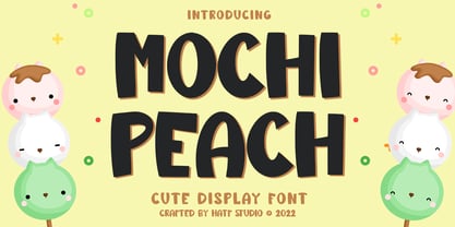 Mochi Peach - Cute Display Font is a font with distinctive handwritten characters perfect for branding projects, logos, wedding designs, media posts, advertisements, product packaging, product designs, labels, photography, watermarks, invitations, stationery, and any project who need handwritten dishes. Features : • Character Set A-Z(only caps) • Numerals & Punctuations (OpenType Standard) • Accents (Multilingual characters) • Ligature. Multilingual Support : Afrikaans, Albanian, Asu, Basque, Bemba, Bena, Catalan, Chiga, Cornish, Danish, English, Estonian, Faroese, Filipino, Finnish, French, Friulian, Galician, German, Gusii, Icelandic, Indonesian, Irish, Italian, Kabuverdianu, Kalenjin, Kinyarwanda, Low German, Luo, Luxembourgish, Luyia, Machame, Makhuwa-Meetto, Makonde, Malagasy, Malay, Manx, Morisyen, North Ndebele, Norwegian Bokmål, Norwegian Nynorsk, Nyankole, Oromo, Portuguese, Romansh, Rombo, Rundi, Rwa, Samburu, Sango, Sangu, Scottish Gaelic, Sena, Shambala, Shona, Soga, Somali, Spanish, Swahili, Swedish, Swiss German, Taita, Teso, Vunjo, Zulu. There it is. I really hope you enjoy it. Comments & likes are always welcome and accepted.
 - Einer Grotesk by Designova,
$15.00 Einer Grotesk is a timeless sans-serif typeface family of 16 fonts, made with perfection in every aspect of design. Created with a special focus on readability and visual aesthetics, this typeface can transform your design projects to another level of craftsmanship. Handcrafted and designed with powerful OpenType features in mind, each weight includes extended language support, including Western European & Central European sets. A total of 294 glyphs are included. Einer Grotesk is a perfect choice for graphic design, text presentation, web design, print, and display use. The typeface can be an amazing option for beautiful branding, logo/logotype design projects, marketing graphics, banners, posters, signage, corporate identities as well as editorial design. Adding extra letter-spacing for the Caps will make this font perfect for minimal headlines and logotypes as shown in promo images here.
 - Mimeograph Lettering JNL by Jeff Levine,
$29.00 Mimeograph Lettering JNL is based on one of the numerous plastic lettering templates once manufactured by the A.B. Dick Company of Chicago and is available in both regular and oblique versions. The mimeograph utilized a porous drum which inked the backside of a waxed stencil sheet. Unlike traditional stencils which have cut out areas that are directly inked or painted, a mimeo stencil has the area to be printed scratched away by removing the wax coating with a stylus. The resulting image allows the ink from the drum to seep through the sheet and transfer to the blank paper. As with a companion font (Mimeograph Template JNL), the character shapes follow the routed letters of the template, complete with rounded terminals. A previous font release [designed with flat terminals and some alternate characters] is available as Interoffice Memo JNL.
 - Binggo Wood Display by Genesislab,
$20.00 Bingo Wood Display in totality and elegance. One of my newest first releases, hand drawn with pinpoint accuracy. Bingo Wood has the perfect amount of simplicity and subtlety for your next project. It perfectly represents retro and vintage aesthetics. I recommend this font for logos, invitations, and your next home decor project that requires a touch of compact alternative combinations! Include Format: - Bingo Wood Display. otf Bingo Wood appears with a total of 593 Glyph characters available: Basic Latin, Extended Latin A, Punctuation, Open & Close Punctuation, Dashes & Quotes, Super Script & Sub Script, Currency, Numbers, Math Symbol, Designer Favorites Case Sensitive Forms, Discretionary Ligature, Denominators, Standard Ligature, Numerators Stylistic Alternates Set, 1, 2, 3, Sup Script, Super Script, Swash Get inspired by the images above and feel free to share with me what you get using this font.
 - White Rainbow by Wyarecreatype,
$13.00 Please welcome, White Rainbow. Fun and casual vintage retro decorative font. The definition of real versatility and flexibility. You can rock on both vibes, retro and modern by using a single font. Yes, just like your favourite day-to-day sneakers. Wide variety of Stylistic Alternates and Ligatures in every single letter to elevate your design game to the next level. Cut the process more because it should be easy. Perfectly fit for the visual project such as logo, branding, poster, food and beverages, social media content, website, UI/UX design, youtube thumbnail, CV, mood board, wedding, you name it. FEATURES Uppercase and Lowercase letters ligature and alternates feature Numbering and Punctuations Multilingual Works on PC or Mac Simple Installation Support Adobe Illustrator, Adobe Photoshop, Adobe InDesign, also works on Microsoft Word Hope you Like it. Thanks. Helotype