10,000 search results
(0.041 seconds)
- PMN Caecilia eText by Monotype,
$29.99PMN Caecilia™ is the premiere work of the Dutch designer Peter Matthias Noordzij. He made the first sketches for this slab serif design in 1983 during his third year of study in The Hague, and the full font family was released by Linotype in 1990. The PMN prefix represents the designer's initials, and Caecilia is his wife's name. This font has subtle variations of stroke thickness, a tall x-height, open counters, and vivacious true italics. Noordzij combined classical ductus with his own contemporary expression to create a friendly and versatile slab serif family. With numerous weights from light to heavy, and styles including small caps, Old style figures, and Central European characters, PMN Caecilia has all the elements necessary for rich typographic expression. eText fonts - the optimum of on-screen text quality With our new eText fonts that have been optimised for on-screen use, you can ensure that your texts remain readily legible when displayed on smartphones, tablets or e-readers. The poor resolution of many digital display systems represents a major challenge when it comes to presenting text. It is necessary to make considerable compromises, particularly in the case of text in smaller point sizes, in order to adapt characters designed in detail using vector graphics to the relatively crude pixel grid. So-called 'font hinting' can help with this process. This, for example, provides the system with information on which lines are to be displayed in a particular thickness, i.e. using a specific number of pixels. As font hinting is a largely manual and thus very complex technique, many typefaces come with only the most necessary information. What is unimportant for a text printed in high resolution can result in a poor quality image when the same text is displayed on a screen, so that reading it rapidly becomes a demanding activity. Specially optimised eText fonts can help overcome this problem. An extremely refined and elaborate font hinting system makes sure that these fonts are optimally displayed on screens. Monotype has not only adopted font hinting for this purpose but has also thoroughly reworked the fonts to hone them for display in low resolution environments. For example, the open counters present in the letters C, c, e, S, s, g etc. have been slightly expanded so that these retain their character even in small point sizes. Also with a view to enhancing appearance in smaller point sizes, line thickness has been discreetly increased and x-height carefully adjusted. Kerning has also been modified. Don't leave the on-screen appearance of your creations to chance. Play it safe and use eText fonts to achieve perfect results on modern display devices. Many typefaces, including many popular classics, are already available as eText fonts and new ones are continually being published. The eText font you can purchase here are available for use as Desktop Fonts or Web Fonts. Should they be used in Mobile Devices such as smartphones, tablets or eReaders, please contact our OEM specialists at sales-eu@monotype.com. - Hasan Elham by Hiba Studio,
$59.00 Hasan Elham is modern Kufi font with a new idea with round shapes. It is a decorative font with mechanical proportions. It is useful for titles and graphic projects. It supported Arabic, Persian and Urdu.
 - Clark by Typemade,
$24.00 Clark Hairline is a sans serif with calligraphic touch, it is part of a large Type System still in production. The main idea is to create a sans serif for use as a text face.
 - Love Julia by Bosstypestudio,
$12.00 Love Julia is a new calligraphy font which is fresh, funny, interesting and with a cute heart that can be connected. It is suitable for greeting cards, branding materials, business cards, quotes, posters, and more!
 - Greztro by Yoga Letter,
$17.00 "Greztro" is a unique display font. This font is equipped with uppercase, lowercase, numerals, punctuation, and multilingual support. It is suitable for Cinco de Mayo, Father's Day, Halloween, Christmas, stickers, posters, banners, branding, and others.
 - Lemonglory by limitype,
$17.00 Lemonglory is a modern font inspired by the shape of a leaf, with a unique shape this font is suitable for displays, logos, headlines, posters etc. Lemonglory is equipped with uppercase, lowercase, symbols and multilingual
 - TG Hagia by Tegami Type,
$20.00 TG Hagia is contemporary serif font inspired by Modern Culture. This font is highly recommended for use as display and body text. Tg Hagia is available in three widths namely regular, semi-bold and bold.
 - Riwayat by Qaratype,
$16.00 Riwaya is a cool and fashionable handwritten font. It is defined by smooth curves and is perfect for fashion branding or editorial designs. Add it confidently to your projects, and you will love the results.
 - Balgor by Syafbe,
$17.00 Balgor is an elegant and modern serif font. It is characterized by smooth curves and is perfect for fashion branding or editorial designs. Add it confidently to your projects, and you will love the results.
 - Kametha by Selvia Design,
$12.00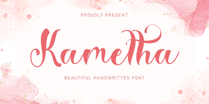 "Kametha" is a beautiful and elegant handwritten font. This font is equipped with uppercase, lowercase, numerals, punctuation, and multilingual support. It is suitable for Christmas, summer, the 4th of July, graduation, a wedding, and others.
 - Geralize by Yoga Letter,
$15.00 "Geralize" is a very elegant and professional modern slab serif font. This font is equipped with uppercase, lowercase, ligatures, numerals, punctuations, and multilingual support. It is suitable for logos, branding, banners, posters, prints, and more.
 - Wake Snake by Typefactory,
$14.00 Wake Snake is a beautiful font that is capable of handling a ton of project types and designs. This vintage, Victorian inspired font is ideal for a giving your projects a classy and nostalgic feel.
 - MBF Marcos by Moonbandit,
$14.00 Marcos, a playful vintage display font, bold and quirky, perfect for that retro look. every glyph is uniquely crafted. Marcos is perfect for logo, title, headline, even text, it is versatile and have high exposure.
 - Marlyca Script by Bosstypestudio,
$14.00 Marlyca Script is a new calligraphy font which is fresh, funny, interesting and with a cute heart that can be connected. It is suitable for greeting cards, branding materials, business cards, quotes, posters, and more!
 - Benice by DRM Works,
$19.99 Benice is a modern display font that is super bold and perfect for headlines. It is fun and playful, perfect display font for any projects, such as logo, magazine, branding, sticker, sublimation and many more.
 - Haston Hailey by Bosstypestudio,
$14.00 Haston Hailey is a new calligraphy font which is fresh, funny, interesting and with a cute heart that can be connected. It is suitable for greeting cards, branding materials, business cards, quotes, posters, and more!
 - DeDisplay by Ingo,
$24.99 A type designed in a grid, like on display panels Type is not only printed. There were always and still are a number of forms of type versions which function completely differently. Even very early in the history of script there were attempts to combine a few single elements into the diverse forms of individual characters and also efforts to construct the forms of letters within a geometric grid system. The “instructions” of Albrecht Dürer are probably most well-known. But although designers of past centuries assumed the ideal to basically be an artist’s handwritten script, the idea which developed in the course of mechanization was to “build” characters in a building block system only by stringing together one basic element — the so-called grid type was discovered, represented most commonly today by »pixel types.« But even before computers, there were display systems which presented types with the help of a mechanical grid display, like the display panels in public transportation (bus, train) or at airports and train stations. In a streetcar, I met up with a modern variation of this display which reveals the name of each tram stop as it is approached. This system was based on a customary coarse square grid, but the individual squares were also divided again diagonally in four triangles. In this way it is possible to display slants and to simulate round forms more accurately as with only squares. The displayed characters still aren’t comparable to a decent typeface — on the contrary, the lower case letters are surprisingly ugly — but they form a much more legible type than that of ordinary [quadrate] grid types. DeDisplay from ingoFonts is this kind of type, constructed from tiny triangles which are in turn grouped in small squares. The stem widths are formed by two squares; the height of upper case characters is 10, the x-height 7 squares. DeDisplay is available in three versions: DeDisplay 1 is the complex original with spaces between the triangles, DeDisplay 2 forgoes dividing the triangles and thus appears somewhat darker or “bold,” and DeDisplay 3 is to some extent the “black” and doesn’t even include spaces between the individual squares.
 - Anselm Sans by Storm Type Foundry,
$63.00One of the good practices of today’s type foundries is that they release their type families as systems including both serif and sans serif type. Usually, the sources of inspiration need to be well tried with time and practice, since production of a type family is such a laborious and complex process. From the beginning, it needs to be clear that the result will be suited for universal use. Such systems, complete with the broad, multi-lingual variations permitted by the OpenType format, have become the elementary, default instrument of visual communication. Non-Latin scripts are useful for a wide scope of academic publications, for packaging and corporate systems alike. And what about outdoor advertisement designated for markets in developing countries? Cyrillics and Greek have become an integral part of our OpenType font systems. Maybe you noticed that the sans serif cuts have richer variety of the light – black scale. This is due to the fact that sans serif families tend to be less susceptible to deformities in form, and thus they are able to retain their original character throughout the full range of weights. On the other hand, the nature of serifed, contrasted cuts does not permit such extremes without sacrificing their characteristic features. Both weights were drawn by hand, only the Medium cut has been interpolated. Anselm Ten is a unique family of four cuts, slightly strengthened and adjusted for the setting in sizes around 10 pt and smaller, as its name indicates. The ancestry of Anselm goes back to Jannon, a slightly modified Old Style Roman. I drew Serapion back in 1997, so its spirit is youthful, a bit frisky, and it is charmed by romantic, playful details. Anselm succeeds it after ten years of evolution, it is a sober, reliable laborer, immune to all eccentricities. The most significant difference between Sebastian/Serapion and Anselm is the raised x-height of lowercase, which makes it ideal for applications in extensive texts. Our goal was to create an all-round type family, equally suitable for poetry, magazines, books, posters, and information systems. - Anselm Serif by Storm Type Foundry,
$63.00 One of the good practices of today’s type foundries is that they release their type families as systems including both serif and sans serif type. Usually, the sources of inspiration need to be well tried with time and practice, since production of a type family is such a laborious and complex process. From the beginning, it needs to be clear that the result will be suited for universal use. Such systems, complete with the broad, multi-lingual variations permitted by the OpenType format, have become the elementary, default instrument of visual communication. Non-Latin scripts are useful for a wide scope of academic publications, for packaging and corporate systems alike. And what about outdoor advertisement designated for markets in developing countries? Cyrillics and Greek have become an integral part of our OpenType font systems. Maybe you noticed that the sans serif cuts have richer variety of the light – black scale. This is due to the fact that sans serif families tend to be less susceptible to deformities in form, and thus they are able to retain their original character throughout the full range of weights. On the other hand, the nature of serifed, contrasted cuts does not permit such extremes without sacrificing their characteristic features. Both weights were drawn by hand, only the Medium cut has been interpolated. Anselm Ten is a unique family of four cuts, slightly strengthened and adjusted for the setting in sizes around 10 pt and smaller, as its name indicates. The ancestry of Anselm goes back to Jannon , a slightly modified Old Style Roman. I drew Serapion back in 1997, so its spirit is youthful, a bit frisky, and it is charmed by romantic, playful details. Anselm succeeds it after ten years of evolution, it is a sober, reliable laborer, immune to all eccentricities. The most significant difference between Sebastian/Serapion and Anselm is the raised x-height of lowercase, which makes it ideal for applications in extensive texts. Our goal was to create an all-round type family, equally suitable for poetry, magazines, books, posters, and information systems.
 - Ggx88 by Typodermic,
$11.95 Introducing GGX88—the Swiss inspired sans-serif typeface that is perfect for on-screen user interfaces. Designed with a minimalist approach, GGX88 offers a sleek and sophisticated look that is both familiar and unique. With seven weights and italics to choose from, GGX88 provides the flexibility you need to create a stunning design. Whether you are designing a website, app or presentation, GGX88 is the perfect choice for any project that requires a clean and modern aesthetic. Its simple yet striking design ensures that your message is conveyed clearly and effectively, while its minimalist look ensures that your content remains the center of attention. But GGX88 is not just a single typeface—we also offer GGX89, a display oriented version of the font that is perfect for headings, titles, and other larger text. With its bold and eye-catching design, GGX89 is the ideal choice for projects that require a more dynamic and attention-grabbing font. So why wait? Try GGX88 and GGX89 today and see the difference that a minimalist and Swiss inspired design can make to your project. With its clean lines and contemporary feel, GGX88 is the perfect typeface for anyone looking to make a bold statement. Most Latin-based European, and some Cyrillic-based writing systems are supported, including the following languages. A Afaan Oromo, Afar, Afrikaans, Albanian, Alsatian, Aromanian, Aymara, Bashkir (Latin), Basque, Belarusian (Latin), Bemba, Bikol, Bosnian, Breton, Bulgarian, Cape Verdean, Creole, Catalan, Cebuano, Chamorro, Chavacano, Chichewa, Crimean Tatar (Latin), Croatian, Czech, Danish, Dawan, Dholuo, Dutch, English, Estonian, Faroese, Fijian, Filipino, Finnish, French, Frisian, Friulian, Gagauz (Latin), Galician, Ganda, Genoese, German, Greenlandic, Guadeloupean Creole, Haitian Creole, Hawaiian, Hiligaynon, Hungarian, Icelandic, Ilocano, Indonesian, Irish, Italian, Jamaican, Kaqchikel, Karakalpak (Latin), Kashubian, Kikongo, Kinyarwanda, Kirundi, Komi-Permyak, Kurdish (Latin), Latvian, Lithuanian, Lombard, Low Saxon, Luxembourgish, Maasai, Macedonian, Makhuwa, Malay, Maltese, Māori, Moldovan, Montenegrin, Ndebele, Neapolitan, Norwegian, Novial, Occitan, Ossetian, Ossetian (Latin), Papiamento, Piedmontese, Polish, Portuguese, Quechua, Rarotongan, Romanian, Romansh, Russian, Sami, Sango, Saramaccan, Sardinian, Scottish Gaelic, Serbian, Serbian (Latin), Shona, Sicilian, Silesian, Slovak, Slovenian, Somali, Sorbian, Sotho, Spanish, Swahili, Swazi, Swedish, Tagalog, Tahitian, Tetum, Tongan, Tshiluba, Tsonga, Tswana, Tumbuka, Turkish, Turkmen (Latin), Tuvaluan, Uzbek (Latin), Venetian, Vepsian, Võro, Walloon, Waray-Waray, Wayuu, Welsh, Wolof, Xhosa, Yapese, Zapotec Zulu and Zuni.
 - Entangled BRK by Ænigma Fonts, a creation by Brian Kent, is a distinctive typeface that seamlessly marries the elegance of classic fonts with the edginess of modern design. This font stands out due t...
- Uniform Rounded by Miller Type Foundry,
$25.99 Uniform Rounded is a type family based on the 2014 Miller Type Foundry release, Uniform. This superfamily is comprised of three widths (regular, condensed, and extra condensed) each with six weights. The result is a fun and playful typeface that is extremely versatile and is a great asset for any project on any medium. Uniform Rounded is a multi-width geometric type family designed around the circle. The O of the Regular width is based on a circle, the O of the Condensed width is based on 1.5 circles stacked (with straight sides) and the O of the Extra Condensed width is based on two circles stacked with straight sides as well, and all other characters are derived from this initial concept. This unique idea creates a remarkably fresh type family that bridges the gap between circular geometric typefaces and condensed straight-sided typefaces. Uniform Rounded also includes many opentype features like Old Style Figures, Tabular Lining Figures, Alternate characters, Ligatures and more.
 - Lettro Script by Ferry Ardana Putra,
$15.00 Make your own retro design with Lettro Font! Lettro is an exquisite bold script typeface inspired by the retro design from 70-80-ish. Lettro is created with a ton of stylistic alternates, swashes, and ligatures, and also comes with 5 total Layered fonts: Regular, Extrude, Extrude Outline, Double Extruded, and Double Extruded Outline. Perfect fitted layer to give you more contrast, more bold look of the title. Every glyph for alternates is curated for the best and possible without eliminating the characteristic of these fonts! Combine that many styles and create an awesome retro design! This retro typeface is perfect for logotypes, t-shirts, vintage badges, retro quotes, branding, packaging, posters, signboards, social media needs, etc. ——— Lettro features: A full set of uppercase & lowercase characters Layered Style Numbers & punctuation Multilingual language support PUA Encoded Characters OpenType Features +563 Total Glyphs +212 Stylistic Alternates +49 Ligatures +47 Swashes and more (Shiny and Spray Effect Included!) ——— ⚠️To enable the OpenType Stylistic alternates, you need a program that supports OpenType features such as Adobe Illustrator CS, Adobe InDesign & CorelDraw X6-X7, Microsoft Word 2010, or later versions. There are additional ways to access alternates/swashes, using Character Map (Windows), Nexus Font (Windows), Font Book (Mac), or a software program such as Pop Char (for Windows and Mac). ⚠️For more information about accessing alternative, you can see this link: http://adobe.ly/1m1fn4Y ——— 🔑Important tutorial from the author: Tutorial for Mollusca font trio: https://lnkd.in/d984CQD6 How to use Midway | Retro Script Font on illustrator: https://lnkd.in/eusbZd7s How to use Midway | Retro Script Font on Photoshop: https://lnkd.in/evsYrwgs Happy Designing...😊
 - Upheaval TT BRK by AEnigma is a testament to the creative and rebellious spirit that fonts can embody. At its core, Upheaval TT BRK is a display font that demands attention, breaking away from the co...
- Receipt by Funk King,
$5.00 Receipt is a composite font. Each glyph is composed of either the dollar or cent sign.
 - Badwulf by Oleg Stepanov,
$11.00 Badwulf is a hand-lettered display font. It is good for cartoons, children's books and games.
 - Sensual by Corradine Fonts,
$29.95 Sensual is ideal for invitations, greeting cards, logotypes, or anywhere a touch of elegance is desired.
 - Girasol by Lián Types,
$35.00 This is a cute story about a mother and her son. :) About a decade ago my own mother got very interested in my work. She used to say my letters had so many swirls and dazzling swashes, and suggested my job seemed to be very fun. She wondered if she could ever try to make her own alphabet... Well, she is a civil engineer and a maths teacher, and appeared to be a little tired of exact sciences... I remember answering this, while she was listening with her typical tender look: -"Mamá... While type-design may be a really enjoyable thing to do, it also involves having a great eye and knowledge about the history of letters: nice curves and shapes require a meticulous study and, like it happens in many fields, practice makes perfect"-. Well, she raised her eyebrows at me. -"and so what?"- She didn't have any experience neither in the field of art nor in the field of graphic design so, I told her that if she really wanted to get into this she should borrow some of my calligraphic books from my beloved shelves in my office. So... she did. Some weeks after that, she came to me with many sketches made with pencils and markers: some letters where very nice and unique while others naturally needed some work. I remember she added ball terminals to all of her letters (even if they didn't need them) because that was one of the rules she imposed. After some back and forth, we had the basis for what would be today, ten years later, the seed of this lovely font Girasol. Her proposal was nice, something I was not accustomed to do, that’s why many years later I decided to watch it with fresh new eyes and finished it. While she was in charge of making the lowercase letters, I helped with the uppercase and also added my hallmark in the alternates, already seen in others of my expressive fonts. The result is an upright decorative font that follows the behavior of the copperplate nib with a naive touch that makes it really cute and useful for a wide range of products. Many alternates per glyph make Girasol a very fun to use font which will delight you. Above posters are a proof of that! This font is a gift for my mother, Susana, who, in spite of her exacts academic background, taught me that beauty can also be found in the imperfect. 1 NOTES (1) In my fonts I'm always in seek of the perfect curve. When I designed Erotica and Dream Script, I read about Fibonacci’s spirals!
 - Ongunkan Bosnia Pyramid by Runic World Tamgacı,
$100.00 The signs of the Bosnian pyramids The pyramid researcher, Semir Osmanagic, began excavations in 2005 in Visoko, Bosnia, 30 km North from Sarajevo. Mr. Senad Hodocic, the curator at the local museum, pointed out at the pyramidal shape of the Visocica Mountain, which grabbed Osmanagic's attention. It is also suspected that the four adjacent hills, covered by plants and greenery, also hide the pyramids. The main sites of the excavations are called the Pyramid of the Sun and the Pyramid of the Moon, and the results achieved so far have already proved that those structures are man-made and artificial. The Pyramid of the Sun is bigger and older than the pyramid in Giza, which was built by Pharaoh Cheops 4600 years ago. Gábor Szakács, who went to the site in June 2006 for the first time, found the symbols on the megalithic blocks inside the tunnel of the Pyramid of the Sun, which correspond to the ancient Hungarian runic writings. Further information about the Bosnian Pyramids is available at the website http://www.piramidasunca.ba/. There are also researchers who do not accept the subject of the Bosnian pyramids. Time will tell the truth.
 - Brohero by Alit Design,
$16.00 Presenting ⚔️The Brohero Typeface⚔️ by alitdesign. The Brohero font is inspired by action movie posters with the theme of war or knights in the Japanese Samurai. The bold character of The Brohero font is perfect for making hero movie titles, game titles, logotypes, t-shirt designs and so on with heroic themes. Apart from the regular font, the Brohero also has an italic style which makes the design more dynamic and cool. The Brohero font has alternatives that you can combine between swashes and symbols that have the theme of heroes and war. Besides that this font is very easy to use both in design and non-design programs because everything changes and glyphs are supported by Unicode (PUA). The Brohero Typeface has a total of 789 glyphs including symbol, multilingual. Language Support : Latin, Basic, Western European, Central European, South European,Vietnamese. In order to use the beautiful swashes, you need a program that supports OpenType features such as Adobe Illustrator CS, Adobe Photoshop CC, Adobe Indesign and Corel Draw. but if your software doesn't have Glyphs panel, you can install additional swashes font files.
 - Riposte by Scholtz Fonts,
$15.00 Riposte is a powerful and carefully-integrated handwriting font. You should use it where you want to create a strong impact but want to avoid heavy, boxy, formal fonts. The characters were designed for excellent letter-spacing without kerning, but you can switch kerning on to add some subtle enhancements to the letter-spacing. Riposte is readable, even at quite small sizes. It was designed to be used as a mix of upper and lower-case letters. Do not make text using only uppercase letters since the spacing of the uppercase letters was optimized for use together with lowercase letters. So remember, when you want your text to have the powerful impact of the master swordsman with his balanced stance and vigorous movement -- try Riposte. The font is fully professional: carefully letterspaced and kerned. It contains over 235 characters - (upper and lower case characters, punctuation, numerals, symbols and accented characters are present). It has all the accented characters used in the major European languages. Riposte works well in professional layout application packages as well as in word-processing packages such as Microsoft Word® that do not support professional kerning.
 - Lust Slim by Positype,
$50.00 Check out the new Lust Pro & Lust Pro Didone to see how the series has grown and evolved. Confident and versatile, Lust is an exercise in indulgence—an attempt to create something over the top and vastly useful. If Lust Slim seems both new and familiar, that’s because it is. The series unapologetically channels Herb Lubalin, but produced with a deliberate, contemporary twist. There is an intentional slyness infused in the letterforms—the extreme thick and thin lines flow effortlessly without becoming gratuitous. It’s always just enough, not too much. What makes the type series so appealing? The curves. When asked to describe the letterforms, most people unwittingly allude to the human form, using adjectives usually reserved for describing physical traits… creating all-too-familiar comparisons. Summerour has grown to accept this as unavoidable and reasonable given his acknowledgement of its influences and has provided nuances within the letterforms to accentuate that. Intended to be set large, the typeface has both Standard (Lust, Lust Didone and a single unified Italic) and Display variants making it perfect for editorial use and a flexible solution for any display need.
 - The Blowar by Alit Design,
$15.00 Presenting ⚔️The Blowar Typeface⚔️ by alitdesign. The Blowar font is inspired by action movie posters with the theme of war or knights in the Roman era. The bold and bold character of The Blowar font is perfect for making hero movie titles, game titles, logotypes, t-shirt designs and so on with heroic themes. Apart from the regular font, the Blowar also has an italic style which makes the design more dynamic and cool. The Blowar font has alternatives that you can combine between swashes and symbols that have the theme of heroes and war. Besides that this font is very easy to use both in design and non-design programs because everything changes and glyphs are supported by Unicode (PUA). The Blowar Typeface has a total of 706 glyphs including symbol, multilingual. Language Support : Latin, Basic, Western European, Central European, South European,Vietnamese. In order to use the beautiful swashes, you need a program that supports OpenType features such as Adobe Illustrator CS, Adobe Photoshop CC, Adobe Indesign and Corel Draw. but if your software doesn't have Glyphs panel, you can install additional swashes font files.
 - Hello Najwa by Kotak Kuning Studio,
$17.00 Hello Najwa is a lovely bouncy script font with a natural & stylish flow. Perfect for making elegant stylish statements - or adding a touch of class to your designs. This script has a multitude of lovely alternates character in its OpenType features - making the font look a beautiful Hello Najwa is perfect for many different projects such as logos & branding, invitation, stationery, wedding designs, social media posts, advertisements, product packaging, product designs, label, photography, watermark, special events or anything. I highly recommend using a program that supports OpenType features and Glyphs panels such as Adobe Illustrator, Adobe Photoshop CC, Adobe InDesign, or CorelDraw, so you can see and access all Glyph variations. Hello Najwa is encoded with Unicode PUA, which allows full access to all additional characters without having special design software. Mac users can use Font Book, and Windows users can use Character Map to view and copy one of the extra characters to paste into your favorite text editor/application. We hope you enjoy the font, please feel free to comment if you have any thoughts or feedback. Or simply email me at kotakkuningstudio@gmail.com. Thanks for purchasing and have fun!
 - Dealova by HKL Studio,
$19.00 Dealova Script is the font of choice for writing things beyond words. This typeface is designed with great detail to convey stylish elegance. So, it can be said, the character of the transformation is very beautiful, a kind of classic ornamental copper script. Dealova Script provides alternative variants of most fonts, binders and many calligraphy tips, ideal for elegant labels, high-end packaging, stationery and composition for specific brands, beautiful titles, paragraphs, fonts and short text intended for read only with the eye or intended to be whispered into someone's ear. Dealova Script has 691+ glyphs and 440 alternate characters, including multiple language support. It features OpenType with alternate styles and elegant binding. The OpenType features don't work automatically, but you can access them manually and for best results your creativity will be required in combining variations of these Glyphs. And also a touch of ornament makes this font look elegant. To enable the OpenType Stylistic alternative, you need a program that supports OpenType features such as Adobe Illustrator CS, Adobe Indesign & CorelDraw X6-X7, Microsoft Word 2010 or later. (Windows), Font Book (Mac) or a software program such as PopChar (for Windows and Mac).
 - Wonderful September by Kotak Kuning Studio,
$17.00 Wonderful September is a lovely modern script font with a natural & stylish flow. Perfect for making elegant stylish statements - or adding a touch of class to your designs. This script has a multitude of lovely alternates characters in its OpenType features - making the font look a beautiful Wonderful September is perfect for many different projects such as logos & branding, invitation, stationery, wedding designs, social media posts, advertisements, product packaging, product designs, label, photography, watermark, special events, or anything. I highly recommend using a program that supports OpenType features and Glyphs panels such as Adobe Illustrator, Adobe Photoshop CC, Adobe InDesign, or CorelDraw, so you can see and access all Glyph variations. This font is encoded with Unicode PUA, which allows full access to all additional characters without having special design software. Mac users can use Font Book, and Windows users can use Character Map to view and copy one of the extra characters to paste into your favorite text editor/application. We hope you enjoy the font, please feel free to comment if you have any thoughts or feedback. Or simply email me at kotakkuningstudio@gmail.com. Thanks for purchasing and have fun!
 - Trigomy by Markus Reiter,
$24.90 Trigomy is a proportional pixel font designed on a 5 pixel grid. It is intended for either very small text or as huge display font for posters and the like. To get a crisp look this font should be used at 10 pt or multiples of 10 pt. (A tip for Adobe Creative Suite applications is to change the standard anti-aliasing method from “sharp” to “crisp” and to align the text to whole pixels. Also avoid centered text.) To get started with type design I thought it was best to start with a pixel font because you don't have to focus much on the design itself, but rather have to focus on how kerning and spacing works and the various features you can implement with OpenType. And of course I wanted to have a pixel font that had all that I was missing from other pixel fonts. We were learning trigonometry at the time I started designing Trigomy, and most of the time I misspoke it “trigometry”. So, when I had to come up with a name for my first font I thought: "Why not go with Trigomy?"
 - Sunetta by Linotype,
$29.99An inkstone, a brush, ink, and paper. In China, one speaks of “wenfang sibao” — the four treasures of the scholar’s study. With these centuries-old hand tools, Werner Schneider created a calligraphic type trilogy of the highest aesthetic order; he named this typeface family after Buddha’s stepbrother, Sunetta. Sunetta is an outstanding choice for contemporary display type purposes. Its combination of lively forms overcome sterile text passages, lending them a more personal note and feeling. But Sunetta is not only recommended for documents bestowing distinction and accolades; the fonts are superb for shorter text passages as well. Sunetta’s spirited flow raises it above the fray that so many generic letterforms find themselves mired in, creating an unforgettable impression. Sunetta’s three complementary styles, Sunetta Flair, Sunetta Charme, and Sunetta Magic, offer three varying degrees of calligraphic verve. The family’s base font, Sunetta Flair, harkens back to the showcard lettering styles of the 1950s, while remaining distinctly European in taste. Sunetta Charme has a more swash-type appearance, while Sunetta Magic is joyfully decorative — its brush-written strokes dance across the line. Together, they may help you reach typographic nirvana. - Rachel Lovelyn by Kotak Kuning Studio,
$17.00 Rachel Lovelyn is a lovely bouncy script font with a natural & stylish flow. Perfect for making elegant stylish statements - or adding a touch of class to your designs. This script has a multitude of lovely alternates character in its OpenType features - making the font look a beautiful Rachel Lovelyn is perfect for many different projects such as logos & branding, invitation, stationery, wedding designs, social media posts, advertisements, product packaging, product designs, label, photography, watermark, special events or anything. I highly recommend using a program that supports OpenType features and Glyphs panels such as Adobe Illustrator, Adobe Photoshop CC, Adobe InDesign, or CorelDraw, so you can see and access all Glyph variations. Rachel Lovelyn is encoded with Unicode PUA, which allows full access to all additional characters without having special design software. Mac users can use Font Book, and Windows users can use Character Map to view and copy one of the extra characters to paste into your favorite text editor/application. We hope you enjoy the font, please feel free to comment if you have any thoughts or feedback. Or simply email me at kotakkuningstudio@gmail.com. Thanks for purchasing and have fun!
 - Schnebel Sans Pro by URW Type Foundry,
$35.99 It took me 12 years to bring this extensive font family to completion. A lot has been changed, transformed, peeled and developed in all those years. For many of my projects I used it as my quarry and so it might have become something like a synthesis of all my imaginations and experiences. To me »Schnebel Sans« represents the optimal design of a contemporary grotesque that perfectly unites dynamics with statics. For copy text the typefaces are very legible, neutrally and remain in the background, but despite this generate the necessary tension when set as headlines. »Schnebel Sans« is available in 48 different styles. It is available as a Pro Font, containing West, East Greek, and Cyrillic or as the Schnebel Sans ME, also containing Arabic and Hebrew. The scripts include small caps and various figure sets. This big range of styles from Thin to Black and from Compressed to Expanded offer many possibilities for design and fulfill all requirements for a professional use. Because of the supplement of several non-Latin character sets, the »Schnebel Sans« is perfectly suitable for global services too. Volker Schnebel, 2016