10,000 search results
(0.731 seconds)
- FS Sophie by Fontsmith,
$50.00 Slinky Chic, svelte and slinky, FS Sophie was inspired by and designed in partnership with ATTIK UK. With clean lines, simple, elegant curves and dynamic forms, it brings a feminine sophistication to text and headlines in publishing and advertising. Kinky FS Sophie’s engaging simplicity arises from its construction, using a modular set of core, rounded shapes and straight strokes, drawn and then repeated to create letterforms. An extra technical detail of occasional, short 45-degree diagonals adds a distinctive little kink to Sophie’s cool exterior. Alchemy By some kind of typographic alchemy, the combination of simple curves and lines with unexpected twists to the shapes of characters creates an unusually spirited and lively design in all three weights and their italic sets. Born for the spotlight, FS Sophie is a natural for big headlines, pull quotes and other high-profile text elements.
 - Sassoon Sans by Sassoon-Williams,
$48.00 A more mature font retaining the clarity of the Sassoon typefaces that accentuate word shape, while omitting the exit strokes. A more legible alternative to standard Sans serif typefaces - superb on the screen. Many alternative letters are included in each font. A typeface designed with the computer screen in mind. It retains maximum legibility even in the most unusual layout - ideal for multi media uses and giving unimagined clarity to menus and navigational aids. Avoid eyestrain with a typeface that accentuates word shape as well as the identity of individual letters. Legible in print at tiny point sizes so ideal for captions. Ideal for older pupils, perhaps at Secondary school, or adults, who no longer require ‘exit strokes’ to clump the letters together. Free to download resources: How to access Stylistic Sets of alternative letters in these fonts
 - TessieXtraBirds by Ingrimayne Type,
$13.95 A tessellation is a shape that can be used to completely fill the plane—simple examples are isosceles triangles, squares, and hexagons. Tessellation patterns are eye-catching and visually appealing, which is the reason that they have long been popular in a variety of decorative situations. These Tessie fonts have two family members, a solid style that must have different colors when used and an outline style. They can be used separately or they can be used in layers with the outline style on top of the solid style. For rows to align properly, leading must be the same as point size. To see how patterns can be constructed, see the “Samples” file here. Shapes that tessellate and also resemble real-world objects are often called Escher-like tessellations. TessieMoreStuff contains mostly Escher-like tessellations with no clear organizing principle. Most or all of these shapes were discovered/created by the font designer during the past twenty years in the process of designing maze books, colorings books, and a book about tessellations. (Earlier tessellation fonts from IngrimayneType, the TessieDingies fonts, lack a black or filled version so cannot do colored patterns. The addition of a solid style that must be colored makes these new fonts a bit more difficult to use but offers far greater possibilities in getting visually interesting results.)
 - VLNL Bonen by VetteLetters,
$30.00 While sketching for a music project logo, Donald DBXL Beekman looked at several wood type alphabets as a starting poing. One of these was No.120, patented in 1880 by William Hamilton Page. With its distinct diagonally cut serifs and round shapes cut off at top and bottom, it bore just the right feel for the project. DBXL digitized the alphabet, adding all characters needed for a full set. During this process all shapes were widened, tweaked and streamlined to enhance consistency and rhythm along the whole font. VLNL Bonen is an all-caps display font with a very specific western cowboy or circus look. For instance burger or barbecue grill restaurants would do well with this one. We can easily see it shine on a festival flyer or poster as well, and not just country & western festivals. VLNL Bonen is suitable for any ‘big’ use that needs to stand out of the crowd. Bonen is the Dutch word for beans, a world wide source of nutrition and proteins it comes in a multitude of shapes, colours and sizes. Beans are also the most eaten foods in a cowboy’s diet along the trail. Available in abundance and easily preserved and transported, many recipes on the cattle drives in the American Wild West used beans. Think of chili, mashed beans with biscuits and bean soups. “Keep them doggies movin’, cowboy!”
 - TessieMoreStuff by Ingrimayne Type,
$11.95 A tessellation is a shape that can be used to completely fill the plane—simple examples are isosceles triangles, squares, and hexagons. Tessellation patterns are eye-catching and visually appealing, which is the reason that they have long been popular in a variety of decorative situations. These Tessie fonts have two family members, a solid style that must have different colors when used and an outline style. They can be used separately or they can be used in layers with the outline style on top of the solid style. For rows to align properly, leading must be the same as point size. To see how patterns can be constructed, see the “Samples” file here. Shapes that tessellate and also resemble real-world objects are often called Escher-like tessellations. TessieMoreStuff contains mostly Escher-like tessellations with no clear organizing principle. Most or all of these shapes were discovered/created by the font designer during the past twenty years in the process of designing maze books, colorings books, and a book about tessellations. (Earlier tessellation fonts from IngrimayneType, the TessieDingies fonts, lack a black or filled version so cannot do colored patterns. The addition of a solid style that must be colored makes these new fonts a bit more difficult to use but offers far greater possibilities in getting visually interesting results.)
 - Elanor by Dirtyline Studio,
$25.00 Elanor is a serif typeface inspired by Retro ’70s fonts mixed with Experimental touches. Its main features are a diagonal stress and soft curved teardrop shape terminals. It has ligatures that make it more elegant and grotesque elements that give it a modern look and make it more versatile.This typeface both impressive at display sizes and easily readable in text size, while the sharp shapes of the triangular serifs and the distinctive letter shapes show their strength in logo design and impressive editorial use. Elanor come with elegant style, Retro and contrasts, with features an extended latin character set of 555 glyphs covering over 94 languages, Latin & Cyrillic. Elanor is ready to making your projects looking classic but contemporary, finely tuned but assertive, and elegant as the best retro design. 94 languages : Afrikaans, Albanian, Asu, Basque, Belarusian, Bemba, Bena, Bosnian, Bulgarian, Catalan, Chiga, Colognian, Cornish, Croatian, Czech, Danish, Embu, English, Esperanto, Estonian, Filipino, Finnish, French, Friulian, Galician, German, Gusii, Hungarian, Indonesian, Irish, Italian, Kabuverdianu, Kalaallisut, Kalenjin, Kamba, Kikuyu, Kinyarwanda, Latvian, Lithuanian, Low German, Lower Sorbian, Luo, Luxembourgish, Luyia, Macedonian, Machame, Makhuwa-Meetto, Makonde, Malagasy, Malay, Maltese, Manx, Meru, Morisyen, North Ndebele, Norwegian Bokmål, Norwegian Nynorsk, Nyankole, Oromo, Polish, Portuguese, Romanian, Romansh, Rombo, Rundi, Russian, Rwa, Samburu, Sango, Sangu, Scottish Gaelic, Sena, Serbian, Shambala, Shona, Slovak, Slovenian, Soga, Somali, Spanish, Swahili, Swedish, Swiss German, Taita, Teso, Turkmen, Upper Sorbian, Vunjo, Walser, Zulu
 - TessieAnimals by Ingrimayne Type,
$18.95 A tessellation is a shape that can be used to completely fill the plane. Simple examples are isosceles triangles, squares, and hexagons. Tessellation patterns are eye-catching and visually appealing, which is the reason that they have long been popular in a variety of decorative situations. These Tessie fonts have two family members, a solid style that must have different colors when used and an outline style. They can be used separately or they can be used in layers with the outline style on top of the solid style. For rows to align properly, leading must be the same as point size. To see how patterns can be constructed, see the “Samples” file here. Shapes that tessellate and also resemble real-world objects are often called Escher-like tessellations. This typeface contains many Escher-like tessellations that resemble animals including horses, goats, rabbits, fish, frogs, and other vertebrates. Most or all of these shapes were discovered/created by the font designer during the past twenty years in the process of designing maze books, coloring books, and a book about tessellations. (Earlier tessellation fonts from IngrimayneType, the TessieDingies fonts, lack a black or filled version so cannot do colored patterns. The addition of a solid style that must be colored makes these new fonts a bit more difficult to use but offers far greater possibilities in getting visually interesting results.)
 - TessieFlyingBirds by Ingrimayne Type,
$19.95 A tessellation is a shape that can be used to completely fill the plane—simple examples are isosceles triangles, squares, and hexagons. Tessellation patterns are eye-catching and visually appealing, which is the reason that they have long been popular in a variety of decorative situations. These Tessie fonts have two family members, a solid style that must have different colors when used and an outline style. They can be used separately or they can be used in layers with the outline style on top of the solid style. For rows to align properly, leading must be the same as point size. To see how patterns can be constructed, see the “Samples” file here. Shapes that tessellate and also resemble real-world objects are often called Escher-like tessellations. This typeface contains many Escher-like tessellations that resemble flying birds. Most or all of these shapes were discovered/created by the font designer during the past twenty years in the process of designing maze books, colorings books, and a book about tessellations. (Earlier tessellation fonts from IngrimayneType, the TessieDingies fonts, lack a black or filled version so cannot do colored patterns. The addition of a solid style that must be colored makes these new fonts a bit more difficult to use but offers far greater possibilities in getting visually interesting results.)
 - Schism One by Alias,
$55.00 Schism is a modulated sans-serif, originally developed from our Alias Didot typeface, as a serif-less version of the same design. It was expanded to three sub-families, with the thin stroke getting progressively heavier from Schism One to Schism Three. The different versions explore how this change in contrast between thick and thin strokes changes the character of the letterforms. The shape is maintained, but the emphasis shifts from rounded to angular, elegant to incised. Schism One has high contrast, and the same weight of thin stroke from Light to Black. Letter endings are at horizontal or vertical, giving a pinched, constricted shape for characters such as a, c, e and s. The h, m, n and u have a sharp connection between curve and vertical, and are high shouldered, giving a slightly square shape. The r and y have a thick stress at their horizontal endings, which makes them impactful and striking at bolder weights. Though derived from an elegant, classic form, Schism feels austere rather than flowery. It doesn’t have the flourishes of other modulated sans typefaces, its aesthetic more a kind of graphic-tinged utility. While in Schism Two and Three the thin stroke gets progressively heavier, the connections between vertical and curves — in a, b, n etc — remain cut to an incised point throughout. The effect is that Schism looks chiselled and textural across all weights. Forms maintain a clear, defined shape even in Bold and Black, and don’t have the bloated, wide and heavy appearance heavy weights can have. The change in the thickness of the thin stroke in different versions of the same weight of a typeface is called grading. This is often used when the types are to used in problematic print surfaces such as newsprint, or at small sizes — where thin strokes might bleed, and counters fill in and lose clarity, or detail might be lost or be too thin to register. The different gradings are incremental and can be quite subtle. In Schism it is extreme, and used as a design device, giving three connected but separate styles, from Sans-Didot to almost-Grotesk. The name Schism suggests the differences in shape and style in Schism One, Two and Three. Three styles with distinct differences, from the same start point.
 - Schism Three by Alias,
$55.00 Schism is a modulated sans-serif, originally developed from our Alias Didot typeface, as a serif-less version of the same design. It was expanded to three sub-families, with the thin stroke getting progressively heavier from Schism One to Schism Three. The different versions explore how this change in contrast between thick and thin strokes changes the character of the letterforms. The shape is maintained, but the emphasis shifts from rounded to angular, elegant to incised. Schism One has high contrast, and the same weight of thin stroke from Light to Black. Letter endings are at horizontal or vertical, giving a pinched, constricted shape for characters such as a, c, e and s. The h, m, n and u have a sharp connection between curve and vertical, and are high shouldered, giving a slightly square shape. The r and y have a thick stress at their horizontal endings, which makes them impactful and striking at bolder weights. Though derived from an elegant, classic form, Schism feels austere rather than flowery. It doesn’t have the flourishes of other modulated sans typefaces, its aesthetic more a kind of graphic-tinged utility. While in Schism Two and Three the thin stroke gets progressively heavier, the connections between vertical and curves — in a, b, n etc — remain cut to an incised point throughout. The effect is that Schism looks chiselled and textural across all weights. Forms maintain a clear, defined shape even in Bold and Black, and don’t have the bloated, wide and heavy appearance heavy weights can have. The change in the thickness of the thin stroke in different versions of the same weight of a typeface is called grading. This is often used when the types are to used in problematic print surfaces such as newsprint, or at small sizes — where thin strokes might bleed, and counters fill in and lose clarity, or detail might be lost or be too thin to register. The different gradings are incremental and can be quite subtle. In Schism it is extreme, and used as a design device, giving three connected but separate styles, from Sans-Didot to almost-Grotesk. The name Schism suggests the differences in shape and style in Schism One, Two and Three. Three styles with distinct differences, from the same start point.
 - Schism Two by Alias,
$55.00 Schism is a modulated sans-serif, originally developed from our Alias Didot typeface, as a serif-less version of the same design. It was expanded to three sub-families, with the thin stroke getting progressively heavier from Schism One to Schism Three. The different versions explore how this change in contrast between thick and thin strokes changes the character of the letterforms. The shape is maintained, but the emphasis shifts from rounded to angular, elegant to incised. Schism One has high contrast, and the same weight of thin stroke from Light to Black. Letter endings are at horizontal or vertical, giving a pinched, constricted shape for characters such as a, c, e and s. The h, m, n and u have a sharp connection between curve and vertical, and are high shouldered, giving a slightly square shape. The r and y have a thick stress at their horizontal endings, which makes them impactful and striking at bolder weights. Though derived from an elegant, classic form, Schism feels austere rather than flowery. It doesn’t have the flourishes of other modulated sans typefaces, its aesthetic more a kind of graphic-tinged utility. While in Schism Two and Three the thin stroke gets progressively heavier, the connections between vertical and curves — in a, b, n etc — remain cut to an incised point throughout. The effect is that Schism looks chiselled and textural across all weights. Forms maintain a clear, defined shape even in Bold and Black, and don’t have the bloated, wide and heavy appearance heavy weights can have. The change in the thickness of the thin stroke in different versions of the same weight of a typeface is called grading. This is often used when the types are to used in problematic print surfaces such as newsprint, or at small sizes — where thin strokes might bleed, and counters fill in and lose clarity, or detail might be lost or be too thin to register. The different gradings are incremental and can be quite subtle. In Schism it is extreme, and used as a design device, giving three connected but separate styles, from Sans-Didot to almost-Grotesk. The name Schism suggests the differences in shape and style in Schism One, Two and Three. Three styles with distinct differences, from the same start point.
 - Kernig Braille by Echopraxium,
$5.00 This font is the younger sister of HexBraille with which it may be combined to create new patterns. This also explains why their introductory text are similar. Introduction The purpose of this monospace font is to display braille in an original and "steganographic" way. The Kernig prefix means "Robust" in German, this is because of the crank shapes . The core of the glyph design is a flat hexagon which can be read as 3 rows of 2 dots (i.e. regular braille glyph grid). Even if within a glyph, braille dots ("square dots" indeed) are placed on the vertices of a flat hexagon, the difference with HexBraille is that edges connecting vertices are not straight lines but "crank shapes" instead. This can be summarized by saying that the whole glyph is a Hexcrank (a flat hexagon where vertice pairs are connected by a crank shape) NB: The initial design is illustrated by glyphs 'ç' (no dot) and 'û' (6 dots) as shown by poster 6. A. "Kernig Lattice" In KernigBraille, glyphs are connected to each other, thus for each Hexcrank glyph there are 6 connections: 2 on left/right and 4 on top/bottom. In the final design some cranks were removed for esthetical reason (i.e. leave empty space for allowing patterns diversity). In summary, a text using this font won't display a honeycomb but a lattice instead. NB: Please notice that in order to obtain the lattice without vertical gaps, you must set the interline to 0. The lattice is made from 3 kind of shapes: a.1. Hexcrank a.2. Square a.3. Irregular cross (mostly unclosed) The design favored squares over crosses. The whole slightly resembling a PCB. B. Text Frames It's possible to frame the text with 4 sets of frame glyphs (as illustrated by poster 2) b.1. Kernig { € ° £ µ § ¥ ~ ¢ } b.2. Rectangular-High { è é ê ï î à â ä } b.3. Rectangular-Low { Â ù Ä Ê Ë Ô õ ö } b.4. Mixed Kernig+High: a mix of Kernig and Rectangular-High frame glyphs When using frame glyphs, it is advised to show Pilcrow (¶) and Non Breaking Space, which are replaced by empty shapes in this font (e.g. in Microsoft Word, use CTRL+8 or use [¶] button in the ribbon).
 - Jesaya by Typodermic,
$11.95 Introducing Jesaya: the typeface that will elevate your design game. With its unique geometric design, Jesaya will bring a new level of sophistication and style to your creative projects. Its clean shapes and sharp angles give your message a distinctive voice, projecting a sense of precision and attention to detail. And with seven weights and italics, you have the flexibility to experiment with different styles and layouts, ensuring your design stands out from the crowd. But that’s not all—Jesaya is designed with your comfort in mind. Its shaved sharps prevent typographic injury, ensuring a smooth and seamless design process. So whether you’re crafting a bold logo, designing a sleek website, or creating eye-catching marketing materials, Jesaya’s contemporary style and unique geometry will help you express your vision with clarity and impact. Try it today and see the difference for yourself. Most Latin-based European writing systems are supported, including the following languages. Afaan Oromo, Afar, Afrikaans, Albanian, Alsatian, Aromanian, Aymara, Bashkir (Latin), Basque, Belarusian (Latin), Bemba, Bikol, Bosnian, Breton, Cape Verdean, Creole, Catalan, Cebuano, Chamorro, Chavacano, Chichewa, Crimean Tatar (Latin), Croatian, Czech, Danish, Dawan, Dholuo, Dutch, English, Estonian, Faroese, Fijian, Filipino, Finnish, French, Frisian, Friulian, Gagauz (Latin), Galician, Ganda, Genoese, German, Greenlandic, Guadeloupean Creole, Haitian Creole, Hawaiian, Hiligaynon, Hungarian, Icelandic, Ilocano, Indonesian, Irish, Italian, Jamaican, Kaqchikel, Karakalpak (Latin), Kashubian, Kikongo, Kinyarwanda, Kirundi, Kurdish (Latin), Latvian, Lithuanian, Lombard, Low Saxon, Luxembourgish, Maasai, Makhuwa, Malay, Maltese, Māori, Moldovan, Montenegrin, Ndebele, Neapolitan, Norwegian, Novial, Occitan, Ossetian (Latin), Papiamento, Piedmontese, Polish, Portuguese, Quechua, Rarotongan, Romanian, Romansh, Sami, Sango, Saramaccan, Sardinian, Scottish Gaelic, Serbian (Latin), Shona, Sicilian, Silesian, Slovak, Slovenian, Somali, Sorbian, Sotho, Spanish, Swahili, Swazi, Swedish, Tagalog, Tahitian, Tetum, Tongan, Tshiluba, Tsonga, Tswana, Tumbuka, Turkish, Turkmen (Latin), Tuvaluan, Uzbek (Latin), Venetian, Vepsian, Võro, Walloon, Waray-Waray, Wayuu, Welsh, Wolof, Xhosa, Yapese, Zapotec Zulu and Zuni.
 - Science Noire by Fonts of Chaos,
$10.00 Science Noire is a special font with more than 154 glyphes, upper and lower case, punctuation, number and special characters.
 - Swirly by Trim Studio,
$12.00 Swirly is a cute handwritten font to share happy, loving, and cheerful vibes and moments in life like Easter, Valentine, Christmas, and for many other occasions.
 - Shareholder JNL by Jeff Levine,
$29.00 Shareholder JNL could possibly be found on a stock certificate, but in truth, it's based on hand-lettering found on some old sheet music entitled "Sharing".
 - West Avenue by KA Designs,
$12.00 West Avenue is a chic font that combines the look of both a traditional and modern serif. Use opentype features to take full advantage of the sleek alternates and glyphs - making each project luxurious and unique! This font is perfect for logos, branding, packaging, advertisements, social media and more!
 - Reasont by Genesislab,
$15.00 Reasont is to be perfect for logos, branding, greetings, social media themes and wedding invitation designs. It is also a great typeface for titles due to its smooth design and eye-catching appearance. Available Fonts: . Multilingual. If you have any questions don't hesitate to contact me! Thank you,
 - Southwood by Timurtype,
$14.00 Introducing by Timur type Proudly Present, Southwood Southwood A Handwritten Script Font Southwood is perfect for product packaging, branding project, megazine, social media, wedding, or just used to express words above the background. Southwood also multilingual support. Embelish your designs with our original fonts.Enjoy the font,Thank you!
 - Stalshine by Qwrtype Foundry,
$14.00 Proudly Present, Stalshine Stalshine is a Handwritten Font Stalshine is perfect for product packaging, branding project, megazine, social media, wedding, or just used to express words above the background. Stalshine also has multilingual support. Enjoy the font, feel free to comment or feedback, send me PM or email.
 - Dimetone by Timurtype,
$14.00 Proudly presented by Timur Type: Dimetone – A handwritten script font Dimetone is perfect for product packaging, branding projects, magazine, social media, wedding invitations, or just used to express words above the background. Dimetone has multilingual support. Embellish your designs with our original fonts. Enjoy the font, thank you!
 - This year by Jadatype,
$10.00 This Year is a duo font that contains fine line script font and playful slab that had cute, playful, joy, youth, and bouncy feel. suitable for social media, branding, craft, products, handwritten, and so on. contains standard English letters, numbers, punctuation, and several accents that support multilingualism. Thank you!.
 - Above Ground by Larin Type Co,
$14.00 Above Ground this is a handwritten brush font for a wide range of design ideas. It is perfect for creating posters, flyers, integrating blogs, banners, designing social pages, designing T-shirts, magazines, book covers, packaging and much more. This fonts is easy to use and has OpenType features.
 - MC Ronttsly by Maulana Creative,
$15.00 Ronttsly script brush font. This font is good for logo design, Social media, Movie Titles, Books Titles, a short text even a long text letter and good for your secondary text font with signature or script typeface. Make a stunning work with Ronttsly script brush font. Cheers, Maulana Creative
 - Rise of Beauty by Kereatype,
$9.00 Rise of Beauty - Modern Variable Paired Duo A classy, contemporary pair of Script Signature and Sans Serif fonts. With a stylish expressive script companion, Rise of Beauty offers beautiful typographic harmony for a diversity of design projects, including logos & branding, wedding designs, social media posts, advertisements & product designs.
 - Quantica by Gian Studio,
$10.00 Quantica is to be perfect for logos, branding, greetings, social media themes, and wedding invitation designs. It is also a great typeface for titles due to its smooth design and eye-catching appearance. Available Fonts: . Multilingual. . Ligatures. If you have any questions don't hesitate to contact me! Thank you,
 - Million Dreams by Typesthetic Studio,
$13.00 Million Dreams is a bold and playful, but also elegant handwritten font. It has beautiful and neat characters and as a result, it matches a wide pool of designs. This font is perfect for many different project such as logos, branding, social media, crafty DIY projects or anything.
 - Kallisty by Creaditive Design,
$12.00 Kallisty is a thin lettered and graceful script font. Fall for its ravishing style and use it to create gorgeous wedding invitations, beautiful stationary art, eye-catching social media posts, and your branding project! Kallisty is PUA encoded which means you can access all glyphs and swashes with ease!
 - Khalitta by Yoga Letter,
$14.00 Khalitta is a modern calligraphy font. This font is very elegant and beautiful and is perfect for all types of your work. This font is perfect for weddings, branding and logos, for marketing your business, status updates on social media, and for capturing beautiful and romantic moments, and more.
 - Beloved Sandra by Lunas Type,
$19.00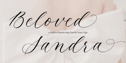 Introducing, Beloved Sandra! Beloved Sandra is a modern and luxury calligraphy font. Beloved Sandra will add charm and impression for your design. Beloved Sandra is perfect for many design needs such as merch, T-shirts, signature logo, wedding, book covers, social media posts, websites, events, and many more.
 - Soda Land by Typefactory,
$14.00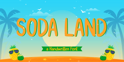 Soda Land is a fancy font that will bring playful feel to your designs. It is inspired by Summer theme typographies and it looks casual and natural. Soda Land is perfect for branding purposes such as logo, label, title, headline, product, social media, business card, quotes, and others
 - Segments by Artisan Studio,
$18.00 Segment Rough a work that is purely a result of handwriting, has a natural characteristic. this is perfect for invitations, signatures, blogs, social media, business cards, product brands. Ainsley has Stylistic standard, Stylistic Initial, Stylistic Teminal and ligatures. and includes uppercase and lowercase letters, numbers and punctuation marks.
 - Auditory Perception by Ali Hamidi,
$12.00 Auditory Perception is a monoline and handwritten font. Auditory Perception have a fashion and simple curves to add charm impression for your design. This font is perfect for many design needs such as merch, T-shirts, signature logo, wedding, book covers, social media posts, websites, events, and many more.
 - Calton Elegance by Lemonthe,
$8.00 Calton Elegance is a perfect mix modern calligraphy and sans-serif font. It was created to help you designing makes gorgeous logos, posters, wedding invitations, blog posts, social media, and more! NOTE: Quick access swash and titling with ligature, add 2x underscore before or after lowercase a-z.
 - Storytelling by Motokiwo,
$15.00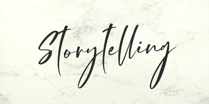 Storytelling is luxury and elegant modern calligraphy with natural handwriting style. It's great for various design purposes that need a classy feel such as logos, social media, wedding, branding, business cards, and many more. Storytelling contains uppercase, lowercase, numeral & punctuation, ligature, it's multi-lingual and already PUA encoded.
 - Graffiti Rusty by Nirmana Visual,
$22.00 Inspired by the urban landscape and the rebellious spirit of youth culture. characterized by an edgy, raw, and energetic aesthetic that captures the dynamic energy of the street. Graffiti Rusty offers beautiful typographic harmony for a diversity of design projects, including logos & branding, social media posts, advertisements & product designs.
 - Christmas Festival by Doehantz Studio,
$18.00 Christmas Festival. A magnificent curved monoline font with christmas theme. Use it to add vintage and mystique flavor to any design! It’s ready and perfectly fit for your logo designs, headline, music projects & social media posts, event poster, brand imagery, product packaging, quotes, merchandise, gift card, wedding invitation, etc.
 - Ashwood by Elswick,
$25.00 Ashwood is a contemporary, premium and sophisticated take on hand lettering. Its carefully crafted unique character has a soft edginess and looks great across fashion, branding, packaging, website headers, album art, magazines, advertising campaigns and social media. This typeface includes multilingual support and features a range of contextual ligatures.
 - Farmshed by Essentials Studio,
$16.00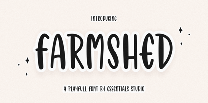 ntroducing by Essentials Studio Proudly Present, FARMSHED FARMSHED Is a A Handwriting Playfull Fonts FARMSHED is perfect for product packaging, branding project, megazine, social media, wedding, or just used to express words above the background. Enjoy the font, feel free to comment or feedback, send me PM or email.
 - Gastonila by Timurtype,
$14.00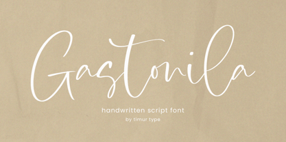 Introducing by Timur type Proudly Present, Gastonila Gastonila A Handwritten Script Font Gastonila is perfect for product packaging, branding project, megazine, social media, wedding, or just used to express words above the background. Gastonila also multilingual support. Embelish your designs with our original fonts.Enjoy the font,Thank you!