10,000 search results
(0.042 seconds)
- Revolter by Gassstype,
$25.00 Here comes a New font,Introducing Revolter It's Unique Rough Brush Font is a Authentic Style and classy style, this font is great for your creative projects such as watermark on photography, and perfect for logos & branding, invitation,advertisements,product designs, stationery, wedding designs,label ,product packaging, special events or anything that need handwritting taste.
 - Lintang Serif by Rillatype,
$17.00 Introducing, Lintang. Lintang is a display serif font that is firm yet elegant and unique because of its character and swash alternatives. Lintang is furnished with many character and swash alternatives that you can choose from making this font feel special and stand out. by using this font you can create elegant designs very easily.
 - Brandon Grotesque Office by HVD Fonts,
$40.00 This special Office version of Brandon Grotesque is especially for all Microsoft Office applications (Word, Excel, Powerpoint …). It contains just the 4 basic styles which are stlye-linked and can be easily accessed by the "I" or "B" button in Office. The fonts are manually hinted so their appearance is also optimized for these applications.
 - Heal The World by Letterara,
$12.00 Heal The World is a cute and sweet handwritten font with an incredibly friendly feel. This font will turn any creative idea into a true piece of art! This font is PUA encoded which means you can access all of the cute glyphs with ease! It also features a wealth of special features including ligatures.
 - Latinate by K-Type,
$20.00 LATINATE is a condensed Latin typeface whose sharp serifs are not as fiercely pointed as traditional Latins. The fonts are derived from the serial numbers of bus tickets issued by the Bell Punch Company in the mid twentieth century, and the LATINATE ROUGH font is a distressed version based on scans of coarsely printed tickets.
 - Orchide by Almarkha Type,
$27.00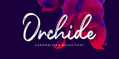 Introducing **Orchide** – Handwritten Brush is a handwritten script font with a Signature Style and classy style, this font is great for your creative projects such as watermark on photography, and perfect for logos & branding, photography, invitation, watermark,advertisements,product designs, stationery, wedding designs,label ,product packaging, special events or anything that need handwritting taste.
 - ALS Dulsinea by Art. Lebedev Studio,
$63.00 Decorative font based on XIX century Cyrillic handwriting. Dulsinea is a handwriting-based font, that is why most of the letters are tied to each other. Such handwriting is often seen in documents dated 2nd half of the XIX century. Its special features are rounded lengthy movements and unusual for present days sequence of strokes.
 - The Socker by Mozatype,
$11.00 THE SHOCKER a natural brush font. THE SHOCKER would be perfect for sports, music festivals, quotes, special events, or anything. What’s Included : - Works on PC & Mac - Easy to use ( Installations ) - Compatibility Windows, Apple, Linux, Cricut, Silhouette, and Other cutting machines Thank you for purchasing this font. Please appreciate, if you like this. ENJOY it :)
 - Seathera by Almarkha Type,
$35.00 Seathera is a beautiful script that feels classy, elegant, and modern. It is perfectly suited for a wide variety of projects! This font is PUA encoded which means you can access all of the magical glyphs and swashes with ease! It also features a wealth of special features including alternate glyphs and ligatures. Thank you
 - P22 Hoy Pro by IHOF,
$39.95 Hoy is a decorative font whose name derives from one of the Orkney Islands. Inspired by the wonderful encounter between the Celtic and Norse cultures in this specific geographic location, the font has adapted some of the features of the Insular half-uncial. It is playful and relaxed, and easily recognizable by its roundness.
 - Florens LP by LetterPerfect,
$39.00 Florens is a flourished, semi-formal script that designer Garrett Boge modeled after his own italic calligraphy, which is a contemporary version of the chancery script of the Italian Renaissance. In addition to the standard character set, a Flourished font provides old-style figures, special dingbats, and swash variants for all upper and lowercase characters.
 - Guyon Gazebo by Alifinart Studio,
$19.00 Introducing Guyon Gazebo, the luxurious display font that will elevate your designs to new heights. Get ready to make a bold statement with its unique style, perfect for captivating headlines, branding that stands out, eye-catching promotional materials, or adding a touch of elegance as a stylish text overlay to any background image. With its high contrast strokes, slender stem, and pointed terminals, Guyon Gazebo exudes sophistication and charm. Let your creativity flow as you explore the extensive collection of standard and discretionary ligatures, ensuring your designs are irresistibly attractive and visually stunning. Embrace the jovial spirit of "Guyonan" as this font's name suggests, originating from the Javanese language. Inspired by the traditional rural gazebo, where locals gather to exchange jokes, Guyon Gazebo infuses a sense of lightheartedness into your designs. Included in the package are Guyon Gazebo Regular and Italic styles, along with a full set of basic Latin characters, ligatures, numerals, and punctuation marks, providing you with all the tools you need to bring your vision to life. Don't miss out on this opportunity to enhance your design projects with Guyon Gazebo. Take your typography to the next level and let your creativity shine. Get Guyon Gazebo today and unlock a world of endless possibilities. Ready to make a statement? Purchase Guyon Gazebo now and let your designs speak volumes! What’s included: Guyon Gazebo Regular & Italic Full set of basic Latin+ Ligatures Numeral & punctuation Multilingual Support: Afrikaans, Albanian, Basque, Bemba, Bena, Breton, Catalan, Chiga, Colognian, Cornish, Croatian, Czech, Danish, Dutch, Embu, English, Esperanto, Estonian, Faroese, Filipino, Finnish, French, Friulian, Galician, German, Gusii, Hungarian, Indonesian, Irish, Italian, Kabuverdianu, Kalaallisut, Kalenjin, Kamba, Kikuyu, Kinyarwanda, Latvian, Lithuanian, Lower Sorbian, Luo, Luxembourgish, Luyia, Machame, Makhuwa-Meetto, Makonde, Malagasy, Maltese, Manx, Meru, Morisyen, North Ndebele, Norwegian Bokmål, Norwegian Nynorsk, Nyankole, Oromo, Polish, Portuguese, Quechua, Romanian, Romansh, Rombo, Rundi, Rwa, Samburu, Sango, Sangu, Scottish Gaelic, Sena, Serbian, Shambala, Shona, Slovak, Soga, Somali, Spanish, Swahili, Swedish, Swiss, German, Taita, Teso, Turkish, Upper Sorbian, Uzbek (Latin), Volapük, Vunjo, Walser, Zulu. Typeface Story: The name "Guyon" derives from the Javanese language and is often associated with humor or joking. In rural areas, there is a traditional gazebo called "Cakruk" where locals gather in the afternoon or evening to exchange jokes (known as "guyonan"). This font's name pays homage to the jovial atmosphere found in these communal spaces. Thank you for choosing Guyon Gazebo! If you have any questions or need assistance, feel free to reach out to us. ------------------------------ Alifinart Studio alifinart@gmail.com www.alifinart.com Instagram | Behance
 - Loxley by Canada Type,
$24.95 Drawn shortly before Jim Rimmer's passing in 2010, Loxley was designed to be used in a fine press edition of the folklore story of Robin Hood. It was named after the cited birthplace of the story's classic hero. Loxley's shapes were inspired the same early Roman faces (such as Subiaco from the late 1400s) that influenced Frederick Goudy's Aries, Franciscan and Goudry Thirty types. It exhibits the preculiarities of Jim's left-handed calligraphy, as well as his outside-the-box thinking with exit strokes and serif variations. Loxley was remastered for the latest technologies in 2013. Now it comes with a character set of over 450 glyphs, including plenty of stylistic alternates, a full compliment of f-ligatures, a Th-ligature, basic fractions, ordinals, a long s for historic setting, comprehensive class-based kerning, and extended Latin language support. 20% of this font's revenues will be donated to the Canada Type Scholarship Fund, supporting higher typography education in Canada.
 - ITC Clearface by ITC,
$45.99 The Clearface types were originally designed by Morris Fuller Benton in 1907. Their forms expressed the Zeitgeist of the turn of the 20th century; typical and distinguishing characteristics are the forms of the a" and the "k." The ATF version did not include an accompanying Italic. In 1978, ITC's Victor Caruso was licensed by ATF to develop a new serif typeface and matching italic based on the forms of Clearface. The result was ITC Clearface, a serif typeface with marked stroke contrast and italic weights. The teardrop-formed endings of the lowercase a, c and f (also found in Caslon) define the character of the face. The type's design is also distinguished by its small -- almost slab -- serifs, a large x-height, and little stroke contrast. ITC Clearface, with its historical touch, is good for both texts and headlines, but its slightly condensed nature performs at its best when it is allowed its space.
 - 1529 Champ Fleury Initials by GLC,
$42.00 In 1529, Geofroy Tory, French scholar, engraver, printer, publisher and poet, was publishing the well known so called Champ Fleury, printed by Gilles de Gourmond, in Paris. It is a fully illustrated handbook where the author explains how to draw Roman characters. The font used for the text - a Humane/Jenson type - was not a very beautiful one, but rough and ready, and the book is well known for its capital letters designs. We are offering here the two complete historical type sets and more -- we have entirely redrawn the lacked letters: J, U and W, Eth, Lslash, Thorn and Oslash in the two initial forms. The text font, 1529 Champ Fleury Regular is now containing all characters for West European (including Celtic), Baltic, East and Central European and Turkish language, and the Initial set 1529 Champ Fleury Init is containing two complete alphabets, with a very great effort to be as close as possible to the original pictures.
 - Quarantype by Zetafonts,
$- Trapped home during the Coronavirus outburst of March 2020 the Zetafonts team found some solace from the world-wide anxiety by designing letters for the #36daysoftype challenge. To fight dark thoughts and spread some good karma we decided to add a free font twist, selecting the best glyphs drawn to develop a collection of ten free typefaces for download. We did our best to make this little gift to the community valuable, though developed in record time: although playful and excessive, these typefaces all stem from our current research in contemporary trends and historical design solutions, bridging calligraphy and design. The typefaces have been published daily starting Monday, March 30. You can download and use the typefaces in any way you desire, as they are totally free for commercial and non-commercial use. We are not asking anything back, but feel free to share the good karma and, if you want, please consider a donation for hospitals.
 - Carrig Pro by Monotype,
$31.99 Carrig Pro is a refined and elegant serif. Classed as an Antiqua, Carrig Pro is born from [or borne by] a hybrid of influences that range from early Roman inscriptions to type of the Pre-Modern era, giving Carrig Pro a distinctive character all of its own. Carrig Pro will appear instantly familiar and friendly and could well be the perfect typeface for designers seeking to convey a message with a distinctive and prestigious air. Now a 12-font family, Carrig Pro (2017) is an extended version of Carrig (2015), it has been completely redrawn, revised and improved. Carrig Pro has many useful features for typographers to exploit, such as easily accessible small caps, discretionary ligatures, gadzooks and stylistic alternates, as well as a number of ornamental glyphs. See more here. Key features: 6 weights in roman and italic Small Caps, Ornaments, Alternates, Historic Characters, Ligatures and Gadzooks Full Latin character set 750 glyphs per font.
 - Geographica Script by Three Islands Press,
$39.00 Time-tested elegance is what you’ll get with Geographica Script, a handwritten typeface steeped in 18th century sophistication. Source materials include the maps of Emanuel Bowen (circa 1694–1767), Geographer to King George II, as well as English and American trade cards from the middle 1700s, including the work of artist and printmaker William Hogarth (1697–1764). A kindred font to our Geographica serif family, Geographica Script is a painstaking replication of the elegant roundhand cursive seen in engravings of the period. Geographica Script has more than 1,100 glyphs, including scores of standard and contextual ligatures, three full uppercase alphabets, historical forms, decorative flourishes, and full Latin support. It’s also got fifty evocative ornaments inspired by map and trade card illustrations, e.g., lion rampant, unicorn rampant, crowns, anchors, sailing ships, whale, dolphin, sun, moon, and many others. Note: To prevent Microsoft Word from cutting off Geographica Script’s extra-long descenders, set line spacing (Format —> Paragraph —> Spacing) to 1.5 lines.
 - Ghitta Bodoni Cancellaresca by Spurnej Type Foundry,
$39.00 Giambattista Bodoni was an Italian engraver, printer, and publisher who was one of the best typographers of the 18th century and became known worldwide for his iconic serif typeface. In the posthumous edition of Bodoni’s “Manual of Typography” published in 1818 by his widow Margherita “Ghitta” Dall’Aglio may also be found, among the other treasures, the Cancellaresca (Chancery). Ghitta is a redesign of this typeface in its finest form. With strong stroke contrast in 4 optical grades, 850 glyphs with wide range of language support, accented ligatures, oldstyle figures, 8 stylistic sets, and unique way of letter connection, Ghitta Bodoni Cancellaresca follows and builds on the best of Bodoni’s historical prototype and shifts further to a contemporary script typeface full of grace, neatness, and beauty. *** This font is powered by OpenType feature “Ligatures”, so it is necessary to have this function turned on. If you need support or more information, please kindly contact me: spurnej@email.cz
 - Ragna Runes by Mans Greback,
$79.00 Ragna Runes is not just a font; it's a journey back to the days of lore and legend. Using it feels like rediscovering a long-lost civilization, where every rune is more than a letter; it's an artifact of a bygone era. The typeface features characters modeled after historical runes, making it uniquely suited for projects that require an ancient or mystical aesthetic. Ragna Runes is built with advanced OpenType functionality and has a guaranteed top-notch quality, containing stylistic and contextual alternates, ligatures, and more features; all to give you full control and customizability. It has extensive lingual support, covering all Latin-based languages, and includes all the characters and symbols you'll ever need. Behind this exquisite creation is Mans Greback. Known for pushing the boundaries of type design, Greback has ventured into the intricacies of aesthetic diversity with Ragna Runes. His portfolio is a testament to his versatility and daring, turning simple alphabets into powerful visual narratives.
 - House of the Dragon by Mans Greback,
$59.00 House of the Dragon is a gothic blackletter typeface, drawn and created by Mans Greback. Its large, decorative fraktur initials contrasts against the clear, minimalist medieval lowercase, as thrones amongst chairs. With more than one thousand high-quality glyphs, House of the Dragon supports all languages. It is provided in four beautiful styles: Regular, Bold, Outlined and Deco. In addition, the complementary House of the Dragon Color font, with an amazing, classical gold/red effect. This Middle Age typeface is perfect for an Olde English/German logotype, a fantasy game or a poster for a historic battle. The font is built with advanced OpenType functionality and has a guaranteed top-notch quality, containing stylistic and contextual alternates, ligatures and more features; all to give you full control and customizability. It has extensive lingual support, covering all Latin-based languages, from North Europe to South Africa, from America to South-East Asia. It contains all characters and symbols you'll ever need, including all punctuation and numbers.
 - Frigga by Sudtipos,
$49.00 Frigga is a typeface that settles its roots in the Baroque Dutch tradition of text typefaces and northern european type forms. Carefully crafted for an optimum balance between its solid historic structure and a refreshing repertoire of organic forms, where blossoms its contemporary spirit and natural beauty. In the page, spread on long text settings a feeling of comfort and closeness, while in headlines and display use, it reveals itself more exuberant and plentiful of details. Is beautiful, timeless, lush, elegant and smooth like nordic mead. Fully equipped to realize your wildest editorial dreams, Frigga came in 20 styles, with more than a 1000 glyphs per style, alternates, ornaments and borders, old style and tabular figures, small caps and plenty of OpenType features to fulfill any type of editorial need. Named after the nordic goddess Frigga (also called Frejya), taking as a reference the romantic mythos of its cultural representation, the solemn presence and her warm, gentle embrace.
 - KT Quantum by Kotivoro Lab,
$11.00 KT Quantum is a Display Serif Typeface with 8 weight from Thin to Extrablack. Quantum adapted from 1911 old style serif typeface, Our mindset is to bring this historical typeface to this era, which is we have to redrawing that from the scratch and refining the shape to build the strong characteristic and make it ours. KT Quantum have total 434 glyphs and 203 language support. Quantum support latin basic, latin-1 supplement, latin extended A-B, Spacing modifier letters, and combining diacritical marks. This typeface have a bold characteristic with masculine and feminine effect in the same time, that's make this typeface suitable for your Headline and sub-headline, we don't recommended to use it as body text in small size, because it has a very large contrast and reduce the legibility and readability Whats Include: Webfont is available if you purchase the webfont option and we will send the file direct to download it. Enjoy & Happy Creating We're Here Tapinkco@gmail.com
 - California Poster SG by Spiece Graphics,
$39.00 Known to many eastern artists as the California Poster Letter because it originated in the West, this old 1930s style has reappeared in digital form. Carl Holmes, in his wonderful book on old lettering styles, pays tribute to this uniquely American design. Faintly reminiscent of the lettering of Fred G. Cooper, California Poster Bold is at times wildly exaggerated and boisterous. Letters appear to be inflated and loopy. The design might aptly be described as a kind of rollicking Cooper Black (Oswald Bruce Cooper). An extensive range of alternates and figures has been provided for your convenience. California Poster Bold is now available in the OpenType Std format. Some new characters have been added to this OpenType version as stylistic alternates and historical forms. These advanced features work in current versions of Adobe Creative Suite InDesign, Creative Suite Illustrator, and Quark XPress. Check for OpenType advanced feature support in other applications as it gradually becomes available with upgrades.
 - Basic Commercial by Linotype,
$57.99 Basic Commercial is a family of fonts based on historical designs from the hot metal type era. First appearing around 1900, these designs were created by type designers whose names have not been recorded, but whose skills cannot be overlooked. These typefaces were popular among groups and movements as diverse as the Bauhaus, Dadaism, and the masters of Swiss/International-Style typography. They influenced a variety of later grotesque fonts, such as Helvetica and Univers. Basic Commercial was distributed for many years in the United States under the name Standard Series. The typeface worked its way into many aspects of daily life and culture; for instance, it became the face chosen for use in the New York City subway system’s signage. The Basic Commercial family members have a clear and objective design. Their forms exhibit almost nothing unusual, but remain both lively and legible nonetheless. Perhaps for this reason, Basic Commercial’s design has been popular with graphic designers for decades.
 - Charpentier Classicistique Pro by Ingo,
$41.00 An unconventional classicistic Roman typeface This Roman typeface has a livelier effect than is typical of the epoch of classicistic style. In the lower case letters, an echo of the smoother forms of historically early scripts is identifiable. Typical of a classicistic Roman typeface are the emphasized and clear contrast in the weight of the strokes, the fine serifs and the accentuation of the vertical bold stem. Charpentier Classicistique is pleasantly legible. Its effect is much less harsh than other classicistic fonts. The pointed forms of M and N are uncommon. At 30°, the italic version of Charpentier Classicistique is unusually strongly slanted. The italic lower case letters refer, in part, to English handwriting, which also falls under classicism. Especially the curves show forms influenced by writing. Charpentier Classicistique supports all European languages including Turkish, Greek and Russian. It includes lots of ligatures, also discretional ones, as well as tabular figures and cap-height figures.
 - Woodford Bourne by Monotype,
$20.99 Woodford Bourne is a brand new 19th century grotesque typeface. The design is a tribute to the historic stone cast type in the building façades of the former Woodford, Bourne & Co. in Cork City, Ireland. For many years I had admired the type’s simplicity and strength, so I decided to faithfully reproduce those letters and expand them to a fully working font with 500 glyphs per case. A key feature of Woodford Bourne is the ability to change the feel of your typography with just one click. Switch from contemporary to vintage style by selecting “Stylistic Set 1” – this gives Woodford Bourne a unique versatility which I am sure you will enjoy playing with in your designs. It is a solid, reliable “workhorse” font family that reproduces well at all sizes… it’s also great for branding and identities. These font files (v2) were redrawn and updated in April 2021 (v1 created 2015).
 - Hunter by Canada Type,
$24.95Many of the fonts available from Canada Type are revivals of historic brush scripts (such as Bruschetta, Coffee Script, Puma, Tiger Script). Hunter is a deserved addition to the collection. Imre Reiner's Mustang design from 1956 now enters the digital realm to continue living in this world of new typography. Hunter has a wilder streak than other brush scripts. Its irregular terminals give it an almost wooden appearance and a most natural, hand-made expression. This natural look was extended by the expansion of the original design and the addition of some alternates and ligatures, built within the font and easily accessible from any program's glyph palette. Hunter was also slightly modified to accommodate not only sentence- and lowercase-setting, but also all-capital setting, which is a flexibility hardly ever found in most brush scripts. So if you have been looking for a natural, quirky brush script for your designs, Hunter is your type! - Lustra by Grype,
$16.00 Since the early 1980's, the automotive industry has been developing geometric/technical style logotypes for car chrome labels. The styles are ripe with inspiration for great font families, but surprisingly, many of these sleek logotypes are lacking an expansive family to enhance and express their brand in a richer sense, becoming true brand workhorses. The Lustra family finds its origin of inspiration in the HYUNDAI automotive company logo, and from there expands to an 8 font family of weights. Lustra celebrates the techno display styling of the inspiration logotype, transcending its brand inspired origin to give birth to a font family that pulls on modern and historical styles. It inherits a sturdy yet approachable style with its uniform stroke forms and curves, and goes on to include a lowercase, numerals, and a comprehensive range of weights, creating a straightforward, uncompromising collection of typefaces that lend a solid foundation and a broad range of expression for designers.
 - Jeanne Moderno by steve mehallo,
$32.00Jeanne Moderno is a revisionary type family. A synthesis of Bodoni Italic and 19th Century Ultra-Bold "Fat Faces"—distilled with personality taken from early 20th Century Modernists; the Futurists, Dadaists, Suprematists, Constructivists. Historically, Jeanne Moderno could have appeared on the scene around 1918—after the First World War—when new cultural movements, manifestos, theories and countertheories shaped art, industry and society. Spatter in a few later influences—from De Stijl, the Bauhaus, the types of Herbert Bayer, Josef Albers, Paul Renner—plus a twist of Art Deco and High Fashion—Jeanne Moderno is a remanifestation of 19th + 20th Century Modernist thinking; traditional + revisionist, raw and elegant! Jeanne Moderno can best be used for magazines, advertising, posters, flyers, fashion reports, letterpress experiments, silkscreen endeavors, exhibitions, DMV signage, paper money, revolutionary political statements as well as formal declarations of peace or war. Jeanne Moderno is about the future, the past. The Avant-Garde. Humanist geometry + vintage footwear. Form, function, style, art and life. - Pennyroyal Pro by Stiggy & Sands,
$39.00 A Historical Revival for Modern Typesetting Flair Pennyroyal began as a Barnhart Brothers & Spindler typeface called Plymouth Bold, first cut in 1900. What began as a straightforward rustic typestyle has been revived to include a more extensive character set. But this font wasn’t just revived, it has come alive with character and personality. Taking things further, Pennyroyal Pro adds in Unicase (stylistic alternates), Swashes (swash alternates), and a collection of grunge alternates from the original source and additional alternates included (PUA encoded). You’ll find that Pennyroyal Pro contains 1476 characters. The expanded SmallCaps option for Pennyroyal Pro gives the typestyle a more sophisticated option, while the expansive options like Unicase and Swashes allow for more uniqueness, play, and experimenting far beyond the original typeface inspiration. Opentype features include: A collection of ligatures. Smallcaps. Full set of Inferiors and Superiors. Proportional figures and Oldstyle figure sets. Unicase Capitals as Stylistic Alternates Swash Caps & Lowercase alternates Smallcap Swash Caps & Lowercase alternates Grunge Alternates for Capitals Additional Swash Alternates
 - Ongunkan Old Latin by Runic World Tamgacı,
$40.00 The Latin, or Roman, alphabet was originally adapted from the Etruscan alphabet during the 7th century BC to write Latin. Since then it has had many different forms, and been adapted to write many other languages. According to Roman legend, the Cimmerian Sibyl, Carmenta, created the Latin alphabet by adapting the Greek alphabet used in the Greek colony of Cumae in southern Italy. This was introduced to Latium by Evander, her son. 60 years after the Trojan war. There is no historical evidence to support this story, which comes from the Roman author, Gaius Julius Hyginus (64BC - 17AD). The earliest known inscriptions in the Latin alphabet date from the 6th century BC. It was adapted from the Etruscan alphabet during the 7th century BC. The letters Y and Z were taken from the Greek alphabet to write Greek loan words. Other letters were added from time to time as the Latin alphabet was adapted for other languages.
 - ITC Johann Sparkling by ITC,
$29.99ITC Johann Sparkling is the work of Austrian designer Viktor Solt, a perfect imitation of the handwriting of an educated person of the 18th century. ITC Johann Sparkling is intended to close the gap between highly formal copperplate scripts and the scribbled look of 'true' handwriting," says Solt. "I am not very interested in highly formal and perfect calligraphy, but rather in quick, personal-looking scripts. Usually I start with some historical samples in mind, but I do not try to copy these sources. Instead, I incorporate them into my own handwriting. It takes up to two weeks, and many sheet of paper, before the respective script becomes my own. Of course, this would not be an economic approach for individual lettering jobs, but I can conserve the custom script for future use by digitizing it." ITC Johann Sparkling should be used in fairly large point sizes and its capitals only as initials. - Worthington Arcade by Device,
$39.00 Worthington Arcade is a classically-proportioned capitals-only type incorporating a selection of ligatures and alternates. It loosely resembles the hand-painted architectural lettering of the 30s to the 50s, exemplified by the likes of Percy Smith’s interior signage for the BBC or George Mansell’s lettering for the University of London and the signs found on London’s bridges. However, rather than a slavish copy of any historical model, it is more an examination and evocation of certain idiosyncratic quirks of civic lettering of the period, and an attempt to create a peculiarly English titling typeface. The round letters, for example the O, Q and C, are wider than the perfect circle usually found in such designs, while the straight-sided characters, usually drawn on a square, are narrower. This lends the whole a subtle elegance that is also emphasized by the raised crossbars on the H, E and F and extended lower leg of the E. Includes old-style numerals.
 - Selectric Century by Indian Summer Studio,
$45.00 Also known as Schoolbook. 900+ glyphs. After Linn Boyd Benton's and Morris Fuller Benton's 1894 lower contrast version of Scotch Modern, Didone. The part of the large project on revival and further development (by drawing many additional glyphs) of the 20th century’s typewriters’ fonts. And especially the most famous, versatile and beautiful typewriter: IBM Selectric’s golfball fonts, lost for the civilization for many decades after ‘80s, not being created since then in digital vector form. This new sub-project started in July 2018 for the restoration of the most beautiful classical typefaces, used during the 20th century on the extremely rare now IBM Selectric Composer typewriters / desktop publishing systems. Together with Nick Hamze and the Right Reverend Theodore Munk, the collectors of old typewriters. IBM showed the perfect taste by developing these best historical book typefaces of the human civilization for typewriters. So people could type then using both the real book faces, and the famous classical ones.
 - Ongunkan Carpathian Basin Rovas by Runic World Tamgacı,
$60.00 Carpathian Basin Rovas The Carpathian Basin Rovas script, or Kárpát-medencei rovás in Hungarian, was used in the Carpathian Basin between about the 7th and 11th centuries. Most of the inscriptions are in Hungarian, but some were in Onogur, As-Alan, Slavic or Eurasian Avar. Carpathian Basin Rovas is thought to be a descendent of the Proto-Rovas script, which was used to the east of the Aral Sea between about the 1st century AD and 567, when the tribes who were using it, the Avars and Ogurs, started to move into the Carpathian Basin. That process took until about 670 AD, after which the Proto-Rovas script became the Carpathian Basin Rovas and the Khazarian Rovas scripts. The Proto-Rovas script was perhaps a descendent of the Aramaic script. Since 2009 efforts have been made to revive the use of this alphabet. Some letters were added to it to represent sounds in modern Hungarian that weren't used historically.
 - Beyond Babylon by URW Type Foundry,
$35.99 Babylon was a civilisation that stretched from Bagdad to the Persian Gulf. There is an Old and new Babylonia, the era of Babylon civilization and the biblical Babylon. The oldest scriptures to be found since the rise of civilisation are Babylonic. The Christian, the Jewish and the Arabic culture find its origin in the Middle East. And share more or less the same history, the same roots and DNA. One people, but in reality a melting pot of close related cultures whom could not be more far apart, hostile and suspicious towards each other. An eye for an eye, tooth for a tooth. One could say this disagreement is still alive today and has deeply infected all of our systems. Beyond Babylon is sculpted after Hebrew, Arabic character style elements in a European writing. It questions what happened after the great Babylonic confusion. Did the words finally come across? Did they realize the distant and gap was maybe smaller than expected. This typeface is related to my former character Eurabia. As an artist I like to play with contradictions. Use opposite elements and mould them in to one understandable piece and in addition a thought to chew on. Otherwise the experimental ore shape lovin' typeface user could be very happy with an addition feature to the existing characters. One option more to express your selves in writing. Also this typeface is really suitable for theme writing or advertising. ----------- Babylon war eine Zivilisation die sich von Bagdad bis zum Persischen Golf erstreckte. Es gibt das alte und das neue Babylon, die Ära der Babylon Zivilisation und das biblische Babylon. Die ältesten Schriften, welche seit dem Aufstieg der Zivilisation gefunden wurden, sind babylonisch. Die Christen, die Juden und die arabische Kultur finden ihren Ursprung im Mittleren Osten. Sie teilen mehr oder weniger die gleiche Geschichte, die gleichen Wurzeln und DNA: Ein Volk. Aber in Wirklichkeit waren sie ein Schmelztiegel aus eng verwandten Kulturen, welche sich nicht ferner sein könnten: feindselig und misstrauisch zueinander. Auge um Auge, Zahn um Zahn. Man könnte behaupten, diese Unstimmigkeit bestehe noch heute und hätte all unsere Systeme stark infiziert. Beyond Babylon ist eine europäische Schrift, geformt nach hebräischen und arabischen Stilelementen der Zeichen. Sie hinterfragt die Geschehnisse nach der der Babylonischen Sprachverwirrung. Kamen die Worte endlich an? Haben sie realisiert, dass die Weite des Spalts zwischen ihnen vielleicht geringer war als erwartet. Diese Schrift ist verwandt mit meinen vorigen Zeichen der Eurabia. Als Künstlerin mag ich es mit Widersprüchen zu spielen, gegensätzliche Elemente zu einem vernehmbaren Ganzen zu verschmelzen und einen kniffligen Gedanken zu erzeugen. Andererseits könnte der experimentelle oder formenverliebte Nutzer sehr glücklich über eine zusätzliche Funktion der bestehenden Zeichen sein. Eine weite Möglichkeit sich im Schreiben auszudrücken. Diese Schrift ist auch für Werbung sehr geeignet.
 - Speech Bubbles by Harald Geisler,
$68.00 The font Speech Bubbles offers a convenient way to integrate text and image. While the font can be used to design comics, it also gives the typographer a tool to make text speak – to give words conversational dynamics and to emphasize visually the sound of the message. The font includes a total of seventy outlines and seventy bubble backgrounds selected from a survey of historic forms. What follows is a discussion of my process researching and developing the font, as well as a few user suggestions. My work on the Speech Bubbles font began with historic research. My first resource was a close friend who is a successful German comic artist. I had previously worked with him to transform his lettering art into an OpenType font. This allowed his publishing house to easily translate cartoons from German to other languages without the need to use another font, like Helvetica rounded. My friend showed me the most exciting, outstanding and graphically appealing speech bubbles from his library. I looked at early strips from Schulz (Peanuts), Bill Waterson (Calvin & Hobes), Hergé (TinTin), Franquin, as well as Walt Disney. The most inspiring was the early Krazy Kat and Ignatz (around 1915) from George Herriman. I also studied 1980’s classics Dave Gibbon’s Watchmen, Frank Miller’s Ronin and Alan Moore and David Lloyd’s V for Vandetta. Contemporary work was also a part of my research—like Liniers from Macanudo and work of Ralf König. With this overview in mind I began to work from scratch. I tried to distill the typical essence of each author’s or era’s speech bubbles style into my font. In the end I limited my work down to the seventy strongest images. An important aspect of the design process was examining each artist’s speech bubble outlines. In some cases they are carefully inked, as in most of the 80’s work. In others, such as with Herriman, they are fast drawn with a rough impetus. The form can be dynamic and round (Schultz) with a variable stroke width, or straight inked with no form contrast (Hergé). Since most outlines also carry the character of the tool that they are made with, I chose to separate the outline from the speech bubble fill-in or background. This technical decision offers interesting creative possibilities. For example, the font user can apply a slight offset from fill-in to outline, as it is typical to early comic strips, in which there are often print misalignments. Also, rather than work in the classic white background with black outline, one can work with colors. Many tonal outcomes are possible by contrasting the fill-in and outline color. The Speech Bubbles font offers a dynamic and quick way to flavor information while conveying a message. How is something said? Loudly? With a tint of shyness? Does a rather small message take up a lot of space? The font’s extensive survey of historic comic designs in an assembly that is useful for both pure comic purposes or more complex typographic projects. Use Speech Bubbles to give your message the right impact in your poster, ad or composition.
 - FF Mark Paneuropean by FontFont,
$79.00Geometric sans fonts in the Bauhaus tradition were the inspiration for the design of FF Mark®, for example the Universal font by Herbert Bayer, Erbar® Grotesk, Kabel®, Neuzeit Grotesk and of course Paul Renner's Futura®. From an aesthetic point of view, FF Mark is a descendant of these classics of German typeface design that intends to meet the needs of modern communication. Hannes von Döhren and Christoph Koeberlin had the support of the entire FontFont Type Department in the design of FF Mark, including Erik Spiekermann, who took over the artistic direction of the project. The teamwork resulted in carefully planned, balanced forms, which are responsible for the harmonious overall impression of the font. The capitals are not based on Roman square capitals; rather, they have a uniformly wide letter form in a comfortable ratio to the x-height. Thanks to the x-height, which is significantly larger compared to the historical models, FF Mark is also very legible in small sizes. This makes it a very flexible font in terms of its range of applications. A contrast in the stroke width is barely noticeable. At the same time, light modulation supports readability, especially in the bold styles in small sizes. The uniform line ends are obvious for a contemporary sans family nowadays (unlike some of the historical precedents, which evolved over years). Other details from the predecessors are consciously maintained and provide for added individuality in FF Mark. For example, the limbs in the uppercase "K" and "R" are offset slightly from the stem. Alternative characters with crossbars are available for the numbers "0", "1", "7" and the uppercase "Z" and the lowercase "a" also has an alternative with an open form. German typesetters have the option of uppercase umlauts with points that are set lower, as well as a long "s" from the Fraktur. And last but not least, FF Mark has the very characteristic ft-ligature of Futura. FF Mark is available in ten finely tuned weights ranging from Hairline to Black. A Book style for text setting further emphasizes the well-rounded features of this contemporary typeface. When the font was published, it also included ten carefully designed cursives for all weights. Users also have the option of various numeral sets with old-style and uppercase numbers as well as small capitals. FF Mark also has some geometric shapes and arrows based on the features of Futura. FF Mark is a modern, full-featured, geometric sans serif that you can use without hesitation for large projects in headlines as well as in texts. FF Mark's design is a nod to the historical models and transports their charm, elegance and in some cases unusual design applications into a modern font family equipped with the most current typographical features. NEW: the new FF Mark W1G versions features a pan-European character set for international communications. The W1G character set supports almost all the popular languages/writing systems in western, eastern, and central Europe based on the Latin alphabet and also several based on Cyrillic and Greek alphabets. - Baldufa by Letterjuice,
$66.00Baldufa is a charming typeface with strong personality, which looks very comfortable in text. There is a search to obtain complicated curves and detailed features, which give the typeface a touch of beauty and elegance. However, this is also a self-conscious design that claims appreciation for quirkiness and human imperfection through the rounded serifs and irregular vertical stems. The typeface family is also a multi script project, containing Latin and Arabic scripts. The Latin consists of Regular, Bold and Italic styles, including Small Caps and many other typographic features. Whereas Arabic Naskh includes Regular and Bold weights. The whole family has been designed to work harmoniously together to help to produce catalogues and small publications of cultural content. We believe that Baldufa is a tiny but nice contribution to build bridges between cultures and this make us very happy. The letterforms in the Latin are inspired by the slight distortions and idiosyncrasies that came with old printing methods. It has distinct, features such as rounded serifs, irregular vertical streams, ink traps and extremely thin junctions. In the Italic, serifs have been removed to enhance movement and expressivity. These experiments in form have not come at the cost of legibility: The typeface remains suitable for both small and display text. To certain extent, the design of the Arabic gathers the same interest for experimentation than its Latin companion. Baldufa Arabic respects the basic features of Arabic script such as thick stokes in the baseline, multiple vertical axis, genuine stem modulation and good linking between words. However, it steps away from traditional Calligraphic Style. It has rounded top terminals and the traditional contrast between curves and straight stokes has been softened. Letter shapes sometimes slightly differs from tradition in order to obtain more expressivity. Overall, Arabic has been designed to acquire the same elegant and quirky aspect of the Latin.