10,000 search results
(0.053 seconds)
- Libra by Bitstream,
$29.99 A skillful revival of the Uncial by S.H. de Roos for Lettergieterij Amsterdam in 1938.
 - COMANDO X by RASDesign,
$50.00Comando X is special font, built to create different characters using case-sensitive different characters. - Leitura Symbols by DSType,
$19.00Leitura Symbols is part of Leitura Type System and was specially designed for editorial purposes. - flutSaus by JOEBOB graphics,
$- Another font by Hilde Rikken (age 10) with crazy serifs and almost every special sign.
 - FG Jason by YOFF,
$13.95FG Jason is a casual male handwriting with special i's without a dot - really unique! - Vtg Stencil France No1 by astype,
$40.00 The Vtg Stencil fonts from astype are based on real world stencils from several countries. In the case of French stencils the challenge was special, because of the varieties of different widths and weights between the stencil sets – so I made France No. 1, No. 3 and No. 5. The most unique and eye-catching elements of typical French stencils are the figures 1, 2, 3, 7 and a specially 5. The figure 5 changes in style on smaller stencil sizes, its bobble getting replaced by something like a “breve”. The letters J and Q can differ in style too. While the local stencil lettering styles are gradually disappearing in other countries, there are regions in France, such as Normandy and Brittany, where these stencils are still in use today. They are used for technical lettering, which is what stencils were originally intended for, but also for ads and information signs in a more artistic or patriotic context. Over the time, these stencil letters became a globally recognized landmark of French design and French taste. All styles offering an extended Latin character set. » pdf specimen «
 - Gill Display Compressed by ITC,
$29.99The successful Gill Sans® was designed by the English artist and type designer Eric Gill and issued by Monotype in 1928 to 1930. The roots of Gill Sans can be traced to the typeface that Gill's teacher, Edward Johnston, designed for the signage of the London Underground Railway in 1918. Gill´s alphabet is more classical in proportion and contains what have become known as his signature flared capital R and eyeglass lowercase g. Gill Sans is a humanist sans serif with some geometric touches in its structures. It also has a distinctly British feel. Legible and modern though sometimes cheerfully idiosyncratic, the lighter weights work for text, and the bolder weights make for compelling display typography. Gill Sans is also available as Value Pack for Macintosh, PC or as Hybrid CD with both platforms. - Gill Sans MT Greek by Monotype,
$67.99The successful Gill Sans® was designed by the English artist and type designer Eric Gill and issued by Monotype in 1928 to 1930. The roots of Gill Sans can be traced to the typeface that Gill's teacher, Edward Johnston, designed for the signage of the London Underground Railway in 1918. Gill´s alphabet is more classical in proportion and contains what have become known as his signature flared capital R and eyeglass lowercase g. Gill Sans is a humanist sans serif with some geometric touches in its structures. It also has a distinctly British feel. Legible and modern though sometimes cheerfully idiosyncratic, the lighter weights work for text, and the bolder weights make for compelling display typography. Gill Sans is also available as Value Pack for Macintosh, PC or as Hybrid CD with both platforms. - Gill Kayo Condensed by ITC,
$40.99The successful Gill Sans® was designed by the English artist and type designer Eric Gill and issued by Monotype in 1928 to 1930. The roots of Gill Sans can be traced to the typeface that Gill's teacher, Edward Johnston, designed for the signage of the London Underground Railway in 1918. Gill´s alphabet is more classical in proportion and contains what have become known as his signature flared capital R and eyeglass lowercase g. Gill Sans is a humanist sans serif with some geometric touches in its structures. It also has a distinctly British feel. Legible and modern though sometimes cheerfully idiosyncratic, the lighter weights work for text, and the bolder weights make for compelling display typography. Gill Sans is also available as Value Pack for Macintosh, PC or as Hybrid CD with both platforms. - Gill Sans MT WGL by Monotype,
$92.99The successful Gill Sans® was designed by the English artist and type designer Eric Gill and issued by Monotype in 1928 to 1930. The roots of Gill Sans can be traced to the typeface that Gill's teacher, Edward Johnston, designed for the signage of the London Underground Railway in 1918. Gill´s alphabet is more classical in proportion and contains what have become known as his signature flared capital R and eyeglass lowercase g. Gill Sans is a humanist sans serif with some geometric touches in its structures. It also has a distinctly British feel. Legible and modern though sometimes cheerfully idiosyncratic, the lighter weights work for text, and the bolder weights make for compelling display typography. Gill Sans is also available as Value Pack for Macintosh, PC or as Hybrid CD with both platforms. - Gill Sans MT Cyrillic by Monotype,
$67.99The successful Gill Sans® was designed by the English artist and type designer Eric Gill and issued by Monotype in 1928 to 1930. The roots of Gill Sans can be traced to the typeface that Gill's teacher, Edward Johnston, designed for the signage of the London Underground Railway in 1918. Gill´s alphabet is more classical in proportion and contains what have become known as his signature flared capital R and eyeglass lowercase g. Gill Sans is a humanist sans serif with some geometric touches in its structures. It also has a distinctly British feel. Legible and modern though sometimes cheerfully idiosyncratic, the lighter weights work for text, and the bolder weights make for compelling display typography. Gill Sans is also available as Value Pack for Macintosh, PC or as Hybrid CD with both platforms. - ITC Motter Sparta by ITC,
$29.99ITC Motter Sparta is the work of Austrian designer Othmar Motter and for its inspiration, he turned to car design. As we all know, trends in car design affect many other fields of design in a way that shapes tastes." At the end of the 1990s, Motter saw the trend moving away from soft lines and toward a tighter, tenser look: "In this latest trend, sharp clearly-defined edges meet broadly-drawn, dynamic curves and cut them off sharply." And so too is ITC Motter Sparta, with each character form distinct, which also creates a typeface instantly recognizable from a single character. "The sharp straight strokes, cut off almost at right angles, and the strong cross-stroke curves, ending in points, form a charged contrast to the vertical and horizontal straight strokes that give Motter sparta its taut framework."" - Gill Sans MT Infant by Monotype,
$43.99The successful Gill Sans® was designed by the English artist and type designer Eric Gill and issued by Monotype in 1928 to 1930. The roots of Gill Sans can be traced to the typeface that Gill's teacher, Edward Johnston, designed for the signage of the London Underground Railway in 1918. Gill´s alphabet is more classical in proportion and contains what have become known as his signature flared capital R and eyeglass lowercase g. Gill Sans is a humanist sans serif with some geometric touches in its structures. It also has a distinctly British feel. Legible and modern though sometimes cheerfully idiosyncratic, the lighter weights work for text, and the bolder weights make for compelling display typography. Gill Sans is also available as Value Pack for Macintosh, PC or as Hybrid CD with both platforms. - Brotherside Signature by Figuree Studio,
$18.00 The Brotherside is a signature decorative font with which you can achieve a handwritten-type lettering feeling. This signature style is perfect for your modern graphic design needs. This font has a really nice flow so you use it in a large text if you want to give them a touch of personality. It can be used on social media content, for branding or packaging. The Brotherside is the ideal typeface for organic products branding and packaging. Additionally, you can use this for adding romantic vibes for wedding invitation designs. Especially if you are looking for a font for Instagram quote posts or any other social media content, this typeface is for you! With your purchase you get: Uppercase and Lowercase Numbers and Punctuation Marks Ligature PUA Encoded open Support for MAC or PC Simple installation for Adobe Illustrator, Corel Draw, Photoshop, or Procreate (New Updated) Support Multilanguage I hope you make something cool with it. If you have any questions don't hesitate to ask! Stay Classy! Fadhil - Figuree Studio
 - Full Tools by Bülent Yüksel,
$9.00 Full Tolls is the younger brother of original Full Sans, Full Neue and Full Slab. Full Tools started with Social Media Icons. In the following days coming new icons. For example "Full Tools - Communication" and "Full Tools - Emojis" and mode. To take up less space and simplifying icons on the web and phone apps. All icons bigger 110% from another Full Brothers. Full Tools is the perfect font for web use. You can enjoy using it. EMOJI ICONS - Amazed - Angry - Beard - Crying - Dead - Dissapointed - Embarrassed - Evil - Friendly - Happyness - Happy - Hilarious - In-love - Indifferent - Kiss - Laughing - Lovely - Muted - Nerd - Quiet - Sad - Scaret - Smile - Stress - Sunglasses - Suprised - Suspect - Thief - Tongue - Wink SOCIAL MEDIA ICONS - Amazon, - Android, - Apple, - Bechance, - Bing, - Box, - Buffer, - Creative Market, - Crome, - Delicious, - Deviantart, - Dribbble, - Dropbox, - Etsy, - Facebook, - Facebook Like, - Facebook Unlike, - Flckr, - Firefox, - Foursquare, - Google+, - Grafiport, - Hi5, - Howcast, - Html5, - Instagram, - Klikstarter, - Linkedin, - Messenger, - Myspace, - Myfonts, - Opera, - Path, - Paypal, - Periscope, - Pinterest, - Plaxo, - Quora, - Reddit, - Rss, - Shutterstock, - Skype, - Snapchat, - Spotify, - Stumbleupon, - Twitter, - Trello, - Tumblr, - Vimeo, - Vine, - WhatsApp, - Wikipedia, - Wordpress, - Yelp, - Youtube You can enjoy using it.
 - Le Monde Journal Std by Typofonderie,
$59.00 A highly legible typeface in 4 series Le Monde Journal by definition is intended for newspaper use & at small sizes. It’s an economical and workshorse typeface adapted to any extrem condition of uses. Even though it has the same colour as Times, it appears more open. The reading flow has been made more fluent & less abrupt. The glyphs counters are bigger, as if they were “alluminating the interior.” The form, characterized by its serifs, remains embedded in our visual memory. Intermediate weights like Book can be considered as a grade supplement of the Regular. Italics accompany Le Monde Journal. With a more delicate design & a distinctive rhythm, they remain noticeable when used with the romans. Its companion, Le Monde Sans can extend your typographic palette. For beautiful page layout, use it in conjunction with Le Monde Livre for titling sizes. The verticals metrics and proportions of Le Monde Journal are calibrated to match perfectly others Typofonderie families. This family was designed in 1994 as bespoke typeface family for the French newspaper Le Monde. The family is not used any more by this newspaper from November 2005. Bukva:raz 2001 Type Directors Club .44 1998 European Design Awards 1998
 - Rocher by Harbor Type,
$29.00 🏆 Selected for Tipos Latinos 8. 🏆 Hiii Typography 2018 Merit Award. Rocher was designed while looking for an answer to a simple question: what would a typeface look like if it was made of stone? It certainly would look solid, but did we have to add cracks and rubble so it would resemble rocks? We didn’t think so. We decided to tackle the problem a different way. We added corners where there usually aren’t any and threw some unusual letterforms into the mix. The result is a typeface that feels like stone, but if you look closely there is nothing inherently stony about it. Unexpected corners provide just the right amount of roughness, while unusual letterforms give the text an informal aesthetic, traces of something naive and handmade. A family was born when the sturdy letterforms were turned into a series of playful layers. With 9 fonts in total, Rocher can be mixed and matched to create unique layered compositions that add depth to the layout. We designed Rocher to be used in logotypes, packaging, mobile apps and headlines. We are confident you will find another handful of scenarios where it can shine.
 - Crescendo by Canada Type,
$29.95 A year after the tremendous success of Memoriam in the "Lives They Lived" issue of the New York Times magazine at the end of 2008, Patrick Griffin and Nancy Harris Rouemy teamed up once more to tackle the same project for the 2009 issue. This time the magazine's design concept revolved around a typeface they created specifically for custom vertical malleability, and that can play just as well in single- or multi-color environments. The result was another iconic commemorative issue that shows exotic tri-line letters merging, swashing, extending and flourishing in stunning gold, silver and blue on black on the cover, and in black on white on the inside pages. Just like in the previous year, the issue won multiple publication design and typography awards. Crescendo is that typeface, finally issued for retail by public demand. Just turn your setting into outlines in your favorite vector program, grab single strands and extend away, and do your best alternating colours between strands. Crescendo comes with a limited punctuation set, but accented characters for Western Latin languages are included, and there many, many alternates and ligatures in there as well. This typeface is best used in large display sizes.
 - Mislab Std by Typofonderie,
$59.00 A brighter slab n’ sans in 18 styles Referred to as Egyptian’s in the early years of the nineteenth century, today slab serifs are primarily used in display sizes but seldom used in body text. With Mislab, Xavier Dupré has designed a brighter and more legible slab serif than most. Mislab aptly combines the strength of a slab serif with the lightness of a sans serif. Bold and thick serifs make for strong impact in display uses while performing extremely well under the most stressful body text conditions. A slight cursive feel adds spice to the text while its delicate rounded rectangular structure is naturally adapted to screen displays. The capitals have fully assumed serifs while the lowercases have more discreet versions. Notable features include sanserif endings on the lowercase a, c, e & s, inducing fluidity and enhanced readability. This highly versatile typeface brings clarity to headlines. Mislab will provide foolproof stability to your layouts. Mislab, a new design by Xavier Dupré Type Directors Club 2014 Tokyo TDC 2014 Communication Arts Typography Awards 2014 Club des directeurs artistiques, 45e palmarès Slanted: Contemporary Typefaces #25
 - Arsena by Apostrof,
$50.00 The font Arsena was designed for a contest on the creation of modern Ukrainian business font "Arsenal" and awarded the 3rd prize. A little squared figure which is enlightened from the middle, unobvious, but the existing modular grid, simplified, but not a primitive design of letters, mathematically defined optimum inclination angle, counterbalanced ratio of thickness, an optimum spacing and a manual kerning - all of this is for the best reproduction in any conditions as well as for the maximum clarity and readability. Asymmetric slab serifs make the font Ukrainian and at the same time have a modern and dynamic look. Besides its highlighting function, Italics also have an independent assignment. The Italics are made under calligraphic traditions in a modern style of mono-thickness (but optically compensated) and in particular, in combination with alternative initials of the same style and it is relevant to use it in a private letter, or in the design of the official greetings, etc. It is also promoted by four typographic ornamental motives. Due to the above-mentioned qualities this font can be used successfully for a wide range of tasks - from business to mass media, publishing, advertising and accidental.
 - Enzian by Polygraph,
$65.00 Enzian is the fruit of a yearlong German Chancellor Fellowship sponsored by the Alexander von Humboldt Foundation. Our hope was simple: to make something useful and beautiful out of something that most people consider to be neither. We were fascinated by the complex persona of Blackletter in Germany and drawn to its emotive ornament and its sensual, non-geometry. Two areas in particular, the long-standing rivalry and widely-believed inferiority that Blackletter had with Roman type and Blackletter’s relevance in contemporary culture, became the foundation of the project. The result is Enzian: an invigorated, original Blackletter of uncommon depth and hopefully, a bit of charm. It is warm and expressive, feminine and contemporary, while staying true to its hand-written, calligraphic roots. Enzian is a multi-language, workhorse typeface that can create hierarchy (with unconventional italic and small caps), and has numerals that fit the family. It is a display face that isn't afraid of handling longer text; one that is equally comfortable in headlines and in poetry. We are delighted to announce that Enzian has been awarded a Certificate of Excellence in Type Design by the Type Director’s Club.
 - Novel Sans Hair Pro by Atlas Font Foundry,
$50.00 Novel Sans Hair is the new package of 24 ultra light weights of Novel Sans Pro, the humanist grotesque typeface family within the largely extended award winning Novel Collection, containing Novel Pro, Novel Sans Pro, Novel Sans Hair Pro, Novel Sans Condensed Pro, Novel Mono Pro, Novel Sans Rounded Pro and Novel Sans Office Pro. Novel Sans Hair has a carefully attuned character design and a well balanced weight contrast. Classic proportions and the almost upright italic makes Novel Sans Pro being a modern humanist with the calligraphic warmth of a real italic. Many similarities with the other typeface families within the Novel Collection enable designers to combine the families and reach highest quality in typography. Novel Sans Hair [1020 glyphs] comes in 24 styles and contains small caps, an extra set of alternate glyphs, many ligatures, lining figures [proportionally spaced and monospaced], hanging figures [proportionally spaced and monospaced], small caps figures [proportionally spaced and monospaced], positive and negative circled figures for upper and lower case, superior and inferior figures, fractions, extensive language support, arrows for uppercase and lowercase and many more OpenType™ features.
 - Blacklisted by Motokiwo,
$18.00 Blacklisted is a vintage script font with clean brush strokes. It’s very recommended for logo, branding, clothing, poster, and many more. You can customize every word with alternates characters and swashes. Blacklisted also support special characters for multilingual. Files & Features: Uppercase & Lowercase Numeral & Punctuation Stylistic Alternates Stylistic Sets (SS01 & SS02) Special Characters PUA Encoded
 - TT Norms Pro Serif by TypeType,
$39.00 Introducing TT Norms® Pro Serif, version 1.100! The updated font now has new OpenType features and localization for the Serbian and Bulgarian languages. TT Norms® Pro Serif is a functional serif based on our studio's main bestseller—the versatile sans serif TT Norms® Pro. Together, they form an ideal font pair. Although these typefaces are made for each other, they can easily be used independently and paired with other fonts. So, TT Norms® Pro Serif is a self-sufficient and elegant serif, neutral at the same time. It is easy to recognize due to its gentle proportion dynamics, open aperture, slanted oval axis, and low stroke contrast. Another distinctive feature of this font is brutal serifs that adjust in length according to the weight of the font. As well as TT Norms Pro, there are Italic font styles in TT Norms® Pro Serif. However, for this serif, we have designed true italics instead of simple slanted font styles. Their key feature is the ability of the lowercase letterforms to change in reference to the roman font styles. They become more rounded, moving towards handwritten shapes. The nature of the italics turned out sharper than that of the roman font styles. It can be used to place accents that would attract attention without interfering with the process of reading. TT Norms® Pro Serif is capable of solving multiple design tasks. It is highly readable, which makes it convenient for small point sizes. This serif's application range is broad and diverse: it can be used for websites, printed materials, and packaging design. The font is well-suited for projects in the domains of culture, art, history, or literature and can be implemented into the designs of signs, posters, or premium products and services. TT Norms® Pro Serif, version 1.100, consists of: 24 font styles: 11 roman, 11 italic, and 2 variable fonts (one for the roman font styles and another—for italics); 1380 glyphs in each font style; 31 OpenType features, including options for localization.
 - Apricot by Canada Type,
$24.95 A. R. Bosco made Romany for ATF in 1934, when there was much demand for script types in advertising and publishing. It was the high times of Speedball lettering, and a casual script in that fashion was naturally very welcome. It became an instant hit and was used widely for a good part of the 1930s and 1940s. Apricot is not only a revival of Bosco's work, but also a major expansion of it. It contains very effective solutions to the many problems presented by the original metal type, which had to always be tracked too wide because of the forms of some of its letters. Solving these problems was not an easy task. A comprehensive set of alternates was designed to give the user the ability to replace some forms in certain uses, and a large set of two-, three-, and even four-letter ligatures was added to solve the awkwardness of some of the more common letter pairings. The resulting work is quite delightful, especially for those who like to take advantage of OpenType technology. Apricot is the rarest kind of script in digital type these days, the kind that is upright, round, bold, feminine, and distinctly young in appearance. A birthday cake for a teenage girl can certainly benefit from these letters. So can greeting cards, family show posters, diary covers, party invitations, women's shirts, toy packaging, celebration literature, and almost anything that needs that special touch of shiny happy youth. Apricot is available in all common font formats. The Postscript and True Type versions come in 4 fonts, which include one for alternates and two for ligatures alongside the main font. The OpenType version is one font that contains more than 380 glyphs and all the necessary programming for the palettes of OpenType-supporting applications. If you liked Canada Type's hugely popular font Dominique, you will love Apricot.
 - Anime Ace - Personal use only

- Roman Forum by Solotype,
$19.95A special effects font that forms headlines reversed on a background. Many different endpieces are furnished. - Dymond by Indian Summer Studio,
$35.00 A unique, special historical font. Add the feeling of the '60s to you designs with Dymond.
 - Naguel by RodrigoTypo,
$25.00 With only 2 pesos, this font can be the most fun! multilanguage and special for titles!
 - Southmore by Ergibi Studio,
$18.00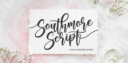 Southmore Script - Lovely Modern Script, Southmore that contain lowercase, uppercase, symbol and also support multi-language in this font. Southmore also comes with Swash and doodle font, is perfect for logos & branding, photography, invitation, watermark, advertisements, product designs, stationery, wedding designs, label ,product packaging, special events or anything that need special taste. or handwritten quote. Also already PUA
 - Stylish Serif by Sensatype Studio,
$15.00 Stylish Serif is a Modern Retro Vintage Serif Font that we created special for Display, Logo and Branding A new Serif font that is nice to leverage designer or product owner that need solutions to make their design look more gorgeous and vintage. And specially for this font, We prepared any characters to help you create gorgeous for your creative needs specially for headline, and typography needs. Stylish Serif font ready with: Stylish Shape to get creative Preview as a inspirations that you can do with this font Ready with All Uppercase characters Wish you enjoy our font. :)
 - Campaign Serif by Sensatype Studio,
$15.00 Campaign is a Modern Stylish Serif Font that we created special for Display, Modern logo and Branding needs A new Serif font that is nice to leverage designer or product owner that need solutions to make their design look more gorgeous and modern. And specially for Campaign font, We prepared any characters to help you create gorgeous for your creative needs specially for headline, and typography needs. Campaign Modern Stylish Serif font ready with: Stylish Shape to get creative Preview as a inspirations that you can do with Campaign font Ready with Lowercase and Uppercase characters Wish you enjoy our font. :)
 - Filosofi 3 finger Italic by Rhd Studio,
$12.00 Filosofi 3 Finger Sans Serif Font that we created special for Display, Logo and Branding A new Serif font that is nice to leverage designer or product owner that need solutions to make their design look more gorgeous and vintage. And specially for this font, We prepared any characters to help you create gorgeous for your creative needs specially for headline, and typography needs. Filosofi 3 Finger Sans Serif font ready with: Stylish Shape to get creative Preview as a inspirations that you can do with this font Ready with All Uppercase characters Wish you enjoy our font. :)
 - Hanah Hebrew by Jonahfonts,
$42.00 Hanah Hebrew without cantillation marks, very much used in everyday modern Hebrew. I have added Alternate Stylistics with just some additional cantillation marks which in some cases may be necessary. Use the Character Map (Windows) or Character Viewer (Mac) to access these characters. Unlimited Fractions can be obtained. You may be interested in these Hebrew fonts as well, NEWMARK HEBREW, HEBRON HEBREW,YOM TOV HEBREW, KOMUNIDAD HEBREW SCRIPT and PAGEANTRY HEBREW. Check them out! These fonts require OpenType-aware software.
 - Texas Chili by FontMesa,
$29.00 Texas Chili is a modified version of our Philadelphian font family. With Texas Chili we've squared the curved inside brackets from the Philadelphian font which helps open up the inside of some letters for a sharper appearance. The Texas Chili font family also includes a Unicase i that's balanced to the weight of the uppercase. You need an application such as Adobe Creative Suite or any other Opentype aware program to access the alternate Unicase i in the Chili font family.
 - Anime Ace - Personal use only

- Anime Ace - Personal use only

- Goygoy by Ali Güzel,
$14.00 It is a font that combines futurism and elegance. It is specially designed for logo font creation.
 - Italian Didot by BA Graphics,
$45.00 Exquisite design, delicate but yet strong enough to make a statement just right for that special occasion.
 - Fashion Didot by BA Graphics,
$45.00 Exquisite design, delicate but yet strong enough to make a statement. Just right for that special occasion.


