10,000 search results
(0.033 seconds)
- Beverly Shores Script SG by Spiece Graphics,
$39.00 If you take the South Shore Line from Chicago to South Bend, your train will pass though the small community of Beverly Shores, Indiana. The beautifully restored and highly colorful “Beverly Shores” train station sign not far from the Lake Michigan beach is the source of inspiration for this connecting script typeface. The sign’s existing ten letters have now been extended to include the entire alphabet. This old-fashioned depot letterstyle is much in the spirit of such faces as Fulton Sign and Inserat Cursive. Ascenders and descenders have been lengthened and capitals are now much larger. Alternate lowercase swashes, capitals, and small figures have been included for your convenience. And custom uphill words such as “The,” “for,” and “to” have been added for more novelty and spark in headline settings. Beverly Shores Script with Alternates is also available in the OpenType Std format. Some new characters including old style figures have been added to this OpenType version. Advanced features currently work in Adobe Creative Suite InDesign, Creative Suite Illustrator, and Quark XPress 7. Check for OpenType advanced feature support in other applications as it gradually becomes available with upgrades. All aboard for Beverly Shores!
 - Priori Serif by Emigre,
$59.00 After the popular successes of Exocet and Mason, Emigre has once again teamed up with Jonathan Barnbrook to bring you his latest venture into type land. Priori is a logical progression from Mason, a typeface he designed around ten years ago. Where Mason was designed purely for display purposes and featured only caps, Priori includes lower case, companion serif and sans serif versions, alternates and, according to its creator, is shooting for text face status - a bold claim from a designer who loves to wear his influences on his sleeve and who has little use for typography that aspires to be "neutral" or "transparent." Like many of Barnbrook's typeface designs, Priori is based on his interest in British typography of the early 20th century. It is inspired by the work of famous British typographers, such as Eric Gill and Edward Johnston. But it also embraces all of the signage and lettering that Barnbrook observes in the streets, cathedrals, and public buildings of his London neighborhood. This mixing of native influences with a contemporary pop culture intent is what gives Barnbrook's types a distinct and unique flavor. Like its creator, Priori is a one of a kind.
 - Becky by W Type Foundry,
$22.00 Becky is a versatile display type designed to appeal to to a young audience of creative, up-to-date people. Geared towards the world of advertising and retail. It is well-suited for large headlines, branding, logos, publishing and short texts. With a modern look inspired by such geometric classics as Futura and an overall edgy, informal quality (seen in details like the subtle curve of its verticals), Becky stands out as a fun, unique type. Becky is a 10-variant type family that comes in 5 weights: light, regular, medium, bold and extra bold. It features 445 characters in total. Becky features 2 alternative stylistic sets: SS1 in which the diagonals in the letters X, Y, V, W, R, K, y,x,v,w and k shift from curved to straight in order to achieve a more formal look, especially useful for smaller texts. SS2 offers alternate glyphs for I, E, J, e, j and t, further expanding the possibilities of the typography. Learn about upcoming releases, work in progress and get to know us better! On Instagram W Foundry On facebook W Foundry wtypefoundry.com
 - Priori Sans by Emigre,
$59.00 After the popular successes of Exocet and Mason, Emigre has once again teamed up with Jonathan Barnbrook to bring you his latest venture into type land. Priori is a logical progression from Mason, a typeface he designed around ten years ago. Where Mason was designed purely for display purposes and featured only caps, Priori includes lower case, companion serif and sans serif versions, alternates and, according to its creator, is shooting for text face status - a bold claim from a designer who loves to wear his influences on his sleeve and who has little use for typography that aspires to be "neutral" or "transparent." Like many of Barnbrook's typeface designs, Priori is based on his interest in British typography of the early 20th century. It is inspired by the work of famous British typographers, such as Eric Gill and Edward Johnston. But it also embraces all of the signage and lettering that Barnbrook observes in the streets, cathedrals, and public buildings of his London neighborhood. This mixing of native influences with a contemporary pop culture intent is what gives Barnbrook's types a distinct and unique flavor. Like its creator, Priori is a one of a kind.
 - Rondana by Sudtipos,
$39.00 Crafted in the best tradition of the geometric sans-serif, Rondana is a typographic tribute to the the retro-futuristic aesthetics of the 1960s and 70s, as well as an exercise in purity of line. However, its spirit is decidedly non-bauhausian, since its strokes intentionally deviate from the dull, obvious, ruler-and-compass construction; its arcs and curves being much more complex, tending towards a slightly square shape, imbued with subtle modulations. This sums up to a more organic, flowing, extroverted personality than the one just expected from the use of plain, simple geometry. Another feature is the conscious use of non-standard shapes for many signs, that are quite legible but somewhat unexpected, such as the E, the g and the ampersand; making Rondana an excellent display face and also giving a particular flavor to the text composed in it, especially in its italic variants —which are, by the way, designer italics in their own right and not just an oblique version of the roman. Rondana comes in twelve variants comprising a wide spectrum of weights, allowing for an extremely diverse range of expression.
 - Conium by MKGD,
$13.00 I designed Conium to be a sister font to Nightshade. It was meant to have the appearance of the hemlock plant without being too derivative; it’s thin drooping stems conjure images of Hamlet’s mad Ophilia clutching sickly weeds while thinking them to be flowers. It also projects the appearance of an ice cold, wrought iron, cemetery gate. The sort that one might pass on a damp overcast day. A fitting compliment to an Edward Gorey illustration from top, right down to the frigid ground from which it sprang. Conium has a glyph count of 388 and supports the following languages Afrikaans, Albanian, Asu, Basque, Bemba, Bena, Bosnian, Catalan, Chiga, Colognian, Cornish, Croatian, Czech, Danish, Embu, English, Esperanto, Estonian, Faroese, Filipino, Finnish, French, Friulian, Galician, German, Gusii, Hungarian, Icelandic, Indonesian, Irish, Italian, Kabuverdianu, Kalaallisut, Kalenjin, Kamba, Kikuyu, Kinyarwanda, Latvian, Lithuanian, Low German, Lower Sorbian, Luo, Luxembourgish, Luyia, Machame, Makhuwa-Meetto, Makonde, Malagasy, Malay, Maltese, Manx, Meru, Morisyen, North Ndebele, Norwegian Bokmål, Norwegian Nynorsk, Nyankole, Oromo, Polish, Portuguese, Romanian, Romansh, Rombo, Rundi, Rwa, Samburu, Sango, Sangu, Scottish Gaelic, Sena, Shambala, Shona, Slovak, Slovenian, Soga, Somali, Spanish, Swahili, Swedish, Swiss German, Taita, Teso, Turkmen, Upper Sorbian, Vunjo, Walser, Zulu
 - Sabio by Greater Albion Typefounders,
$11.95 I regard Sabio as an evolutionary face. By this I mean that it merges elements of script and Roman design into one elegant whole. The design was 'evolved' somewhere between these two classic approaches. The resulting family of faces makes an excellent display family, but is also clear and legible at small sizes and can be used as a text face with a distinctive flair. Sabio is a wonderfully flexible face that can sit happily alongside artwork that owes its inspiration to any era from the Art Deco onwards. The regular form is gently and subtly oblique, and the glyphs have a slight hint of swash about them. Alternate and perpendicular forms are also offered. The regular, alternate and perpendicular forms are all in turn offered in regular, and bold weights as well as in a condensed form. All in all Sabio is a humanist face with which almost anything can be done offering flair and elegance for almost any project. Whether it's a distinctive way of setting paragraph text, or poster work that's eye catching yet flowing and clearly legible, Sabio offers the answer.
 - Mousse Script by Sudtipos,
$79.00 Mousse Script is based on Glenmoy, a 1932 Stephenson Blake typeface. Glenmoy a prime example of what display typography was in pre-WWII American ad art. It graced the pages of magazines, sold numerous products and services, then simply died out when the typographic trends shifted towards the more personalized, stylized and handwritten types of calligraphy. The current trend in typography is a revivalism that brings all of the distinctive display typography of the 20th century, without chronological discrimination, back in the name of ‘retro’. Who are we to deny the masses what they want? Mousse Script doesn’t just bring Glenmoy back from the ashes of the 20th century. It expands upon the limited metal character set nearly twice over and takes advantage of the latest type technologies. This makes Mousse Script a striking typeface, both functionally and visually. A simple, attractive display font on the surface, Mousse Script is unique in its bold upright calligraphy, something rarely found these days. The OpenType version of Mousse Script combines both the regular and alternate character sets into a single, cross-platform package that takes advantage of the extended typographic features of the OpenType format.
 - ITC Johnston by ITC,
$29.00ITC Johnston is the result of the combined talents of Dave Farey and Richard Dawson, based on the work of Edward Johnston. In developing ITC Johnston, says London type designer Dave Farey, he did “lots of research on not only the face but the man.” Edward Johnston was something of an eccentric, “famous for sitting in a deck chair and carrying toast in his pockets.” (The deck chair was his preferred furniture in his own living room; the toast was so that he’d always have sustenance near at hand.) Johnston was also almost single-handedly responsible, early in this century, for the revival in Britain of the Renaissance calligraphic tradition of the chancery italic. His book Writing & Illuminating, & Lettering (with its peculiar extraneous comma in the title) is a classic on its subject, and his influence on his contemporaries was tremendous. He is perhaps best remembered, however, for the alphabet that he designed in 1916 for the London Underground Railway (now London Transport), which was based on his original “block letter” model. Johnston’s letters were constructed very carefully, based on his study of historical writing techniques at the British Museum. His capital letters took their form from the best classical Roman inscriptions. “He had serious rules for his sans serif style,” says Farey, “particularly the height-to-weight ratio of 1:7 for the construction of line weight, and therefore horizontals and verticals were to be the same thickness. Johnston’s O’s and C’s and G’s and even his S’s were constructions of perfect circles. This was a bit of a problem as far as text sizes were concerned, or in reality sizes smaller than half an inch. It also precluded any other weight but medium ‘ any weight lighter or heavier than his 1:7 relationship.” Johnston was famously slow at any project he undertook, says Farey. “He did eventually, under protest, create a bolder weight, in capitals only ‘ which took twenty years to complete.” Farey and his colleague Richard Dawson have based ITC Johnston on Edward Johnston’s original block letters, expanding them into a three-weight type family. Johnston himself never called his Underground lettering a typeface, according to Farey. It was an alphabet meant for signage and other display purposes, designed to be legible at a glance rather than readable in passages of text. Farey and Dawson’s adaptation retains the sparkling starkness of Johnston’s letters while combining comfortably into text. Johnston’s block letter bears an obvious resemblance to Gill Sans, the highly successful type family developed by Monotype in the 1920s. The young Eric Gill had studied under Johnston at the London College of Printing, worked on the Underground project with him, and followed many of the same principles in developing his own sans serif typeface. The Johnston letters gave a characteristic look to London’s transport system after the First World War, but it was Gill Sans that became the emblematic letter form of British graphic design for decades. (Johnston’s sans serif continued in use in the Underground until the early ‘80s, when a revised and modernized version, with a tighter fit and a larger x-height, was designed by the London design firm Banks and Miles.) Farey and Dawson, working from their studio in London’s Clerkenwell, wanted to create a type family that was neither a museum piece nor a bastardization, and that would “provide an alternative of the same school” to the omnipresent Gill Sans. “These alphabets,” says Farey, referring to the Johnston letters, “have never been developed as contemporary styles.” He and Dawson not only devised three weights of ITC Johnston but gave it a full set of small capitals in each weight ‘ something that neither the original Johnston face nor the Gill faces have ‘ as well as old-style figures and several alternate characters. - Juvenis by Storm Type Foundry,
$32.00Designs of characters that are almost forty years old can be already restored like a historical alphabet – by transferring them exactly into the computer with all their details. But, of course, it would not be Josef Tyfa, if he did not redesign the entire alphabet, and to such an extent that all that has remained from the original was practically the name. Tyfa published a sans-serif alphabet under the title Juvenis already in the second half of the past century. The type face had a large x-height of lower-case letters, a rather economizing design and one-sided serifs which were very daring for their time. In 1979 Tyfa returned to the idea of Juvenis, modified the letter “g” into a one-storey form, narrowed the design of the characters even further and added a bold and an inclined variant. This type face also shows the influence of Jaroslav Benda, evident in the open forms of the crotches of the diagonal strokes. Towards the end of 2001 the author presented a pile of tracing paper with dozens of variants of letter forms, but mainly with a new, more contemporary approach: the design is more open, the details softer, the figures and non-alphabetical characters in the entire set are more integral. The original intention to create a type face for printing children’s books thus became even more emphasized. Nevertheless, Juvenis with its new proportions far exceeds its original purpose. In the summer of 2002 we inserted all of this “into the machine” and designed new italics. The final computer form was completed in November 2002. All the twelve designs are divided into six variants of differing boldness with the corresponding italics. The darkness of the individual sizes does not increase linearly, but follows a curve which rises more steeply towards the boldest extreme. The human eye, on the contrary, perceives the darkening as a more fluent process, and the neighbouring designs are better graded. The x-height of lower-case letters is extraordinarily large, so that the printed type face in the size of nine points is perceived rather as “ten points” and at the same time the line spacing is not too dense. A further ingenious optical trick of Josef Tyfa is the figures, which are designed as moderately non-aligning ones. Thus an imaginary third horizontal is created in the proportional scheme of the entire type face family, which supports legibility and suitably supplements the original intention to create a children’s type face with elements of playfulness. The same applies to the overall soft expression of the alphabet. The serifs are varied; their balancing, however, is well-considered: the ascender of the lower-case “d” has no serif and the letter appears poor, while, for example, the letter “y”, or “x”, looks complicated. The only serif to be found in upper-case letters is in “J”, where it is used exclusively for the purpose of balancing the rounded descender. These anomalies, however, fit perfectly into the structure of any smoothly running text and shift Juvenis towards an original, contemporary expression. Tyfa also offers three alternative lower-case letters *. In the case of the letter “g” the designer follows the one-storey form he had contemplated in the eighties, while in “k” he returns to the Benda inspiration and in “u” adds a lower serif as a reminder of the calligraphic principle. It is above all the italics that are faithful to the tradition of handwritten lettering. The fairly complicated “k” is probably the strongest characteristic feature of Juvenis; all the diagonals in “z”, “v”, “w”, “y” are slightly flamboyant, and this also applies to the upper-case letters A, V, W, Y. Juvenis blends excellently with drawn illustrations, for it itself is modelled in a very creative way. Due to its unmistakable optical effect, however, it will find application not only in children’s literature, but also in orientation systems, on posters, in magazines and long short-stories. - Ruthyne by DM Studio,
$25.00 The Ruthyne Handwritten Font is a captivating and versatile typeface that embodies the beauty and warmth of human handwriting. With its flowing strokes and authentic character, this font adds a personal and elegant touch to your designs, making it perfect for greeting cards, invitations, branding, and various creative projects. Features: 1. Authentic Handwritten Style: The Ruthyne Font captures the authenticity and charm of natural handwriting. Its flowing strokes and genuine character lend an intimate and genuine feel to your text, making it suitable for projects that require a personal and human touch. 2. Versatile Application: This font is versatile and well-suited for a wide range of design projects. Use it in greeting cards, invitations, social media graphics, branding materials, and more to add a touch of personal elegance to your designs. 3. Uppercase and Lowercase Letters: The font includes both uppercase and lowercase letters, providing flexibility and creative freedom in your designs. Mix and match the cases to create visually appealing and balanced typography. 4. Punctuation and Symbols: In addition to the alphabet, the Ruthyne Font includes a comprehensive set of punctuation marks, numerals, and common symbols. This ensures consistency and ease of use when incorporating the font into your design projects. 5. Ligatures and Special Characters: The font offers a variety of ligatures and special characters that add character and uniqueness to your text. These unique glyphs create interesting connections between letters and decorative elements, allowing you to create personalized and visually appealing typography. 6. Easy to Use: Installing and utilizing the Ruthyne Handwritten Font is user-friendly. It's compatible with both Windows and Mac operating systems and seamlessly integrates into popular design software such as Adobe Photoshop, Illustrator, and InDesign. This ensures a smooth and efficient design workflow. Elevate your designs with the authentic and personal touch of the Ruthyne Handwritten Font. Let its flowing strokes and genuine character add a touch of elegance and human warmth to your greeting cards, invitations, and branding materials. Embrace the natural beauty of this font and create designs that resonate with sincerity and authenticity.
 - SchulVokalDotless - 100% free

- Remington - Unknown license

- Showmanship JNL by Jeff Levine,
$29.00 Despite the racially demeaning 1906 sheet music for "The Ghost of the Banjo Coon", the title's lettering provided an interesting hand-lettered sans serif that has been re-drawn digitally as Showmanship JNL in both regular and oblique versions.
 - Write by Aah Yes,
$12.00Write is a handwriting font, more like neat print than a flowing cursive script, which renders it highly readable and almost like a formal font, but still retaining the informality of handwriting. Also there are some "special effects" varieties. - Embarla Firgasto by Mr. Typeman,
$15.00 Take a look at Embarla Firgasto - my new enchanting family of four styles. They pair beautifully together in all kinds of applications. Embarla Firgasto comes with uppercase, lowercase, standard punctuation and special letters for most of the European languages.
 - Nice Dream by Sronstudio,
$12.00 Nice Dream is a fun display Font font, this font Is perfect for lproduct packaging, product designs, label, photography, watermark, special events or anything. Caps Only Fonts. Nice Dream comes with uppercase and lowercase letters, multilingual symbols, numerals, punctuation.
 - PIXymbols Signet Modern by Page Studio Graphics,
$29.00Creates monograms with a crisp, stylish contemporary feel, for personal or business stationery. Each of the 36 borders is selected with a single keystroke. The border aligns and centers the letterforms by the use of a special spacer key. - Cape Horn by Palmer Type Company,
$30.00 Cape Horn is a typeface inspired by seafarers who have perished by navigating the treacherous seas surrounding Cape Horn, which is at the southern-most tip of South America. A-Z Numbers Multi-language support Symbols Special Characters Uppercase
 - Roemisch by Linotype,
$29.99The Roemisch type family is a historic hot metal face with left slanted weights that is used for the german cartographic map production. There are also special typefaces required like the Venus type family and Topografische Zahlentafel type family." - Aillek by Twinletter,
$18.00 Introducing Aillek, a retro-condensed font with multilingual support and a distinctive look that will enhance any project. Aillek lends a touch of retro charm to any design with its lofty letterforms and alternate characters. Your design becomes more dynamic and interesting thanks to its ligatures options. Aillek is ideal for producing vintage flyers, logos in retro style, nostalgic social media graphics, and more. It is perfect for branding initiatives, packaging design, book covers, and more due to its condensed letterforms. It is adaptable for any project that needs to reach a large audience thanks to its multilingual support. Aillek is a must-have for any designer, marketer, or anyone looking to add a dash of nostalgia to their work because of its distinctive design and features. It’s ideal for those who want to add a touch of nostalgia to their designs as well as for those who want to create designs that evoke nostalgia and vintage aesthetics. Make Aillek your go-to font for all your retro-condensed design needs by taking advantage of this opportunity. Don’t wait, get this special font right away, and start making designs that will be remembered. What’s Included : - File font - All glyphs Iso Latin 1 - Alternate, Ligature - Simple installations - We highly recommend using a program that supports OpenType features and Glyphs panels like many Adobe apps and Corel Draw so that you can see and access all Glyph variations. - PUA Encoded Characters – Fully accessible without additional design software. - Fonts include Multilingual support
 - Calissha Script by Mega Type,
$10.00 Calissha Script is a handmade font created with a brush and ink, bold and irregular baseline. Contains a complete set of lowercase, uppercase, alternates, ligatures, punctuation, numbers, and multilingual support. And additional Calissha Capitals, working in harmony with Calissha Script to create typography awesome creations. Get some inspiration from the preview above. Contains a complete set of lowercase, uppercase, ligatures, punctuation, numbers, and multilingual support. Calissha Script is perfect for use in watercolor design or lettering style bold hand, such as blog header, branding, t-shirt, weddings, social media, product design, stationery, advertising, apparel, cover books, business cards, greeting cards, branding, merchandise, invitations and handmade quotes and more. Calissha Script features OpenType stylistic alternates, ligatures and International support for most Western Languages is included. To enable the OpenType Stylistic alternates, you need a program that supports OpenType features such as Adobe Illustrator CS, Adobe Indesign & CorelDraw X6-X7, Microsoft Word 2010 or later versions.How to access all alternative characters using Adobe Illustrator: https://www.youtube.com/watch?v=XzwjMkbB-wQ Calissha Script is coded with PUA Unicode, which allows full access to all the extra characters without having special designing software. Mac users can use Font Book , and Windows users can use Character Map to view and copy any of the extra characters to paste into your favourite text editor/app.How to access all alternative characters, using Windows Character Map with Photoshop: https://www.youtube.com/watch?v=Go9vacoYmBw If you need help or have any questions, please let me know. I'm happy to help :) Thanks & Happy Designing!
 - Cooker Cake by Sabrcreative,
$25.00 Elevate your design projects with Cooker Cake, a vibrant and playful sans serif display font. With its charismatic style and versatile nature, this font adds a touch of excitement and creativity to any typography-based endeavor. Whether you're designing logos, posters, headers, or website elements, Cooker Cake will captivate your audience and make your text pop. Cooker Cake features all capital letters, giving your designs a bold and impactful appearance. The font also includes a wide range of numbers and punctuation, ensuring that your compositions are complete and functional. Its multilingual support allows you to incorporate various languages seamlessly, making it ideal for global projects. One of the standout features of Cooker Cake is its PUA (Private Use Area) encoding. This means that you have access to additional special characters, glyphs, and ligatures, expanding your creative possibilities and enabling you to add unique flourishes to your designs. Let your imagination run wild as you explore the various alternates and stylistic options available in this font. With its sans-serif style, Cooker Cake strikes the perfect balance between modern aesthetics and a playful vibe. It works harmoniously in both digital and print formats, making it suitable for a wide range of applications. From branding and packaging to social media graphics and advertising campaigns, this font will bring a sense of joy and energy to your projects. Experience the versatility and captivating charm of Cooker Cake Sans Serif Display Font. Let its playful and dynamic personality infuse your typography with excitement.
 - Sherbrooke by Eyad Al-Samman,
$- Sherbrooke is a simple and sans serif font. I have chosen the name of this typeface after the "Sherbrooke" Street in Montreal, Canada, that I daily walked in for several months in the late 2005 while I was studying in Montreal, Quebec, Canada. I do adore this street and also I adore the whole city of Montreal. This font comes in two different weights. "Sherbrooke" can be used in wide fields of publications such as the titles of novels, literary texts, short stories, dictionaries, books, newspapers, websites, and magazines. It is suitable for T-shirts, mugs, advertisement light boards in malls, subtitles of movies, logos, cans of foods, and medicines' names. The font is more attractive when it is printed in calendars and for displaying the contents and paragraphs of electronic encyclopedias and different online websites. "Sherbrooke" is specifically designed for educational, journalistic, literary, and social purposes. The main characteristics of "Sherbrooke" Typeface are in its sans serif new designed letters and also in its lowercase special numerals. I think that these characteristics have made "Sherbrooke" exceptionally unique with its alphanumeric combinations. You can enjoy this typeface and use it anywhere at any product or service. It is simply gratuitous for all. The word "Sherbrooke" is a person's name. Sherbrooke Street - officially Rue Sherbrooke - is a major east-west artery at 31.3 kilometers in length and it is the second longest street on the Island of Montreal in Canada. The street is named for John Coape Sherbrooke, the Governor General of British North America from 1816 to 1818.
 - Overline Stencil by WAP Type,
$15.00 Overline Stencil font is perfect for your up coming projects. Such as logo branding, editorial design, fashion, stationery design, sport design, blog design, modern advertising design, card invitation, art quote, home decor, book/cover title, special events and any more.
 - Dyane by Wiescher Design,
$39.50 Dyane is based on monolinear scripts from the Bauhaus time. But it is very special for ist counterstrokes in the lowercase letters a, h, m and n that gives the script a very distinct rhythm. Your rhythmic type-designer Gert Wiescher
 - Oklean by Pengedar Seni,
$15.00 Oklean is a special font for your logo & branding. Every character is designed for a good logo, so they are not suitable for long texts. Oklean has a concept that is : Bright / Clean / Clear / Cool / Nature / Minimal / Smart / Urban / Balanced.
 - Famosa by TypeThis!Studio,
$54.00 Famosa was designed by Anita Jürgeleit. Its lively and handmade character makes for a charming image for an unmistakably elegant typography. Seven styles, old-style figures, and special ligatures serve as titles and headlines about the finer things in life.
 - Diane Amorta by Grezline Studio,
$10.00 Diane Amorta is a cute handdrawn sans serif font crafted very carefully. Diane Amorta is perfect use for a logo for branding, typography design, product packaging, invitation, quotes, t-shirt design, label poster, special events and anything that need handwriting taste.
 - Stencil Army by WAP Type,
$15.00 stencil army font is perfect for your up coming projects. Such as logo branding, editorial design, fashion, stationery design, sport design, blog design, modern advertising design, card invitation, art quote, home decor, book/cover title, special events and any more.
 - Galpon Next by RodrigoTypo,
$25.00 The "Galpon Next" typeface is a gestural and dynamic font specially designed for informal or children's texts. The idea behind this typeface is to capture the energy and spontaneity of handwriting, creating a sense of joy and fun in the designs.
 - Thitheri by RagamKata,
$14.00 Introducing Thitheri – the font that's here to infuse your creative projects with a delightful '70s retro charm! Thitheri also includes a unique set of 26 special alternates. These alternates provide you with even more creative freedom and versatility for your projects.
 - Hecscript by Hecttorpaiz,
$2.00 This is an original typography to use in your homeworks, arts and more; created to inspire your documents or website. Buy it! with a special price, and you will support me and i would create more designs to share with you.
 - Sindenetta by Almarkha Type,
$29.00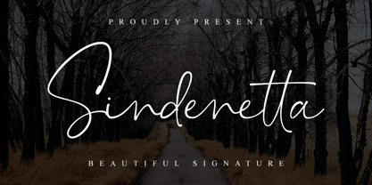 Sindenetta – Beautiful Signature, this font is great for your creative projects such as watermark on photography, and perfect for logos & branding, photography, invitation, watermark, advertisements, product designs, stationery, wedding designs,label, product packaging, special events or anything that need Signature taste.
 - Super Monogram by MonogramBros,
$10.00 Super Monogram is a perfect shaped monogram font consisting of 26 letters. With just a single font file you will be able to create beautiful monograms in just a matter of minutes after the purchase! Numbers and special characters not included.
 - Nebulora by Supfonts,
$16.00 Nebulora is a Quirky & Playful Sans. Ideal for advertising, headlines, editorial design, branding, and posters. Nebulora Font Features: - CAPS for normal sans - lowers for Quirky sans - PUA Encoded - no special software needed to access extra characters - Multilingual Characters AÁĂÂÄÀĀĄÅÃÆBCĆČÇĊDÐĎĐEÉĚÊËĖÈĒĘẼFGĞĢĠḠHĦIIJÍÎÏİÌĪĮĨJKĶLĹĽĻŁMNŃŇŅÑ OÓÔÖÒŐŌØÕŒPÞQRŔŘŖSŚŠŞȘẞTŤŢȚUÚÛÜÙŰŪŲŮŨVWẂŴẄẀXYÝŶŸỲỸZŹŽŻ
 - Ines by DSType,
$40.00 Ines is a full featured typeface with seven weights and italics, including Small Capitals, smart fractions and several ligatures. Ines was specially designed for books, with a slight short x-height, making the ascenders and descenders more elegant and tall.
 - Dawnora by Typomancer,
$24.00 Inspired by aurora, one of the most impressive phenomenon. Dawnora is a spirited serif font comes with various weights and many opentype features, suitable for both simple text and elegant lettering. Especially, Initials style for drop cap and special usage.
 - NowGrotesk by Hot Russian Pancakes,
$- Retro-futuristic unicase with alternates and ligatures, specially designed for magazine headlines and cheerful logos. Inspired by the art deco geometry and late 2000s trends in graphic design. Works well as text pattern. It is better suited for large type sizes.
 - County Clerk JNL by Jeff Levine,
$29.00 County Clerk JNL was modeled after the vintage Hamilton wood type design Gothic Special, and is available in both regular and oblique versions. An early grotesk font, this condensed sans serif lends itself well to short headlines and brief body copy.

