10,000 search results
(0.037 seconds)
- Hamdany by Fargun Studio,
$16.00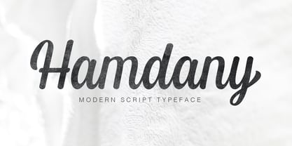 Hamdany is modern script typeface that perfect for photography, branding, signature. It is so beautiful and classy for your projects. This Font has given PUA code (specially coded fonts). So that all the alternate characters can easily be accessed in full by a craftsman or designer.
 - Fragilly by Sarid Ezra,
$15.00 Fragilly is a modern calligraphic font that will make your project more stunning. It comes with cute and quirky vibes. There's also essential ligatures that will you often use! Also comes with multilingual support and PUA encoded! Sent me an email to saridezra@gmail.com for more information!
 - Volante by Hindia Studio,
$12.00 Volante is a gorgeous condensed sans serif typeface that comes with various stylistic alternates and discretionary ligatures. It comes with multiple weights, from thin to heavy, with 3 extra outline styles. This is perfect to sweeten up your headlines, branding visual identity, editorial, poster, and etc.
 - Hadesz BASIC by JOEBOB graphics,
$17.00 Hadesz is a lusty and playful font with a rough, brushy texture. It comes with an abundance of opentype features, which make for the handwritten authenticity one looks for in a handwriting font. Hadesz comes in two versions: Basic (without ligatures) and PRO (the complete set)
 - Hanthem Script by Fargun Studio,
$14.00 Hanthem Script is modern script that perfect for photography, branding, signature. It is so beautiful and classy for your projects. This Font has given PUA code (specially coded fonts). So that all the alternate characters can easily be accessed in full by a craftsman or designer.
 - Kianda by QubaType,
$20.00 Kianda typeface was created as a non-classic, sport logo typeface. Now it has only one style with Latin and Cyrillic uppercase, numerals and punctuation. Almost every letter have 3-4 alternates, which allows you to feature stylish text for your logo. Also this typeface works good with short slogans, packaging and more.
 - Coronette by Chank,
$99.00 The exciting new typewriter font, Coronette, combines old-fashioned charm with modern typographic sensibilities. Originally commissioned as a custom font for Magnetic Poetry, this clean, medium-weight typewriter font is now available to the general font-lovin' public. Enjoy a new, multi-purpose workhorse font for all your labeling and page layout needs.
 - Dividers by Dingbatcave,
$15.00Formerly only available from my own font site for orders over $50, Ann’s Dividers are now being made available separately. Decorative, spirally, funky and artsy lines and separators perfect for web graphics or on a printed page. A must-have for all web graphic designers. There are 72 characters in this font. - Rotterdam Redemption by Letterena Studios,
$10.00 Rotterdam Redemption is a beautiful display font with a unique and modern look. It is perfect for elegant and luxury logos, book and movie titles, fashion brands, magazines, clothes, lettering, quotes, and many more. Add it now to your fonts' gallery, and it will make any of your designs stand out! ** Uppercase
 - Aristide by Jonahfonts,
$29.95 There are many fonts inspired by Toulouse-Lautrec. I felt this one was needed and tried to get that loose brush-stroke appearance typical of Toulouse’s style of his famous French Cabaret posters. Aristide Bruant a dancer and comedian made famous by Lautrec’s posters can now be further immortalized with this font.
 - Ferrocarbon by Megami Studios,
$7.50 For the angular, blocky look, the future is Ferrocarbon! Designed primarily as a title font, I created it way back in 2013 and promptly forgot about, so I'm releasing it to the world now. it's meant to be used for your tech and sci-fi uses, but don't let us stop you there!
 - Movie Matinee JNL by Jeff Levine,
$29.00 A 1926 trade ad for the silent comedy “The Nut-Cracker” starring Edward Everett Horton has the film’s title hand lettered in a decorative bold sans serif design complete with highlight lines and accent dots. This festive type face is now available digitally as Movie Matinee JNL in both regular and oblique versions.
 - Sign Studio by Jeff Levine,
$29.00 The French lettering book Album de Lettres Arti (1949) displayed a number of examples of unique, stylized typefaces. One in particular features a multi-line sans serif in a classic Art Deco style with open-ended characters. This design is now available as Sign Studio JNL in both regular and oblique versions.
 - Curtain Up JNL by Jeff Levine,
$29.00 The 1937 sheet music for the tune "Sweet Stranger" has the title hand lettered in a round cornered Art Deco sans with an inline featuring square corners. Now available as Curtain Up JNL, it is available in regular, oblique, solid and solid oblique versions (for those who prefer a version without the inline).
 - Millinery JNL by Jeff Levine,
$29.00 One of the type samples showcased in the 1907 Barnhart Brothers & Spindler specimen book was named “Sterling”; a spurred serif Art Nouveau design. This is now available digitally as Millinery JNL in both regular and oblique versions. An old fashioned term for a once plentiful business, ‘millinery’ is a women’s hat shop.
 - P22 Zebra by IHOF,
$24.95Zebra was originally designed by Karlgeorg Hoefer in 1965 for the Stempel foundry in Germany. This unique font was designed as a two-color script face and is now available digitally for the first time. The P22/IHOF release presents six separate fonts based on the original painted drawings and Stempel proofs. - Paint Store JNL by Jeff Levine,
$29.00Paint Store JNL is the third in Jeff Levine's series of display fonts modeled from actual water-applied decals that were manufactured by the Duro Decal Company of Chicago (now Duro Art Industries). Duro Decals were sold in paint, hardware, variety and art supply stores, and even [in some cases] print shops. - Studio Five by Lafonts,
$29.00 Designed after the sixties neon sign of an arthouse cinema in downtown Zurich, Studio 5 is now a typeface for many applications. The three different styles include old style numbers and alternate characters for titling. All styles have the same metrics. Bold and open styles can be layered for neon sign effects.
 - Art Materials JNL by Jeff Levine,
$29.00 The cover of the 1930s-era “Catalog of Artists’ Materials” from Ernst H. Friedrichs, Inc. (New York) has the words “Artists’ Materials” hand lettered in a stylized Art Deco sans serif type style. This unique design is now the digital font Art Materials JNL, which is available in both regular and oblique versions.
 - Bilground by Prioritype,
$17.00 Introducing Bilground - Handwritten Fonts Beautiful handwritten fonts with strong characters are now here to accompany your design projects. You can apply it to wedding designs, logos, quotes, social media posts, video content display etc. See some of the previews above for reference. Features: • Uppercase • Lowercase • Numeral • Punctuation • Multilingual • PUA Encoded • Opentype Features Thanks.
 - Team Deco JNL by Jeff Levine,
$29.00 In an online edition of Modern Screen Magazine for March of 1936, many of the article headlines were set in a bold, slab serif inline font which (although possessing some Art Deco traits) could double as a sports font. This is now available as Team Deco JNL in both regular and oblique versions.
 - Laca Pro by Nova Type Foundry,
$52.99 Laca Pro now supports Greek and Cyrillic scripts. The letter shapes capture the playful spirit of Laca. The added language support brings even more usefulness for the use of Laca for branding, editorial and other projects. Communication is one of our passions, by supporting other scripts we want to create better communication.
 - Artwork Stencil JNL by Jeff Levine,
$29.00 Many great lettering examples were found in the 1939 French publication by Georges Léculier, "Modèles de Lettres Moderns" ("Models of Modern Letters"). One design in particular is a stencil alphabet so typical of the Art Deco movement of the 1930s. Artwork Stencil JNL is now available digitally in both regular and oblique versions.
 - Londrina by Tipos Pereira,
$- Londrina is formerly known as Folk. The Londrina family originally had four typefaces: Solid, Shadow, Outline and Sketches. The idea is to combine the main typeface Solid with the others, experiencing different outlines. Now Londrina has three new weights: Thin, Book and Black, growing the family to work with the Solid version.
 - Murisa Elena by Murisa Studio,
$10.00 Murisa Elena is an attractive and attractive font. It has beautiful shapes like brush strokes on canvas. Very amazing fonts. You can use it to display your products or your personal and company logo. Murisa Elena appears with a perfect shape, just like you write with your favorite brush. Get it right now.
 - Deco Holiday JNL by Jeff Levine,
$29.00 A hand lettered Art Deco ‘stencil’ design used in various ads for “Holiday” and other Pathé films was found in the July 22, 1930 issue of “The Film Daily”. Similar in style to Futura Black and other like designs, it is now available as Deco Holiday JNL in both regular and oblique versions.
 - Dead Mementro by Letterhead Studio-VG,
$20.00 Dead Mementro typeface (ex Dead Metro) has simple and strong shapes. It is a little bit narrow sans serif typeface with brutal constructions of characters. The first edition of typeface — Dead Metro — was realised in 1998 as the part of Garbage Type Foundry project. Now Dead Mementro has more characters and styles.
 - KD Dekorat by Kassymkulov Design,
$12.00 KD Dekorat - Artdeco font for display use. Initially submitted for a font design competition, it's now redrawn and polished with extra glyphs incl. Cyrillic script. All letters stay true to the uniformity of the modular design. Create catchy headlines, logos, large billboard messages that will drag client's attention. Pairs nicely with sans families.
 - Film Critic JNL by Jeff Levine,
$29.00 An ongoing movie review column known as the "Critic's Forum" (such as was found in the May 23, 1936 issue of The Film Daily) had a simple Art Deco monoline hand lettering of the column's name. Redrawn digitally as Film Critic JNL, this typeface is now available in both regular and oblique versions.
 - Estilo Pro by DSType,
$26.00 Five years later, DSType proudly introduces Estilo Pro: the Ultimate version of Estilo. Now with sharp edges and five weights from Hairline to Bold, Estilo Pro includes an extraordinary set of features like alternate characters, initial swashes, ending swashes, ligatures, ornaments and drop caps in a total of 1000 glyphs per weight.
 - Dining Menu JNL by Jeff Levine,
$29.00 A 1930s menu from a restaurant with locations in both Long Island and Miami Beach called the “Roadside Rest” sported on its cover some very unusual Art Deco outline lettering. Adapted and slightly modified for typographic purposes, the font is now available as Dining Menu JNL in both regular and oblique versions.
 - Tabloid Edition JNL by Jeff Levine,
$29.00 The headline across the October 7, 1918 edition of the UK’s Daily Mail stated: "Germany Asks the Allies for Peace". Set in extrabold sans serif lettering, it’s now available digitally as Tabloid Edition JNL in both regular and oblique versions. This is another “redrawn from the headlines” typeface from Jeff Levine Fonts.
 - Erotica by Lián Types,
$49.00 “A picture is worth a thousand words” and here, that’s more than true. Take a look at Erotica’s Booklet; Erotica’s Poster Design and Erotica’s User’s Guide before reading below. THE STYLES The difference between Pro and Std styles is the quantity of glyphs. Therefore, Pro styles include all the decorative alternates and ligatures while Std styles are a reduced version of Pro ones. Big and Small styles were thought for better printing results. While Big is recommended to be printed in big sizes, Small may be printed in tiny sizes and will still show its hairlines well. INTRODUCTION I have always wondered if the circle could ever be considered as an imperfect shape. Thousands of years have passed and we still consider circles as synonyms of infinite beauty. Some believe that there is something intrinsically “divine” that could be found in them. Sensuality is many times related to perfectly shaped strong curves, exuberant forms and a big contrasts. Erotica is a font created with this in mind. THE PROCESS This story begins one fine day of March in 2012. I was looking for something new. Something which would express the deep love I feel regarding calligraphy in a new way. At that time, I was practicing a lot of roundhand, testing and feeling different kinds of nibs; hearing the sometimes sharp, sometimes soft, sound of them sliding on the paper. This kind of calligraphy has some really strict rules: An even pattern of repetition is required, so you have to be absolutely aware of the pressure of the flexible pen; and of the distance between characters. Also, learning copperplate can be really useful to understand about proportion in letters and how a minimum change of it can drastically affect the look of the word and text. Many times I would forget about type-design and I would let myself go(1): Nothing like making the pen dance when adding some accolades above and below the written word. Once something is mastered, you are able to break some rules. At least, that’s my philosophy. (2) After some research, I found that the world was in need of a really sexy yet formal copperplate. (3) I started Erotica with the idea of taking some rules of this style to the extreme. Some characters were drawn with a pencil first because what I had in mind was impossible to be made with a pen. (4) Finding a graceful way to combine really thick thicks with really thin hairlines with satisfactory results demanded months of tough work: The embryo of Erotica was a lot more bolder than now and had a shorter x-height. Changing proportions of Erotica was crucial for its final look. The taller it became the sexier it looked. Like women again? The result is a font filled with tons of alternates which can make the user think he/she is the actual designer of the word/phrase due to the huge amount of possibilities when choosing glyphs. To make Erotica work well in small sizes too, I designed Erotica Small which can be printed in tiny sizes without any problems. For a more elegant purpose, I designed Erotica Inline, with exactly the same features you can find in the other styles. After finishing these styles, I needed a partner for Erotica. Inspired again in some old calligraphic books I found that Bickham used to accompany his wonderful scripts with some ornated roman caps. Erotica Capitals follows the essentials of those capitals and can be used with or without its alternates to accompany Erotica. In 2013, Erotica received a Certificate of Excellence in Type Design in the 59th TDC Type Directors Club Typeface Design Competition. Meet Erotica, beauty and elegance guaranteed. Notes (1) It is supossed that I'm a typographer rather than a calligrapher, but the truth is that I'm in the middle. Being a graphic designer makes me a little stubborn sometimes. But, I found that the more you don't think of type rules, the more graceful and lively pieces of calligraphy can be done. (2) “Know the forms well before you attempt to make them” used to say E. A. Lupfer, a master of this kind of script a century ago. And I would add “And once you know them, it’s time to fly...” (3) Some script fonts by my compatriots Sabrina Lopez, Ramiro Espinoza and Alejandro Paul deserve a mention here because of their undeniable beauty. The fact that many great copperplate fonts come from Argentina makes me feel really proud. Take a look at: Parfumerie, Medusa, Burgues, Poem and Bellisima. (4) Some calligraphers, graphic and type designer experimented in this field in the mid-to-late 20th century and made a really playful style out of it: Letters show a lot of personality and sometimes they seem drawn rather than written. I want to express my sincere admiration to the fantastic Herb Lubalin, and his friends Tony DiSpigna, Tom Carnase, and of course my fellow countryman Ricardo Rousselot. All of them, amazing.
 - Sharung by Twinletter,
$14.00 Sharung, our newest font family, is now available! This font family is opulent and one-of-a-kind. This collection includes 18 various styles, making it ideal for a wide range of projects. Each style was built from the ground up to optimize beauty and personality. This font was created specifically for a wide range of display design and branding requirements. Sharung has everything you’ll need to create stunning graphics, including titles, texts, banners, posters, and more. Get a unique design look with this font right now! of course, your various design projects will be perfect and extraordinary if you use this font because this font is equipped with a font family, both for titles and subtitles and sentence text, start using our fonts for your extraordinary projects.
 - Outset by Alexander Phelps,
$5.98 Outset is a rough, display font family designed for a wide range of expression. It's all-caps design gives additional variants to make sure that you can create with your desired intention. Each letterform for the Outset font family was drawn by hand to insure natural deviations for it's roughness. These deviations help make this typeface feel authentic and relatable. The boldness of the letterforms makes this typeface an excellent choice for display type for posters, titles, merchandise, and specific marketing opportunities. Outset was originally drawn up for a range of t-shirt designs, and has now been extended into the full typeface you see now. It's rough edges interact perfectly with textures and overlays. Outset's multiple styles and variant letterforms allow for a very versatile range of outputs.
 - Abigale by Hustletter Studio,
$15.00 Abigale was built with OpenType features and includes beginning and ending swashes, heart / love swashes, numbers, punctuation, alternates, ligatures and it also supports other languages :) Say hello to Abigale - A font that you were meant to find, and is now destined to be with you :) Abigale is a lovingly handwritten script , with an air of grace and flamboyancy. Abigale is special in that one word can be written in a many different ways - thanks to the large selection of extra letters that it has built in. To access all the extra characters , Opentype capable software is recommended - most apps support Opentype features now days. The alternates are accessible by turning on 'Stylistic Alternates' and 'Ligatures' buttons on in Photoshop's Character panel, or via any software with a glyphs panel, e.g. Adobe Illustrator, Photoshop CC, Inkscape.
 - SantaMonicaMF - Unknown license

- XperimentypoThree-C-Square - Unknown license

- Pixelette - Unknown license

- Marfhaus - Unknown license


