10,000 search results
(0.021 seconds)
- Amhara by Ingo,
$38.00 A “latin” alphabet modelled on the ethiopian Ge'ez script - an experiment that works. Amhara was created by transferring the typical forms of the Ethiopian Amharic script to the west European alphabet. Because Amharic is traditionally written with an expanded pen tip, it shows the typical ductus also characteristic of the uncial scripts of late antiquity and the early Middle Ages. So this font »Amhara« has a somewhat sacramental effect. And, although the individual forms look foreign, the overall picture is strangely familiar. The two styles of »Amhara« include a number of ligatures which dispose of many non-attractive letter combinations. Stylistic alternates are available for some letters, too. Read more about this font at ingoFonts...
 - Trance FJ by Frncojonastype,
$29.00 «fj Trance™» is the first colaborative display typography of frncojonastype this 2020. «fj Trance™» is a display typography that characterizes. For having reverse contrast and play with the exaggeration of shapes and counterforms from the same typography. Conceptualized and designed originally by Jorge Morales Salas, produced by Franco Jonas Hernandez, collaborating Valentina Pino Faúndes and Rodrigo Araya Salas. Also, Greek and shadow variable version has been designed only available by his distributor of favorite typefaces :) • To exclusive licenses and to follow the develop of this project please visit frncojonas.com Learn about upcoming releases, work in progress and get to know us better! WB: frncojonas.com BE: beh.net/frncojonas TW: @frncojonas ING: @frnco.jonas
 - Genia by Akufadhl,
$40.00 Genia is a script typeface that carries roundhand calligraphy DNA. Instead of using pointed nib pen, Genia was created using a fine brush resulting in clean and wavy character. With the OpenType features, Genia creates the natural feel of calligraphy writing. This contextual feature makes the font 'smart'. It knows which letters are the initial and which one is the finial. The feature can be activated in the OpenType section under the names of CALT or Contextual Alternates. Genia also gives you old style and proportional number options. Our advice is always turn the contextual alternates, and don't use the OPTICAL kerning on Adobe softwares. The preview on this site does not support the contextual alternates.
 - Paris SS by Sensatype Studio,
$15.00 PARIS is a new Vintage Sans Serif font that perfect for Headline needs with all uppercase characters ready. Based on our experience as a graphic designer who works for a lot of companies, we often are requested to design a graphic with a vintage feels and modern style. So, we try to brainstorming and create this font to make the idea is going out. This is perfect for show off in historical style and vintage vibes but with small space. You will get vintage, modern, and certainly unique style with this font. PARIS font is also included full set of: All Uppercase letters Multilingual characters Numerals Punctuations Wish you enjoy our font. :)
 - M Gentle HK by Monotype HK,
$523.99 The design concept of M Gentle is inspired by the aesthetics of ribbon gymnastics and the tenderness of orchids. The beauty of the two are combined in one typeface. Keeping the characters in right proportion and standard structure, its horizontal and vertical strokes (橫、豎) are generally straight. The linkage among dots (點), downstrokes and the ticks (剔) to the right represent a sense of movement and fill the typeface with liveliness and humanity. While M Gentle Light shows purity and softness, Medium and Bold fonts have their own personalities. They are all legible and suitable for a wide range of purposes, make the family a popular choice in the advertising industry.
 - Spoonbill by Scriptorium,
$12.00In 1916 the Prang company - still famous for their excellent pens and pencils - commissioned Thomas Woods Stevens to hire the best calligraphers of the era to hand letter sample pages with different Prang pens and in a variety of styles. The resulting book is a font maker's dream, a collection of period lettering samples perfect for making new fonts. One of the sample pages shows off the look of the Spoonbill pen with a set of classic art deco style letters by Charles Earley. This sample is the basis for our Spoonbill font, which includes a full character set, plus character variations for nesting and overlapping, and a small selection of decorative border characters in the art deco style. - Monolith Pro by Gravitype,
$12.90 Monolith Pro is a futuristic heavy display that steals the show. This typeface is inspired by the popular Kubrick’s movie 2001: a space odyssey, from which the iconic monolith scene. The glyphs, in fact, have been designed to fill the rectangular shape, with the addition of minimal inlays to differentiate them consistently. While the uppercase is perfect for impactful headings and titles, the lowercase completes the main headline masterfully - but can also stand out alone due to its own distinguishable personality. The family includes 4 styles: regular, italic, outline and outline italic, to give more dynamism and sense of lightness when needed, in contrast with the heavy weight. Multilingual support is available.
 - Companion Old Style by Matteson Typographics,
$19.99 A unique design accurately revived by Steve Matteson in 2021. Frederic Goudy designed Companion Old Style for Women’s Home Companion in 1928. In his own words: “I believe the new letter I showed him, both in roman and italic, is one of the most distinctive types I have ever made. It incorporates features which deliberately violate tradition as to stress and curves, but which are so handled that attention is not specifically drawn to the innovations introduced.” Companion Old Style exudes the style of pre-World War 2 Americana. The unique characteristics are wonderful for greeting cards, wedding announcements and holiday invitations. Companion’s nostalgic letterforms are light hearted and quirky yet highly readable.
 - Full English by Hanoded,
$15.00 I have always been fascinated by the ‘Full English Breakfast’. A Full English usually consists of toast, baked beans, sausages, fried eggs, fried tomatoes, fried mushrooms and sometimes blackpudding (a kind of sausage made from pig’s blood). When I lived in England, my friends were always quite happy to stow away a big full breakfast, but I, on the other hand, could not really set myself to eating one. Full English is a hand made stencil font. If you own a pub and you serve breakfast, you could use it for your signs, but I guess this font looks good on anything that needs a bit of attention. For attention, it will get!
 - Stalemate Pro by MAC Rhino Fonts,
$49.00 A clean sans serif, originally constructed as a proprietary font for a German IT-company. From the beginning it was designed to work both in print and on screen and experience shows that it performs well in both environments. First released as a commercial typeface with GarageFonts in 2002 and later with the Fountain Type Foundry (2004). During 2007-08 the family was expanded and upgraded into a full OpenType Pro package. The company Jura have since long used Stalemate as part of thier corporate identity. They have also licensed special versions with full support for Greek and Cyrillic languages. This will be available as a commercial option in the near future.
 - Lightron by Sensatype Studio,
$15.00 Newon is an Unique Neon Light Font with Floating shape make your design look unique and modern A new Display Font that we created special for Headline, Title and more stand out typography needs, with extra ligature that will add your variations. It's so perfect to add your style and headline overview. And specially for this font, we crafted for unique style and modern feels so enjoy to create any project that will show your main idea out. Newon Neon Light Font ready with: Any options to get creative variations (combination of Ligature Characters) Preview as a inspirations that you can do with this font Ready with Uppercase & Lowercase characters Wish you enjoy our font. :)
 - Uptown Review JNL by Jeff Levine,
$29.00 Cover art for the 1933 sheet music of Harold Arlen and Ted Koehler's "Stormy Weather" (from the musical production "Cotton Club Parade") listed the cast of the show in a condensed hand lettered sans that typified the 1930s and the Art Deco era. This served as the inspiration for Uptown Review JNL; available in both regular and oblique versions. The Cotton Club was a whites-only night club which showcased black acts, and was originally located on 145th Street in Harlem from 1923 to 1935, then existed for a short time in the New York theater district from 1936 to 1940. After the Broadway incarnation of the club closed, its space was taken over by the Latin Quarter.
 - My Left Hand by Breauhare,
$35.00 My Left Hand is exactly what it is...well, not my actual flesh-and-blood left hand but my actual handwriting, and I know that it really is My Left Hand because people tell me all the time, "You're left-handed!" When I hear people say that, it always reassures me that I am left-handed, in case I am ever doubtful about it. Five of the last eight U.S. presidents have been left-handed, so we're in good company, no matter which political party you're a fan of. This font has an appealing rough look at large sizes, but at smaller sizes it looks smooth as silk. Digitized by John Bomparte.
 - Eixample Villa by Type-Ø-Tones,
$55.00 The Eixample project is inspired by modernist signage of various examples found in the Eixample neighbourhood in Barcelona. The name of each subfamily is related to its location or to specific elements of the original sign. Villa is the abbreviation for Carrer Villarroel (Villarroel Street), where the Villarroel Pharmacy has been displaying this sign since the first quarter of the twentieth century. The Eixample Villa typeface system consists of sturdy letters free of ornaments with an industrial aspect. Only the treatment of the curves borrows modernist features. Like the rest of the families in the Eixample series, Villa shows its origin as a display font, but it has been engineered to give good results at small sizes as well.
 - Toiban by Sealoung,
$20.00 Toiban is a classy modern sans serif font. Each Toiban glyph has been modernly drawn and designed for this expansive new edition, which maintains the Swiss mantra of clarity, simplicity and neutrality for the demands of contemporary design and branding. The larger View version is drawn to show off Toiban's subtlety and is spaced with the headline in mind, while the Text size focuses on readability, using strong strokes and comfortable loose spaces. The Toiban struggles to be legible at a small size because of its compactness and closed aperture. The Toiban Micro's design is simplified and exaggerated to maintain impression in small, loosely spaced type, providing excellent legibility at microscopic sizes and in low-resolution environments.
 - Tall Skinny Condensed by Outside the Line,
$19.00 This is the tallest, skinniest, most condensed, non serif font I know of. I designed this because I felt a serious need for that one big, thin word to fit in a narrow space. It is great for ‘SALE!’ in a one column ad. Also is a life saver for several long words in a narrow space like Merry Christmas... If you need a full character set take a look at the new Ultra Condensed 3 font family. Ultra Condensed was based on Tall Skinny Condensed with some changes and a full character set. Ultra Condensed Lettered is a hand lettered version and Ultra Condensed Line is a lighter hand drawn version
 - Solution by Sensatype Studio,
$15.00 Solution is a Modern Fashion Sans Serif Font with Sharp shape make your design look classy and elegant A new San Serif Font that we created special for Headline, Title and more stand out typography needs, with beauty characters that will add your variations. It's so perfect to add your style and headline overview. And specially for Fashion font, we crafted for unique style and modern feels so enjoy to create any project that will show your main idea out. Solution Modern Fashion Sans Serif Font ready with: Any options to get creative variations Preview as a inspirations that you can do with Solution font Ready with All characters Wish you enjoy our font. :)
 - Albollón by Salsipuedes,
$16.00 In the last years our society has change a lot. Nowadays cities and countries are no longer static territories with well-drawn borders and a population perfectly defined. Globalization is a fact and the best consequence of it is the mixture of races, ideas and cultures, and this is exactly what this typography aims to show. Albollón is at once a semi-serif and a semi-sans serif typeface; it is a mixture made with the best parts from both sides. This way is how I understand a healthy society and a healthy design too. Albollón is designed to work in all types of text, both long and shorts, big and small ones.
 - Kisba Nova by Identity Letters,
$29.00 Kisba Nova – A character actor that turns heads. Spiky serifs, soft ball terminals. All eyes on Kisba Nova: enter a typeface designed to arouse attention. Kisba Nova is that one guest who joins a party, and a murmur goes through the crowd. Kisba Nova is pure charisma. Opposites attract: Kisba Nova combines sharp wedge serifs and spiky spurs with round and soft ball terminals. Infuse this with a neoclassical stroke contrast and you get a thrilling typeface driven by visual extremes. Sure: Kisba Nova is a diva. But it’s a pro, after all. That’s why it comes in two optical sizes: Headline and Text. This makes sure it looks gorgeous in any situation. The Kisba Nova Headline subfamily is flaunts the trademark flamboyant looks and extravagant letters like f and k. They bring you all of the excitement of the showbiz in large applications—use it for sizes of 24 Pt. and more. The extraordinarily designed, thin and monolinear diacritics, punctuation marks, and symbols of Kisba Nova Headline add to this modern and elegant character. Kisba Nova Headline consists of seven weights from Thin to Black, offering plenty of possibilities to set headlines and titles. With about 600 characters per weight, it contains enough functionality for the demands of a skilled typographer. OpenType features, such as a large set of ligatures, extended language support, case-sensitive forms, different sets of figures, and arrows, enable sensational designs both in web & print layouts. The Kisba Nova Text subfamily comes with decreased contrast, more generous letter proportions, and wider spacing. Instead of employing flashy thin and monolinear diacritics, punctuation marks, and symbols, Kisba Nova Text aims for a more even texture on the page. It retains the true, elegant Kisba DNA while allowing you to set legible copy in sizes between 9 and 18 Pt. Nothing will distract your reader–Kisba Nova Text aims to please. Kisba Nova Text consists of seven weights from Thin to Black, offering plenty of possibilities to set body copy and subheadlines. With about 600 characters per weight, it contains enough functionality for the demands of a skilled typographer. OpenType features, such as a large set of ligatures, extended language support, case-sensitive forms, different sets of figures, and arrows, enable sensational designs both in web & print layouts. Kisba Nova celebrates the dual nature of softness and sharpness in a single typeface. It’s a character actor that turns heads.
 - Alverata PanEuropean by TypeTogether,
$119.00 Gerard Unger’s new typeface Alverata is a twenty-first-century type-face inspired by the shapes of Romanesque capitals in inscriptions of the eleventh and twelfth centuries, without being a close imitation of them. It is additionally based on the early twentieth-century model, but tweaked so as to prevent blandness and monotony. Alverata performs beautifully in both screen and on paper, delivering excellent legibility. Its letters are open and friendly in small sizes and lively and attractive in large sizes. They are robust, and show refinement in their detail. Unger’s Alverata is an extensive type family, with versions for both formal and informal applications, and with Greek and Cyrillic relatives. Alverata consists of three different fonts: Alverata, Alverata Irregular and Alverata Informal, that vary in form and width, but maintain the same spirit. The Irregular version is particularly inspired by the Insular letterforms, the uncials, and their constantly changing positioning. Alverata strikes a balance among Europe’s diversity of languages, combining contemporary typographical practices with features of medieval letterforms, from the time when Europe came into being. Visually, some written languages, such as Czech and Maltese, differ quite strongly from languages like English and German, notably because of their many accented characters. While other typefaces will show this difference, Alverata removes it. As a result, Alverata enables harmonious convergence of languages. For the development of the Greek letterforms, Unger collaborated with Gerry Leonidas (University of Reading) and Irene Vlachou (Athens), and with Tom Grace on the Cyrillic letterforms.
 - Busted by Canada Type,
$24.95 Busted is the very strange and out-of-character outburst of Bill Troop, a guy who was classically trained in everything, from classical piano and literature to classical photography and type design. As far as we could tell, Bill Troop is the kind of guy whose appearance and voice instantly trigger thoughts of black and white photos, fedoras, and pre-industrial age Europe. A few years ago, he even moved from the United States to England, where it took him less than a week to feel at home and start sounding like a Norwich native. Then something happened and the poor dude just snapped. Busted is the controversial result of the blood rushing to his head. If you know what exactly happened to him, please let us know. Concern, consideration and human interest story aside, Busted is a fascinating thing. It is a set of four interchangeable thick outline fonts where the same letter forms turn from wild to wilder to broken to somewhat clean. Mix them up in a setting and you have words that snarl with a sneer. Life's too short. Take it all with a grain of salt. Scream whenever you feel like it. Busted Pro is a single font combining all four character sets, and rigged with an OpenType pseudo-randomizer in the contextual alternates feature, which you can disable or enable anywhere in your setting for maximum visual shock just the way you like it. Works just as well in PAL or SECAM. Don't be fooled by imitations, and don't get caught with your drawers down.
 - Stay Love by Din Studio,
$29.00 It can be a tough challenge to find a visually best font for your project as an inappropriate font may ruin the project and make it seem unprofessional and careless. Therefore, Stay Love, through which your project will be outstanding, is here for your perfect font to show lovely nuances and displays leaving the best impressions to your project. Stay Love designs are beautifully crafted to look as similar as the artistic humans’ handwritings for unique, interesting displays. The letters, which connect to each other to create continuity and consistency, have high contrasts to show clear differences between the thick and the thin parts of the letters for stronger and more legible writings. Moreover, the swinging letter ends can add feminine touches and elegant beauty to your designs, which you can use in big text sizes for a legibility reason. In addition, you may indeed enjoy the available features here. Features: Alternates Ligatures Multilingual Supports PUA Encoded Numerals and Punctuations Stay Love fits best for any design projects requiring artistic, elegant displays such as wedding invitations, greeting cards, merchandise designs, and more. For such artistic and elegant displays, this script font is also applicable for logo designs, posters, and packaging. Find out more ways to use this font by taking a look at the font preview. Thanks for purchasing our fonts. Hopefully, you have a great time using our font. Feel free to contact us anytime for further information or when you have trouble with the font. Thanks a lot and happy designing.
 - LaFarge by Typetanic Fonts,
$39.00 LaFarge is a typeface primarily inspired by the historic mosaic titling capitals found in the New York City Subway, designed by architect Squire J. Vickers and his staff between 1915-1927. These elegant but industrial signs are characteristic of early-20th century American architectural lettering, and show an evolution of the classical Roman capitals to lower contrast, bolder serifs, and more regular character widths. The majority of this lettering still remains in subway stations today, and though elements of the style vary from sign to sign, many carry the unique features that are reflected in LaFarge: high-waisted crossbars with angled serifs, elegantly curved “R” leg, and distinctive trapezoidal serifs. LaFarge expands this style into a lower case, taking cues from contemporary typefaces like Bookman, Cheltenham, and Della Robbia. A number of typographic features are included, such as small caps, ordinal indicators / superscript letters, arrows, and a set of borders inspired by early subway tile. The result is a fashionable, architecturally-minded typeface that is just as at home on the façade of a grand public building as it is on packaging, magazines, or the web. LaFarge works well in both text and display settings, remaining readable at small sizes but showing off its elegant details in larger uses. LaFarge has received the Communication Arts Typography Award, the ADC Annual Merit Award, is included in the 2020 STA 100, and was part of designer Greg Shutters’ winning portfolio in the 2019 Type Directors Club Ascender Awards. You can download a PDF specimen of LaFarge, and also view a video of LaFarge in action.
 - Colarino by Luxfont,
$18.00 Introducing the incredible, multicolored Colarino family. They are a unique family with perfect color transitions. Modern color combination was used. Letters do not just have a banal linear gradient, here the colors are randomly mixed in a different order, which resembles a watercolor paint or a complex vector mesh. Some variants resemble a sunset, others a sea wave and a cote d'azur. Color in the letters is complemented by transparency, which allows them to perfectly fit into both light and dark backgrounds - the letters take on the background color and do not look superfluous. Unique multi-colored design. Perfect for trending covers and headlines. Looks great in advertising and attracts attention. Very original and versatile family. This font family is based on the Regular font Pacardo - which means that if necessary you can combine these two families and they will be absolutely stylistically identical and complement each other. Check the quality before purchasing and try the FREE DEMO version of the font to make sure your software supports color fonts. P.s. Have suggestions for color combinations? Write me an email with the subject "Colarino Color" on: ld.luxfont@gmail.com Features: · Free Demo font to check it works. · Uppercase and lowercase the same size but different colors. · Transparency in letters. · Mega high-quality coloring of letters. · Kerning. IMPORTANT: - Multicolor version of this font will show up only in apps that are compatible with color fonts, like Adobe Photoshop CC 2017.0.1 and above, Illustrator CC 2018. Learn more about color fonts & their support in third-party apps on www.colorfonts.wtf -Don't worry about what you can't see the preview of the font in the tab "Individual Styles" - all fonts are working and have passed technical inspection, but not displayed, they just because the website MyFonts is not yet able to show a preview of colored fonts. Then if you have software with support colored fonts - you can be sure that after installing fonts into the system you will be able to use them like every other classic font. Question/answer: How to install a font? The procedure for installing the font in the system has not changed. Install the font as you would install the other classic fonts. How can I change the font color to my color? · Adobe Illustrator: Convert text to outline and easily change color to your taste as if you were repainting a simple vector shape. · Adobe Photoshop: You can easily repaint text layer with Layer effects and color overlay. ld.luxfont@gmail.com
 - Ming - Unknown license

- MuenchnerFraktur - 100% free

- Max - Unknown license

- Schwabacher - Personal use only

- Futurex Distro - Survival - Unknown license

- Ristretto Pro by Mint Type,
$- Ristretto Pro is an extremely narrow display sans-serif font family available in 8 weights. It features rich language support, 6 sets of figures and small caps. Ristretto Pro also comes with its slab-serif counterpart - Ristretto Slab Pro.
 - Florisa by limitype,
$10.00 Florisa is a typeface inspired by the unique shape of flower petals, which are made into unique letters. Florisa can be used for displays, headlines, logos etc. Florisa comes with capital letters, numbers and some symbols, and line version
 - Hestor Dawson by madeDeduk,
$16.00 Really excited to introduce Hestor Dawson is gorgeous handwritten font. Hestor Dawson handwritten includes alternative and ligatures to make everything look natural handmade handwritten. Included: Uppercase Lowercase Number & Symbol International Glyphs Multilingual Support Ligature Alternative Hope you enjoy it.
 - Sekek by Gholib Tammami,
$14.00 Sekek is a cute display font. It embodies playfulness and authenticity and is the perfect choice for any children’s activity or school project. Add this chunky lettered font to your designs and notice how it makes them come alive.
 - Marslow by JprintStudio,
$20.00 Marslow is a modern look font with a futuristic vibe, bold and clean. Get inspired by its incredible youthful vibe. Add this lettering font to your designs and watch how it comes to life and your creations stand out!
 - Asmillione by Sibelumpagi,
$18.00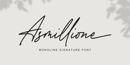 Asmillione is a monoline signature font with a handwriting feel. It comes with ligatures and alternates, also supports multiple languages. It’s perfect for logos, product packaging, wedding invitations, branding, headlines, signage, labels, signature, book covers, posters, quotes, and more.
 - Henceforth by Hanoded,
$15.00 Henceforth is a hand-drawn, all caps didone-style typeface. It is a little rough, a little uneven, but lively and elegant as well. Comes with an abundance of diacritics and, lo and behold, some end-ligatures as well.
 - Cavergiz by Rvandtype,
$9.00 Cavergiz Serif is a cool, thick lettered and assertive display font. Featuring the perfect amount of trendiness, this font will make your designs come to life. Cavergiz is PUA encoded which means you can access all of the glyphs.
 - GungsuhChe by Microsoft Corporation,
$129.00GungsuhChe™ features a mincho (serif) stroke style with half-width Latin characters. This GungsuhChe font file is 6.9 MB in size. GungsuhChe is a trademark of the Microsoft Corporation. GungsuhChe Character Set: Latin 1, Korean code page 949 - Radian by Ayca Atalay,
$8.00 Radian is a modern geometric sans serif typeface that comes in 16 weights: 8 upright fonts and their matching italics. Radian works well in any graphic design project and purpose, both as a display typeface and in smaller sizes.
 - Megalithic by IC Fonts,
$20.00 3D Chiseled Rock type font based on the ideas of Ancient Megalithic Structure and Stone Masonry. This Font comes in a Solid Bolder type or Outlined Type for that Chiseled Ice Block Look. Based on Hulkbusters by Dan Zadorozny.


