10,000 search results
(0.015 seconds)
- Art Project JNL by Jeff Levine,
$29.00 A 1930s WPA (Works Projects Administration) poster advertising a play entitled “Abraham Lincoln, The Great Commoner” had the play’s name done in a hand-lettered Art Deco sans. This is the basis for Art Project JNL. According to Wikipedia, “the Works Progress Administration (renamed in 1939 as the Work Projects Administration; WPA) was the largest and most ambitious American New Deal agency, employing millions of unemployed people (mostly unskilled men) to carry out public works projects, including the construction of public buildings and roads. In a much smaller but more famous project, Federal Project Number One, the WPA employed musicians, artists, writers, actors and directors in large arts, drama, media, and literacy projects.”
 - Atelier Femme by PeachCreme,
$14.00 Introducing our new font trio "Atelier Femme"! Featuring an elegant upright serif, light and clean italic, and a casual handwritten script, this trio brings a splendid, clean visage to websites, logos, brand identities, quotes, and anything else you can think of! Atelier Femme Serif - being something between light and regular, Atelier Femme Serif is a versatile font that gives your projects a modern and minimalist look. Atelier Femme Italic - is a classy and supremely legible font that stands out in both large and small designs be it a display or body text. Atelier Femme Script comes with adorable lowercase beginning and ending swashes and 68 quirky ligatures for a custom handwritten look.
 - Skater Squad by Din Studio,
$29.00 Hi, Everyone! Have you been looking for a graffiti font? Do you dream of creating headings that stand out and inspire creativity, imagination, and prominence style? Introducing Skater Squad- A Grafiti Font Skater Squad is a bold and angular with a distinct street vibe. This font can be used for a host of different content needs and projects. Create gorgeous printed quotes, standout packaging, or beautiful t-shirts! You can even use it to create amazing headings, logos, menus, and social media graphics. Our font always includes Multilingual Support to make your branding reach a global audience. Features: Alternates Standart Ligatures Multilingual Support PUA Encoded Numerals and Punctuation Thank you for downloading premium fonts from Din Studio
 - Maleo by Tokotype,
$39.00 Maleo is a contemporary display sans with grotesque roots, taking cues from typefaces such as Benton’s Franklin Gothic & Alternate Gothic and contemporaries such as Obviously & Mars Condensed. Designed by Aditya Wiraatmaja as his debut retail typeface, Maleo is primarily designed with large-size usage in mind. Its tiny flare and angled cut terminal lends itself a friendly and approachable presence. With a family of 14 styles that range from thin to black with matching italics, it is a versatile display type that stands out in headlines, yet one that emits a charming personality. Maleo support various languages and is equipped with many Opentype features including; Old Style Figures, Ligature, Fractions, Numerators and Denominators, and Stylistic Alternates.
 - Alt Gotisch by HiH,
$12.00 Alt-Gotisch Verzierte is a typeface of decorative initials that is Victorian in style and bears a close family resemblance to the many ornamental tuscans cut throughout the nineteenth century by British foundries. Instead of the bifurcated terminals of the archetypical tuscan (see Figgins Tuscan by HiH or Stereopticon by Dan X. Solo), these letters display what Nicolete Gray might call a “wedge and bite” design -- as if they started with the wedge serif of a latin form and someone came along and took a perfectly round bite out of the wedge. We need not dwell on the lack of teeth marks. The calligraphic curls and flourishes are often graceful, sometimes a bit contrived, but always complex. There is a busyness that marks the style of the period. If you ever see an old photograph of a well-appointed Victorian parlor, you will recognize that same quality of busyness. Overdone is a word that frequently comes to mind. Alt-Gotisch Verzierte means “adorned or decorated old gothic.” The typeface is attributed by Alexander Nesbitt to an unidentified German foundry of the nineteenth century (Decorative Alphabets and Initials, Dover, New York 1987, plate 92). The designer is unknown. Our font is supplied with a lower case that is similar to the upper case, but is 15% shorter and is simplified by the omission of the decorative vines. For the lower case, alternate letters A, E, & T; and ligatures LE, OT & LY have been supplied. In addition, a few small decorative vines were planted here and there for optional use. An accented upper case is not part of the original design and is not here supplied. This design is also seen under the name “Sentinel” -- as always, it is worthwhile to compare the completeness of the character set and the faithfulness of the rendering. We believe you will agree that we provide a balance of quality and value that is unmatched in the contemporary marketplace. Alt-Gotisch Einfach is a simplified version of Alt-Gotisch Verzierte. The vine-less lower case of the Verzierte font is the upper case in Einfach. For a lower case for Einfach, the letters were further simplified by stripping away the three-dimensional outline, down to the bare bones and bites, as it were. Einfach, in fact, means “simple” or “plain.” It is interesting to note that this bare bones & bite lower case bears (I have a special license to use two homonyms in the same sentence) a striking resemblance to the 15th & 16th century ornamental letters from Westminster Abbey shown in Plate 47 of Alexander Nesbitt’s Decorative Alphabets and Initials (Dover, New York 1987).
 - Kungfu Brush by Ditatype,
$29.00 Kungfu Brush is a captivating game-themed display font designed in uppercase, infusing the essence of martial arts and the artistry of brush strokes. It features a distinct brush-style accent that brings a sense of handcrafted artistry to each letter. Inspired by the fluid movements of martial arts, the font captures the energy and elegance of brush strokes. This unique feature adds a touch of creativity and authenticity, making this font stand out from conventional display fonts. Designed with fairly low contrast, Kungfu Brush prioritizes a balanced and harmonious visual experience. The subtle differences in stroke width across the letters create a smooth and comfortable reading experience. With its uppercase design, Kungfu Brush exudes power and strength. Each letter commands attention and showcases the boldness of martial arts. The font's uppercase style adds a sense of authority and captures the spirit of determination found in the martial arts realm. You can also enjoy the available features here. Features: Multilingual Supports PUA Encoded Numerals and Punctuations Kungfu Brush fits in headlines, logos, posters, titles, branding materials, print media, editorial layouts, website headers, and any projects that aim to capture the essence of combat, adventure, and discipline. Find out more ways to use this font by taking a look at the font preview. Thanks for purchasing our fonts. Hopefully, you have a great time using our font. Feel free to contact us anytime for further information or when you have trouble with the font. Thanks a lot and happy designing.
 - King Throne by Nathatype,
$29.00 King Throne is a regal display font that exudes an air of grandeur and elegance. With its high contrast characters and distinctive swinging letter ends, this typeface commands attention and captivates the viewer with its majestic presence. The high contrast design of this font creates a striking visual impact. The stark difference between the thick and thin strokes adds a sense of drama and sophistication to each letter, making them stand out with a commanding presence. The font's weight distribution captures the eye and draws focus to the exquisite details of its letterforms. What sets King Throne apart is the captivating swinging ends of the letters. With a gentle curve and a flourish, these decorative elements add a touch of movement and grace to the font. The swinging letter ends contribute to the font's regal aesthetic, evoking images of royal script and elegant calligraphy. They elevate the font's overall appearance, transforming it into a true symbol of authority and power. For the best legibility you can use it in the bigger text. Enjoy the available features here. Features: Stylistic Sets Ligatures Multilingual Supports PUA Encoded Numerals and Punctuations King Throne fits in headlines, logos, attention-grabbing titles, product packaging, branding materials, editorial layouts and website headers. Find out more ways to use this font by taking a look at the font preview. Thanks for purchasing our fonts. Hopefully, you have a great time using our font. Feel free to contact us anytime for further information or when you have trouble with the font. Thanks a lot and happy designing.
 - DIN Next by Monotype,
$56.99 DIN has always been the typeface you root for—the one you wanted to use but just couldn’t bring yourself to because it was limited in its range of weights and widths, rendering it less useful than it could be. The century-old design has proven to be timeless, but modern use cases demanded an update, which resulted in DIN Next—a versatile sans serif family that will never go out of style. This classic design turned modern must-have includes seven weights that range from light to black, each of which has a complementary italic and condensed counterpart. The family also included four rounded designs, stretching the original concept’s range and core usability. DIN Next also boasts a suite of small capitals, old style figures, subscript, superscript and several alternate characters. A quintessential 20th-century design, its predecessor DIN was based on geometric shapes and was intended for use on traffic signs and technical documentation. Akira Kobayashi’s update made slight changes to the design, rounding the formerly squared-off corner angles to humanize the family. Rooted in over 100-years of history, it’s safe to say that there will always be a demand for the DIN design, and thanks to DIN Next, now it’s as usable as it is desired. Wondering what will pair with it perfectly? Check out Agmena™, Bembo® Book, Cardamon™, Joanna® Nova, FF Quadraat® and Quitador™. Featured in: Best Fonts for Logos, Best Fonts for Websites, Best Fonts for Tattoos
 - Elyzabeth Pro by moriztype,
$15.00 Elyzabeth Pro is a very elegant and practical sans serif font family and precise in its creation. clean fonts that stand upright elegantly that are soft and familiar and easy to read, Not boring to the reader. This type of font is great to use for very large writing purposes, ranging from notes on daily activities, magazines, newspapers, logos, posters, product compositions, product descriptions to be sold and indications of any product composition that requires writing shadows. Elizabeth Pro contains eight fonts. Broadly speaking, this font has two models, namely Regular and Italic. (Thin, Thin Italic, Regular, Regular Italic, Semi Bold, Semi Bold Italic, Bold and Bold Italic. They all support Latin, Greek, and Cryillic characters. This font will be a great asset to your font library, as it has the potential to enhance your next project creation.
 - Gready by Mans Greback,
$59.00 Gready is a swirly brush typeface. With happy swashes and funny curves, this comic lettering has a flowing and soft character and a greedy, optimistic personality. Use it for a fresh, tasty ice cream or food store logo, a cartoon headline or any playful context speaking to the child within us. Drawn and created by Mans Greback, this modern paintbrush font family comes in four styles: Thin, Regular, Bold and the crazy Outline variety. Gready is built with advanced OpenType functionality and has a guaranteed top-notch quality, containing stylistic and contextual alternates, ligatures and more features; all to give you full control and customizability. It has extensive lingual support, covering all Latin-based languages, from North Europe to South Africa, from America to South-East Asia. It contains all characters and symbols you'll ever need, including all punctuation and numbers.
 - Axiom by Australian Type Foundry,
$30.00Influenced heavily by the work of Erik Spiekerman, Axiom came out of a desire to capture Spiekerman's simplicity and elegant style. Axiom seems to work well when extended. - Noki by ActiveSphere,
$30.00 The new release is called Noki. A font family Ideal for flyers, label, logos, magazine, product branding, corporate branding, signage, posters and certainly in advertising. Check it out !
 - Skulduggery by Hanoded,
$15.00 I was playing around with some brushes and ink, and out came Skulduggery. Use it for any project you can apply the term ‘skulduggery’ to. Or not. Whatever.
 - Diamante Robusto by César Modesto,
$- Diamante Robusto Font is my new font, where all the letters came out of this strange shape created without intention of being the inspiration for this new font.
 - Richard Miller Rounded by Miller Type Foundry,
$19.00 Richard Miller Rounded started out as just a logo for a website/business card. It is a modular sans that works well in both print and web design.
 - Aliman by Cititype,
$9.00 Aliman is a simple and neat lettered handwritten font. Add this font to your creative ideas and notice how it will make them stand out! All Caps fonts.
 - Printers Stuff JNL by Jeff Levine,
$29.00 A generous assortment of cartoons, catch words, ornaments, embellishments and even a pointing hand tourist sign modeled from an actual vintage metal one round out Printers Stuff JNL.
 - Esmeralda Pro by Sudtipos,
$59.00 From the beginning “Esmeralda” was born with a strong influence of the classical “capitalis monumentalis”, carved in stone. In the same way, the origin of this majuscule writing emerged from the brush, from a way of writing made merely by hand. For this reason, these two universes were intended to lie beneath the shape of each letter, redefining them. And this combination of styles should also be reflected in a lower case set that also allows to open up the spectrum of usage possibilities. Foundational calligraphy represented a solid base for the development of lower case glyphs, ensuring proper interaction with the upper case letters. “Esmeralda” features a great number of ligatures that mix classic structures with a more contemporary impression. With more than eleven hundred glyphs, it provides a multiplicity of uses across a wide combinatory of ligatures, alternative signs, initial caps, miscellaneous and connectors; each one of them accessible through Open Type. “Esmeralda” is perfect to speak with a classical yet fresh, modern – and a little bit bold – tone of voice. Designed by Guille Vizzari, together with the tough and remarkable work of Ale Paul, in use “Esmeralda” stands out in a subtle and unexpected way that’s almost unnoticeable. Its delicate yet solid curves, serifs and endings give each composition a fine, elegant and exquisite feeling, along with a firm and sturdy look. “Esmeralda” was initially born as a typographic project developed by Guillermo Vizzari – tutored by Ale Paul and Ana Sanfelippo – under completion of the Specialization in Typography Design at University of Buenos Aires, Argentina, during the years 2011 and 2012.
 - Centola by Supfonts,
$12.00 Centola - a perfect clean modern serif Font is an open type with clean shapes and precise kerning. Centola Font Features: - Full Set of standard alphabet and punctuation - Ligatures - PUA Encoded - no special software needed to access extra characters - Language support: All European languages - Multilingual Characters AÁĂÂÄÀĀĄÅÃÆBCĆČÇĊDÐĎĐEÉĚÊËĖÈĒĘẼFGĞĢĠḠHĦIIJÍÎÏİÌĪĮĨJKĶLĹĽĻŁMNŃŇŅÑ OÓÔÖÒŐŌØÕŒPÞQRŔŘŖSŚŠŞȘẞTŤŢȚUÚÛÜÙŰŪŲŮŨVWẂŴẄẀXYÝŶŸỲỸZŹŽŻ aáăâäàāąåãæbcćčçċdðďđeéěêëėèēęẽfgğģġḡhħiıíîïìijīįĩjȷkķlĺľļłmnńňņñoóôöòőōøõœpþ qrŕřŗsśšşșßtťţțuúûüùűūųůũvwẃŵẅẁxyýŷÿỳỹzźžż Thanks so much for checking out my shop, and please get in touch if you have any questions! Don't forget to subscribe so you don't miss out on the new awesome fonts Dima
 - Fabejan by Supfonts,
$12.00 Fabejan a perfect mixed calligraphy and modern serif Font is an open type with clean shapes and precise kerning. Fabejan Font Features: - Full Set of standard alphabet and punctuation - PUA Encoded - no special software needed to access extra characters - **Language support**: All European languages - Multilingual Characters AÁĂÂÄÀĀĄÅÃÆBCĆČÇĊDÐĎĐEÉĚÊËĖÈĒĘẼFGĞĢĠḠHĦIIJÍÎÏİÌĪĮĨJKĶLĹĽĻŁMNŃŇŅÑ OÓÔÖÒŐŌØÕŒPÞQRŔŘŖSŚŠŞȘẞTŤŢȚUÚÛÜÙŰŪŲŮŨVWẂŴẄẀXYÝŶŸỲỸZŹŽŻ aáăâäàāąåãæbcćčçċdðďđeéěêëėèēęẽfgğģġḡhħiıíîïìijīįĩjȷkķlĺľļłmnńňņñoóôöòőōøõœpþ qrŕřŗsśšşșßtťţțuúûüùűūųůũvwẃŵẅẁxyýŷÿỳỹzźžż Thanks so much for checking out my shop, and please get in touch if you have any questions! Don't forget to subscribe so you don't miss out on the new awesome fonts Dima
 - Somewhere by Supfonts,
$15.00 Somewhere Delicate Script Somewhere is a delicate handwritten font with multilingual support. It is perfect for branding, wedding invitations, menu design, YouTube covers and many more Font includes a full set of gorgeous uppercase and lowercase letters, numbers, a large selection of punctuation marks & multilingual support Test it out below to see how it could look for your next project! Includes: Regular Script Multilingual languages support Uppercase and lowercase Numbers and punctuation Check out my blog: https://www.instagram.com/superdizigner https://pinterest.com/dmitriychirkov7
 - Flamingo Plush by PizzaDude.dk,
$20.00 Flamingo Plush is something you want to use when you need your statement shouted out! The large, rough and worn letters will do the job for you - all you need to do is write your message! There is a slight difference in upper- and lowercase in a kind of unicase way. Some of the lowercase letters looks a bit more worn, when mixed with uppercase makes the handmade look really stand out! Go for something big, go for Flamingo Plush!
 - Orphic by Flawlessandco,
$9.00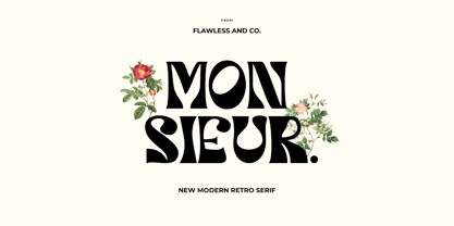 Orphic is a display retro font with a fun and bold style that perfect for your boho-themed projects such as poster design, branding materials, t-shirt, business cards, logo, photography, quotes, and more. Try out some alternate characters for another visual result! This font support for some multilingual. Also contains uppercase A-Z and lowercase a-z, alternate character, numbers 0-9, and some punctuation. If you need help, just write me! Thanks so much for checking out my shop!
 - Headlined by Thinkdust,
$10.00 Reminiscent of a stencilled spray-paint message, making a stand against the world, Headlined is equally at home expressing the voices of the oppressors and the oppressed. Simple in application, this font sets down an idea and makes it stand out from the crowd with a bold tone backed up by a slight fading that implies age and wisdom. Make a statement with Headlined and watch the world change. Alternatively if you're looking for something a little cleaner, check out Headlined Solid.
 - Getone by Robert Corseanschi,
$14.99 Getone is an exotic font, based on the Sereno font made by the same designer. It has a modern touch which makes it to stand out, all the glyphs are designed "out of the box" to combine each other in harmonious way. Getone is coming in ten styles : thin, ultra light, light, regular, bold and italics. Is ideally suited for advertising and packaging, festive occasions, editorial and publishing, logo, branding and creative industries, poster and billboards as well as web and screen design.
 - Jelly Cloud by Supfonts,
$10.00 JellyCloud / Font with Swashes JellyCloud is a chic script with exquisite accents. It is perfect for branding, wedding invitations and invitation cards and much more. Font includes a full set of gorgeous uppercase and lowercase letters, numbers, a large selection of punctuation marks, ligatures Test it out below to see how it could look for your next project! Includes: Regular Script Latin languages support Uppercase and lowercase Numbers and punctuation Ligatures Check out my blog: https://www.instagram.com/zloillev pinterest.com/dmitriychirkov7 Enjoy
 - XXII GoreGrinder by Doubletwo Studios,
$25.99 The face of horror – The GoreGrinder is an extreme logo font designed for extreme music. If you’re in love with deathmetal, grindcore and the horror movie scene, you may find pleasure in using this font. It comes with an upper- and lowercase characterset, numerals, some punctuation and a bunch of drips and stuff used in the genre. Use it in your graphic-editing-application and be creative, play with it and find out what’s possible. Find out more about using it on Behance.net
 - Arlette by TypeTogether,
$49.00 Pilar and Ferran based Arlette on the fast stroke of one letter from a Roger Excoffon family, but along the way they abandoned that starting point in favour of experimentation. Many sans serifs are like a svelte black dress: functional, beautiful, and the unfussy outfit for a nice evening get together. The Arlette family isn’t like this. It’s a stunner — an incandescent reimagining of what defines a sans and how it can look. Arlette explores the boundaries of the sans serif landscape and returns with forms developed from gestural vigour. Thinking of it as “painterly” may at first seem to fit, but it underestimates Arlette’s ability to master an unseen world of countless emotions and physical applications: magazines, branding, editorial, teen and young adult works, book covers, and a host of products and packaging whose content will be amplified with Arlette’s voice. Not only does Arlette use its eight weights plus italics to speak in Latin-based scripts, it is also fluent in Thai and has six weights (hairline through bold) with which it meets that challenge, whether in text or display. Arlette Thai’s modern nature is seen in two features for the script. One is the decorative Thai characters that are based on original palm leaf manuscripts. Another is a version of the Latin numerals adapted to the height of the script due to their wide use in Thailand. Arlette Thai has been meticulously developed, including contextual kerning to avoid mark clashes. Arlette’s OpenType capabilities include mathematic and scientific figures, positional forms, pointers, arrows, and oldstyle, lining, and tabular lining numerals. In addition to all this, it’s packed with swashes and swash ligatures in both scripts for enthusiastic typesetting. Because it pushes experimentation without compromising readability, both Arlette Thai and Latin are surprisingly legible in small sizes and arrestingly beautiful when their details can be seen.
 - Materia Pro by Elsner+Flake,
$79.00 Minimal, modular, modern—at first glance, Materia shows a contemporary flair, combining pure, strong geometrical form with a subtle, distinct appearance. Actually, the design was inspired by lettering from the turn of the 19th to the 20th century that still can be found in the East of France. While its formal origins date back as far as this, revived e. g. by the constructivists into the nineteen twenties and later on by Dutch information designer Wim Crouwel in the nineteen-sixties, the visual language of Materia still speaks of the »future«. Following a minimalistic concept the font is formally built on a grid. Wherever optical curves are needed for a smoother, more comfortable shape of letters than a simple rectangular block, diagonals cut off the egdes – like a diamond is cut to achieve more beauty. Thus headlines and texts set in Materia are given a certain »egdy« feeling, whereas their tonality is still kept well-balanced, keeping concentation all on information in a nonconfomist way. Materia comes in eight styles, from elegant Thin to attention-forcing Ultra. Even a regular Italic is available, following the classic type-set-principle. Two of the styles are explicitly designed for display use, Shadow and Code. Both are ready for combinations with Bold or each other respectively, the layering of Shadow and Code e. g. allows astonishing effects or highlighting within the letters. For OpenType-users Materia is a real Pro, containing accented Latin letters for over 70 languages, small caps, old style, tabular and lining figures and special condensed titling all caps for cases in which space is all that counts. How useful all of the above mentioned is may be seen in the book David Lynch – Lithos, designed by Koma Amok, published in 2010 by item éditions, Paris, and Hatje Cantz, Germany, which was typeset completely in Materia.
 - Kate Slab Pro Ultra Expanded by Monday Type,
$19.00 Kate Slab Pro Ultra Expanded is a sophisticated and robust modern Slab Serif Typeface that works in a variety of design scenarios. It is designed to work in big attention grabbing headlines as well as in smaller text and even body text. The recognition value of Kate Slab Pro Ultra Expanded is its biggest asset in world of uniformity. Ranging from “100 Thin” all the way to “900 Black” makes Kate Slab Pro Ultra Expanded such an amazing and versatile font family that stands out. Kate Slab Pro Ultra Expanded doesn’t only work great in lifestyle and fashion related contexts but will also look amazing for restaurants, coffee shops or and other use cases that ask for character and identity. To fill all the gaps of a designer’s needs, Kate Slab Pro Ultra Expanded comes with an italic style with every weight. Those italics are equipped with unique and real italic characters and will make you love it. Being a Slab Serif Kate Slab Pro Ultra Expanded manages to remind you of a classic Font Family with a modern and timeless approach that will make you happy for decades. Monday Type can’t wait to see the beautiful designs you are going to create with our Kate Slab Pro Ultra Expanded.
 - Broker by In-House International,
$5.00 Broker is an angular variable display type family that invites carefree experimentation, but is designed to make a statement. With twelve unique styles and variable controls for thickness, decoration, and shape, Broker is a versatile and expressive shape-shifter that adapts to fit your mood. It can go from slim, square mono-weight to edgy stressed angled styles, and full-on style with chunky serif heels. And because it’s drawn on a rectangular frame, it’s modular, making it particularly easy to lay out and stack. Inspired by DIY, cut paper lettering Broker isn’t delicate, elegant or precious—it’s a rough and tumble typeface to play with and make your own. Use the variable control to try different styles to give shape to your words. It’s perfect for creative projects, posters, funky packaging, flyers, cover art, motion displays, and fearless branding. The font family includes uppercase and lowercase alphabets, numbers, punctuation and latin diacritics—fully adaptable as a variable type (.ttf) for designers using compatible platforms. It’s also available as thirteen unique opentype (.otf) fonts that can be mixed and matched. Broker was designed by Alexander Wright and In-House International for the In-House International foundry and developed by Rodrigo Fuenzalida at FragType.
 - Tag Banger by Okaycat,
$12.50 TagBanger WADE1 is the first in a short graffiti font series. This series will showcase the hand-styles of various mature street artists that Okaycat is working with. This first release highlights the style of one such graffiti writer, WADE1, who has an eclectic writing style after many years proliferating street art. Long-term graffiti artists develop their own style over their careers, spending as many endless hours honing their letter-forms as any full-time professional typographical artist. Style, individuality, and originality are everything. These attributes are key to the graffiti artist's tao. A writer who copies, or "bites" loses respect -- their work will be painted over or "crossed out" by all other writers. Okaycat's TagBanger series aims to demonstrate just how widely these individual styles can diverge, likely due, at least in part, to the social pressures of a community that ruthlessly punishes copycats. WADE1's tags were transformed into vector format from a generous sampling of their most recent scrawls. Our TagBanger series may not be composed of the most legible or beautiful fonts, but we imagine there are uses for these whenever highly unusual handwriting is needed. TagBanger WADE1 is extended, containing the full West European diacritics & a full set of ligatures, making it suitable for multilingual environments & publications.
 - Polotan by Look Minus Today,
$16.00 Introducing Polotan, the ultimate futuristic and modern sans-serif font. With its sleek and streamlined design, Polotan is perfect for creating a cutting-edge, high-tech look that's perfect for a variety of design applications. Featuring strong lines that convey a sense of power and confidence, Polotan is perfect for headlines, titles, and branding materials. But what sets it apart is its unique alternates, which give you the flexibility to create custom designs that stand out from the crowd. And with its alternates, you can take your designs even further and truly make them your own. Its clean and minimalist design makes it easy to read, while its sharp angles and unique letterforms create a sense of energy and movement!. Whether you're designing a high-tech website, a sleek user interface, or a modern brand identity, Polotan will help you make a bold and unforgettable impression. So why settle for a boring and outdated font when you can make a statement with Polotan sans-serif? Try it today and see how it can take your designs to the next level. And please message me if you want your language included or if there are any features or glyph requests, feel free to send me a message.
 - Kate Slab Pro Expanded by Monday Type,
$19.00 Kate Slab Pro Expanded is a sophisticated and robust modern Slab Serif Typeface that works in a variety of design scenarios. It is designed to work in big attention grabbing headlines as well as in smaller text and even body text. The recognition value of Kate Slab Pro Expanded is its biggest asset in world of uniformity. Ranging from “100 Thin” all the way to “900 Black” makes Kate Slab Pro Expanded such an amazing and versatile font family that stands out. Kate Slab Pro Expanded doesn’t only work great in lifestyle and fashion related contexts but will also look amazing for restaurants, coffee shops or and other use cases that ask for character and identity. To fill all the gaps of a designer’s needs, Kate Slab Pro Expanded comes with an italic style with every weight. Those italics are equipped with unique and real italic characters and will make you love it. Being a Slab Serif Kate Slab Pro Expanded manages to remind you of a classic Font Family with a modern and timeless approach that will make you happy for decades. Monday Type can’t wait to see the beautiful designs you are going to create with our Kate Slab Pro Expanded.
 - Elexis by Danielle Eneh,
$12.00 Elexis is a chunky, blocky script that will stand out in your next project. It's perfect for branding, social media posts, advertisements, product packaging, and invitations. Multilingual Support: AÀÁÂÃÄÅCÇDÐEÈÉÊËIÌÍÎÏNÑOØÒÓÔÕÖUÙÜÚÛWYÝŸỲŸÆŒßÞþ
 - FG Adam by YOFF,
$15.95FG Adam turned out (it always is like that) a bit crazy with the baseline shift it makes a good greeting card font. I like it and it's fun! - Kris Kringle by Sealoung,
$15.00 Kris Kringle is a bold and chunky lettered display font. Add this font to your creative ideas and notice how it will make them stand out! All caps fonts.
 - Lights in Pairs by Bogstav,
$18.00 It's legible, it's handmade and it has a lot of personality...with a twist of organic freshness it is guaranteed to make that next project of yours stand out!
 - P22 Atomica by P22 Type Foundry,
$24.95 Atomica looks back to the dawn of the nuclear era when fall-out shelters were all the rage. This font contains 62 Atomic Age symbols and Civil Defense emblems.
 - Jonah Brush by Jonahfonts,
$19.00 As once a sign-painter in my younger years I loved the quick brush strokes used to turn out quick 'Sale' posters. I tried to relive in this font.