10,000 search results
(0.035 seconds)
- Wascally Wabbit by Comicraft,
$49.00 This cunning, conniving, chattering font is devious, devilish and dashing! It's a toon town tattler that will lend a flippant insouciant personality to your comic books and animated features. These handsome letterforms will nab you, jab you, grab you and may even stab you with their sly wily guile. Our advice: Be Very Very Qwiet when tracking down this Wascally Wabbit. Features: Automatic alternate uppercase alphabets Western & Central European language support Manga characters & Crossbar I Technology™
 - Fishercat by Maulana Creative,
$16.00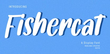 Fishercat is a cool handwritten font such a comic vibes. With sharp bold stroke, slant and fun character with a bit of ligatures. To give you an extra creative work. Fishercat font support multilingual more than 100+ language. This font is good for logo design, Social media, Movie Titles, Books Titles, a short text even a long text letter and good for your secondary text font with sans or serif. Make a stunning work with Fishercat font. Cheers, MaulanaCreative
 - Bright Sunshine by Mindtype Co.,
$15.00 Introducing the "Bright Sunshine" script font. New fashionable handwriting font and super cool with sexy style. And also the Capital letters set with contemporary and sophisticated accents. Bright Sunshine offers beautiful typographic harmony for a diversity of design projects, including logos & branding, wedding designs, social media posts, advertisements & product designs. "Bright Sunshine" includes Italics, full set of lovely uppercase and lowercase letters, multilingual symbols, numerals, and punctuation. And this Font has given PUA unicode (specially coded fonts).
 - Dear Darling by Letterara,
$14.00 dear darling is a lovely and romantic handwritten font with a monogram. It has beautiful and well-balanced characters and as a result, it matches a wide pool of designs. Add it to your most creative ideas and notice how it makes them come alive! This font is PUA encoded which means you can access all of the amazing glyphs and swashes with ease! It also features a wealth of special features including alternate glyphs and ligatures.
 - Strawberry Blossom by StereoType Fonts,
$29.00 Introducing Strawberry Blossom, a smooth script font, made for your best creative typographic designs! Try it for any of your DIY projects, cards, posters, packaging, web design, photos, scrapbooking, or anything hidden in your creative mind! With this soft and rounded style, it comes with plenty of alternates characters and ligatures so that you could create a unique and personal style to your text. And you'll also find a cool sans serif handwritten font to match perfectly!
 - Boavista by Scratch Design,
$10.00 Boavista is a modern handwritten font with a bold signature style. This font has a modern shape that will be useful for digital branding. For some occasions, this font is also perfect for logo design, name cards, signature logos, blogs, Instagram, and other social media purposes. To access all the multi-languages and ligatures, Opentype capable software is recommended Adobe Illustrator, Photoshop, Inkscape. Grab it fast this font and enjoy Boasvista to make some cool stuff :)
 - Minagi Bristone by Beary,
$15.00 Minagi Bristone is a cool and stylish serif font, featuring its own unique style and modern look. Masterfully designed to become a true favorite, this font has the potential to bring each of your creative ideas to the highest level! This typeface is perfect for an elegant & luxury logo, book or movie title, fashion brand, magazine, clothes, lettering, quotes and more. Minagi Bristone is PUA encoded which means you can access all of the glyphs and swashes with ease.
 - Hello Beach by Letterara,
$14.00 Hello Beach is a friendly and elegant handwritten font. Its natural and unique style makes it incredibly fitting to a large pool of designs. Its distinct and well interesting letters make this font a masterpiece. Fall in love with its incredibly versatile style and use it to create spectacular designs! This font is PUA encoded which means you can access all of the awesome glyphs with ease! It also features a wealth of special features including ligatures.
 - Inkle by Gassstype,
$23.00 Here comes a New font, INKLE is Black Bold Display Font this is strong Font, that is written casually and quickly amazing. Then crafted carefully drawn into vector format. This font is great for your next creative project such as logos, printed quotes, invitations, cards, product packaging, headers, Logotype, Letterhead, Poster, Label, and etc. That is Font INKLE has Stylish,Cool and Unique characteristic more natural look to your text with a more modern look to your text.
 - Thrilla by Olivetype,
$18.00 Thrilla is a cool hand brush script font with sophisticated characters and an awesome texture. It is a great font for projects that need an authentic and strong appearance! Thrilla contains 204 glyphs. Supporting more than 66 languages, from English to Zulu. It is also PUA encoded, multilingual, and has open-type features such as ligatures. So what's included: Basic Latin A-Z & a-z. Numbers, symbols, and punctuations Ligatures Multilingual Support. Accented Characters : ÀÁÂÃÄÅÆÇÈÉÊËÌÍÎÏÑÒÓÔÕÖØŒŠÙÚÛÜŸÝŽàáâãäåæçèéêëìíîïñòóôõöøœšùúûüýÿžß Thank You.
 - Kabif by Twinletter,
$15.00 Retro is in again! The distinctive font Kabif will give your work a vintage, extraordinary look. With its erratic, rounded, and geometric shapes, this font typifies popular culture from the 1960s and 1970s. A cool and simple font with an easy-to-see and easy-to-read typeface is called Kabif. The Kabif font works best for text, headlines, headers, signage, greeting cards, posters, flyers, invitations, packaging, book covers, printed quotes, album covers, and other visual elements.
 - Le Gusto by Orenari,
$15.00 Le Gusto is perfect for your unique projects as it looks modern and fun. This font is 100% handwritten by my self and I put much love in each characters. Le Gusto is Mùltïlingûål Šüppórt. And, oh, it's also came with mini vector bonus. YAY. I really hope your projects will be cool with this font, and please don't hesitate to drop me a message if you have any questions or you wanna share some jokes! :) Thank You, Ari
 - The Vanguard by RCKY Studio,
$15.00 The Vanguard font is a handwritten font specially designed for a cool textured font with a bold body tone and an eye-catching texture. This is a modern logo style. The Vanguard also has tons of alternatives, and bonus underscores that can be used in each sentence. It will look perfect in every design. Suitable for use in design titles such as invitations, name boards, book titles, stationery designs, quotes, branding, logos, greeting cards, packaging designs, posters, and more.
 - Happenstance by Just My Type,
$25.00 Happenstance came out of a play session with Bezier curves with a sense of fun built into its being. First came play, then came work. Thomas Edison once said,”Creativity is 1% inspiration and 99% perspiration.” Nikola Tesla thought the opposite. In this case, what started as inspiration took a lot of perspiration to corral into a usable font. So maybe the reality is a) different for different people or b) somewhere in the middle. Just sayin’.
 - Silk Goned by Imoodev,
$20.00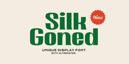 Silk Goned is cool modern fonts with visual elegance, smooth curves, and beautiful ligatures clear, making your work look true and attractive. A versatile font that works in both large and small sizes. This font is suitable for a wide variety of projects such as invitations, logos, branding, magazine, photography, card, product packaging, mugs, quotes, poster, labels, signatures, and more. A font which is perfect for all business sectors including personal projects, studio, corporate, creative agency, industrial, company, etc.
 - Studio Brush by Hanoded,
$15.00 I really enjoy making brush fonts. I usually just get my Chinese ink and a bunch of brushes and start drawing glyphs. It took some time to get Studio Brush right, but I think spending that extra time paid off. Studio Brush is quite a neat brush font: the glyphs of this all caps font are of equal height (more or less) and complement each other perfectly. Studio Brush comes with double letter ligatures and some alternate glyphs.
 - Golden Way by Typehill Studio,
$12.00 Golden Way Family attracts such a subtle, clean, feminine, sensual, glamorous, simple and very readable typeface. The classic style is perfect to apply in various formal forms such as invitations, labels, menus, Logos, fashion, make up, stationery, letterpress, romantic novels, magazines, books, greeting / wedding cards, packaging, labels Golden Way Family also features a strong neoclassical serif typeface with high contrast, cool, stylish and unique look with alternative fonts, Ligatures, and multilingual support Thank you for your visit.
 - De Bambeet by Zamjump,
$17.00 De Bambeet is a serif font that has a little style compared to other serifs, with multiple languages, alternate and also ligature is quite cool and suitable to be paired in various media like a posters, wedding invitations, craft products, book covers, photography, t-shirts , product packaging and other media. By using De Bambeet, I am sure that your products will look elegant, classic and luxurious. Font Featured : Uppercase Lowercase Numbers Symbols Punctuations Sylistic alternates Discretionary Ligatures
 - JP2 by Linotype,
$40.99JP2 has some special roots being inspired by the actual handwriting of Pope John Paul II. Franciszek Otto took this source material and transformed it into a high quality font. The result is a rough, but intelligent, design with letters that slightly bounce along the baseline to mimic typical writing. Their short x-height, long extenders, and unique capital letters make this a very beautiful and distinctive typeface. Try it out for greetings, invitations, or posters! - Lighters by Sarid Ezra,
$15.00 Lighters is a light and minimalist logo font family with unique lowercase that will make your logo and design looks more clean and simple. With three weight styles that you can use together will make your design more cool . You can use this font for any purpose, especially to make logotype and poster design. You can mix and match the uppercase and lowercase to make your logo more advanced. This font also comes with number, symbol, and multilingual support!
 - Gazella by Raditya Type,
$14.00 GAZELLA Displays Fonts. This font has a unique and bold typeface, making it suitable for unique design themes. The unique binding of the serifs makes this typeface cool and stands out from the usual serif fonts, perfect for headlines, logos, posters, packaging, T-shirts, coffee shops, restaurants, magazine headers, signs or gift/post cards, cafes and weddings or any kind of advertising purposes. GAZELLA comes with uppercase, lowercase, Numbers, Punctuation, Ligatures and also Multi Language Support.
 - Magical Horison by Beary,
$15.00 Magical Horison is a cool and stylish serif font, featuring its own unique style and modern look. Masterfully designed to become a true favorite, this font has the potential to bring each of your creative ideas to the highest level! This typeface is perfect for an elegant & luxury logo, book or movie title, fashion brand, magazine, clothes, lettering, quotes and more. Magical Horison is PUA encoded which means you can access all of the glyphs and swashes with ease.
 - Albertina by Monotype,
$29.99Albertina was a typeface ahead of its time. It was in the early 1960s when designer Chris Brand, an accomplished calligrapher, aspired to draw a typeface based on the principles of calligraphy. Unfortunately, typesetting machines of that era put many restrictions on designers. Characters had to be drawn within a very coarse grid, which also defined their spacing. Technological limitations meant that italic designs often had to share the same character widths as the romans. Designers were forced to draw italic faces much wider and with more open spacing than what would be typical in calligraphic lettering or hand-set type. Not surprisingly, production of the first Albertina fonts went very slowly. Brand would submit his character drawings, and the Monotype Drawing Office would modify them to be compatible with the company's typesetting equipment. The new drawings would then be sent back to Brand for approval or rework. Most were reworked. The process took so long, in fact, that by the time the face was completed it was once again out of phase with the times: instead of being released as metal type for the Monotype composing machines it had been tailored for, Albertina debuted as phototype fonts for the Monophoto typesetter. The design's first use was for a catalog of the work of Stanley Morison, exhibited at the Albertina Library in Brussels in 1966. Sales of the design were not remarkable. With the advent of digital type technology, Albertina's story took a far happier turn. Frank E. Blokland, of the Dutch Type Library, used Brand's original, uncompromised drawings as the foundation of a digital revival. The Monophoto version had taken a considerable battering from the limitations of Monotype's unit system," recalls Blokland, "but there was no need for me to incorporate these restrictions in the digital version." With the full backing of Monotype and original designer Brand looking over Blokland's shoulder, a new design for Albertina emerged, displaying all the grace and verve of Brand's original drawings. The basic family drawn by Brand also grew into three weights, each with an italic complement and a suite of small caps and old style figures." - Mont Blanc by Fontfabric,
$35.00 A new type giant emerges taking after the legendary geometric sans serif Mont! Mont Blanc elevates all prized unique details of Mont and translates them into an independent flawless text font family. This type prodigy comes with heaping legibility improvements dedicated to the smaller sizes and challenging paragraphs. The new type family is set to climb to the top of your “favorite design tools” with adjusted x-height, refined weight, and glyphs redesign to name but a few. Venture into new projects equipped with 8 font weights and matching italics, multi-script support, and rich OpenType features set. Language Support: Extended Latin (all Western languages), Cyrillic, Greek OpenType Features: Localized Forms Subscript Scientific Inferiors Superscript Numerators and Denominators Fractions Ordinals Lining Figures Proportional Figures Tabular Figures Oldstyle Figures Case-Sensitive Forms Standard Ligatures Stylistic Alternates Contextual Alternates
 - Tusque by Eclectotype,
$40.00 Tusque is a layered chromatic type family with a Tuscan flavor. Regular, Circus and Tooled can stand alone, while Highlight and Deco are purely for layering up multicolored gorgeousness. Tusque lends itself to fairy tales, wine labels and boutique logos, and makes some particularly delectable drop caps. Although it’s all caps, the lower case slots are all different from the upper case so you can mix and match to your heart’s content. There are also a bevy of swash alternates and ligatures at your disposal. The contextual alternates feature cleverly substitutes alternate versions of more triangular glyphs like A and V to give a better fit. The ordinal feature changes ‘a’ and ‘o’ to the feminine and masculine ordinals for Spanish etc. but also changes ‘c’ and ‘ac’ to superscript lowercase versions for names like McBride and MacDonald.
 - Brava Sans by Rafael Jordan,
$30.00 Brava Sans (the naked & extended version of Brava Slab ) is a family of 8 weights, 2 widths and true italics. Designed for editorial purpose, it has a monolinear appearance with a humanist construction, open counters and a tall “x height” that give it a right personality for use in branding. Also Brava Sans has a lot of helpful features as a wide range cover of Latin languages, a lot of OpenType features, a new condensed width and two bolder and cooler weights that make Brava Sans a useful tool for the graphic designer. A full range of numerals (included old style figures, lining, numerators, denominators, superiors, subs, circled and black circled), small caps, forty ligatures (between standard & discretionary ligatures), a lowercase superior and inferior set and a stylistic set are some of the features that makes Brava Sans a solid choice.
 - Ginder by Craft Supply Co,
$20.00 Ginder – Bold Serif Font: Striking and Versatile Bold and Commanding Presence: Ginder – Bold Serif Font stands out with its strong, bold character. It’s perfect for titles and posters needing a powerful impact. This font captures attention effortlessly. Ideal for Titles and Posters: With its robust design, Ginder excels in creating striking titles and posters. It enhances visibility and readability. This font is a top choice for impactful visual designs. Adaptable Across Mediums: Despite its boldness, Ginder is surprisingly adaptable. It works well in both digital and print formats. This versatility makes it a valuable tool for various design projects. User-Friendly for Designers: Ginder is designed for ease of use, suitable for all skill levels. Its compatibility with multiple design platforms adds to its appeal. It’s a favorite among graphic designers for its simplicity and impact.
 - F6 Grand Prix by Ortho,
$19.99 It's here! Designed with the future in mind, while paying tribute to a rose-tinted past we all deeply cherish. As usual for Ortho's fonts, F6 Grand Prix is a display type meant to engender a feeling of freedom and potential in any designer's hands. Although it comes ready for any occasion, it's also incredibly malleable and quickly-transformed for even the most specific projects. Inspired by the classic Y2K styles seen in series such as Wipeout and SSX, nothing will quench the need for speed quite like F6 Grand Prix! This stylish font sports a comprehensive Western Latin glyph set of 192 glyphs (per typeface!) as well as meticulously-tuned kerning pairs. Whether it be for titles, body copy, or logotype design, F6 Grand Prix is sure to be a powerful tool in any modern-day designer's belt!
 - Deuterium by Kostic,
$40.00 This versatile font family comprises 10 distinct weights, ranging from the delicate Thin to the bold and distinctive Ultra Heavy. What makes Deuterium special is its approach to the heavy styles. Balancing geometric principles with the challenges of extreme weight, Deuterium manages to preserve the geometric character even when the stems expand to extraordinary widths and the apertures narrow to the size of a dot. In the world of type design, geometric sans-serif fonts are known for their precision and adherence to symmetry. Deuterium deviates from this norm while keeping its geometric essence — it is a thoughtful reinterpretation of the classic style. Whether you’re designing for branding, headlines, or text, Deuterium is a versatile tool that adds a modern touch to your projects. It explores geometry in unconventional heavy styles, making your designs stand out with a subtle yet distinct geometric charm.
 - Publishing Script by Fontscafe,
$39.00 Publishing script pack combines the sensuality and elegance of Tango Argentino, evocative of special moments, of the new avant-garde font "Publishing Script" with the wildness and daring of "Publishing Draft Script". Two handmade new script fonts with 105 variations, between alternatives and swashes, plus 32 exclusive stylistic Ligatures that convey unequivocally fluidity and audacity. The distinction and vintage-contemporary approach of "Publishing Script", from the handmade character of the universe of the Fonts Café creations, which conserves the depth of the vintage/retro style mixed with an avant-garde stylish look. The authenticity and the self-confident approach of the "Publishing Draft Script", as a tool to rediscover the most intimate human being feelings, which introduces the new Fonts Café concept of Bio-write script! A perfect combination of style, readability and flexibility, a "must have" for your next Publishing projects!
 - Iwan Stencil by Linotype,
$40.99 Iwan Stencil is a new revival of an old display typeface. Based on type originally designed by Jan Tschichold in 1929, the style was revived by Klaus Sutter in 2008. The letterforms in this peculiar design are very high contrast; all of the thin bits are much thinner than the thick parts. They have a modern, upright axis. All in all, the creation has a bit of a Bodoni-gone-crazy touch. The thin elements are the unique part of the design that binds this face together. They almost naturally fade away in the stencil gaps (or pylons), making you wonder if you are really looking at a stencil face at all. These thins contribute greatly to the typeface's overall serif-style, making the design at least a semi serif typeface, if not a full serif one. The lowercase n, for instance, has no serifs of its own, but many of the other letters have clear ones, or serif-like terminals. A serif stencil face is a peculiar variety, especially in this day and age, but in the past they were much more common, if not the norm, The Iwan Stencil typeface has only one weight. Naturally, this is just for display. Use Iwan Stencil to cut real stencils, or only to create the effect of stenciled type in your design work. Ivan Stencil includes all of the characters that you have come to expect in a font. Just because this design was originally made in 1929 does not mean that is has a 1929 character set. Instead, it includes a 21st century, with extended European language support Jan Tschichold, who we have to thank for today's Iwan Stencil inspiration, was a man of many faces. A trained calligrapher who went on to codify the New Typography, would go on to become a teacher, a classical book designer, and the creator of the Sabon typeface. Like all young designers, he was occasionally in need of money. Before his emigration from Germany in 1933, he took on many kinds of commissions. In the late 1920s, a time full of waves of economic turmoil within Germany and across the world, he began designing a typefaces for different European companies, mostly display things like this. For a time during the mid-1920s, Jan Tschichold went by the name Iwan" "
 - ITC Johnston by ITC,
$29.00ITC Johnston is the result of the combined talents of Dave Farey and Richard Dawson, based on the work of Edward Johnston. In developing ITC Johnston, says London type designer Dave Farey, he did “lots of research on not only the face but the man.” Edward Johnston was something of an eccentric, “famous for sitting in a deck chair and carrying toast in his pockets.” (The deck chair was his preferred furniture in his own living room; the toast was so that he’d always have sustenance near at hand.) Johnston was also almost single-handedly responsible, early in this century, for the revival in Britain of the Renaissance calligraphic tradition of the chancery italic. His book Writing & Illuminating, & Lettering (with its peculiar extraneous comma in the title) is a classic on its subject, and his influence on his contemporaries was tremendous. He is perhaps best remembered, however, for the alphabet that he designed in 1916 for the London Underground Railway (now London Transport), which was based on his original “block letter” model. Johnston’s letters were constructed very carefully, based on his study of historical writing techniques at the British Museum. His capital letters took their form from the best classical Roman inscriptions. “He had serious rules for his sans serif style,” says Farey, “particularly the height-to-weight ratio of 1:7 for the construction of line weight, and therefore horizontals and verticals were to be the same thickness. Johnston’s O’s and C’s and G’s and even his S’s were constructions of perfect circles. This was a bit of a problem as far as text sizes were concerned, or in reality sizes smaller than half an inch. It also precluded any other weight but medium ‘ any weight lighter or heavier than his 1:7 relationship.” Johnston was famously slow at any project he undertook, says Farey. “He did eventually, under protest, create a bolder weight, in capitals only ‘ which took twenty years to complete.” Farey and his colleague Richard Dawson have based ITC Johnston on Edward Johnston’s original block letters, expanding them into a three-weight type family. Johnston himself never called his Underground lettering a typeface, according to Farey. It was an alphabet meant for signage and other display purposes, designed to be legible at a glance rather than readable in passages of text. Farey and Dawson’s adaptation retains the sparkling starkness of Johnston’s letters while combining comfortably into text. Johnston’s block letter bears an obvious resemblance to Gill Sans, the highly successful type family developed by Monotype in the 1920s. The young Eric Gill had studied under Johnston at the London College of Printing, worked on the Underground project with him, and followed many of the same principles in developing his own sans serif typeface. The Johnston letters gave a characteristic look to London’s transport system after the First World War, but it was Gill Sans that became the emblematic letter form of British graphic design for decades. (Johnston’s sans serif continued in use in the Underground until the early ‘80s, when a revised and modernized version, with a tighter fit and a larger x-height, was designed by the London design firm Banks and Miles.) Farey and Dawson, working from their studio in London’s Clerkenwell, wanted to create a type family that was neither a museum piece nor a bastardization, and that would “provide an alternative of the same school” to the omnipresent Gill Sans. “These alphabets,” says Farey, referring to the Johnston letters, “have never been developed as contemporary styles.” He and Dawson not only devised three weights of ITC Johnston but gave it a full set of small capitals in each weight ‘ something that neither the original Johnston face nor the Gill faces have ‘ as well as old-style figures and several alternate characters. - FS Truman by Fontsmith,
$80.00 Beyond broadcast Like Truman Burbank, the star of The Truman Show, FS Truman was born for TV. You’ll know it from Sky One’s on-screen trails and announcements, but it’s just as at home in other media. Its starting point was the skeleton of a highly legible, space-saving, corporate font with some of FS Dillon’s geometric discipline built in. Its distinctive tone of voice and “ownability” are in its boxy but friendly shapes, and characters with hybrid features. FS Truman’s weights and widths were honed to work at TV screen resolutions. A face for TV it may have been, but this is a font that works on every level, on screen, in print, in headlines, in listings, in longer text, in tight corners and open spaces. The space-saver Compact, condensed but crystal clear, FS Truman comes into its own where a lot needs to be said in not a lot of space. Its letter spacing allows the type room to breathe, even at small sizes, while its fulsome x-height and diminutive descenders pave the way for tighter leading. A natural for headlines and titles over three or four lines. “Hybrid” features With every font, Fontsmith look for crafty new ways to imbue letterforms with a consistent character. The idea with FS Truman was to introduce “hybrid” features. In open letters such as “c” and “s”, for example, the top terminals have straight, vertical cuts while their lower terminals have a more angular, cursive finish. Boxy, spacious forms with unusual curves and angles create not just highly legible and efficient letters but strongly distinctive ones, too.
 - FF Hertz by FontFont,
$68.99 Low stroke contrast, generous spacing, and fine-grained weights from Light to Extra Bold make FF Hertz a workhorse text typeface which holds up well under today’s widely varying output conditions from print to screen. The quite dark Book style works well on e-ink displays which usually tend to thin out letters, as well as in print when you want to evoke the solid letter image of the hot-metal type era. Two sizes of Small Caps are included: A larger size for abbreviations and acronyms, and a smaller size matching the height of the lowercase letters. FF Hertz is a uniwidth design, that means each letter occupies the same space in all weights. This feature allows the user to switch between weights (but not between Roman and Italic styles) without text reflow. Jens Kutilek began work on FF Hertz in 2012. From a drawing exercise on a low-resolution grid (a technique proposed by Tim Ahrens to avoid fiddling with details too early), it soon evolved into a bigger project combining a multitude of influences which up until that point had only been floating around in his head, including his mother’s 1970s typewriter with its wonderful numbers, Hermann Zapf’s Melior as well as his forgotten Mergenthaler Antiqua (an interpretation of the Modern genre), and old German cartographic lettering styles. Jens likes to imagine FF Hertz used in scientific books or for an edition of Lovecraftian horror stories.
 - Metairie by insigne,
$24.99 Get in the swing with Metairie. This high-contrast script from Jeremy Dooley sets the rhythm for your next headline or short phrase with its fresh, expressive forms. Metairie’s (sometimes exaggerated) scrawled letterforms play on the colorful world of calligraphy to bring you a fully developed personality of its own. Inspired by elixirs and pharmaceuticals of the 1800s, this design has forms that dig down deep to the soul. It brings a unique, vibrant feel for your next message. The typeface supports all major Latin languages, and the expanded OpenType capabilities let you slide elements easily and quickly into your design. Metairie also includes a number of distressed options. Improv a bit, too, with Metairie’s decorative ornaments, variations on the fleur de lis. Ornaments and tails are accessed through the glyph palette or using the Swash function. An extensive set of ligatures gives you more options for humanizing the handwriting on the page. Then take it up a notch by using the glyph palette to find the perfect solution for project. You have full access to this amazing capability with InDesign, Illustrator, QuarkXpress and similar software. We recommend that you explore what this font can offer by using the glyph palette. Get a glimpse of the font’s strength by looking over the brochure in PDF format in the "Gallery" section. Ready to step in? Take a stab at your next design with Metairie. It could be just the color you need.
 - Compasso by Plau,
$30.00 The idea that mathematical precision and the supposed "purity" of geometric forms are part of the discourse of us graphic designers is not new. Studying typography for some time now and learning about all the small alterations and adjustments that this geometry undergoes to better adapt to the imperfect human eye, I found myself with a new way of seeing things. Compasso is, in a way, a result of my growth as a designer. Established and recognized fonts like Futura, Avenir, and their predecessors (including Tempo - published by the Ludlow foundry in the early 20th century) informed the result of Compasso at some level. Others opened my mind to possibilities. Mallory, Azo Sans, the font designed for Audi by Bold Monday, and many other contemporary sans-serif fonts that left me speechless are also responsible for details present in this font. From the first sketch, the family grew on both sides, gaining condensed and extended counterparts. From there - and from a brilliant insight from designer Nicole Rauen - I learned that Compasso was not about geometry. Compasso is about rhythm. It's about the rhythmic movement that provides a foundation, supports, and also makes you dance and swing. My musical taste is too eclectic, I can go from classical to funk in less than two songs on Spotify. Compasso is also eclectic. It's a font to take your project anywhere, a record to listen to on any occasion.
 - Inka by CarnokyType,
$49.00 Inka is the name by which the closest-ones called my partner. Inka is also the name of a text typeface – in its form very friendly and welcoming. The same way as relationships develop through the life, text typefaces develop, too. I had started the work on this typeface about the same time as I met Inka, while reaching the final output has been a long and progressive process. Inka is a modern serif typeface with wide universality in functions (various editorial usages as books, magazines, annual reports…). The concept and the scope of the complete type family are based on the principle of optical sizes of the typeface designed for the particular use of the size of typesetting. Inka consists of several drawing variations for the typesetting of small sizes (Small), text typesetting (Text), larger typesetting sizes (Title), and headlines sizes (Display). Two constructive alternatives, differing in the height of the construction of the font signs, further extend the variability of the usage of the typeface. Inka A has classical proportions ideal for book typesetting. Inka B has lower ascenders and descenders, lower uppercase glyphs and numbers. Typeface with such construction allows us to use the typesetting efficiently while using tighter leading and still looking more contemporary. Each of the font set (Display, Title, Text, Small) consists of four weights (Regular, Medium, Bold, Black), each has wide character set and a lot of OpenType features. “Inka is dedicated to Inka.”
 - FS Millbank by Fontsmith,
$80.00 A sign of something better When designer Stuart de Rozario surveyed the fonts used in signage on London’s public transport systems, he reached a dead end. They seemed staid, sterile, lacking in personality, and ill-suited to use by modern brands. He was pointed in another direction entirely. ‘The driving force behind my thoughts was to design something more current and fresh without compromising legibility and clarity. A font with both personality and function, that’s versatile and large and small sizes, and effortless to read, but which also says something new.’ Speed reading Late for a meeting and can’t find your way? Trying to catch a flight? Lost in a hospital? Reading signs is a different business to reading a book or a newspaper. Text on signs needs to be deciphered quickly and effortlessly. So the legibility criteria for signage letterforms are different to those for normal reading, too. Throughout FS Millbank’s uppercase and lowercase alphabets, characters have been given features for extra definition, including: wide ink traps on the A, K, M, V, W, X and Y; a serifed i, accentuated spurs on the a, d, l u; and different x-height shapes on the b, g, p and q. Distinctive forms and generous, open internal shapes all help the quick reading of sign text, and wide, open terminals and counters allow similar letter shapes to be distinguished easily when viewed at different angles. Running down a corridor, maybe... Positive/negative Standard type tends to glow on the kind of dark backgrounds often used for signage, and look heavier than its true weight. To correct the imbalance caused by this optical trick, special weights of the typeface have to be drawn for these ‘negative’, light-on-dark applications. These are lighter than their comparable positive weights to overcome the ‘glow’ effect. After extensive tests of the negative weights, at all sizes, we achieved the right optical balance. Glowing, glowing, gone. Icons This wouldn’t be a signage typeface without its own set of icons, or symbols, to help people find what they’re looking for. So, to sit alongside the positive and negative fonts, we’ve created a comprehensive set of 172 icons, covering a wide range of applications from transport and user interface to information and directional. Designed within the typeface capital height, they sit on the baseline and are spaced centrally.
 - Hive Mind by Okaycat,
$7.50This font has 2 styles in one keyboard layout! There is a solid style, and an outline style. The capital letters match the small-case. The capitals are all solid letters, while the small-case are the same, but an outline version. Same with your numbers, there is 2 styles (Outlined hollow numbers, or press shift and a number to get it's matching solid version). Common punctuation marks, brackets, etc., are included too, in both styles (There's even a hexagonal euro and dollar sign). To make these characters easier to find, repeats are spread throughout your alternate keys. The two styles can be used together, nicely complimenting each other. Hive Mind is NOT appropriate for important business presentations, lengthy novels, or anything you want to be an easy read. Use this font anywhere you want to create a funky look or need to be cryptic... Have fun with it! - Hero Sandwich Ingredients by Comicraft,
$19.00 As comic book readers know all too well, team ups are every super hero’s bread and butter... when the brave and the bold are in a pickle, and super villains are running onion rings around them, here’s how they roll: They Meat! They Team-Up with your taste buds! They Fight Hunger! Yes, some hero combos may get along better than others, but they are always more powerful together. So take a footlong bite out of crime, and make the subways safe again with our mouthwatering HERO SANDWICH! Prepared with plastic gloves on by those awfully nice chaps at the Comicraft deli. Anyway you slice it, these five Ingredients can be layered to generate a Hero Sandwich with the carbs and protein you need to deliver a knuckle sandwich to the bulking agents of your deadliest foes! See these families related to Hero Sandwich Ingredients: Hero Sandwich Combos Hero Sandwich Pro