10,000 search results
(0.029 seconds)
- Malibu Waves by Epiclinez,
$18.00 Sometimes you just need a little bit of that old-fashioned charm. That's why we created Malibu Waves. With a beautiful, handwritten style, this font is perfect for those who love the classic look with a modern twist. It’s timeless, perfect for adding some natural flair to your designs, and works great with any project.
 - PictiFont Symbols - Calendar by PictiFont,
$12.00 Our very first symbol set, intended to be used within any of the PictiFont™ typefaces, features a complete 12-month collection of symbols to personalize your very own calendar. Mix and match to create an entire seasonal feel. Perfect for office calendars, classrooms, scrapbooking, or anything else that needs a little bit of fun!
 - Quichflour by Allouse Studio,
$16.00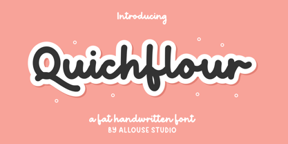 Proudly Presenting, Quichflour a Fat Handwritten Font. Quichflour is perfect for any titles, logo product packaging, branding project, megazine, social media, wedding, or just used to express words above the background. Quichflour also come with Multi-Lingual Support. Enjoy the font, feel free to comment or feedback, send me PM or email. Thank You!
 - BD Motra by Typedifferent,
$20.00 BD Motra is fat wide uppercase font with some variants on the small character keys. The inspiration source for this typeface is the stencil lettering on Honda’s rare Motra CT50 off-road scooter made in Japan 1982. The font usage ranges from big lettering on vehicles, cargo boxes, products, buildings with an industrial approach.
 - Soutkind by Sitintahitam,
$19.00 SOUTKIND is a display typeface with heavy bold style, inspired by pop culture in 80s century. Soutkind have a unique and fat forms. This font suitable for your design suh as packaging, poster, apparel, etc. SOUTKINDalso includes a set of some pop illustration. Extras allows you to develop awesome design with this font. Cheers! 🍻
 - Rosalinde by Scriptorium,
$18.00Rosalinde is an original font based on rough hand-lettering reminiscent of 1960s era protest poster lettering. It's the kind of lettering you'd expect to see used for a snippet of anti-war poetry set against a red-white-and-blue striped background, or perhaps accompanied by a fat dove with an olive-branch. - Wildwick by Allouse Studio,
$16.00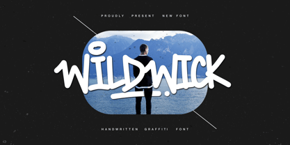 Proudly Present, Wildwick Fat Handwritten Graffitti Font. Wildwick is perfect for any titles, logo, product packaging, branding project, megazine, social media, wedding, or just used to express words above the background. Wildwick also come with Multi-Lingual Support. Enjoy the font, feel free to comment or feedback, send me PM or email. Thank You!
 - Deco Triline JNL by Jeff Levine,
$29.00 From the title on the sheet music for the 1935 composition "Along Tobacco Road" comes Deco Triline JNL in both regular and oblique versions. Reminiscent of Broadway if done as a neon sign, this typeface virtually shouts about the Manhattan nightlife of the 1930s. For maximum readability, space the letters a bit wider than normal.
 - Autumn Voyage by Hanoded,
$15.00 Autumn is my favourite time of the year: I love the colors in the forest, the colder temperature and the stormy winds. Autumn Voyage is a very nice set of hand made fonts: a fat one, a thin one and a lovely autumn leaves doodle pack. Comes with a heap of diacritics as well.
 - Pedrita by PintassilgoPrints,
$24.00 Sometimes you want to go unnoticed, sometimes you don't. This font is definitely for the second option. Pedrita is a generous type, a bit bold, somewhat showy, quite authentic. When you need that extra-something, go with caps and turn on the stylish interlocking pairs: added eye-catchingness guaranteed. And let the good times roll!
 - East To West JNL by Jeff Levine,
$29.00 Sheet music for a song featured in "East to West", a film starring Mexican bombshell Dolores Del Rio, had the movie's name lettered in a bold sans style with early Art Deco influences. East to West JNL preserves not only the name, but all of the characteristics of this wonderful bit of typographic nostalgia.
 - Chub by Chank,
$39.95Chub was inspired by and dedicated to: Jimmy Dean Pork Sausage, J Otto, Ben & Jerry, Spunk, Chuck Jones, Run DMC, those teenage kids with their big baggy pants, French Market coffee, George Clinton, Bill Clinton, Chistina Ricci, Sesame Street and the letter C. God bless all those big, fat, fun things that make life grand. - Party Trick by PizzaDude.dk,
$15.00 Party Trick is loosely based on the capital letters of a classic typewriter, but I have added a bit sugar and spice to the letters - making them more funky and loose. Another great thing is the contextual alternates, which gives you 6 different versions of each letter - and they automatically changes as you type!
 - Sailor Marie by Otto Maurer,
$23.00 Sailor Marie is dedicated to my little lovely Daughter Marie. Sailor-Marie is an Oldschool Tattoo-Style Font, made for all Tattooartists of the world. The Tattoos of the 50th like Sailor Jerry are always designed with Fonts like this. The Font comes with many Opentype Feature and an GraphicFontfile wit Banner and more.
 - LT Shortcake Medium - 100% free

- LT Bread Medium - 100% free

- LT Leap Medium - 100% free

- Selfie Neue Sharp by Lián Types,
$29.00 INTRODUCTION When I started the first Selfie back in 2014 I was aware that I was designing something innovative at some point, because at that time there were not too many, (if any) fonts which rescued so many calligraphy features being at the same time a monolinear sans. I took inspiration from the galerías’ neon signs of my home city, Buenos Aires, and incorporated the logic and ductus of the spencerian style. The result was a very versatile font with many ligatures, swashes and a friendly look. But… I wasn’t cognizant of how successful the font would become! Selfie is maybe the font of my library that I see the most when I finally go out, (type-designers tend to be their entire lives glued to a screen), when I travel, and also the font that I mostly get emails about, asking for little tweaks, new capitals, new swashes. Selfie was used by several renowned clients, became part of many ‘top fonts of the year’ lists and was published in many magazines and books about type-design. These recognitions were, at the same time, cuddles for me and my Selfie and functioned as a driving force in 2020 to start this project which I called Selfie Neue. THE FONT "Selfie for everything" Selfie Neue, because it’s totally new: All its glyphs were re-drawn, all the proportions changed for better, and the old and somehow naive forms of the first Selfie were redesigned. Selfie Neue is now a family of many members (you can choose between a Rounded or a Sharp look), from Thin to Black, and from Short to Tall (because I noticed the feel of the font changed notoriously when altering its proportions). It also includes swashy Caps, which will serve as a perfect match for the lowercase and some incredibly cute icons/dingbats (designed by the talented Melissa Cronenbold, see also Selfie Neue Rounded for more!) which, as you see in the posters, make the font even more attractive and easy to use. You'll find tons of alternates per glyph. It's impossible to get tired with Selfie! Like it happened with the old Selfie, Selfie Neue Sharp was thought for a really wide range of uses. Magazines, Book-covers, digital media, restaurants, logos, clothing, etc. Hey! The font is also a VF (Variable Font)! So you can have fun with its two axes: x-height and weight, in applications that support them. Let me take a New Sharp Selfie! TECHNICAL If you plan to print Selfie Neue VF (Rounded or Sharp), please remember to convert it to outlines first. The majority of the posters above have the "contextual" alternates activated, and this makes the capitals a little smaller. I'd recommend deactivating it if you plan to use Selfie for just one word. Use the font always with the "fi" feature activated so everything ligatures properly. The slant of the font is 24,7 degrees, so if you plan to have its stems vertical, you may use Selfie with that rotation in mind. THANKS FOR READING
 - Affair by Sudtipos,
$99.00 Type designers are crazy people. Not crazy in the sense that they think we are Napoleon, but in the sense that the sky can be falling, wars tearing the world apart, disasters splitting the very ground we walk on, plagues circling continents to pick victims randomly, yet we will still perform our ever optimistic task of making some little spot of the world more appealing to the human eye. We ought to be proud of ourselves, I believe. Optimism is hard to come by these days. Regardless of our own personal reasons for doing what we do, the very thing we do is in itself an act of optimism and belief in the inherent beauty that exists within humanity. As recently as ten years ago, I wouldn't have been able to choose the amazing obscure profession I now have, wouldn't have been able to be humbled by the history that falls into my hands and slides in front of my eyes every day, wouldn't have been able to live and work across previously impenetrable cultural lines as I do now, and wouldn't have been able to raise my glass of Malbeck wine to toast every type designer who was before me, is with me, and will be after me. As recently as ten years ago, I wouldn't have been able to mean these words as I wrote them: It’s a small world. Yes, it is a small world, and a wonderfully complex one too. With so much information drowning our senses by the minute, it has become difficult to find clear meaning in almost anything. Something throughout the day is bound to make us feel even smaller in this small world. Most of us find comfort in a routine. Some of us find extended families. But in the end we are all Eleanor Rigbys, lonely on the inside and waiting for a miracle to come. If a miracle can make the world small, another one can perhaps give us meaning. And sometimes a miracle happens for a split second, then gets buried until a crazy type designer finds it. I was on my honeymoon in New York City when I first stumbled upon the letters that eventually started this Affair. A simple, content tourist walking down the streets formerly unknown to me except through pop music and film references. Browsing the shops of the city that made Bob Dylan, Lou Reed, and a thousand other artists. Trying to chase away the tourist mentality, wondering what it would be like to actually live in the city of a billion tiny lights. Tourists don't go to libraries in foreign cities. So I walked into one. Two hours later I wasn't in New York anymore. I wasn't anywhere substantial. I was the crazy type designer at the apex of insanity. La La Land, alphabet heaven, curves and twirls and loops and swashes, ribbons and bows and naked letters. I'm probably not the very first person on this planet to be seduced into starting an Affair while on his honeymoon, but it is something to tease my better half about once in a while. To this day I can't decide if I actually found the worn book, or if the book itself called for me. Its spine was nothing special, sitting on a shelf, tightly flanked by similar spines on either side. Yet it was the only one I picked off that shelf. And I looked at only one page in it before walking to the photocopier and cheating it with an Argentine coin, since I didn't have the American quarter it wanted. That was the beginning. I am now writing this after the Affair is over. And it was an Affair to remember, to pull a phrase. Right now, long after I have drawn and digitized and tested this alphabet, and long after I saw what some of this generation’s type designers saw in it, I have the luxury to speculate on what Affair really is, what made me begin and finish it, what cultural expressions it has, and so on. But in all honesty it wasn't like that. Much like in my Ministry Script experience, I was a driven man, a lover walking the ledge, an infatuated student following the instructions of his teacher while seeing her as a perfect angel. I am not exaggerating when I say that the letters themselves told me how to extend them. I was exploited by an alphabet, and it felt great. Unlike my experience with Ministry Script, where the objective was to push the technology to its limits, this Affair felt like the most natural and casual sequence of processions in the world – my hand following the grid, the grid following what my hand had already done – a circle of creation contained in one square computer cell, then doing it all over again. By contrast, it was the lousiest feeling in the world when I finally reached the conclusion that the Affair was done. What would I do now? Would any commitment I make from now on constitute a betrayal of these past precious months? I'm largely over all that now, of course. I like to think I'm a better man now because of the experience. Affair is an enormous, intricately calligraphic OpenType font based on a 9x9 photocopy of a page from a 1950s lettering book. In any calligraphic font, the global parameters for developing the characters are usually quite volatile and hard to pin down, but in this case it was particularly difficult because the photocopy was too gray and the letters were of different sizes, very intertwined and scan-impossible. So finishing the first few characters in order to establish the global rhythm was quite a long process, after which the work became a unique soothing, numbing routine by which I will always remember this Affair. The result of all the work, at least to the eyes of this crazy designer, is 1950s American lettering with a very Argentine wrapper. My Affair is infused with the spirit of filete, dulce de leche, yerba mate, and Carlos Gardel. Upon finishing the font I was fortunate enough that a few of my colleagues, great type designers and probably much saner than I am, agreed to show me how they envision my Affair in action. The beauty they showed me makes me feel small and yearn for the world to be even smaller now – at least small enough so that my international colleagues and I can meet and exchange stories over a good parrilla. These people, whose kindness is very deserving of my gratitude, and whose beautiful art is very deserving of your appreciation, are in no particular order: Corey Holms, Mariano Lopez Hiriart, Xavier Dupré, Alejandro Ros, Rebecca Alaccari, Laura Meseguer, Neil Summerour, Eduardo Manso, and the Doma group. You can see how they envisioned using Affair in the section of this booklet entitled A Foreign Affair. The rest of this booklet contains all the obligatory technical details that should come with a font this massive. I hope this Affair can bring you as much peace and satisfaction as it brought me, and I hope it can help your imagination soar like mine did when I was doing my duty for beauty.
 - Coming Together by Font Aid,
$20.00 Coming Together contains over 400 glyphs and is supplied as a single, cross-platform OpenType font. All glyphs are accessible using OpenType-savvy applications, Unicode-savvy utilities, the Character Map utility on Windows, and FontBook on Mac OS X. Nearly 400 designers contributed to “Coming Together”: Adam Humphries, Aditi Dilip, Adrien Midzic, Afraa Gutub, Al Insan Lashley, Alan Lima Coutinho, Alaric Garnier, Alejandro Cabrera Avila, Alejandro Lo Celso, Alejandro Paul, Alessandro Segalini, Alex Cameron, Alex Coblentz, Alexander Trubin, Alexandre Freitas, Alexey Murashko, Alicia Jabin, Aline Horta, Allison Dominguez, Amanda Postle, Amy Brown, Amy Papaelias, Anderson Maschio, Andrea Emery, Andres Perez, Andrew Boardman, Andrew Jesernig, Andrey Furlan, Andrij Shevchenko, Ann Tripepi, Antonio Gutierrez, Antony Kitson, Anushree Kapoor, Anya Cam, AP303 Estudio Design, Becky Krohe, Beejay, Ben Mitchell, Benjamin K. Shown, Benjamin Varin, Brad McNally, Brad Nelson, Bradley Trinnaman, Brady Baltezore, Brandon Horne, Breck Campbell, Brian J. Bonislawsky, Brian Jaramillo, Brian Jongseong Park, Brian Mueller, Brock French, Bruce Rodgers, Bruno Pugens, Bryan Angelo Lim, Buro Reng, Caitlin Martin-Frost, Calou, Carlos Fabián Camargo Guerrero, Carlos Vidal, Cayo Navarro, Cesar Puertas, Chank Diesel, Charles Williams, Chris Lozos, Chris Trude, Christophe Badani, Christy Lai, Claes Källarsson, Claire Coullon, Claudio Piccinini, Colby Cook, Craig Eliason, Cristina Pegnataro, Curve Doctor, Dan DiSorbo, Dan Liggins, Dan Rubin, Daniel Justi, Daniele Capo, Dav(id Hubner), Dave Bailey, Dave Cohen, David Jonathan Ross, David Sudweeks, David Thometz, Dawn Mercurio, Delve Withrington, Diana van de Blaak, Didier Mazellier, Diederik Corvers, Dino Santos, Dmytro Pobiedash, Donald Beekman, Dries Wiewauters, Duncan Bancroft, Ed Hoskin, Eddy Ymeri, Edineide Oliveira, Eduardo Manso, Eduardo Rodríguez Tunni, Eero Antturi, Eli Castellanos, Elias Bitencourt, Elias Stenalt Werner, Elman Padilla, Emery Miller, Emily Leong, Emily Maher, Enrico Limcaco, Eric Frisino, Eric Stine, Erik Brandt, Espen, Evan Moss, Evangeline Rupert, Fabiane Lima, Fabio Foncati, Fabrizio Schiavi, Farbod Kokabi, Felipe Lekich, Francisco Martin, Frank Riccio, Frans van Bellen, Gary Holmes, Gautam Rao, Gayle Hendricks, Gene Buban, Georg Herold-Wildfellner, George Aytoun, Gerd Wiescher, Giles Edwards, Gist Studio, Glen Barry, Glenn Parsons, Goro Mihok, Grace Engels, Grant Alexander, Grant Hutchinson, Greg Smith, Gunnar Swanson, Gustavo Machado, Hans Nieuwstraten, Harold Lohner, Hilary Salmon, Hillary Fayle, Hrant H Papazian, Hugo Gallipoli, Ian Drolet, Ian Lynam, Ilona Kincses, Isac Corrêa Rodrigues, Ivette Chacon, Ivo Federspiel, Jacques Le Bailly, Jae-hyoung Choi, Jaime Vasquez, James Edmondson, James Grieshaber, James L. Stirling, James Lukens-Gable, James Martin, James Ockelford, James Puckett, Jarbas Gomes, Jarett Knuth, Jason Adam, Jason Robinson, Javier Suzuki, Jay Chu, Jayson Zaleski, Jean Francois Porchez, Jeff Fisher, Jeff Jarvis, Jeffrey Vanlerberghe, Jelmar Geertsma, Jennifer Clarke, Jennifer Rutherford, Jens Kutilek, Jerry Allen Rose, Jess Latham, Jesse Ragan, Jessica Page, Jesvin Yeo Puay Hwa, Jim Ford, Jim Lyles, Jim Rimmer, Jin Ping, Jo De Baerdemaeker, Joachim Muller-Lance, Joanna Abbott Moss, Joe Francis, Joe VanDerBos, Joel Vilas Boas (J85), John Downer, John Flanagan, John Foley, John Langdon, John Lopez, John Lyttle, John Skelton, Johnny Dib, Jonathan Hughes, Jonathan Pierini, Jos Buivenga, Jose Luis Coyotl Mixcoatl, Juan Acosta, Judd Crush, Judith Lee, Julie Johnson, Julie Oakley, Julie Thomas, Juliet Shen, Jumin Lee, Jurgen Weltin, Justin Callahan, Justin Chodzko, Karel Piska, Karen MacKay, Karin Eberhardt, Karin van Soest, Karla Perez, Katie Parry, Katie Snape, Katri Haycock, Katy Brooks, Kelley Garrard, Kelly Redling, Kent Lew, Kevin D’Souza, Kevin J. Boynton, Kevin McDermott, Kim Arispe, Kokin, Kristen Caston, Kristen Hartman, Kristian Möller, Kristians Šics, Kyle Jones, L Bollinger, Lan Huang, Larry Van Dyke, Laura Ricker, Laura Worthington, Laurel Wilson, LeAndrea James, Lijklema Design, Linda McNeil, Lise Barreto, Louie Crumbley, Louis Duchesne, Luke Dorny, Luke Stouffer, Madison Cramer, Måns Björkman, Marc Salinas Claret, Marcus Leis Allion, Marcus Parker, Marcus Sterz, Marie-Anne Verougstraete, Mark Simonson, Martin Majoor, Matheus Barbosa, Mathias Forslund, Matt Desmond, Matt McInerney, Matt Millette, Matthew Jerauld, Max Kisman, Michael Browers, Michael Bundscherer, Michael Cina, Michael Doret, Michael G. Adkins, Michael Hernan, Michael Paul Young, Michael Wallner, Miguel Catopodis, Mikael Engblom, Mike Jarboe, Mike Petschek, Miriam Martincic, Moira Sheehan, Monica Pedrique, Nacho Gallego, Naomi Atkinson, Natanael Gama, Nathanael Ng, Neil Fox, Neil Patel, Neil Summerour, Neil Woodyatt, Ngoc Ngo, Nguyen Pham, Nicholas Curtis, Nicole Hudson, Nicole Sowinski, Nicolien van der Keur, Nina Stössinger, Noah Scalin, Ojasvi Mohanty, Oleg Macujev, Olivia Choi, Ong Fang Zheng, Pata Macedo, Patrick Gallagher, Patrycja Zywert, Paul Hunt, Paul Langman, Pedro Moura, Pedro Paz, Per Ohlsson, PJ Onori, Premm Design Ltd, Rae Kaiser, Rafael Carozzi, Rafael Cordeiro, Rafael Neder, Randy Jones, Ray Larabie, Raymond Forbes, Ressa McCray, Ricardo Esteves, Ricardo Martins, Riccardo Sartori, Richard Kegler, Richard Miller, Rob Keller, Roballo, Rose Coplon, Roy Rub, Rudo van der Velden, Russell McGorman, Ryan Rushing, Ryan Thorpe, Sander Neijnens, Sara Cross, Scott Boms, Scott Fisk, Sergio Jimenez, Shi-Min Chin, Sílvio Gabriel Spannenberg, Soohyen Park, Sorin Bechira, Stanley Friesesk, Stefan Hattenbach, Stefan Kjartansson, Stephen Lay, Steve Harrison, Steve Marsh, Steve Matteson, Steve Mehallo, Steve Zelle, Steven Bonner, Steven Wulf, Stuart Brown, Stuart Ford, Stuart Sandler, Sue Zafarana, Sulekha Rajkumar, Susan Surface, Tanya T Stroh, Taylor Loman, Ted Ullrich, Teja Ideja, Tena Letica, Terrance Weinzierl, Theo França, Thiago Martins, Tiffany Wardle, Tim Whalen, Titus Nemeth, Tom Plate, Tom Rickner, Tomato Košir, Tomi Haaparanta, Travis Kochel, Troy Leinster, Tyler Heron, Type Mafia, Vanessa Robertson, Veronika Burian, Victor Esteves, Victor Zuniga, Viktor Nübel, Viviana G, Wellinton Reis, Wilson Thomas, Wolfgang Homola, Xavier Dupre, Xerxes Irani, Zvika Rosenberg These designers represented the following countries: Argentina, Australia, Austria, Belgium, Brazil, Canada, Columbia, Croatia, Czech Republic, El Salvador, England, Finland, France, Germany, India, Ireland, Italy, Japan, Latvia, Lebanon, Mexico, New Zealand, Peru, Poland, Portugal, Scotland, Siberia, Singapore, Slovenia, Spain, Sweden, Switzerland, The Netherlands, Ukraine, United States, Venezuela, Vietnam
 - Civane by insigne,
$- High atop the mountain of fonts, a new structure has been raised--one solid and strong against the challenges of time. Civane is a victorious conqueror among fonts, standing above the clutter and the mundane. Its firm structure joins effortlessly with graceful calligraphy in a new flowing, inscriptional typeface. Civane is inspired by monuments of great civilizations, whose lofty inscriptions remain chiseled into the very stones and columns of their structures. The font’s medium contrast with its flared stroke ends lead the reader to feel the solemn presence found in these great obelisks and shrines. Even Civane’s thinnest weight holds a quiet power over its audience. Still, its classic lines provide a beautiful flow between the strong letters, allowing the reader’s eye to move easily across the page. Civane supports OpenType features and comes with upright italics, alternates, ligatures, old-fashioned figures, titling and small caps. Preview all these features in the interactive PDF manual. The font family has 48 fonts, with three widths and eight weights. The font family also includes glyphs for 72 languages; over 550 glyphs per font stand ready for you to command throughout your design. Civane is built for advertising and display typesetting as well as title and small text, making it an excellent choice for websites as well as flyers and packaging. Use it for defining your brand or for creating designs that evoke academia, militaria, monuments, automobiles, signs, and so on. Its 48 well-designed fonts are well-equipped to help you leave your mark on history. Production assistance from Lucas Azevedo and ikern.
 - Advertisers Gothic by HiH,
$12.00 Advertisers Gothic is bold and brash, like the city it comes from, Chicago. It was designed by the accomplished German-American matrix engraver, Robert Wiebking, for the Western Type Foundry in 1917. As its name suggests, it was designed for commercial headliner work, much as Publicity Gothic by Sidney Gaunt for BB&S the year before. See our Publicity Headline. Alternate letters ‘A’ & ‘S’ are provided. The most popular ad words “Free!”, “New!” and “Sale” (with both esses) are provided at an angle for dramatic tension. Advertisers Gothic became quite popular because it was effective. It can work equally well for a flyer advertising a non-profit event as for a magazine product ad. This font refuses to be a wimp. Use it boldly. Advertisers Gothic ML represents a major extension of the original release, with the following changes: 1. A total of 335 glyphs (compare) with added glyphs for the 1250 Central Europe, the 1252 Turkish and the 1257 Baltic Code Pages. 2. Added OpenType GSUB layout features: pnum, ornm, liga, hist & salt ˜ with total 13 lookups. 3. Added 209 kerning pairs. 4. Revised vertical metrics for improved cross-platform line spacing. 5. The most popular ad words “Free!”, “New!” and “Sale” (with both esses) are provided at an angle for dramatic tension The zip package includes two versions of the font at no extra charge. There is an OTF version which is in Open PS (Post Script Type 1) format and a TTF version which is in Open TT (True Type)format. Use whichever works best for your applications.
 - Aillek by Twinletter,
$18.00 Introducing Aillek, a retro-condensed font with multilingual support and a distinctive look that will enhance any project. Aillek lends a touch of retro charm to any design with its lofty letterforms and alternate characters. Your design becomes more dynamic and interesting thanks to its ligatures options. Aillek is ideal for producing vintage flyers, logos in retro style, nostalgic social media graphics, and more. It is perfect for branding initiatives, packaging design, book covers, and more due to its condensed letterforms. It is adaptable for any project that needs to reach a large audience thanks to its multilingual support. Aillek is a must-have for any designer, marketer, or anyone looking to add a dash of nostalgia to their work because of its distinctive design and features. It’s ideal for those who want to add a touch of nostalgia to their designs as well as for those who want to create designs that evoke nostalgia and vintage aesthetics. Make Aillek your go-to font for all your retro-condensed design needs by taking advantage of this opportunity. Don’t wait, get this special font right away, and start making designs that will be remembered. What’s Included : - File font - All glyphs Iso Latin 1 - Alternate, Ligature - Simple installations - We highly recommend using a program that supports OpenType features and Glyphs panels like many Adobe apps and Corel Draw so that you can see and access all Glyph variations. - PUA Encoded Characters – Fully accessible without additional design software. - Fonts include Multilingual support
 - DT Skiart Subtle by Dragon Tongue Foundry,
$9.00 ‘Skiart Serif Subtle’ is now available online. Originally inspired by the san serif font ‘Skia’ by Mathew Carter for Apple. ‘Skiart’ was designed to feel more like a serifed font, but without any serifs. It took a step between sans serif and serif fonts. Next on the path towards a serif font came Skiart Serif Mini, with tiny serifs added. This was a true serif font, all be it on the small side. Skiart Serif Subtle is less of a serif than Skiart Serif Mini, in that it doesn’t have actual 'serifs' as such. It has a subtle flare where a serif might normally be found. It remains fully readable and feels as clean and normal as any of the best body copy serifs, and yet still has the strong solid bones of all the other Skiart font families. If compared to one of the more commonly used serifs like ‘Times New Roman’, the ‘Skiart Serif Subtle’ lowercase is more open with a taller x-height, increasing its readability and friendliness. The serifs are smaller and less distracting. They are not pretending to be ligatures. Where ‘Times’ makes its p q b d forms out of a barely touching oval and stem, the ‘Serif Subtle’ forms are much more firmly attached, appearing clearly as single letters. The standard setting for the a’s and g’s are round single story, feeling warmer and more inviting in the ‘Serif Mini’ font. Much more friendly than the stuffy double-storied versions in fonts such as ‘Times’ etc.
 - DIN Next by Monotype,
$56.99 DIN has always been the typeface you root for—the one you wanted to use but just couldn’t bring yourself to because it was limited in its range of weights and widths, rendering it less useful than it could be. The century-old design has proven to be timeless, but modern use cases demanded an update, which resulted in DIN Next—a versatile sans serif family that will never go out of style. This classic design turned modern must-have includes seven weights that range from light to black, each of which has a complementary italic and condensed counterpart. The family also included four rounded designs, stretching the original concept’s range and core usability. DIN Next also boasts a suite of small capitals, old style figures, subscript, superscript and several alternate characters. A quintessential 20th-century design, its predecessor DIN was based on geometric shapes and was intended for use on traffic signs and technical documentation. Akira Kobayashi’s update made slight changes to the design, rounding the formerly squared-off corner angles to humanize the family. Rooted in over 100-years of history, it’s safe to say that there will always be a demand for the DIN design, and thanks to DIN Next, now it’s as usable as it is desired. Wondering what will pair with it perfectly? Check out Agmena™, Bembo® Book, Cardamon™, Joanna® Nova, FF Quadraat® and Quitador™. Featured in: Best Fonts for Logos, Best Fonts for Websites, Best Fonts for Tattoos
 - Alfie by Monotype,
$29.99 Alfie™ is lively, friendly, inviting and easy on the eyes. What more could you want in a script? How about four flavors of the same design? Alfie Script is a delightful connecting script with a touch of comfortable elegance. Use it for everything from social announcements to headlines and packaging. Alfie Casual is a little more laid-back with letters standing on their own. It works great in short blocks of text copy, subheads and navigational links. Alfie Informal has spirited serifs and its own demeanor, while Alfie Small Caps does a fine job of supporting its other siblings. There’s an immediacy to words and messages set in these lighthearted confections. Jim Ford was practicing drawing with a new brush pen when the inspiration for Alfie came to him. He had filled several pages in a notebook with letters and, at one point, realized that there might be a typeface among them. As it turned out, there were four. The process, however, wasn’t choosing one design and modifying it. The makings of all the designs were on the pages. It was just a matter of culling out the right collection of characters to build the foundations for the four flavors of Alfie. Because they share the same family roots, each design in the Alfie family can be paired and intermixed. Ford admits that there’s a hint of Emil Klumpp’s 1950s Murray Hill typeface (https://www.myfonts.com/fonts/bitstream/murray-hill/) in the Alfie family. Just enough to give the design a 50s vibe. (Some fashions never go out of style.)
 - Guzzo by Monotype,
$50.99 A playful caricature of a midcentury grotesque, Guzzo is a fresh addition to the Monotype Library. Somewhat eccentric and full of surprises, its unmistakable quirk can be found on closer inspection, stemming from details proudly borrowed from brush lettering and calligraphy. The wide range of weights and style can take you through any design space, from the condensed weights squeezing in larger headlines or dense blocks of text with the condensed range, to experimenting with small point sizes, labels or packaging with the extended cut. However, Guzzo’s real charm is probably best expressed through its wonderfully playful shapes, its unusual 'laid-back italics' feature cursive forms and a backslant. The different stylistic sets allow you to decide what you make of Guzzo, with several sets of alternate glyphs steering it in any direction you want. Guzzo is a happy-go-lucky character, and has a warm, humble and painterly quality that - at a glance - may be unrecognizable as a typeface. It can almost pass for hand-lettering. Guzzo pairs exceptionally well with scripts and slab typefaces, and feels most at home in situ with toys, packaging, menus, broadcasting, cartoons and merchandising! Guzzo encourages you to turn up the silliness and is for designers who want to emulate hand-painted and casual motifs. Taking its name from American artist Jeremy Pinc, aka the painter Guzzo Pinc, the typeface channels the quirky, funny and poignant qualities of his paintings - with wacky characters, loosely painted geometric forms and bright colors. For this mid century, authentic, nostalgic typeface - the story is really what you make of it.
 - Bonyad by Naghi Naghachian,
$98.00 The Bonyad font family, designed by Naghi Naghashian, was developed considering specific research and analysis on Arabic characters and definition of their structure. Bonyad is a modern Sans Serif font family.The Bonyad innovation is a contribution to modernisation of Arabic typography; gives the Arabic font letters real typographic arrangement and provides for more typographic flexibility. Bonyad supports Arabic, Persian, and Urdu and includes proportional and tabular numerals for the supported languages. The Bonyad Font family is available in six weights; Thin, Light, Regular, Demi Bold, Bold and Heavy. Its intuitive design arrangement fulfills the following needs: It is precisely crafted for use in electronic and print media. Bonyad is not based on any pre-digital typefaces and it is not a revival. Rather, its forms were created with today’s ever-changing technology in mind. Bonyad is suitable for multiple applications, and gives the widest potential for acceptability. It is extremely legible not only in its small sizes, but also when the type is filtered or skewed, e.g., in Photoshop or Illustrator. Bonyad's simplified forms may be artificially oblique with InDesign or Illustrator, without any degradation of its quality for the effected text. Bonyad is an eye-catching and classy typographic image that developed for multiple languages and writing conventions. Bonyad uses the very highest degree of geometric clarity along with the necessary amount of calligraphic references. The Bonyad typeface is of a high vibration that is finely balance between calligraphic tradition and the contemporary sans serif aesthetic commonly seen in Latin typography.
 - Daily Routines by Fikryal,
$23.00 The “Daily Routines” Handwritten Display Font is a delightful and charismatic typeface that effortlessly captures the essence of casual elegance. With its carefully crafted strokes and artful imperfections, this font exudes a sense of handmade authenticity that is both inviting and versatile. Designed with meticulous attention to detail, “Daily Routines” showcases a harmonious blend of playful curves and well-balanced letterforms, making it a perfect choice for projects that seek to strike a harmonious balance between approachability and sophistication. Its smooth and flowing lines lend a sense of fluidity and ease, evoking a feeling of effortlessness and natural rhythm. The irregularities in each letter lend a unique charm, reminiscent of handwritten notes penned with care. The “Daily Routines” Handwritten Display Font is specifically tailored for projects that demand a warm and friendly touch, such as invitations, greeting cards, product packaging, and branding materials. It easily conveys a sense of personal connection, making it ideal for conveying heartfelt messages or highlighting the human element in design. Whether utilized for digital or print media, this font ensures legibility and readability, even in smaller sizes. Its captivating appearance adds a touch of personality to any text, making it stand out while retaining a sense of tasteful subtlety. Embrace the captivating allure of the “Daily Routines” Handwritten Display Font to infuse your designs with a genuine and endearing character, elevating them to new levels of aesthetic appeal and resonating with your audience on a profound level. If you have any questions please don’t hesitate to contact me follow my Instagram: fkryall Thank you
 - Millenium Pro by TypoStudio Pro,
$29.00 In designing the Millenium® typeface, Patrice Provost was inspired by great typographers in the great French typographic tradition to create a unique and modern variable font. His goal was to reinterpret the mid-20th century sans serif style in a variable typeface that will conform to the need of the 21st century. He succeeded with mastery in drawing large characters. In doing so, patrice provost added an exceptional dimension to the design of this typeface, a graphic personality that evolves over the styles. The attention to detail brought to each letter, each accent, each diacritic, make this font a solid tool for all Western graphic designers and layout artists. With more than 1000 glyphs per style, Millenium® can be used in more than 210 countries. With its 13 styles drawn in Classical Roman style, in Italics and in condensed Millenium® provides designers from all walks of life with a fantastic tool to bring novelty and class to your creations. Ideal for signage, Millenium, thanks to its "wide case", is also widely used for posters. It is also a gold mine for creating logos for dynamic tech start-ups. The Millenium family is made up of designs with progressive weight changes. it is very extensive. It ranges from "Super Thin" to "Extra Black". Unique in the world, its thinness makes it possible to design a very light style even to print on posters and other large formats. Designed from the outset as a variable typeface, Millenium offers a range of 900 possible variations and an infinity of creations...
 - Peach Crush by Fenotype,
$25.00 Peach Crush is a bold vintage style serif font with a soft charm and smooth features. Peach Crush delivers a reminiscence of a familiar and warm nostalgic feeling. Peach Crush is equipped with Contextual, Swash, Stylistic and Titling alternates as well as Discretionary Ligatures and even more extra alternates. All these features can be accessed by OpenType controls or straight from Character or Glyphs window. Contextual Alternates and Standard Ligatures are automatically on and they simply do small changes to prevent certain character collisions. Other features are optional and can be used for bolder design solutions. Peach Crush has a total number of 115 alternate characters, even Swash Alternates for certain Standard and Discretionary Ligatures such as ch, ck, sh, sk, ff, fl and fi. Peach Crush is a great typeface for contemporary graphic design with that certain feeling of familiarity. It works well on logos, packaging, restaurant graphics, or any display use, as well as in headlines or shorter texts. Try Peach Crush with reduced tracking for tighter word images, or if you want to use it in really small sizes add some tracking. Peach Crush is based on another Fenotype font, Tomato Ketchup but has more contrast and sharper serifs.
 - GOBAH by Product Type,
$15.00 Welcome to Gobah, a font that presents the future atmosphere in an amazingly modern and futuristic style. Are you looking for the perfect solution for modern, futuristic, sci-fi, and future-themed projects? Gobah is the right choice. Gobah is a font that transports you to an extraordinary world with a unique look that reflects a sophisticated future feel. Each letter is uniquely designed, giving your project a modern, innovative, and charming look. With Gobah, you can steal the show and create an unforgettable impression. The main benefit of Gobah is its ability to deliver stunning styles. Each letter has an exclusive design, creating an eye-catching futuristic look. This font will give your projects a strong visual appeal, reinforcing the message you want to convey. Gobah also supports multilingualism, allowing you to display text in multiple languages without a hitch. This flexibility ensures that you can easily reach a global audience and convey your message with consistent clarity across cultural contexts. Take a step forward in your design with Gobah. This font will give a stunning modern and futuristic twist, creating a memorable impression on your logos, posters, and web presence. Let Gobah be the right choice for your vibrant, modern, futuristic, sci-fi, and future projects.
 - Senja Mentari by Ahmad Jamaludin,
$15.00 Senja Mentari is elegant modern calligraphy font inspired by delicate inky hand lettering, gorgeous wedding calligraphy and trending minimal branding designs. This beautiful font is for those who are needing of elegance and stylish for their designs and particularly well suited for wedding invitations, cards and feminine branding. I have wanted to create such combination a long time and can’t believe that it is here. I’m super excited and hope you’ll estimate it too. Now all you need for perfect wedding invitation design is in one product. I think this decision will help you to save your time! What's included? More than 100 beautiful swashes in this font Accessible in the Adobe Illustrator, Adobe Photoshop, Adobe InDesign, even work on Microsoft Word. PUA Encoded Characters - Fully accessible without additional design software. Multilingual Support : à á â ã ä å æ ç è é ê ë ì í î ï ñ ò ó ô õ ö ø ù ú û ü ý ÿ š fl fi ž œ ı ç ø š ž æ œ À Á Â Ã Ä Å Æ È É Ê Ë Ì Í Î Ï Ñ Ò Ó Ô Õ Ö Ø Œ Ù Ú Û Ü Ý Ÿ Š Š ŽŁ Ð Ç
 - Pantera by Lián Types,
$39.00 ROARRR! THE STYLES -Pantera Pro is the most complete style, and although its default look is mono-rhythmic it gets really playful and crazy like the examples of the posters by just activating the Decorative Ligatures button in the Open-type Panel of Adobe Illustrator. However, I recommend using also the Glyphs Panel because there you'll find much more variants per letter. Pantera Pro is in fact, coded in a way the combination of thicknesses will always look fantastic. -Pantera Black Left, and Pantera Black Right are actually “lite” versions of Pantera Pro: They have very little Open-Type code, so what you see here is what you get. Pantera Black Left has its left strokes thick, while Pantera Black Right has its right strokes thick. -Pantera White is a lovely member in this family that looks lighter and airy, hence its name. With the feature Standard Ligatures activated (liga) the font gets very playful. -Pantera Caps is based on sign painters lettering and since it follows the same pointed brush rules as the other styles, it matches perfectly. -Pantera Claws like its name suggests, is a set of icons that were done by our dear panther. THE STORY It is said that typography can never be as expressive as calligraphy, but sometimes it can get close enough. I tend to think that calligraphic trials, in order to work well as potential fonts, need first to go through very strict filters before going digital: While calligraphy is synonym of freedom (once its rules are mastered), type-design, in the other hand, has its battlefield a little tighter and tougher. When I practice pointed brush lettering, there are so many things happening on the paper. And most of them are delicious. The ones who know my work may see that although many of my fonts are very expressive, my handmade brush trials are much more lively than them. With that in mind, this time I tried to go further and rescue more of those things that are lost in the process of thinking type when first sketches are calligraphic. I wondered if I could create something wild, hence its name Panther, by understanding the randomness that sometimes calligraphy conveys and turning it to something systemic: With Pantera, I created an ordered disorder. Like it happens a lot in many kinds of lettering styles, in order to enrich the written word the scribe mixes the thickness of the strokes and the width of the letters. Like one of my favorite mentors say (1), they make thoughtful gestures Some lively strokes go down with a thick, while some do that with a thin. Some letters are very narrow, meaning some of them will need to be very wide to compensate. Why not?. The calligrapher is always thinking on the following letters, and he/she designs in his head the combination of thicks and thins before he/she executes them. He/she knows the playful rhythm the words will have before writing them. It takes time and skill to master this and achieve graceful results. Going back to the font, in Pantera, this combination of varying thicknesses and widths of letters were Open-Type coded so the user will see satisfactory results by just enabling or disabling some buttons on the glyphs panel. I'm very pleased with the result since it’s not very easy to find fonts which play with the words' rhythm like Pantera does, following of course, a strong calligraphic base. I believe that if you were on the prowl for innovative fonts, this is your chance to go wild and get Pantera! NOTES (1) Phrase by Yves Leterme. In fact, it’s the title of a book by him. EPILOGUE Esta fuente está dedicada a mi panterita
 - Indoctrine - Personal use only

- Siena by Monotype,
$29.99The blackness of the Siena Black font makes it a good choice for display and packaging. - Gal MF by Masterfont,
$59.00 Even stroke widths with geometrical symmetric structure will make it into a great signage and logo.
 - KnewFont by Ingrimayne Type,
$9.95 KnewFont simulates neat and meticulous hand printing. Its letters slant left and come in five weights.
 - Barsime by Forberas Club,
$18.00 Barsime is usable for anything. But will be better if you use it for memorable moment.
 - JH Noha by JH Fonts,
$40.00 JH Noha is a geometric modern Arabic typeface. It includes black, bold, medium and regular weights.


