10,000 search results
(0.039 seconds)
- Passport48 by Coniglio Type,
$19.95 Passport48 exclusively in otf. opentype format, originally debuted in 1997 as Passport, close to the beginning of the indie typographer boom. Almost 25 years have passed since it was introduced at MyFonts as PS1 and later in 2003 in TT TrueType.** It was designed by Joseph Coniglio of Coniglio Type as a revival. Historically, Passport was digitized from a shiny black enamel 1948 Royal Silent Deluxe portable. Kept on the ship of merchant marine, Captain John O’Learn, it was a salty manual typewriter with no intrinsic value as a collectable, even though it is awash as a work horse and a fine communicator of it’s time.. **NOTE: Little Passport family leaves the nest: The old weight variations, styles and formats have been eliminated to allow the original face to be stand alone, on its own attributes. For those purchasing their first typewriter fonts and to our diehard collectors as well, Passport presents a friendly new port-of-entry. A simple set, that is freed of many of the normal distressed points and paths that had made most “typewriters” authentic looking, but difficult to print and manipulate in layouts back in the day. It’s smooth nature comes from its impressions struck directly onto a piece of carbon paper bypassing the silk ink ribbon and going directly from metal to carbon paper transferring to a piece paper with very little tooth. Examine the glyphs to be certain you have what you need from this minimalist set, Passport48 is intended for ease of use and affordability. This is a warm font in a cold cruel world and a real port in the storm! It is versatile in today’s layouts with 24 years of worldwide sales. …Please enjoy the fruits of its travels, hoping your destinations and explorations into graphic design and letter composition are happy ones. -Joe Coniglio, the Pacific Northwest (2021).
 - Beachy by Mofr24,
$11.00 Introducing "Beachy," the ultimate summer display font that effortlessly blends elegance with nostalgic 90's and 00's vibes. Uniquely crafted, this multilingual typeface captures the essence of beachy aesthetics, offering both regular and outline variations. Whether you're designing posters, marketing materials, T-shirts, or headlines, "Beachy" infuses your projects with a touch of sophistication. Its versatility shines through, reflecting the sun-soaked days and gentle coastal breezes. What sets "Beachy" apart is its ability to evoke a sense of timeless charm while embracing the retro styles of the past. It pays homage to the bygone era while remaining relevant in modern design trends. Pairing "Beachy" with other related font families or typefaces further enhances its appeal. Consider combining it with complementary styles to create harmonious typographic compositions that exude a cohesive visual experience. Apart from its aesthetic appeal, "Beachy" boasts a wide range of functional aspects. Its character set includes support for multiple languages, allowing you to communicate your message effectively across various cultures and regions. The regular and outline variations offer flexibility, empowering you to experiment and create eye-catching designs that suit your specific needs. The design concept behind "Beachy" was born out of a deep appreciation for the carefree spirit and timeless beauty of coastal living. It aims to encapsulate the feeling of warm sand between your toes, the sound of crashing waves, and the nostalgia associated with 90's and 00's aesthetics. We created "Beachy" because we believe that design should not only be visually captivating but also evoke emotions and memories. By using this font, you can transport your audience to a place where summer never ends, allowing your creativity to flourish in a world of endless possibilities. Let "Beachy" be your gateway to capturing the magic of sun-soaked days and embracing the allure of the coastal lifestyle.
 - Leroy by Andinistas,
$39.95 Leroy is a font family of 5 members designed from geometrizing Roman and Gothic skeletons. Its purpose is to provide optimal reading of titles and paragraphs with strong mechanical flavor. Because of this, its variables are designed to sort information in media such as labels, signs and industrial atmosphere packaging related with the Soviet Union’s fonts in 1920. This idea matured white horizontal lines superimposed on alphabets drawn with an ancient architectural team known as “Leroy K & E Controlled Lettering System”. Then that evolved into a family concept unifying its proportion to the same X height for its members, resulting in a versatile type system. Therefore, Regular and Bold variables have low contrast between thick and thin strokes. Its upstream and downstream are extremely short, generating a suitable interline that clogs the vertical area. Its overall width equal to its X height, supports its tight spacing that compacts the horizontal area. Therefore, the variant with black caliber has plenty of contrast between thick and thin strokes. The light variable has a “blind” effect radiating light halos, ideal to propose hierarchies and combinations with orthogonal projection. In that sense, Leroy’s modular character reminds constructivist ideology merged with typographical variants suitable for graphic design with geometric look. To achieve this, I studied the softening of forms and counter blocks into a typographical system specially designed for composing useful information to attract attention. In that sense, the dingbats were obtained through a careful process of research and testings done with drawings that provided full and empty visual strategies that with the passage of time helped to forge the major decisions of a metamorphosis from industrial tools, birds and humans from pictogram mixing various genres.
 - Ahoura by Naghi Naghachian,
$58.00 The Ahoura font family, designed by Naghi Naghashian, was developed considering specific research and analysis on Arabic characters and definition of their structure. The Ahoura innovation is a contribution to modernisation of Arabic typography; gives the Arabic font letters real typographic arrangement and provides for more typographic flexibility. This step was necessary after more than two hundred years of relative stagnation in Arabic font design. Ahoura supports Arabic, Persian, and Urdu and includes proportional and tabular numerals for the supported languages. The Ahoura Font family is available in three weights; Light, Regular and Bold. Each has two different styles-- normal and italic. Ahoura is the first real italic Arabic typeface known until now and its intuitive design arrangement fulfils the following needs: - It is precisely crafted for use in electronic media and it fulfils the demands of electronic communication. Ahoura is not based on any pre-digital typefaces and it is not a revival. Rather, its forms were created with today’s ever-changing technology in mind. - Ahoura is suitable for multiple applications, and gives the widest potential for acceptability. - It is extremely legible not only in its small sizes, but also when the type is filtered or skewed, e.g., in Photoshop or Illustrator. Ahoura's simplified forms may be artificially obliqued with In Design or Illustrator, without any degradation of its quality for the effected text. - Ahoura is an eye-catching and classy typographic image that developed for multiple languages and writing conventions. - Ahoura uses the very highest degree of geometric clarity along with the necessary amount of calligraphic references. The Ahoura typeface is of a high vibration that is finely balance between calligraphic tradition and the contemporary sans serif aesthetic commonly seen in Latin typography.
 - Ardena Variable by Julien Fincker,
$185.00 About Ardena: Ardena is a modern sans-serif typeface family. While neutral and clear at first glance, it can be characterized as both pleasant and confident due to its open, rounded forms and vertical terminals. It can be used in both a restrained and expressive way. The thinner and thicker weights are particularly suitable for strong headlines, while the middle weights can be used for typographic challenges and body text. Completed with an extensive character collection, it becomes a real workhorse. A versatile allrounder that is up to all challenges – for Corporate Identity, Editorial, Branding, Orientation and Guidance systems and much more. Variable Font The Variable Font contains 2 axes: weight and oblique – all in just one file. Features: With over 1064 characters, it covers over 200 Latin-based languages. It has an extended set of currency symbols and a whole range of Open Type Features. There are alternative characters as stylistic sets, small caps, automatic fractions – just to name a few. Arrows and numbers: In particular, the extensive range of arrows and numbers should be highlighted, which are perfectly suited for use in orientation and guidance systems. Thanks to Open Type Features and an easy system, the various designs of arrows and numbers can also be simply "written" without first having to select them in a glyph palette. The principle is easily explained: If a number is placed in round or square brackets, it will automatically be displayed in an outlined circle or square. If you add a period to the number, it is displayed in a full circle or square. The same principle also applies to the arrows. The arrows themselves are combinations of greater/less symbols with the various slashes or hyphens. Get the static version of the Ardena family here: https://www.myfonts.com/fonts/julien-fincker/ardena/
 - Adelle by TypeTogether,
$52.00 While Adelle is a slab serif typeface conceived by Veronika Burian and José Scaglione specifically for intensive editorial use, mainly in newspapers, magazines, and online, its personality and flexibility make it a true multipurpose typeface. Adelle’s superior screen rendering and cross-platform consistency has also made it one of our most popular webfonts. The intermediate weights deliver a neutral look when used in text sizes, providing the usual robustness expected in a newspaper font. The unobtrusive appearance, excellent texture, and slightly dark colour allow it to behave flawlessly in continuous text, even in the most unforgiving editorial applications. As it becomes larger in print, Adelle shows its personality through a series of measured particularities which make it easy to remember and identify. Its energetic character, so inherent to slab serif fonts, becomes evident when used for subheadings and headlines. A condensed series of seven weights with matching italics expand Adelle’s possibilities. This extension provides flexible solutions in situations where saving space is vital but losing legibility is not an option. The new condensed series shares the same personality, proportions, and skeleton of the Adelle family, creating an harmonious texture when combined. Be sure to check out the companion to Adelle, Adelle Sans, to complete the look of your design with the intended personality and flexibility. Awards – Third prize for Latin text typeface in the 2009 Granshan Type Design Competition – Won Gold for Original Typeface in the 2010 European Design Awards – Selected in the first Ukrainian typeface competition in 2010 – Exhibited at the Rutenia Calligraphy & Typography Festival (http://rutenia.org.ua/en/index_u.html) in Kyiv, 2010 – Selected in the 2011 Type Directors Club Tokyo Exhibition – Selected in Communication Arts 2011 Typography Annual – Selected in Yearbook of Type I, 2013 – Part of the exhibition «Call for Type» and subsequent book Neue Schriften (New Typefaces)
 - Lotus Heart by Putracetol,
$28.00 Lotus Heart - Classy Ligature Font Lotus Heart is a stunning and luxurious display font that exudes sophistication and elegance. This font is the perfect choice for those looking to add a touch of class to their design projects. The idea behind the creation of Lotus Heart was to capture the essence of luxury and elegance in a typeface. Its classic and timeless style is perfect for high-end product branding, fashion, beauty, logos, book covers, posters, and flyers. Lotus Heart is a versatile typeface that can be used in a variety of design projects. It's a perfect match for any project that requires a touch of luxury and elegance, such as high-end product branding or fashion. This font is perfect for creating logos, book covers, posters, and flyers that will stand out and make a statement. The font comes with various features, including uppercase and lowercase letters, alternates, and ligatures, which can be accessed using OpenType technology. Additionally, this font includes number, punctuation, and symbols, making it suitable for a wide range of design projects. It also supports multiple languages, making it accessible to users from different regions. In the package, you will receive three different formats of the font, including OTF, TTF, and WOFF. This means that you can use Lotus Heart across a range of digital design platforms, including Adobe Photoshop, Illustrator, and InDesign. Lotus Heart is a classy and elegant ligature font that is perfect for adding a touch of sophistication to any design project. Its versatility, along with its classic and timeless style, makes it an excellent choice for product branding, fashion, beauty, and many more design projects. With Lotus Heart, you can create stunning designs that will leave a lasting impression on your audience. Choose Lotus Heart today and elevate your design projects to the next level with its luxurious and sophisticated style.
 - Antique Tuscan No 9 by HiH,
$8.00 Antique Tuscan No.9 was one of the earlier wood-type designs by William Hamilton Page. It was first shown among the specimens produced in 1859, shortly after Page entered into a new partnership with Samuel Mowry, owner of the Mowry Axle Company. The new company was named Page and Company and was located at the Mowry facility in the Greenville section of Norwich, Connecticut. Antique Tuscan No.9 is an extra-condensed version of the tuscan style that had been released in moveable type by Vincent Figgins of London in 1817 and had become so popular for advertising in the intervening years. Because of the extreme compression in the design, we might be tempted to describe it as "Triple-X," but that might be misleading. The analogy would, of course, be to clothing sizes, not movie ratings. Because of the compression, this typeface reads best when set extra-extra-extra large. For printing, we recommend 36 points or larger. For the screen, we suggest at least 72 points. An unusual and distinctive design, it is best used with discretion. If I were doing a term paper for school or submitting an article to a magazine for publication, I might use it for the title page, to grab someone’s attention. I would certainly not use it for the main body of text - not if I expected anyone to read what I wrote. If you wonder why we make this recommendation, take the Ten-Point challenge. Print this paragraph using Antique Tuscan No.9 and set the font size at 10 points. If you are young and blessed with good eyesight, you will probably be able to read it - with effort. So, here is the challenge: hand it to your Grandmother and ask HER to read it.
 - David Hadash Script by Monotype,
$50.99Monotype Imaging is pleased to present David Hadash (New" David), the full family of typefaces by Ismar David, in its intended authentic form. The Estate of Ismar David has sought to revive this jewel of Twentieth-Century design by granting an exclusive license to Monotype Imaging to implement it in industry-standard format. Never before has the typeface in its full set of sub-styles been made available to the design community. David Hadash consists of three style families, Formal, Script, and Sans. Each of these appears in three weigths: regular, medium, and bold. Originally devised as a companion to the upright Formal style, the Script style has a beauty and grace all its own that allows it to be used for full-page settings also. While it is forward-leaning and dynamic, it does not match any of the existing cursive styles of Hebrew script. Ismar David created an eminently readable hybrid style which is like no other by inclining the forms of the upright while blending in some features of Rashi style softened with gentle curves. One can say that the Script style is the first truly italic, not just oblique, typeface for Hebrew script. Although the proportions of the Sans style are very similar to those of the Formal style, its visual impression is stunningly different. If the Formal style is believably written with a broad-point pen, the Sans is chiseled in stone. Rounded angles turn angular and stark. The end result is an informal style that evokes both ancient and contemporary impressions. David Hadash (Modern) supports the writing conventions of Modern Hebrew (including fully vocalized text) in addition to Yiddish and Ladino. David Hadash Biblical is a version of the Formal style that supports all the complexities of Biblical Hebrew, including vocalization and cantillation marks. " - David Hadash Biblical by Monotype,
$50.99Monotype Imaging is pleased to present David Hadash (New" David), the full family of typefaces by Ismar David, in its intended authentic form. The Estate of Ismar David has sought to revive this jewel of Twentieth-Century design by granting an exclusive license to Monotype Imaging to implement it in industry-standard format. Never before has the typeface in its full set of sub-styles been made available to the design community. David Hadash consists of three style families, Formal, Script, and Sans. Each of these appears in three weigths: regular, medium, and bold. Originally devised as a companion to the upright Formal style, the Script style has a beauty and grace all its own that allows it to be used for full-page settings also. While it is forward-leaning and dynamic, it does not match any of the existing cursive styles of Hebrew script. Ismar David created an eminently readable hybrid style which is like no other by inclining the forms of the upright while blending in some features of Rashi style softened with gentle curves. One can say that the Script style is the first truly italic, not just oblique, typeface for Hebrew script. Although the proportions of the Sans style are very similar to those of the Formal style, its visual impression is stunningly different. If the Formal style is believably written with a broad-point pen, the Sans is chiseled in stone. Rounded angles turn angular and stark. The end result is an informal style that evokes both ancient and contemporary impressions. David Hadash (Modern) supports the writing conventions of Modern Hebrew (including fully vocalized text) in addition to Yiddish and Ladino. David Hadash Biblical is a version of the Formal style that supports all the complexities of Biblical Hebrew, including vocalization and cantillation marks. " - David Hadash Formal by Monotype,
$50.99Monotype Imaging is pleased to present David Hadash (New" David), the full family of typefaces by Ismar David, in its intended authentic form. The Estate of Ismar David has sought to revive this jewel of Twentieth-Century design by granting an exclusive license to Monotype Imaging to implement it in industry-standard format. Never before has the typeface in its full set of sub-styles been made available to the design community. David Hadash consists of three style families, Formal, Script, and Sans. Each of these appears in three weigths: regular, medium, and bold. Originally devised as a companion to the upright Formal style, the Script style has a beauty and grace all its own that allows it to be used for full-page settings also. While it is forward-leaning and dynamic, it does not match any of the existing cursive styles of Hebrew script. Ismar David created an eminently readable hybrid style which is like no other by inclining the forms of the upright while blending in some features of Rashi style softened with gentle curves. One can say that the Script style is the first truly italic, not just oblique, typeface for Hebrew script. Although the proportions of the Sans style are very similar to those of the Formal style, its visual impression is stunningly different. If the Formal style is believably written with a broad-point pen, the Sans is chiseled in stone. Rounded angles turn angular and stark. The end result is an informal style that evokes both ancient and contemporary impressions. David Hadash (Modern) supports the writing conventions of Modern Hebrew (including fully vocalized text) in addition to Yiddish and Ladino. David Hadash Biblical is a version of the Formal style that supports all the complexities of Biblical Hebrew, including vocalization and cantillation marks. " - Geodec by Intellecta Design,
$12.95Geodec is a bold sans serif with classical ornament turning it in a Ornate Initial - Bern Bern by Daylight Fonts,
$50.00 This font can be very fashionable, feminine and cute depending on how you use it.
 - Pugnax by Pugnax,
$22.34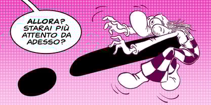 It is a font suitable for comics, with many ligatures to simulate the "handmade" effect.
 - Fowler by Mr. Typeman,
$16.00 Meet my new font Fowler with its pleasant and charismatic style, wich simulates natural handwriting.
 - Butt Writer by Buttfaces,
$18.00ButtWriter is based on a typewriter's type with a rough halftone pattern applied to it. - Secret Handshake by PizzaDude.dk,
$15.00A nice trashy font for those grungy posters...or was it the other way around? - Rafine by Fontmachine,
$9.00 Original, thought-out minimized simplicity. It is designed for those who want a unique font.
 - Alphon MF by Masterfont,
$59.00 This unique ultra wide font family has its outstanding forms to create a great title.
 - TDR by VSF,
$16.00 A heavy futuristic display font that can be strecthed and squiched without losing its identity.
 - Hastrico DT by DTP Types,
$46.00 Sans serif grotesque with a rounded feel that makes it suitable for text or display.
 - Blocky Shape by Cititype,
$12.00 Blocky Shape is a bold script with attractive features. Get inspired by its unique style!
 - Thik by Zang-O-Fonts,
$25.00I've heard it described as "Copperplate Gothic" on LSD. It's broad, funky and dangerously pointy. - LD Red Hatters Hand by Illustration Ink,
$3.00This whimsical font is thicker than normal and slightly toggled. It is playful and fun. - Big Stuff by ArFF,
$24.95Keep Big Stuff away from toner and ink as it can't resist eating them up. - Balonim MF by Masterfont,
$59.00 This is not a balloon - it is a happy curly fonts to make you smile.
 - Allstar by Fly Fonts,
$15.00Allstar is a bold retro font with serious attitude! It works best in display sizes. - Runaway by PizzaDude.dk,
$20.00A heavy graffiti-inspired font! Don't drop it, 'cos it's weight might crush the floor! - Achshelo MF by Masterfont,
$59.00 Rude, rough, wild, energetic - it is all here, waiting for your next headline to emerge.
 - Bald Eagle by Gleb Guralnyk,
$13.00 Hi! Introducing vintage font Bald Eagle. Stamp textured effect surface makes it really authentic look.
 - Vontana by Earlyfair Studio,
$15.00 Vontana is incredibly elegant and authentic and contains smooth curves, making it a standout script!
 - Kotohogi by URW Type Foundry,
$35.99 Kotohogi means "celebration words" in Japanese. It is a typeface of a geometric bright image.
 - Abysmal Gaze by Hanoded,
$15.00 A trashy script with some surprising glyphs. It comes with a full range of accents.
 - Deadspace by Tension Type,
$15.00 Deadspace is a sci fi display typeface suitable video games, movie posters, logos and headlines.
 - Misslena by Din Studio,
$29.00 Have you been looking for a serif font? Do you sometimes have an appetite for a bit more wholesome typography? Do you dream of creating headings that stand out and inspire creativity, imagination, and endless fun? Wait no more, we will give you the best choice. Misslena-A Serif Font One of the most elegant, exquisite yet strong fonts. Misslena is made to bring out a modern and stylish view of what you make. This font contains upper & lowercase characters, all punctuation, and numerals. Also features ligatures and alternates characters to help the text flow naturally and add a custom-made feel. Its lighter weights are well-suited for body text. The available stylistic alternates offer a number of different characters that give your logo or business card a unique look. Misslena includes Multilingual Support to make your branding reach a global audience. Inspire your audience, clients, or guests with this beautiful, statement font. Features: Ligatures Alternates PUA Encoded Numerals and Punctuation Thank you for downloading premium fonts from Din Studio
 - ADs Comics For All by Letters by Amal Desai,
$10.00 AD's Comics For All has everything you need from a professional comic book font but with a light, accessible price tag. The key to digitally lettering comics is mimicking the style and natural imperfections of hand lettering. This font was handmade and programmed (with nifty tricks) keeping exactly that in mind. The functionality of hand lettered comic book fonts definitely doesn't end at comic books. It can give an energetic and natural feel to just about any design. They can be especially handy when a bit of contrast is needed in a type-heavy layout. If you need an exceptional and affordable font to letter your indie comic book/manga/graphic novel, AD's Comics For All is an excellent choice. If you're a seasoned letterer, this versatile font is worth adding to your dialogue arsenal. If you're a designer and have never looked twice at a comic book, you'll find that comic book fonts are a category of their own and a useful tool in your utility belt.
 - Sebastian Pro by Storm Type Foundry,
$32.00Sans-serif typefaces compensate for their basic handicap – an absence of serifs – with a softening modulation typical of roman typefaces. Grotesques often inherit a hypertrophy of the x-height, which is very efficient, but not very beautiful. They are like dogs with fat bodies and short legs. Why do we love old Garamonds? Beside beautifully modeled details, they possess aspect-ratios of parts within characters that timelessly and beauteously parallel the anatomy of the human body. Proportions of thighs, arms or legs have their universal rules, but cannot be measured by pixels and millimeters. These sometimes produce almost unnoticeable inner tensions, perceptible only very slowly, after a period of living with the type. Serifed typefaces are open to many possibilities in this regard; when a character is mounted on its edges with serifs, what is happening in between is more freely up to the designer. In the case of grotesques, everything is visible; the shape of the letter must exist in absolute nakedness and total simplicity, and must somehow also be spirited and original. - Fielding by AVP,
$25.00 Characterized by generous unstressed curves, subtley waisted stems and asymmetric serifs, Fielding is a great choice for sure-footed stylish text and elegant headlines. Its warm classical forms resolve into highly readable text at any size both on paper and on screen. Six weights and corresponding italics provide a choice of styles while small capitals, superscript, subscript, fractions, a range of ligatures and cameo capitals will add refinement to the most demanding of layouts. Default numerals are of uniform height, a little smaller than capitals and are proportional: not 'old style' in the traditional sense, they nevertheless sit comfortably in general text. Tabular numerals and lining numerals are also available. Italic styles are lighter in weight and freer in form, skipping alongside their upright counterparts to provide pleasing emphasis or variation. The comprehensive latin character set includes eastern European, Baltic and Turkish languages. First designed for a quarterly magazine, Fielding can be used wherever a modern interpretation of tradition is required including branding and packaging, websites, news media, books, general publicity and smart documentation.
 - Guilloche A by Wiescher Design,
$80.00 Guilloches were – in the old days – used to make the falsification of banknotes more difficult. The engraving of these intricate lines was done by a highly specialized mechanical machine, which was operated by an equally highly specialized engraving artist. Once the settings for a specific curve were changed back to zero it was very difficult, if not impossible to set them back to the old design. I have designed a useful set of Guilloches that join to form ribbons that create a kind of op-art 3d effect. Under the keys A-U and a-u you find joining pieces. Under the keys V-Z and v-z I placed start- and endpieces. 0-4 are different lenght straight extensions and 5-9 are not quite so straight extensions. All other keys are corner pieces that can be used as stand-alones or put in rows to make for superb decoration. With a little bit of experimentation and maybe colored overlays you can achieve super-phantastic designs. Your elegant type designer Gert Wiescher.
 - ITC Batak by ITC,
$29.99In Northern Sumatra, the crystal clear waters of Lake Toba lap gently against the surrounding mountains. In the middle of the lake sits the island of Samosir, for centuries the secluded home of the Batak people. Visitors arrive by ferry into the tiny town of Tuk Tuk, escaping the heat and humidity of the Sumatran jungle. Throughout the village, restaurants and guest houses are adorned with hand-painted signs in bright colors. Perhaps due to Sumatra's long history of European colonization, the letterforms are reminiscent of those used for posters and handbills in America and Europe at the end of the 19th century, but with a distinctly Southeast Asian flavor. Charles Nix, intrigued by the combination of Victorian fancy and Batak arabesque, photographed, sketched and translated the letterforms into a design that is now ITC Batak. Named for the proud ancestors of Samosir's inhabitants, it is a bold condensed letter with hexagonal serifs - a sort of properly dressed grotesque. Batak is available in either Condensed or Condensed Bold.