10,000 search results
(0.092 seconds)
- Tectura II by Greater Albion Typefounders,
$14.50 Tectura II is Greater Albion's answer to the infamous Comic Sans. It's a family of four 'hand printed' typefaces that provides our very own answer to the infamous 'Comic Sans', and follows on from one of our early release 'Tectura'. Tectura II offers a distinctive blend of hand written character with legibility.
 - Kenlan by Muksal Creatives,
$16.00 Kenlan Modern Bold serif Font typeface with beautiful alternate and Ligature, special glyphs, ornament and multilingual support. It's a very versatile font that works great in large and small sizes. Perfect for editorial projects, Logo design, Clothing Branding, product packaging, magazine headers, or simply as a stylish text overlay to any background image.
 - Circumulus by HakanPolatovic,
$15.00 CIRCUMULUS is a font that designed based on a single circle SOFT AND CURVY Circumulus has soft appearance and curvy lines, which gives it's nice look GEOMETRICALLY RATIONAL Every glyph has a ratio to one another, which makes this font can be used in any kind of rational system like repeating patterns
 - Marky Marker NF by Nick's Fonts,
$10.00Here's a nifty single-stroke marker font based on the work of Mike Stevens, long-time contributor to Signcraft magazine. Clean, crisp and stylish, it's the perfect choice for appealing subheads. This font contains the complete Latin language character set (Unicode 1252) plus support for Central European (Unicode 1250) languages as well. - Bustellina by Krafted,
$10.00 Seeking to redefine your brand's image or add an extra essence to your projects? We've got you covered. Introducing Bustellina - An Elegant Sans Serif Font. Whether it's logos, digital assets, or print media, Bustellina leaves an enduring impression. Amplify your brand's visual identity with the captivating allure of this font. Have fun!
 - Dosty by Dhan Studio,
$18.00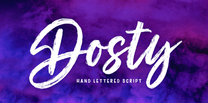 Dosty is a unique textured brush font because this brush font is made digitally. It's a contemporary approach to design, and has underlines and also several ligatures. Suitable for use in title designs such as book tittles, stationery designs, quotes, branding, logos, clothing, invitations, greeting cards, t-shirts, packaging designs, posters and more.
 - Aerobic by Wildan Type,
$10.00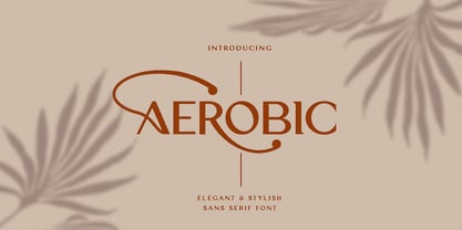 Aerobic is a Modern Elegant font with special alternative glyphs and multilingual support. It's a very versatile font that works great in large and small sizes. Classy Marisa is perfect for branding projects, Logo design, Clothing Branding, product packaging, magazine headers, or simply as a stylish text overlay to any background image
 - KD Dekorat by Kassymkulov Design,
$12.00 KD Dekorat - Artdeco font for display use. Initially submitted for a font design competition, it's now redrawn and polished with extra glyphs incl. Cyrillic script. All letters stay true to the uniformity of the modular design. Create catchy headlines, logos, large billboard messages that will drag client's attention. Pairs nicely with sans families.
 - Oakland by Greater Albion Typefounders,
$9.50 Oakland is a Streamline era design inspired by some hand-drawn lettering on a 1930's French poster advertising a certain brand of Car (Automobile for our American cousins). It's ideal for giving poster and design work that late 1930s to mid 1950s feel. Make a bold statement with this all capitals typeface!
 - Loopkin by Ben Burford Fonts,
$25.00 Loopkin is a new display font from Ben Burford Fonts. It's a stylistic take on the classic modern serif font that has been a staple in high fashion publications for decades. This OpenType font comes with a full set of characters as well as ligatures and alternative characters using the stylistic sets.
 - Camilen by Muksal Creatives,
$14.00 Camilen Modern serif Font typeface with beautiful alternate and ligature, special glyphs, ornament and multilingual support. It's a very versatile font that works great in large and small sizes. Perfect for editorial projects, Logo design, Clothing Branding, product packaging, magazine headers, or simply as a stylish text overlay to any background image.
 - Ready Kid by Flying Fuzzball,
$22.00 Ready Kid is a versatile, funky display typeface that is inspired by freehand signpainting with a dose of childhood nostalgia. It's perfect for children's birthday party invitations, punk band marketing, or packaging for art supplies. There are six sets of stylistic alternatives, 340+ ligatures, and 1200+ glyphs that cover over 200 languages.
 - Tabloid Edition JNL by Jeff Levine,
$29.00 The headline across the October 7, 1918 edition of the UK’s Daily Mail stated: "Germany Asks the Allies for Peace". Set in extrabold sans serif lettering, it’s now available digitally as Tabloid Edition JNL in both regular and oblique versions. This is another “redrawn from the headlines” typeface from Jeff Levine Fonts.
 - Pinkerton by LetterStock,
$20.00 Pinkerton Introducing Pinkerton font. It was inspired from a cartoon that i saw on television, and it was originally crafted by hand to add natural handmade feeling than i make it clean with pentool. We improvise it a little bit to make a playful feel, this font is bold so and it can look strong if you use it for branding or even title for your poster design with playful decorative style. Opentype features Pinkerton Font is very good looking in playful decorative logotype, labels, t-shirt prints, product packaging, invitations, advertising and others. If you looking for a playful decorative font, than this item is a good choice for you because this font have a strong playful feel. This fonts works with folowing languages: Afrikaans, Albanian, Asu, Basque, Bemba, Bena, Chiga, Cornish, Danish, English, Estonian, Filipino, Finnish, French, Friulian, Galician, German, Gusii, Indonesian, Irish, Italian, Kabuverdianu, Kalenjin, Kinyarwanda, Low German, Luo, Luxembourgish, Luyia, Machame, Makhuwa-Meetto, Makonde, Malagasy, Malay, Manx, Morisyen, North Ndebele, Norwegian Bokmål, Norwegian Nynorsk, Nyankole, Oromo, Portuguese, Romansh, Rombo, Rundi, Rwa, Samburu, Sango, Sangu, Scottish Gaelic, Sena, Shambala, Shona, Soga, Somali, Spanish, Swahili, Swedish, Swiss German, Taita, Teso, Vunjo, Zulu Thank you for using this font. LS
 - Avilusia by Zanfonts,
$17.00 Introducing “Avilusia”, a captivating semi-gothic typeface that seamlessly blends tradition with a modern twist. With its unique character and versatile design, “Avilusia” is poised to make a bold statement in a variety of design projects. The design concept behind “Avilusia” revolves around merging the timeless charm of semi-gothic typography with contemporary design sensibilities. The goal was to create a typeface that reflects the rich historical roots of gothic letterforms while infusing it with a fresh and modern edge. “Avilusia” aims to be a versatile tool that empowers designers to explore new creative territories while honoring the legacy of classic typography. While “Avilusia” draws inspiration from the semi-gothic tradition, it is not based on any specific historical design. Instead, it pays homage to the stylistic traits of semi-gothic typefaces while embracing the demands of contemporary aesthetics. This approach results in a typeface that is both captivating and adaptable, suitable for a wide range of design applications. “Avilusia” is a captivating semi-gothic typeface that seamlessly blends tradition with a modern twist. Its distinctive design, versatile nature, and extensive character set make it an excellent choice for creating visually engaging designs. Whether you're working on branding, editorial layouts, or display graphics, “Avilusia”'s unconventional elegance will leave a lasting impression on your projects.
 - Grandeux Serif by Mans Greback,
$59.00 Grandeux Serif is a classic Victorian-inspired font that exudes vintage elegance and sophistication. Its distinct vintage style makes it perfect for adverts, restaurant branding, and other high-end design projects that require a touch of luxury and refinement. The font's heavy strokes and high-quality craftsmanship give it a strong presence, while its intricate details and stylistic alternates allow for a truly customized and unique typographical experience. The Grandeux Serif font family includes six high-quality styles to suit various design needs: Light: Delicate and sophisticated for a subtle, elegant presence Light Italic: Adds a touch of dynamic flair to the light style Regular: A well-balanced, classic look for versatile use Regular Italic: Combines the versatility of regular with a touch of expressiveness Bold: A strong, assertive style for impactful designs Bold Italic: Merges the boldness of the bold style with the energy of italic The font is built with advanced OpenType functionality and has a guaranteed top-notch quality, containing stylistic and contextual alternates, ligatures and more features; all to give you full control and customizability. It has extensive lingual support, covering all Latin-based languages, from Northern Europe to South Africa, from America to South-East Asia. It contains all characters and symbols you'll ever need, including all punctuation and numbers.
 - Telepath by Coniglio Type,
$19.95 TELEPATH Telepath by Coniglio Type, first appeared in 1998. It is now in opentype .otf as of 2021. Telepath is a master sampling of a Royal office typewriter of industrial strength provided by the Miller Furniture store, of Dunkirk, New York. It had a baseline set of numbers to make accounting practices easy and line up nicely on the statements. (No gentile old fashioned numerical ascenders and descenders.) Yet, for a a rather old and stolid machine, it was very luxurious and built to definitely take the test of time. Cudo's for Royal Typewriter Company, is all I can say. The set of images were very carefully gathered and has fallen into the preferred category for a typewriter font that has it all. The font has exceptional value as a text font -and- a display font. It contains a great deal of graphic information and doesn't spike at higher sizes. Telepath presents a strikingly handsome typewriter font with a uniquely intuitive difference. Unlike the original source material—scans of monospaced typewriter copy, every font is painstakingly hand kerned for your most demanding copy fitting work in justified or casually ragged settings for print or the web. All Coniglio Type fonts are 100% embeddable. It will get you there.
 - Digot 03 by Fontsphere,
$16.00 DIGOT 03 is an innovative two-font family that blends minimalism and geometric precision to create a visually striking and modern design. These fonts are perfect for those seeking a clean and contemporary look for their projects. --- Usage Recommendations DIGOT 03 is a font that thrives in environments where simplicity and clarity are valued. It works exceptionally well in both digital and print formats. Consider using DIGOT 03 in the following situations: Web Design: DIGOT 03 can add a touch of modernity to website designs, providing a clean and contemporary experience for users. Poster Design: Whether creating event posters or advertising material, DIGOT's bold and eye-catching letterforms make it a perfect choice for grabbing attention. Logo Design: This font, despite its very experimental approach, can help establish a strong and memorable brand identity. Its simplicity allows the logo to be easily recognizable and versatile across various marketing channels. Iconography: As DIGOT 03 is built upon geometric principles, it excels in creating visually appealing icons and symbols that follow the same minimalist style. --- DIGOT 03 is the perfect font for designers and creatives who appreciate simplicity and have a keen eye for detail. With its unique minimalist geometric style, DIGOT offers endless possibilities for creating clean and impactful designs.
 - Handasi by Arabetics,
$39.00 The Handasi type family follows the guidelines of the Mutamathil Taqlidi type style. It has one glyph for every basic Arabic Unicode character or letter and one additional, final-position, glyph for each Arabic letter that is normally connected with other letters from both sides in traditional cursive Arabic strings. Handasi employs variable x-height values. Its design uses straight lines only but with variable distributed weight. Handasi fonts include all required Lam-Alif ligatures and use ligature substitutions and selected marks positioning but they do not use any other glyph substitutions or forming. Text strings composed using types of this family are non-cursive with stand-alone isolated glyphs. It employs our "natural Arabic input" method where first glyph is displayed in its non-isolated form. Tatweel (or Kashida) glyph is a zero width space. Keying it before any glyph will display that glyph isolated form. Keying it before Alif Lam Lam Ha will display the Allah ligature. Handasi family includes both Arabic and Arabic-Indic numerals, all required diacritic marks, Allah ligature, in addition to all standard English keyboard punctuations and major currency symbols. The fonts in this family support the following scripts: Arabic, Persian, Urdu, Pashtu, Kurdish, Baluchi, Kashmiri, Kazakh, Sindhi, Uyghur, Turkic, and all extended Arabic scripts.
 - Mehdi by Arabetics,
$39.00 The Mehdi type family follows the guidelines of the Mutamathil Taqlidi type style. It has one glyph for every basic Arabic Unicode character or letter and one additional, final-position, glyph for each Arabic letter that is normally connected with other letters from both sides in traditional cursive Arabic strings. Mehdi employs variable x-height values. Its design uses full curves with variable distributed weights. Mehdi family includes all required Lam-Alif ligatures and uses ligature substitutions and selected marks positioning but it does not use any other glyph substitutions or forming. Text strings composed using types of this family are non-cursive with stand-alone isolated glyphs. The family employs our "natural Arabic input" method where first glyph is displayed in its non-isolated form. Tatweel (or Kashida) glyph is a zero width space. Keying it before any glyph will display that glyph isolated form. Keying it before Alif Lam Lam Ha will display the Allah ligature. Mehdi family includes both Arabic and Arabic-Indic numerals, all required diacritic marks, Allah ligature, in addition to all standard English keyboard punctuations and major currency symbols. The fonts in this family support the following scripts: Arabic, Persian, Urdu, Pashtu, Kurdish, Baluchi, Kashmiri, Kazakh, Sindhi, Uyghur, Turkic, and all extended Arabic scripts.
 - Tablet Gothic by TypeTogether,
$35.00 Graphic designers of any nationality and background know very well that the art of composing titles correctly is not easy, Especially when it comes to periodical publications where there is need for both flexibility and graphic coherence. Tablet Gothic was originally engineered as a titling type family, meant to help designers working on publications that require output as hard copies and a variety of digital platforms at the same time. As such, it is a grotesque sans serif that looks to the future of publishing with a clear understanding of its history, and reminiscences that go back to nineteenth century Britain and Germany. Tablet Gothic delivers the sturdy, straightforward and clean appearance expected from a grotesque, but it allows itself a good measure of personality to make it stand out on the page. Its 84 styles –six series of condensation and seven weights in each series plus obliques– guarantee that, whatever the publication format is, there's a Tablet Gothic font that will do the job and perform well both technically and aesthetically. Furthermore, the rounder styles, Tablet Gothic Wide, Normal and Narrow achieved amazing results at very small sizes, producing a beautiful texture and highly readable text blocks. Tablet Gothic fonts can be purchased individually, by series or as a complete bundle (best value!)
 - Mir by Juliasys,
$22.00 Мир is Mir. The Russian word Мир (Mir) means both World and Peace. The rendezvous of the two terms seems quite unique and utopistic today, but it is comforting to see that it was natural at some time deep down in Russian history. Bits of both meanings were going through my mind while I was designing this typeface. Mir’s character set is multiscript – Latin, Cyrillic and Greek – and extends to many parts of the linguistic world. In fact it covers more than 100 languages. Stylistic consistency between the language systems make typographic border crossings painless even where national borders are still closely guarded. And in regions where mathematics, physics or chemistry are to be expressed, a rich set of OpenType features lets Mir master also these situations. Serious things are best be said in a relaxed, unpretentious way. So Mir doesn’t put on a show. Mir has authority without being authoritarian, it is serious but not stern. It can explain difficult things and stay calm and down to earth at the same time. Mir Medium has another useful feature: It can be freely downloaded and used by anybody anywhere. You can test the Mir Family with free Mir Medium and get more styles when you need them. @juliasys
 - Knock Type by sugargliderz,
$20.00 KnockType is based on the concept of braille notation in Japanese. It does not support braille notation in other languages. KnockType is not necessarily aimed at facilitating “braille transcription”. It is designed so that someone who understands the grammar of “braille transcription” can instantly transliterate into braille text that was previously transcribed to kana characters, etc. In addition, it allows ink characters to be converted to braille using OpenType features. It is recommended for use in applications that are compatible with OpenType features. If they are not compatible, KnockType is “simply a kana font”. To be a little more specific, it is assumed that KnockType will be used in Adobe’s InDesign and Illustrator applications. If you don't have them, you will not get satisfactory results. Four types of font are available. There are “hasBox&Line”, “hasnotBox&Line”, and the reversed font of each. When displayed on a convex surface, the assumption is that they will be used mainly for printing applications. When displayed on a concave surface, the assumption is that they will be used mainly for writing on braille boards, etc. By printing, you can get a rough idea of the dot positions. It is more effective to match them to the grid size of the braille board.
 - Man Ray by Andinistas,
$29.00 ManRay is a photogenic typefamily of 6 fonts designed by @andinistas, with more than 2600 glyphs distributed in 3 Scripts and 3 Caps. Its shapes are ideal for attention-grabbing and for its eloquent character set, each style is presented with three levels of erosion planned with meticulous dotted texture bézier drawing, diagonal texture, and vertical texture pattern. ManRay Script, Script2, Script3 is based on calligraphy made with a fine tip brush and therefore communicates pleasant and attractive ideas. Its capital letters measure three times the height of the lower case and stand out for its artistic curved lines ideal for writing on photos, logos, labels, packaging, posters, covers of food products, spirits, organic teas, etc. In that order, it also offers other expressive alternate letters that activate spontaneously, and each of the three styles is case-infinite with and without Swash, Stylistic, and Titling Alternates. ManRay Caps, Caps2, Caps3 are inspired by calligraphic Roman letters drawn with a brush with a square tip and are equipped with descending flourishes for word start and end. The core of ManRay mixes the ideas of Ed Benguiat and Ross F. George and its name is a tribute to the Dada hero who changed history a century ago by working against the conventions of art and photography.
 - Jantar Sharp by CAST,
$45.00 Jantar Sharp is a text family with flared terminals that eludes the categories of serif or sans. Its most recognisable features are taken from both styles to achieve proper design and high legibility standards. Jantar Sharp performs especially well when used for continuous reading including texts on web platforms. Its personality lies in the flared stroke endings and certain details which make its shapes neither sans nor serifs. Rather than following any particular historical model, it picks up elements from various periods to achieve an organically dynamic look which is entirely compatible with the reading process. Jantar Sharp Italic makes a nice contrast, though the pace and proportions are not drastically different from the upright. This allows for effortless reading of longer passages of italicised text. Jantar Sharp – as well as its teammate Jantar Flow – has been designed in seven weights from ExtraLight to Heavy, all with accompanying italics; it has a tabular and proportional set of figures in both old style and lining options are included together with a special set of hybrid figures sitting between x-height and capitals. Superscripts and subscripts are provided together with a vast collection of diacritics covering all European language and a set of case-sensitive characters.
 - Gogh by Type Forward,
$32.00 Gogh is a geometric sans serif with a modern look and traditional spirit. It blends evenly without overly distracting the reader, yet still keeps a rich and distinctive character. The generous x-height, easily distinguishable glyph forms, and open terminals help the eye perceive a block of text smoothly, making it clearly legible. Gogh thrives when used both on-screen and on print media. Gogh type family consists of 10 weights from Hairline to Black and their matching Italics. Gogh is also available as a fully functional variable font, which gives unlimited opportunity to explore typography without the restrictions of predefined weights. Gogh Variable is also the best option if used on the web as it has a much-reduced size compared to the original font family. Regardless of which Gogh family you choose, the typeface covers a broad spectrum of languages, as it includes Extended Latin and Cyrillic. And it also comes with an alternative stylistic set that will completely change the overall look of a paragraph, giving it a more contemporary and display appearance. In addition to that, Gogh type family is enriched with an extensive list of OpenType features for advanced typographic layout, including standard and discretionary ligatures, tabular and small figures, fractions, language localizations, case sensitive punctuation, and more.
 - Floras Display by Putracetol,
$22.00 Floras is a display typeface font inspired by vintage albums and posters from 1960s music bands. This unique font features a classic typeface with a fun and groovy impression, making it perfect for any display purpose, including album covers, posters, labels, t-shirts, apparel, signage, quotes, logos, greeting cards, and more. Floras also supports multiple languages, making it a versatile font for any project. In addition to its classic typeface, Floras also features several variations such as ligatures, adding to its uniqueness and versatility. The font comes with several Open Type features, including swashes, stylistic sets, stylistic alternates, contextual alternates, and ligatures, which can be accessed using Open Type savvy programs such as Adobe Illustrator, Adobe InDesign, Adobe Photoshop, Corel Draw X version, and Microsoft Word. The Floras font package includes three file formats - otf, ttf, and woff - providing compatibility across various platforms. It also comes with several features, including uppercase and lowercase letters, alternates, ligatures, and support for numbers, punctuation, and symbols. If you're looking for a font with a classic yet unique vibe, Floras is an excellent choice. This display typeface is perfect for any project that requires a touch of vintage charm and a groovy impression. With its multiple language support and versatile features, Floras is sure to impress.
 - 1812 by Apostrof,
$40.00 '1812' type family is a revival and further development of the typeface '1812' by Lehmann Type Foundry (St. Petersburg). It was created for the centenary of the French invasion of Russia, known in Russia as the Patriotic War of 1812 along the lines of decorative engraved inscriptions and ornamented typefaces of that time, presumably by the artist Alexandre Benois. It was used mainly for the decoration of luxurious elegant publications. Later, in 1917, this typeface was used on the Russian Provisional Government banknotes. In the Soviet period of time '1812' appeared to be one of the few typefaces included in the first Soviet type standard OST 1337. It was produced for manual typesetting until the early 1990s. This typeface could be seen on Soviet letterheads, forms, posters and even air tickets. The digital version development was launched in 2010. The original version was supplemented with lowercase letters and alternative symbols, the extended Latin and Cyrillic alphabets were fully supported. The font was evolved into a family of 14 decorative styles which can refine any design giving it a festive and elegant but at the same time strict and nostalgic look. Despite its decorative nature, '1812' is perfectly readable in small emphasized text blocks due to its classic shape and careful spacing.
 - Bright Bridge by Putracetol,
$28.00 Bright Bride - Beautiful Script Font Introducing Bright Bride, a stunning and elegant script font that exudes sophistication and beauty. This font was carefully crafted with the intention of adding a touch of glamour to any design project. Its clean lines and flowing curves create a sense of grace and charm, making it perfect for wedding invitations, branding projects, social media posts, and much more. For those seeking a romantic and feminine touch, Bright Bride is the perfect font choice. Its delicate strokes and intricate details add a level of elegance that is sure to catch the eye of any viewer. Pair it with soft pastels or classic black and white to create a stunning contrast that will make your designs stand out. One of the standout features of Bright Bride is its OpenType alternates and ligatures. These unique letter combinations add an extra level of creativity and customization to your designs. Plus, with full multilingual support, this font can be used for projects in a variety of languages. The Bright Bride font package includes three different file formats: OTF, TTF, and WOFF. This makes it easy to use the font across a variety of design software and platforms. Whether you're a professional graphic designer or a casual hobbyist, this font is sure to be a valuable addition to your design arsenal. If you're looking for a font that is both stunning and versatile, look no further than Bright Bride. Its unique combination of elegance and creativity make it a perfect fit for a wide range of projects. So why wait? Add Bright Bride to your font collection today and start creating designs that are truly unforgettable. In summary, Bright Bride is a beautiful and sophisticated script font with delicate strokes and intricate details. It comes with OpenType alternates and ligatures, multilingual support, and three different file formats: OTF, TTF, and WOFF. This font is perfect for wedding invitations, branding projects, social media posts, and more.
 - Acroyear by Typodermic,
$11.95 Looking for a unique display typeface that will set your designs apart? Look no further than Acroyear! This quirky font is based on a soft, capsule shape that is sure to catch the eye of anyone who sees it. And while it can be used horizontally, it truly shines when placed on an upward incline. Whether you’re designing a poster, logo, or website, Acroyear is the perfect font to add a touch of personality to your work. Its soft curves and playful vibe make it perfect for anything from children’s books to edgy fashion campaigns. But don’t just take our word for it—give Acroyear a try for yourself and see how it can elevate your designs to the next level. With its unique style and endless versatility, this font is sure to become a staple in your toolkit in no time. So why wait? Try Acroyear today and see the difference it can make! Most Latin-based European, Greek, and some Cyrillic-based writing systems are supported, including the following languages. Afaan Oromo, Afar, Afrikaans, Albanian, Alsatian, Aromanian, Aymara, Bashkir (Latin), Basque, Belarusian (Latin), Bemba, Bikol, Bosnian, Breton, Bulgarian, Cape Verdean, Creole, Catalan, Cebuano, Chamorro, Chavacano, Chichewa, Crimean Tatar (Latin), Croatian, Czech, Danish, Dawan, Dholuo, Dutch, English, Estonian, Faroese, Fijian, Filipino, Finnish, French, Frisian, Friulian, Gagauz (Latin), Galician, Ganda, Genoese, German, Greek, Greenlandic, Guadeloupean Creole, Haitian Creole, Hawaiian, Hiligaynon, Hungarian, Icelandic, Ilocano, Indonesian, Irish, Italian, Jamaican, Kaqchikel, Karakalpak (Latin), Kashubian, Kikongo, Kinyarwanda, Kirundi, Komi-Permyak, Kurdish (Latin), Latvian, Lithuanian, Lombard, Low Saxon, Luxembourgish, Maasai, Macedonian, Makhuwa, Malay, Maltese, Māori, Moldovan, Montenegrin, Ndebele, Neapolitan, Norwegian, Novial, Occitan, Ossetian, Ossetian (Latin), Papiamento, Piedmontese, Polish, Portuguese, Quechua, Rarotongan, Romanian, Romansh, Russian, Sami, Sango, Saramaccan, Sardinian, Scottish Gaelic, Serbian, Serbian (Latin), Shona, Sicilian, Silesian, Slovak, Slovenian, Somali, Sorbian, Sotho, Spanish, Swahili, Swazi, Swedish, Tagalog, Tahitian, Tetum, Tongan, Tshiluba, Tsonga, Tswana, Tumbuka, Turkish, Turkmen (Latin), Tuvaluan, Uzbek (Latin), Ukrainian, Venetian, Vepsian, Võro, Walloon, Waray-Waray, Wayuu, Welsh, Wolof, Xhosa, Yapese, Zapotec Zulu and Zuni.
 - FS Sinclair by Fontsmith,
$80.00 ZX Spectrum In 1982, a home computer came on the market that would launch the UK IT industry. The ZX Spectrum sold five million units and spawned thousands of software titles. It was the must-have gadget for every teen. FS Sinclair is inspired by the memory of Sir Clive Sinclair’s greatest creation: the experience of entering its clunky command codes and reading its simple, grid-placed type. Smart, switched-on, great in text and display, FS Sinclair is a modern grid-based font, drawn with the Spectrum in mind and brought to life by well thought-out design. Formula Having completed the font for Channel 4’s brand update, the Fontsmith team defined the formula for its next font: the creative essence of the C4 work but with more structural discipline, more rigid form and a little more seriousness. The new font wouldn’t look self-consciously retro but it would reference the past and, it was hoped, influence the future. Readability Like the ZX Spectrum, it took a while for the new font to do exactly what it was meant to do. Many of the early concepts by Phil Garnham and Jason Smith were too jagged – the result of an awareness of getting too close to existing fonts of the same ilk, such as Wim Crouwel’s Gridnik. Eventually, FS Sinclair evolved into a more readable, functional grid-based type design that answered Phil and Jason’s original, self-set brief. Idiosyncratic There’s a technological, systems feel to FS Sinclair but ultimately, humans are in charge. The lowercase “a”, “n”, “m” and “r” have clean-cut “ears”, and the square-ish design is softened by round joins on the inside of the letterforms. The idiosyncratic design of letters such as “g”, “j”, “k”, “v”, “w” and “y” bring the design up to date. This is a modular font with character, and a range of weights that allow varied application.
 - FS Alvar by Fontsmith,
$80.00 The classic modernist FS Alvar grew out of a library of pure modular shapes gathered by Fontsmith’s master of the abstract starting point, Mr Phil Garnham. “It was a collection that just had to be explored and brought to life in a typographic voice. “We debated long and hard about this. It was big decision to make a shift away from the typefaces that people knew us for. And we didn’t want to compromise our reputation of well crafted typographic quality”. Modular forms A headline font that’s both graphic and functional, in the modernist tradition, FS Alvar focused Fontsmith’s eyes on the bigger issue of what makes a font show its age. “Looking at those fonts from the 1980s that were supposed to represent the ‘future’,” says Phil, “they looked so dated now. With Alvar, we weren’t concerned with creating future-thinking typography but with exploring form for form’s sake, and how that can evolve to create letterforms. Modular forms with a typographic eye.” Stencilled The concept for Alvar first materialised back in 2001 with some sketches Phil made while still at Middlesex University. Eight years later, something made him dig them out again. “There was something really nice about the proportions of that first design. Working on it again, I thought about it properly, but it still needed something to give it that edge. “Jason stood up in the studio and supplied the missing link: ‘Why don’t we make it stencilled?’ He didn’t mean in an obvious way, but by building a kind of architectural stencil into the form. It worked and the idea of using an architect’s name (Alvar Aalto) to describe the font felt perfect.” Featured in... The three weights of FS Alvar are made for standout headlines in advertising campaigns and magazines. Alvar has had a starring role in campaigns for brands from Nike to Amnesty International, as well as on CD covers, record labels and packaging.
 - Berganza by Cuchi, qué tipo,
$9.95 "Berganza" is a typeface designed as a tribute to the spanish century called "Siglo de Oro". Embellished with several ornaments and swashes, it quickly reminds an age in which castilian arts & letters were flourished, as well as the fantasy knighty fables adventures of heroes, loved ladies and evil villains. Although the Siglo de Oro cannot be set in specific dates, it is generally considered to have lasted more than a century; between 1492, the year of the discovery of America and 1681, the year in which the writer Pedro Calderón dela Barca died. Lope de Vega, Francisco de Quevedo, or even William Shakespeare (in England) are also famous figures of this time. Berganza typeface takes its name from the main character of the picaresque novel "The Conversation of the Dogs" (Cervantes, 1613). Berganza is able to speak with the other dog Scipio on a big number of social & philosophical topics. Talking about technics, Berganza is a modern typeface but with a humanist flavour. Thanks to its various styles and flourishes, it immediately refers to the culteranism aesthetic of that time, whose aim was to elevate the noble over the vulgar. But also, Berganza takes advantage of the contemporary technology, highlighting in his drawing the contrasted forms and certain broken and unusual strokes in order to give it a brave and different style touch. Berganza includes four weights to be used for continuous reading with great visual richness. However, it is more recommended for large sizes, since its unusual and particular details appear when the letter grows. Finally, the hundreds of glyphs and Opentype features that it has incorporated, allow us to change the aesthetics of the type according to our needs. OPENTYPE FONT 518 CHARACTERS 1113 GLYPHS 4 INSTANCES (Regular, Bold, Italic & Bold Italic) 38 LANGUAGES 28 LAYOUT FEATURES (stylistic sets, ligatures, historical ligatures, swashes, contextual alternates, numerals, etc) DESIGNED BY CARLOS CAMPOS IN 2021 www.cuchiquetipo.com Dummy text from wikisource.org («Rinconete y Cortadillo», by Miguel de Cervantes).
 - Proprietor by Sudtipos,
$59.00 The great value of something crafted thoroughly by hand has been observed for years by Guille Vizzari throughout a wide spectrum of clients and projects developed at «Yani & Guille» —the studio he runs cheek by jowl with Yani Arabena—, and they both noticed that recently it has been taking on a new meaning. From barbers at their shops, to a barista that passionately prepares coffee every morning, or a bartender that deeply enjoys diving towards unknown ingredients, and even Guille’s admiration for sign painters worldwide that keep spreading their passion for the perfectly constructed letter. This wide trades universe, where craftsmanship represents a huge difference, is where «Proprietor» lives, and it’s the reason why it exists. «Proprietor» was born in a Moleskine notebook —just pencil, paper and ink— as a tribute to those crafts, and to regain the art behind Type Design that involves the fusion between tools, materials and the action of the hand. Fed by these principles, every single glyph within the whole «Proprietor» Family has been fully designed and illustrated by hand by its author (including all the ornaments, frames and crafts icons that can be seen along this specimen), showcasing Vizzari’s solid formation in the drawing field. Proprietor can be described as a compact type family system illustrated by hand, intended and designed to be able to create solid —but beautifully ornamented— paragraphs, and elaborate compositions. For this purpose, Proprietor Roman and Open displays a notorious x-height which goes perfectly with plenty of ornaments that unfold along the ascenders and descenders, but always containing its swashes inside the text line. The icing on the cake, Proprietor Script, a copperplate-based font unbelievably flooded with ornamented capitals, flourishes and endings to break through the coarse feeling of the Proprietor non-script sets, with a huge load of delicate and warm letterforms. Proprietor Wide and Wide Open hand a complete font set to complement the family for composing extended words in uppercase, matching in style and adding a striking personality. And as being part of Sudtipos’ catalogue «Proprietor» comes packed with full Open Type support —thanks to Ale Paul, fearless to tame this hand–drawn beast, supported by his vast knowledge in programming and optimization—. 7 imperfectly elegant and completely handmade fonts join the «Proprietor» system, bringing life to designs that are meant to represent the spirit of the genuine and skilled craftsmen, showing respect for their trade, and at the same time being part of it.
 - Kirshaw by Kirk Font Studio,
$24.00 Kirshaw is not your grandfather's sans serif from the 1950s and 1960s. All those old classics like Helvetica, Futura, Franklin Gothic, and Univers are showing their age like an old Elvis Presley song. Kirshaw is a clean, rounded design with sharp contrasting edges. Like those classics, Kirshaw is easy to read in small body copy and captions, plus it's delightfully modern and stylish for headlines and logos. I designed Kirshaw and Kirkly while undergoing cancer treatment at Stanford Medical Center. Font design was always in the back of my mind and now I had extra time. Kirshaw is a distinctive, modern, easy-to-read sans serif family consists of 14 weights (including italics). It’s an Adobe Latin 3 Character Set containing 350 glyphs per style (including special characters).
 - Christmas Blink by Jolicia Type,
$25.00 Introducing Christmas Blink, the perfect festive font to add a touch of holiday magic to your designs! This whimsical and joyful typeface is specially crafted to bring the spirit of Christmas to life in your creative projects. "Christmas Blink" is more than just a font, it's a journey into a playful wonderland of letters adorned with festive charm. Each character sparkles with a unique personality, making your text come alive with the joyful spirit of the season. The font's playful elegance ensures that it's perfect for a wide range of Christmas-themed designs. This font comes equipped with charming variations for select characters, allowing you to customize your text and add a personal touch to your designs. Experiment with alternate styles to create truly unique and eye-catching compositions.
 - Janeiro by IKIIKOWRK,
$19.00 Proudly present Janeiro - Vintage Bold Font, created by ikiiko. Janeiro a bold font that personifies masculinity and retro vibes! This font dances in a contemporary setting with a fluidity that evokes the energy of the past. In a world where conformity sometimes takes center stage, Janeiro boldly challenges convention and invites everyone to join in a colorful and energetic parade. It's more than just a font; it's a typographic carnival that welcomes you to experience the joy of expression and the flow of creativity. This font is very suitable for making a poster, vintage or retro stuff, fashion brand, magazine layout, food & beverages packaging, quotes, or simply as a stylish text overlay to any background image. What's Included? Uppercase & Lowercase Numbers & Punctuation Multilingual Support Works on PC & Mac
 - Logtown by Jinan Studio,
$12.00 Logtown Duo is a hand-drawn font that blends vintage charm with a rugged edge. It's the perfect choice for your vintage-themed logos, branding, and adventurous designs. This font combo combines both elegant Script and Slab Serif styles, giving you options from solid to textured looks. Plus, it's got your back with support for multiple languages, making sure your message reaches everyone. Whether you're aiming for nostalgia or a modern twist on the classics, Logtown Duo has you covered for stylish and impactful designs. Features A set of uppercase and lowercase glyphs Number, symbol, and punctuation Multilingual Support Alternates, ligatures, and swashes (script version) Type j_1 until j_9 to features swash, ligatures will automatically replace the standard letter pairs whenever available, when using any OpenType capable software (script version).
 - Beatarisa by Phoenix Group,
$7.00 Beatarisa is inspired by my handwriting. This font is feminine and playful, you can use it in various categories including making banners and posters etc. The name "Beatarisa" derived from Hawai language and means "he who brings happiness". We hope this font can be a source of happiness for everyone who uses it.
 - LTC Kennerley by Lanston Type Co.,
$24.95 Kennerley Old Style was designed by Goudy for publisher Mitchell Kennerley in 1911. Goudy described it as a "book letter with strong serifs, firm hairlines, and makes a solid, compact page." One of Goudy's best text faces, Kennerley is considered an original American classic as it is not based on historical type designs.