10,000 search results
(0.037 seconds)
- Azalleia Ornaments by Intellecta Design,
$24.90 Azalleia Ornaments is a new flourished ornaments typeface. Well elaborated and unusual design, inspired by old cross-stitch and craft books and entirely designed by hand, without use of auto-tracing and available in two different designs.
 - Bakersville by TypeFaith Fonts,
$6.00 Bakersville is a package of 2 hand drawn sketch serif fonts by TypeFaith Fonts. The fonts are very useable for food packaging, menu's, etc and gives your product the authentic hand made look.
 - Landscape by Rochart,
$10.00 Landscape is a modern hand writing script. It's great for logotype, Branding Design, Logo Design, Digital Lettering Arts, T-Shirt/Apparel, Poster, Magazine, Signs, Advertising Design, wedding invitation and any hand lettered needs.
 - Pushkin by ParaType,
$25.00 Designed for ParaType in 1999-2004 by Gennady Fridman. The Pushkin type family is based on the autographs of Alexander Pushkin, the eminent Russian poet (1799-1837). Alternative letters typical for Pushkin's hand are included. There are several variants of Pushkin's hand. Pushkin Script in 2 styles was based on the manuscripts of 1815 and covers Western and Russian character sets. Pushkin One was developed on the basis of thoroughly written documents. Pushkin Two imitates small but nevertheless rather legible hand. Pushkin Three in 2 weights was created on the basis of the autographs distinguished by sprawling hand. Pushkin One, Two and Three series covers just the Russian character set. This set of Russian fonts was amended by Pushkin French font that is based on French writings and covers Western character set.
 - Sterling Script by Canada Type,
$54.95 Sterling Script was initially meant to a be digitization/reinterpretation of a copperplate script widely used during what effectively became the last decade of metal type: Stephenson Blake's Youthline, from 1952. The years from 1945 to 1960 saw a heightened demand for copperplate faces, due to post-war market optimism, as well as the banking and insurance industries booming like never before, which triggered the need for design elements that express formal elegance and luxury. The name Sterling Script is a tip of our hat to England, the Stephenson Blake foundry's country of origin. It is also a historical hint about copperplate scripts having been used mainly for banking and bonds in the 19th century. Originally we just wanted to resurrect a gorgeous metal type from the ashes of forgotten history. But after the main font was done we saw that the original s really needed an alternate. We made one. But we felt sorry for the original s and didn't want to see it dropped from use altogether, so we saved it by building a set of ligatures that solve the minor connection problem with the s at large sizes. Before the completion of the ligatures, a few different alternates were also drawn, and we were faced by the fact that the single font we set out to do was now a much larger set than we anticipated. While thinking about how to split up our unexpected bundle of large characters, we drew a few more alternates and some swashes. This abundance "problem" reached a certain point where there was no looking back, so we just decided to go all the way with this font. We added many more alternates, swashes, ligatures, and two full sets of each beginning and ending lowercase letter. The result is over 750 characters of sheer elegance. Sterling Script has many features that set it above and beyond other copperplate scripts: - It has 2 beginning and 2 ending alternates for every single lowercase character. The beginning and ending variants on the vowels are also available in accented form in the appropriate cells of the character map. - Sterling Script is the ultimate elegant font choice for luxury design. Very elegant, but not too soft. Its strong and confident shapes convey a message that is real, comforting and assuring. - One of the eventual purposes of expanding Sterling Script this extensively was to create a script that finds the middle ground between formal and informal without compromising either trait, a script where the degree of formality can be gauged, tweaked, cranked up or toned down depending on the layout's needs. Aside from beginnings and endings, there are multiple variations for the majority of the basic characters. This is a formal script on steroids, where twirls and swashes can be set to come out unexpectedly from any place in the word, which is great for reducing the inherent rigidity of words set in copperplate scripts and "humanizing" them whenever needed. This is especially useful for wedding, postcard and invitation design, where not every viewer of the collateral material has something to do with banking or insurance. - With such an extensive character set, a designer can easily set a word or a sentence in 10 or more different ways, and choose the perfect one for the task at hand. This is particularly useful for work where details are of utmost importance, like logos, slogans, or elegant engravings that consist of one to three words. Let those swashes and twirls intertwine for maximum elegance. The Sterling Script complete package consists of 7 fonts: Sterling Script, Alternates, Beginnings, Endings, Swashes, Swash Alternates, and Ligatures. Sterling Script is available in five different purchase options and price ranges. But with such a massive offering of variation, the Sterling Script complete package is definitely the most value-laden set in its class. Once you use Sterling Script, you will never want to go back to other copperplates.
 - Troubador JNL by Jeff Levine,
$29.00The charm of wood type -- especially in reproductions from worn specimens -- is the combination of hand-crafted letters and numbers and a connection with the past. - Handmade Stencil JNL by Jeff Levine,
$29.00 Handmade Stencil JNL was inspired by the hand lettered opening credits of the 1954 film “Human Desire” and is available in both regular and oblique versions.
 - Mick by Oleg Stepanov,
$12.00 Mick is a hand-drawn typeface inspired by graffiti works of old style. The family contains Regular and Light styles. Cyrillic and extented latin character sets.
 - Azaelia by Cultivated Mind,
$24.00 A unique and hand painted font collection by Cultivated Mind. The Azaelia Family comes with a beautiful font, handmade frames, page dividers, ribbons and fancy flourishes.
 - Richie by Monotype,
$29.99 The Richie™ typeface grew out of a lettering experiment inspired by the work of Czech type designer Oldrich Menhart (1897-1962). Menhart’s typefaces were primarily text designs with a strong personal calligraphic influence. Monotype Studio designer, Jim Ford, wondered what a display typeface from Menhart might look like, and began drawing bold script characters with a broad-tipped chisel marker. “It was a familiar but laborious exercise,” explains Ford, “I tried to achieve an authentic – yet controlled – randomness that would serve as the foundation of a typeface.” Ford first drew a large suite of characters using the marker. All the drawings were then carefully adjusted, and scanned. Ford then pieced together a typeface from the best versions of letters, and refined those further. The result is a rugged, somewhat eccentric and playful script built on an obvious hand-drawn foundation. In a world of smooth scripts, the Richie design is heavy, chunky and rough. Its hand-made feel and vigorous rhythm put the power of raw brush lettering into the typographer’s hands. OpenType® fonts of Richie include standard, contextual and discretionary ligatures, in addition to contextual and stylistic alternates, old style, lining and superior figures, plus a large complement of swash characters. The name “Richie”? It grew out of Ford’s original premise for the design. “I wondered what it might it look like if ‘Old Richie’ had designed a heavy display face or script.”
 - Mouser Outline by Sharkshock Productions is a distinctive font that captures the imagination through its unique design and playful character. Its overall appearance is influenced by the concept of ou...
- Manfred Klein's "Fatsans" is a visually intriguing and robust font that embodies simplicity with a playful twist, emerging from the creative prowess of the renowned font designer. As of my last updat...
- As of my last update, there isn't a widely recognized font explicitly named "Playtoy" within mainstream design resources or typographic libraries. However, the fantasy or imaginative concept of a fon...
- As of my last update in April 2023, the typeface "Snowshoe" does not appear to be a widely recognized or mainstream font; its specifics, such as design details or history, are not readily available i...
- Oh, if fonts were animals in a grand zoo of alphabets, then PANDA, my dear friends, would be the adorable, munching, and utterly irresistible main attraction. Picture this: each letter of PANDA font ...
- Pumpkinseed by Three Islands Press,
$19.00 The tale of Pumpkinseed began with a bit of hand-printing I noticed on the dinner menu at a local restaurant. I took a menu home for future reference. Several months later, some similar hand-lettering on another dinner menu caught my eye. I became a sort of connoisseur of hand-done menu lettering. After tweaking and adjusting a few of these menu-inspired (uppercase) characters, I placed them -- along with some other designs -- in an online Type in Progress survey. They won. So I finished the caps, drew out the lower case from scratch, created three weights and oblique styles. The result: Pumpkinseed, a full-featured casual hand-lettering face. Comes in Light, Medium, and Heavy.
 - Paloma by Jonahfonts,
$35.00 This is a hand-written script font. Specifically designed for books, invitations, magazines and advertisements.
 - Janda Celebration Script by Kimberly Geswein,
$5.00 This beautiful script has lovely connections and swirls that create an elegant, hand-written look.
 - Ballpoint Signature by Viswell,
$18.00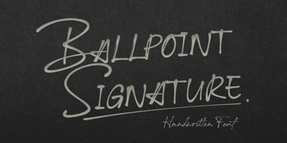 Ballpoint Signature is made with natural hand-drawn inspired by beautiful handwriting, and includes alternates.
 - Adventuring by K-Type,
$20.00 Rock-steady and friendly, yet animated and exciting, Adventuring evolved from the hand drawn, uppercase title lettering used for the 1950s and 1960s dust jackets of Enid Blyton’s Famous Five series of books.
 - Pintenium Script by FHFont,
$19.00 Pintenium is a vintage script with a hand-lettering brush style, and includes several OpenType features. Suitable for design, element design, wedding, event, t-shirt, logo, badges, sticker, and awesome work, and more.
 - Vacation Resort JNL by Jeff Levine,
$29.00 The hand lettered cast and production credits for the 1942 music comedy “Holiday Inn” (starring Bing Crosby and Fred Astaire) inspired Vacation Resort JNL, which is available in both regular and oblique versions.
 - ITC Connectivities by ITC,
$29.99Some words from the designer... West coast artist Teri Kahan developed a "design font" of 68 pictographs capturing the sentiments of relationship, connection and synchronicity. Many of the characters were created with phrases in mind like, "handing you the world on a platter", "howling at the moon", and "message in a bottle". Others represent life experiences. The clean, simple illustration style originates from the look of hand-carved rubber stamps, and lends itself beautifully to logos and graphics. - Oilvare by Adam Ladd,
$25.00 Oilvare is a hand-drawn, layered typeface inspired by vintage painted signs and oil cans. While sturdy, it also has a softer side—wide proportions, oval-inspired forms, curled angle strokes, and a medium contrast all help give it a little bit of distinction from the typical sans serif. Mix, match, and layer the styles to your liking. Carefully drawn, when you enlarge the typefaces, the subtle irregularities become more apparent and harken to hand lettering of the past.
 - Dudley Castle by Putracetol,
$28.00 Dudley Castle - Hand Written Script Font is a beautifully crafted font with a hand-drawn script style that exudes elegance and luxury. Designed to resemble handwritten text, this font adds a personal touch and a sense of authenticity to your designs. With its abundance of alternative characters and flourishes, Dudley Castle offers versatility and allows for creative exploration. It is a perfect choice for titles, names, branding, headlines, logos, and various other design applications. The hand-written script style of Dudley Castle brings a unique and personalized feel to your projects. It captures the essence of beautiful handwriting, giving your designs a human touch and an intimate connection. The font's elegant and luxurious appearance elevates the visual appeal and adds a touch of sophistication to any text it is applied to. Whether you're creating a title for a magazine, a name for a product, or a logo for a high-end brand, Dudley Castle will help you achieve a refined and stylish look
 - The Sweetest Thing by Seniors Studio,
$17.00 The sweetest thing is handmade fresh typeface, created with brush and ink. contemporary approach to design hand-painted natural and also a combination of delicate script with an irregular baseline. Suitable for use in watercolor design or as a hand brushed bold letters. Such as Novel tittle, Apparel, Invitations, Quotes, Books tittle, Stationery Design, Branding, Logos, Greeting Card, T-shirt, Packaging design, Poster and more. Includes a complete set of uppercase and lowercase letters, as well as multi-language support, numbers, punctuation, ligatures and alternative character.
 - Patisserie by Thinkdust,
$10.00 Patisserie is exactly the font you might expect to see on chalkboards outside Parisian cafés; tall, elegant and enticing. The lithe, thin and graceful characters of this font compliment the hand-drawn style to create a typeface that is both casual and professional. Excellent for display work and larger sizes, to really show off the slightly rough edges, Patisserie supports over 26 languages with full punctuation and character sets. Step on in for a traditional, hand-made, French fontant, or whatever else you fancy.
 - Maryland JNL by Jeff Levine,
$29.00 The 1913 sheet music for "There's A Girl in the Heart of Maryland (with a Heart That Belongs to Me)" may have had no shortage of words in the title - fifteen to be exact, but it also offered some nice hand lettering in the Art Nouveau style. Maryland JNL is a condensed typeface with an unusual twist. The "S" and "G" both have spurs on them, which is reminiscent of the preceding Victorian period and the popular spurred Tuscan alphabets of the time.
 - Inky Fingers by Hanoded,
$20.00 Inky Fingers… Well, the name says it all! This rather obese font was made by hand (literally) using my index finger, some sheets of paper and a lot of Chinese ink. As the eco-paper absorbed quite a lot of ink, I had to do a second ink-run! Inky Fingers is a very legible typeface, ideal for headlines, books and posters. It comes with Babylonian language support - including the Schwa/schwa glyphs for the Azeri speaking crowd. Ain't I nice?
 - Apparel JNL by Jeff Levine,
$29.00 An image spotted online showed a rendering of a ladies’ fashions storefront that had appeared in the Libbey-Owens-Ford Glass Company’s 1939 brochure. The signage consisted of the hand lettered word ‘Apparel’, and was done in a variant of the Art Deco stencil style of lettering that’s most recognizable in Futura Black. From these few sign letters came the inspiration for a digital font of the same name, Apparel JNL – which is available in both regular and oblique versions.
 - Stencil Label JNL by Jeff Levine,
$29.00 In the 1943 Three Stooges comedy short “Higher than a Kite”, Curly reaches into a box with the label “hand grenades” painted on its side and pulls out one of the devices. The bold, squared stencil hand lettering on that prop inspired Stencil Label JNL, which is available in both regular and oblique versions.
 - PaperCutAlmond by PineStreet,
$25.00 PaperCutAlmond breathes just the hands-on self-made authentic happy feeling you may be looking for. Each and every glyph is based on a paper letter cut by hand with a pair of scissors by me in my studio. Ideal for packaging for organic products, illustrated goods, book covers, editorial illustrations and other freestyle projects.
 - PiS Malefiz by PiS,
$24.00 PiS Malefiz is inspired by the hand-drawn type on the package of the german 60's version boardgame „Malefiz“, also known as Barricade or Barricata. Extended to five hand-drawn weights PiS Malefiz turned out to be the weird lovechild of Saul Bass and Ralph Steadman, fun and childish plus angry and strange. Just as playing the boardgame, PiS Malefiz is a wild and superfast rollercoaster ride of emotions! Combine the five interchangeable weights for total whackyness or use the clean and legible thin and regular versions for sleek and slender slanting. Have fun! Keep the dice rolling!
 - Chaman by Cubo Fonts,
$29.00 Chaman is a “hybrid” font. On the one hand serifless, temperate and readable, and on the other hand quick and livily as a manual script, thanks to many unexpected ligatures. Letter design is plain and functional, punctuated by dynamic elements, mostly in ligatures and contextual glyphs, generated at the beginning and end of the word, thanks to your software’s OpenType features. It draws inspiration from the Tibetan alphabet, originally close to our own latin alphabet, as it stems from Bhram handwriting, itself derived from Phoenician alphabet. This alternation of stright vertical lines and regular bows makes Chaman’s design stand out.
 - Gradl Initialen ML by HiH,
$12.00 Max Joseph Gradl designed Art Nouveau jewelry in Germany. At least some of his designs were produced by Theodor Fahrner of Pforzheim, Germany -- one of the leading manufacturers of fine art jewelry on the Continent from 1855 to 1979. I don't know if he designed for Fahrner exclusively, but every example I found was produced by that firm. I assume it was also the same M.J, who edited a book, Authentic Art Nouveau Stained Glass which was reissued by Dover and is still available. For an artist as accomplished as Gradl was, he is very tough to research. There just does not seem to have been much written about him. The jeweler is visible in most of his typeface designs. They exhibit a sculptural quality as if they were modeled in clay (or gold) rather than drawn on paper. His monograms, especially, reflect that quality. Those shown in plates 112 through 116 in Petzendorfer actually appear to have been designed specifically for fabricating in the form of gold or silver pendents. Of the initial letters that came out of Germany during this period, these by Gradl seem unusually open and lyrical. They seem to be dancing on the page, rather than sitting. Please note that Gradl designed only the decorated initials. All other characters supplied were extrapolated by HiH, including the accented initials. Orn.1 (unicode E004) is based on a jeweled gold clasp designed by Gradl (please check out Gallery Image on Myfonts.com). Also included are an art nouveau girl’s face, a swan and the face from Munch’s “Scream”, from scans of old printer’s ornaments. Gradl Initialen M represents a major extension of the original release, with the following changes: 1. Added glyphs for the 1250 Central Europe, the 1252 Turkish and the 1257 Baltic Code Pages. Added glyphs to complete standard 1252 Western Europe Code Page. Special glyphs relocated and assigned Unicode codepoints, some in Private Use area. Total of 341 glyphs. Both upper & lower case provided with appropriate accents. 2. 558 Kerning Pairs. 3. Added OpenType GSUB layout features: salt, dlig, ornm and kern. 4. Revised vertical metrics for improved cross-platform line spacing. 5. Refined various glyph outlines. 6. Alternative characters: 16 upper case letters (with gaps in surrounding decorations for accents above letter). 8. Four Ornaments: face1, face2, swan and orn1 (silhouette of Gradl clasp) The zip package includes two versions of the font at no extra charge. There is an OTF version which is in Open PS (Post Script Type 1) format and a TTF version which is in Open TT (True Type)format. Use whichever works best for your applications.
 - RePublic by Suitcase Type Foundry,
$75.00In 1955 the Czech State Department of Culture, which was then in charge of all the publishing houses, organised a competition amongst printing houses and generally all book businesses for the design of a newspaper typeface. The motivation for this contest was obvious: the situation in the printing presses was appalling, with very little quality fonts existing and financial resources being too scarce to permit the purchase of type abroad. The conditions to be met by the typeface were strictly defined, and far more constrained than the ones applied to regular typefaces designed for books. A number of parameters needed to be considered, including the pressure of the printing presses and the quality of the thin newspaper ink that would have smothered any delicate strokes. Rough drafts of type designs for the competition were submitted by Vratislav Hejzl, Stanislav Marso, Frantisek Novak, Frantisek Panek, Jiri Petr, Jindrich Posekany, and the team of Stanislav Duda, Karel Misek and Josef Tyfa. The committee published its comments and corrections of the designs, and asked the designers to draw the final drafts. The winner was unambiguous — the members of the committee unanimously agreed to award Stanislav Marso’s design the first prize. His typeface was cast by Grafotechna (a state-owned enterprise) for setting with line-composing machines and also in larger sizes for hand-setting. Regular, bold, and bold condensed cuts were produced, and the face was named Public. In 2003 we decided to digitise the typeface. Drawings of the regular and italic cuts at the size of approximatively 3,5 cicero (43 pt) were used as templates for scanning. Those originals covered the complete set of caps except for the U, the lowercase, numerals, and sloped ampersand. The bold and condensed bold cuts were found in an original specimen book of the Rude Pravo newspaper printing press. These specimens included a dot, acute, colon, semicolon, hyphens, exclamation and question marks, asterisk, parentheses, square brackets, cross, section sign, and ampersand. After the regular cut was drafted, we began to modify it. All the uppercase letters were fine-tuned, the crossbar of the A was raised, E, F, and H were narrowed, L and R were significantly broadened, and the angle of the leg and arm of the K were adjusted. The vertex of the M now rests on the baseline, making the glyph broader. The apex of the N is narrower, resulting in a more regular glyph. The tail of Q was made more decorative; the uppercase S lost its implied serifs. The lowercase ascenders and descenders were slightly extended. Corrections on the lower case a were more significant, its waist being lowered in order to improve its colour and light. The top of the f was redrawn, the loop of lowercase g now has a squarer character. The diagonals of the lowercase k were harmonised with the uppercase K. The t has a more open and longer terminal, and the tail of the y matches its overall construction. Numerals are generally better proportioned. Italics have been thoroughly redrawn, and in general their slope is lessened by approximatively 2–3 degrees. The italic upper case is more consistent with the regular cut. Unlike the original, the tail of the K is not curved, and the Z is not calligraphic. The italic lower case is even further removed from the original. This concerns specifically the bottom finials of the c and e, the top of the f, the descender of the j, the serif of the k, a heavier ear on the r, a more open t, a broader v and w, a different x, and, again, a non-calligraphic z. Originally the bold cut conformed even more to the superellipse shape than the regular one, since all the glyphs had to be fitted to the same width. We have redrawn the bold cut to provide a better match with the regular. This means its shapes have become generally broader, also noticeably darker. Medium and Semibold weights were also interpolated, with a colour similar to the original bold cut. The condensed variants’ width is 85 percent of the original. The design of the Bold Condensed weights was optimised for the setting of headlines, while the lighter ones are suited for normal condensed settings. All the OpenType fonts include small caps, numerals, fractions, ligatures, and expert glyphs, conforming to the Suitcase Standard set. Over half a century of consistent quality ensures perfect legibility even in adverse printing conditions and on poor quality paper. RePublic is an exquisite newspaper and magazine type, which is equally well suited as a contemporary book face. - GG Casual by Gerald Gallo,
$20.00 GG Casual is based on a hand lettering style of Gerald Gallo. The family is casual and informal and is ideal for use in conveying these qualities.
 - Wheat by Atlantic Fonts,
$26.00 Like fresh, warm just-out-of-the-oven bread, Wheat is wholesome and comforting. Wheat's crusty texture and bubbly, hand-drawn letters give it all natural appeal.
 - Jules Thicket by Rachel White Art,
$14.00 Jules Thicket is a wonky caps font, with kicky angles. Mix and match caps and lowercase letters to create a unique hand-lettered look in your designs.
 - Canadian Brusher by Motokiwo,
$15.00 Canadian Brusher, hipster Hand-brush display font with stunning characters and texture. It’s all caps with numeral & punctuation and standard multilingual support. Very cool for multipurpose project.