8,025 search results
(0.023 seconds)
- Candytwist by Moderinatos,
$15.00 Candytwist is a stylistic sans-serif font with unique patterns for a holiday season vibe. Geometric yet stylistic, it gives a modern holiday look while having some retro tones. Most notably, the stylistic & symbol will make your branding applications impeccable! Candytwist's features include: A Christmas vibe Multilingual support with most latin languages. Rounded strokes Candy cane design With a minimal and festive design, this font fits with seasonal brands, advertisements, festive publications and more!
 - MC Aregia by Maulana Creative,
$15.00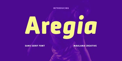 Aregia is a modern round sans font. Bold stroke, fun character with a bit of ligatures and alternates. To give you an extra creative work. Aregia font support multilingual more than 100+ language. This font is good for logo design, Social media, Movie Titles, Books Titles, a short text even a long text letter and good for your secondary text font with script or serif. Make a stunning work with Aregia font. Cheers, Maulana Creative
 - Mooncat by VladB,
$32.00 Mooncat is a modern sans serif geometric font with rounded edges, includes upper and lower case characters, Latin, Cyrillic, Latin Eastern Europe, Turkish, Baltic and other. Mooncat family consists of 8 fonts, divided into 2 subgroups (according to the type of style - Op, Rg), and have the 4 types of thickness in each subgroup. Mooncat fonts will be useful in developing a brand, creating posters and other graphic products, and for word processing.
 - Jumbalo by Sharkshock,
$115.00 Jumbalo is a fun loving family suitable for a variety of purposes. This all caps display font is characterized by its loose, rounded features and balloon-like structure which gives it a retro vibe. The letters are closely spaced together to create a snug feel. Jumbalo would work well in a children’s book, retail packaging, or company logo. The complete family contains full and basic Latin, punctuation, European accents, kerning, and includes an outlined version.
 - Anguita Sans by Latinotype,
$29.00 Anguita Sans is a condensed sans serif font family of 8 weights with matching italics- 16 styles in all. The font is characterized by rounded terminals, a large x-height and a condensed structure, which allows you to create a good vertical rhythm. Anguita Sans is a stylish and versatile typeface perfectly suitable for a wide range of applications- especially titles and short lines of text, in both print and digital media.
 - Grifa Slab by deFharo,
$14.00 Grifa Slab is a chunky typeface with thick rounded slab serifs in 4 styles with true italics, ideal for very legible titles and with a hard and smooth aspect at the same time. You can use this font in editorial design for headlines, also for advertising and the design of posters, signs or posters, in all cases readability is guaranteed. The typography has a set of 525 characters (Latin Extended-A) and OpenType functions.
 - Gome Pixel by Fitrah Type,
$12.00 Gome Pixel is focused on the purpose of the display. It contains uppercase and lowercase characters. Suitable for use in retro game design and computing vibes. Gome Pixel is inspired by bitmap fonts This is the first release of the Fitrah Type. The entire typography has been designed to work on large sizes and display purposes such as branding, titles, thumbnails, posters, and animation. This font is available in 2 styles, regular and rounded
 - Galora by Gravia Design,
$15.55 Galora is a sleek and contemporary high-contrast serif font. The typeface comes in two different styles. Regular has round and curvy lines to bring a soft aesthetic to your designs. The oblique style features sharp angles and diagonal lines for a more dynamic look. Galora is perfect for designing logos, headlines, posters, packaging, and invitations, adding a modern and captivating charm. Features Uppercase & Lowercase Number & Symbol Ligatures Multi-language 2 Styles
 - Quan Slim by Typesketchbook,
$40.00 The typeface of Quan Slim is based on the successful Quan font family by font foundry Typesketchbook. Font designer Chatnarong Jingsuphatada created Quan Slim as a condensed version to Quan. Both type families consist of eight weights plus obliques and additional rounded versions. Quan Slim’s typeface has a clean and modern sans serif appearance. This modern geometric font is very legible and can be used for headlines as well as small and long text.
 - Caslon Gotisch by RMU,
$25.00 A blackletter font by William Caslon (1692-1766), with Dutch influences, which appeared for the first time in a font sample book of William Caslon & Son, London, 1763. To access all ligatures in this font, it is recommended to activate both OT features Standard and Discretionary Ligatures. The round s occupies the number sign key, and typing N - o - period and activating this combination with the OT feature Ordinals gives you the numero sign.
 - Muffin by ParaType,
$30.00 Muffin is a soft and rounded humanistic low-contrast sans serif based on broad nib writing. It comes in five weights ranging from Regular to Black. The friendly character of the font becomes even more pronounced in the darkest styles. Muffin is well suited for food packaging, menus, children's products, while Regular may be easily used for long runs of text. The font was designed by Natalia Vasilyeva and released by Paratype in 2017.
 - Rustico Farmero by Kaligra.co,
$19.00 Rustico Farmero is a Textured ultra condensed Type Family that includes 3 styles: Regular, Rounded & Vintage versions. This family is an All-Caps family with each version contains a textured (Aged) and alternates. With 3 styles and iconic alternates, this font can give a diverse set of aesthetics. With light giving a much more simple modern vintage look, fashionable feel and the bold giving a more rugged vibe for Simple strong and mature design look.
 - HU Suryeo KR by Heummdesign,
$25.00 HU SuryeoKR is a new typeface of Heumm's calligraphy that takes the motif from carefully written calligraphy. It follows the calligraphic shape of Korean classics and can be used for titles and body text without distinction. The stroke thickness, strength, and degree of bending were set differently for each style. The thinner it is, the sharper it is, and the thicker it is, the blunt and round it is. HU SuryeoKR includes Korean.
 - NCS Radhiumz by Namara Creative Studio,
$12.00 NCS Radhiumz is a modern powerful quality sans serif font with great versatility. This extended font can be used for bold editorial statements, graphic heavy prints or just as a simple logo. This new type will definitely make your designs stand out and unique. Included 08 variant to choose : Light Light Italic Regular Italic Bold Bold Italic Bold Rounded Bold Shadow Included uppercase, lowercase, numerals, punctuations, multilingual support, and some alternates & ligatures.
 - Chairdrobe by XTOPH,
$25.00 Chairdrobe is minimalistic typeface with a contemporary, urban style. It feels pure, raw and a bit dirty. You can use it as display type as well as in longer text. Try to space it up. It looks super tight with a lot of spacing! Chairdrobe is a sans-serif, condensed typeface. Available in 3 different variations – Normal, Rounded and Grunge. It features upper and lowercase letters and up to 7 Weights and Italics.
 - Aloha Beach by HansCo,
$15.00 Aloha beach is a slab type font with rounded characters on each side. You will also get some alternative swashes in it. Use this display slab font to add that special retro vintage touch to any design idea you can think of! Very suitable for logotype, Stickers, Packaging design, Cricut Project, headlines, brand identity, t shirt or apparel industry, posters, magazines, books, YouTube, Instagram, websites, or any of your creative design projects. Enjoy!
 - Troia by Ahmet Altun,
$10.00 Troia Font Family comes in three weights; normal and italic. In addition, with rounded corners, each weight has its own smoother version. Thanks to its large letters and added spaces between the letters, this font can be used to get perfect results and create great works such as web typography, banners, logos, texts, t-shirts and printings, and also presentations. Troia's eye-pleasing and nice-looking style makes writing much more pleasant.
 - Summering by Letterara,
$12.00 Summering is a fresh, sweet, and friendly handwritten font. Its friendly feel makes this font incredibly versatile, fitting a wide range of contexts. Its distinct and well-rounded letters make this font a masterpiece. Add it to your creative ideas and notice how it makes them stand out! This font is PUA encoded which means you can access all of the awesome glyphs with ease! It also features a wealth of special features including ligatures.
 - Caldense by Tiago Cândido,
$20.00 The typeface was baptized as "Caldense" in order to honor the city of Caldas da Rainha, a small city in Portugal, the typography's birth place. It has three weights, Regular, Demi Bold and Bold and it is a sans serif and grotesque. Each character was based on a grid and was built in modules, having round edges and straight finishes. The font can be used in titles and normal text while being easy to read.
 - ITC Static by ITC,
$29.99Static looks almost like it was stamped on paper: the black color is not evenly distributed and the background comes through the letters and consciously irregular forms reinforce the effect. The characters do not all have the same height, nor do they stand straight and regularly on the base line. Static is a robust font with bold, rounded serifs and is best used for headlines and short texts in point sizes of 12 and larger. - Lesthone by Nathatype,
$29.00 Lesthone is a display font that seamlessly merges vintage aesthetics with modern elegance. The rounded shapes of Lesthone contribute to its friendly looks. Each letter has its own personality, and this contributes to the font's handcrafted appeal. On the other hand, the most standout characteristic of Lesthone is its slightly rough texture that add a rustic charm. This font includes beautiful ornaments as a bonus. Lesthone fits in headlines, logos, branding materials, and many more.
 - Conifer by Ryan Keightley,
$15.00 Conifer is a blocky geometric sans serif font that adheres to strict grid rules in order to define its corner angles. Its seemingly rigid form is tempered by the soft, rounded corners, and fine notched details present at acute angles in the glyphs. Available in a clean solid and a varied, textured rough. The result is a rugged, retro, typeface that is at home in fashion lookbooks and wood-carved park signage alike.
 - Modula by Emigre,
$39.00 Modula was the first high resolution headline face that Zuzana Licko designed with the Macintosh computer. In 1985, the computer was very crude as far as being able to produce subtle curves, but it was outstanding at producing perfect geometric elements. As a guide, she used the proportions of her earlier Emperor Fifteen bitmap design and applied the precision of the computer's geometric elements. See also Modula Round and Ribbed. Greek version by Dimitris Arvanitis.
 - RNS Pictografica Cocina by RNS Fonts,
$9.00 RNS Pictografica Cocina (Kitchen, culinary arts and food related font) it is comprised of 230 glyphs, it's based on a modular structure of a minimal thickness on lines and round corners, making a clean visually drawing, give importance to the surround white for improve contrast. The font is better used on a big white canvas for achieve visual focus. And in great sizes for more impact, however the font is legible even at small sizes.
 - Mithella by Lafontype,
$19.00 Mithella is a sans serif family with a pleasant touch. Some letters, especially linear ones, look normative like other rounded sans serifs, but the difference can be seen clearly in curved letters so that it gives a pleasant impression for each series of words. Mithella comes with eight weights ranging from thin to black to complement your design needs be it branding, blogging, logos, advertising, games, cooking, packaging, editorial and publishing, web and screen design.
 - Knocky by Jehoo Creative,
$23.00 Knocky is a display typeface that is complete and versatile with a bold round condensed look with unique flexibility. We've added solid alternatives to letters, numbers, and some symbols, plus an outline style that will make the graphic look unique and stand out. With 8 styles and more than 530 glyphs in each. knocky has multi-language support, it will be perfect for many projects from editorial design to branding, advertising, publicity and digital.
 - Spiro 2020 by Etewut,
$30.00 Introducing rounded sans serif Spiro. The family includes 3 styles: regular, bold and italic. Spiro supports multi language symbols as æ, ß, ç, etc. It also has all necessary ligatures and extra glyphs you may need. To use them you have to open glyphs panel in menu Window. The font is compatible on both Windows and Mac. You can use it in all popular apps like Adobe, Corel Draw, Microsoft, Final Cut etc.
 - Graviola by Harbor Type,
$30.00🏆 Selected for Tipos Latinos 7 with a Certificate of Excellence. With semi-rounded terminals, Graviola is soft and friendly. The family consists of 16 fonts, from Thin to Black and matching italics. While the intermediate ones are suited for body text, the extreme weights look specially beautiful at display sizes. Each font contains 530+ glyphs, supporting more than 90 languages. Stylistic sets provide alternates in two groupings (a, v, w, y and G, g, &). - Blauhaus by Hanoded,
$15.00 Yes, you're right. Blauhaus should have been 'Blaues Haus', as that is the proper way of saying Blue House in German. But hey, Blauhaus sounds much better and in writing, it is quite similar to Bauhaus. Blauhaus is a stylish, rounded sans serif font, modeled after some early 20th century German typefaces. It is easy on the eye and it will certainly give your work a sophisticated punch. Comes with a classy collection of diacritics.
 - Cartoon Nouveau JNL by Jeff Levine,
$29.00 Most of the lettering on a piece of sheet music for a song from the 1921 George M. Cohan musical comedy entitled “The O’Brien Girl” was hand lettered in a playful, casual Art Nouveau design with rounded ends. The characters on that page took on a look reminiscent of cartoon or comic strip wording, and the result is a digital typeface named Cartoon Nouveau JNL, which is available in both regular and oblique versions.
 - Homkiges by Edignwn Type,
$16.00 The font collection is called "Homkiges", it is a display font for logotype. These collections contain script and sans serif font. Every font comes with 4 style typefaces (regular, rounded, rough and stamp). Homkiges give more extras 3 pack illustrations (shoe, tailor and barber). This script font includes some alternates and ligatures. The Homkiges matches apply in some designs such as the logo, poster, label, badge, packaging, t-shirt, branding, quotes and more custom design.
 - Aerioz by Letrasupply Typefoundry,
$18.00 Aerioz is a monoline all caps font, comes with over 600 characters including 324 alternate letters. Smooth with rounded lines, simple, elegant, and perfect in any layout project such a headline magazines, custom name, neon sign and more typography work. Aerioz is packed with ornaments and OpenType alternates, you can combine the regular font with the ornament to make it more perfect. How to get access alternate glyphs from open type fonts : http://adobe.ly/1m1fn4Y
 - Mozziano by Mostardesign,
$15.00 Created in 2010 by Olivier Gourvat, Mozziano is an elegant cross between geometric and round shapes. Its post-retro style opposes also fine and thick lines. This font can be used for very short texts however it is particularly effective for headlines in larger point sizes so that its details are emphasized. Mozziano best used in experimental designs. Mozziano contain an extensive character set that includes support for Central and Eastern European languages.
 - Heyday by Hemphill Type,
$30.00 Heyday is a font in its prime! This font was inspired by vintage style typography with the use of thick rounded serifs, while the shape of the letterform has a contemporary edge which brings it into the modern day. This combination of classic and modern creates a unique look and feel that enables the font to feel at home in any era. The Heyday family consists of a serif and sans weight.
 - Vinyle by Lián Types,
$37.00 Bold, rounded and super cool. Those are the attributes of my latest font “Vinyle”, french for vinyl. In this epoque where all fields of Design are giving a lot of importance and attention to Typography and Lettering, I felt it was my duty to contribute with something that could really stand alone and ‘say something else’ that just words to be read. I've found that lately in the world, regarding a finished piece of design, the role of Typography (and of letters in general) went from being secondary, (like a minor player or a supporting actor) to the most important one. People are starting to understand the beauty of a well-done letter: they want their storefronts with unique scripts, they want to drink coffee surrounded by lettered blackboards, they want to buy books with astonishing covers with swashes ‘por doquier’. I'm more than happy to be alive in a present where even the most unimaginable friends of mine, (who couldn't spot differences between comic sans and helvetica before) are now conscious of the importance of a letter, or let’s say: Of the ‘voice’ of Typography. With Vinyle I tried to make a font with power. Following the nowadays trend of, let me say, “the vintage sans renaissance”. This time I put my brushes and nibs aside and experimented with something new. It wasn't easy, if you will pardon, for me to see swashes all over the place withouth the classic calligraphic ‘thick and thins’, but with after some weeks of work I started to love them. Like I already showed you in other creations (1) let me finish with the phrase: GEOMETRY IS SEXY! TIPS Vinyle has a lot of attitude, it shouts “here I am!” it really can ‘design an entire piece’ for you with just a word or two: It was designed with a 10 degree slant on purpose so the user may rotate it (like on the posters) that amount of degrees in order to see better results. Use Vinyle with the ‘fi’ standard ligatures activates for better kerning and ligatures! NOTES (1) See my font Selfie , the ‘little sister’ of Vinyle.
 - Martin Luther by Harald Geisler,
$59.00 ❧ Useful links: Luther’s Manuscripts at the UNESCO Memory of the World at Google Arts and Culture Martin Luther font on Kickstarter (with Film about the creation) Each letter of the Martin Luther font is strictly based on original samples found in Martin Luther’s 500 year old handwritten manuscripts. Letters that occur more often for example vowels have two or more different versions stored in the font. (➶ Figure 4) These alternative forms are exchanged automatically by the font as you type, and create a vivid look that comes close to actual handwriting. The font avoids that two identical letters are placed next to each other like, for example the two “o” in the word “look”. ➸ What Historic Sources is the Font based on? Two historic documents were used to base the font on. The notes Luther took before giving his speech in Worms in 1521 and a 6 page letter he wrote immediately after to Emperor Charles V., summarising his speech (➶ Figure 2). Both documents have been added to the UNESCO “Memory of the World” and can be seen at the Google Arts and Culture website. ➸ The Creation of a Handwriting Font The creation of a handwriting font is very different from the creation of a regular font. Harald Geisler has specialised in recreating handwriting in preceding projects with Albert Einstein’s, Sigmund Freud’s and his own handwriting. His experience working with Archives and Museums has gone into this project. First Geisler analyses the movement in the writing to understand how each letter is drawn. This involves partially learning how to write like a person. In this process not the outlines of the sample are reproduced but the original movement path of the handwriting (➶ Figure 3). In a second step width and contrast is added to reproduce Martin Luther’s characteristic impetus and the writing tools used at the time. (Link: Youtube Playlist showcasing the creation of individual letters) How about signs that can’t be found in archives? Some Glyphs can not be found in 500 year old manuscripts, for example the @-sign. Towards the end of the creation one collects a profund amount of details about how a writer moves on paper and addresses certain tasks moving the pen. Keeping this knowledge in mind an improvisation can be based on similar letter forms. For example the @ sign is based on of the movement of a lowercase a and parenthesis. ➸ Features of the Martin Luther font ❶ Extensive Documentation of the creation of the font, including high quality reproduction of the used manuscripts. ❷ Additional texts from Historian Dr. Henning Jürgens and Palaeographer (and Luther handwriting expert) Prof. Ulrich Bubenheimer ❸ Alternating Letters - in handwriting every word looks a bit different. To avoid that two identical letterforms are placed next to each other (for example in the word look) the font actively changes between different versions of letters as you type. ❹ Ligatures - characteristic writing forms when two letters are combined (for example “ct”) (➶ Figure 5) ❺ Terminal Letterforms - renders a special letterform when letter is at the end of a word. (➶ Figure 8) ❻ ‘’’Initial and Medial Letterforms''' - some letterforms are different when placed in the beginning or middle of a word, for example the lowercase s. ❼ Luther Rose - is a seal Luther used to authorise his correspondence. Today it is a widely recognized symbol for Luther. When you enter the numbers of Luthers year of birth and death 14831546 using the Martin Luther PRO font, it will render a stylised version of the Luther Rose. (➶ Figure 7) ❽ Historic letter-forms - letter-forms that are specific to medieval writing around 1500. For example the long-s or h with a loop at the bottom. (➶ Figure 6) ⚑ Multi language support - see the technical information tab for a full list of supported languages. (➶ Figure 11) ➸ The different Styles explained ❋ Martin Luther PRO - this includes all features listed above and is geared towards writing texts that are more readable today. It features alternating letters to create a natural handwriting look as well as two stylistic sets accessible through the OpenType menu. Historic forms are available through the glyph picker. ❋ Martin Luther Historic - this font creates a historically correct reproduction (i.e. with long-s) of Luther’s medieval latin handwriting. It features alternating letters to create a natural handwriting look as well as two stylistic sets accessible through the OpenType menu. ❋ Martin Luther Expert-1 - Dedicated access to the first set of letters only. ❋ Martin Luther Expert-2 - Dedicated access to the second set of letters only. ❈❈❈ Family Pack - recieve all fonts at a discounted price. ❈❈❈ ➸ Kickstarter The creation and development of the Martin Luther font was financed by 500 supporters on ➸Kickstarter.
 - Le Monde Courrier Std by Typofonderie,
$59.00 A rounded slab in 4 styles In our age, since the arrival of microcomputing, the majority of professional letters have been composed in quality typefaces. Typewriters & the typestyles they used have become antiques. A letter set in Times or Helvetica & printed with a laser printer at 600 dpi or more are of such quality that one can no longer distinguish it with a document produced by offset printing. But letters composed in this way appear overly institutional when a bit of informality is needed. Le Monde Courrier, designed by Jean François Porchez, attempts to re-establish a style halfway between writing and printing. Informal neo-tech style This rounded slab serif returns the informal character of “typewritten” fonts to letters and suit well all bad conditions, from inkjet printed memos to webfonts use. With a unique typographic colour, it integrate itself with the rest of the Le Monde family with effective contrast. The verticals metrics and proportions of Le Monde Courrier are calibrated to match perfectly others Typofonderie families. Bukva:raz 2001 Type Directors Club .44 1998 European Design Awards 1998
 - Nostalgia by Resistenza,
$39.00 Say Hello to Nostalgia! A Modern Font with a retro feeling 3 Fonts Regular, Effect and Flowers Go back in time and travel through the magazines and graphics from the fabulous 1970´s. Different serif typefaces, rounded and bold were the big focus to add a spark of life and modernity to the products. Nostalgia is our contemporary interpretation of this beautiful collection of fonts. Our aim is to draw the positive mood of these nostalgic letterforms with softened edges and rounded terminations, to evoke a fresh and contemporary view on this graphic approach. An extended set of alternates & swashes specially designed to create stylish lettering compositions have been included. You can Access your OpenType features and discover all the possibilities. Combining the glyphs with "Nostalgia Icons" as well as changes of color you'll feel the magic. This endless collection of flowers and decorative forms will boost the vintage mood to any project. The result is a very versatile font that works in a wide range request, from logos, headlines, branding, magazine design to wedding cards, poster and so much more.
 - Binario by Tarallo Design,
$14.99 Binario is a simple and friendly font with three weights and matching obliques. The geometric and modular characteristics of this typeface subtly reference the Art Deco and early modernist periods. It is an ideal choice for achieving a clean, distinctive, and contemporary aesthetic, making it suitable for branding, posters, and screen-based designs. The light weight of Binario is good for body text. The regular weight exudes confidence, making it suitable for both body and heading text. For impactful headlines, the bold weight is superb. The clear weight distinction of this family make it easy to create organized text. Binario was designed in Siena, Italy taking some inspiration from train stations and shop signage. The name Binario means train platform in Italian. Other aspects that informed the design of this font are modularity and efficiency. The interior rounded forms of the letters (counterforms) are based on shape of the Roman arch. Binario has a sibling, Binario Soft. This version has gently rounded stroke ends, which make a softer impression on the page.
 - Omletta by Invasi Studio,
$17.00 This chunky rounded bold font is not only fun and playful but also incredibly versatile. Whether you're working on food product branding, creating a display headline, or designing packaging for your latest project, Omletta font will surely bring a smile to your face. With its bold and rounded design, Omletta font is perfect for creating eye-catching designs that demand attention. It's perfect for brands that want to make a bold statement and stand out from the crowd. Plus, with its support for Latin multilingual, you can use Omletta font for all of your international design projects. So what are you waiting for? Add some fun and excitement to your next project with Omletta font. With its playful and youthful tone, this font is perfect for creating unique and memorable designs. Whether you're designing for a food brand or a fun event, Omletta font is the perfect choice to help you capture the essence of your project. Get ready to make your designs pop with this bold and playful font!