8,026 search results
(0.03 seconds)
- Railham by OhType!,
$25.00 RAILHAM is a slab typeface with more than 330 glyphs including uppercase, lowercase, numbers, small caps, accents, punctuation, currencies, etc. Inspired by the tracks of a railroad, with stems that narrow at the top, Railham typeface, like a train looks to the future without forgetting the fundamentals of a long road, detaining in the detail of every element to form a strong, fast and versatile family. Retaking and uniting essential concepts of typography, rounded serifs with especially wide base, forms and counterblocks that complement together, RailHam typeface neatly adapts to any topic, besides being practical and readily legible in small and large formats, joining a select list of modern slab serif fonts.
 - HS Gold by Hiba Studio,
$69.00 HS Gold is based on some modern lines of Naskh calligraphy which supports Arabic, Persian and Latin with a Sans Serif with subtle round on stems and corners. The typeface has been optimized for corporate identity work, editorial design and modern projects when a contemporary and simple look with a similarity between Arabic and Latin is requested. It features swash, ligatures and swash ligatures. Its proportions allow high impact on the tightly set lines of big and small text alike. This font consists of two weights (regular and bold) which can constitute a striking addition to the library of Arabic and Latin contemporary fonts models that meet the purposes of various designs for all tastes and projects.
 - Bakeshop by Melvastype,
$29.00 Bakeshop is a casual script font family. It is drawn with rounded marker so the contrast is quite low. It has bumps at the end of strokes where the pen has stopped and the ink has spread. Bakeshop includes three weights and has both connecting and non-connecting versions. Connecting Bakeshop versions has OpenType features like Final Forms, looping connections with lowercase e, high connecting stroke with ascenders and plenty of discretionary ligatures. You can enable Final Forms either enabling Final Form feature or Contextual Alternates. If you want to use the high connection strokes with ascenders enable Stylistic Alternates or Stylistic Set 2. And if you like to use the ligatures just enable Discretionary Ligatures feature.
 - Modern MT for Dior JP by Monotype,
$29.99Cut by Monotype between 1900 and 1902, the Monotype Modern font family was based on Miller & Richards News 23 and 28; slightly condensed news text types of the 1890s. Monotype Modern is a lively typeface, with long, fine hairlines and well rounded letterforms, representing the best of nineteenth century modern face design. A classic text face, and typical of the moderns that were produced in the United Kingdom at that time, being less extreme in its rendering than some of the models of purer form being produced elsewhere. Monotype Modern is an excellent text face for magazines, newspapers and books, the heavier and more condensed versions are useful in headlines and display. - Sica by dooType,
$30.00The Sica Family was designed in order to address issues related to technology, while maintaining humanistic forms. Thus, a font with square shapes emerged, but with smooth curves and slightly rounded terminals making it friendly. The family has three widths – condensed, normal and expanded – each of them with six weights and their respective italics, resulting in 36 fonts. With particular details and open shapes that increase legibility, it can be used for both text compositions as well for display sizes. It has 774 glyphs, covering more than 50 languages, as well as ligatures, lining, oldstyle, tabular and proportional figures, fractions, superiors, inferiors, and small caps, all of them accessible through OpenType features. - Modern MT for Dior KO by Monotype,
$29.99Cut by Monotype between 1900 and 1902, the Monotype Modern font family was based on Miller & Richards News 23 and 28; slightly condensed news text types of the 1890s. Monotype Modern is a lively typeface, with long, fine hairlines and well rounded letterforms, representing the best of nineteenth century modern face design. A classic text face, and typical of the moderns that were produced in the United Kingdom at that time, being less extreme in its rendering than some of the models of purer form being produced elsewhere. Monotype Modern is an excellent text face for magazines, newspapers and books, the heavier and more condensed versions are useful in headlines and display. - Geo Deco by Tipo Pèpel,
$28.00 Geodeco font family brings to you the recovery of the typographic forms from the beginning of the 20th century, with a strong ArtDecó flavour but from a new point of view: modernity and geometry. Modernity in the visual contrast between lowercase and capital letters, where rounded shapes are opposed to the breaks and graphic tensions of the strokes of the capital letters. which gives it an enormous originality. Generous doses of internal whites, assure a powerful legibility even with the spite of its short ascending and descending strokes. What we get is a coherent and martial look where fluidity and homogeneity is the main note. Soft and rounded minuscule, with large internal whites for super legibility, bombproof, especially on screens, where Geodeco lives with an astonishing naturalness. The capital letters, used alone as display, or as companions of the minuscule characters, give the family a touch of originality and exotic flavor. Like the spices in the food; a brief but intense note. Breaking the rectangular shapes so that the appearance of the letter comes out benefits from enlarging the internal whites and making them consistent with the white of the lower case. GeoDeco works very well in plain text with the obvious limitation that it is not a type for small bodies, but exceptionality weldon for plain text and signage. Maximum visibility, total beauty on screens. A family of this new century with the flavour of that epoch of experimentation that were the years 20. Extensive multilanguage support and almost all Opentype functionalities. Try it and it will convince you - for sure!
 - TT Livret by TypeType,
$39.00 If you still think that an antiqua is a typeface with a strong historical character that difficult to apply in modern realities, meet the new typeface from TypeType! TT Livret is an elegant, modern and functional antiqua featuring a calm text and an expressive display subfamily. TT Livret useful links: Specimen | Graphic presentation | Customization options This font looks harmonious in books and other periodicals, on posters or on magazine covers. The scope is not limited to the printing industry, because TT Livret looks aesthetically pleasing wherever text is used. The text subfamily has uniwidth proportions and a calm spirit, oval round characters, free spacing and more open apertures. The glossy display subfamily is proportional and has round signs that are as close to a circle as possible, the apertures are closed, and the spacing is dense. The font has an intermediate subfamily - Subhead, which can look more relaxed when used as text font, or be contrasting and used as a display font. In TT Livret, we have embodied the idea of an antiqua that will be comfortable to use in modern realities. This is a functional font, where the text face does not distract from reading, and the display face, on the contrary, attracts attention. The TT Livret font family consists of 32 faces: 15 upright, 15 oblique, and 2 variable fonts. Each face has 1031 glyphs. The font contains 26 OpenType features, as well as a large number of ligatures. There are many alternative characters in italics, which are especially diverse in Cyrillic.
 - Neuliner by CozyFonts,
$20.00 The Neuliner Family is sleek, condensed, extremely legible & flexible available in 7 styles. The inspiration stems from the classic, slender Art Deco era. Designed with a repeated vertical theme Neuliner is consistent from style to style with variations in weight and character. With over 350 glyphs and applying in over 80 languages with Numerals, Dingbats & Euro accents this family is complete. At the time of its first release Neuliner is available in Medium, Bold, Italic, Outline, Drop, Rough, & Rounded. Other styles are in the works. As displayed in the posters, Neuliner works well, in any style, for headlines, by-lines, logos, titles, posters, signage, billboards, ads, main & end titles, monograms, numbering systems, wedding invites and stationary, etc. The Bold style works congruously with the Outline & Drop styles, for either 'trapped' or 'offset' effects. This family also has its roots and influence in Mid Century influenced architecture and design yet lends its style to contemporary and modern design in the 2020s. The Drop & Rough versions are unique styles that render well in Adobe Illustrator & Adobe Photoshop for use in a myriad of colors and effects. The rough-edged style resembles a stitched and weathered effect, while the drop version plays prominently as headlines in either bright or muted color combinations. The versatile, ever-classic outline style gives any image or photographs an impression of elegance and transparency without sacrificing legibility. Neuliner Rounded embosses and engraves either blindly or foil added with a lasting impression. Neuliner Family from Cozyfonts Foundry.
 - Dolsáb by Kent Barns,
$20.00 Dolsáb was designed from scratch with uniqueness in mind. The subtle movement from thick to thin and the variants of sharp to rounded make this cutting edge san serif a must have. The inspiration for Dolsab was a simple pairing of a rhombus and calligraphy. While neither of those two elements can be seen in their entirety in any instance, the influence of both is strong. The rhombus can be notice on most ascenders like on the lowercase t & l, for example. And the calligraphy inspiration is most easily captured on the descenders such as the lowercase y & g. The most beautiful characteristics of Dolsab is definitely the calligraphy-influenced movement. These features really stand out on the lowercase a & e. It's almost amusing to let your eye follow the contours of those two letter forms as they travel from thick to thin, sharp to rounded and back again. Users are welcomed to try all font styles of Dolsab in any applique of their choosing. However, it will be quickly noticeable that only Dolsab Air & Demi (the thiner of the styles) will be best suited for body copy. Personally I like to see these letterforms as large as they can be to really showcase the subtle movement, especially in Dolsab Heavy where these movements become much more dramatic. You'll never know what really works best unless you experiment. Dolsab surely isn't the answer to all projects, but it's certainly worth trying. No other typeface moves quite like Dolsáb.
 - DIN Next by Monotype,
$56.99 DIN has always been the typeface you root for—the one you wanted to use but just couldn’t bring yourself to because it was limited in its range of weights and widths, rendering it less useful than it could be. The century-old design has proven to be timeless, but modern use cases demanded an update, which resulted in DIN Next—a versatile sans serif family that will never go out of style. This classic design turned modern must-have includes seven weights that range from light to black, each of which has a complementary italic and condensed counterpart. The family also included four rounded designs, stretching the original concept’s range and core usability. DIN Next also boasts a suite of small capitals, old style figures, subscript, superscript and several alternate characters. A quintessential 20th-century design, its predecessor DIN was based on geometric shapes and was intended for use on traffic signs and technical documentation. Akira Kobayashi’s update made slight changes to the design, rounding the formerly squared-off corner angles to humanize the family. Rooted in over 100-years of history, it’s safe to say that there will always be a demand for the DIN design, and thanks to DIN Next, now it’s as usable as it is desired. Wondering what will pair with it perfectly? Check out Agmena™, Bembo® Book, Cardamon™, Joanna® Nova, FF Quadraat® and Quitador™. Featured in: Best Fonts for Logos, Best Fonts for Websites, Best Fonts for Tattoos
 - Melt by Flavortype,
$24.00 Introducing "Melt," a captivating and versatile font that seamlessly blends boldness with soft, rounded curves, exuding an irresistible charm. This font is a harmonious fusion of cursive elegance, bold confidence, and modern trends, making it perfect for eye-catching headlines that demand attention. The Melt font family is thoughtfully crafted with three distinct selection font files, ensuring a range of creative possibilities: Melt Italic (Full Features): The italic variation of Melt boasts full features, providing a dynamic and playful touch to your designs. With its stylish slant and graceful curves, Melt Italic is ideal for adding a touch of sophistication to headlines, posters, and other creative projects. Melt Swashes: Elevate your designs with the Melt Swashes font file, where uppercase letters are replaced with delightful swashes. These swashes add a whimsical and artistic flair to your text, creating a unique and expressive visual impact. Perfect for adding a touch of creativity to logos, branding, and more. Melt Swashes Alt: For those seeking alternative swashes for uppercase letters, Melt Swashes Alt offers a distinct set of alternative swash designs. This variation provides even more versatility and customization options, allowing you to tailor your typography to suit the specific aesthetic of your project. Whether you're designing for a trendy website, playful branding, or vibrant marketing materials, Melt's bold, cursive, and rounded style, coupled with its three font file options, ensures that you have the perfect tool to make a lasting impression. Embrace the charm of Melt and let your headlines stand out with a delightful blend of modernity and cuteness.
 - Okojo Pro by Wordshape,
$20.00 The Okojo Pro Complete family is a reworking of Wordshape’s immensely popular Okojo family of typefaces. It includes Okojo Pro, a semi-geometric sans serif, Okojo Slab Pro, a semi-geometric slab serif, Okojo Pro Display, a round-cornered sans serif variation, and Okojo Slab Pro Display, a round-cornered slab serif. The entire Okojo Pro family looks great at small or large sizes. The Okojo Pro family is designed for readability in long texts while simultaneously functioning as effective display type. Features of Okojo Pro Display: - all lowercase characters have an enlarged x-height, creating less optical dazzle than typefaces like Futura, Neutra or Avant Garde - more humanist numerals and punctuation for enhanced readability - complete Western, Central and Eastern European characters sets - radically improved spacing guaranteeing beautiful results in print and on screen for the Czech, English, Hungarian, Croatian, Esperanto, Maltese, Romanian, Turkish, Albanian, French, Portuguese, Spanish, Basque, Bulgarian, Finnish, Swedish, Norwegian languages The Okojo Pro Display family is influenced by the type designs of Paul Renner and Herb Lubalin, but smoothed over with more than a bit of Americana. Both work well on-screen as webfonts and in print as book type. Each is hinted with accuracy and kerned with precision.The lighter weights are slightly slimmer than the regular and bold weights to give the typeface more of a vertical feel, inviting readers' to rapidly read typeset text with a maximum of contrast and a minimum of optical distortion. Okojo: it’s a little bit country and a little bit rock’n’roll.
 - Familiar Pro by CheapProFonts,
$- This family was inspired by a Type Battle over at Typophile: How would you design a font metrically compatible with Helvetica, but better than Arial? Working with preset letter widths was an interesting constraint, both a relief and a limitation at the same time. I have done all the 4 basic weights, and the skewed obliques (done to a slightly less steep 10 degrees angle as opposed to the originals 12) has been optically adjusted. The letters have been designed quite close to the german/swiss grotesk tradition, but by using super-elliptical rounds, rounded dots and slightly curved outer diagonals the end result is a friendly looking font family that still looks... familiar. ALL fonts from CheapProFonts have very extensive language support: They contain some unusual diacritic letters (some of which are contained in the Latin Extended-B Unicode block) supporting: Cornish, Filipino (Tagalog), Guarani, Luxembourgian, Malagasy, Romanian, Ulithian and Welsh. They also contain all glyphs in the Latin Extended-A Unicode block (which among others cover the Central European and Baltic areas) supporting: Afrikaans, Belarusian (Lacinka), Bosnian, Catalan, Chichewa, Croatian, Czech, Dutch, Esperanto, Greenlandic, Hungarian, Kashubian, Kurdish (Kurmanji), Latvian, Lithuanian, Maltese, Maori, Polish, Saami (Inari), Saami (North), Serbian (latin), Slovak(ian), Slovene, Sorbian (Lower), Sorbian (Upper), Turkish and Turkmen. And they of course contain all the usual "western" glyphs supporting: Albanian, Basque, Breton, Chamorro, Danish, Estonian, Faroese, Finnish, French, Frisian, Galican, German, Icelandic, Indonesian, Irish (Gaelic), Italian, Northern Sotho, Norwegian, Occitan, Portuguese, Rhaeto-Romance, Sami (Lule), Sami (South), Scots (Gaelic), Spanish, Swedish, Tswana, Walloon and Yapese.
 - Swarha by Gumpita Rahayu,
$18.00 Built in 1930 - 1935 by Dutch architect Wolff Schoemaker, the Swarha Islamic Building was originally used as a lodging for the honoured guest country and the journalists for Asia-Africa Conference in 1955. This building has an important role as one of Bandung historical art deco heritage, with the art deco typefaces styles on it's singage in this building, giving it a more classic west and east taste. Wolff Schoemaker was trying to combine the elements between eastern and western culture in design. One of his works was the Swarha Islamic Building in a circular design with rounded and high dynamic angle. Unfortunately the Swarha Islamic Building has been abandoned and and less attentioned by the local people itself to preserve this historic building. So I'm trying to raise the value of the historical heritage by creating this typefaces. This typefaces was inspired by the Swarha Building characteristic itself with its solid construction and dynamic, by adding classic taste on each characters. Available in two styles, Neue and Rounded represents the classic architectural Swarha Islamic Building styles with tropical Bandung Art Deco taste. This typeface is highly usable as a display type for your designs, and will fit with movie titles, magazines, your classic shops logo and signage designs, or you can use this typefaces as your web pages headlines. The characters of this typefaces are only in uppercase style, but it built with small caps on the lowercase featured, and additional Opentype Features were loaded, some stylistic alternates, accessible catchwords in the discretionary ligatures, and standard ligatures.
 - Valecia by ejhaa,
$20.00 Valecia is a calligraphic script font that presents exquisite vogue characters, a form of classic ornamental copper script infused with a modern touch. It has been intricately designed with 715 glyphs to convey a stylish and elegant flair. Valecia possesses an alluring quality characterized by refinement, cleanliness, femininity, sensuality, glamour, simplicity, and remarkable readability due to the abundance of lavish letter connections.
 - Anatolian by Artegra,
$29.00 Anatolian typeface was designed with inspiration from the traditional Anatolian kilim motifs and symbols that characterize Turkish culture. Motifs and design elements that has been used for centuries on carpets now found place in a typeface as serifs. It was exciting to see how these old design elements would turn into a modern font that would be applicable for modern designs.
 - Tango by ITC,
$40.99Colin Brignall designed the Tango typeface in 1974. A groovy swirl of a font, Tango looks like disco party ready to lift off. Tango is one of many fonts that have come to symbolize the party music of the 1970s, familiar forms can be found on countless album covers from that era. Tango is a child of it's times - flashy, lively, and fun! - Bold Display Sans JNL by Jeff Levine,
$29.00 Bold Display Sans JNL is loosely based on one of the classic alphabets found within a Speedball Lettering Textbook of the 1940s; itself called "Bold Display". The original featured a stippled texture and inline curves placed in random patterns throughout the letters. This more simplified, all-caps version is for titling requirements where a strong, yet casual design is needed.
 - Quinceanera NF by Nick's Fonts,
$10.00Here's a new take on an old dry-transfer standard from the 70s named Barrio. This unicase version features several handy ligatures not found in the original typeface, which will substitute in OpenType-savvy applications when the lowercase combos are typed. This font contains the complete Latin language character set (Unicode 1252) plus support for Central European (Unicode 1250) languages as well. - Bergsland Pro by Hackberry Font Foundry,
$24.95 This new OpenType pro family has four members so far with 588 characters and glyphs each. It is a redrawing of Diaconia Old Style, which has been worked hard and found to be very readable, elegant, and extremely useful for books, newsletters, or anything you need. It is elegant enough to use the regular weight as huge display type over 200 point.
 - Piano Teacher by Haksen,
$14.00 This font is about fleeting vision, touch of moments. some letters may be illegible, but their shapes arouses emotions. sometimes in design emotions are more important. our brain can uncode the letter shapes.It includes full set of uppercase and lowercase letters, multilingual symbols, numerals, punctuation and ligatures. The font has bold texture. Thanks and have a great day, Haksen Studio
 - Body Copy Sans Pro by Hackberry Font Foundry,
$24.95This new OpenType pro family has four members so far with 473 characters and glyphs each. It is a redrawing of Albe Sans, which has been found to be very readable, elegant, and extremely useful for books, newsletters, or anything you need. It is a humanist sans that works well for body copy or headlines. A black version is in the works. - Signs Of Yesterday JNL by Jeff Levine,
$29.00Signs of Yesterday JNL brings another twenty-six vintage signs inspired by a series of decals once made by the Duro Decal Company (now Duro Art Industries) of Chicago. This font complements the original twenty-six designs found in Too Much Information JNL. There are two blank sign panels on the parenthesis keys for use in creating custom retro signage. - Solid Stencil JNL by Jeff Levine,
$29.00 In 1962, the late Robert Libauer of the Stenso Lettering Company (of Baltimore, MD) revised two of his popular stencil lettering guides to offers users two choices: “traditional” stencil letters and numbers and "solid" letters for tracing and coloring. Solid Stencil JNL was modeled from one of those lettering guides, and contains all of the character anomalies found within that vintage stencil.
 - Doorn by Scholtz Fonts,
$12.00 In its loose, angular forms, it is reminiscent of thorn bushes dotting the immense Kalahari desert. Spiky and freeform, Doorn calls to mind the irregular hand-drawn lettering found on wooden signs outside small shops in tiny African villages. The font contains all upper and lower case characters, punctuation, numerals and mathematical operators, as well as all accented characters used in European languages.
 - Kenosha Antique NF by Nick's Fonts,
$10.00 The inspiration for this elegant, willowy typeface was found in the 1903 type specimen catalog of Barnhard Brothers & Spindler. The original version was named "Racine"; this version takes its name from another town in Wisconsin. The Postscript and Truetype versions contain a complete Latin language character set (Unicode 1252); in addition, the Opentype version supports Unicode 1250 (Central European) languages as well.
 - Suave Sam NF by Nick's Fonts,
$10.00An extremely low midline marks this offering, based on an “elegant” alphabet found in Samuel Welo’s chapbook, Lettering: Modern and Foreign, published in 1930 by Frederick J. Drake and Company. Definitely different, and Deco at its most debonair. All versions of this font include the Unicode 1250 Central European character set in addition to the standard Unicode 1252 Latin set. - Barrowboy by Studio K,
$45.00 Barrowboy was inspired by the handwritten sales tickets that are still to be found on market stalls and fruit barrows, and are as familiar as the street cries that accompany them. The signage is mostly confined to numerals, so translating it into a font is pretty much a work of imagination. See also my other fun fonts Bebopalula, Calypso and Pier Arcade.
 - PiS Konzert by PiS,
$36.00 PiS Konzert is a bulky quirky all caps headline sans, inspired by letters found on a hand drawn polish poster from the 1960s. Its slightly shaky mid-century style makes it perfect for concert posters, movie intros or any other applications that need to evoke that bold, loud and still a little classy feeling of staggering inebriatedly through a murky jazz club.
 - Really Distinct by Haksen,
$17.00 This font is about fleeting vision, touch of moments. some letters may be illegible, but their shapes arouses emotions. sometimes in design emotions are more important. our brain can uncode the letter shapes.It includes full set of uppercase and lowercase letters, multilingual symbols, numerals, punctuation and ligatures. The font has bold texture. Thanks and have a great day, Haksen Studio
 - ND Kronenberg by NeueDeutsche,
$9.00 Moooorrrttyyyy, stop drooling over Jessica, the ND Kronenberg is a font family based on the connection found in the letter ю and extrapolated across a whole geometric sans serif, beeerp. A mutant freak futura of some kind. Excuse me. You can find these artifacts all over 3 scripts (Latin, Greek, and Cyrillic). That and set of various additional glyphs. Enjoy.
 - Lyric Stencil NF by Nick's Fonts,
$10.00This elegant stencil face is based on an alphabet found in one of the innumerable Dover Books volumes edited by Dan X. Solo. Intended for headline use, it can also be employed effectively for short blocks of body copy. This font contains the complete Latin language character set (Unicode 1252) plus support for Central European (Unicode 1250) languages as well. - Phantom Peach by Hanoded,
$15.00 This summer there is an abundance of peaches. However, every time I like to eat one, they’re gone. My kids love them, so that leaves me looking for phantom peaches. Phantom Peach is a very higgledy piggledy, fun (yet slightly scary) Didone font, which makes it ideal for children’s books, posters and packaging. Comes with a skin full of diacritics.
 - Ardin by Parker Creative,
$18.00 Meet Ardin, a wedge serif that merges letter characteristics of traditional serifs with textures and styles found almost exclusively in modern sans-serif typefaces. The result is a bold design that feels distinctly classic, powerful, and handcrafted. With Ardin, you can make your projects (logos, product sheets, marketing materials, business cards, websites, etc.) look sophisticated while feeling both approachable and fresh.
 - Eckhardt Trilinear JNL by Jeff Levine,
$29.00 Eckhardt Trilinear JNL was inspired by [and modeled from] a pen-drawn alphabet found in a 1960 edition of the Speedball® lettering textbook. As with many other "sign painter-oriented" typefaces by Jeff Levine, it is named in honor of Jeff's good friend -- the late Albert Eckhardt, Jr. Al ran Allied Signs in Miami, Florida from 1959 until his passing.
 - Hola Easter by Yoga Letter,
$16.00 "Hola Easter" is a special Easter display font. This font is very unique with the rabbit ears character on the letters. Equipped with uppercase letters, lowercase letters, uppercase rabbit ears characters, lowercase rabbit ears characters, numerals, punctuations, multilingual support. This font has been specially designed, making it easy to use. The procedure for using fonts is found in the 6th preview.
 - Stardelle by Letterhanna Studio,
$19.00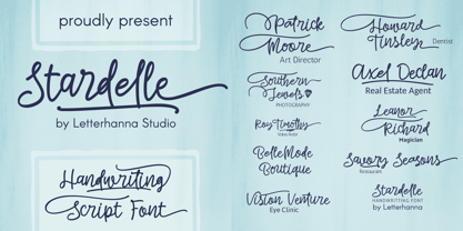 "Introducing 'Stardelle,' a bold and beautifully handcrafted font that adds a touch of elegance to your designs. With its flowing lines and abundant swashes, 'Stardelle' exudes charm and sophistication. This handwritten font is perfect for adding a personal and artistic flair to invitations, posters, branding, and more. Let 'Stardelle' illuminate your creativity and bring a touch of magic to your projects."
 - Conjur by chrismetcalfe,
$30.00This work is inspired by creatures that I have drawn for my six year old boy. The monsters can be found at chrismetcalfe.com. I wanted to take their hair/fur and translate the fun attitude to type. To be honest I think this font is used best as display type. However the fun attitude lends to many usages without structure. - Rahman by Kah Khiong Design,
$13.00 Rahman font is based on the idea of reflecting the personality of the first Prime Minister of Malaysia, Tunku Abdul Rahman in a typeface design. This sans serif font shows the founding father of Malaysia as a modern, simple, open-minded, uncomplicated and straightforward person. The font is suitable for posters, labels as well as book covers and paper printing.