10,000 search results
(0.115 seconds)
- Sears Tower - 100% free

- Cryptic by Jessie Makes Stuff,
$16.00 Cryptic is a font family of caps and small caps whose unique design was inspired by Morse Code. The traditional dots and dashes have been re-imagined as diamonds that you can read from top to bottom on the letters themselves. Secret code hidden within the letters, hence - Cryptic. This font family is truly versatile! The letters are all based on the character shapes of the Naked style, and all the diamonds have the same proportions, so you can stack and layer as many as you like to create a custom look for any project. Cryptic is perfect for website headers, posters, t-shirts, billboards, book covers, SVG cutting files, and anything else you want to add a little mystery, intrigue, or glitz to. Please note that some styles are better suited for larger scale projects to show off the fine details.
 - Nawin Latin by Letterjuice,
$66.00 Nawin is an informal Arabic typeface inspired by handwriting. The idea behind this design is to create a type family attractive and ownable for children but at the same time a design that keeps excellent letter recognition for reading. Handwriting has been a great source of inspiration in this particular typeface. By emulating the movements of the pen, we have obtained letter shapes that express spontaneity. A bright group of letters create a lively and beautiful paragraph of text. To get closer to handwriting and the variety of letter shapes that we draw while writing, this typeface offers a large number of alternative characters, which differ slightly from the default ones. Because we have programed the «Contextual Alternate» feature in the fonts, these alternate characters appear automatically as you set a text on your computer. For instance, in the Arabic variability on vertical proportions between letters Alef and initial Lam, create movement in text and avoid the cold mechanical feel of repetition. In the case of the Latin a part from having an entire alternate basic alphabet, there are also different letterforms for characters with diacritics, this way variability becomes even greater. Nawin is quirky and elegant at the same time. Letter recognition is relevant when reading continuous text. For this reason, in the Arabic, we have added another contextual alternate feature with alternate characters that help to avoid confusion when letters with similar or the same shape repeat inside one word. This is the case of medial «beh and Yeh» repeated three times continuously in the same word. The alternate characters change in shape and length, facilitating distinction to the reader. Since this typeface is inspired by handwriting and the free movement of the hand while writing, we considered ligatures a good asset for this design. The Arabic has a wide range of ligatures that enhance movement and fluidity in text making look text alive, while the Latin achieves this same effect via contextual alternates.
 - Nawin Arabic Ltn by Letterjuice,
$107.00 Nawin is an informal Arabic typeface inspired by handwriting. The idea behind this design is to create a type family attractive and ownable for children but at the same time a design that keeps excellent letter recognition for reading. Handwriting has been a great source of inspiration in this particular typeface. By emulating the movements of the pen, we have obtained letter shapes that express spontaneity. A bright group of letters create a lively and beautiful paragraph of text. To get closer to handwriting and the variety of letter shapes that we draw while writing, this typeface offers a large number of alternative characters, which differ slightly from the default ones. Because we have programed the «Contextual Alternate» feature in the fonts, these alternate characters appear automatically as you set a text on your computer. For instance, in the Arabic variability on vertical proportions between letters Alef and initial Lam, create movement in text and avoid the cold mechanical feel of repetition. In the case of the Latin a part from having an entire alternate basic alphabet, there are also different letterforms for characters with diacritics, this way variability becomes even greater. Nawin is quirky and elegant at the same time. Letter recognition is relevant when reading continuous text. For this reason, in the Arabic, we have added another contextual alternate feature with alternate characters that help to avoid confusion when letters with similar or the same shape repeat inside one word. This is the case of medial «beh and Yeh» repeated three times continuously in the same word. The alternate characters change in shape and length, facilitating distinction to the reader. Since this typeface is inspired by handwriting and the free movement of the hand while writing, we considered ligatures a good asset for this design. The Arabic has a wide range of ligatures that enhance movement and fluidity in text making look text alive, while the Latin achieves this same effect via contextual alternates.
 - Linotype Projekt by Linotype,
$29.99Linotype Projekt was created by German type designer Andreas Koch with both a well-defined inspiration and goal. It occurred to me that typefaces like Helvetica and Univers seemed to have a higher quality in hot-metal composition as with modern digital typesetting. They are stronger and livelier. This is in part due to the printing process, which presses the characters onto paper, and in part to the forms of the letters, which differ from the PostScript version of the same typeface. An important aspect of printing is the slight increase in character width resulting from the pressure which also serves as an optical correction to the forms. (True exact squares appear slightly barrel-formed to the eye.) I wanted to revive this peculiarity, not because of a nostalgic feeling, rather just because it is more attractive." The result is Linotype Projekt, a text font which is harmonious, clear and extremely legible. Koch lives in Bielefeld, Germany, and is a freelance book and type designer." - Proxemic by Sarid Ezra,
$15.00 Proxemic is a bold sans based font with unique lowercase that will make your logo and design looks advance and modern. With the unique characteristic lowercase, this font can make your logo even more stunning only with simple steps. You can use this font for any purpose, especially to make logotype. You can mix and match the uppercase and lowercase to make your logo more advanced. This font also comes with number, symbol, and multilingual support!
 - Organic Antique by Sarid Ezra,
$19.00 Introducing, Organic Antique, Handmade Blackletter Fonts Organic Antique is blackletter fonts with organic and handmade feels. Containing two styles, regular and true italic, will make your presentations more standout when you use both of the styles. With classic and vintage vibes, you can use this fonts for logotype, quotes, branding, or even movie poster. The hand lettered and rough of this fonts will also make your designs have more stunning and earthy. This fonts also support multi language!
 - Baku Gym by Nirmana Visual,
$24.00 Introducing our cutting-edge Sporty Techno font, designed to add a futuristic and sleek aesthetic to your designs. With its sharp lines, geometric forms, and high-tech vibe, this font is perfect for projects that require a modern and forward-looking visual identity. Inspired by the sleek designs of technology and the digital age, this font captures the essence of innovation and progress. Its clean and precise letterforms, along with its distinct futuristic style, make it an excellent choice for technology-based branding, gaming graphics, sci-fi posters, and digital interfaces.
 - Grafro Techno by Nirmana Visual,
$29.00 Introducing our cutting-edge techno font, designed to add a futuristic and sleek aesthetic to your designs. With its sharp lines, geometric forms, and high-tech vibe, this font is perfect for projects that require a modern and forward-looking visual identity. Inspired by the sleek designs of technology and the digital age, this font captures the essence of innovation and progress. Its clean and precise letterforms, along with its distinct futuristic style, make it an excellent choice for technology-based branding, gaming graphics, sci-fi posters, and digital interfaces.
 - Techno Charm by Nirmana Visual,
$24.00 Introducing our cutting-edge techno font, designed to add a futuristic and sleek aesthetic to your designs. With its sharp lines, geometric forms, and high-tech vibe, this font is perfect for projects that require a modern and forward-looking visual identity. Inspired by the sleek designs of technology and the digital age, this font captures the essence of innovation and progress. Its clean and precise letterforms, along with its distinct futuristic style, make it an excellent choice for technology-based branding, gaming graphics, sci-fi posters, and digital interfaces.
 - Superfast by Studio&Story,
$19.00 Superfast is a hand-written, flowing, script that will add a fast and sharp movement style to your projects. It charms you right at the beginning. If you are looking for a sensitive font that can respond to the vibe of your design, Superfast is the right choice. On the one hand it is elegant and luxurious, and on the other hand, trendy and modern. Created for beautiful logos, branding projects, posters, blog posts, social media, campaigns, advertising, web design and more! Superfast contains upper and lowercase characters, numerals and a large range of punctuation. Its OpenType features include 41 Ligatures and a large number of alternates, which make everything you write authentic and flowing.
 - Schnorr by HiH,
$10.00 Schnorr is a family of three fonts drawn by a German designer, Peter Schnorr. Schnorr Dekorativ is one of the less frequently seen of the alphabets he designed and one of the few for which he designed as lower case. Like many of the alphabets of the period, Schnorr Dekorativ is a delicate design. To provide a little more presence, we have added a DEMIBOLD version. Included in both Schnorr Dekorativ and Schnorr Demibold are an ornament of Schnorr’s design, seven T-ligatures and an alternate lower case t. 123=Ta, 125=Te, 135=Th, 137=Ornament, 167=Ti, 172=To, 188=Tr, 190=Tu and 177=alternate t. Schnorr’s design for the lower case t is unusual and not readily recognized. The alternate may be used to improve readability. Schnorr Initialen was designed as an upper case only design and as such is quite popular. It is often seen under the name of Odessa. Our font is a fresh scan and is paired with our Schnorr Demibold to provide a compatible lower case, along with all the rest of the auxiliary characters. Schnorr Initialen includes all the extras supplied with Schnorr Dekorativ and Schnorr Demibold: 123=Ta, 125=Te, 135=Th, 137=Ornament, 167=Ti, 172=To, 188=Tr, 190=Tu and 177=alternate t. In addition, Schnorr Initialen also includes an alternate uppercase I (172) and five lotus ornaments (123, 125, 167, 188 and 190).
 - Kambegi by Sealoung,
$25.00 Kambegi is a bold retro serif font with a casual feel and a clean, great modern retro aesthetic. Use this Kambegi serif font to add a special retro modern touch to any design idea you can think of. This font is PUA encoded which means you can access all glyphs and swashes easily via Character map or Character Viewer on mac! Feature : Uppercase & lowercase Numbers and punctuation Multilingual Alternates, swash & ligatures PUA encoded We highly recommend using a program that supports the OpenType feature and the Glyphs panel such as many Adobe and Corel Draw applications, so that you can view and access all variations of Glyphs.
 - Runestars by Letterhend,
$19.00 About the Product RuneStars is a organic display typeface with unique ligatures. This typeface has unique looks and strong character with natural looks because it was made by manual hand lettering. This font perfectly made to be applied especially in logo, and the other various formal forms such as invitations, labels, magazines, books, greeting / wedding cards, packaging, fashion, make up, stationery, novels, labels or any type of advertising purpose. Features : Numbers and punctuation Stylistic alternates multilingual PUA encoded We highly recommend using a program that supports OpenType features and Glyphs panels like many of Adobe apps and Corel Draw, so you can see and access all Glyph variations.
 - Hymers JNL by Jeff Levine,
$29.00 Born on May 8, 1892 in Reno Nevada, Lewis Franklin (“Lew” ) Hymers left an indelible mark as a caricaturist, cartoonist and graphic artist. At the age of twenty [in 1912] he worked for the San Francisco Chronicle. During World War I he worked for the Washington Post. He even was employed for a time by Walt Disney as an animator - but most of his life was spent in either Tujunga, California or his birthplace of Reno, Nevada as a self-employed illustrator. Hymers inked a feature for the Nevada State Journal called “Seen About Town”, which was published during the 1930s and 1940s. In this panel, he caricaturized many of the familiar faces around Reno. He also designed signs, logos, post cards and numerous other commercial illustrations for clients, but what has endeared him to a number of fans was his vast library of stock cuts (the predecessor to paper and electronic clip art) which feature his humorous characters in various professions and life situations. So popular is his work amongst those “in the know” that a clip art book collection of over seven hundred of his drawings that was issued by Dover Publications [but long out of print] commands asking prices ranging from just under $15 to well over $100 for a single copy. Lew Hymers passed away on February 5, 1953 just a few months shy of his 61st birthday. Although his artwork depicts the 1930s and 1940s lifestyles, equipment and conveniences, more than sixty years after his death they stand up amazingly well as cheerful pieces of nostalgia. The twenty-seven images (and some variants) in Hymers JNL were painstakingly re-drawn from scans of one of his catalogs and is but just a tiny fraction of the hundreds upon hundreds of illustrations from the pen of this prolific artist.
 - Feltboard JNL by Jeff Levine,
$29.00Feltboard JNL was drawn from images of letters and numbers contained in a felt board (also known as a flannel board) sign kit from the 1940s or 1950s. The irregularity of stroke widths and character shapes is representative of the actual shapes of the die-cut pieces found within this kit. Note: The cap height is slightly smaller than normal for the respective point size. This will give the effect of wider line spacing - similar to that of hand-made signs. - Runegrim by Beewest Studio,
$10.00 "Runegrim" Font is Base in Anchient Viking Rune Script . This font is best as Clothing , apharel and any handicraft. This font is Very useful for the the people that not familiar with Unicode format of anchient font. Thank You for use this font.
 - Rogan by Brink,
$30.00 Rogan: A Robust Modular Sans Rogans clean lines started out as an exercise in modularity and geometric forms. This initial construction approach was then adapted to improve the functionality of the family; Breaking away from the strictly modular system in exchange for more refinement and clarity. The resulting forms display a refined contemporary feeling alongside a hi- tech industrial element.
 - Viory by Sign Studio,
$15.00 Viory is a versatile font family. There are 7 thicknesses that match the italic version. They will complement each other to support your design. Equipped with Stylistic Set, Discretionary Ligature and Alternative Character features. Viory has a smooth shape because the pressure on each curve has been adjusted to the ideal. The impression of an elegant and classic is in this family.
 - Tourist Postcard JNL by Jeff Levine,
$29.00 Alf Becker graced many issues of “Signs of the Times” (a trade magazine for the sign industry) with his innovative hand lettered alphabets for others to use as design inspirations. His 134th submission was titled “Post Card Type”, a condensed thick-and-thin stylized Art Deco design. This served as the inspiration for Tourist Postcard JNL, which is available in both regular and oblique versions. Thanks to Tod Swormstedt of S.T. Media Group and the American Sign Museum for providing the work image for this type revival.
 - Zing Rust by Fontfabric,
$29.00 Zing Rust is a truly handmade type system consisting of 238 fonts. This incredible font family is based on layer combinations and gives endless possibilities to mix and make various designs. Each style could be used separate or merged in order to achieve all the creative designs you can imagine. The font is based entirely on hand writing which brings an aesthetics that can’t be imitated with any computer filters, scripts or plugins. Having moderate proportions Zing RustTM is the perfect solution for logos and headlines that really stand out. Zing Goodies As a dessert we serve you Zing GoodiesTM that tops off the whole package, making it the extraordinary delicacy! It has 4 basic forms—Bakery, BBQ, Banners and Words — with two style each, which contain plenty of adorable icons for any food and taste, elaborated banners, ribbons and ornaments, and even beautiful selection of useful words accentuating your design.
 - Tropical Leaves by Sakha Design,
$10.00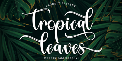 Tropical Leaves is a modern calligraphy font. It will add a luxury spark to any design project that you wish to create! This font is PUA encoded which means you can access all of the amazing glyphs and ligatures with ease!
 - Lightning Christmas by Letterafandi Studio,
$16.00 Lightning Christmas is handwitten font featuring stars light. It will add an awesome to any design project that you wish to create! This font is PUA encoded which means you can access all of the glyphs and swashes with ease!
 - Celan by Craft Supply Co,
$20.00 Introduction to Celan Bold Serif Font The Celan – Bold Serif font stands out with its robust and masculine appearance. It features thick, strong lines and minimal white space. This design choice gives it a dominant presence, making it ideal for impactful titles. Characteristics of the Font Celan is characterized by its bold, assertive strokes. The limited white space between letters enhances its solidity. This quality makes the font appear more masculine and forceful. Its serif design adds a touch of classic elegance. Ideal Uses of Celan – Bold Serif This font is perfect for powerful titles that need to command attention. Its boldness makes it suitable for headers in various mediums like posters, websites, and magazines. The strong character of the font conveys confidence and authority.
 - Kit Cloudkicker by Anastasia Kuznetsova,
$19.00 I present to you the universal everyday font 'Kit Cloudkicker'!! This font is very versatile and can be used in various styles of projects where a fast relaxed handwritten font is required. Filled with fun and energetic brush strokes, this font will undoubtedly add a touch of playfulness to your text - perfect for greeting cards, branding, merchandise, invitations and handmade quotes! The 'Kit Cloudkicker' font is so easy to use and create completely unique, hand-made words every time. It looks so great!! Font Features A-Z; a-z character set; 1 language (English); numbers and punctuation marks, symbols. A font containing uppercase and lowercase letters, numbers, and a wide range of punctuation marks. Fonts can be opened and used in any software that can read standard fonts, even in MS Word. No special software is required, and to get started. It is recommended to use it in Adobe Illustrator or Adobe Photoshop Made with love and magic ♡ Thanks for checking it out, and feel free to drop me a message if you had any queries! ~ Anastasia
 - Italiano Fushion New by RM&WD,
$35.00 Italiano Fushion is part of an expanding project on which we have been working for several years and which we are committed to in the future. Like the first two, this one too starts from the study of the great Futurist adventure of the early 1900s by great artists such as DEPERO and MARINETTI, who twisted the world of typography with shapes and colors. Italian Fushion is made up of almost 2,000 glyphs for each weight and in addition to hundreds of alternatives mainly, such as initials and endings of each word but also different alternatives for the letters I, J, Y. Thanks to the characteristics of Open Type, you can change them in automatic many of the alternatives, use it as a simple text font by changing only the I's and J's that have the typical capital dot, and giving the text a more fun breath to the composition. Italiano Fushion is suitable for large texts and to get the most out of it it is compulsory to transform the text into UPPERCASE text using the tabs of graphic applications such as Illustrator, or activate the Alternavive tabs and the various options of SS. Ideal for creating Logos, Head Lines, Web Titles, Posters, Epub Covers, Tatoo Projects, T-Shirts, Drink Labels ... Thanks
 - Solina by Scratch Design,
$14.00 Solina is an exciting typeface that is inspired by the future life which is full of robots, mechanics, speed races, automotive and life in space. References to this font are based on the science-fiction visual of the modern-futurism mindset, making it perfect for any project that requires a futuristic and technologically advanced design. This font is perfect for creating sci-fi movie posters, technology-based branding, packaging, event and festival materials, automotive designs, and many more.
 - Deutschmeister by RMU,
$25.00 This crisp and constructed Ludwig Wagner, Leipzig, blackletter font in textura style had been originally designed by Berthold Wolpe. Freshly redrawn and redesigned, it adds now to the treasure trove of historic typefaces. This font contains a bunch of useful ligatures, and it is recommended to activate Discretionary Ligatures too. By typing 'N', 'o' and period plus activating Ordinals you get an oldstyle numbersign. As usual in my blackletter fonts, the # key is occupied by the 'round' s.
 - Gazella by Raditya Type,
$14.00 GAZELLA Displays Fonts. This font has a unique and bold typeface, making it suitable for unique design themes. The unique binding of the serifs makes this typeface cool and stands out from the usual serif fonts, perfect for headlines, logos, posters, packaging, T-shirts, coffee shops, restaurants, magazine headers, signs or gift/post cards, cafes and weddings or any kind of advertising purposes. GAZELLA comes with uppercase, lowercase, Numbers, Punctuation, Ligatures and also Multi Language Support.
 - Oceanfront Property JNL by Jeff Levine,
$29.00 Oceanfront Property JNL was modeled from the hand lettered title on the cover of the 1932 sheet music for "There's Oceans of Love by the Beautiful Sea". A simple sans, it still reflects the beginnings of the Art Deco Era with its approach to letter forms and varying widths. This type design is available in both regular and oblique versions.
 - Good Vibes by Mysterylab,
$17.00 Good Vibes is a three-variation font family with a groovy retro vibe. This lettering style conjures up the early 1970s and the whimsical post-psychedelic graphic era. Stack the three styles to build different combinations of shaded and outlined layers. Good Vibes, as it's name suggests, has a charming and lively funkiness that will add splash and pizzazz to your designs.
 - Blankcho by Luhop Creative,
$12.00 Blankcho, There’s beauty in the plain version Blankcho, even without all the extras, for a clean and elegant minimal serif. Any version of Blankcho brings a touch of luxury and bespoke custom typography to modern logos, websites, social media quotes, wedding branding, and more. This font is PUA encoded which means you can access all of the amazing glyphs and ligatures with ease!
 - Guillermo by Homelessfonts,
$49.00 Homelessfonts is an initiative by the Arrels foundation to support, raise awareness and bring some dignity to the life of homeless people in Barcelona Spain. Each of the fonts was carefully digitized from the handwriting of different homeless people who agreed to participate in this initiative. Please Note: these fonts include only the latin alphabet; no accented characters, no numbers or punctuation. MyFonts is pleased to donate all revenue from the sales of Homelessfonts to the Arrels foundation in support of their mission to provide the homeless people in Barcelona with a path to independence with accommodations, food, social and health care. Guillermo was born in Argentina. And after crossing four continents and travelling in more than twenty countries, he still has his accent. His luck ran out on the streets of Barcelona. But despite his circumstances, he hasn’t lost a bit of his wit or articulacy. “The worst thing about the street is something that touches your heart, your brain. Not being able to have sex, not having any privacy until it leaves you empty.” On the street he follows his passion for art and writing as best he can, using old cardboard when he can’t find paper and listening to the music that comes to him. His way of thinking and expressing himself leaves people wide-eyed and open-mouthed, but even so he admits he’s a solitary man. “Solitude is an individual word. A solitary type like me can’t bring the word solitude to the whole world.”
 - DT Lythmore by Dragon Tongue Foundry,
$9.00 Lythmore This font is called Lythmore and is inspired by Lithos. Lithos was originally designed for Adobe by Carol Twombly in 1990, based it on the lettering from ancient Greek inscriptions. The Capitals are similar in feel and design, but is totally original and built from scratch. It is designed to be similar intentionally, but it is not a clone or rip off. Lithos is an example of a simple blocky san serif font style, with subtly concave sides, angled ends, and off centred curves. Lythmore is also an example of that same style. But is also different in places where I felt it could be improved. And it has a complete lower case set, which Lithos doesn't. I built Lythmore with 8 different weights. Lythmore can be very effective when used in advertising and general display work, but it can also be used for much more. Although it was never designed to be body copy, when used as such, it is still perfectly readable and adds its own version of sans serif style and flavour. I have included two versions of the Lythmore family. Lythmore A and Lythmore B. In the Lythmore A family, the lighter 4 weights all vary in weight in both the horizontal and vertical axis. The heavier 4 weights all vary in the horizontal axis only. In the Lythmore B family, the transition is even in both directions across the entire family. The result of this difference is that the A and B versions difference is most noticeable between the Regular and Medium weights. While the extreme ends of each family version are virtually identical.
 - Sanity by Popkern,
$- The design of Sanity typeface is modernized by abandoning any characteristics associated with hand writing, such as curved lines or elaborate corner details. The design is based on a rigid geometric grid and radiates confidence with its daring contrasts and provocative style. In large amounts of text the font “Sanity” can be hard to read due to a «dazzle» effect caused by alternating thick and thin strokes, particularly as the thin strokes are hardly visible at small point si es. Due to this quality, the “Sanity” font-family is best suitable for titles or large print advertisements. There are five key stylistic principles taken as a main framework for the creation of the “Sanity”: symmetry, contrast, geometry, artificiality and monospacing.
 - Aurelia Michelle by Letterhend,
$16.00 Meet Aurelia Michelle, the hand-drawn font that exudes effortless femininity and chic sophistication. With its brush texture and delicate curves, this font is perfect for adding a touch of elegance to any design project, especially in logo, and the other various formal forms such as invitations, labels, logos, magazines, books, greeting / wedding cards, packaging, fashion, make up, stationery, novels, labels or any type of advertising purpose. Features : Uppercase & lowercase Numbers and punctuation Alternates & Ligatures Multilingual PUA encoded We highly recommend using a program that supports OpenType features and Glyphs panels like many of Adobe apps and Corel Draw, so you can see and access all Glyph variations.
 - Queulat Condensed by Latinotype,
$- This font is the condensed version of Queulat, but keeping the same features as the original typeface. Queulat Cnd is a hybrid typeface that combines different styles, reflecting charm, freshness and, especially, a strong personality.. Since it is a condensed font, it is well-suited for publishing and subheadings. The font is inspired by Modern and Grotesk styles. The former is shown in some characteristic features such as teardrop terminals, which give the typeface an attractive unique look, making it an ideal choice for logotypes and labelling. The latter, with its rationality, makes Queulat Cnd a stable and strong face for headings and subheadings. The combination of styles can be clearly seen by comparing the Regular with the Alt version. The Regular version is more simple than the Alt one. Differently, the alternative version possesses more features of the Modern style, like teardrop terminals in ‘k’ and ‘v’.
 - Belwe by ITC,
$29.99The typeface Belwe, created in 1926 by German typographer and teacher Georg Belwe, has an uncommon style that is difficult to describe. It is a synthesis of many different genres: it is a slab serif with Art Nouveau style but also with many blackletter influences. The angled serifs on the ascenders and the calligraphic flourishes on the the upper and lowercase V, W, and Ys reference marks made by pens. There are also many other special characters that are unlike any other designs. Have a look at the fun lowercase a, the quirky lowercase f and g, and the unique C, F, L, and R for the uppercase. This design works especially well for display sizes, but is also good for short amounts of text. The mood and image suggested by this typeface is great for menus, invitations, and signs when you want to send a personal and friendly message. It's Art Nouveau roots also give it a place in history for designs from the Victorian period up through the 1920's and 30's - Belwe Mono by ITC,
$29.99 The typeface Belwe, created in 1926 by German typographer and teacher Georg Belwe, has an uncommon style that is difficult to describe. It is a synthesis of many different genres: it is a slab serif with Art Nouveau style but also with many blackletter influences. The angled serifs on the ascenders and the calligraphic flourishes on the the upper and lowercase V, W, and Ys reference marks made by pens. There are also many other special characters that are unlike any other designs. Have a look at the fun lowercase a, the quirky lowercase f and g, and the unique C, F, L, and R for the uppercase. This design works especially well for display sizes, but is also good for short amounts of text. The mood and image suggested by this typeface is great for menus, invitations, and signs when you want to send a personal and friendly message. It's Art Nouveau roots also give it a place in history for designs from the Victorian period up through the 1920's and 30's
 - Reimbrandt by IKIIKOWRK,
$19.00 Proudly Present Reimbrandt - Art Nouveau Type, created by ikiiko. Reimbrandt is a classic typeface that is a perfect representation of the timelessness and romance of the past, inspired by the beautiful Art Nouveau era. This alluring typeface transports you back to a time when elegance and grace were the norm. This font exudes beauty and romance with its simple, decorative shapes reminiscent of the painstaking craftsmanship of the Art Nouveau era. This typeface is perfect for an vintage vibes, classic & vintage poster layout, fashion look book, book cover, packaging, food & beverages and also good for quotes, or simply as a stylish text overlay to any background image. What's included? Uppercase & Lowercase Number & Punctuation Multilingual Support Works on PC & Mac
