3,252 search results
(0.018 seconds)
- Corner D by CarnokyType,
$20.00 Corner D is a part of Corner type family. This subfamily is designed with inverse rounded shapes in the corners. The concept of the typeface Corner is based on variation of corner shapes in font characters, from what is also its name derived. The basis is a bitmap modular principle, to which by simple addition of “the missing pixels” in corners of the characters ( Corner A ) to the shape of diagonal ( Corner B ), curvature ( Corner C ), or inversion curvature (Corner D), three more font variations are created. The basic monolinear bitmap weight is supplemented by two more extreme thicknesses – hairline and fat weight. The character set supports the complete Latin, while the x-height of lowercase is drawn at the same height as in the uppercase characters. Corner is a strong display typeface, which allows you to easily experiment and to combine it with its mutual font variations.
 - Corner A by CarnokyType,
$20.00 Corner A is a part of Corner type family. This subfamily is designed with square shapes in the corners. The concept of the typeface Corner is based on variation of corner shapes in font characters, from what is also its name derived. The basis is a bitmap modular principle, to which by simple addition of “the missing pixels” in corners of the characters (Corner A) to the shape of diagonal ( Corner B ), curvature ( Corner C ), or inversion curvature ( Corner D ), three more font variations are created. The basic monolinear bitmap weight is supplemented by two more extreme thicknesses – hairline and fat weight. The character set supports the complete Latin, while the x-height of lowercase is drawn at the same height as in the uppercase characters. Corner is a strong display typeface, which allows you to easily experiment and to combine it with its mutual font variations.
 - Horier Time by Letterhend,
$17.00 Unveil the depths of terror and embrace the macabre with our latest font creation,Horier Time - – a bloody mesmerizing horror display font. Prepare to embark on a spine-tingling journey into the darkest realms of design, where fear and fascination intertwine. Features : Uppercase & lowercase Numbers and punctuation Alternates/Ligatures Multilingual PUA encoded
 - Corner B by CarnokyType,
$20.00 Corner B is a part of Corner type family. This subfamily is designed with diagonal shapes in the corners. The concept of the typeface Corner is based on variation of corner shapes in font characters, from what is also its name derived. The basis is a bitmap modular principle, to which by simple addition of “the missing pixels” in corners of the characters ( Corner A ) to the shape of diagonal (Corner B), curvature ( Corner C ), or inversion curvature ( Corner D ), three more font variations are created. The basic monolinear bitmap weight is supplemented by two more extreme thicknesses – hairline and fat weight. The character set supports the complete Latin, while the x-height of lowercase is drawn at the same height as in the uppercase characters. Corner is a strong display typeface, which allows you to easily experiment and to combine it with its mutual font variations.
 - Le Monde Courrier Std by Typofonderie,
$59.00 A rounded slab in 4 styles In our age, since the arrival of microcomputing, the majority of professional letters have been composed in quality typefaces. Typewriters & the typestyles they used have become antiques. A letter set in Times or Helvetica & printed with a laser printer at 600 dpi or more are of such quality that one can no longer distinguish it with a document produced by offset printing. But letters composed in this way appear overly institutional when a bit of informality is needed. Le Monde Courrier, designed by Jean François Porchez, attempts to re-establish a style halfway between writing and printing. Informal neo-tech style This rounded slab serif returns the informal character of “typewritten” fonts to letters and suit well all bad conditions, from inkjet printed memos to webfonts use. With a unique typographic colour, it integrate itself with the rest of the Le Monde family with effective contrast. The verticals metrics and proportions of Le Monde Courrier are calibrated to match perfectly others Typofonderie families. Bukva:raz 2001 Type Directors Club .44 1998 European Design Awards 1998
 - Digital Counter 7 - Personal use only

- LED Counter 7 - Personal use only

- 1786 GLC Fournier by GLC,
$38.00This family was inspired by numerous documents and books printed in Paris during the end of the 1700s. Mainly, documents printed by P.G. Simon & N.H. Nyon, “Printers of the parliament” were used for the Normal and italic styles and “Caps”. “Titling” characters were coming from a collection of hymns printed by Nicolas Chapart. In France these Fournier characters, as Baskerville in Great Britain, were the most often in use in the late 1700s, just before the Didot designs. This font supports strong enlargements, specially the capitals of “Caps” file and “Titling”, remaining very smart, elegant and fine. - PS Fournier Std by Typofonderie,
$59.00 Style and elegance in 14 styles PS Fournier, created by Stéphane Elbaz, is designed in tribute to Pierre Simon Fournier. Fournier was the prolific Parisian type designer whose work is best known for its iconic representation of French transitional style. PS Fournier elegantly represents the transition to the modern era of typography. Featuring three optical sizes, PS Fournier is designed to perform in any context. The Pierre Simon Fournier heritage Pierre Simon Fournier (1712—1768) was a leading innovative type designer of the mid-18th century. Early in his career, the young Pierre Simon developed a strong aesthetic that he cultivated throughout his life. His art is representative of the pre-revolutionary “Age of Enlightenment” (Siècle des Lumières). Precursor of the Modern style, Fournier’s body of work deeply influenced his times, and created the fertile ground from which the Didot family and Giambattista Bodoni developed their own styles. During the historical period of the 18th century, Fournier exemplified the intellectual pursuits of the times with his own research on type, documenting in detail the typefounding process. He also offered a unique vision: he is the first to clearly comprehend the concept of “type family,” sorting a set of similarly styled alphabets by sizes, width, and by x-heights. In addition, Fournier is one of the earliest advocates of the point system to organize the practice of typography, the point system that contemporary typographers continue to use to this day. The refined and discreet elegance of PS Fournier With a close look at the family, one finds you’ll find that the difference between the optical sizes (Petit, standard and Grand) is more than a contrast variation between the thin and the thick; the eye can also denote a palette of distinct tones: More streamlined and robust in the smaller sizes (Petit), more refined and detailed in the larger sizes (Grand). The PS Fournier standard family is designed to adapt to any situation with its intermediate optical size, from body copy to headlines. With a bit of tracking, PS Fournier Petit will make the smallest captions perfectly readable. However, Petit family is not limited to body and captions — its “slabby robustness” will make a relevant headline choice as well. PS Fournier Grand presents a higher contrast adapted to large text sizes, displays or banners. Its refined elegance makes it a perfect choice for Design, Fashion or Luxury publications. As a “modern” type PS Fournier Grand features a larger x-height than the preexistent old style typefaces such as Garamond or Jenson. These proportions provide any basic text set in PS Fournier Grand a strong typographic texture. As a result, the PS Fournier global family is a versatile alternative to the Modern typefaces commonly used in the publishing industry. The optical sizes, the large range of weights, and the design variations make this family adaptable to captions, paragraphs, and pages, as well as to large texts and displays. A leading-edge typography in the 18th century In the spirit of modernity, Pierre Simon Fournier did not find any use for the conventional swashes still produced by peers such as Caslon or Baskerville. Nevertheless the French designer created many inventive elements to decorate the page and set delightful variations in the text itself. To this regard PS Fournier includes a large set of glyphs variations, ligatures and more than one hundred glyphs for borders, rules and ornaments or — as called in French — “vignettes.” PS Fournier: A tribute to the French modern typography era by Stéphane Elbaz
 - Perfume Counter JNL by Jeff Levine,
$29.00 Perfume Counter JNL was based on the hand lettered song title found on the 1938 sheet music for "At A Perfume Counter (On the Rue de la Paix)" from Billy Rose's New York revue "Casa Mañana", and is available in both regular and oblique versions.
 - Counter Service JNL by Jeff Levine,
$29.00 The hand lettered name “Chickland” from a 1958 restaurant menu cover was actually a throwback to the Art Deco style with its condensed thick and thin sans serif design. With just a few available letters to work with, it has been turned into Counter Service JNL; available in both regular and oblique versions.
 - Lefferts Corners 2 - Unknown license

- KR Corners 2 - Unknown license

- Corner Store JF by Jukebox Collection,
$32.99
- EF Copier Pi by Elsner+Flake,
$35.00 - Street Corner Racing by Sipanji21,
$15.00 "Street Corner" is a display font with a Racing and futuristic theme, perfect for design projects such as sports jerseys, athletic shoes, helmets, and other sports-related products. With its dynamic appearance, this font brings a sense of energy and movement to your designs. The clean lines and modern feel of "Street Corner" make it an excellent choice for projects that require a sleek and contemporary look. Whether you're designing for a sports team or creating an athletic product, "Street Corner" will help you create a strong and memorable brand identity that embodies the spirit of sports and the future.
 - Inglenook Corner NF by Nick's Fonts,
$10.00This whimsical wonder is based on the lettering of Laurence Schall, as presented in Lewis F. Day's 1910 classic, Alphabets Old and New. The typeface radiates a charm reminiscent of the works of many talented artists (including Howard Pyle and Arthur Rackham) who illustrated children's books around the turn of the twentieth century. The Opentype version of this font supports Unicode 1250 (Central European) languages, as well as Unicode 1252 (Latin) languages. - Conners Corners NF by Nick's Fonts,
$10.00 Here's another collection of ornate border elements gleaned from the 1888 specimen books of James Conner's Sons United States Type Foundry in New York City. Refer to the PDF guide for detailed, yet simple, instructions for constructing nine delightfully different border patterns.
 - VLNL Tp Kurier by VetteLetters,
$35.00 VetteLetters is proud to bring you the TpKurier-family. It is cooked up by our German chef Martin Lorenz currently living in lovely Barcelona! Chef Lorenz about the TpKurier recipe: “TpKurier is the second redesign we did of Courier. The first redesign in 2000, although based on a five-unit grid, was drawn completely by hand. Six years later we designed another grid version of Courier, and the TpKurier family was born. This version is completely constructed up till its last detail. We didn't want to correct ‘mistakes’ deriving from the use of the grid, but instead make them visible (see “S”). TpKurier is based on a very simple grid, composed a proportion of four units high by two units wide. A series of other links between them make it possible to form a font from this grid. We felt it was important to consistently work within these limitations so that any unexpected asperities would help provide the font with its character. Even though it is a rough constructed typeface it was important to us to design real italic lower case letters and not just a sloped roman (see “a”, “g” or “s”). The first family published contained a serif and sans-serif version of the TpKurier, with italic and bold.”
 - LTC Fournier Le Jeune by Lanston Type Co.,
$24.95 Based on the all caps decorative face Fournier le Jeune of 1768 by Pierre Simon Fournier for the Peignot Foundry. This version uses more elaborate "Vouge Initials" caps which were offered by ATF in 1920s. Because of the decorative nature of this design, a full character set is not included, but accented characters and basic punctuation are included.
 - Antique Borders & Corners 2 by Aerotype,
$29.00 Hand selected from multiple sources, the 60+ glyphs of Antique Borders & Corners 2 can be mixed and matched to make authentic 18th and 19th century borders of any length. Flip the orientation for 'bottom' borders with the shift key.
 - MFC Bruce Corners One by Monogram Fonts Co.,
$19.95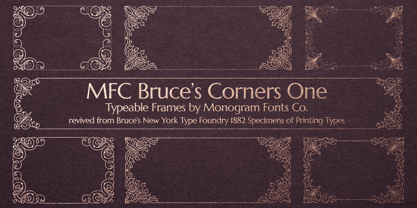
- MFC Franklin Corners Four by Monogram Fonts Co.,
$19.95
- Just Around The Corner by Armandop,
$10.00 - MFC Franklin Corners Two by Monogram Fonts Co.,
$19.95
- Antique Borders & Corners 1 by Aerotype,
$29.00 Hand selected from multiple sources, the 60+ glyphs of Antique Borders & Corners 1 can be mixed and matched to make authentic 18th and 19th century borders of any length. Flip the orientation for 'bottom' borders with the shift key.
 - MFC Franklin Corners One by Monogram Fonts Co.,
$19.95
- MFC Franklin Corners Five by Monogram Fonts Co.,
$19.95
- MFC Bruce Corners Three by Monogram Fonts Co.,
$19.95
- MFC Bruce Corners Two by Monogram Fonts Co.,
$19.95
- MFC Franklin Corners Six by Monogram Fonts Co.,
$19.95
- MFC Franklin Corners Three by Monogram Fonts Co.,
$19.95
- KG Corner Of The Sky by Kimberly Geswein,
$5.00 A fatter, more kid-friendly version of KG Lego House, this font is designed specifically for elementary teachers who requested a neat, legible font with a thicker outline.
 - Aminta by Alias Collection,
$60.00 Aminta is an eclectic and expressive take on the Courier aesthetic. Aminta mixes the utility aesthetic of Courier, the default computer typeface and subversive piece of non-design graphic designers are presented with in the top left hand corner of Quark documents, and eclectic and expressive letterforms derived from drawing and handwriting.
 - Manometer by Fontador,
$18.99 Manometer is a pneumatic ultra-black slab serif typeface with soft corners and fine counters.
 - Shirin by Ahmet Altun,
$- With this nice, rounded-corner handwriting font that is like comic, slab style; sweet and radiant logos, texts and every kind of graphics, editions and printings like magazines, brochures can be created. Text printouts look pretty smart.
 - Isotonic by Emtype Foundry,
$69.00 Isotonic started out as a spin-off with the idea of creating a text oriented version of Ciutadella, it has since taken on a life of its own. Building on a foundation that has proven to work very well, we decided to open the counters and increase the x height. Even though it is not strictly a text font, it works surprisingly well in body sizes and screens. The soft corners gives charm, closeness and an appropriate voice for sports, science, tech, economy etc. Learn more about the design process of Isotonic at the Emtype’s Blog.
 - Magnel by Eimantas Paškonis,
$10.00 Magnel is designed for headlines, posters and big sizes. Besides most Latin alphabet languages, it packs dozens of (accented) ligatures and every single letter has a smart swash variant that when enabled in OT-aware application, conveniently occurs at the start/end of line. Other OT features include: lining/oldstyle numerals, ordinals, popular fractions, capital spacing, scientific superiors/inferiors.
 - Niemi by Blank Is The New Black,
$10.00 Niemi is a continuation of the work started with Versteeg. Where Versteeg was separated into individual circles, Huet connects these circles and adds a sharp geometric style. This creates a nice juxtaposition between the rounded ends, and sharp corners.
 - Bruna by Antonio Lechuga,
$35.00 Its open counters and large x height give it excellent performance in small sizes. On the other hand, its curved diagonals, generous width and soft shapes give it a friendly but functional personality for a wide range of messages and voices. We recommend the four most extreme weights (Thin, ExtraLight, Black, and Heavy) for large sizes starting at 18 points, and the five intermediate weights (Light, Book, Regular, Medium, and Bold) for small sizes starting at 7 points.


