10,000 search results
(0.023 seconds)
- Staxx Pro by RMU,
$45.00 Staxx Pro - a fantastic plastic display font - for ads, posters, billboards, covers, car and truck design etc.
 - Grandeur by BA Graphics,
$45.00A contemporary design can be used in all applications from text to Headlines. Very clean and readable. - Domestic Bliss by Funk King,
$10.00 Domestic Bliss is a perky dot fonts that can bring some fun and bounce to your project.
 - Badinerie by JBFoundry,
$16.00 Badinerie is a cursive font family with decorative variations. You can choose simplicity, swash, love or flowers.
 - KG Makes You Stronger by Kimberly Geswein,
$5.00 Crayon-style script handwriting. Can also work as a colored pencil or chalk handwriting. Perfect for teachers!
 - Kingdom by Funk King,
$15.00 Kingdom is a castle font. You can use the characters for display and build your own castle.
 - Sevigne ST by Reserves,
$39.99 Sevigne [sey-vee-nyey] is a highly refined, contemporary geometric stencil, inspired by the ambience of high-end fashion and luxury combined with the raw, utilitarian nature of the stencil. The inclusion of over 130 unique ligatures expand it’s sensibility of alluring, well-balanced letterforms and distinctive style. The stencil marks are atypically placed and vary throughout, giving it a purposely forward presence. Stylistically, as an all-caps typeface, Sevigne exudes a greater sense of harmony and polish due to it’s unicase form where the interplay of a limited amount of characters is the focus. Subtle, considered details are found within individual letters, contrasted by the complex, intersecting forms that make up the various ligatures. With multiple stylistic sets added to the expanded ligatures, individual letters and ligature pairs can be carefully exchanged to fine-tune text settings for a unique custom type solution. Features include: Precision kerning- Expanded set of over 130 Ligatures, including alternates (ae, oe, fi, fl, ffi, ffl, ffj, ff, fh, fj, ft, tt, th, ct, st, oo, og, go, ogo, gog, la, ea, ev, ew, fy, ez, et, oc, ga, do, uv, vu, yu, uy, nn, mm, xy, yx, ao, oa, ac, da, aq, nt, aa, ll, ss, ut, tu, ka, ca, ag, of, off, co, ne, nr, nl, nd, nk, hn, mn, me, mp, al, an, af, ar, ak, ah, ad, ab, and, gg, all, co, ço, he, the, tl, tn, tf, tr, tk, td, tb, te, am, ame, amb, tm, ap, tp, wu, uw, kt, tz, ra, za, mk, xx, yy, vv, ww, ky, fu, oq, cc, cq) Alternate characters (A, G, R, Q, _, $, ®, •, ¶) Slashed zero Full set of numerators/denominators Automatic fraction feature (supports any fraction combination) Extended language support (Latin-1 and Latin Extended-A) *Requires an application with OpenType and/or Unicode support.
 - Sevigne by Reserves,
$39.99 Sevigne [sey-vee-nyey] is a highly refined, contemporary geometric sans, inspired by the ambience of high-end fashion and luxury. The inclusion of over 130 unique ligatures expand its sensibility of alluring, well-balanced letterforms and distinctive style. Stylistically, as an all-caps typeface, Sevigne exudes a greater sense of harmony and polish due to its unicase form where the interplay of a limited amount of characters is the focus. Subtle, considered details are found within individual letters, contrasted by the complex, intersecting forms that make up the various ligatures. With multiple stylistic sets added to the expanded ligatures, individual letters and ligature pairs can be carefully exchanged to fine-tune text settings for a unique custom type solution. Features include: Precision kerning- Expanded set of over 130 Ligatures, including alternates (ae, oe, fi, fl, ffi, ffl, ffj, ff, fh, fj, ft, tt, th, ct, st, oo, og, go, ogo, gog, la, ea, ev, ew, fy, ez, et, oc, ga, do, uv, vu, yu, uy, nn, mm, xy, yx, ao, oa, ac, da, aq, nt, aa, ll, ss, ut, tu, ka, ca, ag, of, off, co, ne, nr, nl, nd, nk, hn, mn, me, mp, al, an, af, ar, ak, ah, ad, ab, and, gg, all, co, ço, he, the, tl, tn, tf, tr, tk, td, tb, te, am, ame, amb, tm, ap, tp, wu, uw, kt, tz, ra, za, mk, xx, yy, vv, ww, ky, fu, oq, cc, cq) Alternate characters (A, G, R, Q, Z, _, $, ®, •, ¶) Slashed zero Full set of numerators/denominators Automatic fraction feature (supports any fraction combination) Extended language support (Latin-1 and Latin Extended-A) *Requires an application with OpenType and/or Unicode support.
 - Neue Frutiger Paneuropean by Linotype,
$79.00During planning for the new Roissy Charles de Gaulle airport in Paris at the beginning of the 1970s, it was determined that the airport's signage system had to include the clearest and most legible lettering possible. The development of all signage was put into the hands of Adrian Frutiger and his studio. The team carried out their task so effectively that a huge demand for their typeface soon arose from customers who wanted to employ it in other signage systems, and in printed materials as well. The Frutiger® typeface not only established new standards for signage, but also for a range of other areas in which a clear and legible design would be required, especially for small point sizes and bread-and-butter type. The typeface family that which emerged as a result of this demand was added into the Linotype library as "Frutiger" in 1977. Frutiger Next, created in 1999, is a further development of Frutiger, not necessarily a rethinking of the design itself. It was based on a new concept, the most obvious visual characteristics of which is the larger x-height, as well as a more pronounced ascender height and descender depth for lower case letters in relation to capitals. This new design created a balanced image and included considerably narrower letterspacing. Frutiger Next meets the demand for a space-saving, modern humanist sans. 2009's Neue Frutiger is a rethink of the 1977 Frutiger family, now revised and improved by Akira Kobayashi in close collaboration with Adrian Frutiger. Despite the various changes, this "New Frutiger" still fits perfectly with the original Frutiger family, and serves to harmoniously enhance the weights and styles already in existence. The perfect mix, guaranteed Neue Frutiger has the same character height as Frutiger. As a result of this, already existing Frutiger styles can be mixed with Neue Frutiger where necessary. Likewise, Neue Frutiger is perfect for use alongside Frutiger Serif. Newly added are the "Neue Frutiger 1450" weights. Especially for the requirements of the newly released German DIN 1450 norm we have built together with Adrian Frutiger specific weights of the Neue Frutiger. The lowercase l" is curved at the baseline to better differentiate between the cap "I", additionally the number "0" has a dot inside to better differentiate between the cap "O", and the number "1" is now a serifed 1. The font contains additionally the origin letterforms from the regular Neue Frutiger font which can be accessed through an Opentype feature." - Neue Frutiger Cyrillic by Linotype,
$89.00During planning for the new Roissy Charles de Gaulle airport in Paris at the beginning of the 1970s, it was determined that the airport's signage system had to include the clearest and most legible lettering possible. The development of all signage was put into the hands of Adrian Frutiger and his studio. The team carried out their task so effectively that a huge demand for their typeface soon arose from customers who wanted to employ it in other signage systems, and in printed materials as well. The Frutiger® typeface not only established new standards for signage, but also for a range of other areas in which a clear and legible design would be required, especially for small point sizes and bread-and-butter type. The typeface family that which emerged as a result of this demand was added into the Linotype library as "Frutiger" in 1977. Frutiger Next, created in 1999, is a further development of Frutiger, not necessarily a rethinking of the design itself. It was based on a new concept, the most obvious visual characteristics of which is the larger x-height, as well as a more pronounced ascender height and descender depth for lower case letters in relation to capitals. This new design created a balanced image and included considerably narrower letterspacing. Frutiger Next meets the demand for a space-saving, modern humanist sans. 2009's Neue Frutiger is a rethink of the 1977 Frutiger family, now revised and improved by Akira Kobayashi in close collaboration with Adrian Frutiger. Despite the various changes, this "New Frutiger" still fits perfectly with the original Frutiger family, and serves to harmoniously enhance the weights and styles already in existence. The perfect mix, guaranteed Neue Frutiger has the same character height as Frutiger. As a result of this, already existing Frutiger styles can be mixed with Neue Frutiger where necessary. Likewise, Neue Frutiger is perfect for use alongside Frutiger Serif. Newly added are the "Neue Frutiger 1450" weights. Especially for the requirements of the newly released German DIN 1450 norm we have built together with Adrian Frutiger specific weights of the Neue Frutiger. The lowercase l" is curved at the baseline to better differentiate between the cap "I", additionally the number "0" has a dot inside to better differentiate between the cap "O", and the number "1" is now a serifed 1. The font contains additionally the origin letterforms from the regular Neue Frutiger font which can be accessed through an Opentype feature." - Neue Frutiger 1450 by Linotype,
$71.99 During planning for the new Roissy Charles de Gaulle airport in Paris at the beginning of the 1970s, it was determined that the airport's signage system had to include the clearest and most legible lettering possible. The development of all signage was put into the hands of Adrian Frutiger and his studio. The team carried out their task so effectively that a huge demand for their typeface soon arose from customers who wanted to employ it in other signage systems, and in printed materials as well. The Frutiger® typeface not only established new standards for signage, but also for a range of other areas in which a clear and legible design would be required, especially for small point sizes and bread-and-butter type. The typeface family that which emerged as a result of this demand was added into the Linotype library as "Frutiger" in 1977. Frutiger Next, created in 1999, is a further development of Frutiger, not necessarily a rethinking of the design itself. It was based on a new concept, the most obvious visual characteristics of which is the larger x-height, as well as a more pronounced ascender height and descender depth for lower case letters in relation to capitals. This new design created a balanced image and included considerably narrower letterspacing. Frutiger Next meets the demand for a space-saving, modern humanist sans. 2009's Neue Frutiger is a rethink of the 1977 Frutiger family, now revised and improved by Akira Kobayashi in close collaboration with Adrian Frutiger. Despite the various changes, this "New Frutiger" still fits perfectly with the original Frutiger family, and serves to harmoniously enhance the weights and styles already in existence. The perfect mix, guaranteed Neue Frutiger has the same character height as Frutiger. As a result of this, already existing Frutiger styles can be mixed with Neue Frutiger where necessary. Likewise, Neue Frutiger is perfect for use alongside Frutiger Serif. Newly added are the "Neue Frutiger 1450" weights. Especially for the requirements of the newly released German DIN 1450 norm we have built together with Adrian Frutiger specific weights of the Neue Frutiger. The lowercase l" is curved at the baseline to better differentiate between the cap "I", additionally the number "0" has a dot inside to better differentiate between the cap "O", and the number "1" is now a serifed 1. The font contains additionally the origin letterforms from the regular Neue Frutiger font which can be accessed through an Opentype feature."
 - Ecatherina by BlessedPrint,
$23.00 Hi! It took me almost a year to design Ecatherina script. Finally it is available to purchase! Ecatherina script is an opentype font-family (15 fonts: 5 styles for 3 line thickness) with a bonus (editable wedding invitations, menu, quotes, letters, and more) HOW TO GET ACCESS TO ALTERNATES? Absolutely easy, just type a number after any letter: a1, a2, a3 etc Capital letters have 3-4 options and more. So just type E1, E2, E3 etc and find your favourite one! I found this method the most useful when you need to experiment with design very fast. All characters are available through Glyph panel as well, even more each of the alternate letter has it’s own unicode (PUA) so you can copy/paste from Apple Font Book or Windows Character Map. Total amount of glyphs 1436. Compatible with SILHOUETTE & CRICUT DESIGN SPACE WHAT IS INCLUDED BP-Ecatherina OTF & TTF It goes with 5 weights: Thin, Medium, Regular, Bold, UltraBold BP-Ecatherina-Ex1 The only difference between previous font is that thin line is a bit thicker. BP-Ecatherina-Ex2 Even more thicker line. Help.pdf Help file with most common questions. Bonus - Ecatherina.fig with editable wedding invitations (10+ designs 5x7 inches), menu, quotes, letters. Important! You need to install Figma application (it is free) to access files. With Figma application you can import bonus files and edit the text, export as png, pdf, svg and print it. Bonus - help.pdf file with general information how to work with Figma if you are new. It is very easy application and I recommend it to you! It works with MS Word, I included example.docx file so you can understand how to work.
 - Karoline by Gilar Studio,
$16.00 Karoline is a lovely script font with beginning and ending swashes, 31 ligatures that add more beautiful and aesthetic fonts to perfect your extraordinary project. Karoline is a lovely script with handwritten, sophisticated flows. It is perfect for branding, wedding invites, and other romantic projects. "Karoline" includes a full set of uppercase and lowercase letters, multilingual symbols, Alternate,numerals, punctuation and ligatures. Also it includes: -short lowercase beginning and ending swashes which serve to connect two words or letters (This is so perfect for invitations, monograms) All of features and special characters of this font are included in one file. So it is easy to accessed by using program or software that support the opentype like Adobe Illustrator, Adobe Photosop, and Adobe Indesign). This font also very easy to use because compatible for all software even for non-opentype supported.so it would be perfect for all types of printing techniques+you can do embroidery, laser-cut, gold foil, etc. You can mix and match with Opentype feature: Ekstras 31 ligature More than 540 of glyphs Alternates Stylistic sets from ss01 to ss04 If you don't have a program that supports OpenType features such as Adobe Illustrator and CorelDraw X Versions, you can access all the alternate glyphs using Font Book (Mac) or Character Map (Windows). To Access Alternate Characters Click The Link Below: Adobe illustrator CS https://www.youtube.com/watch?v=geL0Ye02Ryk Adobe illustrator CC https://www.youtube.com/watch?v=V25yiUh8BcE Ms Word https://www.youtube.com/watch?v=HxkhZiCuwEw Coreldraw X7 https://www.youtube.com/watch?v=UBVsufJjons Adobe Photoshop CC https://www.youtube.com/watch?v=BYKXl58AdNY Indesign CS https://www.youtube.com/watch?v=HgZTCxKG14Q Check my other Font here : https://gilarstudio.com/ Thanks and happy designing :-)
 - The Auratype by Auratype Studio,
$9.00 Hai Folks! The Auratype is retro and classic typeface who inspired by the 60s - 80s designs with more unique explored style like swosh and alternate character. This font made from manual sketch with many many scratch then finished to font. Make your designs project with this font and extras illustration to give more superb. This font also suitable to design like logo, sticker, tees design, banner, poster, sign, display design, packaging and more superb designs! Enyoy with our product and feel free contact us for support! Features : Full set of Upper & Lowercase Character Number & Punctuation Swosh Alternate Extras Illustration Multilingual Language PUA encoded Opentype Features _________ ▼To using the feature OpenType Stylistic alternate (including swosh), you must use program that supports OpenType such as Adobe Illustrator CS, Adobe Indesign, Corel Draw X6-X7 and Microsoft Office 2010 or later versions. Additional way to access alternate/swoshes are using Character Map (Windows), Nexus Font (Windows), Font Book (Mac), or more program which has Pop Character. ▼For more information about accessing alternative, you can see on this link : http://adobe.ly/1m1fn4Y ✌ Get in touch with author https://www.instagram.com/wahyudwi.cc/ https://www.instagram.com/auratype/ https://www.behance.net/fontsfighters ❤ Thank you for purchasing our product and supporting us! We hope this font can be part of your designs project. If you have other queries, questions or issues, just feel free and have fun to contact us directly. We are glad if we can help you more! If you are happy with our product, please put your star into our design reviews, it was so fantastic moment for us. Thanks! :)
 - Ignazio by Figuree Studio,
$18.00 Ignazio is a powerfull sans serif font family with modern touches. A balance of hard lines and smooth curve makes them able to stand on their own dynamically Ignazio includes all-caps fonts Features - Support for MAC or PC - Simple installation for Adobe Illustrator, Corel Draw, Photoshop, or Procreate (New Updated) - Support Multi-language Ignazio works great in any branding, logos, magazines, films. The different styles give you a full range to explore a whole host of applications.
 - Tape Up by Ingrimayne Type,
$9.00 The letters in TapedUp are constructed from straight pieces of what could be masking tape. The letters have a unsophisticated or unpolished quality to them. The typeface is caps-only but many of the shapes on the lower-case keys differ from those on the upper-case keys. It was formed with a template used for several letterbat fonts and also typefaces Rumpled and Tinkerer. The family has six styles: regular, bold, shadowed, oblique. bold oblique, and shadowed oblique.
 - Questal by insigne,
$21.99 Questal is an intriguing unicase serif. The face appears rather eccentric, yet it still retains a refined character. The typeface is wider than most, but not to the degree that Aviano is extended. The font includes some interesting OpenType alternate characters to extend the quirky quality of the letterforms even further. If unicase isn't your thing, the Questal family also includes a small caps variant for more traditional uses. Use Questal for eye-catching and distinctive logotypes or headlines.
 - Vine Street by Proportional Lime,
$9.99 VineStreet a place somehow familiar to everyone in the English speaking world. It might be just around the corner or the next town over. This font gives that aged feel of comfort and familiarity and the authority of tradition. The example for this font was derived from a ecclesiastical history published by the Caxton Press of the Sherman & Co. of Philadelphia and was originally developed prior to 1867. This font has over 1000 defined glyphs and small caps included.
 - Rum Soft Serif by Trine Rask,
$30.00 Rum Soft Serif is a soft version of Rum Serif with softly rounded outer corners. Rum Soft Serif is a text & display family suitable for any purpose, any media, any size. A humanistic modular Serif in five weights containing small caps, italic, swashes, alternative characters, old style, lining, tabular & proportional figures. Design date: 2011-2023 The complete family consists of Sans Serif & Serif in both sharp and soft version + the display fonts Rum Plakat & Rum Silhouette.
 - Agis by Cloud9 Type Dept,
$40.00 Agis is a modern geometric sans-serif family by Cloud9 Type Dept's Jani Paavola. The whole family consists of 5 weights from ExtraLight to Bold. The range of styles provides legit options for title, headline and body text. Suitable for branding of any form. Agis fonts have an extended character set to support Central and Eastern European as well as Western European languages, as well as OpenType features such as small caps, fractions, oldstyle numerals and ligatures.
 - Rum Soft Sans by Trine Rask,
$30.00 Rum Soft Sans is a soft version of Rum Sans with softly rounded outer corners. Rum Soft Sans is a text & display family suitable for any purpose, any media, any size. A humanistic modular sans serif in five weights containing small caps, italic, swashes, alternative characters, old style, lining, tabular & proportional figures. Design date: 2001-2021 The complete family consists of Sans Serif & Serif in both sharp and soft version + the display fonts Rum Plakat & Rum Silhouette.
 - Major Production NF by Nick's Fonts,
$10.00 This typeface was designed specifically for producing movie posters, as well as VHS and DVD packaging for them. The uppercase letters are ultracondensed, and the lowercase letters are small caps, approximately a third the size of the uppercase. Also included are various logos and symbols suitable for the intended use, including those for MPAA ratings, and various audio and video formats. Both versions of this font include the complete Unicode Latin 1252 and Central European 1250 character sets.
 - WrenchedLetters by Ingrimayne Type,
$14.95 WrenchedLetters is a novelty font in which characters are composed of wrenches and bolts. It is caps only, but the characters on the lower-case keys differ from those on the upper-case keys. It has a large set of accented characters. It is not often that one needs a typeface made of wrenches and bolts, but if one does, there is a font for that. For related, tool-based typefaces, see Screwged, NailsNStaples, and Hammered.
 - Screwged by Ingrimayne Type,
$14.95 Screwged is a letterbat font in which letters are made of screwdrivers and screws. It is caps only, but the characters on the lower-case keys differ from those on the upper-case keys. It contains a large set of accented characters. It is not often that one needs a typeface made of screws and screwdrivers, but if one does, there is a font for that. For related, tool-based typefaces, see WrenchedLetters, NailsNStaples, and Hammered.
 - [D]ONLINE by Don Citarella,
$20.00 [D]ONLINE is the first font family designed by Don Citarella for his blog, [D]ONLINE, and was created to provide a signature feel for its namesake. It combines a strong, medium stroke with arching end caps to embue the typeface with a futuristic curvilinear feel. This display font is best used for headlines, identities, wordmarks and other instances involving minimal copy and maximal whitespace The typeface includes 300 characters, including 45 accented glyphs and 30 ligatures.
 - Nockwell by Ronny Studio,
$19.00 Nockwell font - Psychedelic liquid decorative font, which works perfectly for bold titles, Festival posters, as a graphic element for bright T-shirt or hoodies, or even backgrounds! This weird and ugly font likes an experiment with spacing and different deformation. Please, don't hold back on your bold modern ideas! Features : - Lowercase & Uppercase ( All Caps ) - numbers and punctuation - Ligature - multilingual - PUA encoded Please contact us if you have any questions. Enjoy Crafting and thanks for supporting us! :) Thank you
 - Last Midnight by The Ampersand Forest,
$45.00 Suggested by J.M.Bergling’s 1917 “New Romeo Initials, Last Midnight is a display face created in a distinctive pseudocalligraphic Belle Époque style that we’ve come to associate with beloved fairy tales. Rich in typographic goodies, with two additional stylistic sets and a host of standard ligatures, Last Midnight now even has a Roman small caps set in both smooth and rough varieties — great for all of your tale-telling, folkloric, swashbuckling, & spellcasting needs! Part of The Ampersand Forest's Sondheim Series.
 - GhostKid AOE Pro by Astigmatic,
$24.95 NYC Graffiti is translated into a lively comic letter-style that is highly engaging. GhostKid was inspired by a few graffiti murals tagged "iRAK", the four letters that ended up inspiring this uber-black typeface. GhostKid has now been expanded to a Pro version to include a Small Caps set, Unlimited Fractionals, Superiors & Inferiors, and Ordinals. GhostKid Pro achieves a wider appeal and a new sense of personality, taking its comic display typestyle to a whole new level.
 - Bubble Krabby by Ronny Studio,
$19.00 Bubble Krabby it's retro, bold, and playful, really ties together your piece to give it that retro feel. This is font perfect for designers who are looking to add a psychedelic acid graphics contemporary hand-done touch to their projects. be it posters, magazines, Instagram, Logo, Game or branding. Features : - Lowercase & Uppercase ( All Caps ) - numbers and punctuation - Alternate & Ligature - multilingual - PUA encoded Please contact us if you have any questions. Enjoy Crafting and thanks for supporting us! :) Thank you
 - Capital Ideas NF by Nick's Fonts,
$10.00A new series of eclectic decorative initials, Capital Ideas 1 NF features numbers and uppercase letters rendered in nixietube displays, along with a whimsical walk through the alphabet patterned after Milton Glaser's Hologram. Capital Ideas 2 NF features K. H. Schaefer's eponynmous Versalien for Schriftguss AG in 1927, and Walter Haettenschweiler's Breitfette Unziale from 1958, along with a fancy nine-element box border. Dressing up your next projects with these snappy caps is, indeed, a capital idea. - Firon by Maulana Creative,
$14.00 Firon is a modern Decorative Display font. Bold strokes, fun character with a bit of ligature and alternates. To give you extra creative work. Firon font support multilingual more than 100+ language. This font is good for logo design, Social media, Movie Titles, Books Titles, short text even long text letters, and good for your secondary text font with script or serif. Make stunning work with Firon font. This is all caps font style. Cheers, Maulana Creative
 - 2010 Dance Of Death by GLC,
$30.00 This font was inspired from the medieval Dances of Death patterns, as a modest tribute to the famous engraver Hans Holbein's Alphabet of Death. We have tried to keep the spirit of the time -- its sarcastic humor mixed with its objective and frozen realism. The font, consisting in two complete capital alphabets: Initials and caps, and a lot of separate figures added, is especially improved by strong enlargements, 72 pts and more, and has very good results when printed.
 - Sarun Pro by Stawix,
$49.00 Sarun is a typeface that harmonises between Humanist, Geometric and Industrial Sans, it would be a bit problematic to define its definite character. Nevertheless, Sarun is very compatible with layouts and super easy to use in a variety of designs. Not only is Sarun equipped with Italic, Small Caps and a complete Alternate set, it also contains the 10 most significant Cryptocurrency signs. Sarun consists of 10 weights and 3 widths along with Italic in every styles.
 - Mangan by Hoftype,
$49.00 Mangan is a new text face which combines classical rationality with contemporary design. Mangan appears dynamic, elegant, vivid and provides a high standard of functionality. The Mangan family comprises 14 styles and is well suited for ambitious typography. It comes in OpenType format with extended language support. All weights contain small caps, ordinals, ligatures, proportional lining figures, tabular lining figures, proportional old style figures, lining old style figures, matching currency symbols, fraction- and scientific numerals, and arrows.
 - MC Zhinx by Maulana Creative,
$16.00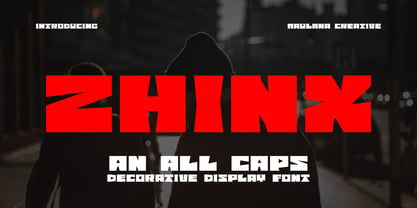 Zhinx is a Square Decorative Display font. Heavy stroke, fun character with a bit of ligatures and alternates. To give you an extra creative work. Zhinx font support multilingual more than 100+ language. This font is good for logo design, Social media, Movie Titles, Books Titles, a short text even a long text letter and good for your secondary text font with script or serif. Make a stunning work with Zhinx font. All CAPS. Cheers, Maulana Creative
 - Abiah by Creativetacos,
$15.00 Abiah Sans Serif Typeface is a minimal sans serif font, which contains 5 weights and It features unique and modern sans serif look and feel. Perfect for gorgeous logos, titles, web layouts and branding. It looks gorgeous in all caps with a wide-set spacing if you want to try a classy look, or beautiful on its own in capital and lowercase letters for something completely timeless. Included Features: Font Weight: Regular, Thin, Light, Bold and Distorted
 - Jaroslav by Suitcase Type Foundry,
$45.00 Jaroslav is a typeface that breaks down typical assumptions on the construction of a monolinear grotesque, but still maintains excellent readability and the recognizability of individual characters. The sensitively-balanced type family of five weights is accompanied by a distinctive italic, so it works well with both expressive titles as well as shorter texts. This is why all weights include small caps, nine types of figures, alternatives, a large number of ligatures, arrows and other ornaments.
 - Noelia Script Pro by Vástago Studio,
$19.00 Noelia Script is a typeface inspired on the work of Doyald Young, Tommy Thompson, Matthew Carter and Giambattista Bodoni. This project is great to use in designs about sports, travel, and city postals, among others. This font has about 360 glyphs with stylistic alternates, old style numbers, serif caps, and a nice touch of classic penmanship. This is the result of a few months of work and that is it! Enjoy it! Thanks for buy it!
 - Hai California by Colllab Studio,
$15.00 Meet Hai California, a handwritten font with a fancy script and a small-caps companion, this passionate pair of hand-drawn marker fonts is for logos + branding ,website design + website accents - think travel blogs, fashion blogs, & more, Clean print design, like magazines + flyers, header elements that need handwritten touch, quote graphics for social media. Hai California comes with stylistic alternate, ligatures, swashes, and multilingual support. Follow us for more great fonts. A Million Thanks Colllab Studio
 - Chatter Pro by Jonahfonts,
$35.00 Chatter Pro is a handwritten unconnected script face in four styles: Light, Regular, Semibold and Bold with Small-Caps. Chatter Pro is a Pro-version of my previous font 'Chatter'. A free style specifically designed for Packaging but still works well for Greeting cards, Magazines, Posters and Advertising Ads. Invoking the OpenType CONTEXTUAL ALTERNATIVE variant. A space after any lower-case glyph will produce the word terminal. (Opentype variants may only be accessible via Opentype-Aware applications.)