868 search results
(0.015 seconds)
- Konrad Kachelofen by Proportional Lime,
$9.99 Konrad Kachelofen was a printer in the city of Leipzig beginning around 1483. He printed many works by contemporary authors and also many of the classics. He acquired an unusually large amount of typefaces for his shop, a place that included a wine bar and book store. This type face is based on Typ.11:340G GfT510 Gesamtkatalog der Wiegendrucke and is similar to Proportional Lime’s “Kachelofen'' font. The major differences are that the whole miniscule set is slimmer and the majuscule set has different style glyphs and this face was used solely for titles and section headings because of its sharper and clearer appearance at large point values. Konrad probably died in 1529 after passing his business on to his son-in-law Melchior Lotter, who also went on to fame as an industrious and illustrious printer.
 - Chigland script by Akrtype Studio,
$19.00 Chigland script is an elegant script combination. It is slender, feminine and classy, while still maintaining a friendly feel. Chigland script is versatile and will work perfectly for e-commerce brands, wedding boutiques, initial name cards or any business that wants to appear upscale and chic. With its many variant stylistic character Chigland script is perfect for creating original and functional designs. It has extensive language support and alternates, stylistic sets that add visual interest to every letter. You can use the Chigland script for high-end logotypes and magazine headlines, but let’s not forget greeting cards, invitations, posters, ads and the various web and screen usages. The overall feel of the font is elegant, sophisticated with a touch of informal and it is ideal if you want to convey a sense of class and style.
 - Dionisio by CastleType,
$49.00 Dionisio, a CastleType original, takes its inspiration from one of the overlooked treasures of the CastleType library: Ransahoff. The latter is extremely condensed and very elegant. I particularly like its hairline slab serifs and cross-bars. I decided to use it as a starting point for a new design, but to make the proportions more classic and to make it more sensuous with gentler curves and bracketed cross-bar serifs. The result is very Bodoni-like, but less extreme and more contemporary looking. Meanwhile, Dionisio maintains a hint of Ransahoff with condensed letterforms and very fine serifs. Dionisio brings together the best of both, making it the perfect choice where a slender, sophisticated typeface is needed. Dionisio is available in two widths: normal and condensed, five fonts each. Includes an extensive character set and OpenType features.
 - Alfina Notte by Eurotypo,
$39.00 Alfina Notte is a chancery typeface that shows a modern temperament, but is inspired by the eponymous town of Torre Alfina, one of the most beautiful medieval villages of Italy, situated on the edge of the plateau Alfina, a few miles from of Orvieto. The place where is the castle is steeped in history. Its roots date back to the Lombard kingdom (seventh century); later it was under the rule of Monaldeschi (1200-1700) and more recently (1880) the property of the rich French banker Count Edoardo Cahen of Antwerp, who was responsible for the present aspect of the Castle. Alfina Notte is the bold version of Alfina, a type with soft lines, very slender upper cases and thin overlapping strokes; The stylistic alternates are particularly important, and the type is enriched by many, different OpenType features.
 - Ulga Grid Rounded by ULGA Type,
$19.00 ULGA Grid Rounded is the smooth, rounded sibling of ULGA Grid and ULGA Grid Solid. The typeface consists of three weights, regular, medium and bold, with corresponding oblique styles. Every character in the extended ULGA Grid family shares the same width. ULGA Grid Rounded features a rounded square design, giving this typeface a soft, yet sturdy appearance. A contradictory mix of stiffness and suppleness, characters slide around like lead-filled snakes trying to find their way through a maze. If this typeface were a snack, it would be a smooth, chocolatey treat - too much of it and you’ll feel dizzy and a bit sick. But, hey, I’m not your dad, do what you want. Learn from your mistakes, that’s what I say. A versatile display typeface that can be used for a wide range of purposes including CD covers, posters, packaging, advertising, name badges for robots, brochures and film titles. Mix and match with ULGA Grid and ULGA Grid Solid, use the alternatives, sneak in an oblique style to spice things up, but most of all this is a fun typeface family. The character set supports Western Europe, Vietnamese, Central/Eastern Europe, Baltic, Turkish and Romanian.
 - Etnier by Ahmad Jamaludin,
$17.00 Introducing Etnier – A brand-new modern family with a unique! Etnier is a modern variable font. Essentially, it's a sans-serif font with a sturdy and squared appearance, ensuring excellent legibility. It offers various widths and italics that provide versatility for your designs. The bolder, the stronger – this defines Etnier. Its bold and robust qualities, especially in the italic version, make it ideal for UI/UX-related designs. In total, there are 14 font styles available, or even more if you use the single files variable. You have the flexibility to slide through the weight and width options to find the sweet spot for Etnier. shape! What's Included? Etnier Main File 14 fonts family with Weight and Oblique options Instructions (Access special characters in all apps, even in Cricut Design) Accessible in Adobe Illustrator, Adobe Photoshop, Microsoft Word even Canva! PUA Encoded Characters. Fully accessible without additional design software Language Support: Danish, English, Estonian, Filipino, Finnish, French, Friulian, Galician, German, Gusii, Indonesian, Irish, Italian, Luxembourgish, Norwegian Bokmål, Norwegian Nynorsk, Nyankole, Oromo, Portuguese, Romansh, Rombo, Spanish, Swedish, Swiss-German, Uzbek (Latin) Come and say hello over on Instagram! https://www.instagram.com/dharmas.studio/ Have a great day! Dharmas Studio
 - Dobro by Sudtipos,
$39.00 Strings vibrating against wood. Counterpoints. Strong beated rhythms and smooth flexible melodies. Repetitive sequences and syncopations. Sweeps and slides. Folk and tradition. That's how Dobro sounds. Inspired by the spirit of bluegrass music and the aesthetic of its wood type gig posters,this typeface explores certain concepts of rhythm and seeks to translate a piece of this universe into writing. Meant to be used in large sizes, Dobro is a 6-font set designed to work nicely together. It comes in 4 different weights, one color font with miscellaneous and connectors, plus frames and borders that pay tribute to vintage wood type catalogues. As an old company motto used to say: "Dobro means good in any language!" ––––––––––––––––––– IMPORTANT INFO ––––––––––––––––––– When you license Dobro you will download a pack with OpenType fonts but also a Color Font version of Dobro Drunk. (To use color fonts Photoshop CC 2017 /2018, Illustrator CC 2018 or QuarkXpress 2018 is required). If you create outlines in illustrator you can also modify the colors! Dobro Drunk BW OTF font (works like any font but is black & white.) Web files are only black and white until browsers support color fonts.
 - Mahamaya - Unknown license

- Wolverhampton by Greater Albion Typefounders,
$12.50 Wolverhampton is a new Neo-Victorian face from Greater Albion Typefounders. It's something of an example of starting with a small idea and running with it. This family of three typefaces (Regular, Small Capitals and Capitals) was inspired by a line of lettering seen on a late 19th Century enamel advertisement made by Chromo of Wolverhampton (hence the family name). The family grew, topsy-like, from a recreation of these initial fifteen capital letterforms to the three complete typefaces offered here. The three typefaces are ideal for advertising and poster work with a Victorian, Edwardian, or 'Steam-punk' theme. They would also be eminently suitable for signage inspired by the same eras or (as we've seen a number of our other typeface families prove very popular) for book covers of period related novels and historical works. Finally, these slender elegant display faces are just plain fun!
 - Battle Scarred by Comicraft,
$19.00 We know what you're thinking... This is not a new font, just an old one with a few bullet holes in its helmet, dirt on its shins and some carbon scoring on its breastplate. You're thinking this is like a variant cover by Joe Madureira or J. Scott Campbell -- handsome and rugged on the outside but weak and effete on the inside. Well, my fine, font-finagling friend, you'd be Dead Wrong! This really is an All-New, All-Different, All Star, Ultimate Collectable, from the Comicraft House of Ideas! Our Dynamic Duo -- Johnny Comicraft and Ferran 'Nuff Said have brought you another winner from the Silver Age of comic book lettering. It’s a little worse for wear, we admit it, but wouldn't you be after three rounds with the Justice League of Avengers Assembled?!? See the families related to Battle Scarred: Battle Cry & Battle Damaged .
 - Versina by Latinotype,
$39.00 Versina is a display typeface with a unique and expressive yet moderate personality resulted from its organic elegant shapes which are inspired by Spanish transitional typefaces from the 18th century. This font is perfectly suitable for both titles and short text. Versina features a flowing organic stroke and asymmetric bracketed serifs, and its shapes convey rhythm and dynamism. The font has a large x-height and its ascenders are shorter than the cap height, making it look more slender and modern. Calligraphic and crescent-like terminals give the design great formal richness. Versina comes in 5 weights with matching italics plus a set of ornaments, in Regular and Black styles, and also includes old style/lining/tabular figures, fractions, superscripts and subscripts as well as a set of small caps, standard ligatures, historical ligatures, symbols and frames. Versina contains a set of 694 characters that support over 200 Latin-based languages.
 - Shakeglow by Alandya TypeFoundry,
$12.00 Shakeglow script is an elegant combination of a script and a narrow modern serif. It is slender, feminine and classy, while still maintaining a friendly feel. Shakeglow script is versatile and will work perfectly for fashion, e-commerce brands, trend blogs, wedding boutiques or any business that wants to appear upscale and chic. With its many variant stylistic characters, Shakeglow script is perfect for creating original and functional designs. It has extensive language support and alternates, stylistic sets that add visual interest to every letter. You can use the Shakeglow script for high-end logotypes and magazine headlines, but let’s not forget greeting cards, invitations, posters, book covers, ads and the various web and screen usages. The overall feel of the font is elegant, sophisticated with a touch of informal and it is ideal if you want to convey a sense of class and style.
 - Wholecar by Mans Greback,
$59.00 Wholecar is a train graffiti typeface. The letters are fun and friendly, with a happy personality and cartoonish quirkiness. A street style, Wholecar is drawn and created by Mans Greback, and is the perfect combination of cool and childish typography. This hip-hop styled comic typeface family comes in eight styles: Black, Inline, Invert, Regular and White. Additionally, the Wholecar Color, consisting of Noir, Pink and Silver, specifically created for Photoshop and Illustrator. Use characters [ ] { } ¤ # _ for train parts fitting the letters. Examples: [¤#¤_¤_¤#¤] [¤Graffiti¤] The font is built with advanced OpenType functionality and has a guaranteed top-notch quality, containing stylistic and contextual alternates, ligatures and more features; all to give you full control and customizability. It has extensive lingual support, covering all Latin-based languages, from North Europe to South Africa, from America to South-East Asia. It contains all characters and symbols you'll ever need, including all punctuation and numbers.
 - Ambiguity by Monotype,
$50.99 Ambiguity is a type family with five distinct personalities or ‘states’, created as a tool for coaxing designers and brands out of their comfort zone. It embraces both tradition and radicality, as well as generosity and thrift, encouraging us to question our beliefs about the intersection of style and meaning. The family is designed by Charles Nix, who describes Ambiguity as “as much thought experiment as typeface.” Its five states—Tradition, Radical, Thrift, Generous and Normate—each express or subvert different aspects of typographic tradition. Tradition is conservative, relying on historical letter shapes. Radical rejects inherited ideas of proportion, making typically slender letterforms wide, and wide letterforms slender. “It’s contrarian,” says Nix. Thrift cherry picks the condensed shapes from Tradition and Radical, while Generous does the same for wide forms. Normate sits at the center, a synthetic blend of all of the others. “Tradition is very comforting,” says Nix. “It’s the mask of conservatism. It’s calming because it delivers the proportions we expect. With Thrift more fits into a smaller space, so it’s great where words want to get large, like gigantic headlines, or text needs to cram in, like small screen type. You get a sense of carefree and luxury from the Generous cut. One would expect the Radical to be used in a sort of Dadaist way, but in a classic context it provides an enjoyable jolt.” Ambiguity is a litmus test. Designers could spend hours trying on typefaces that offer just one of these voices. Ambiguity provides five different personalities—ideas—beliefs—each of which also work seamlessly together. “It’s a palettea, like idea cards,” he says. “It’s a way of making yourself see differently. My hope is that traditionalists will try on radical clothes and vice versa. It’s a way of exploring outside your comfort zone, breaking out of the doldrums, by stepping through a variety of voices.”
 - Pinstripe Limo - Personal use only

- Balmecia by IbraCreative,
$17.00 Balmecia – A Tall Display Serif Typeface Balmecia is a distinguished tall display serif typeface that exudes a timeless elegance and sophistication. With its tall and slender letterforms, Balmecia commands attention and lends a touch of grace to any design it graces. The carefully crafted serifs add a classic flair, while the generous letter spacing ensures optimal legibility even in larger sizes. Balmecia’s vertical proportions create a sense of stateliness, making it an ideal choice for headings, titles, and other display applications where a touch of refinement is desired. This typeface seamlessly blends tradition with a modern aesthetic, offering a unique personality that captures the essence of both vintage and contemporary design sensibilities. Balmecia is perfect for branding projects, logo, wedding designs, social media posts, advertisements, product packaging, product designs, label, photography, watermark, invitation, stationery, game, fashion and any projects. Fonts include multilingual support for; Afrikaans, Albanian, Czech, Danish, Dutch, English, Estonian, Finnish, French, German, Hungarian, Italian, Latvian, Lithuanian, Norwegian, Polish, Portuguese, Slovak, Slovenian, Spanish, Swedish. **Uppercase
 - Strak by Kustomtype,
$25.00 Strak is a font that was born out of admiration for the work of E. Vermeulen, a Belgian artist known for his tight, precise line and an unseen masterpiece that is spread around the world. He has published and exhibited his work in London, Liverpool, Angoulême, New York, Geneva, Amsterdam, Lyon and Turku (in Finland) and he even signed for the New York Times. Based on a few characters, a complete font was composed by Kustomtype. After a few sketches, Strak came to life. The name Strak, in this case, refers to the slender, beautiful woman with the correct waistlines and proportions. The font is designed this way; it is completely hand-drawn, digitized and can be used in all modern and graphic media. Strak is available in 8 different styles, has class and will make many people's mouth water when they see it on your designs. Do you want quality and style? Then Strak is the font-perfect solution!
 - Jubilee by Red Rooster Collection,
$45.00 Jubilee is a glyphic font family with moderate stress, slightly inclined serifs, and storied history. Its original design was created in 1934 by famous English type designer Eric Gill for the Stephenson Blake type foundry. The development name was “Gill Text,” but this was changed to “Cunard” once the famous steamship company showed interest in using the typeface. The company, however, never utilized it. Stephenson Blake changed the name to Jubilee in 1935 to commemorate George V and Queen Mary’s Silver Jubilee Wedding Anniversary announcement. After International TypeFounders, Inc. acquired the exclusive rights to the Stephenson Blake collection, Paul Hickson (P&P Hickson) and Steve Jackaman (ITF) revived the family exclusively for the Red Rooster Collection in 1994. A new, Medium weight was created to accompany the original Light and Bold weights. Jubilee has an inscribed, Renaissance feel, and performs well at all sizes. Its letterforms are sturdy, yet there is an undeniable delicacy to the face.
 - Lepraqun by IbraCreative,
$17.00 Lepraqun – A Minimalist Narrow Sans Serif Font Lepraqun, a minimalist narrow sans-serif font, epitomizes simplicity and modern sophistication. With its slender letterforms and clean lines, Lepraqun embodies a sleek aesthetic that is both contemporary and timeless. This typeface offers a refined and space-efficient design, making it an ideal choice for projects that demand a sleek, minimalist appearance without sacrificing readability. The precise and balanced proportions of Lepraqun contribute to its versatility, allowing it to seamlessly integrate into various design contexts, from branding to editorial layouts. Lepraqun stands as a testament to the power of minimalism in typography, providing a stylish and efficient solution for those seeking a clean and sophisticated visual identity. Lepraqun is perfect for branding projects, logo, wedding designs, social media posts, advertisements, product packaging, product designs, label, photography, watermark, invitation, stationery, game, fashion and any projects. Fonts include multilingual support for; Afrikaans, Albanian, Czech, Danish, Dutch, English, Estonian, Finnish, French, German, Hungarian, Italian, Latvian, Lithuanian, Norwegian, Polish, Portuguese, Slovak, Slovenian, Spanish, Swedish.
 - Guess by DearType,
$59.00 Guess is a versatile, connecting script, designed to convey elegance and style. It is slender, feminine and friendly, let alone sexy. Guess will work perfectly for fashion, e-commerce brands, trend blogs, or any business that wants to appear classy and chic. The font is ideal for high-end logotypes and magazine headlines, but let’s not forget greeting cards, invitations, posters, ads and the various web usages. When it comes to the glyph set, well, Guess Pro has quite a lot of that (2500+ glyphs) - think multiple languages and tons of swashes and stylistic alternates to unleash your creativity. For all pragmatists out there, there is also a basic version of the font with an extended latin glyph set (no swashes, contextual alternates or stylistic sets). Last, but not least, Guess comes with a neat geometric sans in capital letters, which makes a great addition to the script, and a set of beautiful ornaments and borders that complete the whole look with a bang.
 - Ongunkan Lydian by Runic World Tamgacı,
$50.00 Lydia (Lydian: 𐤮𐤱𐤠𐤭𐤣𐤠, Śfarda; Aramaic: Lydia; Greek: Λυδία, Lȳdíā; Turkish: Lidya) was an Iron Age kingdom of western Asia Minor located generally east of ancient Ionia in the modern western Turkish provinces of Uşak, Manisa and inland Izmir. The ethnic group inhabiting this kingdom are known as the Lydians, and their language, known as Lydian, was a member of the Anatolian branch of the Indo-European language family. The capital of Lydia was Sardis. The Kingdom of Lydia existed from about 1200 BC to 546 BC. At its greatest extent, during the 7th century BC, it covered all of western Anatolia. In 546 BC, it became a province of the Achaemenid Persian Empire, known as the satrapy of Lydia or Sparda in Old Persian. In 133 BC, it became part of the Roman province of Asia. Lydian coins, made of silver, are among the oldest coins in existence, dated to around the 7th century BC.
 - Merc by Canada Type,
$24.95 Merc is a four-letter word that stops just one y short of Mercy. Merc is also the standard street abbreviation for mercenary, or a soldier for hire. Now that the global security business has become a two hundred billion dollar industry, we thought you would like to have your very own affordable merc. Knew you'd be pleased. Merc is based on an all-cap metal face called Agitator, designed by Wolfgang Eickhoff and published by Typoart in 1960. The rough brush letters look like they were made by someone who is capable of elegance but has no time for it. These are letters that live to catch the eyes and warn them loudly: Doom is here, and if you want it screamed out, this Merc is at your service. This font contains more than 460 glyphs, which means quite a few stylistic alternates and support for the majority of Latin languages.
 - Academica by Storm Type Foundry,
$44.00 Josef Týfa first published the Academia typeface in 1967-68. It was the winning design from competition aimed at new typeface for scientific texts, announced by Grafotechna. It was cut and cast in metal in 1968 in 8 and 10 point sizes of plain, italic and semi-bold designs. In 2003 Josef Týfa with František Štorm began to work on its digital version. During 2004 Týfa approved certain differences from the original drawings in order to bring more original and timeless feeling to this successful typeface. Vertical stem outlines are no more straight, but softly slendered in the middle, italics were quietened, uppercase proportions brought closer to antique principle. Light and Black designs served (as usual) as starting points for interpolation of remainig weights. The new name Academica distinguishes the present digital transcription from the original idea. It comprises Týfa’s rational concept for scientific application with versatility to other genres of literature.
 - Dream Reacher by Asenbayu,
$14.00 Reacher is a creative stylish ligature serif font. Each letter is beautifully crafted which has an elegant look that attracts a tall, minimalist and slender shape. Reacher font is a typeface that combines the elegance of a serif with a unique and decorative binding, creating a more harmonious and visually appealing look. This font has alternate and ligature features, perfect for using it in creative and artistic designs, such as logos, branding, headlines, titles, invitations, posters and more. Reacher font features: kerning, standard glyphs, stylistic alternates, stylistic ligatures, symbol, punctuation and multilanguages supported. Note: To use the alternate and ligature features, please look in the Glyph Panel / Character Map in your software to be able to access all the glyphs in this font. The ligature style in this font is simply "Standard Ligature", meaning it appears automatically. To set your desired letter binding, you can block letters or add them from the glyph panel. Thank you!
 - Garduja by IbraCreative,
$17.00 Garduja, a stylish slim serif font, effortlessly blends sophistication with modern aesthetics, creating a typographic masterpiece that captivates the eye. Its slender and refined letterforms exude a timeless elegance, while subtle serifs add a touch of classic charm. Garduja strikes the perfect balance between readability and artistic flair, making it an ideal choice for projects that demand a polished and contemporary design. The font’s graceful curves and precise detailing contribute to its overall sleek appearance, ensuring a distinctive and memorable presence in both print and digital applications. With Garduja, every character embodies a harmonious fusion of tradition and innovation, offering a visually striking and versatile option for designers seeking a tastefully sleek serif typeface. Garduja is perfect for branding projects, logo, wedding designs, social media posts, advertisements, product packaging, product designs, label, photography, watermark, invitation, stationery, game, fashion and any projects. Fonts include multilingual support for; Afrikaans, Albanian, Czech, Danish, Dutch, English, Estonian, Finnish, French, German, Hungarian, Italian, Latvian, Lithuanian, Norwegian, Polish, Portuguese, Slovak, Slovenian, Spanish, Swedish.
 - Silverline by Fenotype,
$18.00 Silverline Script & Sans Silverline Script is a hand drawn signature style script. Silverline is fast and expressive -it’s great for contemporary branding and advertising. Silverline Script is equipped with Contextual Alternates and Standard Ligatures that keep the script eloquent and connections smooth. Contextual Alternates and Standard Ligatures are automatically on. In addition Silverline Script has Swash Alternates for A-Z and a-z that can be used for extra flair. From Discretionary Ligatures you’ll find specially designed ligatures for “and”, “for”, “the”, “at” and “in”. Silverline Script is PUA encoded so you can access extra glyphs in any graphic design software. Another half of the Silverline family is Silverline Sans -a three weight ultra-condensed sans serif that works great with the Script. Silverline Sans is great for making sturdy text word blocks - a great type for any display use from magazine covers to packaging. Try combining Silverline Script with Silver Script -they make a nice contrast together.
 - Kilasera by IbraCreative,
$17.00 Kilasera – A Modern Narrow Sans Serif Font Kilasera is a contemporary narrow sans-serif font that effortlessly blends sophistication with modernity. Exhibiting clean lines and minimalistic design elements, Kilasera exudes a sense of sleekness and versatility. With its slender proportions, the font is well-suited for a wide range of applications, from editorial layouts to digital interfaces. The letterforms are meticulously crafted, featuring balanced spacing and a subtle geometric precision that ensures readability without compromising on its distinctive aesthetic. Kilasera’s sleek and timeless appeal makes it an ideal choice for projects seeking a refined, contemporary typographic style that seamlessly integrates into the visual language of the present day. Kilasera is perfect for branding projects, logo, wedding designs, social media posts, advertisements, product packaging, product designs, label, photography, watermark, invitation, stationery, game, fashion and any projects. Fonts include multilingual support for; Afrikaans, Albanian, Czech, Danish, Dutch, English, Estonian, Finnish, French, German, Hungarian, Italian, Latvian, Lithuanian, Norwegian, Polish, Portuguese, Slovak, Slovenian, Spanish, Swedish.
 - Mc Lemore by Galapagos,
$39.00Back when OpenType hadn't yet opened and Apple was developing the Line Layout Manager called GX Typography I created a test font that I name after my stepdaughter, Kristen (now ITC Kristen). Not wanting to offend my wife I started on a font project and gave her name to this new set of glyphs, Roberta. Unfortunately, the name was already in use so I needed to find another name for the fonts. After September 11th I decided that there were people I'd met during my life who were truly cut from the cloth of the hero. Master Sargent McLemore of the 75th Ranger Battalion was one of these people. I met the Sarge when I was in basic training at Fort Gordon. I saw him 2 weeks before he died in 1970. All of the heroes we see on the silver screen pale in comparison to this man. John Wayne and Clint Eastwood both have played the type well, both could have taken lessons from the Sarge. - Dan Panosian by Comicraft,
$29.00 It’s true -- having your own font IS The Secret Of Happiness! At times suave and sophisticated, at other times rough and ready for anything, superstar comics artist Dan Panosian has worked on the likes of CAPTAIN AMERICA, SPAWN, THE FLASH,, SPIDER-MAN, X-THE X-MEN and GREEN LANTERN, as well as the movie, HARRY POTTER AND THE SORCERER'S STONE and games like DUKE NUKEM. He hasn't been seen in comics for some time, but he’s back, baby, working on a series of JOHN TIFFANY bandes desinée, and he’s brought his own font with him, courtesy of that awfully nice John JG Roshell at Comicraft. John Tiffany is one of the best bounty hunters in the world and he has no illusions about the world that employs him. Tiffany relies exclusively on four people: the Reverend Lovejoy, who taught him to love his money; Wan Chao, of the geek underworld who serves as an interface with the outside world; Dorothy, his partner, and Magdalena, the ‘call girl in his life.’ But in Mexico, the hunter has become prey, his head has a price. And if his rivals know his location, it means that John Tiffany was betrayed by one of four people he thought he could trust...and now he can rely on only ONE thing, his secret weapon. His FONT. See the families related to Dan Panosian: Urban Barbarian.
 - Secession by HiH,
$14.00 Secession is a very readable typeface, suitable for short blocks of text. If you have grown weary of the standard sans-serif faces one sees all the time, you may want to use Secession as a fresh and distinctive substitute. Like Kunstler Grotesk, Secession is one of a number of typeface designs that attempts to reconcile Germany’s blackletter tradition with the international familiarity of roman letterforms in a simple, robust design suitable for meeting the demands of a modern industrial economy, while rejecting the extraneous ornamentation of the departing Victorian era. Unlike Kunstler Grotesk, Secession was designed with a lower case. Secession Bold was originally jointly released as Halbfette Secession by Bauer & Company of Stuttgart and H. Berthold AG of Berlin around 1898. The rest of the family was designed by HiH. The basic family of four: Text, Oblique, Bold and BoldOblique are available in two versions: one set with the standard contemporary lining or ranging numerals for spreadsheets and tables and one set of old-style figures (with OSF in font name) for use with text. The two versions of the basic family, Secession and Secession OSF were released in July 2006. Cousins include ExtraBold, SCOSF Text, and two multi-lingual versions of the text weight. Secession ML includes the Latin Extended-A character set in unicode format plus 17 ligatures and a few strays. Secession GreekML has all the characters of the ML version plus the unicode Greek set and 17 Greek ligatures. Release of the cousins took place in August and October of 2006. Click on BUYING CHOICES. Click on GLYPHS and use drop-down menus and slider to see the all the glyphs for the various fonts. Similar: Birmingham (Ref 100 Ornamental Alphabets, Solo); Spartana (Art Nouveau Display Alphabets, Solo)
 - Serling Galleria by Mans Greback,
$39.00 Serling Galleria is a classy, classic serif font that exudes an air of fine art and high-end creativity. With its clear, legible letterforms and modernist inventiveness, Serling Galleria brings a touch of strict creativity to your designs, making them stand out in sophistication. This versatile font family is perfect for projects that require a refined, elegant aesthetic. With its variable font feature, you have the flexibility to fine-tune the font to your specific needs and create a truly bespoke typographical experience, or use the pre-defined font styles: Thin, Thin Italic, Extra Light, Extra Light Italic, Light, Light Italic, Regular, Regular Italic, Medium, Medium Italic, SemiBold, SemiBold Italic, Bold, Bold Italic, Extra Bold, Extra Bold Italic, Black, Black Italic The diverse styles in the Serling Galleria font family provide unmatched versatility, allowing you to adapt your typography to various design contexts and moods seamlessly. With this array of weights and styles at your fingertips, you can effortlessly create a visual hierarchy, emphasize key elements, and establish a cohesive, engaging design language across your creative projects. Also includes a variable font! Only one font file, but the file contains multiple styles. Use the sliders in Illustrator, Photoshop or InDesign to manually set any weight and width. This gives you not only the predefined styles, but instead more than a thousand ways to customize the type to the exact look your project requires. Built with advanced OpenType functionality, Serling Galleria ensures top-notch quality and provides you with full control and customizability. It includes stylistic and contextual alternates, ligatures, and other features to make your designs truly unique and tailored to your needs. Serling Galleria offers extensive lingual support, covering all Latin-based languages, from Northern Europe to South Africa, from America to South-East Asia. It contains all the characters and symbols you'll ever need, including all punctuation and numbers.
 - Varese Outlined by Tarallo Design,
$14.99 Varese Outlined is the perfect font for giving content a retro, dimensional, and playful feel. Use it for headlines or short body text for an optimistic or nostalgic tone. It comes in two variations, outlined and shadow. It has standard uncolored and colored options. Please see the slides to know what each color font is named. This geometric and modular typeface was inspired by Italian posters of the 1920s and 1930s. Its design playfully explores the boundaries between unity and variety. The blocky characteristics lend it well to tightly composed text either horizontally or vertically. The lowercase is similar in form to the uppercase, yet many of the lowercase letters have interior spaces (counterforms). It comes with standard ligatures; ff, fi, fl, ffl and three alternate glyphs for number 1. The color fonts in Varese Outlined are vector-based and in the fully scalable SVG OpenType format. Color fonts are supported by Photoshop 2017, Illustrator and InDesign 2018, and QuarkXPress 2018 (and later versions). Those who do not want a color font should purchase the files simply named “Regular” and “Outlined”. These will not have any color words in the names. Varese Outlined has two siblings; Varese and Varese Soft. The designer suggests pairing Varese Outlined with his ornamental fonts FormPattern or FormPattern Color Two, Three, or Six.
 - The font Chizzler Thin, crafted by GemFonts | Graham Meade, stands out in the realm of typography for its distinctive character and elegance. This particular variant of the Chizzler family leans towa...
- TF Bleedwax by Teenage Foundry,
$19.00 TF Bleedwax Font - an eerie and spine-chilling typeface perfectly suited for Halloween-themed designs. This font exudes a horror style, created specifically to send shivers down your spine. Each letter is meticulously crafted to resemble dripping blood, giving your designs a blood-curdling and macabre feel. With its gory and unsettling appearance, "TF Bleedwax" font is sure to add a terrifying touch to any Halloween project, horror movie poster, haunted house flyer, or spooky party invitation. Let this font unleash a wave of fear and make your designs stand out in the dark and creepy night. Multilingual contained: Afrikaans, Albanian, Asu, Basque, Bemba, Bena, Breton, Catalan, Chiga, Cornish, Danish, Dutch, English, Estonian, Filipino, Finnish, French, Friulian, Galician, German, Gusii, Indonesian, Irish, Italian, Kabuverdianu, Kalenjin, Kinyarwanda, Luo, Luxembourgish, Luyia, Machame, Makhuwa-Meetto, Makonde, Malagasy, Manx, Morisyen, North Ndebele, Norwegian Bokmål, Norwegian Nynorsk, Nyankole, Oromo, Portuguese, Quechua, Romansh, Rombo, Rundi, Rwa, Samburu, Sango, Sangu, Scottish Gaelic, Sena, Shambala, Shona, Soga, Somali, Spanish, Swahili, Swedish, Swiss German, Taita, Teso, Uzbek (Latin), Volapük, Vunjo, Zulu. For any questions please contact me 🙂 Thanks!
 - Highand by Craft Supply Co,
$20.00 Highand – Gothic Font A Font of Horror Highand – Gothic Font encapsulates the essence of terror, designed meticulously to send spine-tingling shivers down your spine and evoke chilling emotions. Dreadful Display Furthermore, Highand’s unnerving aesthetics deliver an atmosphere of dread, creating an unforgettable and unsettling experience for your audience. It’s the perfect choice for spine-tingling displays that demand immediate attention. Terrifying Typography With every character, Highand conjures a feeling of impending doom. Its jagged edges and macabre curves create a nightmarish impression that lingers in the mind. Ideal for Horror-themed Projects Highand is tailor-made for horror-themed projects. Whether it’s for spine-chilling horror movie posters, eerie Halloween invitations, or haunting haunted house flyers, this font sets the eerie tone with sinister grace. In Conclusion Highand – Gothic Font is your sinister accomplice in design, evoking fear and suspense with every meticulously crafted letter. Embrace the darkness and plunge your audience into an abyss of fear. Make your displays truly terrifying with Highand’s chilling presence, ensuring an unforgettable and spine-tingling experience that leaves a lasting impression of horror.
 - Slatz by CozyFonts,
$20.00 The Slatz Font Family is Vertical. It has a slender, consistent weight that is best used in limited, left to Right, space limitations as to maximize font height. Slatz font variations all have extremely clean edges and even the serif versions are crisply defined with a flat-pointed serif for an added unique character. The designed intent was for a tight kern, however evenly letterspacing these family members give a distinct personality and continues to command the negative space just as in tight kerned examples. The compatible relationship of these font family members, serif to sans serif, and regular to italic is seamless and the overall design coloring of words as sentences is well balanced and extremely legible. The Slatz Family fonts are matching members glyph to glyph yet there is a noticeable difference between the serif and sans serif members. The sans serif works in contemporary and vintage settings. The serif members work particularly well in vintage, period applications. The Bold and Drop versions of Slatz also fit the above descriptions and also work on their own.
 - Molandika Script by Great Studio,
$16.00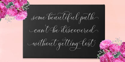 Molandika Script is elegant calligraphy font, designed to convey elegance and style. It is slender, feminine and friendly, This font is casual and pretty with swashes. Can used for various purposes. such as logos, product packaging, wedding invitations, branding, headlines, signage, labels, signatures, book covers, posters, quotes and more. Molandika Script features OpenType stylistic alternates, ligatures and International support for most Western Languages is included. To enable the OpenType Stylistic alternates, you need a program that supports OpenType features such as Adobe Illustrator CS, Adobe Indesign & CorelDraw X6-X7, Microsoft Word 2010 or later versions. How to access all alternative characters using Adobe Illustrator : https://www.youtube.com/watch?v=XzwjMkbB-wQ Molandika Script is coded with PUA Unicode, which allows full access to all the extra characters without having special designing software. Mac users can use Font Book , and Windows users can use Character Map to view and copy any of the extra characters to paste into your favourite text editor/app. How to access all alternative characters, using Windows Character Map with Photoshop : https://www.youtube.com/watch?v=Go9vacoYmBw
 - Generous Hospitality by Dear Alison,
$19.00 While there can be similar handwriting styles out there, no two handwritings are exactly the same. I like to think that I have the same handwriting style as my father, but I had never seen him write with lowercase letters, only in all capitals, except when signing his name on something in cursive. I recently came across a letter my father had written long ago to a friend. It was returned to sender, yet he kept it intact. The letter primarily thanked his friend for his hospitality when my father unexpectedly dropped in for a visit while traveling. I was so taken by the handwriting, that I decided to make it into a font, not only to remember my father, but also to forever preserve his handwriting. Generous Hospitality not only taps into the character of the person the letter was written to, it also reflects the personality of my father. If you are looking for a masculine handwriting type style for your designs, I think this font could be a nice fit.
 - Monotage by Fargun Studio,
$14.00 Monotage a modern combination Monoline Script and Sans. Monotage Font Duo, a classy, contemporary pair of Monoline Script and Sans. With a stylish didot-style Sans font and a free-flowing, expressive script companion, Silver South offers beautiful typographic harmony for a diversity of design projects, including logos & branding, wedding designs, social media posts, advertisements & product designs. Monotage Script • A clean, free-flowing script font containing upper & lowercase characters, numerals and a large range of punctuation. Monotage Sans • A classy Sans font containing uppercase characters, numerals and a large range of punctuation. Creates a perfect pairing contrast with Monotage Script fonts. Monotage Script Ligatures & Alternates • Monotage Monoline Script also includes 5 character ligatures and 130 alternates. To enable the OpenType Stylistic alternates, you need a program that supports OpenType features such as Adobe Illustrator CS, Adobe Indesign & CorelDraw X6-X7. There are additional ways to access alternates, using Character Map (Windows), Nexus Font (Windows), Font Book (Mac) or a software program such as PopChar (for Windows and Mac).
 - Excelsius by Comicraft,
$19.00 Once upon a midnight dreary, this Comicraftsman pondered, weak and weary, For a name synonymous with Mighty and Marvelous comics lore. Solid, Outline, Inline was the nameless font I'd crafted, I nodded, nearly napping o'er the work I'd grafted When suddenly came a tapping, As of someone gently rapping, rapping at my cubicle door. "'Tis some visitor," I muttered, "tapping at my cubicle door-- Calling out "EXCELSIOR!" Then an Amazing Vision beguiled my sad fancy into smilin', By the Spectacular decorum of the countenance it wore, "Though thy crest be shorn and shaven," he said, "thou art sure no craven, And thy font should not remain nameless here forevermore!" Eagerly I wished the morrow; vainly I had sought to borrow From comic books surcease of sorrow, letters that called out "EXCELSIOR!" Then, upon the velvet sinking, I betook myself to linking Fancy unto fancy, thinking of the nominative neuter singular thing Like Some Silvered Surfer wandering from the Nightly shore-- The Vision shrieked, upstarting--"Tell me what thy lordly name is thus!" Quoth the Craftsman: "EXCELSIUS!"

