2,303 search results
(0.009 seconds)
- Enzia by insigne,
$21.99 Enzia is a friendly and flowing sans serif. Enzia exists somewhere between a slab serif and a semi-sans, and features flared vertical stems and rounded terminals. Its bulbous terminals and open counters inject a flavor of ease and excitement. Enzia provides plenty of impact and is best used with short to medium length texts. Six different weights provide plenty of versatility and contrast for poster designs, logotypes and headlines, while still retaining excellent legibility for extended copy.
 - Zennat Pro by Latinotype,
$29.00 This font is inspired by the compact, high-impact design aesthetic of the 1990s in Chile, which was defined by the use of very heavy fonts to create eye-catching graphic pieces. With this idea in mind, Zennat Pro was born, a “semi-slab serif” that takes advantage of OpenType features which rotate in alternate characters to best fit the design. Zennat pro comes in 10 weights, and is ideal for magazine design, motion graphics, trademarks, logos, posters, etc. ...
 - Mionic by Adam Fathony,
$18.00 Introducing Mionic, An Inverted Contrast Display typeface. Mionic is combinations between the Antique of slab serif typeface with the modern look of today. Available with the new Variable type system that made you more easy to choose the weight of this fonts. Mionic Bold is Best for the Headliner, Display, Or anything with bigger typography needs with a Strong Characteristic. The thinnest one are good for more longer text because of the contrast on every characters.
 - Litore by Enfeeltype,
$22.00 This font represents the wonders of the sea, with an engraved design that brings waves to mind when reading. Litore is a clean and elegant font with clear strokes and a modern style. Life is just one big journey, and the path you choose has a great impact on your future and overall happiness. So if you're looking for inspiration on what represents beauty in life and love, Litore is the perfect font to spend some time with.
 - Timeless Radiance by Letterhend,
$14.00 Timeless Radiance is an organic font duo consist of a bold script paired with a slab serif with a touch of classic look and feel. This type of font perfectly made to be applied especially in logo, headline, signage and the other various formal forms such as invitations, labels, logos, magazines, books, greeting / wedding cards, packaging, fashion, make up, stationery, novels, labels or any type of advertising purpose. Features : Uppercase & lowercase Numbers and punctuation Alternates/Ligatures Multilingual PUA encoded
 - Retrorelic by Runsell Type,
$9.00 The Retrorelic perfectly represents vintage aesthetics in a contemporary script, serif and slab serif version. This Font Family consists of clean, rough and outline feature as well. The Retrorelic Font Family is perfect for designs such as the logotypes, packaging, branding, quotes, business cards and more custom design. It features uppercase, lowercase, numeral, punctuation and symbols, ligatures, stylistic alternates, multi-lingual support, and is PUA encoded. How to get access alternate glyphs from OpenType fonts Click Here
 - Wascally Wabbit by Comicraft,
$49.00 This cunning, conniving, chattering font is devious, devilish and dashing! It's a toon town tattler that will lend a flippant insouciant personality to your comic books and animated features. These handsome letterforms will nab you, jab you, grab you and may even stab you with their sly wily guile. Our advice: Be Very Very Qwiet when tracking down this Wascally Wabbit. Features: Automatic alternate uppercase alphabets Western & Central European language support Manga characters & Crossbar I Technology™
 - LifeAfterCollege by Ingrimayne Type,
$13.95 The LifeAfterCollege family began as a set of four fonts based on two styles of Ranger, which are slab-serif, geometric fonts with no curves. Two of the four are outlines with hollow insides, and two have-filled insides. The two fonts that are outlined have been taken apart and made into three typeface that can be layered. This allows one color for the inside, another for the middle ring, and a third for the outside outline.
 - Gambero by Typoforge Studio,
$29.00 Say hi to new member of Typoforge zoo! Gambero family consists of 18 styles (including italics) with a subtle rounded finished details. Gambero is a stable, slab cousin of Kapra, Kapra Neue adn Kapra Neue Pro. It is ideally suited for advertising, editorial and publishing, offering new design potential. Font Gambero is inspired by a "You And Me Monthly" published by National Magazines Publisher RSW "Prasa" that appeared from May 1960 till December 1973 in Poland.
 - MC Eafist by Maulana Creative,
$22.00 Eafist is a retro slab serif font. With bold stroke, fun character with a bit of ligatures and alternates. To give you an extra creative work. Eafist font support multilingual more than 100+ language. This font is good for logo design, Social media, Movie Titles, Books Titles, a short text even a long text letter and good for your secondary text font with sans or serif. Make a stunning work with Eafist font. Cheers, Maulana Creative
 - Grover by Sudtipos,
$35.00 The object of Grover was to join two distinctive typeface designs: the basic European gothic of the late nineteenth century and the ‘rounded’ style found in 1960s America. The result is a clear, friendly face with subtle yet unforgettable features. Named after Grover Washington, Jr., the jazz saxophone player, Grover is geometrically constructed and yet very human in appearance. Sans and slab serif variations, true italic weights, as well as small caps afford Grover versatility and unique display characteristics.
 - Kheops by Tipo Pèpel,
$22.00 Kheops is a slab-serif style typeface, with a contemporary scent and designed for long texts, without giving up on big headlines, it is accompanied by an authentic cursive with a dynamic rhythm and a skeleton with humanist reminiscences, it also includes a set of ornaments based on in simple geometric shapes, and an extensive range of OpenType functionalities to meet the needs of the most demanding designer, an all-rounder that cannot be missing from your typographic palette.
 - Prumo Poster by DSType,
$40.00 Prumo is a new type system, based on a unique skeleton that flows, like a pendulum, from high contrast to low contrast fonts, is a sort of typographic journey, from the eighteen century typefaces to the nineteen century slab serif typefaces, gathering information from the scotch roman fonts on it's journey. Prumo is a type family with classic proportions, that takes advantage of the recent type production technology while looking carefully at the most important historical references.
 - Waterloo Bold by ITC,
$29.99The slab serif Waterloo Bold was designed by Alan Meeks. He chose unique and individual forms to give this alphabet its unmistakable character. The cross strokes of the capitals are not in the optical center, the serifs have light furrows, and the figures have a slight slant tot he right, giving this font a dynamic, flowing look. Waterloo Bold is reminiscent of cigars, whiskey and the 1930s and should be used only in headlines in large point sizes. - Kraken Ink by Fat Hamster,
$20.00 Kraken Ink & Kraken Script fonts were inspired by mystery of ocean and sea, their secrets and creatures. As unique, rustic, frivolous and fun as a wind! With Kraken Ink font you can give your project it's own trendy and stylish feel. Kraken Ink typeface is perfect for your label and packaging design, social media quotes, logo and branding design, t-shirt design, heading, scrapbooking, calendars, book covers. Enjoy using the illustrations and elements in your design projects.
 - Roklet by Maulana Creative,
$12.00 Roklet is a semi slab serif font. With round bold stroke, fun character with a bit of ligatures and alternates. To give you an extra creative work. Roklet font support multilingual more than 100+ language. This font is good for logo design, Social media, Movie Titles, Books Titles, a short text even a long text letter and good for your secondary text font with sans or serif. Make a stunning work with Roklet font. Cheers, Maulana Creative
 - Posterizer KG by Posterizer KG,
$40.00 This slab serif font is inspired by European industrial, machine-made letters. It looks rational and geometric, but optically corrected and balanced. As the name says this font face is designed to be used by mostly for posters, headlines, visual identities and short texts. Font was created for Celebration of the 5 year anniversary of Design Studio Box from the city of Kragujevac (KG), the industrial city of Serbia. Posterizer KG contains all the Latin and Cyrillic glyphs.
 - Prumo Banner by DSType,
$40.00 Prumo is a new type system, based on a unique skeleton that flows, like a pendulum, from high contrast to low contrast. It’s a sort of typographic journey, from the 18th century typefaces to the 19th century slab serif typefaces, gathering information from the Scotch Roman fonts on its journey. Prumo is a type family with classic proportions that takes advantage of the recent type production technology while looking carefully at the most important historical references.
 - Broochy by Maulana Creative,
$16.00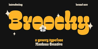 Broochy is a Groovy Slab serif Display font. Heavy and medium contrast stroke, fun character with a bit of ligatures and alternates. To give you an extra creative work. Broochy font support multilingual more than 100+ language. This font is good for logo design, Social media, Movie Titles, Books Titles, a short text even a long text letter and good for your secondary text font with script or serif. Make a stunning work with Broochy font. Cheers, Maulana Creative
 - Badehaus by Hanoded,
$15.00 In the German city of Bad Neuenahr you can visit a spa called Thermal Badehaus. This beautiful art deco building has an even more beautiful art deco lettering covering its facade. I had to work with only a couple of glyphs ('Thermal Badehaus' to be exact) and tried to capture their beauty in the remaining glyphs. The result is a font called Badehaus (Bath House in German). It is a bold, all caps typeface, with some unique glyphs.
 - Prumo Text by DSType,
$40.00 Prumo is a new type system, based on a unique skeleton that flows, like a pendulum, from high contrast to low contrast. It’s a sort of typographic journey, from the 18th century typefaces to the 19th century slab serif typefaces, gathering information from the Scotch Roman fonts on its journey. Prumo is a type family with classic proportions that takes advantage of the recent type production technology while looking carefully at the most important historical references.
 - Modern West JNL by Jeff Levine,
$29.00 Presenting… a Western style alphabet from the 1960 edition of Samuel Welo’s “Studio Handbook for Artists and Advertisers”… Extra bold, featuring slab serifs and concave corners, this type style could easily have been found on building signage in the Old West… but in redrawing it digitally, it’s been named Modern West JNL because at one time, this would have been considered a modern style of lettering. Modern West JNL is available in both regular and oblique versions.
 - Wacca by One Fonty Day,
$4.00 Wacca straddles the categories of Humanist slab and Contemporary serif, and it also gives a handwriting taste especially in the italics. Its tall x-height enables them to be extremely visible, and the slightly curved strokes on some letters give them a pleasant and organic look as a whole. The Italics introduces more cursive strokes all over, so it comes across much more organic than the regulars. This unique, fun, yet simple family is good for any purpose.
 - Bilany by Letterhend,
$14.00 The Bilany is a font duo package contain a classic script and slab serif which looks great to be paired especially for vintage and adventure theme! This font duo is purposely made for headline, display or logotype, and the other various formal forms such as invitations, labels, logos, magazines, books, greeting / wedding cards, packaging, fashion, make up, stationery, novels, labels or any type of advertising purpose. Features : Uppercase & lowercase Numbers and punctuation Alternates & Ligatures Multilingual PUA encoded
 - Wellrythm by Maulana Creative,
$15.00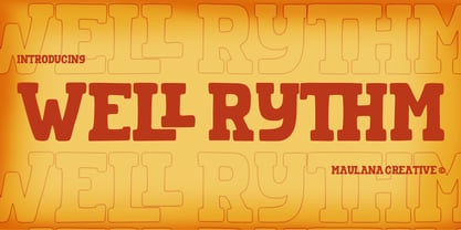 Wellrythm is a fancy display slab serif font. With handwritten medium stroke, fun character with a bit of ligatures and alternates. To give you an extra creative work. Wellrythm font support multilingual more than 100+ language. This font is good for logo design, Social media, Movie Titles, Books Titles, a short text even a long text letter and good for your secondary text font with sans or serif. Make a stunning work with Wellrythm font. Cheers, MaulanaCreative
 - Belle Jardin by Greater Albion Typefounders,
$18.00 Belle Jardin is an Art Deco inspired display family of three typefaces, offered in in-line engraved regular and demi bold forms as well as a solid bold form. It offers upper and lower case solid slab-built forms that create an immediate atmosphere of the streamline era of the thirties and are also at home in post-war revival inspired design work. The letterforms are solidly legible and ideal for cover and poster inspired design work.
 - Tightwad JNL by Jeff Levine,
$29.00 “I Don't like No Cheap Man” is a piece of early 1900s sheet music featuring its title hand lettered in a condensed slab serif design. The influences of the Art Nouveau era are clearly found in the many eccentric character shapes within the various letters of the original artwork. Recreated in digital type, Tightwad JNL is available in both regular and oblique versions – and its font name is a variant of the “Cheap Man” portion of the song’s title.
 - Coltan Gea by deFharo,
$11.00 Coltan Gea is a Slab Serif typographic family with 6 Weights plus the italic versions all include small capital letters and cryptocurrency symbols. It is a geometric, minimalist typeface, with neo-grotesque modulations and slightly rounded corners. The typeface has alternative letters and numbers, small caps and advanced OpenType functions. The proportions, metrics and kerning I have configured meticulously for a perfect reading in any size. The complete package includes the roman version in VariableFont format.
 - Screwball Comedy JNL by Jeff Levine,
$29.00 Cary Grant was one of Hollywood’s most versatile actors, playing romantic leads, dramatic parts and showing off his impeccable timing in screwball comedies. A perfect example of this is Frank Capra’s “Arsenic and Old Lace” from 1942. The movie trailer for the film had the title hand lettered in a playful and casual slab serif style, with varying character shapes and weights. This is now available as Screwball Comedy JNL in both regular and oblique versions.
 - Prumo Deck by DSType,
$40.00 Prumo is a new type system, based on a unique skeleton that flows, like a pendulum, from high contrast to low contrast. It's a sort of typographic journey, from the 18th century typefaces to the 19th century slab serif typefaces, gathering information from the Scotch Roman fonts on its journey. Prumo is a type family with classic proportions that takes advantage of the recent type production technology while looking carefully at the most important historical references.
 - Prumo Display by DSType,
$40.00 Prumo is a new type system, based on a unique skeleton that flows, like a pendulum, from high contrast to low contrast. It’s a sort of typographic journey, from the 18th century typefaces to the 19th century slab serif typefaces, gathering information from the Scotch Roman fonts on its journey. Prumo is a type family with classic proportions that takes advantage of the recent type production technology while looking carefully at the most important historical references.
 - Diamond Ring by Dharma Type,
$24.99 Diamond Ring is an Art Deco font inspired by Japanese designs for cosmetic packaging and posters used from the end of the 19th century to the early 20th. The most distinguishing characteristic is the diagonal parts of the glyphs. All diagonals have the same degree of the angle. By this elements, whole design of this font and typography with this font look like the shining of diamond ring during total solar eclipse. When you prefer more humanly letter form, please try our Yasashii that used in La La Land.
 - Song Composer JNL by Jeff Levine,
$29.00 The sheet music for the 1939 tune "Chico's Love Song (Ma-La-Ja Fa-La Pas-Ka Lah-Ta) [Cuban Double Talk]" may have had an odd title, but the main portion of it was hand lettered in an interesting style. Condensed letters with rounded corners complemented by sharp lines and angles give the characters an almost futuristic look, despite the fact that they were designed during the Art Deco era. This became the basis for Song Composer JNL, which is available in both regular and oblique versions.
 - Nouveau Techno JNL by Jeff Levine,
$29.00 The French publication “La Lettre Dans le Decor et La Publicite Modernes” (“The Letter in the Modern Décor and Advertising”) was a 24-page booklet showcasing the then-current trends of the time (circa late 1930s-early 1940s). On one page was found a squared, extra bold sans serif alphabet set with strong Art Nouveau influences, yet it was ahead of its time by taking on the look and feel of 1980s techno typography. They say “everything old is new again”, and Nouveau Techno JNL is now available digitally in both regular and oblique versions.
 - Brassens by Typorium,
$53.00 Le Typorium présente une nouvelle famille de caractères calligraphiques basés sur une écriture étudiée à travers les manuscrits et autographes de Georges Brassens, poète et musicien (1921-1981). Son tracé, rigoureux et appliqué, souvent minutieux, est à l’image d’une œuvre unique et singulière, immédiatement reconnaissable. Le script Brassens offre des fonctionnalités OpenType telles que des caractères alternatifs pour les majuscules et les minuscules afin de renforcer la fluidité d’une écriture manuelle, des chiffres alternatifs, des fractions et un jeu de caractères accentués étendu pour prendre en charge de nombreuses langues étrangères. Trois graisses ont été créées afin d’offrir une large palette de possibilités graphiques. 60 images d’un poète qui a cassé sa pipe à l’âge de 60 ans., classées en trois séries de vignettes (pictogrammes, symboles, portraits), elles illustrent l’univers imagé et la richesse symbolique de la poésie de Georges Brassens où les représentations mythologiques et allégoriques y tiennent une part importante. Georges Brassens est un poète, auteur-compositeur-interprète né à Sète le 22 octobre 1921, mort à Saint-Gély-du-Fesc le 29 octobre 1981 et enterré au cimetière Le Py de Sète. Auteur de plus de deux cents chansons populaires, il met en musique et interprète ses poèmes en s’accompagnant à la guitare. Outre ses propres textes, il met également en musique des poèmes de François Villon, Victor Hugo, Paul Verlaine, Paul Fort, Antoine Pol, ou encore Louis Aragon. Il reçoit le Grand Prix de Poésie de l’Académie Française e 1967. Un grand nombre d’écoles, salles de spectacle, voies, parcs et jardins portent également son nom, dont à Paris le parc Georges-Brassens, tout proche de l’impasse Florimont où il vécut ses premières années parisiennes, de sa maison de la rue Santos-Dumont et du café Les Sportifs Réunis – Chez Walczak – rue Brancion qui lui inspira « Le Bistrot ». À Sète, l’Espace Georges Brassens ainsi que de nombreux festivals et associations redonnent vie au poète et à son œuvre. The Typorium presents a new calligraphic typeface family based on a writing studied through the manuscripts and autographs of Georges Brassens, poet and musician (1921-1981). Its layout, rigorous and applied, often meticulous, is in the image of a unique and singular work, immediately recognizable. Brassens script offers OpenType features such as alternate characters for upper and lower case to enhance the fluency of handwriting, alternate numbers, fractions and an extended accented character set to support many foreign languages. Three weights have been created to offer a wide range of graphic possibilities. 60 images of a poet who broke his pipe (French expression for passing away) at the age of 60, classified into three series of vignettes (pictograms, symbols, portraits), they illustrate the imagery world and the symbolic richness of Georges Brassens poetry where mythological and allegorical representations hold an important part. Georges Brassens is a poet, singer-songwriter born in Sète on October 22, 1921, died in Saint-Gély-du-Fesc on October 29, 1981 and buried in Le Py cemetery of Sète. Author of more than two hundred popular songs, he sets to music and performs his poems, accompanying himself on the guitar. In addition to his own texts, he also sets to music poems by François Villon, Victor Hugo, Paul Verlaine, Paul Fort, Antoine Pol, or Louis Aragon. He received the Grand Prix of Poetry from the Académie Française in 1967. A large number of schools, theaters, streets, parks and gardens also bear his name, including in Paris the Georges-Brassens park, very close to the impasse Florimont where he lived his first years in Paris, his house in the rue Santos-Dumont and the café Les Sportifs Réunis - Chez Walczak - rue Brancion which inspired "Le Bistrot". In Sète, the Espace Georges Brassens as well as numerous festivals and associations bring the poet and his work back to life.
 - Beton by Linotype,
$29.99The Bauer Typefoundry first released the Beton family of types in 1936. Created by the German type designer Heinrich Jost, the present digital version of the Beton family consists of six slab serif typefaces. First developed during the early 1800s, by the 1930s slab serif faces had become one of many stock styles of type developed by foundries all over the world. Because of their distance from pen-drawn forms and their industrial appearance, they were seen as “modern” typefaces. (Their serifs kept them from being too modern.) The first slab serif typefaces were outgrowths of didone style text faces (e.g., Walbaum). As newspapers and advertising grew in importance in the western world (especially in “Wild West” America), type founders and printers began to create bigger, bolder typefaces, which would set large headlines apart from text, and each other. Through display tactics, businesses and industry could begin to visually differentiate their products from one another. This craze eventually led to the development of monster sized wood type, among other things. By the 20th Century, the typographic establishment had begun to tame, categorize, and codify 19th Century type styles. It was in the wake of this environment that Jost developed Beton. The Beton family is a type “family” in a pre-1950s sense of the word. Although six styles of type are available, only four of them fit in logical progression with each other (Beton Light, Beton Demi Bold, Beton Bold, and Beton Extra Bold). The other two members of the family, Beton Bold Condensed and Beton Bold Compressed, are more like distant cousins. They function better as single headlines to text set in Beton Light or Beton Demi Bold, of as companions to totally separate typefaces. - Typist Code Prop by VanderKeur,
$25.00 The Typist Code SansSerif is part of a big family, the Typist Family. The family consists of a monospaced, a Slab Serif and a SansSerif version. The idea behind this family originated from the research into the design of typewriter typestyles, which is also the reason why the monospaced version was released first. Since it was decided from the start to make a SlabSerif and a SansSerif version of these monospaced fonts, it was also a logical consequence that the proportional variants also became available in these versions. The monospaced SansSerif fonts have been given the name 'Code' since they are designed to be used while writing code for a software program, for example. The proportional variants with each 6 weights of the Typist Slab Serif and Code (SansSerif) are now available. Although the name may seem a bit strange, it is a logical consequence from the monospaced variant. The SansSerif variant therefore has Typist Code Prop, written in full the Typist Code Proportional. After all, who wants to be bothered with long font names in their font menu. The entire Typist family is designed as a font for use in editorial and publishing publications. A lot of attention has been paid to the spacing and kerning of the fonts. Due to the many variants and weights, this font is versatile. Typist Font Family was designed by Nicolien van der Keur and published by vanderKeur design. Typist Slab Prop and Typist Code Prop contains each 6 styles (Thin, Light, Regular, Medium, Semi-Bold and Bold, each weight also designed as a true italic) and has family package options. The links to the monospaced version of The Typist are here: https://www.myfonts.com/collections/typistslabfont-vanderkeur https://www.myfonts.com/collections/typist-code-font-vanderkeur
 - ITC Ellipse Neo by Typorium,
$30.00 The Typorium presents a new optimized and enriched version of ITC Ellipse which first appeared in 1996 in the International Typeface Corporation typeface library. ITC Ellipse Neo design has been lightly modified. Three weights have been added (light, Medium, Extra Bold, including Italics) to the original Regular and Bold styles. ITC Ellipse Neo is both modern and classic. Modern in the unusual shape based on the geometric ellipse form. And classic in the structure of some letters like the lower cases c, e, g, o, s. These letters alone could come from a traditional typeface, but they fit perfectly with the atypical rest of the alphabet giving it a present-day and traditional mix. Furthermore, the ellipse shape fits naturally in the italic styles, giving the font an organic and fluid feeling. ITC Ellipse Neo offers OpenType features such as alternate characters for upper and lower case, and an extended accented character set to support many languages. Five weights have been created for each style to offer a wide range of graphic possibilities in a tidy digital footprint. Designer: Jean-Renaud Cuaz Publisher: Typorium MyFonts debut: December 15, 2020 Le Typorium présente une nouvelle version optimisée et enrichie d'ITC Ellipse qui est apparue pour la première fois en 1996 dans la bibliothèque de caractères de l'International Typeface Corporation. Le design de ITC Ellipse Neo a été légèrement modifié. Trois graisses ont été ajoutées (léger, moyen, extra gras, y compris les italiques) aux styles originaux Regular et Bold. ITC Ellipse Neo est à la fois moderne et classique. Moderne dans le dessin inhabituel basé sur la forme géométrique de l’ellipse. Et classique dans la structure de certaines lettres comme les minuscules c, e, g, o, s. Ces lettres pourraient provenir d'une police de caractères traditionnelle, mais elles s'intègrent parfaitement avec le reste de l'alphabet plus insolite en lui donnant un mélange de modernité et de tradition. De plus, la forme de l'ellipse s'intègre naturellement dans les styles italiques, donnant à la police une sensation organique et fluide. ITC Ellipse Neo offre des fonctionnalités OpenType telles que des caractères alternatifs pour les capitales et les bas de casse, et un jeu de caractères accentués étendu pour prendre en charge de nombreuses langues. Cinq graisses ont été créés pour chaque style afin d'offrir un large éventail de possibilités graphiques pour une empreinte numérique rigoureuse.
 - Anachronic by PintassilgoPrints,
$20.00 Anachronic is the polished version of our Chronic font family and preserves its libertarian dna. It's kind of strong, while friendly. Because sometimes you've just got to be bold — pero sin perder la ternura jamás!
 - PiS VinoZupa by PiS,
$28.00 PiS VinoZupa is based on a logo found on an old Serbian bottle of brandy. The vintage 1971 plum fuel burns down your throat and blinds your eyes, the serifs you draw grow bigger and bigger with every sip you take. A Western-style slab serif font, coming from the finest distilleries in an Eastern European village. Features heavy caps with a few alternating glyphs in the lowercase letters and all the nice diacritics you need for super-drunk Serbian babble.