10,000 search results
(0.138 seconds)
- Grover by Sudtipos,
$35.00 The object of Grover was to join two distinctive typeface designs: the basic European gothic of the late nineteenth century and the ‘rounded’ style found in 1960s America. The result is a clear, friendly face with subtle yet unforgettable features. Named after Grover Washington, Jr., the jazz saxophone player, Grover is geometrically constructed and yet very human in appearance. Sans and slab serif variations, true italic weights, as well as small caps afford Grover versatility and unique display characteristics.
 - Waterloo Bold by ITC,
$29.99The slab serif Waterloo Bold was designed by Alan Meeks. He chose unique and individual forms to give this alphabet its unmistakable character. The cross strokes of the capitals are not in the optical center, the serifs have light furrows, and the figures have a slight slant tot he right, giving this font a dynamic, flowing look. Waterloo Bold is reminiscent of cigars, whiskey and the 1930s and should be used only in headlines in large point sizes. - Posterizer KG by Posterizer KG,
$40.00 This slab serif font is inspired by European industrial, machine-made letters. It looks rational and geometric, but optically corrected and balanced. As the name says this font face is designed to be used by mostly for posters, headlines, visual identities and short texts. Font was created for Celebration of the 5 year anniversary of Design Studio Box from the city of Kragujevac (KG), the industrial city of Serbia. Posterizer KG contains all the Latin and Cyrillic glyphs.
 - Wacca by One Fonty Day,
$4.00 Wacca straddles the categories of Humanist slab and Contemporary serif, and it also gives a handwriting taste especially in the italics. Its tall x-height enables them to be extremely visible, and the slightly curved strokes on some letters give them a pleasant and organic look as a whole. The Italics introduces more cursive strokes all over, so it comes across much more organic than the regulars. This unique, fun, yet simple family is good for any purpose.
 - Bilany by Letterhend,
$14.00 The Bilany is a font duo package contain a classic script and slab serif which looks great to be paired especially for vintage and adventure theme! This font duo is purposely made for headline, display or logotype, and the other various formal forms such as invitations, labels, logos, magazines, books, greeting / wedding cards, packaging, fashion, make up, stationery, novels, labels or any type of advertising purpose. Features : Uppercase & lowercase Numbers and punctuation Alternates & Ligatures Multilingual PUA encoded
 - Meteora by Andinistas,
$19.95 Meteora is a font designed for headlines by Carlos Fabian Camargo Guerrero. Its purpose is to be useful tool for solving decorative problems in graphic design which require broken letters without ascending and descending strokes. Due to its vertical and horizontal proportions these letters are compact, appealing and special to compose headlines and featured with worn look in covers, magazines, posters and advertising material. The first Meteora sketches were made by hand, photocopying and deforming letters of an old Letraset catalog, specifically from slab serif typefaces from the Nineteenth Century. Hence, uppers cases and lower cases were merged in the same height x, obtaining a narrow width, endings with some serifs and stencil cuts here and there. The amount of low contrast between thick and thin strokes brings strength and consistency with the contours apparently brokens. Thus, developed features slab serif and sans-serif proposing empty and full shapes connoting decomposition and noise; and from a rigorous process of scanning letters I set up damaged letters, but drawn with the greatest possible thoroughness and high definition in 438 glyphs per font. Finally, in regular and bold variables I included opentype features with some discretionary ligatures and a few titling alternates. In Meteora bold all glyphs are framed simulating the effect of letters cut out of paper.
 - Fairplex by Emigre,
$49.00 Zuzana Licko's goal for Fairplex was to create a text face which would achieve legibility by avoiding contrast, especially in the Book weight. As a result of its low contrast, the Fairplex Book weight is somewhat reminiscent of a sans serif, yet the slight serifs preserve the recognition of serif letterforms. When creating the accompanying weights, the challenge was to balance the contrast and stem weight with the serifs. To provide a comprehensive family, Licko wanted the boldest weight to be quite heavy. This meant that the "Black" weight would need more contrast than the Book weight in order to avoid clogging up. But harmonizing the serifs proved difficult. The initial serif treatments she tried didn't stand up to the robust character of the Black weight. Several months passed without much progress, and then one evening she attended a talk by Alastair Johnston on his book "Alphabets to Order," a survey of nineteenth century type specimens. Johnston pointed out that slab serifs (also known as "Egyptians") are really more of a variation on sans serifs than on serif designs. In other words, slab serif type is more akin to sans-serif type with serifs added on than it is to a version of serif type. This sparked the idea that the solution to her serif problem for Fairplex Black might be a slab serif treatment. After all, the Book weight already shared features of sans-serif types. Shortly after this came the idea to angle the serifs. This was suggested by her husband, and was probably conjured up from his years of subconscious assimilation of the S. F. Giants logo while watching baseball, and reinforced by a similar serif treatment in John Downer's recent Council typeface design. The angled serifs added visual interest to the otherwise austere slab serifs. The intermediate weights were then derived by interpolating the Book and Black, with the exception of several characters, such as the "n," which required specially designed features to avoid collisions of serifs, and to yield a pleasing weight balance. A range of weights was interpolated before deciding on the Medium and Bold weights.
 - French Serif Moderne JNL by Jeff Levine,
$29.00French Serif Moderne JNL gives a slab serif treatment to the lettering comprising Jeff Levine's French Art Initials JNL. The font - containing a full character set - was inspired by a page from an early 20th Century French alphabet book posted online at an image sharing site. - Heyosan by Balevgraph Studio,
$12.00 Heyosan is a bold, vintage styled slab serif font. No matter the topic, this font will be an incredibly asset to your fonts’ library, as it has the potential to elevate any creation. What's Included? Uppercase & Lowercase Ligatures & Alternates Numbers & Punctuation Regular & Italic Multilingual Support PUA Encoded
 - ITC Kumquat by ITC,
$29.99ITC Kumquat is the work of American designer Eric Stevens. He started with the logo for his company, Tower of Babel Design, and expanded upon the Mesopotamian look to create a typeface to match. Stevens imagined drawing figures in the sand with a stick and how this method would change the way one usually draws characters, usually with lines replacing curves. Most characters are slim but a few, like the uppercase A and L, were made to contrast with the rest. ITC Kumquat is a great display typeface for anything which should have an antiquated feel."" - Cloudbuster by K-Type,
$20.00 Cloudbuster is K-Type’s take on the mid twentieth century style of extra condensed slabs/moderns inspired by Imre Reiner’s Corvinus Skyline of 1934. Unusually, Cloudbuster has a printed-look softness, courtesy of very slightly rounded corners throughout, so it looks a little less harsh than similar typefaces. The font is an imposing display face with elegant, unfussy letterforms and a generous x-height.
 - Rikna by Tour De Force,
$30.00 Rikna is compact, solid and gently condensed slab serif font family that comes in 14 styles. Imagined as family with ability to be used as main project font, Rikna’s visual flow of characters in composed paragraph reveals its high legibility in all sizes. With distinctive serifs, Rikna contains display characteristics with recommend the font for use in bigger sizes as well. Contains Fractions as Open Type Feature.
 - Locke by North Type,
$- Locke is a stylish slab serif with a modern twist. Currently, it has 6 weights, ranging from ExtraLight to Bold. The presence of ball terminals on certain glyphs and its unusually high x-height give it a unique look, perfect for large titles or body copy. Locke has extensive multi-language support, counting over 390 glyphs per weight. Try out Locke Regular for free!
 - Quan Pro by Typesketchbook,
$60.00 Quan Pro is new redesigned version of Quan(2013) – one of the most popular font families of Typesketchbook foundry. This new family has refreshed structure, corners, and a new shape of glyphs. It is developed in 8 separate weights ranging from Thin to Black, each coming with Rounded and Slim version, which is well suited for a variety of typographic applications such as headlines and small texts. Quan Pro font family supports multiple languages and is available as both webfont and desktop font.
 - Bungker by Alit Design,
$12.00 The Bunker Typeface is inspired by the glamorous and cool nightlife in big cities. Designed with a retro sign concept, this font looks different and cool to use for making neon retro lettering designs. classic slab serif like “Bunker Typeface” are very easy to apply to any design, especially those with an retro and sign concept, apart from that this font is very easy to use in both design and non-design programs because all alternates and glyphs are supported by Unicode (PUA).
 - Abendschroth by SIAS,
$34.90 Abendschroth is a wonderful dreamy and whimsical typeface for novel titlings and other fiction headline settings. Also a sophisticated choice for lullabies, girl’s literatur, murder poems, fairy tales, short stories and christmas gift books. New! There is now two alternative fonts: Abendschroth Scriptive and Abendschroth Slim. Even more jolly, whimsical and – wonderfully odd! – Enhance your means of typographic expression with this brandnew romantic fonts. Abendschroth supports every Euro-Latin language. For the choice of a similar font go to Albyona.
 - ZT Voltra by Zeune Type Foundry,
$25.00 ZT Voltra is a stylish and charismatic serif type family that brings modern and vintage feels that allow you to make a visual journey from thinnest body slab to a very thick expanded display serif. ZT Voltra works in modern digital interfaces on mobile and web platforms also suitable in humanist serif touch for prints and any design projects. Twelve weights with seven expanded widths cover everything from an airy thin to a good looking heavyweight and support for 100+ languages.
 - Guest Invitation JNL by Jeff Levine,
$29.00 Samuel Welo was a sign painter who had published in the 1920s and again in 1960 editions of his “Studio Handbook – Letter and Design for Artists and Advertisers”. In-between, in 1930 Welo also published “Lettering - Practical and Foreign”. Within the pages is an Art Deco outline slab serif design using multiple thin lines to create an “incised” or “engraved” look within the characters. This intriguing type style is now available as Guest Invitation JNL, in both regular and oblique versions.
 - Kartell by ParaType,
$25.00 Kartell type family was designed by Oleg Karpinsky for ParaType in 2006. Design features: lower contrast between strokes and slim serifs. It consists of three weight styles with corresponding Italics. The Open Type version contains a lot of alternate characters and additional ligatures. Italic styles contain some alternate letterforms and lots of swash characters. Kartell is recommended for long text passages at magazines, books and booklets, as well as for headlines, logos, billboards, visit cards, newspaper adds and so on.
 - Sanchez by Latinotype,
$- CHECK OUT Sánchez Niu (new, nova, neue, next) Sánchez, designed by Daniel Hernández, is a serif typeface belonging to the classification slab serif, or Egyptian, that bears a strong resemblance to the iconic Rockwell, but with rounded edges— offering contrast and balance to the square structure. Sánchez & Sánchez Condensed comprises 12 variants, ranging from extra light to black, each of the same x-height. Regular and Italic variants are available for free. Download specimen pdf
 - Homeward Bound by Hanoded,
$15.00 Homeward Bound is a fat, grungy slab serif font - all handmade and inspired by a well known 1934 font. Together with sidekick Homeward Bound II, this baby will lighten up your day, bring you your newspaper and do your dishes to boot. Well, that may not be an accurate description of Homeward Bound’s abilities, but I am sure it will make your work stand out, giving it that ‘handmade eroded vintage’ look.
 - MC Ringlock by Maulana Creative,
$15.00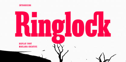 Ringlock is a Slab serif Display font. Bold stroke, fun character with a bit of ligatures and alternates. To give you an extra creative work. Ringlock font support multilingual more than 100+ language. This font is good for logo design, Social media, Movie Titles, Books Titles, a short text even a long text letter and good for your secondary text font with script or serif. Make a stunning work with Ringlock font. Cheers, Maulana Creative
 - MC Merchy by Maulana Creative,
$12.00 Merchy is a Bold Slab Serif display font. Bold stroke, fun character with a bit of ligatures and alternates. To give you an extra creative work. Merchy font support multilingual more than 100+ language. This font is good for logo design, Social media, Movie Titles, Books Titles, a short text even a long text letter and good for your secondary text font with script or serif. Make a stunning work with Merchy font.
 - Trad by Powerfonts,
$13.99 Trad (Träd is Swedish for tree) is inspired by viking mythology and runic alphabets. Imagine a viking warrior crudely carving a message into a tree stump with his trusty dagger, sipping on a flagon of ale and pondering a hard days slaying. Like the blade of his blood encrusted axe, Trad is ideal for projects requiring a sharp edge, such as the cover of your next thriller, zombie flick, or death metal album.
 - Exit Strategy by Hanoded,
$15.00 Every exit is an entry somewhere else. It’s a quote by British playwright Tom Stoppard and I really like it! Exit strategy is a rough brush font, which I made using Chinese ink (where would I be without my Chinese ink??) and the new batch of French paper I bought. Use this font to highlight all that is important, stick it on posters, slap it on book covers - it will definitely do the trick!
 - Bold Fashion by Mans Greback,
$59.00 Bold Fashion is a heavy slab-serif font of the disco era. Its funk-style design, coupled with soft, rounded serifs, embodies the soul of retro, bringing forth memories of neon lights, bell-bottoms, and roller discos. Each letter is profoundly heavy, yet they prance with a bouncy, comfy rhythm, akin to catchy 70s beats. The swashes adorning the uppercase letters add flair, reminiscent of iconic burger joint signs and groovy vinyl covers.
 - Nashter by Maulana Creative,
$15.00 Nashter a Slab serif Display font. Bold stroke, fun character with a bit of ligatures and alternates. To give you an extra creative work. Nashter font support multilingual more than 100+ language. This font is good for logo design, Social media, Movie Titles, Books Titles, a short text even a long text letter and good for your secondary text font with script or serif. Make a stunning work with Nashter font. Cheers, Maulana Creative
 - XAirebesk by Ingrimayne Type,
$14.95 I am not sure exactly how to classify these geometrical ornaments. They resemble the arabesque ornamentation of medieval Islamic art, but also have similarities to Celtic knots and to some Chinese and Korean ornamentation. The bolder of the two only works well at very large point sizes, while the thinner is designed for use at smaller point sizes. There are usually similar ornaments on the same characters of the two, but not always.
 - Servat by Maulana Creative,
$14.00 Servat is a retro semi slab serif font. With medium stroke, fun character with a bit of ligatures and alternates. To give you an extra creative work. Servat font support multilingual more than 100+ language. This font is good for logo design, Social media, Movie Titles, Books Titles, a short text even a long text letter and good for your secondary text font with sans or script. Make a stunning work with Servat font.
 - MC Rothers by Maulana Creative,
$17.00 Rothers is a slab serif display font. Bold stroke, fun character with a bit of ligatures and alternates. To give you an extra creative work. Rothers font support multilingual more than 100+ language. This font is good for logo design, Social media, Movie Titles, Books Titles, a short text even a long text letter and good for your secondary text font with script or serif. Make a stunning work with Rothers font. Cheers, Maulana Creative
 - Korge by Ferry Ardana Putra,
$19.00 Introducing "Korge", a captivating and versatile retro bold slab serif font that seamlessly marries vintage aesthetics with modern functionality. With its bold design, serif form, and a trio of regular, rounded, and extruded versions, Korge offers a wealth of creative possibilities for your design ventures. Korge is a font that transports your projects back to the golden eras of design. Its bold and distinct serifs evoke a sense of nostalgia, lending your creations a classic and enduring appeal. Korge provides not one, but three distinct styles to choose from. The regular version exudes a commanding presence, while the rounded variant softens the edges for a more approachable feel. The extruded version adds depth and dimension, giving your text a 3D, eye-catching quality. Korge is a font that speaks the language of design across borders. With its multi-language support and PUA encoding, it ensures your message resonates with audiences from diverse linguistic backgrounds. From logo design to branding, packaging, posters, and beyond, Korge adapts seamlessly to a wide array of design projects. Its bold slab serifs demand attention, making sure your message is delivered with both authority and style. Korge invites you to embark on a journey of creative exploration. Craft memorable headlines, iconic logos, or striking signage – this font is your canvas for pushing the boundaries of design. With Korge, the possibilities are limitless. Its vintage-inspired bold slab serif design, multi-language support, and versatile styles make it the ideal choice for designers seeking to infuse their projects with timeless charm and contemporary appeal. Get ready to bring your visions to life with Korge, where classic meets cutting-edge. ——— Korge features: A full set of Uppercase & Lowercase letters Numbers and punctuation Multilingual language support PUA Encoded Characters OpenType Features +237 Total Glyphs Rounded Style + Regular Style Extruded Style Korge Includes: Korge Regular Korge Regular Extruded Left Korge Regular Extruded Right Korge Regular Extruded Left Italic Korge Regular Extruded Right Italic Korge Rounded Korge Rounded Extruded Left Korge Rounded Extruded Right Italic Korge Rounded Extruded Left Korge Rounded Extruded Right Italic
 - FS Clerkenwell by Fontsmith,
$80.00 A creative context 2003. Fontsmith was sharing a small, cold, whitewashed studio space in Northburgh Street, Clerkenwell. But things were on the up following prestigious custom type commissions for The Post Office and E4. “Slab serifs were on the brink of another revival, we could feel it,” says Jason Smith. “All we wanted to do was have a play with these slabs, go as far as we could within what was acceptable and readable.” “It wasn’t initially clear what was happening,” recalls Phil Garnham. “We were becoming very influenced by our surroundings, outside the studio space. We absorbed the essence and the designer grime of where we were.” Process Jason began by drawing stems on-screen. “The key aspect of the font is the upward bend of the leading shoulder serif, the way it kind of ramps up and then plummets back down the stem. “The regular and light characters are quite narrow – great for text but the bold is quite wide and chunky – better for headlines. I think ‘y’ is quite different for a slab design. We call it the Fontsmith ‘y’.” Promotion Fontsmith were determined to get FS Clerkenwell noticed. To launch the font, Ian Whalley, a designer friend of Fontsmith, captured words heard on the streets of Clerkenwell, set them in the new font and crafted a small book of typographic conversations. It was a first for Fontsmith. “I think that’s part of why this font has been so successful,” says Phil. “It really does embody the spirit of the area, as a special place for design, arts and crafts. And designers love that.” Contemporary twist FS Clerkenwell, based on influences in and around this part of London with a rich tradition of printing and design, mixes tradition with creation. Old-fashioned values meet new-school trends. Its quirky, contemporary character lends an edge to headlines, logotypes and any large-size text.
 - Grandfami by UlianaShabanova,
$10.00 Welcome to the new font! An elegant slim handwritten font created from childhood memory. This is how my grandfather wrote. He seemed very beautiful to me when he was little and I really wanted to write "when I grow up" too:) Perfect for captions in photo albums, on photos, birthday invitations, calendars, magazines, Instagram posts and more! A vector font is composed of uppercase and lowercase letters. Feel free to email me shabanovasprt@gmail.com if you have any questions. :)
 - Timeless Radiance by Letterhend,
$14.00 Timeless Radiance is an organic font duo consist of a bold script paired with a slab serif with a touch of classic look and feel. This type of font perfectly made to be applied especially in logo, headline, signage and the other various formal forms such as invitations, labels, logos, magazines, books, greeting / wedding cards, packaging, fashion, make up, stationery, novels, labels or any type of advertising purpose. Features : Uppercase & lowercase Numbers and punctuation Alternates/Ligatures Multilingual PUA encoded
 - LifeAfterCollege by Ingrimayne Type,
$13.95 The LifeAfterCollege family began as a set of four fonts based on two styles of Ranger, which are slab-serif, geometric fonts with no curves. Two of the four are outlines with hollow insides, and two have-filled insides. The two fonts that are outlined have been taken apart and made into three typeface that can be layered. This allows one color for the inside, another for the middle ring, and a third for the outside outline.
 - Kheops by Tipo Pèpel,
$22.00 Kheops is a slab-serif style typeface, with a contemporary scent and designed for long texts, without giving up on big headlines, it is accompanied by an authentic cursive with a dynamic rhythm and a skeleton with humanist reminiscences, it also includes a set of ornaments based on in simple geometric shapes, and an extensive range of OpenType functionalities to meet the needs of the most demanding designer, an all-rounder that cannot be missing from your typographic palette.
 - Broochy by Maulana Creative,
$16.00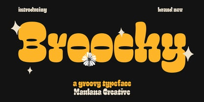 Broochy is a Groovy Slab serif Display font. Heavy and medium contrast stroke, fun character with a bit of ligatures and alternates. To give you an extra creative work. Broochy font support multilingual more than 100+ language. This font is good for logo design, Social media, Movie Titles, Books Titles, a short text even a long text letter and good for your secondary text font with script or serif. Make a stunning work with Broochy font. Cheers, Maulana Creative
 - Modern West JNL by Jeff Levine,
$29.00 Presenting… a Western style alphabet from the 1960 edition of Samuel Welo’s “Studio Handbook for Artists and Advertisers”… Extra bold, featuring slab serifs and concave corners, this type style could easily have been found on building signage in the Old West… but in redrawing it digitally, it’s been named Modern West JNL because at one time, this would have been considered a modern style of lettering. Modern West JNL is available in both regular and oblique versions.
 - Bianca by Laura Worthington,
$25.00 Bianca is a semi-connected script whose slim strokes, gently curving verticals, and big, beautiful capitals convey a fashionable, feminine style. Customize with over 50 alternate glyphs to add variation to your design. See what’s included! http://bit.ly/2cdTMIe *NOTE* Basic versions DO NOT include swashes, alternates or ornaments This font has been specially coded for access of all the swashes, alternates and ornaments without the need for professional design software! Info and instructions here: http://lauraworthingtontype.com/faqs/
 - Logtown by Jinan Studio,
$12.00 Logtown Duo is a hand-drawn font that blends vintage charm with a rugged edge. It's the perfect choice for your vintage-themed logos, branding, and adventurous designs. This font combo combines both elegant Script and Slab Serif styles, giving you options from solid to textured looks. Plus, it's got your back with support for multiple languages, making sure your message reaches everyone. Whether you're aiming for nostalgia or a modern twist on the classics, Logtown Duo has you covered for stylish and impactful designs. Features A set of uppercase and lowercase glyphs Number, symbol, and punctuation Multilingual Support Alternates, ligatures, and swashes (script version) Type j_1 until j_9 to features swash, ligatures will automatically replace the standard letter pairs whenever available, when using any OpenType capable software (script version).