10,000 search results
(0.04 seconds)
- Ottmar by Atom,
$17.00 Ottmar is a bold casual script font, created using a brush that is etched on paper with care to produce a unique and organic character. With contextual alternate and ligature it will give a very special nuance if used in the design. Hope you like it!
 - Concord by Soneri Type,
$39.00 Yet another typeface with simplicity as its core element. Concord is derived from a successful type family ‘Accord Alternate’ with an added geometric touch. Concord is a geometric sans serif. It has large counters which enhance readability. It is available in seven different weights for emphasis.
 - Street Power by Arendxstudio,
$17.00 Street Power is a free style font that has the characteristics of street art that shows freedom. It is filled with unique characters. Features : • Character Set A-Z • Numerals & Punctuations (OpenType Standard) • Accents (Multilingual characters) • Ligatures • Alternates There it is! I really hope you enjoy it.
 - Kathaline by Fikryal,
$15.00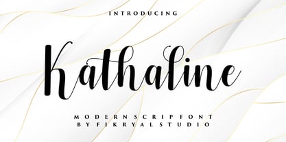 Kathaline is a natural script font perfect for crafting, branding, invitation, stationery, wedding designs, social media posts, advertisements, product packaging, product designs, label, photography, watermark, special events, or anything. Kathaline comes with full set of uppercase and lowercase letters, alternates, ligatures,multilingual symbols, numerals and punctuation.
 - Dearlove by Fikryal,
$16.00 Dearlove is a beautiful calligraphy font perfect for crafting, branding, invitation, stationery, wedding designs, social media posts, advertisements, product packaging, product designs, label, photography, watermark, special events or anything. Dearlove comes with full set of uppercase and lowercase letters, swash alternates, ligatures,multilingual symbols, numerals and punctuation.
 - The Overcook by Arendxstudio,
$22.00 The Overcook is a free style font that has the characteristics of street art that shows freedom and is filled with unique characters Features : • Character Set A-Z • Numerals & Punctuations (OpenType Standard) • Accents (Multilingual characters) • Ligature • Alternate There it is! I really hope you enjoy it
 - Juvenis by Storm Type Foundry,
$32.00Designs of characters that are almost forty years old can be already restored like a historical alphabet – by transferring them exactly into the computer with all their details. But, of course, it would not be Josef Tyfa, if he did not redesign the entire alphabet, and to such an extent that all that has remained from the original was practically the name. Tyfa published a sans-serif alphabet under the title Juvenis already in the second half of the past century. The type face had a large x-height of lower-case letters, a rather economizing design and one-sided serifs which were very daring for their time. In 1979 Tyfa returned to the idea of Juvenis, modified the letter “g” into a one-storey form, narrowed the design of the characters even further and added a bold and an inclined variant. This type face also shows the influence of Jaroslav Benda, evident in the open forms of the crotches of the diagonal strokes. Towards the end of 2001 the author presented a pile of tracing paper with dozens of variants of letter forms, but mainly with a new, more contemporary approach: the design is more open, the details softer, the figures and non-alphabetical characters in the entire set are more integral. The original intention to create a type face for printing children’s books thus became even more emphasized. Nevertheless, Juvenis with its new proportions far exceeds its original purpose. In the summer of 2002 we inserted all of this “into the machine” and designed new italics. The final computer form was completed in November 2002. All the twelve designs are divided into six variants of differing boldness with the corresponding italics. The darkness of the individual sizes does not increase linearly, but follows a curve which rises more steeply towards the boldest extreme. The human eye, on the contrary, perceives the darkening as a more fluent process, and the neighbouring designs are better graded. The x-height of lower-case letters is extraordinarily large, so that the printed type face in the size of nine points is perceived rather as “ten points” and at the same time the line spacing is not too dense. A further ingenious optical trick of Josef Tyfa is the figures, which are designed as moderately non-aligning ones. Thus an imaginary third horizontal is created in the proportional scheme of the entire type face family, which supports legibility and suitably supplements the original intention to create a children’s type face with elements of playfulness. The same applies to the overall soft expression of the alphabet. The serifs are varied; their balancing, however, is well-considered: the ascender of the lower-case “d” has no serif and the letter appears poor, while, for example, the letter “y”, or “x”, looks complicated. The only serif to be found in upper-case letters is in “J”, where it is used exclusively for the purpose of balancing the rounded descender. These anomalies, however, fit perfectly into the structure of any smoothly running text and shift Juvenis towards an original, contemporary expression. Tyfa also offers three alternative lower-case letters *. In the case of the letter “g” the designer follows the one-storey form he had contemplated in the eighties, while in “k” he returns to the Benda inspiration and in “u” adds a lower serif as a reminder of the calligraphic principle. It is above all the italics that are faithful to the tradition of handwritten lettering. The fairly complicated “k” is probably the strongest characteristic feature of Juvenis; all the diagonals in “z”, “v”, “w”, “y” are slightly flamboyant, and this also applies to the upper-case letters A, V, W, Y. Juvenis blends excellently with drawn illustrations, for it itself is modelled in a very creative way. Due to its unmistakable optical effect, however, it will find application not only in children’s literature, but also in orientation systems, on posters, in magazines and long short-stories. - Green Mountain 3 isn't a font with widespread recognition or detailed public documentation as of my last update in early 2023, so providing an accurate and detailed description poses a bit of a chall...
- Quietism Variable by Michael Rafailyk,
$150.00 A smooth contemplative Antiqua with aspiring to the sky ascenders, inspired by the Quietism philosophy. Clarity of the mind is achieved by bringing the body into a state of calm and contemplation, and this is reflected in the design – the quiet horizontal serifs (body) are opposed to the peaky soaring ascenders (mind). The design also features four optical size subfamilies with different x-height and contrast, oldstyle diagonal stress, oldstyle figures by default, smooth details and slightly dark texture. Variable axes: Weight, Contrast, X-Height. Scripts: Latin, Greek, Cyrillic. Languages: 480+. The complete list of supported languages: michaelrafailyk.com/quietism Kerning: 4553 class-to-class pairs. Hinting: Not applied. Format: TTF – OpenType with TrueType outlines. Variable Font: Quietism Variable provides more options than static versions, and has three axes: Weight (Thin–Black), Contrast (Low-High), and X-Height (Low-High). Variable fonts includes thousands of styles that you can access using a sliders on graphic editor or via CSS on web browser. Mixing different axes gives you extra styles not represented by static fonts. Optical Size: The typeface is represented by four subfamilies: Text (low contrast, high x-height – for paragraph 10-20 pt), Deck (medium contrast, medium x-height – for subheading 20+ pt), Display (high contrast, medium x-height – for heading 72+ pt), Poster (high contrast, low x-height – for big size 120+ pt). Small Caps: Lowercase letters and Oldstyle Figures are replaced with Small Capitals forms. Capitals to Small Caps: Uppercase letters, all figures, and some punctuation are replaced with Small Capitals forms. Case Sensitive Forms: ()[]{}‹›«»-–—•·#%‰@ and Arrows are centered on capitals. Oldstyle figures are replaced with Lining figures. Oldstyle Figures: 0123456789 #%‰. Designed to work with lowercase letters. Used by default. Lining Figures: 0123456789 #%‰. Figures are the same height as uppercase letters (cap height). Proportional Figures: Lining, Oldstyle, Small Caps, Capitals to Small Caps. Tabular Figures: Lining, Oldstyle, Small Caps, Capitals to Small Caps. Ordinals: adehnorst. Superscript, Subscript, Numerator, Denominator: 0123456789. Fractions: ¼½¾⅐⅑⅒⅓⅔⅕⅖⅗⅘⅙⅚⅛⅜⅝⅞⅟ (precomposed). Any other fractions (even those typed through a slash) will also be displayed correctly, with the automatic replacement to Numerator + fraction + Denominator. Slashed Zero: All 0 figures. Contextual Alternates: Number sign character (#) before uppercase letters is replaced by its version centered on capitals. Hyphen character (-) between two uppercase letters is replaced by its version centered on capitals. First of two TT letters is replaced by its alternate form. Letters vwy before the letters fijmnprtuvwxy are replaced with an alternate shorter versions that fits better in the context. Contextual Alternates (Greek): ΆΈΉΊΌΎΏ. Greek uppercase accented characters lose their tonos accent and retain only dieresis in All Caps and Small Caps modes. Turned on by default. If you need tonos accents in All Caps then turn off Contextual Alternates (calt) feature. Stylistic Alternates: FTГТИЦЩцщ and their versions with diacritical marks. Stylistic Set 01 “Arrows”: Left <- Right -> Up Left Right <-> Up Down North West South East \> South West Stylistic Set 02 “Round-Square Cyrillic”: ДИЙЍЛФвгджзийѝклнптцчшщьъю characters are replaced with its Bulgarian or Russian forms. Stylistic Set 03 “Cyrillic Tse Shcha short tails”: ЦЩцщ characters are replaced with its alternate form with short tail. Stylistic Set 04 “Cyrillic I full serifs”: ИЙЍӢ characters are replaced with its alternate form with inner serifs. Stylistic Set 05 “FT bent inward serif”: FTГ characters and their versions with diacritical marks are replaced with its alternate form with right head serif that bent inside. Stylistic Set 06 “Small Caps centered on Capitals”: Small Caps are vertically centered on uppercase letters. Standard Ligatures: fi fl fb ff fh fj fk ffb ffh ffi ffj ffk ffl. Discretionary Ligatures: Th ct st. Localized Forms: 52 character substitutions for Azeri, Bulgarian, Catalan, Dutch, German, Kazakh, Macedonian, Moldavian, Polish, Romanian, Serbian, Tatar, Turkish. Glyph Composition/Decomposition (Diacritics): Full Latin and based Vietnamese set of diacritics (571 characters). Precomposed.
 - Larchmont by Greater Albion Typefounders,
$8.95 Larchmont is a piece of pure fun, inspired by inter-war enamel advertising hoardings (often known as 'street jewelry') and by traditional sign writing. It's ideal for poster design, book covers and any sort of signage, or just about anywhere you need more than a hint of flair. Larchmont combines a sense of fun with a traditional ethos. The family is offered in three widths, each in upright and oblique forms. Revive the golden age today!
 - Brown Marlyn by Ergibi Studio,
$20.00 This is the perfect combination of fonts, we are proud to introduce BROWN MARLYN, these fonts are of two types serif and script. Display Serif inspired by famous logo, This typeface has been made carefully to make sure its premium quality and luxury feel. The ligatures on serif makes this typeface unique and stands out rather than the regular serif font, perfectly for headlines, wedding, social media, logos, posters, packaging, T-shirts,coffee shops, restaurants, magazine’s headers, signs or gift/post cards,cafe’s and weddings or any type of advertising purpose. What's Included : Standard glyphs Ligatures International Accent Works on PC & Mac Simple installations If there is a problem, question, or anything about my fonts, don't hesitate to ask! Big Thanks ~ Ergibi Studio
 - La Casa by URW Type Foundry,
$35.99 Font design meets architecture – the unique and architectural design of the urban villa “Dupli.Casa” by the architect J.Mayer.H triggered the inspiration for the typeface “La Casa”. Inclinations and curvatures mirror the linear, modern impression of the architecture. The overall impression of the sans serif accounts for the great readability, even in lower point sizes – perfect for the design of books and magazines. The fresh and modern appearance of the font is particularly suitable for corporate designs of enterprises. The seven-font weights support more than 100 languages and the Cyrillic characters ensure a versatile and international use. The low contrast, the reduction of the corner points and the clear nature of the font make “La Casa” perfectly applicable as a web font.
 - Echelon by Barnbrook Fonts,
$50.00 Echelon is based upon 1970s Eastern European ‘pipe-style’ typefaces. This style of Communist consumer typography came from what, at the time, seemed like a bizarre mirror universe: Existing alongside the West, similar-but-different, essentially unknowable. Even though the letterforms had the same historical origins as their Western equivalents, they also had their own bizarre fashionable/unfashionable aesthetic. The parallels between the surveillance practices of the Soviet Union and those of today’s Western governments informed the naming of this typeface. Echelon is the codename for a massive international surveillance system that collects and processes data from communications satellites. It can eavesdrop on telecoms and computer systems, it can track bank accounts. It can record and store information on millions of individuals.
 - Forked Tongue by Comicraft,
$19.00 Are you Troubled by Ghostly Voices in the night? Do you hear the Terrifying Tones of Demons and Ghouls in your Attic or Cellar? Have you or any of your family spoken with "Forked Tongue? Well, talk of the devil, Forked Tongue happens to be the latest offering brought to you buy our courteous and efficient staff this month (now on call twenty-four hours a day to serve all your supernatural lettering needs). If it Sounds Spooky, it most probably speaks with Forked Tongue. Oh, but if you really have got ghosts or poltergeists, well, um, we don't know who you gonna call. Features: Four weights (Regular, Italic, Bold & Bold Italic) with upper and lower case alphabets. Includes Western and Central European international characters.
 - Plinc Swiss Interlock by House Industries,
$33.00 Swiss Interlock represents the extraordinary meeting of two disparate cultural phenomena of the mid-twentieth century. Its compact frame combines the International Style of the late 50s, which championed the clarity of sans serif, with the interlocking lettering characteristic of 60s counterculture aesthetics. The remarkable result is a tightly woven face with unexpected letter pairs that warm an otherwise cold industrial appearance. Swiss Interlock’s unusual origins make it comfortable on everything from album cover artwork and snack food packaging, to home improvement applications and automotive-themed advertsing. Like all good subversives, House Industries hides in plain sight while amplifying the look, feel and style of the world’s most interesting brands, products and people. Based in Delaware, visually influencing the world.
 - Linotype Party Time by Linotype,
$29.99Linotype Party Time is part of the Take Type Library, chosen from the entries of the Linotype-sponsored International Digital Type Design Contests of 1994 and 1997. The typeface is the work of Bulgarian designer Christo Velikov and is composed exclusively of capital letters. Different components make up this cheeful, frolicking font: stripes, dots, triangles, arrows, a trumpet, a ribbon, and others. The characters of Linotype Party Time stand straight on the base line while those of Linotype Party Time Drunk take on the stance typical of this state. Linotype Party Time is perfect for anything which has to do with fun and should be used exclusively in larger point sizes to emphasize the details which make the figures so unique. - Linotype Flamingo by Linotype,
$29.99Linotype Flamingo, from German designer Michael Leonhard, is part of the TakeType Library, chosen from the entries of the Linotype-sponsored International Digital Type Design Contest 1999 for inclusion on the TakeType 3 CD. The figures of this font have pieces missing, the curve of an a, the stroke of an n. The eye fills in the gaps, allowing the designer to present a unique font with reductionist forms which can still communicate written ideas to the reader. A small number of forms come together to create the alphabet and the 'missing pieces' make a light and airy overall impression. Linotype Flamingo should be used in point sizes of 18 and larger and because of reduced legibility should be used only for very short texts. - Holy Grail by Comicraft,
$29.00 GOOD GOD! You have circumnavigated the globe and chosen wisely...The Grail is FOUND! Oh... no, Zoot set light to our beacon, which I've just remembered is Grail-shaped. But wait, look! There! Carved in the wall... a Legend: "Here may be found the last words of Joseph of Aramathia: He who finds the Grail must face three, maybe four, challenges. First, the path of God; Second, the word of God; Third, the breath of God, and fourth is the Font of God. Only a font that is valiant, pure of spirit and includes international characters, both European AND Cyrillic -- may find the Holy Grail... in the Castle of AARRGGGHHH… That's all it says; the guy carving it must have died before he could finish.
 - Ongunkan Kensington Runestone by Runic World Tamgacı,
$70.00 The Kensington Runestone is a rune-covered slab of brownstone that was claimed to have been discovered in central Minnesota in the United States in 1898. Olof Öhman, a Swedish immigrant, reported that he dug it out of a field in the largely rural town of Solem in Douglas County. It was then named after the nearest settlement, Kensington. The inscription claims to be a record left behind by Scandinavian explorers in the 14th century (internally dated to 1362). There has been a long-standing debate as to the stone's authenticity, but since the first scientific review in 1910, scientific consensus has classified it as a 19th-century hoax, and some critics have directly accused Öhman of fabricating it. there is community.
 - Scoundrel by Comicraft,
$19.00 Leathery and Loopy Letterer of Legend, Richard Starkings has pointed his Apple Pencil at Procreate on his iPad and proceeded to raise the bar on lower case for this scandalous series of squiggles we had to call Rendered in the style of ShoutOut, this jaunty new Comicraft offering features both upper and lower case and recreates a pen lettering style of which we honestly thought Old Man Starkings was no longer capable! Suitable for jolly journal entries, hand-written notes to loved ones and sundry laundry lists, SCOUNDREL does more than Shout, and it does it quite quietly too! Scoundrel includes four weights (Regular, Italic, Bold & Bold Italic) with upper and lower case alphabets plus Western and Central European international characters.
 - Linotype Bix by Linotype,
$29.99Linotype Bix Plain, from Argentinian designer Victor Luis Garcia, is part of the Take Type Library, chosen from the entries of the 1999 International Digital Type Design Contest for inclusion on the Take Type 3 CD. The font is composed exclusively of capital letters. The figures have constructed basic forms and show the influence of the advertisement types of the 1920s, with all their well-mannered details. The lower sections of the graceful letters are white and set against a black background, the upper sections are black on white. This makes the overall picture look as though written on stripes and gives the delicate letter stability. The nostalgic-modern Linotype Bix Pleain is best for headlines in point sizes of 18 or larger. - Appetite Pro by Serebryakov,
$39.00 Appetite Pro is a total upgrade of the world wide popular display font Appetite (2011). It is based on original lettering and belongs to the upright script like. Appetite Pro consists of 10 weights of the refreshed curves — 5 regular and 5 italic — from Light to Heavy. It’s a multilingual and international font, with a full Western Latin, Cyrillic (Russian, Belarusian, Ukrainian) and basic Greek support. The Appetite Pro font family is specially designed for food identity and packaging design projects. In addition to standard letter cases, Appetite Pro also includes dingbats set. Due to the 10 weights font palette, you can solve a wide variety of professional problems without spending money on extra fonts for titles, subtitles, and main text. Try and buy!
 - Halesbridge by Joanne Marie,
$12.00 Halesbridge is a soft sans serif font family consisting of 7 weights (from hairline to black), 4 widths (regular to super wide) and all styles are in italic. Many languages are supported (see the picture showing the international glyphs). It’s simple letterforms make it easy on the eyes for reading large amounts of body text and looks very modern, especially in the lighter weights. This family is perfect for editorial design, website design and general informative media. However, I can see endless possibilities for typographic logo designs because of the different widths and weights. Overall, this font family will be a great addition to your design assets, commanding the attention your creative projects deserve. For regular updates and freebies please follow me on Instagram at joannemarie_cm
 - Pivnaya-Arabic by Roman Type,
$35.00 An Arabic font designed by a German living in Berlin’s Neukölln district, between Karl-Marx-Strasse and Sonnenallee. This is the Latin+Arabic version of poster/display font Pivnaya designed and published by Roman Type. Designer Roman Wilhelm finds himself constantly surrounded by Arabic type and hand-lettering in his neighborhood. With this font, he is trying to answer to all these linguistic, type-related, and cultural inspirations. It works for Afrikaans, all languages of the Arab World, Albanian, Catalan, Croatian, Czech, Danish, Dutch, English, Estonian, Farsi, Finnish, French, German, Hungarian, Icelandic, Italian, Latvian, Lithuanian, Maltese, Norwegian, Polish, Portugese, Romanian, Slovak, Slovenian, Spanisch, Swedish, Turkish, Urdu, Vietnamese, Zulu. Equipped with a wide coverage of the International Phonetic Alphabet (IPA), the font is equipped for multi-purpose usage.
 - Blackstar by Cooldesignlab,
$15.00 Blackstar is a beautiful and interesting calligraphy handwriting font. The font looks sweet and full of character. You can use this font in your design products like invitation, mockup, embossed, branding card and others. Bonus is Extra Swashes. Blackstar includes a full set of large and attractive international letters, numbers, punctuation and ligatures. All lowercase letters include the beginning and end of the swashes. Also multilingual symbols. The script is encoded with PUA Unicode, which allows full access to all additional characters without special design software. Mac users can use Font Books, and Windows users can use Map Characters to view and copy additional characters to be included in your favorite text editor / app. Thank you for the purchase & don't forget to click recommended.
 - Linotype Startec by Linotype,
$29.99Linotype Startec, from Jan Tomás, is part of the TakeType Library, chosen from the entries of the Linotype-sponsored International Digital Type Design Contest 1999 for inclusion on the TakeType 3 CD. This is another fun font from Tomás, who also designed Alphabat, and the two share some characteristics. Linotype Startec is an outline font whose unique forms are reminiscent of futuristic dreams and space adventures. It should be used in point sizes of at least 18, but the phrase 'the bigger the better' fits this font well. The careful details and figures of the alphabet turn into UFOs and space ships from another world when set in very large point sizes. Linotype Startc is best for very short texts and headlines. - Jugo Script by Sudtipos,
$39.00 Jugo Script is a Koziupa/Paul near-parody of the soft and speedy late-1980s, early-1990s display scripts. Though it essentially is one of the usual exhibits of Koziupa's calligraphic skill, its individual shapes and overall construct show a mischievous wink at Oz Cooper and the hundreds of lens-blurred film types he inspired in the 1970s and 80s. Koziupa's unique sense of letterform and proportion is on full display in the uppercase and the figures, while the lowercase is an eccentric exercise in single stroke lettering, complete with quick and subtle wrist bends, minimal pausing, and hurried exits. Jugo Script's softness and internal call-and-answer structure make it a natural for comfort food packaging, especially the sweet stuff.
 - Jenthill by Katsia Jazwinska,
$15.00 Introducing Jenthill - a lovely font family which includes 4 font styles: - a wonderful script typeface Jenthill - Jenthill Light - a delicate version of Jenthill - 2 uppercase fonts Jetnthill Caps and Jenthill Light Caps which are perfect for headings. Each font consists of about 380 glyphs and includes basic punctuation, numbers, roman typeface and international characters, so the font can be used with most of the European languages. Each font in this family is amazing in itself and perfectly combined with each other. So, if you are looking for a font that simulates the soft-edged handwriting, the Jenthill is just for you! Every letter of this font has been carefully crafted to look wonderful and helps you to add a little fancy to your work.
 - Brevier by CAST,
$45.00 Compact sans, ideal for setting long texts in small or very small type sizes: for packaging, instruction booklets, drug information leaflets and anything else that has to be legible at very small sizes. Lean and rhythmical, designed ideally to be used at less than 8 points (Brevier was the old typefounders’ name for 8-point type), Brevier holds up well even under adverse printing conditions. The apparently geometric letterforms hide Renaissance characteristics, the x-height and openings are very generous and the strokes slightly modulated. In order to offset ink spread – which is inevitable when printing very small sizes of type – Brevier has large white spaces between the letters. All internal angles have deep ink traps and many connections have been left open.
 - Linotype Sangue by Linotype,
$29.99Linotype Sangue is part of the Take Type Library, selected from the contestants of Linotype’s International Digital Type Design Contests of 1994 and 1997. This prize-winning font was designed by the German artist Gabriele Laubinger. The most distinguishing characteristic of Linotype Sangue is the contrast between the wide, rounded capital letters and the tall, narrow and pointed lower case. Another factor which makes this font so unique is the way Laubinger worked with stroke contrasts, using heavy strokes in the top third of the characters and diminishing to extremely light strokes at the bottom. Linotype Sangue makes a mysterious, secretive impression. It is best used for headlines and displays and shorters texts with point sizes of 12 and larger. - Little Paws by Tigade Std,
$25.00 Little Paws. Are you team Cat or team Dog? Doesn't matter which side you are pick to, this font is cuteness overload. It is for everyone, not only limited to Cat or Dog but also open for any Pet Lovers. This font is suitable for happy theme, cute, party, holiday, kids and many more. It is also suitable for Logo, Cards, Branding, Social Media, Youtube Thumbnail, Advertisement, Posters, any many others. To make it easier for you to design, we provide two additional font family to enhance the beauty of the design. Features: - Standard Characters (Uppercase and Lowercase) - Numerals - Punctuation - International Characters Disclaimer: Clips arts shown in the posters/images are not included. It is for promotional purpose. Enjoy designing and stay Safe! Tigadestd
 - Thertole by Twinletter,
$16.00 Thertole is a dramatic display font with a strong background. Because of its rock-inspired design, this typeface is dashing and bold for individuals who dare to be distinctive. If you use this font for a variety of outdoor events, you will get an exquisite and unique look. Standard ligatures, character choices, and international language support are also included in this typeface. This font is perfect for games, sporting events, branding, banners, posters, movie titles, book titles, quotes, and more. of course, your various design projects will be perfect and extraordinary if you use this font because this font is equipped with a complimentary font family, both for titles and subtitles and sentence text, start using our fonts for your amazing projects.
 - Moskau Pattern by Letter Edit,
$49.00 The design of the typeface Moskau Grotesk and Moskau Pattern is based on the signage created for the Café Moskau in Berlin by the graphic artist Klaus Wittkugel in the beginning of the 1960s. The Café Moskau, across from the Kino International on Karl-Marx-Allee in Berlin Mitte was one of the prestige edifices of the former DDR (German Democratic Republic). Built in the early 1960s, it advanced over the years and changing social developments to a trademark building of the capital. The lettering display on the roof was created by the graphic artist Klaus Wittkugel (October 17, 1910 – September 19, 1985). He had been Professor at the School for Applied Arts in Berlin, and, in addition to the creation of many posters, book covers and postage stamps, he was responsible for the signage of the Kino International as well as for the complete graphic treatment for the Palace of the Republik. The signage for the Café Moskau with the words »RESTAURANT«, »CAFÉ«, »KONZERT« and »MOCKBA« set in capital letters, becomes the basis for the Moskau Grotesk which was developed by Björn Gogalla in 2013. This face should not be seen as an imitation. A few shortcomings were »fixed«. In favor of maintaining the core characteristics some unique features were, however, not relinquished. Lower case letters and the missing capital letters were designed from scratch. It is not surprising that the plain, unassuming geometrical direction of the basic character style forms a bridge to the architecture of the 1960s. Inspired by the then favored, diverse possibilities inherent in the architectural example and wall reliefs, two complimentary pattern fonts emerged.
 - Moskau Grotesk by Letter Edit,
$39.00 The design of the typeface Moskau Grotesk is based on the signage created for the Café Moskau in Berlin by the graphic artist Klaus Wittkugel in the beginning of the 1960s. The Café Moskau, across from the Kino International on Karl-Marx-Allee in Berlin Mitte was one of the prestige edifices of the former DDR (German Democratic Republic). Built in the early 1960s, it advanced over the years and changing social developments to a trademark building of the capital. The lettering display on the roof was created by the graphic artist Klaus Wittkugel (October 17, 1910 – September 19, 1985). He had been Professor at the School for Applied Arts in Berlin, and, in addition to the creation of many posters, book covers and postage stamps, he was responsible for the signage of the Kino International as well as for the complete graphic treatment for the Palace of the Republik. The signage for the Café Moskau with the words »RESTAURANT«, »CAFÉ«, »KONZERT« and »MOCKBA« set in capital letters, becomes the basis for the Moskau Grotesk which was developed by Björn Gogalla in 2013. This face should not be seen as an imitation. A few shortcomings were »fixed«. In favor of maintaining the core characteristics some unique features were, however, not relinquished. Lower case letters and the missing capital letters were designed from scratch. It is not surprising that the plain, unassuming geometrical direction of the basic character style forms a bridge to the architecture of the 1960s. Inspired by the then favored, diverse possibilities inherent in the architectural example and wall reliefs, two complementary pattern fonts emerged.
 - Typek by Agnieszka Ewa Olszewska,
$25.00 Typek is a sans serif typeface for the lovers of minimal design and great curves. Typek outlines' professional shapes are perfect for large display usage.. Perfect for branding, posters, web and publications. The idea is to treat the letters' stroke create absorbing and interlaced shape. The design of small interfering in letters' construction makes Typek unique. Typek contains uppercase, diacritics and digits. The Typek Family is in two versions: Regular and Outline. Outline version can be an interesting addition and decoration for the Regular version.
 - Ollie by Eclectotype,
$40.00 Meet Ollie, a casual signage script whose friendly, bouncy exterior belies a heart of sophisticated OpenType programming. This font is designed to make the most of OpenType savvy applications, and as such is recommended for professional design use. Or to put it another way: Make sure that contextual alternates and ligatures are always turned on! Ollie includes about 900 glyphs, many of which are automagical substitutions to keep the text flowing smoothly, and to pseudo-randomly pick different glyphs to avoid repetition. With contextual alternates turned on (as they should be by default), most lowercase letters will alternate between at least two different forms. The powerful OpenType programming makes the font itself ‘look back’ (up to eight characters) on previously used letters; typing “banana” will give you three different a’s and two different n’s (the last a is a special ‘end form’ character). The calt feature controls many other ‘special effects’ which all add together to give a smooth-flowing, hand-lettered look. These effects include start and end forms (and indeed, ‘loner’ forms) of many letters, which are automatically substituted in at beginnings or ends of words, or when the previous or next letter doesn't connect. Another special feature tests to see if there is room for the crossbar of t (or tt ligature) to extend further over the previous or next letter, or both, as is often the case. The last main effect of the calt feature is to substitute certain letters typed before any ‘e’ character, to make for a more natural connection (see the pe combination in ‘Eclectotype’ in the first poster). Ligatures should be on by default, for a much nicer looking tt combination, and a few others besides. The swash feature should be used sparingly (one glyph at a time, really) to apply a more extravagant look to g,j and y in the lower case, and quite a few of the upper case too. Oldstyle figures are included, as well as the lining defaults. Now to delve into the stylistic alternates... These are all included in the salt feature, or for uses of applications that support them, separated into stylistic sets thus: ss01 - (with swash feature on) L and G swashes get even swashier. ss02 - standard s changes to a connected script s form. ss03 - r takes on a script form. ss04 - z also gets a scriptier look. [the previous three sets also change any versions of s, r or z with diacritics] ss05 - a useful underline function. When enabled, typing two or more underscores will extend a cool underline under the previous letters. More underscores = longer underline. ss06 - the Polish script lslash changes to its more standard form. ss07 - E, S and B change to a more top-heavy alternate form. ss08 - An alternate form for A characters. ss09 - Alterative rounder forms of M and N. ss10 - An alternate ampersand. That about wraps up the features. Now all that’s left is for you to license the font and get experimenting!
 - Gamory by Alit Design,
$21.00 🌿 Embrace the beauty of the natural world and the sophistication of elegant design with the Garmony Typeface. This exquisite font is a harmonious blend of nature-inspired decorative leaf illustrations and a versatile typeface that effortlessly combines two styles: Serif and Elegant Script. Whether you're working on a project for your wedding, branding, or any creative endeavor, Garmony brings the perfect balance of organic charm and refined aesthetics. ✒️ Serif Meets Script: Garmony Typeface seamlessly marries two distinct design styles. The serif characters exude a timeless and classical feel, while the elegant script elements add a touch of fluidity and grace. This dynamic fusion makes Garmony Typeface exceptionally versatile, suitable for various applications and themes. 🌱 Nature-Inspired Decorative Leaves: Each character within Garmony Typeface is adorned with delicate decorative leaf illustrations, reminiscent of lush foliage. These charming details infuse your text with a touch of nature, making it ideal for eco-friendly, organic, or natural-themed projects. 🎨 Dynamic Ligatures and Alternatives: Garmony Typeface includes an array of dynamic ligatures and alternative characters, enhancing the fluidity and elegance of your designs. With these options at your disposal, you can create text that appears hand-crafted and truly unique. 🌐 PUA Unicode and Multilingual Support: No matter where your project takes you, Garmony Typeface is fully equipped to meet your linguistic needs. It includes PUA (Private Use Area) Unicode, ensuring compatibility with various design software and providing support for multiple languages. This international versatility ensures your message reaches a global audience with style. 🌾 Swash and Swirl Delight: Elevate your design with Garmony's swash and swirl elements, perfect for adding an extra dash of sophistication to headlines, titles, and logos. These intricate details showcase the font's elegance, making it stand out in any context. 🌏 Versatility and Style: From wedding invitations to logos, product packaging to blog headers, Garmony Typeface brings unparalleled versatility and style to your creative projects. It's the perfect choice for designers, creatives, and individuals seeking a font that combines the beauty of the natural world with the grace of elegant design. Embrace the harmony of nature and elegance with Garmony Typeface. Unleash your creativity and let your designs flourish with the timeless charm and artistic sophistication that only Garmony can provide. Experience the magic of Garmony Typeface today and elevate your projects to a new level of style and allure.
 - Soft Whisperings Calligraphic by Joanne Marie,
$16.00 Introducing Soft Whisperings Calligraphic - A beautifully flowing modern calligraphy font. This delicate, modern script font is full of romance and elegance. It’s perfect for wedding stationery, Save The Date and special occasion cards. Soft Whisperings has a lovely handwritten feel to it so it’s also great for logos, signatures, taglines and calligraphic projects. There are plenty of alternate glyphs and ligatures! International Language Support Soft Whisperings Calligraphic supports 219 latin based languages, which are spoken in different 212 countries. Abenaki, Afaan Oromo, Afar, Afrikaans, Albanian, Alsatian, Amis, Anuta, Aragonese, Aranese, Aromanian, Arrernte, Arvanitic (Latin), Asturian, Atayal, Aymara, Azerbaijani, Bashkir (Latin), Basque, Belarusian (Latin), Bemba, Bikol, Bislama, Bosnian, Breton, Cape Verdean Creole, Catalan, Cebuano, Chamorro, Chavacano, Chichewa, Chickasaw, Cimbrian, Cofán, Cornish, Corsican, Creek, Crimean Tatar (Latin), Croatian, Czech, Danish, Dawan, Delaware, Dholuo, Drehu, Dutch, English, Esperanto, Estonian, Faroese, Fijian, Filipino, Finnish, Folkspraak, French, Frisian, Friulian, Gagauz (Latin), Galician, Ganda, Genoese, German, Gikuyu, Gooniyandi, Greenlandic (Kalaallisut), Guadeloupean Creole, Gwich’in, Haitian Creole, Hän, Hawaiian, Hiligaynon, Hopi, Hotcąk (Latin), Hungarian, Icelandic, Ido, Igbo, Ilocano, Indonesian, Interglossa, Interlingua, Irish, Istro-Romanian, Italian, Jamaican, Javanese (Latin), Jèrriais, Kaingang, Kala Lagaw Ya, Kapampangan (Latin), Kaqchikel, Karakalpak (Latin), Karelian (Latin), Kashubian, Kikongo, Kinyarwanda, Kiribati, Kirundi, Klingon, Kurdish (Latin), Ladin, Latin, Latino sine Flexione, Latvian, Lithuanian, Lojban, Lombard, Low Saxon, Luxembourgish, Maasai, Makhuwa, Malay, Maltese, Manx, Māori, Marquesan, Megleno-Romanian, Meriam Mir, Mirandese, Mohawk, Moldovan, Montagnais, Montenegrin, Murrinh-Patha, Nagamese Creole, Nahuatl, Ndebele, Neapolitan, Ngiyambaa, Niuean, Noongar, Norwegian, Novial, Occidental, Occitan, Old Icelandic, Old Norse, Onĕipŏt, Oshiwambo, Ossetian (Latin), Palauan, Papiamento, Piedmontese, Polish, Portuguese, Potawatomi, Q’eqchi’, Quechua, Rarotongan, Romanian, Romansh, Rotokas, Sami (Inari Sami), Sami (Lule Sami), Sami (Northern Sami), Sami (Southern Sami), Samoan, Sango, Saramaccan, Sardinian, Scottish Gaelic, Serbian (Latin), Seri, Seychellois Creole, Shawnee, Shona, Sicilian, Silesian, Slovak, Slovenian, Slovio (Latin), Somali, Sorbian (Lower Sorbian), Sorbian (Upper Sorbian), Sotho (Northern), Sotho (Southern), Spanish, Sranan, Sundanese (Latin), Swahili, Swazi, Swedish, Tagalog,Tahitian, Tetum, Tok Pisin, Tokelauan, Tongan, Tshiluba, Tsonga, Tswana, Tumbuka, Turkish, Turkmen (Latin), Tuvaluan, Tzotzil, Uzbek (Latin), Venetian, Vepsian, Volapük, Võro, Wallisian, Walloon, Waray-Waray, Warlpiri, Wayuu, Welsh, Wik-Mungkan,Wiradjuri, Wolof, Xavante, Xhosa, Yapese, Yindjibarndi, Zapotec, Zarma, Zazaki, Zulu, Zuni. --------------------------------------------------------------------------------------------------------------------- The fonts are PUA encoded which means that you don’t need any special software to be able to use the alternates and Ligatures. Well, that’s about it! Enjoy! Jo
 - Qoutiens by ZetDesign,
$15.00 Qoutiens is a signature style font. made by following the handwritten pattern to produce a natural and elegant shape and produce a beautiful and classy shape. This font also comes with an Opentype feature to add an alternative style to the design. happy work and enjoy this awesome font ..
 - Tiger Rag by ITC,
$29.00Tiger Rag is the work of English calligrapher John Viner, who was inspired by Japanese calligraphy when creating this dramatic, informal typeface. The font is extensive and flexible, with many alternate characters. Tiger Rag is an excellent choice for casual display typography which should produce a fresh, random effect.