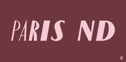
Paris was designed by Crous-Vidal in 1953 and is part of the Grafía Latina collection. Paris Bold originally had two alternative capital letters O, one with pronounced 45° stress; they are both incorporated in the ND version. París is a Trademark of BauerTypes SL
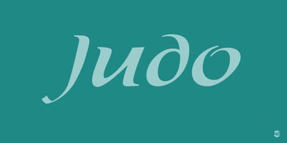
Judo ND is a wide-point italic typeface digitized in close collaboration with Helmut Matheis in honor of his long career and loyalty to typographic beauty. It brings spontaneity and elegance to its uses, always maintaining legibility. Judo is a Trademark of BauerTypes SL
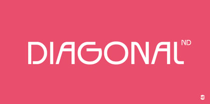
Inspired by Barcelona’s Diagonal street, Antoni Morillas designed Diagonal ND in 1970. A sans that alternates straight and inclined lines, with a strong rhythm and its own personality. Its range of possible usages are very varied: signage, headlines, packaging, etc. Diagonal is a Trademark of BauerTypes SL
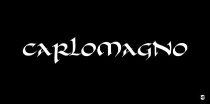
Carlomango is a typeface designed by Ricardo Rousselot. It maintains the characteristics of the Carolingian script while preserving legibility. It stands out for the realism of its strokes, which look as if they are handwritten, bringing freshness and authenticity to its applications. Carlomagno is a Trademark of BauerTypes SL
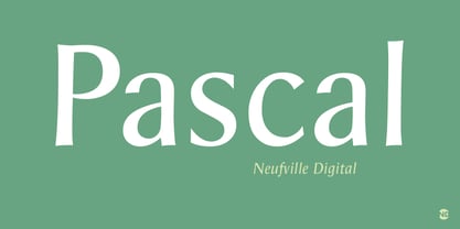
Pascal is a typeface designed in 1953 by José Mendoza y Almeida, inspired by an alphabet created by his father for engraving. It is an elegant and classic typeface. Its use is optimal for use in short texts, headlines and covers. Pascal is a Trademark of BauerTypes SL
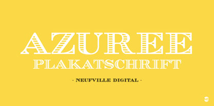
Azuree is a typeface designed by Bauersche Giessere in 1908, simulating copperplate engraving, frequently used in cards. Today it is still an excellent choice for publishing projects, both for typographic compositions and for headlines, adding a romantic and rough touch at once. Azuree is a Trademark of BauerTypes SL
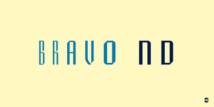
Designed by José María Cerezo, with a geometric style and futuristic touches. A typeface family that offers good results in labeling, posters and big formats. Inspired by art deco with a sci-fi touch, it is a typeface with a strong character and personality. Bravo is a Trademark of BauerTypes SL
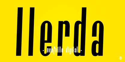
Also referred to as ‘Champs Elysées’ in France. This is the first typeface created by Crous-Vidal in the field of Grafía Latina. It is a character that expresses strength, and energy yet retains a certain elegance and even a touch of flirtatiousness. Ilerda is a Trademark of BauerTypes SL
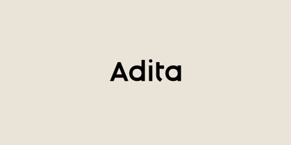
Adita is a font family evolved from the fundamentals. It supports 113 languages, features a total of 485 glyphs and includes an italicized version for each of the 5 weights.
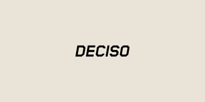
Deciso is a font family assembled from angular modules. It supports 113 languages, features a total of 485 glyphs and includes an italicized version for each of the 5 weights.
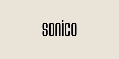
Sonico is a font family stretching upwards and beyond. It supports 113 languages, features a total of 482 glyphs and includes an italicized version for each of the 5 weights.
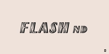
Flash was designed in 1953 by the designer Enric Crous-Vidal, as part of the graphic trend “Grafía latina”. It is a three-dimensional typography, which seeks optical and relief effects, similar to those of wood engraving. It gives a handcrafted look to any printed piece. Flash is a Trademarks of BauerTypes SL
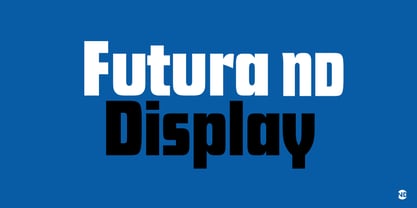
Futura Display was designed by Paul Renner in 1932. Its original German name was Futura Schlagzeile, which means “headline”, alluding to its suitability for display use. Its forcefulness and robustness have made it a widely used typeface in film posters, advertising, logos, and music covers. Futura is a Trademark of BauerTypes SL
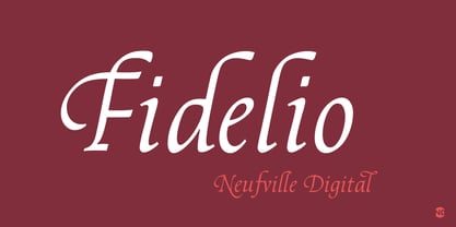
Fidelio is a chancery italic typeface with swashes, designed by José Mendoza y Almeida in 1980. Written with a broad nibbed pen, it has Caps with swash versions, Lower Case and a wide number of ligatures. It is one of the most complete and appealing calligraphies. Fidelio is a Trademark of BauerTypes SL
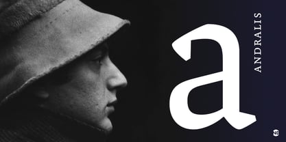
Andralis was designed by Ruben Fontana in tribute to the designer Juan Andralis. Its handcrafted, strong and robust appearance, maintains at the same time a friendly and human tone. It was specifically designed to perform well in long texts, also offering excellent results in headlines. Andralis is a Trademark of BauerTypes SL
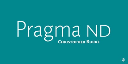
Pragma ND is a sans serif typeface with calligraphic features. Its vital rhythm facilitates the reading of long texts. It also has an “authentic” italic imitating the movement of handwriting. Its high legibility makes it an ideal typeface for long texts in analog and digital contexts. Pragma is a Trademark of BauerTypes SL
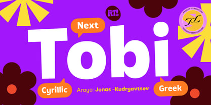
Tobi Next is the improved version of Tobi pro, which in the extended version contains 213 ligatures, contains Greek and Cyrillic, as well as contains its basic version at a lower cost
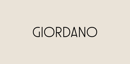
Giordano is a font family alternating between rectangular and circular forms. It supports 113 languages, features a total of 483 glyphs and includes an italicized version for each of the 5 weights.
Transcribed from letters designed by Jan van Krimpen for The Curwen Press at Plaistow, London, in 1925; printed on pages 49, 51 & 53 of A Specimen Book of Types and Ornaments in Use at The Curwen Press (1928). A setting at 120 pt is recommended to match the size of the original.
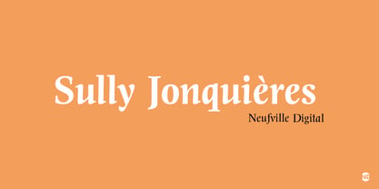
Sully-Jonquières is Mendoza’s most original calligraphic alphabet. It was commissioned by the French publisher Henri Jonquières. Its characters are based on the shape of cursive letters. Its range of possible usages is very varied: signage, headlines, packaging, etc. It brings personality and elegance to any design. Sully-Jonquières is a trademark of BauerTypes SL
Adita is a font family that elevates the content of its characters. It supports 113 languages, features a total of 467 glyphs and includes an italicized version for each of the 5 weights.
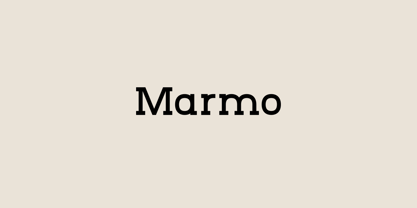
Marmo is a font family with sharp-edged and thick-bodied character. It supports 113 languages, features a total of 486 glyphs and includes an italicized version for each of the 5 weights.
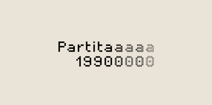
Partita 1990 is a font family to use in the initial simulation. It supports 113 languages, features a total of 482 glyphs and includes an italicized version for each of the 5 styles.
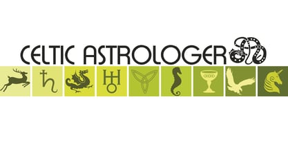
Containing over 130 symbols. Unlike traditional western zodiacs, the Celtic zodiac contains 13 signs instead of 12. This series contains the zodiacs, the planets as well as the Ogham numbers. NOTE: this font comes with an interpretation guide in pdf format.
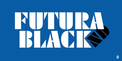
Designed by Paul Renner and published in 1929. It shows an alternative method of giving maximum thickness to a font by being designed to resemble the use of a stencil. It was a very fashionable typeface during the avant-garde period. It is still an excellent typeface for display use. Futura is a Trademark of BauerTypes SL
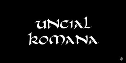
There are many Uncial types in the type catalogues around the world, but most of them have a rough and stiff appearance. The Roman Uncial ND by Ricardo Rousselot stands out for the realism of its strokes, which look as if they are handwritten, bringing freshness and authenticity to its applications. Uncial Romana is a Trademark of BauerTypes SL