10,000 search results
(0.04 seconds)
- Balisay by Sronstudio,
$18.00 Meet Balisay, A Calligraphy font that is perfect for branding, invitation, stationery, wedding designs, social media posts, advertisements, product packaging, product designs, label, photography, watermark, special events, and more. Features: Uppercase and lowercase letters 70+ Lowercase Swash alternates Multilingual symbols, numerals, and punctuation How do access swashes alternate? https://sronstudio.com/sronstudio-font-guide/ Any question? Don't hesitate to drop me a message :) Follow Instagram: @sronstudio
 - Maelie by Supfonts,
$15.00 Hello dears! This font is a new Calligraphic Script. Here is that: floating baseline, ligatures and multilingual support :) Maelie Script will look beautiful on holiday invitations, wedding invites and stationery, logos, and more. Test it out below to see how it could look for your next project! Includes: Uppercase and lowercase Numbers and punctuation Foreign language support Ligatures Check out my blog: https://www.instagram.com/zloillev pinterest.com/dmitriychirkov7
 - Rosalina by Supfonts,
$15.00 Hello, friends. Here's my new experiment. This font breaks the boundaries even more. Rosalina combines all these qualities: simple and clear, looks at ease. It is perfect for signatures or design, wedding invites and cards, where you do not need a strict style :) Test it out below to see how it could look for your next project! Check out my blog: https://www.instagram.com/zloillev pinterest.com/dmitriychirkov7 Enjoy
 - Lisboa Tamil by Vanarchiv,
$85.00 Lisboa Tamil is a humanist sans-serif typeface based on the same design as the original Latin version (2005). Originally designed for small sizes, this font family can work as display typeface where there own calligraphic style gives elegant low contrast personality between organic and solid design approach. Tamil is an Indic script, spoken in southern India, Sri Lanka and Singapore. Latin transliteration characters were also included.
 - Grate by Otto Maurer,
$7.00 Grate is a simple styled Font, it is best for Logo designing. How much we can cut down a Font till it is possible to reat it? That was the question, and this font is the answer. I think it is so much cut down but Human can read it. It is total simple Kerning inside. You can overlay the glyphs and it is almost readable.
 - Yanice by Viaction Type.Co,
$20.00 Yanice is a semi-condensed sans serif font that has a strong and subtle character. Perfect for modern & industrial themed designs. Yanice is available in 4 styles that you can use according to your needs. Get the Yanice font now at a great price to speed up your work. Feature Font : Standard Ligature Multilingual Support Symbol & Punctuation I hope you enjoy and thank you. Viaction Type
 - Fastest by Letterara,
$16.00 Fastest is a unique and modern sans serif font, specially designed for headlines, big text, branding, logotypes, marketing graphics, banners, posters, signage, and display usage. It can easily be matched to an incredibly large set of projects, so add it to your creative ideas and notice how it makes them stand out! This font is PUA encoded which means you can access all of the amazing glyphs.
 - Maree by Ashton,
$5.00 If you want to write something sincere and genuine but not too formal then this is the font for you. It is based on real handwriting, not some artificial calligraphy made to be either too haphazard or spiky or have loads of elegant flourishes but an ordinary person's writing, and designed to look as natural and as close to the original lettering as possible. Like any person's writing it is individual and distinctive, but so easy going on the eye those differences sit comfortably with you. It is friendly and open with easy to read glyphs both as lowercase and uppercase. The letters are relatively wide with clearly shaped distinct outlines. This font may be ideal for projects where you expect a wide readership with different reading abilities from young to old. When you are using this font a slightly bigger point size usually gives a better result so for a standard letter or similar you should size up to 15 points or more. Maree has been individually crafted to the smallest detail. To create a realistic handwriting font that looks relatively simple but works in a wide variety of languages requires a complexity and attention to detail most fonts will never require. This font in any ordinary business environment would never have been made, the effort required to make it too great, the length of time too long. There have been no shortcuts in this font, no automatic scanning or tracing, no automatic generation, no class kerning. Not only is each glyph individual but the width of letters, the height, the accents and the positions of the accents are all different. Even the line weight of the letters is designed to have natural variation but yet similar enough that the font appears as though it were written effortlessly in the same pen. And in order to keep the spacing consistent even though the letters have different widths, heights, lengths of descenders and so on, there are a vast number of kerning pairs, letter to letter, number to number, letter to number... All kerning has been individually assessed with an eye to proportionality taking in character shape, size and weight. For instance if you write a telephone number the numbers all sit close together but if you write a number before a letter such as in a UK post code or before a unit of measurement an extra little bit of space has been added which makes the number more distinct and therefore readable. That space is so natural to the eye that you don’t even know it is there. However even in the spacing allowance has been made for the fact it can’t be too perfect because when you write by hand the spacing is inconsistent. There have to be some letters which are too close or far apart otherwise the font would look artificial. For similar reasons if you are going to print out this font for a letter, etc, check the print version before you make any letter spacing changes because with the zoom functions in modern applications that uneven spacing and lettering can seem more pronounced than it actually is. When this font is printed out you will find it is surprisingly neat. This font is what it is, simple clear handwriting. You will not go wow. But if you want something unique and different and looks good on the page you won’t be disappointed. This font is not a work of art but it is a work of love. This font has a soul. How many fonts can you say that about?
 - Blank Manuscript by Aah Yes,
$14.95Blank Manuscript allows you to produce sophisticated musical scoresheets even on basic Word Processors - anything from simple plain staves to complex full-page orchestral scores of your own design, to write in the notation yourself. The basic stuff is really easy and straightforward, but there's some quite advanced things you can do as well. So Copy and Save these Instructions. • The main stuff is simple and tends to follow the initial letter. Treble, Bass and Alto clefs are on upper case T B A (there are more clefs, below). The 5 Lines for the clefs are on L or l. • A small v will give a small vertical line (like a bar line) and a Big U will give a Big Upright - these can start or end a line or piece. • Time Signatures - type the following letters: Think of W for Waltz and it's easy to remember that 3/4 time is on W. Then from that they go up or down together like this: V=2/4 W=3/4 X=4/4 Y=5/4 Z=6/4 Compound Times are on H I J K like this: H=3/8 I=6/8 J=9/8 K=12/8 Common Time and Cut Common symbols can be found on semi-colon and colon respectively (all begin with Co- ). 2/2 3/2 are on lower case a and b, 7/4 and 7/8 are on lower case c and d, 5/8 is on small k (think POL-k-A) • Flat signs are on the numbers. Flat signs on LINES 1 to 5 are on numbers 1 to 5. Flat signs on SPACES 1 to 5 are on numbers 6 to 0 (space 1 being above line 1, space 5 being above the top line of the stave). Sharp signs are on the letters BELOW the long-row numbers. Which is q w e r t for the sharp signs on Lines 1 to 5, and y u i o p for sharp signs on spaces 1 to 5. Doing it this way means it works the same for all clefs, whether Treble, Bass, Alto, Tenor or any other. Sharp and Flat Signs always go in this order, depending on how many sharps or flats your key signature requires: Treble Clef Sharps t i p r u o e Flats 3 9 7 4 2 8 6 Bass Clef Sharps r u o e t i w Flats 2 8 6 3 1 7 = Alto Clef Sharps o e t i w r u Flats 7 4 2 8 6 3 1 • Guitar Chord Boxes are on G and g (G for Guitar) Upper Case G has a thick line across the top Lower case g has an open top, for chords up the fretboard TAB symbols are available: Six-string Tablature is on s & S for Six. Four-string Tablature is on f & F for Four. (Lower case has the "TAB" symbol on it, Upper Case has just the lines to continue.) Five-string tablature, is on lower case "j" (as in BAN-j-O) and of course L or l will continue the 5 lines. •RARE CLEF SIGNS including Tenor Clef, are on various punctuation marks, i.e. dollar, percent, circumflex, ampersand & asterisk, above the numbers 4 to 8. NOTE: The important symbols were kept on the letter and number keys, which are fairly standard all over, but some of the less important symbols are on various punctuation keys, which in different countries are not the same as on my keyboard. If it comes out wrong on your system, all I can say is it's right on the systems we've tried, and they'll be in here somewhere, probably on a different key. CLOSING THE ENDS OF THE LINES and BAR-LINES is done with the 3 varieties of brackets - brackets, brace and parentheses - Left/Right for the Left/Right end of the line. Parentheses L/R () which are above 9, 0 give a clef with a small vertical upright (the same as a bar line). Brace L/R and Brackets L/R (both on the 2 keys to the right of P on my keyboard) will close off a staff line with tall upright bars. Brace gives a double upright - one thick, one thin. Brackets give a single tall upright. A Big Upright is on Big U, (Big U for Big Upright) and a small vertical line is on small v (small v for small vertical). The Big Upright is the maximum height, and the small vertical is exactly the same height as a stave. And there's a tall upright Bar, on Bar (which is to the left of z on my keyboard, with Shift,) which is the same height as the bar on upper case U but twice as broad. • There's a staff intended for writing melodies, which is a little bit higher up than an ordinary treble clef giving a space underneath to put lyrics in - on m and M for Melody line. Lower case has the Treble Clef on, Upper case M has just the higher-up staff lines with no clef. (Use mMMMMMMM etc.) However this clef will be in the wrong place to put in sharp and flat signs, key signatures and so on, so if you use this clef you'll have to write the sharps, flats and key signature yourself. There's also a clef that's smaller (less tall) than the ordinary clef, but with the same horizontal spacing so it will align with other standard-sized clefs - on slash (a plain clef) and backslash (with a Treble Clef). • There are some large brackets for enclosing groups of staves, such as you'd use on large orchestral scores, on Upper Case N O P Q R, which can aid clarity. N and O on the left, Q and R on the right. P is a Perpendicular line to be used on both sides to increase the height of the enclosure, in this way but with the staff lines in between: N Q P P P P P P O R OTHERS —————————————— • Repeat marks are on comma (left) and period/full stop (right). • Hyphen is left as a sort of hyphen - it's a thin line like a single staff line, with the same horizontal spacing as ordinary staff lines - in case you want to draw a line across for a Percussion Instrument, or a Title or Lyric Line. • Space is a Space, but with HALF the width or horizontal spacing as ordinary staff lines, so 2 space symbols will be the same width as a clef symbol or line. • Grave (to the left of 1 on the long row, or hold down Alt and type 0096 then let go) gives a staff line that is one eighth the width of an ordinary staff line. • If you want manuscript in a clef and key which requires a flat or sharp sign in the space underneath the 5 lines, they’re on = equals and + plus . SYMBOLS • Many of these symbols will only be useful if you have worked out in advance which bars will need them, but they are here in case you've done that and wish to include them. • Symbols for p and f (piano and forte) are on 'less than' and 'greater than' < > (above comma and full stop) and m for mezzo is on Question, next to them. They can be combined to make mp, mf, ff, pp, etc. These signs -- and other signs and symbols like Pedal Sign, Coda Sign and so on -- can be found on various punctuation mark keys, including above 1, 2, 3 in the long row, and others around the keyboard. There's a sort of logic to their layout, but in different countries the keys are likely to give different results to what is stated here, so it's probably best to just try the punctuation and see if there's any you might want to use. (But on my keyboard a Coda sign is on circumflex - because of the visual similarity. Pedal sign is on underscore. A "Sign" symbol is on exclamation mark.) They were only included in case you really need them to be printed rather than handwritten. • However, a Copyright symbol is deemed necessary, and also included are a "Registered" symbol and a TradeMark symbol. They are found in the conventional places, and can be accessed by holding down ALT and typing 0169, 0174 or 0153 respectively in the numberpad section and letting go. • Staff lines with arco and pizz. above are on capital C and D respectively ---C for ar-C-o. • An empty circle above a staff line (to indicate sections by writing letters A, B, C or 1,2,3 inside for rehearsal marks) is on n. The actual signs for an A, B, C and D in a circle above the staff line can be produced by holding down ALT and typing 0188, 0189, 0190 and 0191 respectively and letting go. • The word "Page", for indicating page numbers, is on the numbersign key. • The two quotes keys, (quote single and quote double) have symbols representing "Tempo is", and "play as triplets", respectively. • INSTRUMENT NAMES There's a whole lot of Instrument Names built in (over a hundred) which can be printed out above the clef, and you do it like this. Hold down Alt and type in the given number in the numberpad section, then let go. For Piccolo it's 0130, for Flute it's 0131, Cornet is on 0154, Violin is on 0193, and the numbers go up to over 0250, it's a fairly complete set. There's also a blank which is used to align un-named clefs on 0096. Put them at the very beginning of the line for the best results. Here they are: WOODWIND Piccolo 0130 Flute 0131 Oboe 0132 Clarinet 0133 Eng Horn 0134 Bassoon 0135 Soprano Sax 0137 Alto Sax 0138 Tenor Sax 0139 Baritone Sax 0140 Saxophone 0142 Contrabassoon 0145 Recorder 0146 Alto Flute 0147 Bass Flute 0148 Oboe d'Amore 0149 Cor anglais 0152 Pipes 0241 Whistle 0242 BRASS Cornet 0154 Trumpet 0155 Flugelhorn 0156 Trombone 0158 Euphonium 0159 Tuba 0161 French Horn 0162 Horn 0163 Tenor Trombone 0164 Bass Trombone 0165 Alto Trombone 0166 Piccolo Cornet 0167 Piccolo Trumpet 0168 Bass Trumpet 0170 Bass Tuba 0171 Brass 0172 VOICES Vocal 0175 Melody 0176 Solo 0177 Harmony 0178 Soprano 0179 Alto 0180 Tenor 0181 Baritone 0182 Treble 0183 Bass 0197 (see also PLUCKED STRINGS) Descant 0184 Mezzo Soprano 0185 Contralto 0186 Counter Tenor 0187 Lead 0206 BOWED STRINGS Strings 0192 Violin 0193 Viola 0194 Cello 0195 Contrabass 0196 Bass 0197 Double Bass 0198 Violoncello 0199 Violin 1 0200 Violin 2 0201 Fiddle 0252 PLUCKED STRINGS Harp 0202 Guitar 0203 Ac. Gtr 0204 El. Gtr 0205 Lead 0206 Bass 0197 Ac. Bass 0207 El. Bass 0208 Slide Gtr 0209 Mandolin 0210 Banjo 0211 Ukelele 0212 Zither 0213 Sitar 0214 Lute 0215 Pedal Steel 0216 Nylon Gtr. 0238 Koto 0239 Fretless 0244 KEYBOARDS + ORGAN Piano 0217 El. Piano 0218 Organ 0219 El. Organ 0220 Harpsichord 0221 Celesta 0222 Accordion 0223 Clavinet 0224 Harmonium 0225 Synth 0226 Synth Bass 0227 Keyboards 0228 Sampler 0249 PERCUSSION and TUNED PERCUSSION Percussion 0229 Drums 0230 Vibes 0231 Marimba 0232 Glockenspiel 0233 Xylophone 0234 Bass marimba 0235 Tubular Bells 0236 Steel Drums 0237 Kalimba 0240 OTHERS Harmonica 0246 Mouth Organ 0247 FX 0251 Intro 0243 Verse 0245 Refrain 0248 Chorus 0250 un-named 0096 (this is a small spacer stave for aligning clefs without a name) ALSO copyright 0169 registered 0174 TradeMark 0153 Rehearsal marks 0188-0191 (giving A, B, C, D in a circle, an empty circle is on n ) Clef signs for Treble Bass Alto without any staff lines 0253-0255 An Alphabetic List of all signs: a 2/2 time b 3/2 time c 7/4 time d 7/8 time e sharp sign, centre line f Tab sign for 4-string tab g Guitar Chord Box, no nut h half-width stave I sharp sign, third space up j Tab sign for 5-string tab k 5/8 time l Lines - 5 horizontal lines for a stave m Melody Clef - a standard clef but placed higher up, with Treble sign n Stave with an empty circle above o sharp sign, fourth space up p sharp sign, space above stave q sharp sign, bottom line r sharp sign, fourth line up s Tab sign for 6-string tab t sharp sign, top line (fifth line up) u sharp sign, second space up v vertical line (bar-line) w sharp sign, second line up x Fretboard, four strings y sharp sign, first space up z Fretboard, five strings A Alto Clef B Bass Clef C “arco” above stave D “pizz.” above stave E Double Vertical Lines F Four Horizontal lines (for 4-string tab) G Guitar Chord Box with nut H 3/8 time I 6/8 time J 9/8 time K 12/8 time L Lines - 5 horizontal lines for a stave M Melody Clef - a standard clef but placed higher up, plain N Bounding Line for grouping clefs - top left O Bounding Line for grouping clefs - bottom left P Bounding Line for grouping clefs - Perpendicular Q Bounding Line for grouping clefs - top right R Bounding Line for grouping clefs - bottom right S Six Horizontal lines (for 6-string tab) T Treble Clef U tall, thin Upright line V 2/4 time W 3 / 4 time X 4/4 time Y 5/4 time Z 6/4 time 1 flat sign, first line up (the lowest line) 2 flat sign, second line up 3 flat sign, third line up 4 flat sign, fourth line up 5 flat sign, fifth line up (the top line) 6 flat sign, first space up (the lowest space) 7 flat sign, second space up 8 flat sign, third space up 9 flat sign, fourth space up 0 flat sign, space above stave - Tomato by Canada Type,
$22.95Tomato is the digitization and quite elaborate expansion of an early 1970s Franklin Photolettering film type called Viola Flare. This typeface is an obvious child of funk, the audio-visual revolution that swept America and put an end to the art nouveau period we now associate with the hippy era. Funk is of course little more than jazz with a chorus and an emphatic beat. Nevertheless, it became the definition of cool in the 1970s, thanks to blaxploitation movies with excellent soundtracks like Shaft and Superfly. Funk began as a commercial audio experience, then later expanded its signature to cover everything, from design to fashion to the later birth of disco, which is really a further simplification of funk. Funk had very strong and unique typographical elements, particularly a kind of titling with an essentially western, wooden core that suddenly changed and flared in unexpected areas until a very individual brand was achieved. Everything that can be tacked on to the alphabet was used towards that individuality. Things like curls, swirls, swashes, ligatures were always plentiful in funk, sometimes giving the titling a specific gender, sometimes bulging, sometimes speeding, sometimes fading in the distance, sometimes doing nothing but crazily aligning with other design elements, but the result was always a fascinating creature that seemed to invariably want to dance and have fun. Tomato was built in exactly that spirit. The original film type certainly had enough swashes and curls to be an unmistakable funk font in itself, but our further expansion of it cements it and makes it the definite font for the genre. With as many as 12 different possibilities for some letters, the designer's choices for a titling set in Tomato are virtually limitless. The Postscript and True Type versions of Tomato come in five fonts, including two fonts for alternates, one font for ligatures, and one font for swashes. These are split into two affordable packages. The entire family package is also available at an even more affordable price, and includes complimentary Cyrillic, Greek, Turkish, and Central European versions of Tomato. A Tomato Pro OpenType version is also available. It is a single font that includes over 650 characters, glued together with extensive programming for convenience of use in OpenType-friendly applications, where you can watch the letters morph and dance as you push the buttons and change the options of your OT palette. Now you know which font will come to mind when someone says the word "funky". - Boberia by Linotype,
$29.99Linotype Boberia is part of the Take Type Library, which features winners of Linotype’s International Digital Type Design Contest. Designed by Bo Berndal, its historical roots lie in the neoclassicism of the turn of the 20th century. The slender letters with a large x-height and marked stroke contrast give the font an elegant character. The nostalgic, flowing forms are typical of Art Deco fonts and allow designers a number of possibilities for the font’s use. Boberia includes regular, italic and bold type styles. - Palmona Plus by Ingo,
$46.00 A rustic black letter from the 1930ies — with stylistic alternates. The high degree of abstraction of this typeface allows it to appear modern, even though its shapes clearly show an origin from Fraktur and Gothic. The letters present the effect of woodcarving or silhouette cuttings as they are defined exclusively with straight lines and sharp corners. By doing without any bowls, the typeface becomes a stylistic entity with a decorative effect. Palmona is especially appealing in combination with bold illustrations. Some of the characters of Palmona are available in one or more alternate forms which can be accessed manually or automatically. Use of these alternates is most easily operated with OpenType-Functions Standard-Ligatures and Discretional Ligatures in the user program. With Standard Ligatures activated, problematic letter compositions are substituted with appropriate ligatures. Likewise, in certain letter combinations the alternates are inserted. The Discretional Ligatures include additional alternatives. Configuration of the characters of the Palmona font is according to Unicode ISO 8859-1 (Latin1). Consequently all characters for all European languages with Latin type are covered — including Turkish, the Baltic languages, East European and Scandinavian languages. Congruent with the time of its origin and typical for black letter typefaces, Palmona also includes a long s as well as — uncommon but definitely reasonable — a capital ß. Both characters are automatically applied with the activation of Discretional Ligatures, and the associated ligatures appear automatically as well. When using ”long s,“ you must ensure the correct use of the rules for the Fraktur font: ”round s“ is always at the end of the word, also in compound words. For those of you who want to be even more correct, read the corresponding >> article in Wikipedia.
 - Gemini Type Fontpack by Chank,
$49.00 INTRODUCING THE GEMINI TYPE FONTPACK, an industrial-strength OpenType font bundle inspired by and optimized for dimensional type. Chank Co is proud to introduce the new “Gemini Type Fontpack,” a collection of ten fonts available for use on your desktop computer or web pages, but also optimized for use as exterior cast-metal signage in bronze or aluminum in collaboration with Gemini, a family-owned industry leader in the wholesale manufacture of dimensional letters, logo and plaques based in Cannon Falls, MN. Gemini collaborated with Chank Co to assemble a line of fonts that would work well as dimensional, cast-letter signage for use on the sides of buildings, in stores, and other public spaces. The fonts included in the “Gemini Type Fontpack” are reinterpretations of previous Chank Fonts, now optimized for dimensional signage display, but then also repackaged and presented for your use as an OpenType desktop computer font collection: GT-Adrianna DemiBold GT-Adrianna Bold GT-Adrianna ExtraBold GT-Fairbanks GT-Forward Thinking GT-Hydropower ExtraCondensed GT-Kegger GT-Shopaganda GT-Shopaganda Condensed GT-Timeless Geometric. This is a multi-purpose collection of heavy-lifting fonts to convey your message strong and clearly, full of legibility and clarity, but also displaying personality and distinction. You can purchase and download these fonts in OpenType format for your desktop computer right now via MyFonts. Get it today and you'll also get a great introductory special sale price. These exclusive typefaces are also available as dimensional letters, manufactured by Gemini in bronze or aluminum, from 6" tall up to 18" tall, with a variety of finish options, for use in public signage and wayfinding systems. Gemini manufacture their products in 20 plants through out the US, Canada and Mexico, and all their products are backed by a lifetime guarantee. Chank Co is excited to offer these ten strong, industrial font designs in durable cast metal format via Gemini. ----- More about the fonts in the Gemini Type Fontpack: GT-Adrianna DemiBold, Bold, and Adrianna ExtraBold Clear, invisible, no-nonsense, multi-purpose. A versatile sans-serif heavy-lifting font family. GT-Fairbanks Vintage, silent film, speedball, old-timey, old-fashioned, retro. Based upon the lettering in the 1914 silent film, “The Good Bad Man.” GT-Forward Thinking Futuristic, semi-serif, clean, distinctive, contemporary, idiosyncratic. A font for tomorrow and the future. GT-Hydropower ExtraCondensed Extra-condensed, compressed, strong, rigid and concise. GT-Kegger Strong, sporty, collegiate, athletic. Nothing says “GO TEAM” quite like a big, bold slab-serif font. GT-Shopaganda and GT-Shopaganda Condensed Industrial, geometric, constructivist, propaganda, oh there’s so much to love about the strength and clarity of these two fonts. Based on Chank’s Liquorstore and Nicotine fonts, which have been married and unified here, with a few new twists and turns to their letterforms. GT-Timeless Geometric Bauhaus, anyone? The geometric and minimalist alphabet here is about as clean and straight-forward as a semi-condensed sans can get. ----- All of the fonts in this package are available individually, or save money when you purchase all ten of them as a collection. Download this digital font package from MyFonts today and you'll receive both OpenType and TrueType formats in your download for your desktop computer. Webfont format is also available. (If you'd like to use these fonts as cast-metal letters for exterior, architectural purposes, visit the Gemini website to learn more about how you can find a signage retailer near you.)
 - Walnut Candy by Nathatype,
$29.00 Ready to enhance your branding? Looking for that “something” that’ll make your audience go WOW and clients get on board immediately? Ready to enhance your branding? Looking for that “something” that’ll make your audience go WOW and clients get on board immediately? If you need to create a big, bold logo for your business, work on a poster for an event, or whatever your project may be-then this is the perfect font for you. Walnut Candy-A Signature Font Walnut Candy is a handcrafted font designed to bring your branding to life and add a touch of elegance, modernity and style. Perfect for social media branding projects, fashion designs, printed quotes, packaging, or even as a stylish text overlay to any background image. Our font always includes Multilingual Support to make your branding reach a global audience. Features: - Ligatures - Stylistic Sets - PUA Encoded - Numerals and Punctuation Thank you for downloading premium fonts from Nathatype
 - Almoneda by Sudtipos,
$49.00 Almoneda: Sale at public auction of movable goods, generally used. And also: private and voluntary sale of jewelry and junk that is made without the intervention of justice. Formerly, it was nothing more than the market or sale of things and spoils won from the enemy in war. Nowadays, the almoneda is practically associated with spaces where the sale of "old things" takes place and, in Madrid, they are usually concentrated in the area of El Rastro, an open-air market that is set up on Sundays and some holidays in the center of Madrid. There, you can find everything and, if you walk around a lot and look hard enough, great typographic finds. It is there where I find a large number of elements (usually from the late nineteenth and early twentieth century) such as boxes, posters, books, etc.. in which appear uppercase letters with a variety of shapes, letters embedded, rare ligatures ... In addition, many elements extracted from street signs, tiles from bars and commemorative elements of Madrid have been used to complete this font design made with care and patience. Thus was born Almoneda, a modern typeface with a marked axis and great contrast, and an uppercase with several sets of characters to play with and enjoy. It also includes a large number of ligatures and discretionary ligatures. A Variable font is included with the full package license. Almoneda, a typeface that will not leave you indifferent. They take it out of my hands, hey!
 - Austen Aesthetic by Ardyanatypes,
$15.00 Description Austen Aesthetic comes with an aesthetic style with a modern and elegant serif-type tagline appearance. This font comes with 8 thickness levels, from thin to black to suit your needs. Austen Aesthetic is also equipped with modern professional characteristics that can present an elegant and attractive identity for your company or project for business purposes. It pairs well with modern serifs and scripts pictured or stands firm as a title and brand representative for an elegant look. Austen Aesthetic also comes with multiple languages, making it easy to use for any country and language use. It also comes with alternative Ligatures and stylistics to make your designs more appealing. Austen Aesthetic is suitable for branding projects and various design purposes such as business cards, name tags, uniforms as a brand enhancement. Advertising, posters, invitations, branding, logos, magazines, merchandise, presentations, etc. Supports languages: Afrikaans, Albanian, Asturian, Asu, Azerbaijani, Basque, Bemba, Bena, Bosnian, Breton, Catalan, Chiga, Colognian, Cornish, Croatian, Czech, Danish, Dutch, Embu, English, Esperanto, Estonian, Faroese, Filipino, Finnish, French, Friulian, Galician, German, Gusii, Hungarian, Icelandic, Igbo, Indonesian, Irish, Italian, Kabuverdianu, Kalaallisut, Kalenjin, Kamba, Kikuyu, Kinyarwanda, Latvian, Lithuanian, Low German, Lower Sorbian, Luo, Luxembourgish, Luyia, Machame, Makhuwa-Meetto, Makonde, Malagasy, Malay, Maltese, Manx, Meru, Morisyen, North Ndebele, Norwegian Bokmål, Norwegian Nynorsk, Nyankole, Oromo, Polish, Portuguese, Quechua, Romanian, Romansh, Rombo, Rundi, Rwa, Samburu, Sango, Sangu, Scottish Gaelic, Sena, Shambala, Shona, Slovak, Slovenian, Soga, Somali, Spanish, Swahili, Swedish, Swiss German, Taita, Teso, Turkish, Turkmen, Upper Sorbian, Vietnamese, Vunjo, Walser, Welsh, Western Frisian, Yoruba, Zulu
 - Airosol by Firstype Studio,
$15.00 Airosol is an edgy and expressive graffiti font that captures the essence of street art with a style that's undeniably urban. It's the perfect choice for designers and artists looking to infuse their projects with a raw and rebellious vibe, complete with striking swashes for added flair. Gritty Street Art Aesthetics: Airosol is a graffiti font that channels the raw energy and aesthetics of street art. Its bold and expressive letterforms showcase the essence of rebellious creativity, making it a standout choice for projects that demand an urban edge. Street Art Style: What sets Airosol apart is its authentic street art style. Every character exudes a sense of authenticity, as if it were lifted directly from a city wall, ready to make a statement. Swashes for Added Impact: Airosol comes with dynamic swashes, allowing you to accentuate your text with unique and artistic flourishes. These swashes are your tool for adding that extra touch of graffiti-inspired artistry to your designs. Versatile Expression: Airosol is more than just a font; it's a versatile form of expression. Whether you're working on urban branding, event posters, or any project that demands a street-smart aesthetic, Airosol will be your creative companion. Unleash Your Inner Rebel: With Airosol, you're not just selecting a font; you're unleashing your inner rebel and embracing the power of street art in your designs. Choose Airosol for Your Urban Adventures: Explore the creative possibilities with Airosol, and experience how its graffiti-inspired aesthetics and swashes breathe life into your projects, from the streets to the screen.
 - Steampunk by Kustomtype,
$25.00 The Steampunk font is inspired on sixties hand lettered French movie poster of Charles Bronson. This style of type is instantly associated with advertising and design for high-end products with a touch of Arts & Crafts. Steampunk is carefully drawn for quality and readability. Steampunk is great for display, logos, branding, packaging, advertising, food, sports, titles, film, tv, and more. Steampunk comes in 2 styles witch match perfectly together. Steampunk is a great display family with roots in the past century advertising and sign painting industry, and no wits but smooth polished wit hall the features a good designer needs. Steampunk is designed by Coert De Decker in 2018 and published by Kustomtype Font Foundry.
 - Hirradista by Rastype Studio,
$20.00 Hirradista Script is modern calligraphy font. This font is casual and pretty with swashes. Can used for various purposes. such as logo, product packaging, wedding invitations, branding, headlines, signage, labels, signature, book covers, posters, quotes and more. Hirradista Script features OpenType stylistic alternates, ligatures and International support for most Western Languages is included. To enable the OpenType Stylistic alternates, you need a program that supports OpenType features such as Adobe Illustrator CS, Adobe Indesign & CorelDraw X6-X7, Microsoft Word 2010 or later versions. How to access all alternative characters using Adobe Illustrator: https://www.youtube.com/watch?v=XzwjMkbB-wQ Hirradista Script is coded with PUA Unicode, which allows full access to all the extra characters without having special designing software. Mac users can use Font Book , and Windows users can use Character Map to view and copy any of the extra characters to paste into your favourite text editor/app.How to access all alternative characters, using Windows Character Map with Photoshop: https://www.youtube.com/watch?v=Go9vacoYmBw If you need help or have any questions, please let me know. I'm happy to help :) Thanks & Happy Designing!
 - Wienerin by Sudtipos,
$49.00 The starter point of the Wienerin typeface is based on the work of Austrian designer and artist Carl Otto Czeschka who was part of The Wiener Werkstätte, an early twentieth century association of designers, architects, craftsmen, ceramists, jewelers and other graphic arts in his country. This collective of artists was influential for both Bauhaus, art deco and Scandinavian design. Wienerin is a revision and expansion of the Olympia typeface designed almost 100 years ago by Czeschka but adapted for contemporary use with the inclusion of numerous alternative signs and ligatures. Variable font technology allows a greater variety of weights to be achieved. One of the features of the original design was the inclusion of "eifassungen" or modules to create frames. Wienerin presents a repertoire of 500 in 3 weights. With an upward elongated design we have decided to also create a version of the typeface with a larger x-box that allows for a wider use of the typeface family. Because of its contrast it is ideal for use in delicate design pieces such as editorial design, elegant labels, stationery and fashion. All styles of the Wienerin typeface family cover most Latin languages.
 - Caride Script by Krafted,
$10.00 Look back to learn how to look forward - Joe Girard Find yourself and share your purpose with the Caride Script. With its bold vintage script type, sometimes you need to remind others that we must look to the past to pave a better way for our future. It’s time for you to unleash the old school retro trend again. Leather jackets? Making a comeback. Pompadour hairdos? Definitely cool. 70s music? They’re sampled in the music all over our radio stations! The magnificence of the past will surely help you give a new and fresh breath of life to your projects. This font was designed for you to use in any kind of projects that you might have! They were specifically designed to fit in anywhere you want them to be. We assure you that there will be no awkwardness in the relationship between your text and your designs, they’ll get along well like old-timey partners! The Caride Script is the perfect addition to bring your perspective to the world. Have the world see you and your encompassing view of the human experience with your creations!
 - Johto by Superpencil,
$32.00 Finally, a font that’s ready for your pixel adventures. Johto is a hand-crafted, pixelated font that captures the excitement of 1990s Tokyo for today’s developers, designers, and video-game makers. We all love the pixelated games we played as kids. Now, as programmers, video makers, and creators of side projects that make our hearts pound with passion, there is nothing more satisfying than imagining ourselves in the shoes of the people that inspired us. We want to feel like we're right back there in the excitement of 1990s Tokyo, as an artist or engineer. Johto was created because of our disappointment with the pixel fonts we found online. And for people like us, who care deeply about the quality of our work - especially the work we do for ourselves - we realized we needed a high-quality pixel font to give our work the look it deserves. With over six hundred characters plus support for dozens of languages, including Japanese, tons of fun hand-crafted ligatures to get the look right, Johto is an authentic nostalgia trip. It has all those missing details you didn't notice, but your brain did.
 - Bestorika by Mokatype Studio,
$19.00 Introducing Bestorika Beautiful Modern serif with contrast lines and balanced curves. This font may be conservative and classic, and also may be more playful and modern. A lot of stylish alternates will give you many useful variations for use. Try to play with compositions of curves / alternates letters basic. Like all of my fonts it is inspired by lettering from the good old past, but it still has a strong modern appearance. Its wide range of stylistic alternates allows versatile design options and works perfectly for headlines, logos, posters, packaging, coffee shops, restaurants, magazine's headers, signs or gift/post cards,cafe's and weddings. Try to use it in your beauty or travel blogs, you will see how many options you will have with stylish Bestorika. What's Included : Standard glyphs Ligatures Alternates Web Font International Accent Works on PC & Mac Simple installations Accessible in the Adobe Illustrator, Adobe Photoshop, Adobe InDesign, even work on Microsoft Word. PUA Encoded Characters - Fully accessible without additional design software. Fonts include multilingual support Image used : All photographs/pictures/vector used in the preview are not included, they are intended for illustration purpose only. Thank You
 - Haunted Brick by LetterStock,
$20.00 Introducing “Haunted Brick” – The Spooky Halloween Decorative Font Dive into the eerie world of “Haunted Brick,” a spellbinding decorative Halloween font that will send shivers down your spine. Perfect for crafting captivating Halloween posters, invitations, and chilling social media posts, this font boasts a unique hand-drawn style adorned with intricate spider webs in every glyph. Key Features: Spine-Chilling Elegance: “Haunted Brick” strikes the perfect balance between elegance and the macabre, adding a spine-chilling touch to your Halloween designs. Creepy Creativity: Whether you’re conjuring up posters, eerie invitations, or haunting social media content, “Haunted Brick” lends an air of mystery and excitement to your projects. Intricate Spider Webs: Every character in “Haunted Brick” is intricately adorned with spider webs, ensuring that your text is truly one-of-a-kind and perfect for all things Halloween. Why Choose “Haunted Brick”: – Elevate your Halloween designs with a font that’s both spooky and stylish. – Craft invitations that send shivers down the spines of your guests. – Create captivating posters that will haunt the memories of those who see them. – Perfect for adding a dose of horror to your social media posts. Embrace the Spookiness – Download “Haunted Brick” Now!
 - FormPattern Color Two by Tarallo Design,
$14.99 FormPattern Color Two is a dingbat font for creating borders, frames, lines, and patterns. It is made up of a versatile set of interconnectable shapes that can flow together to make lines, borders, and patterns. Try different letter spacing to connect the forms into a continuous pattern or to space them apart. Explore leading (line spacing) to create large areas of pattern. Work with layering and opacity to discover the color-mixing potential of this font. Web designers can use FormPattern to make unique horizontal rules. How does FormPattern work? Install is as a regular font and as you type you will get forms instead of letters. Most design software, such as Illustrator, InDesign, and Photoshop provide a glyphs palette where you can choose the precise form you want. Color fonts are supported by Photoshop 2017, Illustrator 2018, and QuarkXPress 2018 (and later versions). A solid uncolored font comes with every purchase and can be used in applications that do not support color fonts. It will appear black and can be colored in the usual ways. FormPattern Color Two is compatible with all other FormPattern fonts from Tarallo Design.
 - Lady Angelina Script by Mega Type,
$14.00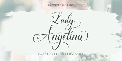 Lady Angelina Script is a sweet calligraphy font. This font is casual and pretty with swashes and can be used for various purposes including logos, product packagings, wedding invitations, branding, headlines, signage, labels, signature, book covers, posters, quotes and more. Lady Angelina Script features OpenType stylistic alternates, ligatures and International support for most Western Languages. To enable the OpenType Stylistic alternates, you need a program that supports OpenType features such as Adobe Illustrator CS, Adobe Indesign & CorelDraw X6-X7, Microsoft Word 2010 or later versions.How to access all alternative characters using Adobe Illustrator: https://www.youtube.com/watch?v=XzwjMkbB-wQ Lady Angelina Script is coded with PUA Unicode, which allows full access to all the extra characters without having special designing software. Mac users can use Font Book , and Windows users can use Character Map to view and copy any of the extra characters to paste into your favourite text editor/app. How to access all alternative characters, using Windows Character Map with Photoshop: https://www.youtube.com/watch?v=Go9vacoYmBw If you need help or have any questions, please let me know. I'm happy to help :) Thanks & Happy Designing!
 - Fakir Pro by Underware,
$50.00 Fakir | A Hindu ascetic or religious mendicant, especially one who performs feats of magic or endurance. The well known feats performed by them include sitting steadily on a bed of nails and walking on burning coals. Blackletter | A script used throughout Western Europe from approximately 1150 to 1500. It continued to be used for the German language until the 20th century. Fakir, a blackletter with a holy kiss is a contemporary interpretation of gone letterforms with origin in blackletters. More precisely, we based the construction on broadnip textura, with lots of broken, edgy, interrupted strokes – try to sit on a nail bed and you’ll know why fakirs like to read just these kind of fonts! After being abandoned for some time (not accepted, nearly forbidden), we would like to give our generation a blackletter from here and now. So Fakir is not a revival, but an all new 21st-century blackletter. Fakir is a set of edgy text and display fonts, ranging from tight and heavy to light and wide. It has 11 fonts, all supporting Underware Latin Plus character set, that covers 219 languages.
 - Marchanda Script by Mega Type,
$14.00 Marchanda Script is modern calligraphy design, including Regular and Slant. This font is casual and pretty with swashes. Can used for various purposes such as logos, product packaging, wedding invitations, branding, headlines, signage, labels, signature, book covers, posters, quotes and more. Marchanda Script features OpenType stylistic alternates, ligatures and International support for most Western Languages is included. To enable the OpenType Stylistic alternates, you need a program that supports OpenType features such as Adobe Illustrator CS, Adobe Indesign & CorelDraw X6-X7, Microsoft Word 2010 or later versions. How to access all alternative characters using Adobe Illustrator: https://www.youtube.com/watch?v=XzwjMkbB-wQ Marchanda Script is coded with PUA Unicode, which allows full access to all the extra characters without having special designing software. Mac users can use Font Book , and Windows users can use Character Map to view and copy any of the extra characters to paste into your favourite text editor/app.How to access all alternative characters, using Windows Character Map with Photoshop: https://www.youtube.com/watch?v=Go9vacoYmBw If you need help or have any questions, please let me know. I'm happy to help :) Thanks & Happy Designing!
 - Goldenwick by LetterStock,
$25.00 Goldenwick This pair was inspired by lettering at invitation design that i got few weeks ago, it was crafted by hand specially to add natural handmade feeling in its brand identity than i make it clean with pentool. Opentype features Goldenwick font has 207 character set included. This font is very good for design logo, labels, packaging product, invitations, advertising and others, this font will make your design authentic and good looking with modern calligraphy style. If you’re looking for original calligraphy script font for your greeting card and make your design authentic, this item is a great choice to make your design looks great and unique. This fonts works with following languages: Afrikaans, Albanian, Asu, Basque, Bemba, Bena, Chiga, Cornish, Danish, English, Estonian, Filipino, Finnish, French, Friulian, Galician, German, Gusii, Indonesian, Irish, Italian, Kabuverdianu, Kalenjin, Kinyarwanda, Low German, Luo, Luxembourgish, Luyia, Machame, Makhuwa-Meetto, Makonde, Malagasy, Malay, Manx, Morisyen, North Ndebele, Norwegian Bokmål, Norwegian Nynorsk, Nyankole, Oromo, Portuguese, Romansh, Rombo, Rundi, Rwa, Samburu, Sango, Sangu, Scottish Gaelic, Sena, Shambala, Shona, Soga, Somali, Spanish, Swahili, Swedish, Swiss German, Taita, Teso, Vunjo, Zulu Thank you for using this font. LS
 - Quiller by Canada Type,
$24.95Quiller is another catch from the hot metal days, another one that managed to slip through the fingers of both the photo-typers and digitizers of last 4 decades. JJ Sierke’s Privat design from 1966 is now resurrected and heavily extended to be used by computer users everywhere. The original design was revived, and two whole new fonts were added to it - one with very unique swash caps and alternates, and one with many many ligatures and letter-combination ornaments. Quiller is a cross between brush calligraphy and very casual fast handwriting. It even has a slight Arabic simulation to it. Given such traits, the addition of a swash font and a multitude of ligatures comes in very handy to keep the natural flow of the font and maintain the elegance of its spirit. Those who like the auto-magic of OpenType’s intelligent substitution should like the fact that the OTF version is a single font with all the bells and whistles ready to go in the swash and discretionary ligatures features. If you use the latest versions of Adobe programs, the OTF version of Quiller is highly recommended. - Prestiquen Script by Mega Type,
$14.00 Prestiquen Script is modern calligraphy design, including Regular, Bold, Slant and Slant Bold. This font is casual and pretty with swashes and can used for various purposes such as logos, product packaging, wedding invitations, branding, headlines, signage, labels, signature, book covers, posters, quotes and more. Prestiquen Script features OpenType stylistic alternates, ligatures and International support for most Western Languages is included. To enable the OpenType Stylistic alternates, you need a program that supports OpenType features such as Adobe Illustrator CS, Adobe Indesign & CorelDraw X6-X7, Microsoft Word 2010 or later versions. How to access all alternative characters using Adobe Illustrator: https://www.youtube.com/watch?v=XzwjMkbB-wQ Prestiquen Script is coded with PUA Unicode, which allows full access to all the extra characters without having special designing software. Mac users can use Font Book , and Windows users can use Character Map to view and copy any of the extra characters to paste into your favourite text editor/app.How to access all alternative characters, using Windows Character Map with Photoshop: https://www.youtube.com/watch?v=Go9vacoYmBw If you need help or have any questions, please let me know. I'm happy to help :) Thanks & Happy Designing!
 - VLNL Bint by VetteLetters,
$35.00 Kornelis de Vries, a headmaster from the Dutch province of Friesland, cultivated new potato breeds that he named after pupils in his school. In the early 1900s he came up with the tasty Bintje (a Frisian girl’s name) and it became a big success – in Belgium and France it has remained the most popular potato for french fries to this day, more than a century since its introduction. Donald Roos took 10 kilos of fresh Bintje potatoes and cut the Bint typeface by hand with a short, sharp knife. He then inked each character once and printed it twice; the second, lighter printing is accommodated in the lower case alphabet. The Bint family offers a script to make the letters bounce up and down the baseline; with OpenType functionality the font randomly chooses each character from the upper- or lowercase alphabet. ‘Tabular lining figures’ will activate a series of negative numerals in boxes; ‘Discretionary ligatures’ activates specially designed letter combinations like ‘www’ as well as arrows and stars. Bint has a distinct, slightly rough handmade appearance, making it useful for a wide range of designs.
 - Clinto Slab by XdCreative,
$29.00 Clinto Slab Serif By. xdCreative Clinto Slab Serif is part of the Clinto Sans font family, built with geometric construction, strong contrast, and sharp lines. It combines the additional feature of ink traps. The font comes with a total of 18 styles and 9 weights, including their respective italic versions. Clinto Slab Serif is a type of font characterized by thick, rectangular serifs. It creates a strong, bold, and robust impression. With its distinct and bold serifs, the Clinto slab serif font is suitable for titles, headlines, and attention-grabbing text. Clinto slab serif font also has historical roots in the Industrial Revolution era and is commonly used in poster design, logos, branding, and editorial design. Special features: - Ink trap Ink traps are small recessed areas or notches incorporated into the corners or junctions of letterforms. They were originally designed for letterpress printing to prevent ink from filling in and distorting the shapes, especially at small sizes. However, in modern digital fonts, ink traps are often used as a design element to add visual interest and maintain legibility at small sizes or in low-resolution environments.
 - Nathalia by Romie Creative,
$15.00 Nathalia Script is calligraphy formal design, including Regular. This font is casual and pretty with swashes. Can used for various purposes. such as logo, product packaging, wedding invitations, branding, headlines, signage, labels, signature, book covers, posters, quotes and more. Nathalia Script features OpenType stylistic alternates, ligatures and International support for most Western Languages is included. To enable the OpenType Stylistic alternates, you need a program that supports OpenType features such as Adobe Illustrator CS, Adobe Indesign & CorelDraw X6-X7, Microsoft Word 2010 or later versions. How to access all alternative characters using Adobe Illustrator: *https://www.youtube.com/watch?v=XzwjMkbB-wQ Nathalia Script is coded with PUA Unicode, which allows full access to all the extra characters without having special designing software. Mac users can use Font Book , and Windows users can use Character Map to view and copy any of the extra characters to paste into your favourite text editor/app.How to access all alternative characters, using Windows Character Map with Photoshop: *https://www.youtube.com/watch?v=Go9vacoYmBw If you need help or have any questions, please let me know. I'm happy to help :) Thanks & Happy Designing!
 - Pattern by Mauve Type,
$29.00 The Pattern Project is an ornamental display type family. It is inspired by medieval initials and transforms their mesmerizing rhichness of detail into cool state-of-the-art typography. All letter shapes and patterns are exclusively geometric, providing a very distinct and contemporary feel. Pattern is the new sexy – perfect for vodka labels, record sleeves and posters. For editorial design and packaging. With a special typographic impact. Some practical details: - Family consists of 9 diverse patterns + a blank version. - 3 weights available. - As with patterns in general: It is quite essential how far you zoom in to change the graphic impression. 3 pattern resolutions (Coarse, Medium + Fine) allow varying the pattern size independently from the font size. - Each pattern comes with diverse weights and/or pattern resolutions. - Use in display sizes only. The bigger – the better! - Fine pattern resolutions require even larger font sizes than coarse resolutions. - Fonts gain kind of ʺtransparencyʺ through the patterns - handy for use on top of images. - Characterset is caps only and supports Central, Eastern and Western European languages. - Entertaining 2 min movie explaining the basic concept: youtube.com/watch?v=wbuUkRDApzs
 - Dx Slight by Dirtyline Studio,
$39.00 Dx Slight a new fresh & modern Sans with a Ultra Condensed style. The font it’s look good in posters, it is ideally suited for setting titles. However, the font has gained wide popularity among designers, and now you can find Dx Slight on the covers of magazines, on restaurant signs and on the main pages of websites. Dx Slight Display Typeface is the part of a strong and modern display family. This typeface both impressive at display sizes and easily readable in text size, while the sharp shapes of the triangular sans and the distinctive letter shapes show their strength in logo design and impressive editorial use. Dx Slight comes with elegant style, strength, and contrasts, with features an extended Latin character set of 366 glyphs covering over 88 languages. It has been designed as a variable font to give lots of options and access to unique type looks, however, it also includes nine weights, three axis H-height and Slant to give just as much access to creativity to those without access to variable supporting software. Its distinctive character and many variables make it a versatile, stylish workhorse, great for interfaces and design.
 - Rodia by Monotype,
$25.00 Rodia is an Oddball Geometric Sans Typeface consisting of nine weights in both roman and oblique. It’s a geometric sans with a twist that’s perfect for branding and identity projects – it will also give your body text a unique voice. Inspiration came from the iconic “RADIO” signage that was once in place at 5041, Pico Boulevard, Los Angeles in 1985 (documented at https://tinyurl.com/y2krt2ox). With its distinctive leg, the /R/ provides a personality trait to define the style of the character set. You can clearly see how this characteristic separates Rodia from other geometric sans families – the /k/v/w/x/y/K/R/V/W/X/Y/ glyphs all display the distinctive ‘feet’ and ‘hands’ as terminals to legs and arms. Then there is the /A/ with its triangular crossbar – this triangular motif has been used to embellish alternates in Stylistic Set 1 for /A/E/F/G/H/Q/S/ glyphs. These will add another layer of versatility for your typographic projects. Rodia features an extensive character set covering all Latin European languages. Key features: 9 weights in Roman and Oblique Full European character set (Latin only) 400+ glyphs per font.
 - Organic Pro by Positype,
$29.00 When I released the original Organic in 2009, I was satisfied with it. It was what was possible from me and the technology at the time. The Organic Pro of 2021 takes those original desires of delivering a highly legible and friendly sans serif, and doubles down on those notions, while exploring what further infusing warmth in a highly structured sans serif can really do for a client. Free of distracting and potentially dating visual traits and cues that could be seen as endemic of a specific time period or ‘type trend’, Organic Pro is its own person—take it or leave it. Inviting warmth, assured reliability, and a head nod of confidence is what you walk away with—a stark contrast to the cold, impersonal geometrics and grotesques proliferating the design annuals currently. Releasing this typeface now, completely redrawing the masters, as well as expanding the weight and language options, should be seen as a laid back challenge that we need to do less with type, let it communicate confidently and warmly when it needs to, and stop forcing one-size-fits-all type trends on everyone.
 - Hoax by More Etc,
$18.00 Introducing Hoax – a pre-worn sans serif with spirit, personality and distinction. This bold and semi-condensed sans serif is inspired by old copy machines and vintage prints. It is lively and eye-catching, ideal for where and when you want to make a lasting impression. Hoax is a celebration of character, a tribute to curiosity. Use this typeface and let everyone know that you mean business. OPENTYPE FEATURES: This font includes over 40 discretionary ligatures of prepositions and common words in English. These OpenType features can be accessed using OpenType friendly applications that allow the use of discretionary ligatures and stylistic sets. MULTILINGUAL SUPPORT: With over 700 glyphs, it has support for more than 150 languages, including Cyrillic script. List of discretionary ligatures: AND, ARE, AT, BY, FOR, EST, FEAT., FROM, IN, IS, OF, ON, OR, OUR, THAN, THAT, THE, TO, WITH, YOUR, CO. Each word is available in both upright and slanted versions. How to use: Activate the discretionary ligatures as you normally do in your OpenType friendly application. When activated, the words are in upright versions. To access the slanted versions, activate the first stylistic set (“Slanted Ligatures”). Happy typing!
 - Katastrofe by PizzaDude.dk,
$20.00 Katastrofe is danish for … well, catastrophe - you may have guessed that! This font was almost a catastrophe to make! I cut out all the letters in a cardboard, and went outside to spray the letters with a spraycan. Everything went smooth as planned, but suddenly the wind started to blow and the papers started to fly away! Luckily I found some stones I used to make the papers stay in place. Lucky for me - otherwise it would have been a catastrophe! Seconds after finishing this font project, it started to rain…I just avoided a catastrophe! But is this font really a catastrophe, or does it just mimic punk/spray/grunge/riot? Make your own statements using Katastrofe, or perhaps your very own punk sayings like “Punk is not dead”, “Anarchy Rebel” or what suits you the best. Whatever you choose to write, you will definitely get that real punk look! Perhaps you could even do a t-shirt print that says “Katastrofe” :) Comes with different upper and lowercase letters along with alternate versions of each letter - and of course a lot of foreign letters, because punk is not dead and punk is universal!