1,237 search results
(0.013 seconds)
- DENNE | Sketchy - Personal use only

- !Sketchy Times - Unknown license

- !Sketchy Times - Unknown license

- Sketchy-Biz by Throndsen,
$10.00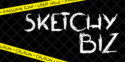
- Sketchy Smiley by Hanoded,
$10.00 Scary and weird, rough and tough, these smileys will leave a lasting impact for sure.
 - Sony Sketch EF - Unknown license

- Flower Sketch Neue by Okaycat,
$29.95 Okaycat presents "Flower Sketch Neue". Flower Sketch Neue contains beautiful illustrations of sunflowers, roses, tulips, olives, and leaves. You may also like our other fonts Flower Sketch and Orchids.
 - Le Havre Sketch by insigne,
$22.00 Le Havre Rough, a letterpress variant of Le Havre is 72% off for a limited time! Le Havre Sketch is a hand-sketched geometric sans serif. The family contains three weights. All members of the family include Sixty-four OpenType ligatures that add a realistic, natural effect and ensure that no two letters in a word repeat, oldstyle figures and small caps. Please see the sample brochure to see these features in action. Le Havre Sketch is an excellent choice when you need a fun and interesting sans-serif.
 - EF Kleins Sketch by Elsner+Flake,
$35.00 - LD Roman Sketch by Illustration Ink,
$3.00 - EF Autograph Sketch by Elsner+Flake,
$35.00 - Sketch Caslon Italic by Wordshape,
$15.00 SketchCaslon Italic is a hand-rendered display typeface with its formal base in the structure of the types of William Caslon.
 - Posterizer KG Sketch by Posterizer KG,
$30.00 Posterizer KG Sketch is basically a drawn version of Egyptian Slab Serif font Posterizer KG. Posterizer KG Sketch, is useful for some themes like music, painting, party, food, nature, kids... and many other funny and creative things. Contains all the Latin and Cyrillic glyphs.
 - Deco Sketch JNL by Jeff Levine,
$29.00 An interesting hand lettered example of Art Deco lettering (minus the letter ‘L’) was spotted on Pinterest and served as the inspiration for Deco Sketch JNL. Because there was no attribution as to the age or source of the alphabet, it can only be surmised that it was a scan from a 1930s or 1940s source. The original showed many of the irregularities of pen lettering, and had rounded terminals. The digital version has been redrawn more uniformly with flat terminals. Deco Sketch JNL is available in both regular and oblique versions.
 - Writes Sketh by Maulana Creative,
$15.00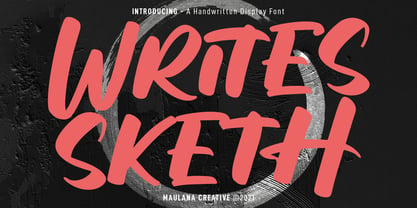 Writes Sketh is an expressive handwritten display font. With bold stroke, fun character with a bit of ligatures and alternates. To give you an extra creative work. Writes Sketh font support multilingual more than 100+ language. This font is good for logo design, Social media, Movie Titles, Books Titles, a short text even a long text letter and good for your secondary text font with sans or serif. Make a stunning work with Writes Sketh font. Cheers, MaulanaCreative
 - Fetch - Unknown license

- Retch by Hanoded,
$15.00 Retch - what's in a name? Retch is a unique typeface, heaving with character. It is scary and grotesque and is made to look like letters scratched onto a metal surface. Retch spits out most Latin based languages.
 - Hand Sketch Rough Poster by TypoGraphicDesign,
$25.00 “Hand Sketch Rough Poster” is a handmade, rough and dirty sans-serif display font for decorative headline sizes. Hand drawn. A–Z (× 2), a–z (× 2) and 0–9 (× 4) are each many different forms. Contextual alternates. Is intended to show the hand-made character and the vibrancy of the display font. The different forms of roughness creates a liveliness in the typeface. Standard ligatures like ae, oe, AE, OE, ff, fl, fi, fj, ffl, ffi, ffj and more decorative ligatures like CT, LC, LE, LH, LI, LO, LU, LY, TOO, TC, TE, TH, TU, TZ and ch, cl, ck, ct, sh, sk, st, sp, additional logotypes like BPM, fff, ppp, sfz and many more … plus Versal Eszett (Capital Letter Double S) give the font more life and shows that despite their retro-looks works with modern OpenType technology (type the word note for the symbol ♫ and the word love for the dingbat ❤ … ). Symbols like play, stop, eject, forward, backward, skip, pause and so on. The topic for the discretionary ligatures and the symbols are music. Have fun with this font – turn up the volume! How To Use – awesome magic OpenType-Features in your layout application ■ In Adobe Photoshop and Adobe InDesign, font feature controls are within the Character panel sub-menu → OpenType → Discretionary Ligatures … Checked features are applied/on. Unchecked features are off. ■ In Adobe Illustrator, font feature controls are within the OpenType panel. Icons at the bottom of the panel are button controls. Darker ‘pressed’ buttons are applied/on. ■ Additionally in Adobe InDesign and Adobe Illustrator, alternate glyphs can manually be inserted into a text frame by using the glyphs panel. The panel can be opened by selecting Window from the menu bar → Type → Glyphs. Or use sign-overview of your operating system. ■ For a overview of OpenType-Feature compatibility for common applications, follow the myfonts-help http://www.myfonts.com/help/#looks-different ■ It may process a little bit slowly in some applications, because the font has a lot of lovely rough details (anchor points). TECHNICAL SPECIFICATIONS ■ Font Name: Hand Sketch Rough Poster ■ Font Weights: Regular ■ Fonts Category: Display for Headline Size ■ Desktop-Font Format: OTF (OpenType Font for Mac + Win) + TTF (TrueType Font) ■ Web-Font Format: SVG + EOT + TTF + WOF ■ Font License: Desktop license, Web license, App license, eBook license, Server license ■ Glyph coverage: 715 ■ Language Support: Afrikaans, Albanian, Alsatian, Aragonese, Arapaho, Aromanian, Arrernte, Asturian, Aymara, Basque, Belarusian (Lacinka), Bislama, Bosnian, Breton, Catalan, Cebuano, Chamorro, Cheyenne, Chichewa (Nyanja), Cimbrian, Corsican, Croatian, Czech, Danish, Dutch, English, Esperanto, Estonian, Fijian, Finnish, French, French Creole (Saint Lucia), Frisian, Friulian, Galician, Genoese, German, Gilbertese (Kiribati), Greenlandic, Haitian Creole, Hawaiian, Hiligaynon, Hmong, Hopi, Hungarian, Ibanag, Iloko (Ilokano), Indonesian, Interglossa (Glosa), Interlingua, Irish (Gaelic), Istro-Romanian, Italian, Jèrriais, Kashubian, Kurdish (Kurmanji), Ladin, Latvian, Lithuanian, Lojban, Lombard, Low Saxon, Luxembourgian, Malagasy, Malay (Latinized), Maltese, Manx, Maori, Megleno-Romanian, Mohawk, Nahuatl, Norfolk/Pitcairnese, Northern Sotho (Pedi), Norwegian, Occitan, Oromo, Pangasinan, Papiamento, Piedmontese, Polish, Portuguese, Potawatomi, Quechua, Rhaeto-Romance, Romanian, Romansh (Rumantsch), Rotokas, Sami (Inari), Sami (Lule), Samoan, Sardinian (Sardu), Scots (Gaelic), Seychellois Creole (Seselwa), Shona, Sicilian, Slovak, Slovenian (Slovene), Somali, Southern Ndebele, Southern Sotho (Sesotho), Spanish, Swahili, Swati/Swazi, Swedish, Tagalog (Filipino/Pilipino), Tahitian, Tausug, Tetum (Tetun), Tok Pisin, Tongan (Faka-Tonga), Tswana, Turkish, Turkmen, Turkmen (Latinized), Tuvaluan, Uyghur (Latinized), Veps, Volapük, Votic (Latinized), Walloon, Warlpiri, Welsh, Xhosa, Yapese, Zulu ■ Specials: Alternative letters, logotypes, dingbats & symbols, accents & €. OpenType-Features like Access All Alternates (aalt), Contextual Alternates (calt), Glyph Composition/Decomposition (ccmp), Discretionary Ligatures (dlig) Denominators (dnom), Fractions (frac), Kerning (kern), Standard Ligatures (liga), Lining Figures (lnum), Numerators (numr), Old Style Figures (onum) Ordinals (ordn), Proportional Figures (pnum), Stylistic Alternates (salt), Stylistic Set 01 (ss01), Stylistic Set 02 (ss02), Stylistic Set 03 (ss03), Stylistic Set 04 (ss04), Superscript (sups), Tabular Figures (tnum) ■ Design Date: 2015 ■ Type Designer: Manuel Viergutz
 - Autograph Sketch EF Pro by Elsner+Flake,
$90.00 - Hand Scribble Sketch Rock by TypoGraphicDesign,
$19.00 U-P-D-A-T-E (more glyphs, bug fixed, MAC (Desktop) + WIN (Office) Version) CHARACTERISTICS An own interpretation of a classic egyptienne/slab serif typeface with modern and fancy handmade haptics/hatching. The 3 styles/weights fits perfectly in each font size. From light till bold. All 3 styles are handemade sketched for diverse display size. APPLICATION AREA This heavy, sketched, scribbled, handmade slab serif font “Hand Scribble Sketch Rock” with many language support would look good in headlines. Magazines or websites, party flyer, movie posters, music Poster, music covers or webbanner. TECHNICAL SPECIFICATIONS ■ Font Name: Hand Scribble Sketch Rock ■ Font Weights: Regular, Bold, Light ■ Fonts Category: Display for Headline Size ■ Font Format: OpenType OTF + Windows TrueType TTF ■ Glyph Set: 361 glyphs ■ Language Support: Basic Latin/English letters, Central Europe, Baltic, Romanian ■ Specials: alternative letters and ligatures (with accents & €) ■ Design Date: 2013 ■ Type Designer: Manuel Viergutz ■ Font License: Desktop license, Web license, App license, eBook license, Server license
 - Hand Scribble Sketch Times by TypoGraphicDesign,
$19.00 CHARACTERISTICS A state-of-the-art OpenType-Feature (like Contextual Alternates (calt) and Stylistic Alternates (salt)) of “Hand Scribble Sketch Times” is, that each uppercase and each lowercase letter has automatically alternated two variations to bring humanly-random characteristics of handwriting to life. The character of the rough, ruggend and raw handwritten classic serif typeface is a very unique warmly atmosphere. An pro-version of the font “Hand TIMES”. APPLICATION AREA warmth, love, handmade. For support of human warmth. Of cooking recipes, menus in the restaurant across party flyer, music cover Art to logo (word marks), headings in magazines and websites. TECHNICAL SPECIFICATIONS ? Font Name: Hand Scribble Sketch Times ? Font Weights: Regular, Rough, Invert ? Font Category: Grunge Serif Display for Headline Size ? Font Format: OTF (OpenType Font for Mac + Win) ? Glyph coverage: 601 ? Language Support: Basic Latin/English letters, Central Europe, West European diacritics, Baltic, Romanian, Turkish ? Specials: Alternative letters, Standard & Discretionary Ligatures, extras like symbols, dingbats, Old-style Digits, Lining Figures, accents & €, incl. OpenType-Features like Contextual Alternates (calt), Glyph Composition/Decomposition (ccmp), Discretionary Ligatures (dlig), Kerning (kern), Standard Ligatures (liga), Numerators (onum), Ordinals (ordn), Stylistic Alternates (salt), Stylistic Set 01 (ss01), Stylistic Set 02 (ss02), Stylistic Set 03 (ss03), Slashed Zero (zero), Lining Figures (lnum), Tabular Figures (tnum), Old Style Figures (onum), Proportional Figures (pnum) ? Design Date: 2013 ? Type Designer: Manuel Viergutz
 - KG Broken Vessels Sketch by Kimberly Geswein,
$5.00 A hand-sketched sans serif sketch font. For a solid version, pair this with KG Second Chances Solid.
 - Hand Retro Sketch Times by TypoGraphicDesign,
$19.00 CONCEPT/ CHARACTERISTICS A serif typeface with modern and fancy handmade haptics. Take the 3 layers for unique designs and create many different variations. From light and warm outline (take the regular style), about heavy and pithy filling (take the bold style) till fancy and modern 3d shadows (take the 3d style). The combination of all 3 font styles = bulky design freedom. Game with it! Handemade sketched for display size. APPLICATION AREA The vintage but modern, the raw but friendly serif font »Hand Retro Sketch Times« with many language support (for a display font) would look good at headlines. Editorial Design (Magazine or Fanzine) or Webdesign (Headline Webfont for your website), party flyer, movie poster, music poster, music covers or webbanner. And and and… TECHNICAL SPECIFICATIONS Headline Font | Display Font | Serif Layer Font »Hand Retro Sketch Times« OpenType Font with 341 glyphs, alternative letters and ligatures (with accents & €) & 3 styles & 3 layers (regular, bold, 3d)
 - Sketchy Smiley II by Hanoded,
$10.00 Another collection of assorted smileys!
 - Sketchy in snow by Abo Daniel,
$13.00 This font "SKETCHY IN SNOW" is so cute and playful. It is great for quotes, logo, branding, packaging, t-shirt design, cover kids book, tote bag design, social media and anything your project Both uppercase and lowercase are match perfectly. You can combined them as you like. Features: Uppercase Lowercase Number & Punctuations International Accent PUA Encoded
 - Starry Stitch - Personal use only

- CROSS STITCH - Personal use only

- Stitched Outline - Personal use only

- Swatch it - Unknown license

- Stitch & Bitch - Unknown license

- Mesh Stitch - Personal use only

- Kill Switch - Unknown license

- Speech Bubbles by Harald Geisler,
$68.00 The font Speech Bubbles offers a convenient way to integrate text and image. While the font can be used to design comics, it also gives the typographer a tool to make text speak – to give words conversational dynamics and to emphasize visually the sound of the message. The font includes a total of seventy outlines and seventy bubble backgrounds selected from a survey of historic forms. What follows is a discussion of my process researching and developing the font, as well as a few user suggestions. My work on the Speech Bubbles font began with historic research. My first resource was a close friend who is a successful German comic artist. I had previously worked with him to transform his lettering art into an OpenType font. This allowed his publishing house to easily translate cartoons from German to other languages without the need to use another font, like Helvetica rounded. My friend showed me the most exciting, outstanding and graphically appealing speech bubbles from his library. I looked at early strips from Schulz (Peanuts), Bill Waterson (Calvin & Hobes), Hergé (TinTin), Franquin, as well as Walt Disney. The most inspiring was the early Krazy Kat and Ignatz (around 1915) from George Herriman. I also studied 1980’s classics Dave Gibbon’s Watchmen, Frank Miller’s Ronin and Alan Moore and David Lloyd’s V for Vandetta. Contemporary work was also a part of my research—like Liniers from Macanudo and work of Ralf König. With this overview in mind I began to work from scratch. I tried to distill the typical essence of each author’s or era’s speech bubbles style into my font. In the end I limited my work down to the seventy strongest images. An important aspect of the design process was examining each artist’s speech bubble outlines. In some cases they are carefully inked, as in most of the 80’s work. In others, such as with Herriman, they are fast drawn with a rough impetus. The form can be dynamic and round (Schultz) with a variable stroke width, or straight inked with no form contrast (Hergé). Since most outlines also carry the character of the tool that they are made with, I chose to separate the outline from the speech bubble fill-in or background. This technical decision offers interesting creative possibilities. For example, the font user can apply a slight offset from fill-in to outline, as it is typical to early comic strips, in which there are often print misalignments. Also, rather than work in the classic white background with black outline, one can work with colors. Many tonal outcomes are possible by contrasting the fill-in and outline color. The Speech Bubbles font offers a dynamic and quick way to flavor information while conveying a message. How is something said? Loudly? With a tint of shyness? Does a rather small message take up a lot of space? The font’s extensive survey of historic comic designs in an assembly that is useful for both pure comic purposes or more complex typographic projects. Use Speech Bubbles to give your message the right impact in your poster, ad or composition.
 - Paragraph Stretch by Paragraph,
$15.00 When merely “extended” just would not do, here is Paragraph Stretch™: a super extended or elongated geometric display typeface. It is a typeface with an unicase effect: the capitals and lower case fit the same height and a similar width, so they are interchangeable: fancy a round “W” in all caps? Use the lower case. Want a straight “x” in lower case? Use the cap. And so on. Designed for use at larger sizes for logotypes, short titles or headings. It supports Western plus Nordic, Eastern European and Turkish languages.
 - Stitch Cursive by Okaycat,
$26.50 Stitch Cursive is a cute cursive font, with the added distinction of looking hand sewn! The applications of this full-out cursive font are many. It is designed to be creative & free flowing, but I also wanted it to be at least somewhat proper. The stitch is the central element to this unique design. Use Stitch Cursive any time you want fancy, legible, and luxurious text. Works great for logo design and beautiful for titles. Go ahead and have fun with it. Stitch Cursive is extended, containing the full West European diacritics & a full set of ligatures, making it suitable for multilingual environments & publications.
 - Easy Speech by Jean-Jacques Morello,
$10.00 Easy Speech is a hand drawn font inspired by my own writing, suitable for texts made in a hurry on sticky notes, letters, postcards... Most glyphs collide to give a real badly written feeling.
 - Cross Stitch by Outside the Line,
$19.00 A great font for crafters and scrapbookers. This font can be used to design and layout samplers, or to just create that Home Sweet Home look.
 - Boott Stitch by Aboutype,
$24.99Pen drawn in line, outline typeface originally designed for embroidery application. Boott was designed for print media in a wide point size range. Boott requires subjective display kerning and compensation. - Switched On by Type Innovations,
$39.00 Switched On and Switched Off where two fonts developed by placing points on a pre-defined square grid template. The experiment was to explore all the variations possible by just using straight connecting lines on a grid. I stumbled on the final concept, almost accidentally, and was amazed by the numerous possibilities. Both designs where created to work together. By adjusting the stroke and inline proportions between the two fonts, I was able to achieve a good overall color balance between 'Switched On' (dark letters on a light background), and the 'Switched Off' design as a knockout treatment (light letters on a dark background). Used in this way, both fonts visually appear similar in overall weight and proportion. They harmonize well together. Used separately, they make for some interesting visual effects and headline treatments. The fonts are best used at large point sizes, but they are still legible in a variety of smaller sizes. I think that by experimenting with these two fonts one can achieve some stunning visual effects. Explore and have fun.
 - Stitch Warrior by Roland Hüse Design,
$19.00 Stitch Warrior is a a gothic style stitch font. It's made of cross stitches ("x") even the kerning - the distance between the letter pairs varies between 1, 2 or 3 stitches distance. I was trying to be as accurate and close to reality as possible. It can be pefectly used for stitch lettering or text pattern to create visual effects.


