10,000 search results
(0.081 seconds)
- Ovane Regular by Tebaltipis Studio,
$13.00 Ovane a new fresh & modern Sans serif with a strong style, a dancing baseline! So beautiful on invitation like greeting cards, branding materials, business cards, quotes, posters, and more! Ovane Clean Display Typeface is the part of a strong and modern Bold display. This typeface both impressive at display sizes and easily readable in text size, while the sharp shapes of the triangular serif and the distinctive letter shapes show their strength in logo design and impressive editorial use.
 - Regular Bien by JASCHA&FRANZ,
$15.00 Regular Bien is a display font that is created out of two shapes - a circle and a line. It has a plain and a mutated face, depending on the usage of lowercase or capital letters. Regular Bien can be used in various fun ways and connections between lines.
 - Maximback Regular by Allouse Studio,
$16.00 Proudly Present, Maximback A Bold Graffiti Font With Four Styles. Maximback is perfect for any titles, logo, product packaging, branding project, megazine, social media, wedding, or just used to express words above the background. Maximback come with Multi-Lingual Support. Enjoy the font, feel free to comment or feedback, send me PM or email. Thank You! Uppercase
 - Nsai Regular - Personal use only

- This by Suomi,
$40.00 An all new rounded type family with Sans, Serif, Geometric and Blackletter!
 - Angular - Unknown license

- Angular by BA Graphics,
$45.00A very contemporary design can be used in any application from headlines to text. Angular serifs give this design a strong base. - regularJoe by JOEBOB graphics,
$49.00 A handwritten but very clean and organized font that's a little bold and a little slanted. Soon to be followed by its evil twin: irregularJoe.
 - Avenir Next Thai by Linotype,
$79.00 Avenir Next Pro is a new take on a classic face—it’s the result of a project whose goal was to take a beautifully designed sans and update it so that its technical standards surpass the status quo, leaving us with a truly superior sans family. This family is not only an update though; in fact it is the expansion of the original concept that takes the Avenir Next design to the next level. In addition to the standard styles ranging from ultralight to heavy, this 32-font collection offers condensed faces that rival any other sans on the market in on and off—screen readability at any size alongside heavy weights that would make excellent display faces in their own right and have the ability to pair well with so many contemporary serif body types. Overall, the family’s design is clean, straightforward and works brilliantly for blocks of copy and headlines alike. Akira Kobayashi worked alongside Avenir’s esteemed creator Adrian Frutiger to bring Avenir Next Pro to life. It was Akira’s ability to bring his own finesse and ideas for expansion into the project while remaining true to Frutiger’s original intent, that makes this not just a modern typeface, but one ahead of its time. Avenir Next Variables are font files which are featuring two axis, weight and width. They have a preset instance from UltraLight to Heavy and Condensed to Roman width. The preset instances are: Condensed UltraLight, Condensed UltraLight Italic, Condensed Thin, Condensed Thin Italic, Condensed Light, Condensed Light Italic, Condensed, Condensed Italic, Condensed Demi, Condensed Demi Italic, Condensed Medium, Condensed Medium Italic, Condensed Bold, Condensed Bold Italic, Condensed Heavy, Condensed Heavy Italic, UltraLight, UltraLight Italic, Thin, Thin Italic, Light, Light Italic, Regular, Italic, Demi, Demi Italic, Medium, Medium Italic, Bold, Bold Italic, Heavy, Heavy Italic.
 - Greycliff Thai CF by Connary Fagen,
$35.00 Greycliff Thai CF adapts Greycliff's popular soft, geometric design to the Thai script. Both Latin and Thai scripts are included, allowing for visually cohesive multiple-script applications. Greycliff Thai CF includes nine weights, obliques, and full Thai diacritics. Greycliff Thai CF works as a complete, self-contained type system, with both Latin and Thai scripts included and designed to compliment one another. All typefaces from Connary Fagen include free updates, new features, and free technical support.
 - Nimbus Sans Thai by URW Type Foundry,
$49.99 The Nimbus Sans Thai has been designed contemporarily and fittingly to the Latin Nimbus Sans family. It includes four upright and three cursive styles and the necessary OTF language features. Nimbus Sans Thai also covers the full Latin character range. Both scripts are perfectly combinable. Nimbus Sans is one of the best supported and most favored URW fonts ever. It is available as a Global Font in 4 weights and contains up to 65.000 characters per font.
 - Neue Frutiger Thai by Linotype,
$79.00 Neue Frutiger Thai was created by Anuthin Wongsunkakon and a team of designers and font engineers from the Monotype Studio, under the direction of Monotype type director Akira Kobayashi. The family is available in 10 weights from Ultra Light to Extra Black in both Traditional (loop terminals) and Modern (loop-less terminals) styles. Neue Frutiger Thai embodies the same warmth and clarity as Adrian Frutiger's original design, but allows brands to maintain their visual identity, and communicate with a consistent tone of voice, regardless of the language. It is part of the Neue Frutiger World collection, offering linguistic versatility across environments – suited to branding and corporate identity, advertising, signage, wayfinding, print, and digital environments.
 - Neue Helvetica Thai by Linotype,
$149.00Neue Helvetica® is a melding of aesthetic and technical refinements that result in superior design proportions, improved legibility and an expanded range of uses beyond the original Helvetica typefaces Neue Helvetica World fonts enable the setting of pan-European languages, in addition to Arabic, Armenian, Cyrillic, Georgian, Greek, Hebrew, Thai and Vietnamese. The Cyrillic fonts include full support of the Unicode block, including characters for Bulgarian, Mazedonian, Serbian and Ukrainian. Other Monotype global fonts can be paired with Neue Helvetica World to create a more comprehensive global typographic solution. A few examples follow: Devanagari: Saral Devanagari Japanese: Tazugane Gothic or Yu Gothic Korean: YD Gothic 100 or YD Gothic 700 Simplified Chinese: M Ying Hei PRC or M Hei PRC Traditional Chinese: M Ying HK or M Hei HK Click here to download a brochure with more information on Neue Helvetica World. - Thai Foon NF by Nick's Fonts,
$10.00One in the series of fonts celebrating the Halcyon Days of Handlettering. Thai Foon, a fun-loving, freewheeling script, is based on a font presented in the book "Lettering of Today" (today being 1933), by W. Ben and Ed C. Hunt. - Thai One On by Emboss,
$24.95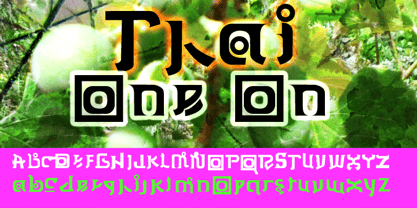
- STR - 100% free

- Stud - Unknown license

- Sadness by Floodfonts,
$29.00 Sadness is based on some experiments during Felix Braden’s stay at the Trier College of Design: "I played around with Fontographer’s blendfonts-feature (a type design tool to interpolate fonts and to minimize effort and expenditure of large families) with some files from a close designer. Since the basic elements derived from extremely varied fonts without any similarities, the concluding shapes first turned out to be rather fragmentary. From those fragments I chose the most characteristic elements and drew a whole new font." For a detailed type specimen have a look at: http://on.be.net/1CdAZlC
 - Stud by Typodermic,
$11.95 Listen up, partner! If you want to give your message some real grit, you need to saddle up with Stud. This ain’t no wimpy, delicate typeface that’ll have you tip-toeing around your message like a city slicker. No way, pal. Stud is a cowboy typeface with brawny serifs that’ll have you shouting your message from the rooftops. With wide characters and robust letterforms, Stud is the epitome of solid confidence. It’s the kind of typeface that’ll have your audience sitting up straight, paying attention, and hanging on your every word. And let me tell you, there ain’t no other typeface out there that can do that. But that’s not all, folks. Stud comes equipped with some serious firepower. Some character combinations are automatically swapped for custom pairs in OpenType-aware apps. That means your message is going to be more powerful than a bull at a rodeo. So if you want to make a real impact, make sure to turn off your application’s “standard ligatures” function to disable the effect. It’s time to get tough with Stud. Saddle up and let your message ride into the sunset with confidence, power, and a powerful style that’ll leave your competition eatin’ dust. Most Latin-based European writing systems are supported, including the following languages. Afaan Oromo, Afar, Afrikaans, Albanian, Alsatian, Aromanian, Aymara, Bashkir (Latin), Basque, Belarusian (Latin), Bemba, Bikol, Bosnian, Breton, Cape Verdean, Creole, Catalan, Cebuano, Chamorro, Chavacano, Chichewa, Crimean Tatar (Latin), Croatian, Czech, Danish, Dawan, Dholuo, Dutch, English, Estonian, Faroese, Fijian, Filipino, Finnish, French, Frisian, Friulian, Gagauz (Latin), Galician, Ganda, Genoese, German, Greenlandic, Guadeloupean Creole, Haitian Creole, Hawaiian, Hiligaynon, Hungarian, Icelandic, Ilocano, Indonesian, Irish, Italian, Jamaican, Kaqchikel, Karakalpak (Latin), Kashubian, Kikongo, Kinyarwanda, Kirundi, Kurdish (Latin), Latvian, Lithuanian, Lombard, Low Saxon, Luxembourgish, Maasai, Makhuwa, Malay, Maltese, Māori, Moldovan, Montenegrin, Ndebele, Neapolitan, Norwegian, Novial, Occitan, Ossetian (Latin), Papiamento, Piedmontese, Polish, Portuguese, Quechua, Rarotongan, Romanian, Romansh, Sami, Sango, Saramaccan, Sardinian, Scottish Gaelic, Serbian (Latin), Shona, Sicilian, Silesian, Slovak, Slovenian, Somali, Sorbian, Sotho, Spanish, Swahili, Swazi, Swedish, Tagalog, Tahitian, Tetum, Tongan, Tshiluba, Tsonga, Tswana, Tumbuka, Turkish, Turkmen (Latin), Tuvaluan, Uzbek (Latin), Venetian, Vepsian, Võro, Walloon, Waray-Waray, Wayuu, Welsh, Wolof, Xhosa, Yapese, Zapotec Zulu and Zuni.
 - Stu by StuArt,
$9.00 Stu is based on the penmanship of the late Raoul "Stu" Stuart. Raoul's penmanship was always admired by those who saw it; it was a first glimpse into the artistic and creative side of an otherwise easy-going, funny guy. The print variants exude a soft yet masculine feel, while the scripts evoke a sense of sentimentality and romance. Stu features dingbats which say something about Raoul: affectionate and romantic (heart), a big coffee drinker (coffee cup), a great cook (spoon and fork), a music lover (musical note), and a prankster (winking smiley). (The winking smiley is available in all the font styles, while each of the other four dingbats is unique to one font style.) Stu is a tribute to the coolest dad in the world.
 - Rigular Script by Gloow Studio,
$18.00 Rigular Script has inspirated from retro style and funky designs like signs and old poster. This font comes with an extra extrude to make the font look more retro/unique and save your time on making it. Font has an opentype features that allow you to modify it as you like as needed. Andala perfect for poster, logo, book covers, tshirt designs, packaging and more. Features : Uppercase Lowercase Number Punctuation Ligature Multilingual Language PUA encode Opentype Features Just enjoy with our product! Thank you
 - PTF NORDIC Std - Unknown license

- Hebrew Yiddish Std by Samtype,
$49.00 This is a classic early 20th century Yiddish font. This has all the new modern Nikud like: Qamats Katan, ShevaNa, Dagesh Hazak and Holam Chaser.
 - Iwata Kyokasyo Std by IWATA,
$149.00 児童教育のためにトメ、ハネ、ハライ、筆順や画数を明確にした書体です。 教育用書籍だけでなく、様々な書籍にもご使用いただけます。
 - Hebrew Esther Std by Samtype,
$59.00 This is a revival of a modern classic, exceptionally good for books and small texts.
 - Iwata Kaisho Std by IWATA,
$149.00 書の基本を生かし、美しく格調高いデザインの筆書系書体です。伝統的な正/中太/特太楷書体に加え「力強さ」「伸びやかさ」「整然とした読みやすさ」を意識した「新楷書」「新楷書かなA」があります。
 - Benton Sans Std by Font Bureau,
$40.00 In 1903, faced with the welter of sanserif typefaces offered by ATF, Morris Fuller Benton designed News Gothic, which became a 20th-century standard. In 1995 Tobias Frere-Jones studied drawings in the Smithsonian and started a redesign. Cyrus Highsmith reviewed News Gothic, and with the Font Bureau studio expanded it into Benton Sans, a far-reaching new series, with matched weights and widths, offering performance well beyond the limits of the original; FB 1995-2012
 - Parisine Office Std by Typofonderie,
$59.00 Humanistic sanserif in 4 fonts The Parisine Office typeface family can be considered as the text version of the Parisine. When Parisine xheight fit Helvetica large xheight, Parisine Office is more close to Gill Sans in term of proportion, as it was developed for Ratp, the public transport in Paris to allow compatibility with documents set in Gill Sans without changing the length of text. Parisine Office by default is a humanistic sanserif available in 4 fonts perfect for text setting. The design of the italic lowercases is more cursive than in Parisine. About Parisine Parisine helps Parisians catch the right bus Observateur du design star of 2007
 - Hebrew Kria Std by Samtype,
$59.00 This is a modern, wonderful, and beautiful font. This font is super readable and can be used from Posters to a Hebrew prayer book. The readability of this font is amazing. This font has the modern Hebrew punctuation: Shevana, Kamatz Katan, Dagesh Hazak, and Cholam Chaser.
 - Hebrew Ariel Std by Samtype,
$59.00 This is a beautiful, modern, and super readable font. You can use it in any kind of text, from folders to prayer books. This font also has modern punctuation: shevana, kamats katan, dagesh hazak, and holam chaser.
 - Hebrew Sevilha Std by Samtype,
$49.00 This is Classic Hebrew Sefardi Font. This is a beautiful typeface to invitations, posters, cover books and small texts. All diacritic marks for vocalization are present (Nikud), including shevana, kamats katan, cholam chaser and dagesh hazak.
 - Anisette Std Petite by Typofonderie,
$59.00 Geometric font inspired by shop signs in 4 styles Anisette has sprouted as a way to test some ideas of designs. It has started with a simple line construction (not outlines as usual) that can be easily expanded and condensed in its width in Illustrator. Subsequently, this principle of multiple widths and extreme weights permitted to Jean François Porchez to have a better understanding with the limitations associated with the use of MultipleMaster to create intermediate font weights. Anisette built around the idea of two widths capitals can be described as a geometric sanserif typeface influenced by the 30s and the Art Deco movement. Its design relies on multiple sources, from Banjo through Cassandre posters, but especially lettering of Paul Iribe. In France, at that time, the Art Deco spirit is mainly capitals. Gérard Blanchard has pointed to Jean Francois that Art Nouveau typefaces designed by Bellery-Desfontaines was featured before the Banjo with this principle of two widths capitals. The complementarity between the two typefaces are these wide capitals mixed with narrow capitals for the Anisette while the Anisette Petite – in its latest version proposes capitals on a square proportions, intermediate between the two others sets. Of course, the Anisette Petite fonts also includes lowercases too. Anisette Petite, a geometric font inspired by shop signs in 4 styles So, when Jean François Porchez has decided to create lowercases the story became more complicated. His stylistic references couldn’t be restricted anymore to the French Art-déco period but to the shop signs present in our cities throughout the twentieth century. These signs, lettering pieces aren’t the typical foundry typefaces. Simply because the influences of these painted letters are different, not directly connected to foundry roots which generally follow typography history. The outcome is a palette of slightly strange shapes, without strictly not following geometrical, mechanical and historical principles such as those that typically appear in typefaces marketed by foundries. As an example, the Anisette Petite r starts with a small and visible sort of apex that no other similar glyphs such as n or m feature, but present at the end of the l and y. The famous g loop is actually inspired by Chancery scripts, which has nothing to do with the lettering. The goal is of course to mix forms without direct reports, in order to properly celebrate this lettering spirit. This is why the e almost finishes horizontally as the Rotis – and the top a which must logically follow this principle and is drawn more round-curly. This weird choice seemed so odd to its designer that he shared his doubts and asked for advise to Jeremy Tankard who immediately was reassuring: “Oddly, your new top a is fine, it brings roundness to the typeface, when the previous pushes towards Anisette Petite to unwanted austerity.” The Anisette Petite, since its early days, is a mixture of non-consistent but charming shapes. Anisette, an Art Déco typeface Anisette Petite Club des directeurs artistiques, 46e palmarès Bukva:raz 2001
 - Phoenica Std Mono by preussTYPE,
$29.00 Phoenica Std Mono expands the already large family of my very successful Phoenica. The motivation to develop a new mono-Phoenica family was that I was not satisfied with monospaced fonts in programming code, or simply in e-mail correspondence. The Mono Phoenica solves the problem of a typical monospaced font, a rigid, fixed width. The design gradations from Condensed monospaced to monospaced from 390em to 600em-square incurred a total of 21 fonts. Packages contain the fonts in CFF-OpenType and TrueType format, so you can use these beautiful fonts on all operating systems.
 - PS Fournier Std by Typofonderie,
$59.00 Style and elegance in 14 styles PS Fournier, created by Stéphane Elbaz, is designed in tribute to Pierre Simon Fournier. Fournier was the prolific Parisian type designer whose work is best known for its iconic representation of French transitional style. PS Fournier elegantly represents the transition to the modern era of typography. Featuring three optical sizes, PS Fournier is designed to perform in any context. The Pierre Simon Fournier heritage Pierre Simon Fournier (1712—1768) was a leading innovative type designer of the mid-18th century. Early in his career, the young Pierre Simon developed a strong aesthetic that he cultivated throughout his life. His art is representative of the pre-revolutionary “Age of Enlightenment” (Siècle des Lumières). Precursor of the Modern style, Fournier’s body of work deeply influenced his times, and created the fertile ground from which the Didot family and Giambattista Bodoni developed their own styles. During the historical period of the 18th century, Fournier exemplified the intellectual pursuits of the times with his own research on type, documenting in detail the typefounding process. He also offered a unique vision: he is the first to clearly comprehend the concept of “type family,” sorting a set of similarly styled alphabets by sizes, width, and by x-heights. In addition, Fournier is one of the earliest advocates of the point system to organize the practice of typography, the point system that contemporary typographers continue to use to this day. The refined and discreet elegance of PS Fournier With a close look at the family, one finds you’ll find that the difference between the optical sizes (Petit, standard and Grand) is more than a contrast variation between the thin and the thick; the eye can also denote a palette of distinct tones: More streamlined and robust in the smaller sizes (Petit), more refined and detailed in the larger sizes (Grand). The PS Fournier standard family is designed to adapt to any situation with its intermediate optical size, from body copy to headlines. With a bit of tracking, PS Fournier Petit will make the smallest captions perfectly readable. However, Petit family is not limited to body and captions — its “slabby robustness” will make a relevant headline choice as well. PS Fournier Grand presents a higher contrast adapted to large text sizes, displays or banners. Its refined elegance makes it a perfect choice for Design, Fashion or Luxury publications. As a “modern” type PS Fournier Grand features a larger x-height than the preexistent old style typefaces such as Garamond or Jenson. These proportions provide any basic text set in PS Fournier Grand a strong typographic texture. As a result, the PS Fournier global family is a versatile alternative to the Modern typefaces commonly used in the publishing industry. The optical sizes, the large range of weights, and the design variations make this family adaptable to captions, paragraphs, and pages, as well as to large texts and displays. A leading-edge typography in the 18th century In the spirit of modernity, Pierre Simon Fournier did not find any use for the conventional swashes still produced by peers such as Caslon or Baskerville. Nevertheless the French designer created many inventive elements to decorate the page and set delightful variations in the text itself. To this regard PS Fournier includes a large set of glyphs variations, ligatures and more than one hundred glyphs for borders, rules and ornaments or — as called in French — “vignettes.” PS Fournier: A tribute to the French modern typography era by Stéphane Elbaz
 - Hebrew Gigi Std by Samtype,
$49.00 Beautiful font, good for posters and small books and folders. This is a complete font with all diacritic marks (Nikud and Taamim) and also shevana, kamatz katan, dagesh hazak and holam chaser.
 - Iwata Reisho Std by IWATA,
$149.00 中国で古くから使用されていた伝統的な隷書を源流にする「イワタ隷書体」と、 新しい感覚の「イワタ新隷書体」の2種類があります。
 - Iwata Mincho Std by IWATA,
$149.00 フトコロが広くシンプルなエレメントで構成され、可読性に優れたオーソドックスな明朝体です。本文から見出しまで、様々な用途に使用できる書体です。
 - Secca Saloon Std by astype,
$27.00 Bored by ancient Western typefaces? Try Secca Saloon. If you like the ornaments in the back, have a look at the Accolades from Astype.
 - Cable Condensed Std by RMU,
$30.00 Three condensed styles which are part of the well-known Kabel font family.
 - Suit Sans STD by Just in Type,
$15.00 Suit Sans STD is a typeface designed for multi-purposes with 4 weights plus matching italics. The set of 554 glyphs embraces all European languages, and it's perfect for branding, interfaces and everything else you could create on large and small sizes. But if Suit Sans STD is not enough for you, take a look at Suit Sans Pro with extended weight range, character set and more cool features.


