10,000 search results
(0.062 seconds)
- Polka Collecta by Invasi Studio,
$15.00 Polka Collecta is a playful display font with alternate cuts. A bold and fun Sans Serif typeface, available in two styles: Regular and Playful. Using the playful version, you can create unique compositions because of the informal grid. Opentype fonts feature stylistic alternate characters to give the composition a unique personality. Suitable for display needs such as quotes, branding, logo, poster, cover design, etc Features: Uppercase Alternates & Ligatures Numerals & Punctuation Multilanguage Supports 60+ Latin based languages
 - DSari by Latinotype,
$29.00 It is inspired by the friendliness and cordiality of neo-humanist typefaces with a mix of rounded shapes, some apexed characters, and a little bit of black. Although it follows the ductus, D Sari is also a daring font with less pointed shapes, as is the case with regular neo-humanist typefaces. D Sari has 22 variants, which make it a very dynamic typeface. Well-suited for highlighting lettering, magazines, motion graphics, advertising, logotypes, signs, etc.
 - Neato Serif by Adam Ladd,
$25.00 Neato Serif is a hand drawn, quirky serif font in regular and italic styles. It features stylistic alternates, standard and discretionary ligatures, and swashes to add options and flair to your typography. The typeface has a unique blend of sophistication with its high contrast of thicks and thins and also playfulness with the distinct ball terminal characters—especially evident in the lowercase "e". It is slightly condensed and great for display headlines, titles, packaging, branding, and more.
 - Voguer Sans by NREY,
$19.00 Voguer Sans is an elegant high-contrast sans-serif font inspired by the fashion glossy magazines typography. It perfectly represents modern and vintage esthetics. The font have 2 weights: regular and bold and includes uppercase and smallcase letters, alternate characters and multilingual support. The font is perfect for wedding elegant invitation cards, beauty and fashion package design, glossy posters. It have supporting for many european languages and perfect cyrillic! Thank you and have a great day!
 - Elodie by Franzi draws,
$12.00 Elodie is an Art Nouveau inspired all caps font with some extra quirky characters. It was hand drawn with a brush pen. Elodie is designed for titles, short quotes, product names etc. Use lower-case letters for regular text, and then add a some special quirks to your writing by using the characters in the upper-case section. Multilingual support is included for Western, Central and Eastern European languages. Please test your characters in the font previewer before purchase.
 - Neva by ParaType,
$30.00 Neva Regular with Italic was created by Moscow book and type designer Pavel Kuzanyan (1901-1992) at Polygrafmash in 1970 for slugcasting and display composition. Based on simple strict letterforms of Russian classical typefaces. Neva typeface was rewarded on the Gutenberg international type design contest in 1971 (Leipzig). The typeface is useful in text and display composition, in fiction and art books. The digital version and bold styles were designed for ParaType in 2002 by Lyubov Kuznetsova.
 - Sassoon Primary by Sassoon-Williams,
$48.00 The Regular typeface was researched with children and developed specially for use in children’s reading books - bridging the gap between reading and handwriting. Short ascenders and descenders may not trouble literate adults but it is quite a different matter for children struggling to read. These fonts include extended ascenders and descenders and slight slant makes blocks of text easier to read. Free to download resources How to access Stylistic Sets of alternative letters in these fonts
 - Fantasia Halloween by Agny Hasya Studio,
$12.00 Fantasia Halloween Is a Display Typeface With Horror, Fun, and Playful Vibes. Come In 2 (Two) Styles (Regular and Slant) And Is Created With Some Alternate and Ligature. Featured with Uppercase and lowercase, Numeral and punctuation, Multilingual Support, and Opentype Features Perfect for Your Design Projects Like Advertising, Branding, Product Designs, Magazine Designs, Book/Cover Title Designs, Art Quotes, Special Events, Labels, Product Packaging, and More. Have Fun Creating & Designing With Fantasia Halloween Thank You! agnyhasyastudio
 - SF Manchit by Sultan Fonts,
$19.99 Manchit is a typeface dedicated to headlines in newspapers, magazines, advertisement banners, book covers and other printing products, and fits headlines on web pages. The Manchit font contains two styles (regular and bold) suitable for large display sizes, especially in the area of advertising, while still functioning well as a text face. The font includes a matching Latin design and support for Arabic, Persian, Kurdish, and Urdu. Designer: Sultan Maqtari Design date: 2020 Publisher: Sultan Fonts
 - Brushstrike by Zetafonts,
$39.00 The Brush Strike Family is an exercise in dynamic, gestural brush type design by Francesco Canovaro. The typeface contains no lowercase set, but it doubles the uppercase with a strikethrough alternate set to be used for dynamic logo design and unusual word highlighting. Two weights are available with consistent design: the light weight (Brushstrike Light aka Lightstrike) can work together with the heavier regular weight but can also be used in white on dark background for light effects.
 - HU Storyserif by Heummdesign,
$15.00 HU Storyserif is a textual font in the form of a slab serif and contains a concise and neat feeling through the round conclusion of straight lines and lines. It is a typeface designed to contain a distinctive feeling by adding a round topknot, not a typical square topknot of slab serif, and a gothic solidity through a straight straight line. There is 1 weight of HU Storyserif : Regular Features : Uppercase & Lowercase Numbers & Puncuatuion Multilanguage 882 Glyphs
 - Code Saver by Dharma Type,
$9.99 Code Saver — Next-generation monospaced font — 1. Code Saver is a monospaced font family for coding and tabular layout. 2. Code Saver is a clean, natural and simple monospaced font family. 3. Code Saver consists of 6 style, Regular, Medium, Bold and their 11° Italic. 4. Code Saver has 93.33% condensed width for more usable space. 5. Code Saver has good distinguishability and legibility especially numerals. 6. Code Saver brings a fresh sensitivity to boring old existing monospaced fonts.
 - Shutterbug JNL by Jeff Levine,
$29.00 On April 20, 1950, film comedian Jerry Lewis indulged his love of cameras by opening up Jerry Lewis’ Camera Exchange on Vine Street in Hollywood. It closed in 1951. Thanks to an image preserved within newsreel footage of the shop’s grand opening night, a glimpse of the post-Art Deco signage with its unusual, block style lettering inspired a digital version. Highly unusual and best for novelty projects, Shutterbug JNL is available in both regular and oblique versions.
 - Classy Brune by Typetemp Studio,
$18.00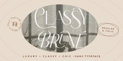 Classy Brune a display sans serif with luxury, clean, chic, and visual elegance with two styles Regular and Italic and alternatives, ligatures, multilingual suport. Perfect for editorial projects, Logo design, Clothing Branding, product packaging, magazine headers, or simply as a stylish text overlay to any background image. Features : Uppercase and Lowercase Stylistic Alternates & Ligatures Numerals & Punctuation Multilanguange PUA Encoded Web Font Included Contact me with an inbox message If you have any question. Thank you! Happy Creating
 - Funky Nouveau JNL by Jeff Levine,
$29.00 The free-form Art Nouveau hand lettering for the 1905 song "Will You Love Me in December as You Do in May" was the design model for Funky Nouveau JNL, which is available in both regular and oblique versions. Since the 1960s hippie counterculture embraced elements of the Art Nouveau period in their art and design, it seemed only fitting to use the term "Funky Nouveau" in the fontís name as an homage to both eras.
 - Contingent Font Duo by Typehill Studio,
$10.00 Introducing Contingent Duo: An elegant serif typeface paired with a casual handwritten script. With its modern and minimal look, Harlow Font Duo brings a luxurious and clean style to websites, modern logos, branding identity, social media quotes, wedding stationery, and whatever your heart dreams up! The Serif includes two weights - regular and bold - and built in OpenType kerning features for a professional touch. Stylish modern font duo consisting of elegant and elegant script and serif fonts.
 - The Reading Display by Great Studio,
$19.00 The Reading Display is a new editorial serif with all clean and soft lines, tight curves, and a trendy elegant look. The Reading Display has two versions of the font, namely Regular Serif & Condensed Serif which are equipped with an italic version style, very suitable for your design needs such as very suitable for creating nostalgic designs but still clean and elegant such as headlines, magazines, logos, packaging, editorial, and so on. much more. Cheers, Great Studio
 - Work Yard Stencil by Jeff Levine,
$29.00 The image of a set of vintage French tin stencils spotted online was the starting point in designing Freight Yard Stencil JNL. A more traditional ‘B’ and ‘R’ replaces the original characters (which looked kind of awkward due to extra ‘stencil breaks’ within the letters). However, there are a few interesting variants in other characters to set the design apart from similar stencil fonts. Work Yard Stencil JNL is available in both regular and oblique versions.
 - Secombe by Greater Albion Typefounders,
$14.50 Secombe is a lively fun family of typefaces in the spirit of the turn of the last century. It's a boisterous fun design, named in honor of the late Harry Secombe (or if you prefer, Neddy Seagoon). Secome is a family of two 'small capitals' display faces, offered in a regular solid form and the 'Grande' form, engraved and shadowed. Ideal for posters, book covers and any other design work where a feel of the 1900s is needed.
 - Old Tijuana JNL by Jeff Levine,
$29.00 Old Tijuana JNL was modeled from the hand lettered title on the cover of the 1939 sheet music for "Class Will Tell" and is available in both regular and oblique versions. Casual, playful and reminiscent of the "serape" style of pseudo-Mexican lettering found on ad designs of the 1930s and 1940s, the type face isn't just for South of the Border themes. Use it for any festive occasion and the design will blend in well.
 - Fitz Sans SRF by Stella Roberts Fonts,
$25.00 Fitz Sans SRF was contributed to the Stella Roberts Fonts project by graphic designer Matt Yow after receiving word of the project from Ray Larabie of Typodermic Fonts. A light, attractive text face, Fitz Sans SRF also lends itself well to headlines and titles. The font is available in both regular and oblique versions. The net profits from my font sales help defer medical expenses for my siblings, who both suffer with Cystic Fibrosis and diabetes. Thank you.
 - Primaria by PeGGO Fonts,
$18.00 Primaria is a display font, inspired on the very first basic handwrite style teaching at primary school, designed in cursive and print styles in three weights each one: light, Regular and Bold, considering stylistic and typographic needs, it also contain OpenType initial lowercase alternative forms in order to get better links in those case where pairs of letters could be look better. Recommended playful and friendly design, teaching and learning stuff, children toys projects, food & drink and soft stuff.
 - Garment Bag Stencil JNL by Jeff Levine,
$29.00 Searching the internet for interesting type ideas leads one to many unusual items for sale online. An antique, hand-cut metal stencil from France with the word “Bagagens” [luggage] provided a condensed Art Deco design in a semi-stencil format (some solid letters, others with traditional ‘breaks’ within the characters). The digital version of the type style has a more traditional stencil character set. Garment Bag Stencil JNL is available in both regular and oblique versions.
 - Arkwright by Greater Albion Typefounders,
$11.95 Arkwright, named for a well known fictional shopkeeper who kept his shop open all hours is inspired by traditional British (and transatlantic) shop signage. It is a spiritual companion and ideal companion to our more elaborate Granville family. Arkwright is offered in Regular and bold weights and a more decorative 'Grand' form. These faces are especially suitable for posters, period advertising, Chapter headings and signage. Arkwright and Granville are also offered together in a value pack.
 - Misses Twiggs by Type Innovations,
$39.00 Misses Twiggs is a contemporary modern serif created by the American type designer Alex Kaczun. It compliments its partner Mister Twiggs and is a perfect marriage of two fonts. Mister Twiggs brings his tall good looks and Misses Twiggs bring her cute little serifs to the relationship. There are absolutely no curves in these elegant typefaces. Both fonts have sharp corners with extra tall capitals and narrow waistlines. Misses Twiggs also comes in 3 flavors: regular, thin and heavy.
 - Mr Dj Signature by Attractype,
$17.00 Mr. Dj Signature is a script typeface specially designed for signature fonts. With a balanced thickness, it is also suitable for various lettering purposes, such as greeting cards, invitations, branding, crafts, wedding decorations, even looks good for text. Mr. Dj Signature comes in two variants, regular appearing like calligraphy and monoline with the same line thickness. both are equipped with several ligatures, alternates and 3 signature swashes placed under the underline character (_) . Happy designing with Mr. Dj Signature.
 - Nordic Folk by Kaer,
$19.00 Hey there! I'm happy to introduce to you my new ethnic-based font. Hurray! It was long and hard work because every glyph is unique. I sketched each letter of the font. Each letter is uniquely designed and has nordic folk art in the background. What you will get: Filled and Regular styles Icons and patterns font Uppercase (lowercase glyphs are same) Numbers and symbols Multilingual support Please feel free to request to add characters you need: kaer.pro@gmail.com
 - Tightwad JNL by Jeff Levine,
$29.00 “I Don't like No Cheap Man” is a piece of early 1900s sheet music featuring its title hand lettered in a condensed slab serif design. The influences of the Art Nouveau era are clearly found in the many eccentric character shapes within the various letters of the original artwork. Recreated in digital type, Tightwad JNL is available in both regular and oblique versions – and its font name is a variant of the “Cheap Man” portion of the song’s title.
 - Periodical JNL by Jeff Levine,
$29.00 Periodical JNL is based on one the many stylized titles from the cover of the 1920s Spanish magazine "Nuevo Mundo" (New World). Each cover displayed a beautiful piece of period artwork along with the magazine's name in different lettering styles of the time (Art Nouveau and early Art Deco). The original design features an "engraved" look and now has an oblique counterpart. Also available are solid versions (without the inside lines) in both regular and oblique styles.
 - Oldion by Locomotype,
$19.00 Oldion is a captivating display font, draws inspiration from the boundless realms of science fiction and modern technology. With its distinctive and futuristic accents adorning each letter, Oldion breathes life and dynamism into your projects. Available in both regular and rounded styles, infuses a touch of innovation and intrigue into your designs. Oldion is your ideal choice for a wide range of creative applications, from commanding movie posters and attention-grabbing headlines to captivating packaging and distinctive logotypes.
 - Argot by K-Type,
$20.00 Argot is inspired by condensed grotesque letterforms and would be a monolinear sans except for an unorthodox disparity between inner and outer shapes. Elegantly curved outlines contrast starkly with austere rectangular counters, suggesting a no-frills functionality, 20th century modernism, or an unsettling discordance. The squared off inner spaces also add clarity and crispness. Argot is available in three widths — Wide, Normal and Narrow. Each width is supplied in three weights — Regular, Bold and Black — with corresponding italics (obliques).
 - Drawlers by Letterhend,
$14.00 Drawlers is a organic sans with stencil versionthat effortlessly infuses your designs with a touch casual and a dash of classic. Its unique type- maekt it perfect choice for any projects especially in logo, and the other various formal forms such as invitations, labels, logos, magazines, books, greeting / wedding cards, packaging, fashion, make up, stationery, novels, labels or any type of advertising purpose. Features : Regular & Stencil Version Uppercase & lowercase Numbers and punctuation Alternates & Ligatures Multilingual PUA encoded
 - Lalalo by Cuda Wianki,
$25.00 Lalalo is a casual, modern sans-serif font family based on hand-lettering. It's oval letter shapes provide soft and friendly appearance. Lalalo font is very legible with a warm touch perfectly suited for children books. Lalalo family consists of 6 weights ( Extra Light, Light, Regular, Semibold, Bold, ExtraBold). You can use it with normal fill or outlined. You can mix various colors and stroke widths to gain interesting results. There is also a set of nice frames available.
 - Banknote 1948 by Ingo,
$39.00 A very expanded sans serif font in capital letters inspired by the inscription on a bank note Old bank notes tend to have a very typical typography. Usually they carry decorative and elaborately designed markings. For one thing, they must be practically impossible to forge and for another, they should make a respectable and legitimate impression. And in the days of copper and steel engravings, that meant nothing less than creating ornate, shaded or otherwise complicated scripts. Designing the appropriate script was literally in the hands of the engraver. That’s why I noticed this bank note from 1948. It is the first 20 mark bill in the then newly created currency ”Deutsche Mark.“ All other bank notes of the 1948 series show daintier forms of typography with an obvious tendency toward modern face. The 1949 series which followed shortly thereafter reveals the more complicated script as well. For whatever reason, only this 20 mark bill displays this extremely expanded sans serif variation of the otherwise Roman form applied. This peculiarity led me in the year 2010 to create a complete font from the single word ”Banknote.“ Back to those days in the 40’s, the initial edition of DM bank notes was carried out by a special US-American printer who was under pressure of completing on time and whose engravers not only engraved but also designed. So that’s why the bank notes resemble dollars and don’t even look like European currency. That also explains some of the uniquely designed characters when looked at in detail. Especially the almost serif type form on the letters C, G, S and Z, but also L and T owe their look to the ”American touch.“ The ingoFont Banknote 1948 comprises all characters of the Latin typeface according to ISO 8859 for all European languages including Turkish and Baltic languages. In order to maintain the character of the original, the ”creation“ of lower case letters was waived. This factor doesn’t contribute to legibility, but this kind of type is not intended for long texts anyway; rather, it unfolds its entire attraction when used as a display font, for example on posters. Banknote 1948 is also very suitable for distortion and other alien techniques, without too much harm being done to the characteristic forms. With Banknote 1948 ingoFonts discloses a font like scripts which were used in advertising of the 1940’s and 50’s and were popular around the world. But even today the use of this kind of font can be expedient, especially considering how Banknote 1948, for its time of origin, impresses with amazingly modern detail.
 - Stillhouse by Surplus Type Co,
$16.00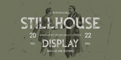 Stillhouse is a vintage serif font that features 2 styles - Textured & Solid. This typeface is great for achieving that rustic aesthetic which is popular in restaurant branding, apparel designs and product packaging.
 - Edison by HiH,
$12.00 Edison, is it Victorian or is it Art Nouveau? While this typeface may be found in Petzendorfer’s Treasury of Art Nouveau Alphabets, I believe the decorative spirals are more Victorian than “New Art.” To me, they looked tacked on, rather than organic -- with the industrial mechanics of a coiled spring, rather than the tendrils of a growing plant as the philosophical wellspring. Originally released by ATF in 1894 as Houghton, this typeface was re-released shortly thereafter by Bauer and Berthold in Germany as EDISON. Please do not make the mistake of thinking the font we offer here is no better than freeware fonts in cheap rip-off collections. This font has a set 218 characters and represents many hours manipulating the bezier curves to produce acceptable results. Available freeware fonts are often little more than raw scans with little accuracy of letterform. The muddy line intersections are a dead give-away. Frequently all you get is the alphabet itself. No numbers, no punctuation and don't even think about diacriticals. The font we offer represents a tremendous value. Considering the hours of work involved, I have no business charging so little. I could make better money cooking hamburgers or bagging groceries. But we want very much to encourage you to purchase and enjoy these fascinating historical typefaces and are making it as easy as possible for you to do so. So please encourage us and order Edison today.
 - Greenhorn by Juraj Chrastina,
$29.00 Greenhorn is a hand-traced comic type for headlines. Funky, irregular and smiling. The first inspiration comes from the unique lettering of a classic czech cartoonist.
 - Roundel by K-Type,
$20.00 Roundel is a paradoxical, modern heraldic typeface. It is a display face of simple, angular and curved shapes, with each main glyph contained within a circle.
 - Bookish by Hackberry Font Foundry,
$24.95 This all started with a love for Jenson. I know there're hundreds of variations on that theme. But, that is where I began, several years ago. How far it came, as usual as I wandered through the vagaries of font design, is not unusual. If you've read any of my font design books, you know my design processes are quite loose and spontaneous. I wanted the general feel of a favorite old font, but softer, easier, and more comfortable. I built these on the same vertical metrics as my Librum Publishing Group. However, this family is not part of that group. I used the metrics because that shows my current taste in fonts. This family does work with the Librum group—but to be honest, I haven't experimented enough to come up with a good companion. I suspect I'll need to make another companion family. I may need make a non-modulated bold version also. But, that remains to be seen. I'm pleased with this.
 - Jemgonza by Pootis Type Corp.,
$24.99 Jemgonza is a Sans-serif font started on January 26, 2022. This font with hyper-extended character sets allow for usage for billboard signs, logos, and even professional documents and essays. It contains localized forms for certain languages that write them differently. For example: Л and л shaped like upside-down V's, д shaped like a lowercase g, и shaped like a lowercase u, and more for Bulgarian; б shaped like the Greek lowercase letter delta for Macedonian and Serbian. There are two non-standard variation sequences for the light and dark shades for when they are used vertically. If it bothers you, you can add Variation Selector-14 after each one of those This font also contains 256 braille patterns for the blind people. Note that each pattern is not tied to any specific letter since multiple scripts have a braille system