10,000 search results
(0.108 seconds)
- The Ground by Balevgraph Studio,
$10.00 The ground is a minimal and neat sans serif font with plenty of stylistic alternatives. This typeface is perfect for an elegant & luxury logo, book or movie title design, fashion brand, magazine, clothes, lettering, quotes, and so much more. What's Included? Uppercase & Lowercase, Number, Punctuation Ligatures & Alternates Multilingual support PUA Encoded Reguler & Italic TTF
 - Hamptons BF by Bomparte's Fonts,
$40.00 Hamptons BF is a beautiful, elegant sans serif with dramatic individuality. A font that steps out in Art Deco style. As a design movement Art Deco came into prominence during the 1920s and 30s when forms were typically sleek, symmetrical, geometric or highly stylized. Today the influence of this enduring style can be clearly seen in architecture, industrial design, fashion, art, graphic design, and yes, even type design. Art Deco style exemplifies luxury, glamour and modernity. I believe Hamptons BF captures something of that retro look in a nod to the past without ever looking dated, all the while retaining a contemporary flair. Named after the well-known New York resorts synonymous with style and elegance, this gothic or sans serif type is based upon University Roman, an early 1970s serif design which in turn was influenced by yet another serif design called Forum Flair (late 1960s); and that in turn owes its pedigree to the late 1930s’ Stunt Roman, which is the original source of inspiration for all of these. Quite a family tree! There’s dynamic interplay between certain wide, full-round letters such as C, D, G, O, P, Q, R, S and narrow ones like A, E, F, H, K, L, M, N, U, etc. This contrast repeats throughout certain lower case letters and serves to create a unique look of distinction. Light and Regular weights communicate a romantic, feminine appeal while the Bold offers a complementary emphasis. The font is somewhat versatile as in addition to its primary purpose for display, Hamptons BF also succeeds in settings containing short blocks of large text. It’s right at home in a variety of typographic environments: branding, packaging, signage logos, magazine headlines, invitations, menus, trendy cafes and more. Among the included OpenType features are Stylistic Alternates, Automatic Ligatures and Fractions. There is extended language support for Western, Central and Eastern Europe and Turkish.
 - Hulbert by Typotheticals,
$10.00A rough hand drawn playful serif that would be good at larger than normal text use, or headlines. - Blantick Script by Ardian Nuvianto,
$26.00 Blantick Script is lovely font fashionable style script. This font was created to look as close to a natural script as possible by including 12 standard ligatures, and stylistic set. Blantick Script is perfect for branding projects, logo, wedding designs, social media posts, advertisements, product packaging, product designs, label, photography, watermark, invitation, stationery and anything that you want. Here is that you get: More than 300 of glyphs Works on PC & Mac Simple installations Supports multilingual Accessible in the Adobe Illustrator, Adobe Photoshop, Adobe InDesign, even work on Microsoft Word. PUA Encoded Characters – Fully accessible without additional design software.
 - Beijin by Abbasy Studio,
$10.00 Introducing Beijin Layered Font Beijin is a serif font and comes with 7 layer style, that allows you to stack however you want. There are more than 407 glyphs in this font including Stylistic sets, Contextual Alternates etc. OpenType features with Stylistic Alternates, Contextual Alternate in some characters that allows you to mix and match pairs of letters to fit your design. Beijin Layered Font is suitable for Logo, greeting cards, quotes, posters, branding, stationary, design title, blog header, art quote, typography art, modern envelope lettering or any purpose to make our art/design project look pretty and trendy.
 - Povetarac Didone by Tour De Force,
$25.00 Povetarac Didone font family is part of Povetarac Superfamily together with Povetarac Sans and Povetarac Display. Available in 6 weights with matching italics, Povetarac Didone relays on lively uppercase proportions that took inspiration from vintage typefaces. It is well balanced family, elegant and fully recognizable. One of its characteristics are straight and wide terminals without usual serifs for this kind of typefaces. Playful and harmonic italics are one more uniqueness of Povetarac Didone. They were gently crafted to fulfil they role not just for editorial use, but as display typeface as well. Comes with Fractions and extended Latin character map.
 - Virzo by Khaiuns,
$16.00 Virzo is a modern serif with loads of style. A unique modern font that is a mix of old and new. It's soft curves mixed with high contrast glyphs lend it self to both feminine and masculine qualities. Virzo Perfect for branding projects, Logo design, Clothing Branding, product packaging, magazine headers, or simply as a stylish text overlay to any background image. Virzo has more than 60 upper and lower case ligatures that to give your logo, business card and another project to a unique vintage look. I hope you have a blast using Virzo. Thanks for use this font ~ Khaiuns
 - The Billates by Letterhend,
$14.00 Looking for a script font with a casual flair? Look no further than Billates! With its natural and free-flowing style, this font exudes a relaxed and informal look that is perfect for capturing a laid-back atmosphere. From handwritten notes to product packaging, Billates brings a touch of casual elegance to your design projects. Features : Uppercase & lowercase Numbers and punctuation Alternates & Ligatures Multilingual PUA encoded We highly recommend using a program that supports OpenType features and Glyphs panels like many of Adobe apps and Corel Draw, so you can see and access all Glyph variations.
 - PGF Elyss by PeGGO Fonts,
$29.00 Download PGF Elyss specimen Document: https://peggofonts.com/download/PGF-Elyss_(Specimen-2022).pdf In the lapse of one and a half year, what's started as a simple font idea turned into a huge multi style project, that we present to you today. Inspired by Jean Larcher's calligraphic work. This adventure began with a classic Roman set, then we added a Lombardic, an Elegant Script, and finally a Catchwords and Ornaments set. All under the influence of Art Nouveau organic look, that makes PGF Elyss an ideal project for label, header and cover design, it can even handle over than +200 latin based languages.
 - Amasis by Monotype,
$40.99 Amasis is a slab serif design which has been drawn with a humanist approach, rather than the traditional geometric construction associated with this style of letter. The result is a typeface that has an affinity with the Ionics, although in character it belongs to the latter decades of the twentieth century. The Amasis italic fonts, rather than being sloped roman or cursive in nature, are related more to the Old Style italics. Amasis works particularly well in small sizes where readability is important. Amasis has proved excellent for use on low resolution printers and for facsimile transmissions.
 - Bronkey by Alit Design,
$15.00 BRONKEY Typeface is a sans serif font that has a bold, sporty feel to it. It comes in several styles, including regular, italic, outline, square, and rough, providing a versatile range of options for designers. The font has a high body, making it stand out when used in large sizes, such as for headlines or titles. It contains 700 glyphs, including ligatures and alternates, allowing for greater flexibility and creativity in designing. Additionally, it supports PUA codes and is multilingual, making it accessible to a broad range of users. Overall, BRONKEY Typeface is an excellent choice for those looking for a modern, bold font with a range of styles and features. Its sporty feel and high body make it a great choice for projects related to sports, fitness, or any project that requires a dynamic, attention-grabbing font. Language Support : Latin, Basic, Western European, Central European, South European,Vietnamese. In order to use the beautiful swashes, you need a program that supports OpenType features such as Adobe Illustrator CS, Adobe Photoshop CC, Adobe Indesign and Corel Draw. but if your software doesn't have Glyphs panel, you can install additional swashes font files.
 - Anziano Pro by MAC Rhino Fonts,
$59.00 Anziano follows the direction staked out with Delicato. When creating traditional typefaces, it is inevitable to be influenced by earlier designs. Anziano does show touches of another classic typeface – Weiss (by Emil Rudolf Weiss, 1926). Weiss is often misjudged and overlooked. Perhaps the most well known Swedish typeface – Berling (by Karl-Erik Forsberg, 1914–1995) is actually based largely on Weiss. MRF have appreciated the design of Weiss uprights for a long time. When Stefan Hattenbach bought the first Swedish edition of The Lord of the Rings (1959–61), in 2004, he was amazed by the excellent flow of the text presented on each page. Despite the very original character that Weiss has, it was a pleasure to read a book set in such a typeface. MRF realized that several major foundries had already done interpretations of Weiss, more or less true to the original. MRF didn’t want to add on to that list! Instead Stefan tried to find his own path. Anziano consists of three core styles, Regular, Italic and Bold; each with small caps, ornaments, stylistic ligatures, and extended Latin accents. Lining, tabular, oldstyle and smallcap numerals help round out Anziano’s typographic range and function.
 - Fulgate by Flavortype,
$15.00 “Luxury in simplicity”. A Family of Luxury Fonts called Fulgate. A Hype of summer themed bring us to expressing a thirsty of creating a product that can help you to choosing a fonts to your creations. Like as we are on the preview above, how the fonts can "stands" within your design. Since Fulgate are created on a 6 weight from Thin, Light, Regular, Medium, Semibold, Bold. You won’t be worried which one to fit to your creative design. Also, You can Mix it up all of it without worrying design collision. Fulgate also comes with opentype features. The one was stand out was Capital Swash, it’s replacing the First letter that typed on Capital. even if you are type with all caps, it still stand out. If you think that all caps are not quite fit, write on with lowercase and turn on the features of Small Caps, a shape of capital but with lower heights. Lowercase also have a few make up with Alternate Characters, just to be noted, not all lowercase characters have an alternates, to keep a luxury feel and avoiding messy. The last are a feature on the numerical, Ordinals, Subscript, Superscript, and Fraction.
 - Butter Sweet by The Paper Town,
$16.00 Butter Sweet is a charming smooth cursive script with a little french touch. It’s perfect for handcrafted brands that are looking for a bold script font with an authentic handwritten feeling. Use it for blog headers, signatures, elegant branding, wedding stationery, products packaging, instagram quotes, greeting cards, social media posts, and so much more. Butter Sweet is designed with a large selection of Opentype features such as contextual alternates, a full stylistic set (Uppercase and lowercase), 38 regular ligatures, 18 terminal forms ligatures, 22 beautiful terminal forms for lowercase letters and you have 4 different ampersands to play with. Software Requirement: ButterSweet can be used in any software though alternates, ligatures and terminal forms require a software that is Opentype capable. Note that you won’t be able to access them features in softwares such as Canva. How it works: Make sure you have activated the « standard ligatures » option in your Opentype panel (Illustrator & Photoshop) Add an «8» after your ending letter to switch to a terminal form letter. Multilingual support is also available for the single letter terminal form. Language support ButterSweet includes multilingual characters for western and central and European languages.
 - Chateez by Eotype,
$14.00 Chateez is a new condense font that is elegant and has a luxury look. This unique font is perfect for creating beautiful logotypes, stunning magazine designs and more. This font can be your solution in completing projects that are equipped with various alternate and ligature collections.
 - Chaveront by Eotype,
$12.00 Chaveront is a new condense font that is beautiful and has a strong look. This unique font is perfect for creating beautiful logotypes, stunning magazine designs and more. This font can be your solution in completing projects that are equipped with various alternate and ligature collections.
 - Diario by Wilton Foundry,
$29.00 I am a huge Moleskine notebook fan - This font is named Diario to celebrate everyone that uses a journal and everyone that appreciates a cool handwriting style. Diario reflects this tactile paper- ink plus designer convergence. In the meantime, be inspired and write your own journal!
 - Levine by Eotype,
$14.00 Levine is a new condense font that is beautiful and has a luxury look. This unique font is perfect for creating beautiful logotypes, stunning magazine designs and more. This font can be your solution in completing projects that are equipped with various alternate and ligature collections.
 - Atwin by Cubic Type,
$14.00Atwin is a modern remake of Franco Grignani’s Gemini. It is inspired by the unusual forms of the MICR numbers on bank cheques. Strangely rounded rectangles make the glyphs appear unfamiliar; an angular but also blobby design that disrupts and breaks away from tradition. Good in display sizes. You should use Atwin to add flair and confidence to sci-fi, futurist, outré, or just plain unusual materials. 13 additional alts are supplied in the A to Z alphabet. Kerned to perfection. Tight. - Giriton by Hazztype,
$18.00 Giritron is a modern geometric sans-serif typeface that effortlessly blends elegance with a contemporary aesthetic. With its precise, angular forms and minimalist design, Giritron offers a perfect balance between readability and visual impact. Giritron is the perfect choice for contemporary branding, editorial layouts, websites, and any design project where a sophisticated, modern look is desired. Its geometric sans-serif nature ensures a timeless quality, while its attention to detail sets it apart as a distinctive and visually pleasing typeface.
 - ITC Coolman by ITC,
$40.99Pelle Piano is the stage name for Per Ellstrom, a musician in Stockholm with an interest in irregular and informal lettering. ITC Coolman was inspired by lettering styles of the 1950s. “I have a passion for old '50s type lettering,” says Piano, “as seen on posters from B-movies and pocketbooks and cartoons.” Although ITC Coolman is not a script face, its caps work best with the lowercase, rather than together. The funky, bouncy look of Coolman cries out for beach movies. - Grafton Titling by Tetradtype,
$35.00 Grafton Titling was designed for dramatic impact. It contemporizes old style proportions, bracketed serifs and a left-leaning stress angle with striking contrast and modern angular joins. The solid style has a timeless feel, while a flared through-line variation provides textural interest. Small caps, a complement of OpenType features, and support for diacritics and accented characters make it a robust and distinctive choice for headlines that demand attention. Through-line characters are accessible using the Stylistic Set or Stylistic Alternate OpenType feature.
 - MVB Solitaire Pro by MVB,
$39.00 A typeface is a tool. Sure, there are frilly fonts that are more art than craft, showy faces that exist merely to call attention to themselves. But, in the end, any functional typeface worth its salt lives to serve one thing first: the text, the content. Everything else—the fashion of the moment, the allure of individual words and letters—is secondary. MVB Solitaire™ epitomizes this universal typographic mandate. As a tempered sans serif somewhere between a humanist and a gothic, MVB Solitaire captures a 21st-century neutrality. But practical doesn’t have to mean banal. MVB Solitaire has a soul. While some “neutral” type is dead the moment the ink hits the page, MVB Solitaire delivers text that feels lively, contemporary, relevant. Readers will not tire of this type. Behind the useful exterior is an arsenal of thoughtful technical features. It’s no surprise that this family’s creator, Mark van Bronkhorst, was first a graphic designer before becoming a type designer. Mark built all the goodies into MVB Solitaire that he would appreciate as a user: case-sensitive punctuation; alternate forms that can be invoked individually or together; oldstyle and lining figures in both tabular and proportional widths; slightly shorter lining figures that don’t stand out in running text, but also cap-height figures for all-cap settings; and the ability to speak nearly any Latin-based language. MVB Solitaire aspires to be the sort of workhorse that a designer keeps installed on their system at all times. It is a family bound to have a permanent spot in the font menu, always at the ready for projects (those most common of all) where the typography mustn’t mask the message. It has that quality that all truly useful typefaces have: the capacity to get the job done without getting in the way.
 - Goldink Brittey by Ws Studio,
$18.00 Goldink Brittey is an elegant Modern Serif Font that gives a romantic feel to any curve that has smooth edges. This typeface has been carefully crafted to ensure premium quality and a luxurious feel, This typeface comes in both uppercase and lowercase, with punctuation, symbols, numbers, alternative styles and also has multilingual support. Make something beautiful today with this font.
 - Coachella by Sarid Ezra,
$15.00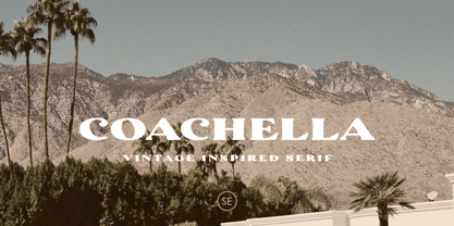 Introducing Coachella, a serif typeface with vintage vibes! Coachella is a vintage inspired serif that will make your project more vintage and modern. You can use this font for any project, such as poster, music concert announcement, or for your logo. This font have a rough detail that will make your design more handmade. This font also support multi language.
 - Libertat by Elyas Beria,
$9.00 In a not-too-distant future, humanity was ruled by a powerful, technologically advanced empire known as the Synod. The Synod controlled all forms of communication, and through this, they controlled the minds of the people. But a small group of rebels, known as the Resistance, had managed to evade the Synod's surveillance and formed a secret underground movement. They were determined to overthrow the Synod and restore freedom to the people. One of the Resistance's key members was a young artist named Trystån. He had a unique talent for creating powerful, visually striking posters that captured the spirit of the Resistance's message and spread it to the masses. Trystån had just completed a new poster, one that would be critical to the Resistance's plans. It depicted a single, outstretched hand holding a traditional Kimarii laser staff, with the words "Libertat!" emblazoned across the top. The poster featured a striking and powerful font that perfectly captured the spirit of the Resistance's message. The font was a combination of bold lines, elegant confident curves, and strong angles, giving it a sense of strength and determination. The lettering was large and prominent, filling up much of the poster, making it hard to miss. The letters seemed to be almost carved into the surface, giving the impression of something that was permanent and unshakable. The font was colored in dark shades, and was a sans serif typeface, that gives the message a very modern and current feel yet also feels vintage and retro, connecting the present with the struggles of the past. And with multilingual support, the typeface ensured that the message of the Resistance could be disseminated in every language on the planet. The background was minimalistic and in contrast, with a neutral palette, with just a hint of a sand-like color, representing the harsh conditions of the land that the people were fighting for their rights. The focus was all on the lettering, and how it conveyed the message. The poster was indeed a moving piece of graphic design, with its strong, striking font, and powerful imagery. It was clear that Trystån had put a lot of thought and care into its design. The poster, he hoped, would connect with people on an emotional level and inspire them to rise up against the oppression of the Synod Empire. The poster was set to be distributed at a major rally in the capital, where the Resistance was hoping to gain the support of thousands of citizens. But the Synod was not about to let this happen. They had long suspected the existence of the Resistance and had been working to infiltrate their ranks and discover their plans. The night before the rally, the Synod launched a surprise raid on the Resistance's hideout, capturing Trystån and several other members of the Resistance. Trystån was thrown into sand pits and interrogated by the Synod's top agents. They wanted to know everything about the Resistance's plans, including the details of the poster and the rally. Trystån, knowing the importance of the poster, refused to give in, even under the harshest of conditions. Meanwhile, the rally was drawing near, and the Resistance was desperate to get the poster out to the public. They knew that it was their only hope of gaining the support they needed to overthrow the Synod. They came up with a plan to smuggle the poster out of the hideout, but it would be a risky endeavor. As the rally began, the Resistance made their move, slipping the poster into the hands of the crowd. Trystån's poster had made a big impact in the rallies, and soon it became the symbol of hope for the resistance, and the visual representation of their struggle for freedom. The poster had become the catalyst for the revolution, and it would be remembered for many years to come as the symbol of the fight for freedom and democracy. The image of the outstretched hand holding the Kimarii laser staff struck a chord with the people, and they began to rise up against the Synod's oppression. Trystån, still locked away in the sand pits behind a stasis feild, could only imagine the scene unfolding outside. But he knew that his work had helped to spark a revolution, and he felt a sense of pride and accomplishment. The Resistance, with the help of the rally, was able to overthrow the empire, and Trystån was released, celebrated as a hero and hailed as the artist who helped to bring about the new era of freedom and democracy. The poster Trystån had designed had become the symbol of a new era, and it would hang in museums and public places as a reminder of the power of resistance and art, in the face of oppression. Features: regular and light weights numbers and punctuation multilingual characters
 - Trinidad Neue by Sudaca Type Design Studio,
$40.00 Trinidad Neue™️ is a geohumanistic typeface developed by the Chilean Type Design Studio Sudaca. The origin of this work lies in an exercise of comparing classic Roman proportions (Trajan Columns) with the capital letter set of Futura by Paul Renner. I wanted to create my own Sans Serif interpretation of classic proportions. I started working with letters A, H, N, O, R and S. When I finished the uppercase set, this exercise transformed itself into a project. I started to develop a set of lowercase letters choosing as direct references Futura and Kabel by Rudolph Koch; always having in mind that the objective was to find a balance between the humanist and the rational or geometric. Here is when this group is formed, giving its name and identity to this family: Paul, Rudolph & Alexis. The result is a typeface with an elegant, modern and versatile aspect. Its seven stylistic sets make Trinidad Neue™️ into a Swiss army knife to compose short and medium texts for editorial design, branding, exhibitions, motion graphics, etc. The family consists of nine weight variants and its corresponding oblique versions. It counts with many OpenType characteristics in each variant, including small caps, seven stylistic sets that can be combined, standard ligatures and discretionals ligatures, proportional numerals, tabular numbers, fractions, superscript, subscript, normal punctuation and also aligned to small caps and capital letters, arrows, emojis and more. With more than 1000 glyphs, this typeface has a wide idiomatic range that includes more than 190 Latin languages. Trinidad Neue™ is the new and alternative version of LC Trinidad™.
 - Lapis Pro by Canada Type,
$29.95 Lapis was Jim Rimmer's venture into a territory he'd earlier explored with his Lancelot and Fellowship faces. This time he stayed much longer, dug pretty deep, and had plenty of fun in there. The end result is the kind of mosaic of influences only a guy like Jim could consider, gather, manage and apply in a way that ultimately makes sense and works as a type family. On the surface Lapis seems like something that can be billed as what Jim would have called an "advertising text face". But under the hood, it's a whole other story. On top of the calligraphic, nib-driven base Jim usually employed in his faces, Lapis shows plenty of typographic traits from a variety of genres, from Egyptian to Latin, from blackletter angularity to Dutch-like curvature, with an overall tension even reminiscent of wood type. There are some Goudy-informed shapes that somehow fit comfortably within all this. Then it's all strung together with a mix of wedged, tapered and leaning serifs, placed with precision to reveal expert spontaneity and a great command of guiding the forms through counterspace. In the fall of 2013, the Lapis fonts were scrutinized and remastered into versatile performers for sizes large and small. The three weights and their italic counterparts have been refined and expanded across the board to include small caps, alternates, ligatures, ordinals, case-sensitive forms, six kinds of figures, automatic fractions, and a character set that covers an extended range of Latin languages. Each of the Lapis Pro fonts contains over 760 glyphs. For more details on the fonts' features, text and display specimens and print tests, consult the Lapis Pro PDF availabe in the Gallery section of this page. 20% of Lapis Pro's revenues will be donated to the Canada Type Scholarship Fund, supporting higher typography education in Canada.
 - Xylograph by Cuda Wianki,
$30.00 This font is based on 17th - 19th century woodcuts. It has many varied alternate characters and over 25 ornaments that make this font unique.
 - FS Hackney by Fontsmith,
$80.00 Elliptical The squareness of curves. That was the elliptical – in more than one sense – notion being explored in the making of FS Hackney. The squareness of curves and vertical terminals to create a gentle, soft sans serif, with a little bit of magic. A momentary thought – “It doesn’t have to be like this” – provided the spur to explore the verticals and skeletons of letterforms beyond conventional type design limits. A 12-month gestation period gave rise to a font with a larger-than-usual character set, including non-lining figures, small caps and superior and inferior numbers. It’s a collection that speaks confidently for itself. Assertive It was the Hackney carriage – the black London cab – that gave this font its name, not the north London neighbourhood. Solid, dependable, effective and built to last, FS Hackney was honed to perform in all conditions. Cool, compelling lines and a satisfying overall simplicity lend FS Hackney its assertive air. Assured, versatile and effective; just like a black cab (but without the grumbling). Machined Over a string of meetings, Jason Smith and FS Hackney designer Nick Job worked out how to infuse Nick’s sketched letterforms with Fontsmith’s familiar geniality. “Nick is very meticulous and produces very clean design work,” says Jason. “Hackney is ideal for branding as it’s very clear and its quirks are sensible ones, not odd ones, that don’t distract from the message.”
 - Nyxali by Typodermic,
$11.95 Nyxali exudes an industrial ruggedness, a typeface that is not content to be relegated to the background. No, Nyxali demands attention, with its rusted metal stamping style that creates an impression of hard work and gritty determination. This typeface’s design is inspired by a misaligned mechanism that is not afraid to show its imperfections. The result speaks to the rough-and-tumble nature of life and the willingness to get one’s hands dirty to get the job done. Nyxali’s alphabet is not content to be perfect; instead, it embraces the irregularity that comes with the cryptic stamping process. But make no mistake, while Nyxali may be rough around the edges, it is not without refinement. The letter pair ligatures are a testament to this, breaking up the monotony of plain, repeating characters and adding a touch of sophistication to an otherwise brutal design. With Nyxali, you can infuse your message with an element of cryptic allure, drawing in your audience with its mysterious and edgy charm. So, if you’re looking for a font that is bold, rugged, and industrial, look no further than Nyxali. It’s the perfect choice for designers who want to inject some personality into their designs and give their message an authentic, industrial edge. Most Latin-based European writing systems are supported, including the following languages. Afaan Oromo, Afar, Afrikaans, Albanian, Alsatian, Aromanian, Aymara, Bashkir (Latin), Basque, Belarusian (Latin), Bemba, Bikol, Bosnian, Breton, Cape Verdean, Creole, Catalan, Cebuano, Chamorro, Chavacano, Chichewa, Crimean Tatar (Latin), Croatian, Czech, Danish, Dawan, Dholuo, Dutch, English, Estonian, Faroese, Fijian, Filipino, Finnish, French, Frisian, Friulian, Gagauz (Latin), Galician, Ganda, Genoese, German, Greenlandic, Guadeloupean Creole, Haitian Creole, Hawaiian, Hiligaynon, Hungarian, Icelandic, Ilocano, Indonesian, Irish, Italian, Jamaican, Kaqchikel, Karakalpak (Latin), Kashubian, Kikongo, Kinyarwanda, Kirundi, Kurdish (Latin), Latvian, Lithuanian, Lombard, Low Saxon, Luxembourgish, Maasai, Makhuwa, Malay, Maltese, Māori, Moldovan, Montenegrin, Ndebele, Neapolitan, Norwegian, Novial, Occitan, Ossetian (Latin), Papiamento, Piedmontese, Polish, Portuguese, Quechua, Rarotongan, Romanian, Romansh, Sami, Sango, Saramaccan, Sardinian, Scottish Gaelic, Serbian (Latin), Shona, Sicilian, Silesian, Slovak, Slovenian, Somali, Sorbian, Sotho, Spanish, Swahili, Swazi, Swedish, Tagalog, Tahitian, Tetum, Tongan, Tshiluba, Tsonga, Tswana, Tumbuka, Turkish, Turkmen (Latin), Tuvaluan, Uzbek (Latin), Venetian, Vepsian, Võro, Walloon, Waray-Waray, Wayuu, Welsh, Wolof, Xhosa, Yapese, Zapotec Zulu and Zuni.
 - Shyest by Twinletter,
$12.00 Shyest is a handwritten typeface that has a dramatic, natural feel to it. This typeface is ideal for your unique projects, particularly those that demand a human touch; of course, this font is the answer to all of your amazing projects! This font is designed with a natural touch of handwriting which is refined to create a portion and composition that suits your needs. So this font is suitable for craft, children’s writing, adventure posters, food banner titles, wedding invitations, product packaging logos, quotes, social media page covers, furniture banner headlines, book covers, and much more.
 - Burning Hammer by Putracetol,
$28.00 Burning Hammer is a fire display font. This font is inspired by the fire flame shape. There is a version of fire that has sparks on it and there is also one that doesn't, it becomes an alternate character in this font. In addition, this font also has a ligature that makes the fire impression of this font more real. With these variations, it will make it easier for you to create creativity for your project. Burning Hammer would be perfect for branding, logo, product, title, quotes, doodle, comic, books, greeting cards, toys, posters, baby clothing, picture books, etc.
 - Slimedunk by Mozatype,
$11.00 SLIMEDUNK is a sans serif display font, which contains 4 styles and It features a unique and modern sans serif. This font would be perfect for E-sport Logo, film posters, games, sports, and any project. It’s also perfect for that delicate look that you want in your invitations, poster Use this font for any crafting project that requires a personalized look! What’s Included : - Works on PC & Mac - Easy to use ( Installations ) - Compatibility Windows, Apple, Linux, Cricut, Silhouette, and Other cutting machines Thank you for purchasing this font. Please appreciate, if you like this. ENJOY it :)
 - Truck Machine by Putracetol,
$28.00 Truck Machine is a heavy display font. This font has a very bold body, with unequal widths for the characters. Plus this font has a large number of ligatures, 160 ligatures. So that makes this font more cool and unique. It is suitable for your projects that require fonts with bold and strong characteristics. Such as branding, logos, titles, headlines, printing, magazines, quotes, posters, fashion, t-shirts, apparel and others. This font is also support multi language. To access the alternate glyphs, you need a program that supports OpenType features such as Adobe Illustrator CS, Adobe Photoshop CC, Adobe Indesign and Corel Draw.
 - Neo mameo by Kaidosan,
$10.00 Neo mameo is a Japanese Style typeface that is ideal for projects that require a distinctly Japanese touch. This typeface will add uniqueness and creativity to your work with a beautiful style and eye-catching look. This font character is taken from Japanese traditional Japanese style. This font will leave a lasting impact and quickly grab the attention of potential customers. This font provides a vivid visual effect. I hope this font can provide solutions in your business and activities.
 - I Heart It by Joanne Marie,
$40.00 Welcome to swash heaven! Since it’s been a few years that I made the very first heart swash font (featherly), I thought its time to create a new one and boy, this is massive! Made with love, I Heart It has over 2600 glyphs, is extremely smooth and is packed full of romance. There are 25 different swashes which connect to, not only, the lowercase alphabet but also on the left of the uppercase letters and the ligatures too. That’s not all! I’ve added 26 ornaments which will come in very handy for that additional touch of elegance and creativity in your designs. It’s all about the love, making this beautiful script font perfect for wedding stationery, engagements, and baby, family and friends orientated themes. Not only that - it can be used for logos, tattoos, delicious food and drink, mugs, clothing, the list is endless! They say that love conquers all and I Heart It will go a long way in expressing that through it’s illustrative design versatility, making it the perfect addition to your font collection. Once you’ve used it you’ll wonder how you’ve ever managed without it!
 - Materia Pro by Elsner+Flake,
$79.00 Minimal, modular, modern—at first glance, Materia shows a contemporary flair, combining pure, strong geometrical form with a subtle, distinct appearance. Actually, the design was inspired by lettering from the turn of the 19th to the 20th century that still can be found in the East of France. While its formal origins date back as far as this, revived e. g. by the constructivists into the nineteen twenties and later on by Dutch information designer Wim Crouwel in the nineteen-sixties, the visual language of Materia still speaks of the »future«. Following a minimalistic concept the font is formally built on a grid. Wherever optical curves are needed for a smoother, more comfortable shape of letters than a simple rectangular block, diagonals cut off the egdes – like a diamond is cut to achieve more beauty. Thus headlines and texts set in Materia are given a certain »egdy« feeling, whereas their tonality is still kept well-balanced, keeping concentation all on information in a nonconfomist way. Materia comes in eight styles, from elegant Thin to attention-forcing Ultra. Even a regular Italic is available, following the classic type-set-principle. Two of the styles are explicitly designed for display use, Shadow and Code. Both are ready for combinations with Bold or each other respectively, the layering of Shadow and Code e. g. allows astonishing effects or highlighting within the letters. For OpenType-users Materia is a real Pro, containing accented Latin letters for over 70 languages, small caps, old style, tabular and lining figures and special condensed titling all caps for cases in which space is all that counts. How useful all of the above mentioned is may be seen in the book David Lynch – Lithos, designed by Koma Amok, published in 2010 by item éditions, Paris, and Hatje Cantz, Germany, which was typeset completely in Materia.
 - Ahoura by Naghi Naghachian,
$58.00 The Ahoura font family, designed by Naghi Naghashian, was developed considering specific research and analysis on Arabic characters and definition of their structure. The Ahoura innovation is a contribution to modernisation of Arabic typography; gives the Arabic font letters real typographic arrangement and provides for more typographic flexibility. This step was necessary after more than two hundred years of relative stagnation in Arabic font design. Ahoura supports Arabic, Persian, and Urdu and includes proportional and tabular numerals for the supported languages. The Ahoura Font family is available in three weights; Light, Regular and Bold. Each has two different styles-- normal and italic. Ahoura is the first real italic Arabic typeface known until now and its intuitive design arrangement fulfils the following needs: - It is precisely crafted for use in electronic media and it fulfils the demands of electronic communication. Ahoura is not based on any pre-digital typefaces and it is not a revival. Rather, its forms were created with today’s ever-changing technology in mind. - Ahoura is suitable for multiple applications, and gives the widest potential for acceptability. - It is extremely legible not only in its small sizes, but also when the type is filtered or skewed, e.g., in Photoshop or Illustrator. Ahoura's simplified forms may be artificially obliqued with In Design or Illustrator, without any degradation of its quality for the effected text. - Ahoura is an eye-catching and classy typographic image that developed for multiple languages and writing conventions. - Ahoura uses the very highest degree of geometric clarity along with the necessary amount of calligraphic references. The Ahoura typeface is of a high vibration that is finely balance between calligraphic tradition and the contemporary sans serif aesthetic commonly seen in Latin typography.
 - Tekrot by Twinletter,
$17.00 Tekrot is a sporty, powerful, and elegant font, with a sporty style. Inspired by design styles that are currently popular, this is the answer to every need for ideas that you will pour in this modern era with a thick and sturdy style in each letter as if this font has a soul in it. Let your brand be as bold as you are with the Tekrot font. This font brings the quality of a sports team and athletic spirit to your designs, so whether you’re designing for all sports, or another message that calls for strength, this is the face for you. What’s Included : - All glyphs Iso Latin 1 - Alternate, Ligature - Simple installations - We highly recommend using a program that supports OpenType features and Glyphs panels like many Adobe apps and Corel Draw so that you can see and access all Glyph variations. - PUA Encoded Characters – Fully accessible without additional design software. - Fonts include Multilingual support