10,000 search results
(0.087 seconds)
- Kamalla by madeDeduk,
$11.00 Introducing Kamalla is a cute font with a matching script and regular will be perfect for book, title branding, product packaging, invitation, quotes, t-shirt, label, poster, logo etc. Feature Uppercase & Lowercase Number & Symbol International Glyphs Multilingual support Ligature Feel free to drop us a message any time and follow my shop for upcoming updates Shoot me on email at: dedukvic@gmail.com if you have any questions Hope you enjoy it.
 - BOT by fontkingz,
$19.00The BOT font package includes two character sets, BOT-Regular and -Stencil. The futuristic looking characters are designed to work in both large scale and small sizes; it works very well as a comfortable, readable lettering on machines of any kind as much as in print and screen publications. In addition, the BOT-Stencil letters can easily be cut out and work as a template for painting type on any surface. - Gavotte by Linotype,
$29.99Linotype Gavotte was designed by Rudo Spemann in 1940. His style was unmistakable, marked by original ideas and completely new forms. His tendency toward the unusual and adventurous resulted in unique, decorative characters. When he wrote, the tip of his pen flew across the page, leaving behind rows of letters which displayed an almost unbelievable regularity of form and flow. Gavotte is a perfect example of the best of Spemann’s calligraphy. - Livemono by Letterhend,
$17.00 Livemono is a new monospaced sans serif. It looks clean and and very suitable for coding style. The typeface is versatile to blend in your design- with 6 weight, ranging from bold, light, medium, regular, semibold, and thin. Perfect anywhere you need a right finas touches for branding, publishing, titles, book, magazine , and use on UI/UX design. Features: Variable Font uppercase & lowercase numbers and punctuation multilingual 6 weight PUA encoded
 - Mystery Show JNL by Jeff Levine,
$29.00 Mystery Show JNL was modeled after the hand lettered titles found on various early episodes of the 1950s TV suspense program "Alfred Hitchcock Presents". The design emulates characteristics found in Frederic W. Goudy's Copperplate Gothic [a sans serif of equal stroke weights with tiny spurs added], but is considered a serif font by the addition of the spurs. Mystery Show JNL is available in both regular and oblique versions.
 - Cinema Nouveau JNL by Jeff Levine,
$29.00 Shadowland was a magazine dedicated to the arts, and was published from 1919 through 1923. The lettering for its masthead was hand lettered in a then-contemporary Art Nouveau style. Although the photoplay (movies) was just an incremental part of the magazine’s overview of the arts, the digital version of the type design has been named Cinema Nouveau JNL, and is available in both regular and oblique versions.
 - Deco Revisited JNL by Jeff Levine,
$29.00 Inspired by a retro Art Deco poster as well as many of the true classic Art Deco type designs of the 1930s and 1940s, Deco Revisited JNL is a bold, black, stencil-influenced design with no counters. Although being a contemporary design, its use in any retro project will truly evoke a feeling for the “streamline” era. Deco Revisited JNL is available in both regular and oblique versions.
 - Throughway JNL by Jeff Levine,
$29.00 From the pages of a small book entitled “A Portfolio of Alphabet Designs for Artists, Architects, Designers & Craftsmen” [Irene K. Ames, 1938] comes a bold Art Deco sans poster display face. The digital version is called Throughway JNL, and is available in both regular and oblique versions. [To note, throughway (or sometimes spelled thruway) is a popular term from the 1950s and 1960s for a major road or highway.]
 - Qapitaly by Wildan Type,
$14.00 Qapitaly is a display sans serif typeface inspired by the beauty of modern sans serif and calligraphic style, fused with elegant appeal to blend with modern needs.This font has regular and italic style. Qapitaly offers many possibilities to be applied in many graphic or editorial projects. Qapitaly also include alternate and ligature. Suitable for short paragraph, headlines, and display purpose such as branding, editorial, book covers, and packaging.
 - Picturesque Stencil JNL by Jeff Levine,
$29.00 Picturesque Stencil JNL gets its name and design from the title of a circa-1920s children’s stencil activity book entitled “Dean’s Picturesque Stencil Book No. 10 - Series 75”; published by the F. Weber Company of Philadelphia and printed in England by Dean. The book’s stenciled title was hand lettered in a bold Roman design in the Art Nouveau style. Picturesque Stencil JNL is available in both regular and oblique versions.
 - Kathleen Sans by ActiveSphere,
$30.00 Kathleen Sans is a geometric sans-serif display font and works best in text and display applications, such as posters, headline, magazine, logos, titles, product branding, corporate branding and publishing. The Kathleen Sans font family has three weights: Light, Regular, and Bold, each available in italic, making a total of six styles. Each style has a full upper and lower-case, accents, punctuation and a selection of monetary symbols.
 - Integra Chic by Kustomtype,
$25.00 Kustomtype’s “Integra Chic” font is a sans serif font family with a regular & oblique version. It contains all upper & lower cases. The “Integra Chic” family is coordinated into letterforms, metrics, and weights to work better together. Why still looking for old school types for your posters, advertising, text, design, artwork, headtext, editoral design, magazines, etc... “To banish imperfection is to destroy expression, to check exertion, to paralyze vitality.” John Ruskin
 - Good Reporting JNL by Jeff Levine,
$29.00 A September 29, 1920 edition of The San Diego Union ran the headline “Cicotte Confesses Baseball Fraud; Eight White Sox Players Indicted”. The White Sox baseball scandal was the first to reveal illegal gambling on the game. However, the headline itself was set in a bold slab serif type style [likely ATF Foster] which served as the model for Good Reporting JNL; which is available in both regular and oblique versions.
 - Agave by Jonahfonts,
$35.00 Agave a sans-serif family with 14 styles and 4 weights. The Light, Regular & Semibold contain Italics and Condensed styles, the Bold comes only in its' upright and Italic styles. A text family designed to easily be read in lower point sizes as well as larger display sizes. Providing a legible print, web or e-book family suitable for reading and not calling attention to its' letter-graphics.
 - Theo Ballmer by URW Type Foundry,
$39.99 The Theo Ballmer font family is based on Theo’s design ideas which were completed by his son Theo Ballmer (Thierry’s father), and digitized by Thierry, with the help of URW++ and their Ikarus technology. Theo Ballmer is available in 3 x 5 variants: condensed, regular, expanded each in 5 weights. Theo Ballmer is a masterpiece, which fills a historical gap and provides a real font family from the Bauhaus era.
 - Wellness JNL by Jeff Levine,
$29.00 The Federal Art Project of the WPA (Works Progress Administration) employed artists to create posters for various subjects including health, tourism, safety, patriotism, theater and the arts during the Great Depression years of the 1930s on through the early 1940s. One health-related poster had the word “against” in a thin Art Deco monoline which served as the basis for Wellness JNL, which is available in regular and oblique versions.
 - Whistleberry by 10four,
$25.00 Originally given life as a wordmark for the Alt-Country band Woodshed Supply Company, the Whistleberry typeface evolved from a few simple letterforms inspired by early 20th Century signage, into a surprisingly functional typeface. With plenty of rustic charm, a robust glyph set, and a variety of alternate characters, Whistleberry will add flare and appeal to your work. Whistleberry comes in two weights; a modest Regular and a beefy Bold
 - Incarceration JNL by Jeff Levine,
$29.00 The hand lettered Art Deco title on the cover of the sheet music for “There Must be A Bright Tomorrow (for Each Yesterday of Tears)” inspired the font Incarceration JNL, which is available in both regular and oblique versions. Incarceration JNL earns its dubious name from the fact the song was written by Prisoner No. 3223 (Wallace Wysocki) who was held in the Marquette State Prison, Marquette, Michigan (1931)
 - Kneebls by Ingrimayne Type,
$9.95 Kneebls was inspired by Art Deco lettering. It is monoline and all caps, with most of the letters on the lower-case keys different from those on the upper-case keys. It comes in three weights: thin, regular, and bold. There is also a distorted, wavy version, KneeblsRuffled, and a shadowed version. The shadowed-inside style is designed to be used in a layer with the shadowed style.
 - Aysiano by Bean & Morris,
$42.00 Aysiano Regular and Italic is a casual sans serif typeface with its influence originating from Eastern broad brush style calligraphy. It includes selected swash caps to vary the settings where required. With a slick, fresh feel, capturing the spontaneity of brushed hand lettering, it will be suited to many applications especially as a display font although it can also be used in larger text sizes with great legibility.
 - Bogeyman by Hanoded,
$15.00 I haven’t been sleeping well lately: I wake up every night around 5 and I don’t know why. Maybe it’s the Bogeyman! Wait… Bogeyman? Excellent name for a new font! Bogeyman is a handmade display font. It comes in two varieties: regular and eroded, both with their Italics. Use it for your posters, book covers and packaging, but you’ll have to promise not to scare your kids with it!
 - Birdy by Omotu,
$22.00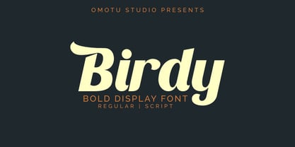 Birdy is bold display font. Comes with 2 styles, regular and script. Great for heading, logotype, branding, packaging design, poster design, website/display, editorial, headline, advertising, and more. Whats Include? Opentype support Multilingual support PUA encoded Features: Uppercase, lowercase, numerals, punctuations, alternates, ligatures, and swashes. Thanks for looking, and I hope you enjoy it! Please don't hesitate to drop me a message if you have any issues or queries.
 - FF Sanuk Big by FontFont,
$57.99FF Sanuk Big is a clean and crisply drawn headline typeface intended for high legibility with a distinct character. Compared to the regular version, FF Sanuk Big has an extensively high x-height—with shorter ascenders and descenders. The tight spacing makes it perfect for big and powerful headlines. The family consists of 16 styles in total, including a wide range of weights and up-to-date OpenType features. - Chinese Monoline by Attype Studio,
$19.00 Chinese Monoline is a Chinese style monoline font, with a modern twist. It has 2 styles: regular and slant. Chinese Monoline is perfect for branding and promotional material for Asian-themed designs The fonts works best as display typefaces or as beautiful headline fonts, but can also be used in other ways to create stunning designs. Features : - Chinese Monoline Family Font - Ligatures - Multilingual, US Roman, Latin 1 Support
 - Romagna by AlienValley,
$5.00 Romagna is a modern and highly versatile sans-serif typeface designed for readability without sacrificing aesthetics. There are 8 included styles to pick from including regular + bold weights plus italics and 2 different uppercase styles so you can either go with a classic look or a modern futuristic theme. Features Modern design Easy to read characters Great for both headlines & large chunks of text Multilingual support Great versatility 8 Included styles
 - Serona by Balevgraph Studio,
$16.00 Serona - Beautiful Duo with Ornaments We are so exited to present Serona, a combination of sans serif fonts and signature styles complemented by beautiful ornaments, Serona with Modern Elegant Style is perfect for branding, logos, invitations, Magazine and more. Serona Features: Multilingual Ligatures Alternates Swashes PUA encoded Files Included: Serona Regular Serona Italic Serona Signature Serona Signature Slanted Serona Ornaments We are ecstatic if our fonts can help your project.
 - Caldense Stencil by Tiago Cândido,
$20.00 The typeface was baptized as “Caldense" in order to honor the city of Caldas da Rainha, a small city in Portugal, the typography's birth place. It has three weights, Regular, Demi Bold and Bold and it is a stencil font, sans serif and grotesque. Each character was based on a grid and was built in modules, having round edges and straight finishes. The font is best used in titles.
 - Tinman Pro by No Bodoni,
$35.00 TinmanPro is a mildly stressed humanist sans serif type based on the University of California Oldstyle type designed by Frederick Goudy. The design captures the warmth and friendly character of Goudy�s original in a monotone sans. Broad Latin support along with small caps, fraction support and other typographic niceties are included in the ten font family. Weight range includes Regular, Medium, DemiBold, Bold and ExtraBold with matching italics for each.
 - Cuanky by Kereatype,
$14.00 Cuanky is a super fun, retro-style sans serif font with subtle serifs. It possesses a recognizable flair and evokes a sense of warm nostalgia. Available in both regular and italic styles, Cuanky also features a playful hint of the future. Cuanky is perfect for headlines or food-related designs, such as pizza, burgers, and restaurant themes. Additionally, it's well-suited for creating eye-catching posters with a cool aesthetic.
 - Art Party by A New Machine,
$19.00 Art Party is a hand-drawn font suitable for headlines of all kinds when you want a handmade look. Prissy Pots owner Erin Solomon drew the playful letters, which include regular and bold versions. Each face also offers an entirely separate set of upper and lowercase letters accessible in your applications' glyphs palettes. With contextual alternates turned on, these extra letters show up automatically, yielding a more natural, random look.
 - Burnest by Adam Fathony,
$10.00 In collaboration with Renov Olivian who was experienced with hand-drawn lettering for a project. We've decided to create Vintage Inspirated Fonts with strong identity for an outdoor design, camping, wild, journey, adventure, masculine, and etc. Burnest Comes with 3 Weight, Thin, Light and Regular. On each Weight have 3 different style, Clean (sharp corner), Round (Rounded Corner), and Rough (Rough Version). 9 Fonts in Total for completing your design style.
 - Deco Drop Caps JNL by Jeff Levine,
$29.00 From the pages of the 1939 French lettering book “Modèles de lettres modernes par Georges Léculier” (“Models of Modern Lettering”) comes an attractive and unusual set of initial drop caps made from square letters adorned with multiple vertical lines. Originally designed as white letters on black backgrounds, an additional set with black letters on white backgrounds comprise Deco Drop Caps JNL; available in both regular and oblique versions.
 - Sunshine Susie JNL by Jeff Levine,
$29.00 Sheet music for the song "Today I Feel So Happy" from the 1932 motion picture "Sunshine Susie" provided both the visual model and the name for Sunshine Susie JNL, available in both regular and oblique versions. The lettering is a bold Art Deco thick-and-thin design, and comes not from the song's title, but the hand lettered name of the movie as it appeared on the cover the song folio.
 - JAF Lapture by Just Another Foundry,
$59.00 Lapture is based on the Leipziger Antiqua by Albert Kapr, released in 1971 by the East German foundry Typoart. It has been extended and carefully redesigned by Tim Ahrens in 2002-05. The strong calligraphic characteristics are a result of the design process: "The size of the counters and the width of individual characters at small optical sizes were analysed with a steel pen while the letter shapes were designed in larger size with a specially trimmed reed pen. Sometimes the hand is more innovative than the head alone," says Kapr. A unique feature of this font is the introduction of gothic shapes into a latin typeface. "The basic concept is to string together narrow white hexagons as counters and inter-letter spaces, defined by vertical stems and triangular serifs. The interior spaces are at least as important as the strokes that make up the characters." Lapture is an ideal choice if a reference to gothic style is desired, as true black letter types are often too eye-catching and not as legible as latin fonts for unfamiliar readers. "The last few years have seen a number of very elegant typefaces based on the mellow and feminine renaissance model. However, sometimes we require a font that is strong and robust, harmonic yet rigid," says designer Tim Ahrens. JAF Lapture is provided in OpenType format. Each font contains more than 600 glyphs, including true small caps, nine sorts of figures, contextual and stylistic alternates and accented characters. This means that you only need to purchase one font whereas in other families you would have to buy two or three fonts in order to get the same. Technically, they follow the Adobe Pro fonts and provide the same glyph set and OpenType functionality. JAF Lapture Basic is provided in OpenType format. Each font contains the standard sets of both MacOS and Windows. In contrast to JAF Lapture they do not provide any advanced OpenType features and no extended glyph set.
 - Collage BB by Posterizer KG,
$24.00 Collage BB font was created for visual imitating of cuted paper Serif letters. The idea was to imitate kid’s clumsiness and irregular shape of letters. Good readability allows using this font for making some long texts. The font contains all the Latin and Cyrillic glyphs. BB - Bajina Bašta (Bašta in English means Garden) is the name of the small town where I spent my carefree childhood. That’s why I was inspired by Peter Pan.
 - Gregean Brush by Gatype,
$16.00 Gregean Brush is a relaxed brush font with a fine grit texture. This font has an irregular treatment between characters to give it a more realistic look. Suitable for use on title designs such as book titles, stationery designs, quotes, branding, logos, clothing, invitations, greeting cards, t-shirts, packaging designs, posters, and others. The Gregean Brush has the texture of a dry brush pen and the Solid is a slightly cleaner version. Thank You! - Gatype
 - Mechanikschrift by Victory Type,
$12.00Mechanikschrift, roughly German for “mechanical writing”, is a typeface from Noah Rothschild and Victory Type. The aesthetic of this font is just what its name points towards: machine-like structure with a German flare. Minimalism is often associated with German design, and Mechanikschrift is a minimalist typeface. Furthermore, the designs of the characters, outside of the general theme of squared-off corners and angular appearance, are related to Herbert Bayer’s work at the Bauhaus. - BlincType Letterpress Fontpak by Chank,
$99.00 Add some old fashioned charm to your designs with the distressed alphabets in the new BLINCtype Letterpress Fontpak, a brand new font collection containing 8 letterpress-inspired fonts from the creative minds at Blinc Publishing in St. Paul, MN. The BLINCtype Letterpress Fontpak contains a handy concise assortment of old-school display fonts. From the old Western "WANTED" poster look of Prospect Modern, to the no-nonsense all-caps classic Goshen and its lowercase companion Gideon, these fonts are inspired by wooden letterpress blocks and other archaic technologies. It's like having your own letterpress print studio! Except it's all instantly downloadable right now as easy-to-use fonts! Designers love working with the Cheltenham-esque Gomorrah and its grittier, grungier counterpart, Sodom. The bouncy Golgotha has a rough and tumble readiness that exudes a hand-made charm, while Hamilton Offset has a cryptic, experimental look and feel that gives the impression of double-vision. You also get the newest member of the Blinc font family, Player Piano, which was based on punch-cut stencil letters on an old player piano paper song roll. Purchase the BLINCtype Letterpress Fontpak today and you'll be able to download and start using these 8 great fonts right away! The BLINCtype Letterpress Fontpak contains the fonts: Gideon, Golgotha, Gomorrah, Goshen, Hamilton Offset, Player Piano, Prospect Modern and Sodom.
 - Mauritz Caps by Mans Greback,
$59.00 Mauritz Caps is a brush script typeface. A lively uppercase graffiti-style lettering fonts, Mauritz Caps was drawn and created by Mans Greback in 2021 to be the ultimate set of wild-style handwritings for logotypes and branding. This calligraphy family consists of five high-quality fonts in a variety of weights: Mauritz Caps Thin, Light, Regular and Bold. The font is built with advanced OpenType functionality and has a guaranteed top-notch quality, containing stylistic and contextual alternates, ligatures and more features; all to give you full control and customizability. It has extensive lingual support, covering all Latin-based languages, from North Europe to South Africa, from America to South-East Asia. It contains all characters and symbols you'll ever need, including all punctuation and numbers.
 - SomaSlab by ArtyType,
$29.00 The 'Somatype' range has expanded further with this latest addition to the collection, titled SomaSlab. Although the basic letterforms are the same as in the generic Somatype family, the introduction of slab-serifs to appropriate characters has transformed the typeface into something new, creating a completely different styling in the process and striking a pleasing balance between classic & contemporary styles. The fishtail and curved serifs on certain characters also introduces a unique quirkiness, making SomaSlab stand out alongside most classic slab serif fonts. Some alternative characters are available too, together with an extended Latin glyph set, allowing users a variable choice and great versatility for text settings. SomaSlab comes in both Regular & Slanted styles, each in 4 practical weights, providing plenty of flexibility on any creative project.