10,000 search results
(0.053 seconds)
- What A Night JNL by Jeff Levine,
$29.00 The hand lettered title on the cover of the 1934 sheet music for "What A Night" not only acted as a design model for What A Night JNL but also as its namesake. The digital type face is available in both regular and oblique versions.
 - The Meez by TipografiaRamis,
$19.00 The Meez is a geometric, extremely extended sans-serif typeface strictly intended for use as a display font. The family consists of three styles: Light, Regular and Bold. In each weight, all letterforms retain the same width, which make it ideal for titling use.
 - Restauranteur JNL by Jeff Levine,
$29.00 The 1960 revised edition of Sam Welo’s “Studio Handbook – Letter and Design for Artists and Advertisers” showcased a beautiful, semi-condensed Art Deco alphabet called “Modern Gothic”. It has been digitally redrawn and is available as Restauranteur JNL in both regular and oblique versions.
 - Stroom Script by wearecolt,
$12.00 Your new favourite handwritten script font. A great display font with a natural flow. All hand-drawn glyphs with custom linked letters for a unique marker pen look. Perfect for magazine titling, logo marks, signatures. Features: • Regular and bold weights • Alternative glyphs • Ligature sets
 - Befano by Balevgraph Studio,
$10.00 BEFANO is a simple and modern sans serif font. It’s playfulness make it great for creative projects. Excellent for headlines, caption, brand logo, t-shirt, school & university, and more. What's Included? Uppercase & Lowercase Numbers & Punctuation Ligature & Stylistic Alternate Multilingual Support PUA Encoded Regular & Italic
 - Hollywood and Vine JNL by Jeff Levine,
$29.00 A condensed type design with Art Deco influences was used for titles within the February, 1938 issue of Modern Screen Magazine. The digital version is named for the famous “Tinsel Town” street intersection. Hollywood and Vine JNL is available in both regular and oblique versions.
 - Barn Dance JNL by Jeff Levine,
$29.00 The hand lettered title on the 1945 sheet music for the song "Louisiana Hayride" is an Art Deco design with a nod to the preceding Art Nouveau era. It is now available as Barn Dance JNL, which is available in both regular and oblique versions.
 - SK Kalender by Salih Kizilkaya,
$9.99 SK Kalender is a sans serif and mono weighted font. It was designed by Salih Kızılkaya in 2020. The name of the font comes from the word “kalender”, which means humble, unpretentious and simple living. SK Kalender has three different versions, regular, medium and bold.
 - Prego by Tour De Force,
$25.00 Prego is small family with a lot of charm packed in 3 weights – Light, Regular and Bold. High contrasting design combined with simple and elegant shapes equipped with OpenType features (Swashes, Stylistic and Contextual Alternates, Fractions). Supports extended Latin character set and Cyrillic as well.
 - Trellacote by Namara Creative Studio,
$8.00 Trellacote is modern sans serif font with 4 styles: Light, Light Italic, Regular and Italic. Trellacote comes with many variant alternates of glyphs, ligatures and special PUA characters. It's perfect for posters, business cards, logos, social media, magazine covers and any project with suitable purpose.
 - Chinese Song JNL by Jeff Levine,
$29.00 The unusual hand lettering found on the 1945 sheet music for “Chinese Song” provided not only the design inspiration but the font’s name as well. A hybrid of Asian and Art Deco influences, Chinese Song JNL is available in both regular and oblique versions.
 - LeftheriaPRO by Sea Types,
$29.00 LeftheriaPRO has its structure projected from the capitals of the Greek columns of Ionian order, it is a typography condensed with vertical emphasis composed by 5 weights (light, regular, medium, semibold, bold) including ligatures, alternates, smal caps, old styles figures, fractions, superiors, inferiors. | Download Specimen
 - Auntie Lee by Dawnland,
$13.00 Meet Auntie Lee - a hand drawn and playful sans serif! An upper-case-only font with upper-case-variants on the lower-case letters. With three happy versions - regular, outline & thin - you just can't go wrong! Don't forget to pay Uncle Lee a visit!
 - Fraiche by Adam Fathony,
$24.00 Fraiche, is an adorable soft & rounded typefaces. Available with the Variable fonts in Weights and the Ink Trap. With the regular style you'll have the correct anatomy of the fonts. with the Ink Trap style, it added more extreme space on the ink trap.
 - The Billion by Lemonthe,
$13.00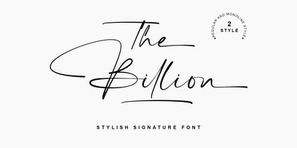 The Billion is a perfect signature font, with 2 style (regular and monoline). The Billion Font is perfect for many different project such as logos & branding, invitation, stationery, wedding designs, social media posts, advertisements, product packaging, product designs, label, photography, watermark, special events or anything.
 - Morning Sweetest by TypeClassHeroes,
$19.00 Morning Sweetest and Morning Sweetest Neue is a Classic feat Modern serif family. It's clean and smooth with 9 variable weight combining the regular and italic and much alternative inside. Suitable to create any branding, product packaging, invitation, quotes, t-shirt, label, poster, logo etc.
 - Jungler by Rumors Foundry,
$3.99 Jungler is a new handwritten consensed typeface, based on the lettering from comic magazines, designed by Gabriele Bellanca in early 2022 for Rumors Foundry. It was created with FontSelf App and the support of Glyphs App. Counts over 270 glyphs in one Regular weight.
 - Secreta by Ixipcalli,
$26.00 Secreta is a modern typeface with a geometric touch using "CAP" modes. It comes in 4 weights: Light Regular, Bold and Extended Bold. Each weight includes extended language support. Perfectly suitable for graphic design and any display use for web design, signage, corporate and editorial.
 - Concreto Mono by iframe,
$16.00 Concreto Mono is a monospaced san serif, built in regular style. The word concrete comes from the Latin word "concretus" meaning compact. Concreto Mono is released in OpenType format with support for most languages. Features: _ Multilanguage Support _ Letters Uppercase + Lowercase _ Glyphs _ Numbers design by iframe
 - Perfume Counter JNL by Jeff Levine,
$29.00 Perfume Counter JNL was based on the hand lettered song title found on the 1938 sheet music for "At A Perfume Counter (On the Rue de la Paix)" from Billy Rose's New York revue "Casa Mañana", and is available in both regular and oblique versions.
 - Stage Show JNL by Jeff Levine,
$29.00 “9 Garcons...Un Cœur” (“9 Boys...One Heart”) is a 1948 French musical starring Edith Piaf. The hand lettered credits for the film are done in a condensed Art Deco sans alphabet, now available digitally as Stage Show JNL in both regular and oblique versions.
 - TF Silence by Teenage Foundry,
$19.00 TF Silence - The awesome bold display font is back for your design projects. There are 2 styles available (Regular & Outline). Suitable to be applied to clothing designs, posters, logos etc. Features: Uppercase, Lowercase, Numeral, Punctuation & Multilingual. For any questions please contact me 🙂 Thanks!
 - Fluro by Kazer Studio,
$5.00 Fluro typeface is Sans Serif hybrid, designed to look modern & minimal in any setting. It is offered in 5 weight styles - Light, Regular, Semibold, Bold + a bonus "Bold Outline" style.The Typeface also includes special characters, language supports and specialized Kerning. Designed by: KAZER STUDIO
 - Bartleby by AdultHumanMale,
$20.00 Bartleby is a hand-drawn all caps display font. It has over 300 glyphs and several variations on the standard alphabet with all those €xtra pesk¥ foreign characters too. It is available in 3 weights regular, bold, black and as a family of all three.
 - Aniara by Gustav & Brun,
$18.00 Aniara is a playful, happy and intergalactic font. Arriving in three different weights, Light, Regular and Bold. + the antagonist; the dark version without the space/counter. Aniara comes with laser shrinked upper case letters. It attacks with a alternative upper and lower case glyph. PoFF!!
 - M Computer PRC by Monotype HK,
$523.99 PRC series fonts are in Unicode encoding and consists covers GB 2312 character set. It conforms to GB12345 standard. The character glyphs are based on the regular simplified Simplified Chinese writing form and style. It is generally used in China Mainland PRC and Singapore.
 - Parenting JNL by Jeff Levine,
$29.00 Parenting JNL is a stylized Art Deco sans serif type design originally found on a vintage WPA (Works Progress Administration) poster designed by the Federal Art Project and touting the topic of "The Job of Being a Parent". Available in regular and oblique versions.
 - Caskier by Hustle Supply Co,
$18.00 CASKIER Caskier is a whiskey inspired layered typeface. With 10 font files, you get access to a variety of potential aesthetics ranging from clean, layered or roughened. What's Included? Regular, Bold, Outlined, Shadow, Roughened + Oblique Versions Western European Character Set A variety of ligatures
 - Favorite Notification by Prioritype,
$25.00 Introducing a new typeface. Yes, "Favorite Notification" is a modern and classic style serif font. The combination of regular & italic is very pleasing to the eye. It is suitable for branding designs, invitations, magazines and so on. Features: Uppercase Lowercase Numeral Punctuation Multilingual Ligatures Thanks.
 - Antique Show Card JNL by Jeff Levine,
$29.00 The very first Speedball-Lettering Book was published in 1915, and within its pages was a rough-hewn example of lettering with the name "Rapid Sho-Card Style". The design is now available as Antique Show Card JNL, in both regular and oblique versions.
 - Fibonacci Heap by ErlosDesign,
$15.00 Fibonacci Heap font is a decorative slab serif, inspired typeface in modern performance. This font includes 2 style Reguler and Outline. It is perfect for logos, posters, headlines, apparel and more.
 - Diamond by Volcano Type,
$19.00 Angular diamond shapes.
 - Sweet Revenge PS by pentagonistudio,
$14.00 Sweet Revenge Is A Modern Family Font Serif Including 8 Font Style. Font Features : Sweet Revenge Thin OTF/TTF/WOFF/WOFF2 Sweet Revenge Extra Light OTF/TTF/WOFF/WOFF2 Sweet Revenge Light OTF/TTF/WOFF/WOFF2 Sweet Revenge Regular OTF/TTF/WOFF/WOFF2 Sweet Revenge Medium OTF/TTF/WOFF/WOFF2 Sweet Revenge Semi Bold OTF/TTF/WOFF/WOFF2 Sweet Revenge Bold OTF/TTF/WOFF/WOFF2 Sweet Revenge Extra Bold OTF/TTF/WOFF/WOFF2 SOFTWARE REQUIREMENTS : Fonts and alternate : No special software required they may be used in any basic program /website apps that allows standard fonts That's it folks! You can go ahead and get cracking :) Follow My Shop For Upcoming Updates Including Additional Glyphs And Language Support. And Please Message Me If You Want Your Language Included or If There Are Any Features or Glyph Requests, Feel Free to Send me A Message. Have a Good Day !
 - Garibaldi by Harbor Type,
$50.00 🏆 Selected for Tipos Latinos 6. 🏆 Selected for the 12th Biennial of Brazilian Graphic Design. 🏆 Typographica Favorite Typefaces of 2015. Garibaldi is a text typeface based on humanist calligraphy. It has an organic look and feel, while preserves the traditional construction of roman typography. It all started with a desire to learn more about the origin of the strokes on humanist typefaces. To accomplish that, Garibaldi features a 20° axis, medium contrast based on translation and expansion, asymmetric serifs, and terminals related to the broad nib stroke. Garibaldi Regular was nominated for Tipos Latinos 2014. Since then, the family was expanded with more weights and matching italics, making it a solid choice for setting books, magazines and documents. Among many OpenType features, each font contains small caps, ligatures and contextual alternates, totalling more than 750 glyphs and supporting at least 80 languages.
 - Novelty Script by HiH,
$10.00 Novelty Script is a bold dynamic script, sharply delineated, yet fluid. Most of the lower case letters and many of the upper case letters have joins. The typeface was designed by Nicholas J. Werner and Gustave F. Schroeder and patented in March 1893. The original release was by the Central Type Foundry of St. Louis, Missouri. Although a part of ATF from 1892, the Central Type Foundry continued to operate under its own name until 1895. Novelty Script uses our new encoding, as noted in the All_customer_readme.txt. The Euro symbol has been moved to position 128 and the Zcaron/zcaron have been added at positions 142/158 respectively. Otherwise, Novelty Script has our usual idiosyncratic glyph selection, with the German ch/ck instead of braces, Western European accented letters, lower case “o” and “u” with Hungarian umlaut and our usual Hand-in-Hand symbol. But that is not all. With the takeover of the Central Type Foundry by ATF, a group of special characters appeared. All are included in this font, except the “&Co” and the "'s", for a total of nine in all. The “Ch” and “nd” ligatures are especially interesting because of the impact they have on the color and overall appearance of the page. Download the PDF Type Specimen for locations. This is a fun font to use. Its strength is print, where it gives a page a refreshing look. The joins sometimes have difficulty on the screen, in spite of extensive hinting. Playing around with small changes on the point size can pay dividends. Not for the faint-of-heart. Are you up to the challenge?
 - Varygraphie by Mans Greback,
$39.00 Varygraphie is a modern Art Deco sans-serif family. This expressive typeface is provided as a variable font, and was designed by Mans Greback between 2019 and 2023. It gives any project a modernist appearance, as a reinvention of the hundred-year-old style of design, adapted and adjusted to fit in present-time purposes and technology. The Varygraphie family contains 12 high-quality styles: Thin, Light, Regular, Medium, Bold and Black, and each weight as Italic. Mix the weights to see how they balance perfectly against each other. Or use the variable font and set any weight between Thin and Black: Only one font file, but the file contains multiple styles. Use the sliders in Illustrator, Photoshop or InDesign to manually set any weight and width. This gives you not only the predefined styles, but instead more than a thousand ways to customize the type to the exact look your project requires. More info about variable fonts: https://mansgreback.com/variable-fonts The font is built with advanced OpenType functionality and has a guaranteed top-notch quality, containing stylistic and contextual alternates, ligatures and more features; all to give you full control and customizability. It has extensive language support, covering all Latin-based languages, from Northern Europe to South Africa, from America to South-East Asia. It contains all characters and symbols you’ll ever need, including all punctuation and numbers.
 - Midsole SC by Grype,
$16.00 Geometric/Technical style logotypes have been developed for car chrome labels since the early 1980’s, but automobile companies don't monopolize the style by any means. Shoe companies have a foothold in the geometric sans serif styles as well, and range from straightforward to full of techno styled play. Nonetheless, these logotypes all lack an expansive family which shows off all the logotypes are and what they "could" be and do. And that's where we come in. The Midsole SC Family finds its origin of inspiration in the CONVERSE shoe company logo, or an older version of their logo, and from there we expanded it into a 40 font family of weights, widths, and obliques. Midsole pays homage to the styling of the earlier logotype, including unicase variations to match the original look, while further evolving beyond the brand inspiration to yield a family that pulls on modern and historical styles. It adopts a sturdy yet approachable and recognizable style with its uniform stroke forms and curves, and goes on to include smallcaps, numerals, and a comprehensive range of weights, creating a straightforward, uncompromising collection of typefaces that lend a solid foundation and a broad range of expression for designers. Here’s what’s included with the Midsole SC Family bundle: 489 glyphs per style - including Capitals, SmallCaps, Numerals, Punctuation and an extensive character set that covers multilingual support of latin based languages. (see the 10th graphic for a preview of the characters included) Stylistic Alternates - alternate characters and unicase variants for a less standardized text look. 4 weights in the family: Light, Regular, Medium & Bold. 4 obliques in the family, one for each weight: Light, Regular, Medium & Bold. Here’s why the Midsole SC Family is for you: - You’re in need of stylish sans font family with a range of weights and obliques. - You’re love that older CONVERSE letter styling, and want to design anything within that genre. - You’re looking for an alternative to Eurostile & Handel Gothic. - You’re looking for a clean techno typeface for your rave poster designs. - You just like to collect quality fonts to add to your design arsenal.
 - Midsole by Grype,
$16.00 Geometric/Technical style logotypes have been developed for car chrome labels since the early 1980’s, but automobile companies don't monopolize the style by any means. Shoe companies have a foothold in the geometric sans serif styles as well, and range from straightforward to full of techno styled play. Nonetheless, these logotypes all lack an expansive family which shows off all the logotypes are and what they "could" be and do. And that's where we come in. The Midsole Family finds its origin of inspiration in the CONVERSE shoe company logo, or an older version fo their logo, and from there expanded it into a 40 font family of weights, widths, and obliques. Midsole pays homage to the styling of the earlier logotype, including unicase variations to match the original look, while further evolving beyond the brand inspiration to yield a family that pulls on modern and historical styles. It adopts a sturdy yet approachable and recognizable style with its uniform stroke forms and curves, and goes on to include a lowercase, numerals, and a comprehensive range of weights, creating a straightforward, uncompromising collection of typefaces that lend a solid foundation and a broad range of expression for designers. Here’s what’s included with the Midsole Family bundle: 489 glyphs per style - including Capitals, Lowercase, Numerals, Punctuation and an extensive character set that covers multilingual support of latin based languages. (see the 10th graphic for a preview of the characters included) Stylistic Alternates - alternate characters and unicase variants for a less standardized text look. 4 weights in the family: Light, Regular, Medium & Bold. 4 obliques in the family, one for each weight: Light, Regular, Medium & Bold. Here’s why the Midsole Family is for you: - You’re in need of stylish sans font family with a range of weights and obliques. - You’re love that older CONVERSE letter styling, and want to design anything within that genre. - You’re looking for an alternative to Eurostile & Handel Gothic. - You’re looking for a clean techno typeface for your rave poster designs. - You just like to collect quality fonts to add to your design arsenal.
 - Adoreles by Nathatype,
$29.00 Adoreles is a distinctive sans-serif display font that stands out with its elegance and unconventional charm. Crafted with a delicate touch, this font creates a visual experience that is both refined and uniquely artistic. With Adoreles, you have a sans-serif display font that redefines the expected. The characters in Adoreles are presented in uppercase, each possessing a subtle sophistication. By eschewing boldness, the font embraces a refined simplicity. The true magic of Adoreles lies in its inlines—irregular, yet meticulously designed to add a touch of unpredictability and individuality to each letter. Enjoy the features here. Features: Multilingual Supports PUA Encoded Numerals and Punctuations Adoreles fits in headlines, logos, posters, flyers, branding materials, greeting cards, print media, editorial layouts, and many more designs. Find out more ways to use this font by taking a look at the font preview. Thanks for purchasing our fonts. Hopefully, you have a great time using our font. Feel free to contact us anytime for further information or when you have trouble with the font. Thanks a lot and happy designing.
 - Mangerica by Ndiscover,
$25.00This design incorporates different styles into a consistent look. A pinch of script, a little of geometric and some humanistic shapes as well create a very distinguishable sans-serif. It has an overall good feeling specially on the heavier weights that have intended contrast irregularities to create a 'cartoonish' look. On the intermediate weights the design will preform well on small font sizes because of its large counters, low contrast and large x-height, but as you go to the extremes you will see shapes full of personality that will pop out in large font sizes. The font is loaded with opentype features such as small caps, ligatures, alternates, old style figures, and much more. The italic version is deeply rooted in the calligraphic heritage of the Italics. This way the brush inspired strokes are emphasized as well as an overall calligraphic look. Far from being a mere slant, Mangerica Italic had every lowercase glyph redesigned as well as some uppercase, besides that, every glyph was optically adjusted to ensure not only aesthetics but functionality too.