2,245 search results
(0.016 seconds)
- SCR-N by URW Type Foundry,
$39.99 SCR fonts are screen optimized (also called 'pixel fonts'). Unlike standard fonts (and like the few well-hinted fonts like Verdana or Arial), they give a crisp look on screen at very small sizes, thus increasing legibility. The perfect applications for those fonts are web pages and software user interfaces (computer, cellular phones, console games and any other system that uses a screen interface). Unlike most pixel fonts, SCR fonts contain kerning information. Kerning is the adjustment of space between certain pairs of characters (like 'AV') to make text look more fluid, thus increasing legibility and appeal. To benefit from this feature, auto-kerning must be activated in the application. In Photoshop, kerning must be set to 'Metrics'. Although SCR fonts are optimized for screen, they can be used for print (in Illustrator or Indesign for example) for a decorative 'computer text' effect. In this case, there is no constraint: they can be used as any other font. For screen use (in Photoshop, Fireworks, Flash... ), they have to keep aligned with the screen pixel grid not to look blurred or distorted. To achieve this, here are the guidelines to follow: RESOLUTION If the application permits it (Photoshop, Fireworks), document resolution must be set to 72 pixels per inch. SIZE The font size must be set to 10 (or multiples of 10) points. POSITIONING & ALIGNMENT The reference points of text fields and text blocks (upper left corner for left aligned text, upper right for right aligned text) must be positioned at integer values of pixels. In Photoshop, text can be precisely moved with [Edit Free Transform]. In Flash, movie clips containing text fields must also be positioned at integer values on the stage. Text must be aligned to the left or right only. Center alignment can be simulated with left alignment by adding spaces at the begin of each line. To dispense with the positioning and alignment constraints, text anti-aliasing can be turned off if the application permits it (Photoshop, Flash MX 2004). OTHER SETTINGS Leading (line spacing), tracking (letter spacing), manual kerning and baseline shift must be set either to integer values of points or to multiples of 100 units (depending on the application). Vertical and horizontal scaling must be set to 100%. Faux bold or Faux italic must not be used. The document must neither be resized on export, nor allow resizing (Flash Movies).
 - SCR-I by URW Type Foundry,
$39.99 SCR fonts are screen optimized (also called 'pixel fonts'). Unlike standard fonts (and like the few well-hinted fonts like Verdana or Arial), they give a crisp look on screen at very small sizes, thus increasing legibility. The perfect applications for those fonts are web pages and software user interfaces (computer, cellular phones, console games and any other system that uses a screen interface). Unlike most pixel fonts, SCR fonts contain kerning information. Kerning is the adjustment of space between certain pairs of characters (like 'AV') to make text look more fluid, thus increasing legibility and appeal. To benefit from this feature, auto-kerning must be activated in the application. In Photoshop, kerning must be set to 'Metrics'. Although SCR fonts are optimized for screen, they can be used for print (in Illustrator or Indesign for example) for a decorative 'computer text' effect. In this case, there is no constraint: they can be used as any other font. For screen use (in Photoshop, Fireworks, Flash... ), they have to keep aligned with the screen pixel grid not to look blurred or distorted. To achieve this, here are the guidelines to follow: RESOLUTION If the application permits it (Photoshop, Fireworks), document resolution must be set to 72 pixels per inch. SIZE The font size must be set to 10 (or multiples of 10) points. POSITIONING & ALIGNMENT The reference points of text fields and text blocks (upper left corner for left aligned text, upper right for right aligned text) must be positioned at integer values of pixels. In Photoshop, text can be precisely moved with [Edit Free Transform]. In Flash, movie clips containing text fields must also be positioned at integer values on the stage. Text must be aligned to the left or right only. Center alignment can be simulated with left alignment by adding spaces at the begin of each line. To dispense with the positioning and alignment constraints, text anti-aliasing can be turned off if the application permits it (Photoshop, Flash MX 2004). OTHER SETTINGS Leading (line spacing), tracking (letter spacing), manual kerning and baseline shift must be set either to integer values of points or to multiples of 100 units (depending on the application). Vertical and horizontal scaling must be set to 100%. Faux bold or Faux italic must not be used. The document must neither be resized on export, nor allow resizing (Flash Movies).
 - Six Pounder by Crumphand,
$20.00 Introducing, Sixpounder Fonts. inspired by indonesian Tribes, Tatto and Poster band. easy to read, easy access to opentype. What's Included The Fonts ? Uppercase Lowercase Symbols Numbers Stylistic Set 1 Stylistic Set 2 Stylistic Set 3 Stylistic Set 4 European Multilingual Thank You, Regards!
 - Air Force by Indian Summer Studio,
$25.00 The family for the official US military fonts/lettering used in U.S. Air Force, U.S. Army, U.S. Navy, U.S. Marine Corps. Made after the existing Military Standards and Technical Manuals.
 - Air Crash by Jehansyah,
$12.00 Air Crush is a modified font of the previous design, I tried to give it a touch of brush, because it will look very strong and bold, and after finishing this boomb the result, looks very energized and very exotic, very suitable for all kinds of designs, titles, books, movies, t-shirts, and much more
 - Fleurons Six by Wiescher Design,
$39.50 Fleurons are embellishments and this is my sixth and so far most beautiful round. I again found some nice old ones and made them completely new. These go well with many Copperplate scripts and especially with my scripts Nadine and Ellida. Your very elaborate, Gert Wiescher
 - MIR Next by Juliasys,
$22.00 MIR Next is a growing multi-script type family best described by the terms “humanist–semi–slab-serif”. Its character set contains Latin and Cyrillic, both extended, as well as Greek, covering more than 100 languages. Strong personality along with consistency between language systems were a basic aim when designing the family. As a result MIR has become a great tool for branding and international identities. A wide choice of symbols and numbers makes it also very useful for statistics, texts about mathematics and the sciences. Serious things are best be said in an unpretentious, relaxed way. MIR gives typography exactly that kind of appearance. Its texts emit a sense of authority but stay easily accessible at the same time. MIR’s name comes from the old Russian word Мир meaning both “world” and “peace” – a unity we will hopefully take for granted sometime in the future.
 - SIAS Gramma by SIAS,
$29.90 The Gramma font family provides about 240 very basic graphic structures. Compilation of of this set has been inspired not by symblic but by graphical-morphological concerns. Therefore the three fonts (A, B, C) represent the entirety of all possible and simple graphic forms. Glyphs of this kind are likely to be found anywhere: in scripts, in signage, in branding marks – and so on. So, the Gramma font package is applicable to a great variety of usage. Whenever a free choice of elemental graphic motifs is desired – be it ideographical, pictographical or for brand design, this package provides you with nearly any graphic shape imaginable.
 - Eurotypo SII by Eurotypo,
$18.00 Eurotypo SII is a sibling of our Eurotypo Sans family and is composed of two Expanded weights and six Condensed styles. Each font of Eurotypo SII contain 359 glyphs and advanced typographical support with OpenType features such as ligatures, discretional ligatures and case-sensitive forms. It also contain diacritics for Central European languages. All aspect of readability and accurate kerning were carefully controlled.
 - Southern Aire by Mans Greback,
$59.00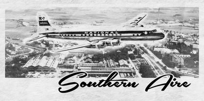
- Six Hands by ParaType,
$10.00 Six Hands is a set of handwritten fonts based on various writing tools, such as pencil, felt-tip pen, ball-point pen, and brush. The character set of each of these fonts supports the Cyrillic alphabet, as well as the extended Latin script for all European languages. Most of the styles also contain additional alternatives that have the capability of automatically interchanging in the setting, which significantly variegates and humanizes the text. Six Hands is quite a rare combination of diverse display fonts that work well together. It is made for talented designers who can use it creatively in packaging, advertising, displays, posters, menus, invitations and so on. The design of Six Hands was a result of collaboration between Alexandra Korolkova, Alexander Lubovenko and all those who assist them in this work. This set of fonts was released by Paratype in 2018.
 - Sri Kandi by Arendxstudio,
$20.00 Sri Kandi is a stylish and effortlessly cool handwritten font with a contemporary twist. It will add a unique spin on any design project! You will find font in OTF formats. No special software is required to use Sri Kandi, just install it as you normally do on your system. Includes: - Uppercase - Lowercase - Numerals - Punctuation - Symbols - Ligatures - Alternates - Multi-language Characters
 - Final Six by Type-Ø-Tones,
$64.00 FinalSix is the typographic adaptation of a lettering. Working on the graphic image for a sports event (the European Waterpolo Final in 2014) we had the idea of creating a character set that reflected the idea of the undulating movement of water in a pool. In practice, we draw characters with rounded tops, bottoms and diagonals and using the word WATERPOLO as a visual reference for a wavy feeling, in a process that we could define as “form follows meaning.” To preserve its personality as much as possible, the most idiosyncratic characters are found in the Default set, while we can find more standardized variations for editorial use in a Stylistic set.
 - Air Factory by Khaito Gengo,
$22.00 Air Factory was originally designed for a merchandise company, and ordered to design iconic but plain forms. Air Factory is a very simple and modern sans-serif font inspired by early 1900’s typefaces, like Futura, and consisting of 5 weights and stencil type(free). This contemporary typeface would be good used for restaurant, retail, book, poster etc. Air Factory also features various ligatures, stylistic alternates, fractions, and languages as well.
 - Big Sur by Mysterylab,
$11.00 Big Sur is a six-width slab serif font family with a unique look. At first glance, it is clearly in the tradition of old west style alphabets, with its chunky top and bottom strokes and serifs. But it also features a whimsical vibe in the curvy and pointed flourishes, the wavy baseline, and the swash terminals on many of the glyphs. It's a true standout with unique identifiers, and is bound to grab the eye as something new and different; yet it's traditional enough to establish a solid Western or vintage Americana style. Great for rodeo, county or state fairs, saloons, pubs & taverns, cowboy gear, and even vintage psychedelic posters.
 - Sin Original by FontHaus,
$14.95 Loosely inspired by the designs of Rudolf Koch and his Koch Antiqua, Sin Original Dark by Mondrey Sin is a curious monoline display face with small x-heights, and large caps. The design almost looks 1920s vintage. Interesting for book Jackets, editorial, and as drop caps.
 - ExperiTypo Six by Intellecta Design,
$14.95 - Air Superfamily by Positype,
$29.00 In B-movie awesomeness, Air began as Grotesk vs. Grotesque. I was trying to unify the prevailing traits of German and English Grotes(que/k)s in order to make something different but familiar. I am NOT trying to reinvent Helvetica (snore), so get that out of your system. From the onset, I intended this typeface to be a true workhorse that offers infinite options and flexibility for the user. At its core, it is the maturation of the Aaux Next skeleton I developed years ago. I worked out Aaux Next to settle my issues and love for Akzidenz. With Aaux Next, I strove to be mechanical, cold and unforgiving with it. I was single, young, cocky and it fit. Now I'm married, kids, dog and have found that I've turned into a big softy. When I look at Aaux Next (and have for the past few years) I see another typeface trying to eek out. I wanted it to avoid the trappings of robotic sans, quick tricks and compromises. The typeface’s DNA needed to be drawn and not just generated on a screen — so I set aside a year. I love type. I love working with type. I hate when my options for a slanted complement is only oblique or italic. I set out to produce both to balance usage — there are more than enough reasons to prepare both and I want the user to feel free to consciously choose (and have the option to choose) the appropriate typeface for print, web, etc. That flexibility was central to my decision-making process. The Oblique is immediate and aggressive. The Italic was redrawn at a less severe angle with far more movement and, as a result, is far more congenial when paired with the Uprights. Condensed and Compressed. Yep, why not? I know I would use them. There are nine weights currently available. The logical progression of weights and the intended flexibility demanded I explore a number of light weights and their potential uses — this has produced a number of ‘light without being too light’ options that really work based on the size. The result is a robust 81-font superfamily that is functional, professional, and highly legible without compromising its personality. Pair that with over 900 characters per font that includes ligatures, discretionary ligatures, stylistic alternates, fractions, proportional/tabular lining and proportional/tabular oldstyle figures, numerators, denominators, ordinals, superiors, inferiors, small caps, case-sensitive functionality and extensive language support and you have a versatile superfamily well-suited for any project.
 - LT Sip - 100% free

- Spicy Rice Pro by Stiggy & Sands,
$29.00 Our Spicy Rice Pro has a festive flair to it that works through winter holidays to summertime jams. Casual and exciting, the extra heavy letterforms are imbued with a little exotic flair and flavor to spice up the party. The SmallCaps and extensive figure sets only offer Spicy Rice Pro an even wider range of creative options. Opentype features include: - SmallCaps. - Full set of Inferiors and Superiors for limitless fractions. - Tabular, Proportional, and Oldstyle figure sets (along with SmallCaps versions of the figures). - Stylistic Alternates for Caps to SmallCaps conversion.
 - Air Millhouse Italic - Unknown license

- Pica Hole - SIM - Unknown license

- Six Feet Over by Brad Mead,
$10.00 Six Feet Over is tall, cool and near impossible to read - what's not to love? This super condensed and trippy typeface was designed to be elusive and is perfect for those that love condensed, compressed - or any other word for squished - fonts.
 - TT Firs Neue by TypeType,
$39.00 TT Firs Neue useful links: Specimen | Graphic presentation | Customization options TT Firs Neue is reborn! We have rethought the font to introduce the next-generation typeface. After analyzing each contour and graphic element, we rebuilt the font, preserving its best features while making any necessary adjustments. We have created a flawless and modern sans serif using the new technical capabilities of the studio. TT Firs Neue is a Scandinavian sans serif that combines expressive graphic elements with the versatility of use. In the latest 2023 edition, the font's display elements have become even more attractive, while the overall font balance has also been improved. This is the result of the visual research we did before working on the update. Here is what has changed. The visual elements of the font are now logically coherent. We got rid of the ones that did not suit the font's concept and kept the most attractive ones. The changes affected letters with diagonal strokes "M, N, И", and figures "2, 3, 6, 9". All round characters' shapes have been standardized for all font styles. In the previous version, all glyphs looked different: more square or oval, depending on the font's weight. We made the shapes consistent for the font to feel more integral. Glyphs containing bowls have also changed. We have worked on the balance, altering the height and shape of the bowls. Like rounded ones, we aspired to make the glyphs more balanced for all font styles. The shapes of the letters "J, M, N, S, W, З, И" and Black font style characters have changed. The individuality of these glyphs was slightly different from the whole set, which became apparent in larger sizes. We have improved the shapes and made them more suitable for the font's style. Letters with diagonal strokes and triangular glyphs, such as "A, V, Y, D". We have brought the characters to a consistent logic in their shapes by refining the angles and weight of diagonals in different font styles. The glyphs' terminals follow the same logic in the new version. We have preserved and perfected the old shapes. Ligatures and stylistic sets have been updated entirely and expanded. We have researched Scandinavian languages and designed ligatures and diacritical sets that would definitely be useful for designers. We have redesigned diacritical marks, figures, and punctuation marks. Now all characters follow the same logic and contribute to a well-balanced impression of the font. The character set in each font style has been increased from 934 to 1719, and the number of OpenType features—from 24 to 40. The new font includes 23 font styles: 11 roman, 11 italic, and 1 variable font. The variable font has also become a significant technological advancement for TT Firs Neue. We retained a warm sentiment towards TT Firs Neue's previous success while redesigning the font and implementing substantial alterations. The 2023 font has been developed according to new technical standards that have become significantly higher in the past 5 years. TT Firs Neue is a font well-suited for a wide range of contexts. It can be used for headings, text fragments, visual merchandising and building decoration, and the web. The font is visually aesthetic on podcast and video covers and is an ideal choice for packaging design and brand identity. TT Firs Neue OpenType features: aalt, ccmp, locl, subs, sinf, sups, numr, dnom, frac, ordn, tnum, onum, lnum, pnum, case, dlig, liga, c2sc, smcp, ss01, ss02, ss03, ss04, ss05, ss06, ss07, ss08, ss09, ss10, ss11, ss12, ss13, ss14, ss15, ss16, ss17, ss18, ss19, ss20, calt. TT Firs Neue language support: English, Albanian, Basque, Catalan, Croatian, Czech, Danish, Dutch, Estonian, Finnish, French, German, Hungarian, Icelandic, Irish, Italian, Latvian, Lithuanian, Luxembourgish, Maltese, Moldavian (lat), Montenegrin (lat), Norwegian, Polish, Portuguese, Romanian, Serbian (lat), Slovak, Slovenian, Spanish, Swedish, Swiss German, Valencian, Azerbaijani, Kazakh (lat), Turkish, Uzbek (lat), Acehnese, Banjar, Betawi, Bislama, Boholano, Cebuano, Chamorro, Fijian, Filipino, Hiri Motu, Ilocano, Indonesian, Javanese, Khasi, Malay, Marshallese, Minangkabau, Nauruan, Nias, Palauan, Rohingya, Salar, Samoan, Sasak, Sundanese, Tagalog, Tahitian, Tetum, Tok Pisin, Tongan, Uyghur, Afar, Asu, Aymara, Bemba, Bena, Chichewa, Chiga, Embu, Gikuyu, Gusii, Jola-Fonyi, Kabuverdianu, Kalenjin, Kamba, Kikuyu, Kinyarwanda, Kirundi, Kongo, Luba-Kasai, Luganda, Luo, Luyia, Machame, Makhuwa-Meetto, Makonde, Malagasy, Mauritian Creole, Meru, Morisyen, Ndebele, Nyankole, Oromo, Rombo, Rundi, Rwa, Samburu, Sango, Sangu, Sena, Seychellois Creole, Shambala, Shona, Soga, Somali, Sotho, Swahili, Swazi, Taita, Teso, Tsonga, Tswana, Vunjo, Wolof, Xhosa, Zulu, Ganda, Maori, Alsatian, Aragonese, Arumanian, Asturian, Belarusian (lat), Bosnian (lat), Breton, Bulgarian (lat), Colognian, Cornish, Corsican, Esperanto, Faroese, Frisian, Friulian, Gaelic, Gagauz (lat), Galician, Interlingua, Judaeo-Spanish, Karaim (lat), Kashubian, Ladin, Leonese, Manx, Occitan, Rheto-Romance, Romansh, Scots, Silesian, Sorbian, Vastese, Volapük, Võro, Walloon, Walser, Welsh, Karakalpak (lat), Kurdish (lat), Talysh (lat), Tsakhur (Azerbaijan), Turkmen (lat), Zaza, Aleut (lat), Cree, Haitian Creole, Hawaiian, Innu-aimun, Lakota, Karachay-Balkar (lat), Karelian, Livvi-Karelian, Ludic, Tatar, Vepsian, Guarani, Nahuatl, Quechua, Russian, Belarusian (cyr), Bosnian (cyr), Bulgarian (cyr), Macedonian, Serbian (cyr), Ukrainian, Kazakh (cyr), Kirghiz, Tadzhik, Turkmen (cyr), Uzbek (cyr), Lezgian, Abazin, Agul, Archi, Avar, Dargwa, Ingush, Kabardian, Kabardino-Cherkess, Karachay-Balkar (cyr), Khvarshi, Kumyk, Lak, Nogai, Rutul, Tabasaran, Tsakhur, Buryat, Komi-Permyak, Komi-Zyrian, Siberian Tatar, Tofalar, Touva, Bashkir, Chechen (cyr), Chuvash, Erzya, Kryashen Tatar, Mordvin-moksha, Tatar Volgaic, Udmurt, Uighur, Rusyn, Montenegrin (cyr), Romani (cyr), Dungan, Karakalpak (cyr), Shughni, Mongolian, Adyghe, Kalmyk.
 - Display Digits Six by Gerald Gallo,
$20.00 Display Digits Six is a display number font with eight sets of variations of the same digits. The digits 0 through 9, with period and comma in appropriate variations, are prepared as (1) solid, (2) outline, (3) solid with contour outline, (4) outline with 3-D shadow, (5) 3-D shadow only, (6) outline with drop shadow, (7) positive in circle, (8) negative in circle.
 - Londonderry Air NF by Nick's Fonts,
$10.00 An elegant face with dashing swash caps, based on an old American Type Founders typeface called Canterbury. The Opentype version of this font supports Unicode 1250 (Central European) languages, as well as Unicode 1252 (Latin) languages.
 - Air Corps JNL by Jeff Levine,
$29.00 What started as a small project for Mike Humphrey of Chiltern Image Service in the UK ended up as Air Corps JNL, a typeface featuring retro letters and numbers from military aircraft. Expanded to a full character set with punctuation, foreign accents, monetary figures and the like, Air Corps JNL is also available in an oblique version.
 - Air Castles JNL by Jeff Levine,
$29.00 The cover of the 1919 sheet music for "While Others are Building Castles in the Air I'll Build A Cottage for Two" had its title hand lettered in a wonderfully eccentric Art Nouveau serif design that typified the era. Also typical of the time was the habit of various songwriters to come up with wordy titles. This particular one checks in at fourteen words. Nonetheless, the sheet music's title inspired Air Castles JNL and its oblique counterpart.
 - FF Dirty Six by FontFont,
$41.99 British type designer Neville Brody created this display FontFont in 1994. The font is ideally suited for music and nightlife and poster and billboards. FF Dirty Six provides advanced typographical support with features such as ligatures. It comes with proportional lining figures. This FontFont is a member of the FF Dirty super family, which also includes FF Dirty Four, FF Dirty One, FF Dirty Seven, and FF Dirty Three.
 - TT Firs Text by TypeType,
$39.00 Specimen | Graphic presentation | Customization options TT Firs Text includes 23 font styles: 11 roman, 11 italic, and 1 variable font. Each font style consists of 898 characters, counting in the characters of the expanded Latin and Cyrillic writing systems. The font has 31 OpenType features, among which are localization features for various languages, circled numerators, and stylistic alternate for the ampersand.
 - Air Circus JNL by Jeff Levine,
$29.00 A 1930s advertising poster for the Inman Brothers Flying Circus offered up an interesting hand lettered Art Deco design that’s a cross between both squared and rounded character shapes. Because of it's 'futuristic look', the resulting type style can also lend itself to 1970s and 1980s retro projects as well as those from the 1930s and 1940s. Now a digital font, Air Circus JNL is available in both regular and oblique versions. A “Flying Circus” is a troupe of ‘barnstormers’ (stunt pilots) who performed aerial tricks either individually or as a team along with selling airplane rides to the general public.
 - Air Factory Rounded by Khaito Gengo,
$22.00 Air Factory Rounded was made for soft looking version of the original font Air Factory. Air Factory Rounded is a very simple and modern sans-serif and consisting of four weights. This contemporary typefaces would be good for restaurants, in retail, books, posters, etc. Air Factory Rounded also features various ligatures, stylistic alternates, fractions, and languages as well.
 - Crimes Times Six by JSH creates,
$39.95 Crimes Times Six is a cool horror font, originally created with a chalk stick back in 2012, by Jonathan S Harris. The typeface design works very well in video games, movies and broadcasting, but also looks great on clothing and posters.
 - HWT Bon Air by Hamilton Wood Type Collection,
$24.95 Bon Air was one of a series of script typefaces cut into wood by the Hamilton Manufacturing Company for the Morgan Sign Machine Co. (makers of the Line-o-Scribe showcard press) in the mid 20th Century. These were some of the last new designs cut into wood by Hamilton until the museum revival in the early 2000s. Bon Air was created in 1958 and trademarked in 1961. The wood type made for Morgan was used largely in department stores to make their own signage. The script styles are reminiscent of sign painters alphabets and evoke a Mad Men era advertising aesthetic. The font was only cut in four sizes: 12, 18, 36 and 72 line. It was distributed by Morgan for use in their presses, but as type high wood type, it could be used on any press. The font was issued with several alternate letters and ligatures to simulate the effect of hand lettering. Its lively strokes and odd details give it an exotic flavor suitable for advertising display work. The digital version includes all of the original alternates plus new characters to fill out a full European character set.
 - Six Week Holiday by Kitchen Table Type Foundry,
$16.00 In Holland, all kids have a six week long school holiday during the summer months. To prevent chaos, traffic jams and other madness, the government has divided the country in three regions (North, Middle and South) and school holidays start a few days to a week and a half apart. For kids this is the best time of the year, as they can have fun for a month and a half, but for us parents this sometimes is a bit of a logistic nightmare, as we still have to work! Six Week Holiday is an ode to the chaos of summer. It is a cute handmade ‘school’ font that will put some sunshine in your designs! Comes with extensive language support.
 - Sitting Pretty JNL by Jeff Levine,
$29.00 Sheet music for the 1923 tune "I'm Sitting Pretty (In A Pretty Little City)" had the main part of the title hand lettered in an Art Nouveau condensed Roman type design which became the inspiration for Sitting Pretty JNL. The typeface is available in both regular and oblique versions.
 - Shaken, Not Stirred by Hanoded,
$15.00 Shaken, Not Stirred. A famous line from just about every James Bond movie (yes, we're talking Martini-time). The font is also quite shaken (and not stirred). It looks like someone scrawled something onto paper, or etched the letters in metal. Shaken, Not Stirred comes with a set of diacritics befitting a Secret Agent.
 - Display Dots Six by Gerald Gallo,
$20.00 Display Dots Six is a display font not intended for text use. It was designed specifically for display, headline, logotype, branding, and similar applications. Display Dots Six has an uppercase alphabet, numbers, and punctuation.
 - ITC Bodoni Six by ITC,
$40.99Giambattista Bodoni (1740-1813) was called the King of Printers; he was a prolific type designer, a masterful engraver of punches and the most widely admired printer of his time. His books and typefaces were created during the 45 years he was the director of the fine press and publishing house of the Duke of Parma in Italy. He produced the best of what are known as modern" style types, basing them on the finest writing of his time. Modern types represented the ultimate typographic development of the late eighteenth and early nineteenth centuries. They have characteristics quite different from the types that preceded them; such as extreme vertical stress, fine hairlines contrasted by bold main strokes, and very subtle, almost non-existent bracketing of sharply defined hairline serifs. Bodoni saw this style as beautiful and harmonious-the natural result of writing done with a well-cut pen, and the look was fashionable and admired. Other punchcutters, such as the Didot family (1689-1853) in France, and J. E. Walbaum (1768-1839) in Germany made their own versions of the modern faces. Even though some nineteenth century critics turned up their noses and called such types shattering and chilly, today the Bodoni moderns are seen in much the same light as they were in his own time. When used with care, the Bodoni types are both romantic and elegant, with a presence that adds tasteful sparkle to headlines and advertising. ITC Bodoni™ was designed by a team of four Americans, after studying Bodoni's steel punches at the Museo Bodoniana in Parma, Italy. They also referred to specimens from the "Manuale Tipografico," a monumental collection of Bodoni's work published by his widow in 1818. The designers sought to do a revival that reflected the subtleties of Bodoni's actual work. They produced three size-specific versions; ITC Bodoni Six for captions and footnotes, ITC Bodoni Twelve for text settings, and ITC Bodoni Seventytwo - a display design modeled on Bodoni's 72-point Papale design. ITC Bodoni includes regular, bold, italics, Old style Figures, small caps, and italic swash fonts. Sumner Stone created the ornaments based on those found in the "Manuale Tipografico." These lovely dingbats can be used as Bodoni did, to separate sections of text or simply accent a page layout or graphic design." - Gothic Initials Six by Gerald Gallo,
$20.00 Gothic Initials Six was inspired by the beautifully-written gothic scripts of medieval scribes. The font contains the upper case letters A through Z under both the character set and shift+character set. This font is intended for use as initials, monograms, drop caps or wherever fancy letters are desirable.


