10,000 search results
(0.029 seconds)
- Monogamma by Tolya Doodko,
$45.00 Monogamma is an experimental typeface which explores opportunities for harmonious connection of broad nib writing and the aesthetics of monospaced typefaces. The typeface is primarily designed for headings and typesetting in large sizes. It is not intended for technical usage, therefore its metrics and characters proportions are optimized and the spacing between letters is optically evened out. Thereby, Monogamma has even letter spacing, contrasting styles and is free from the imperfections of monospaced fonts. It is supplied with kerning and OpenType features and comes in three weights, with full character set or capitals only. Supporting Latin and Cyrillic, it covers most European languages. The full character set includes an alternative capital U and zero, punctuation marks for the upper case and a set of arrows.
 - Vallassina by Wilton Foundry,
$29.00 Vallassina is named after Vallassina, a village in the valley of the upper tract of the river Lambro in northern Italy. The most important settlement in the area is the town of Asso, from which the valley takes its name. Spasell is a slang of Insubric language, spoken until 19th century by inhabitants of Vallassina, when they used to go out from the valley for business and they didn't want to be understood by the people. What makes this valley unique is that the locals use a unique whistle language to communicate to each other. Vallasina is confidently irreverent yet curiously attractive. How many ways can you use Vallassina to whistle to your neighbors? Vallasina is available in OpenType format.
 - Albion's Americana by Greater Albion Typefounders,
$18.00 Albion's Americana is a fun display family and a tribute to our transatlantic friends. The stars and stripes motif is applied to an American inspired all capitals Roman display face, producing something that is bold and boisterous and well...American. The regular face is intended for conventional use, while the 'Black', 'Red', 'White' and 'Blue' faces are designed to facilitate patriotic multi-coloured lettering (of course, you can use other colours as well). It's worth trying out different combinations here- Black and White alone work well, as does read, white and blue minus black. Albion's Americana Companion is also offered, intended as a small or all capitals face for subsidiary lettering. Next time you need some graphic typesetting with that American feel, this is your answer!
 - Sans Skript by Felitasari Rekso,
$25.00 Sans-Skript is a display typeface that is inspired by Javanese Script (or Sanskerta in Bahasa Indonesia). Javanese script is one of Indonesia’s many traditional scripts that were commonly used by Javanese people from mid-15th CE to mid-20th CE. Though not commonly used anymore, it is still taught and used in cities across East and Central Java. Sans-Skript translates the high-contrast, modular and organic features of the Javanese Script into the Latin alphabet. (Hence the not-script naming) The typeface is aimed to be used for large format prints, above 100 pt, and can be used alongside Javanese script. Typefaces that pair nicely mimic features of Javanese script, and Hatton by Pangram Pangram Foundry is an example.
 - Araldo by Hackberry Font Foundry,
$14.95 My latest book production group is quite conservative. I discovered my need for a pair of headline fonts with the same vertical metrics which are looser and more lively. Since the serif family is Biblia Serif, and the Sans family is Draetha [which is Welch for preach], Araldo [which is Italian for herald] makes sense to me. Narrow has my normal set of Opentype features with small caps, small cap figures, and the rest of the figure sets. Bold is too heavy for small caps, without messing with the metrics. So, it has the normal figure sets, plus a decent set of discretionary ligatures. They both work well, and are meeting my need for a headline family to add to the book production group.
 - Nevoclara by MlkWsn,
$23.00 Nevoclara is a Modern Vintage font with beautiful ligatures, with special alternative glyphs, and multilingual support. It is inspired by the decorative arts and architecture movement that originated in the 1920s and developed into a major style in the Western European United States during the 1930s. Nevoclara includes luxury glyphs that are made individually and carefully produced, the aim is to create a quality and elegance that is sleek and semi-modern that symbolizes the glory and sophistication of vintage. It combines modernist style with good craftsmanship. Nevoclara is perfect for your project and allows you to create designs, headlines, posters, logos, badges, t-shirts and many more that are beautiful. It is also best used for posts, logos, posters, certificates, labels and more.
 - Altissimo by Soneri Type,
$32.00 Altissimo is a display type family, derived from the Ample typeface, it has large x-height, optical mono linear and a bit squarish in nature. It has a smooth curve instead of sharp angles formed by the junction of two strokes, which is a prominent feature of its design. It is designed to be a little eye-catching yet legible. It has clear and distinguishable letterforms, which helps to elaborate and emphasise the message. It is graphically strong and commands viewer's attention. The overall appearance of this type is suitable in setting it as heading, title, headline, etc. The type family consists of seven weights viz. Thin, ExLight, Light, Regular, Medium, Bold and ExBold. Altissimo is designed by Aakash Soneri in a period between 2017 and 2018.
 - Magtis by Identitype Co,
$25.00 Magtis is a standout display font that is an ode to Contrast Serif typography in present day. It’s elaborate curves and unique shapes make it perfect for headings, logos & wedding invitations. Magtis is all class so if you want a stylish font that is guaranteed to draw the eye, then this is it! Magtis come with elegant style, strength and contrasts, with features an extended latin character set of 396 glyphs covering over 87 languages. Magtis is ready to be like a top model on the design catwalk, making your projects looking classic but contemporary, finely tuned but assertive, and elegant as the best luxury fashion. There Include : 7 Font Style 49 Ligature Extended Latin Opentype Feature Alternate Character Multilanguage
 - Portgas Display by Skinny Type,
$16.00 Portgas Display is a beautiful and inspiring mix of classic calligraphy and modern serif based on a minimal and simplistic approach to elegance. The inspiration came from the fashion magazines. Its thick-thin, serif strokes express the modernity of the fashion industry. This typeface includes special uppercase letters and access to your OpenType features, alternate glyphs and more than 60 ligatures. Portgas Display is made mainly for headlines, titles, and other short texts and is well-suited for advertising, vintage mood board, branding, logotypes, packaging, titles, editorial design and modern and vintage design. Portgas Display is fully unicode mapped. Includes: - For access to Stylistic Alternates is required software with glyphs panel like Photoshop and lllustrator -- No special software is required to use Ligatures.
 - Arcus by CarnokyType,
$- Arcus OpenType is a geometrically constructed font. The grounding principle is the round curve. The homogeneous character of this font is guaranteed by using this principle not only in drawings of particular letters but in the shaping of diacritical signs, too. The scope of the typeface weight is from Extra Light to Extra Bold while the complete font family includes 6 weights and their respective, well turned italics. This font contains a wide range of alternative signs, small capitals, lining and oldstyle numerals, fractions, superiors, inferiors, ligatures and discretionary ligatures; all this is within the frame of OpenType functions. This font type is not made for the typography of extensive texts. Best it can be used for headline display typeface or in creating logotypes and corporate identities.
 - Cal Roman Modern by Posterizer KG,
$19.00 Cal Roman Modern is one more font from PKG “Cal” (Calligraphic) group. This time for calligraphic sketches we used a wide brush instead of the iron pen. Instead of minuscule letters, there are Small Caps (which are the same weight as capitals). Because there is no difference in the stroke thickness of capital letters and lowercase capital letters the difference in height is only one pen width, because of that, it is possible to use small capitals together with capital letters without noticing a difference in the thickness of the letters. Cal Roman Modern font is rhythmic, informal elegant, bright and light. As such, this font is widely used in the typographic creation of shorter text forms: magazine, catalogs and book titles, logos, posters, movie spots, banners...
 - Bill Hiffith Handwritten by Colllab Studio,
$19.00 "Hi there, thank you for passing by. Colllab Studio is here. We crafted best collection of typefaces in a variety of styles to keep you covered for any project that comes your way! Bill Hiffith is an Organic Script, a gorgeous font that can be used for making multiple things. it includes smooth brush stroke, simple and soft. Its elegant taste is one of the most gorgeous fonts. This typography is reflected in this exquisite font family. The type is clean and simple yet fun and stylish. It is beautiful, better for headlines style design or logo design. Or you can have it on your website’s body style. Grab it now, Bill Hiffith could elevate your elegance brand design. A Million Thanks Colllab Studio www.colllabstudio.com
 - Dollan by Twinletter,
$14.00 Dollan, our newest whimsical typeface, is now available. This font is worth implementing in your remarkable projects since it is a distinctive and eye-catching display font that is dynamically crafted to bring out the originality in each letter. This typeface has a cheerful, unique, energetic, and unique vibe to it, and it will give your creative work a unique look as well. This font is perfect for games, sporting events, branding, banners, posters, movie titles, book titles, quotes, logotypes, and more. of course, your various design projects will be perfect and extraordinary if you use this font because this font is equipped with a complimentary font family, both for titles and subtitles and sentence text, start using our fonts for your amazing projects.
 - Ample by Soneri Type,
$50.00 Ample is a display type family, optical mono linear and a bit squarish in nature. It has a smooth curve instead of sharp angles formed by the junction of two strokes, which is a prominent feature of its design. It is designed to be a little eye-catching yet legible. It has clear and distinguishable letterforms, which helps to elaborate and emphasise the message. It is graphically strong and commands viewer’s attention. The overall appearance of type is suitable in setting it as heading, title, headline, etc. The type family consists of six weights viz. Thin, ExLight, Light, Regular, Medium and Bold. Considering the nature of this type family, italics have been excluded. Ample is designed by Aakash Soneri in a period between 2013 and 2014.
 - Perfume by Fenotype,
$25.00 Perfume - a luxurious display pack. Perfume is a display combo pack of three styles and eight fonts. Perfume fonts are soft and clean and they have a distinguishable character. Perfume Pen is a monoline script with three weights and large x-height. Perfume Pen is equipped with automatic Contextual Alternates that keep the connections smooth. In addition Perfume Pen has Swash, Stylistic and Titling Alternates, boasting over 500 glyphs in total. Perfume Brush is a bold brush script with two weights. Perfume Brush is also equipped with Contextual Alternates to keep connections smooth and Swasha lternates for more imposing character forms. Perfume Sans is a sturdy all caps Sans with three weights. For the best price purchase the whole pack!
 - Sacred Letter by 38-lineart,
$14.00 Sacred letter is a font that follows the rules of calligraphy writing, but the difference is there is a natural emphasis on handwriting. The Thick and thin are not smooth to describe the flow of natural ink. The pure calligraphy tends to the classic style with nuances of the grandeur of the past. This font is more open and appears as-is. The flexibility of the style makes it can survive in the classic style and modern style. Sacred Letter is a flowing and classic handwritten font, described by an elegant touch, perfect for your dearest projects. Fall in love with its incredibly distinct and timeless style and use it to create spectacular designs! This font is PUA encoded which means you can access all of the glyphs and swashes with ease! It features a varying baseline, smooth lines, gorgeous glyphs and stunning alternates.
 - Chateau by Wilton Foundry,
$29.00 On the one hand Chateau is almost palatial but at the same time it has a quite earthy personality as represented by the stenciled strokes. However, this stencil effect serves to refine the strokes by creating the illusion of a completed thin stroke. Chateau is more of a hybrid roundhand script with its contrasting ornate capitals. Originally a fortified residence in France was called a Chateau. Today there are many estates with true Chateaux on them in Bordeaux, but it is customary for any wine-producing estate, no matter how humble, to prefix its name with "Chateau". This is true whether the building itself is a magnificent palace or a shack. The distinctive chateau architecture was in inspiration for the name of this script. Chateau is ideal for packaging design, invitations, announcements, headlines, brochures, menus, weddings, scrapbooking, etc. Chateau is available in Opentype, Postscript and Truetype for Macs and PCs.
 - Complements by Ingrimayne Type,
$9.00 In the typeface family "Complements" two sets of characters complement each other, so much so that they work together much better than they work separately. The two sets are designed to alternate and this alternating is done automatically in applications that support the OpenType feature Contextual Alternatives. Complements is purely for show and display; it is a horrible choice for text. The spacing is very tight, which works well for very large point sizes. At smaller point sizes the user may want to increase character spacing. The typeface is monospaced. If the spacing between words is too large, substitute the non-breaking space (or the underscore) for the space character. Complements is geometric, bizarre, and hard to read, all characteristics that catch the reader's attention. Complements comes in two styles, regular and outline. The outline style was designed to be used in a layer over the regular style.
 - Galix by Eclectotype,
$40.00 Galix is a technical sans designed to look futuristic without any of the retro appearance often found in this genre. It has a squarish, slightly condensed anatomy, and is characterized by thin joints and deep ink traps that add a sparkle to the otherwise monoline typeface. In the italic styles, these cuts are accentuated even more which creates a feeling of speed in the letterforms. Galix is optimized for display typography (the ascender height is the same as the cap height, and the spacing is somewhat tight) but the middle weights are very readable at smaller sizes, where I'd recommend adding a little tracking. OpenType features include ft and tt ligatures, stylistic sets/alternates, automatic fractions, tabular, superscript and subscript figures, case sensitive forms. Perfect for websites, apps, infographics, magazines and logotypes, Galix is technical but with a warmth and personality that is often missing from this genre.
 - Queulat Condensed by Latinotype,
$- This font is the condensed version of Queulat, but keeping the same features as the original typeface. Queulat Cnd is a hybrid typeface that combines different styles, reflecting charm, freshness and, especially, a strong personality.. Since it is a condensed font, it is well-suited for publishing and subheadings. The font is inspired by Modern and Grotesk styles. The former is shown in some characteristic features such as teardrop terminals, which give the typeface an attractive unique look, making it an ideal choice for logotypes and labelling. The latter, with its rationality, makes Queulat Cnd a stable and strong face for headings and subheadings. The combination of styles can be clearly seen by comparing the Regular with the Alt version. The Regular version is more simple than the Alt one. Differently, the alternative version possesses more features of the Modern style, like teardrop terminals in ‘k’ and ‘v’.
 - Braga Huis by Juru Rancang Studio,
$15.00 Braga Huis typeface is a font family that is inspired by the famous street in Bandung that was made to embodies the atmosphere and the environment of Netherland-Indie city at its golden time, whereby all the elements were designed to give the impression of structural, artistic, and advance. Braga Huis typeface has a strong Art Deco character, where the impression is depicted from the strong lines, curvy passion so it is very appropriate to describing the future atmosphere from the perspective of the 19th century. Braga Huis typeface has 3 font styles consisting of uppercase, lowercase and various alternative options that can be customize to your taste, poster is one of the media form of presentation that we believe is very appropriate for this type of font. But whatever the medium is, honestly we say; using Braga Huis typeface will make your artwork will never be cracked by time.
 - Sakrale by Invasi Studio,
$19.00 Sakrale is a modern take on the traditional black letter font. Its unique glyph shape adds a touch of rigidity to its contemporary look, making it a perfect choice for your project who want to add a touch of sophistication to their work. The Sakrale font is designed to be user-friendly, with easy-to-read characters that are perfect for headlines, logos, and branding. This font is ideal for those who want to create a modern, edgy design that stands out. Whether you're a professional designer or just starting out, Sakrale is the perfect font. Sakrale is the perfect font for any design project that requires a touch of elegance and class. Whether you're creating a logo, title, or poster, this font is guaranteed to make your work stand out from the rest. With its clean lines and modern feel, Sakrale is sure to impress.
 - Mandalay - Unknown license

- Pot roaster - Unknown license

- Replete Sans by Sudtipos,
$49.00 Sudtipos’ new sans serif font Replete is inspired by the mixture of aesthetics and philosophies found on the streets of metropolitan cities the world over. Buildings constructed throughout the twentieth century, including those made in the Art Deco style or influenced by the Bauhaus’s gospel, stand side-by-side as symbols of their time. Typography is one factor that bonds these vistas, and simultaneously further complexifies them. Art deco letters appear on storefronts and signage in Europe’s oldest cities and as remnants of the Golden Age of economic expansion for Latin America. Typography, like architecture, sometimes coexists in perfect harmony, and other times in ideological opposition. But it is these juxtapositions in places such as Shanghai, New York, London, Buenos Aires and Tokyo that shape each city’s identity. Replete is inspired by this mixture. We wanted to create a useful modern sans serif family – a set of 7 weights with playful geometric alternates – that allows you to combine characters including wide-width and filled letterforms. Replete is apt for long texts, and equally, for instances where letterforms can stand together like a cityscape. Replete means full, packed and abounding … it is a sans, it is grotesque, it is geometric and it is Deco. Replete is a new family that has a little of everything we like, equipped with everything you need to design anything you want.
 - Swiss 721 by Bitstream,
$29.99 Swiss 721™ is a sans serif family that ranges in style from thin to black while mixing in a few unexpected, but beautifully made and ironically flattering, outline weights that spice up the grotesque design. Couple these upstanding letterforms with matching italic styles and you have yourself a beautiful tool that is as legible on screen as it is off, has the technical prowess to conquer even the trickiest of design riddles and will work in a myriad of projects. Swiss 721 is a staple sans serif that you’ll never be sorry you have in your library. It’s been said that a simple sans serif is one of the most difficult typefaces to design. This is because when letters are reduced to their most basic details, irregularities and inconsistencies in design become immediately visible. The Swiss 721 typeface family is a quintessential example of letterforms distilled to their essence while still possessing warmth and verve. Based on mid-century sans serif typefaces, Swiss 721 is a versatile family of weights and proportions ideally suited to a wide variety of print and interactive design projects and is equally at home as headlines on billboards as it is navigation content on small screens. Swiss 721 takes the essence of mid 20th century sans serif typefaces and melds it with modern design consistency and a systematic weight range.
 - DT Lythmore by Dragon Tongue Foundry,
$9.00 Lythmore This font is called Lythmore and is inspired by Lithos. Lithos was originally designed for Adobe by Carol Twombly in 1990, based it on the lettering from ancient Greek inscriptions. The Capitals are similar in feel and design, but is totally original and built from scratch. It is designed to be similar intentionally, but it is not a clone or rip off. Lithos is an example of a simple blocky san serif font style, with subtly concave sides, angled ends, and off centred curves. Lythmore is also an example of that same style. But is also different in places where I felt it could be improved. And it has a complete lower case set, which Lithos doesn't. I built Lythmore with 8 different weights. Lythmore can be very effective when used in advertising and general display work, but it can also be used for much more. Although it was never designed to be body copy, when used as such, it is still perfectly readable and adds its own version of sans serif style and flavour. I have included two versions of the Lythmore family. Lythmore A and Lythmore B. In the Lythmore A family, the lighter 4 weights all vary in weight in both the horizontal and vertical axis. The heavier 4 weights all vary in the horizontal axis only. In the Lythmore B family, the transition is even in both directions across the entire family. The result of this difference is that the A and B versions difference is most noticeable between the Regular and Medium weights. While the extreme ends of each family version are virtually identical.
 - Alt Gotisch by HiH,
$12.00 Alt-Gotisch Verzierte is a typeface of decorative initials that is Victorian in style and bears a close family resemblance to the many ornamental tuscans cut throughout the nineteenth century by British foundries. Instead of the bifurcated terminals of the archetypical tuscan (see Figgins Tuscan by HiH or Stereopticon by Dan X. Solo), these letters display what Nicolete Gray might call a “wedge and bite” design -- as if they started with the wedge serif of a latin form and someone came along and took a perfectly round bite out of the wedge. We need not dwell on the lack of teeth marks. The calligraphic curls and flourishes are often graceful, sometimes a bit contrived, but always complex. There is a busyness that marks the style of the period. If you ever see an old photograph of a well-appointed Victorian parlor, you will recognize that same quality of busyness. Overdone is a word that frequently comes to mind. Alt-Gotisch Verzierte means “adorned or decorated old gothic.” The typeface is attributed by Alexander Nesbitt to an unidentified German foundry of the nineteenth century (Decorative Alphabets and Initials, Dover, New York 1987, plate 92). The designer is unknown. Our font is supplied with a lower case that is similar to the upper case, but is 15% shorter and is simplified by the omission of the decorative vines. For the lower case, alternate letters A, E, & T; and ligatures LE, OT & LY have been supplied. In addition, a few small decorative vines were planted here and there for optional use. An accented upper case is not part of the original design and is not here supplied. This design is also seen under the name “Sentinel” -- as always, it is worthwhile to compare the completeness of the character set and the faithfulness of the rendering. We believe you will agree that we provide a balance of quality and value that is unmatched in the contemporary marketplace. Alt-Gotisch Einfach is a simplified version of Alt-Gotisch Verzierte. The vine-less lower case of the Verzierte font is the upper case in Einfach. For a lower case for Einfach, the letters were further simplified by stripping away the three-dimensional outline, down to the bare bones and bites, as it were. Einfach, in fact, means “simple” or “plain.” It is interesting to note that this bare bones & bite lower case bears (I have a special license to use two homonyms in the same sentence) a striking resemblance to the 15th & 16th century ornamental letters from Westminster Abbey shown in Plate 47 of Alexander Nesbitt’s Decorative Alphabets and Initials (Dover, New York 1987).
 - Subyep by Subtitude,
$25.00 Subyep is a unique bitmap font with subtle serif and has almost a neoromantic/gothic look. The best size to use it is 17 pt.
 - Night Blazer by Epiclinez,
$18.00 Night Blazer is a cute and lovable handwritten font. It is suitable for your crafting projects, but also for apparels, quotes and so much more.
 - Lydian by Bitstream,
$29.99Lydian is Warren Chappell’s almost calligraphic sanserif, designed for ATF in 1938. Lydian Cursive, done by Chappell in 1940, is much freer and more calligraphic. - Andorra Script by Hanoded,
$15.00 Andorra Script is a hand written font - it is very legible, quite elegant (in an informal way) and useful. Andorra Script comes with all diacritics.
 - Ninfa by dooType,
$34.90 Ninfa is a modern semi-serif, characterized by the search for a personal dash with calligraphic influences. The result is a font with unique features.
 - The Good Stuff by Epiclinez,
$18.00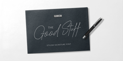 The Good Stuff is a handwritten signature script with a natural flow. This stylish font is a good choice for high-end, sophisticated Branding design.
 - Franklin Stencil JNL by Jeff Levine,
$29.00 Franklin Stencil JNL is based on the classic and perennial workhorse design of Franklin Gothic Condensed and is available in both regular and oblique versions.
 - Lasergraph by hiroki kanda,
$20.00 It is a font created with images of space, movies and games in the near future. The font is futuristic yet has a retro vibe.
 - Disclaimer JNL by Jeff Levine,
$29.00Disclaimer JNL is a narrow, ultra-compact sans serif design that's perfect for fine print clauses or anywhere space is limited - but word copy isn't. - Judlebug by Atlantic Fonts,
$26.00 Confident, endearing and youthful, Judlebug is brimming with personality that’s hard to deny. Now available in 3 weights, Judlebug is ready to light things up!
 - DaDi Arm by inknagir,
$15.00 New Font for Armenian Designers. This is an Armenian handwritten font. The font is comprised of Armenian letters only All Caps, numbers, and minimal punctuation.
 - Musketeer by Monotype,
$29.00Tony Geddes designed Musketeer in 1968. The Musketeer font family is based on Art Nouveau lettering and as such is ideal for posters and signs.

