10,000 search results
(0.029 seconds)
- BoiTu by Vei Vei,
$16.00 BoiTu is a typeface in the BoiTu project designed by Vei Vei. BoiTu has a strong contrast between bold bars and long sharp hook strokes inspired by pheasant feathers on the hat in Hat Boi costume. "Tuong or Hat Boi is a form of Vietnamese classic opera, combining various elements of arts such as stage, music, fine art, literature, dancing, and martial arts. Older Tuong plays are usually about historical events or tales. Allegories, melodramas, soliloquies, modes of expression, forms of performance, repartee singing and recitative conventions, etc., are constantly updated and elevated, and are quintessential elements in the art of Tuong." Boi Tu is a classic design to bring traditional art and culture closer to everyone. Boi Tu is a Vietnamese font that supports multiple languages.
 - Prêt-à-porter by Latinotype,
$39.00 Prêt-à-porter is a project developed as part of a series of type experiments appearing on the blog ‘Letritas’. Prêt-à-porter is a very expressive friendly font with a handwritten look, smooth curves and strong identity. Its counterforms make it a carefree, wild, cheerful, light and highly readable typeface. This type system consists of two Script families—Contrast and Linear—and a Slab family. The Contrast set works as a complement, providing more elegance and formal refinement. Both Linear and Contrast come in 5 weights plus Ornaments, which can be used as initial and terminal forms since they have been designed for connecting with each letter. Linear and Contrast families include ligatures and the whole font family supports 208 different languages.
 - Aventena by Mokatype Studio,
$24.00Aventena is display sans, inspired by blackletter basic writing system. There is a lot of twist from the basic form, that makes Aventena look simple and yet legible. So you can explore, combine, and create designs such as posters, headlines, interfaces, merch, etc. This is single-weight font only, this font is better used for headlines. If you need a multi-weight of this font, just tell us! What's you get : Standard glyphs Ligatures (Opentype features) Web Font International Accent Works on PC & Mac Simple installations Accessible in Adobe Illustrator, Adobe Photoshop, Adobe InDesign, and even work on Microsoft Word. PUA Encoded Characters - Fully accessible without additional design software. Fonts include multilingual support Image used: All photographs/pictures/vectors used in the preview are not included, they are intended for illustration only. Thank You - Ministry by Device,
$39.00 A 14-weight sans family based on the original British ‘M.O.T.’ (Ministry of Transport) alphabet. A capitals-only, single-weight design was drawn up around 1933 for use on Britain’s road network, and remained in use until Jock Kinnear and Margaret Calvert’s ‘Transport Alphabet’ was introduced for Britain's first motorway in 1958. The identity of the original designer is not preserved; however, Antony Froshaug in a 1963 ‘Design’ magazine article mentions Edward Johnston as an advisor. Speculation that it was based on Johnston’s London Transport alphabet is discussed in archived government documents from 1957: “So far as I am aware, the Ministry alphabet was not based on Johnston’s design; indeed, it has been suggested that Gill got his idea from Johnston. Our alphabet was based on advice from Hubert Llewellyn-Smith (then chairman of the British Institute of Industrial Art) and Mr. J. G. West, a senior architect of H. M. Office of Works.” A 1955-57 revision of the alphabet which polished the somewhat mechanical aspects of the original may be the work of stone carver and typographer David Kindersley. For the digitisation, Rian Hughes added an entirely new lower case, italics and a range of weights. The lower case mimics the forms of the capitals wherever possible, taking cues form Gill and Johnston for letters such as the a and g, with single-tier versions in the italic. A uniquely British font that is now available in a versatile family for modern use.
 - Fixture by Sudtipos,
$39.00 Fixture is our massive 72-font take on plentiful offerings of the late 19th century’s typefaces, posters and wood letterpress sundry done in the Grotesk genre. Four widths ranging from Ultra Compressed to Expanded each come in nine weights and accompanying italics. Some common sans-serif alternates, such as the a and g, are included in all the fonts. The idea with this design was to put together a workhorse font family with enough functional flexibility to work in multiple environments, from the subtlety of magazine layout or film credits to the visual drama of billboards or packaging. Aesthetically speaking, it is quite interesting — though in retrospect quite unintentional — that each different width and/or weight of this face ended up pulling a different dominant trait from the melting-pot origins of the entire family. It’s almost like a tribute album to some famous band’s covers of older songs. It may also be a good conversation piece on our tools shaping the very things for which they’re used. Can’t really get any more post-Grotesk than this. In the 21st century, this is the one genre to rule them all.
 - Tiffanky by Maulana Creative,
$11.00 Tiffanky is a Classic Cursive monoline font casual and clean stoke font includes alternate lowercase and opentype features Ligatures inspired by the late 80's sign board. It support multilingual more than 100+ language. This font is suitable for logo design and any awesome project you create. Make stunning work with Tiffanky Monoline font. Give your designs an authentic handcrafted feel. "Tiffanky Monoline Cursive Font" is perfectly suited to stationery, logos and much more. Thanks for Download, Maulana Creative
 - Bloomer by Hanoded,
$15.00 A Bloomer is a crusty loaf of bread with rounded ends. I don’t know why I chose this name, but it may have to do with the fact that my wife signed up for a bread baking course. Bloomer is a rounded, hand made cartoon-ish font. It will look especially good on product packaging, but any design in need of some authenticity could do with a bit of Bloomer! Comes with ligatures and a light dusting of alternates.
 - Neon Magic by Illushvara,
$16.00 Hello, Neon Magic is a decorative display font with sans serif line. This Inline style works great as a headline for music promotion, film titles, sign, logotype and gig posters, and when combined with the included graphic presets* achieves a truly realistic neon look and more! Features : Uppercase and lowercase Numbers Symbols Multilingual Accent What you get : Neon Magic. OTF If you have any question, don’t hesitate to contact me. Happy Designing !!! Thank You, Bayu Suwirya
 - Villain by Clint English,
$25.00 Villain is a new handwritten, multi-alternate glyph font. This font was created with a natural flow in mind. Since it's meant to look handwritten, Villain comes with 3 different glyphs per letter and number and even a few alternate symbols, as well. Pro Tip: Play with the baseline shift of each character to get an even more realistic, organic result. *Note: Grunge overlay texture is for previews only. Villain Font is completely clean and free of texture.
 - Conica by Typogama,
$19.00 Conica is a bold, condensed typeface that aims to grab your attention. By playing with heavy, dark shapes and small counters, this single weight typeface explores the contrast between defined shapes and gentle curves to produce a surprising headline font. It equally includes a range of Opentype features, with a set of small capitals, stylistic alternates and ligatures, users can choose which forms best suit their needs. Conica includes an extended Latin glyph set covering most Latin based languages.
 - Booden by Lithographe,
$36.00 Booden is a name not to boo but to use in display type situations. but as texts funtion s to be read its functionality ges beyond a Cyber-tech font single weight single time use. it can be used for branding purposes or any type of editorial text because of its readability. Be it a logo, or a Title headliner, web or print booden typeface can certainly entertain your need for simple variation.
 - Gustatory Delight by Ali Hamidi,
$12.00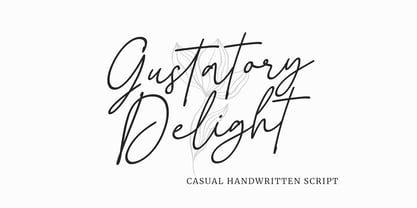 Gustatory Delight is a perfect handwritten script font that has a modern and authentic look, this font has a simple and unique character in both lowercase and uppercase, this font is perfect for branding, signature, logo, packaging, presentations, planners, resumes, business card, brochures, fashion, t-shirt, wedding invitations, yard signs and more.
 - Indulta SemiSerif - Personal use only

- Disoluta - Personal use only

- Schoolyard Stencil JNL by Jeff Levine,
$29.00 A vintage lettering stencil manufactured by the E-Z Letter Stencil Company of Baltimore, Maryland was the model for Schoolyard Stencil JNL, available in both regular and oblique versions. Re-drawn digitally and following the actual bend of the steel rule dies used to cut the stencils, this typeface has not been cleaned up from its original design. Upon close examination, you will find straight angles and slight curves in the most unusual places. This was representative of the difficult work involved in bending steel cutting rule material and fitting it into small areas. For many years, E-Z Letter was the main competitor to the Stenso Lettering Company; the originator of the oil board stencil lettering guide complete with automatic spacing holes. Anyone over 40 will well-remember lettering their science fair posters, report covers and ring binders with these stencils.
 - Spencerian Palmer Penmanship Pro by Intellecta Design,
$38.90 The concepts of Spencerian Palmer Penmanship PRO come from the Palmer’s Penmanship guides and calligraphy manuals from XIX century. This enhanced OpenType version has complete set in Latin alphabet with Central European, Vietnamese, Baltic and Turkish complete resources with all diacritic signs and punctuation marks plus extra characters belonging this ranges. Spencerian Palmer Penmanship PRO presents you with extra sets of stylistic alternates, swashes, ornaments, tails (to artistic increase any letter of this font) and plus over of 120 contextual alternates solutions - ligatures providing a lot of letterform variations that make this type family looks like a real handwriting on a page or the exact fancy text you wish. Over 500 glyphs which you have total access using software such as InDesign, Illustrator, QuarkXpress and others.
 - Guaruja Neue by Tipogra Fio,
$- Get in touch with Tipogra Fio and get inspired by Guaruja Neue specimens. Guaruja Neue is a neo-grotesque typeface with additional industrial traits to it, such as open corners in diagonal glyphs and short curves. The semi-cursive italics shapes, more than an orthographic matter, give sea waves for the headlines and copies that Guaruja Neue will compose, since it is named after a city on the coast of São Paulo, Brazil. Stylistic alternates, ligatures, ordinals, arrows and emojis give extra personality for texts that cross millennial and modernist concepts, going from a comprehensive Latin script, including Vietnamese support, until a basic Cyrillic set. Brazilian music tells the graphic story of Guaruja Neue specimens, songs that speak about beaches and the city of Guarujá, as well as the inspiration of 50’s and 60’s modernist design and the music movement of Bossa Nova. This family is also an evolution of Guaruja Grotesk (2021), a typeface with four fonts —Regular, Italic, Bold and Bold Italic— developed as part of a design school project, that now in Neue gains professionalism, refinement and knowledge. Guaruja Grotesk took 18 months to make, and Neue took additional 12 months of redrawing and rethinking, as design as processes. Part of the project got feedback from the typeface designer Ulrike Raush, under the Alphabettes mentorship program. Overview and features: 8 weights and 8 italics; 2 free fonts: Guaruja Neue Regular and Guaruja Neue Italic; Extended Latin and basic Cyrillic; 800+ glyphs; Numbers: proportional, tabular, superscripts, subscripts, denominators, numerators and fractions; Greek for math; Case-Sensitive forms; Arrows; Standard and discretionary ligatures; SS01: one story a and SS02: two story g; Emojis and SS03: negative alternate emojis; Ligatures for English ordinals;
 - Cute Letters by Harald Geisler,
$68.34 Cute Letters is a hand drawn font family in two styles with extensive character sets. Cute Letters - Hearted is a vibrant happily singing script, all capital as well as some lowercase letters are decorated with heart shapes. Second: Cute Letters - Heartless is still as vivid as it’s sister Hearted but a little less briskly, some straightened forms and without the decorative hearts. Both styles are readable and suitable for longer texts in medium point sizes. Cute Letters Hearted & Heartless is a part of the Light Hearted Font Collection that is inspired by a recording of Jean Baudrillard with the title, "Die Macht der Verführung" (The Power of Seduction) from 2006. Further inspiration came from the article, "The shape of the heart: I'm all yours". The heart represents sacred and secular love: a bloodless sacrifice. by British writer Louisa Young printed in EYE magazine (#43) London, 2002.
 - Shield Classic 2 Letters by MonogramBros,
$12.00 Shield Classic 2 Letters Monogram Font is a perfect shaped monogram font consisting of 52 letters and 1 basic frame. With just a single font file you will be able to create beautiful monograms in just a matter of minutes after the purchase! Shield Classic 2 Letters Monogram Font comes with font file in OTF format.
 - Magnel by Eimantas Paškonis,
$10.00 Magnel is designed for headlines, posters and big sizes. Besides most Latin alphabet languages, it packs dozens of (accented) ligatures and every single letter has a smart swash variant that when enabled in OT-aware application, conveniently occurs at the start/end of line. Other OT features include: lining/oldstyle numerals, ordinals, popular fractions, capital spacing, scientific superiors/inferiors.
 - Thigles by Abbasy Studio,
$15.00 Thigles, is a font inspired by Signs Painting, these pretty hand painted letters that you can see on buildings, billboards and signboards. Thigles font comes with some alternates and ligature as well to create your design more unique. With additional shadow font you will be able to create the beautiful combination and bring retro touch to your artworks!
 - Bold Bavarian by Wiescher Design,
$39.50 Bold Bavarian is a heavy version of my Royal Bavarian that was commissioned by King Ludwig 1st of Bavaria about 1834. I always thought, that I should design a really bold version and now finally I did. But I think it should not be mixed together with the normal version. Your lover of Blackletter typefaces, Gert Wiescher
 - Roadster Script by Fontop,
$9.00 Welcome my new vintage style ROADSTER font family. With so many extras the font gives additional opportunities for logo creation, branding designs, blogs. Also looks cool when used in headers in signs, layouts, ad materials. OpenType features include swashes and dividers. To use swashes and dividers you need to press dot (.) followed by a number from 1-9 range.
 - Steel Grrrder Groove by ULGA Type,
$9.00 A single-weight display font, Steel Grrrder Groove is a constructivist inline stencil design best used in short display settings or as an introductory drop cap to grab attention. The design is sharp, angular and slightly condensed with a striking inline groove giving it an air of chiselled chunkiness. It’s groovy but in a slightly robotic way.
 - Western Trail JNL by Jeff Levine,
$29.00 For decades, Samuel Welo’s “Studio Handbook for Artists and Advertisers” was a source of inspiration for sign painters, graphic artists and designers. In later years, many digital revivals of Welo’s hand lettered typography have been made available. Western Trail JNL is the latest member of such digital fonts, and is available in both regular and oblique versions.
 - Favorite Hangout JNL by Jeff Levine,
$29.00A "thick and thin" line weight treatment is given to Jeff Levine's Hash and Beans JNL, providing a whole new take on the design - first inspired by a sign in an old photograph of a diner. Favorite Hangout JNL conjures up memories of summer nights, drive-ins, your best guy or gal and sharing some tasty burgers and fries. - Belta by Antipixel,
$50.00 Belta is a decorative all-caps handwritten font, perfect for display use. It is available in light, regular and bold, providing a wide range of possibilities and combinations since the glyphs vary from one style to another, allowing a more informal and script look. It's glyph coverage supports languages such as English, Spanish, French, Portuguese, Italian, Swedish, among others.
 - Astroz by Gravitype,
$14.90 Astroz is a single weight display font inspired by sci-fi culture and space environments. It has been conceived for logos, headlines and posters. The sharp lines mixed with perfect circles give a wonderful futuristic aesthetic. In addition, alternates of letter “A” and number “1” are included to give you more stylistic options. Multilingual support is available.
 - Woodchip by Fontasmic,
$16.99 The Woodchip fonts are a collection of fun and edgy, worn and pitted, rough and crunchy typefaces. Styled to be comic & playful enough for children's products, yet edgy enough to advertise a dirt bike/monster truck marathon and anything in between. Sink your teeth in. It’s suitable for some interesting titling and short bits of copy.
 - Roxon by Fo Da,
$7.00 Roxon is a sans serif typeface of 4 weights from Extra Light to Bold and can be used as both a headline and text face. Roxon is recommended for using in long-form writing and articles, since a serif is far more readable for longer passages of text. The typeface has a carefully crafted weight range, with ligatures.
 - Malvie by Eko Bimantara,
$17.00 Malvie is casual, groovy and friendly font. Made for titling and products, branding, packaging, display, signage and other fit-for-bold medium. Each glyphs shown dynamic curves, especially with the stems which is personalized by heavy swinging stroke. Its contain 270 glyphs with latin standard character set and two opentype features; Stylistic Alternates and standard Ligatures also extra swashes.
 - Chivels by Adam Fathony,
$20.00 Chivels : Vintage Chiseled 3D Type System This vintage type family combines chisel effects and pinstripe styling to give it more life. Chivels comes with six fonts that you can combine with each other to get different effects. Starting with a base, you can add more fonts in front to get inner, chisel light, and chisel dark effects. You can also add fonts behind to add outline and shadow effects. Alternate characters are available for every single alphabetical character. In the OTF version, you can select the alternate characters in the Glyphs or Open Type panels. If you're using software that doesn't include Open Type features, you can use the TTF version.
 - BDRmono 2021 by Typedifferent,
$15.00 Büro Destruct’s «BDR mono» typeface has a long tradition in the font library of typedifferent. Initially designed by Lopetz as a single weight, monospaced Mac PostScript Type 1 font way back in 1999, it got a first update as a little family with light, regular and bold weights, plus an extended glyphs set in Opentype format during 2006. With this 2021 update the typeface received a second rounded family and a complete glyphs set with all needed characters used in the north, east, south and west of Europe. The «BDR mono 2021» serves great in signage, routing people, architecture, technical plans, manuals, or even science and fiction related communications.
 - Hamble by YonTypeStudio Co,
$5.00 Hamble was inspired by typographic designs in the 70s, and includes 3 styles for making logos, signboards, simple word signs. It is complete with hundreds of alternatives and with Unicode PUA. Alternative characters will help you create bold, strong, artistic and diverse graphic designs for flyers, posters, Advertising banners, T-Shirts, book covers, titles or classic typography. This font also contains multi-language support. To access the alternate glyphs, you need a program that supports OpenType features such as Adobe Illustrator CS, Adobe Photoshop CC, Adobe Indesign and Corel Draw. how to access alternate characters and pair the basic script font with the drive style here.==>https://youtu.be/1m8AzjnHrf8
 - TT Slabs Condensed by TypeType,
$29.00 TT Slabs Condensed update 1.110 What’s new. • Case Sensitive Forms • Tabular Figures • Fractions • Numerators • Denominators • Superiors • Scientific Inferiors TT Slabs Condensed it is a condensed version of our TT Slabs font family. This new version is designed for strong headlines and design presentations. Very well suited for designers who create Identity and logos, as well as for interior design and navigation. The special features of the typefaces include the classic formula: Thin, Light, Regular, Bold & Black. Scope: food packaging, packaging of household appliances, newspapers, magazines, headers, signs, theatrical scenery, logos, interior design, decoration of shops. Optimized for the websites, mobile applications, and printing materials.
 - Hiragino Sans GB by SCREEN Graphic Solutions,
$200.00 Based on the Hiragino Sans (Kaku Gothic) design, this is the first Chinese-language font from a Japanese font manufacturer to be certified compliant with China’s GB 18030-2000 standard. Unique features are a contemporary typeface design that sets it apart from existing Chinese typefaces and a dedication to high quality down to the slightest detail. Multi-language composition using both Japanese and Chinese Hiragino fonts offer a sense of unity With demand growing rapidly in China, Hiragino Sans Simplified Chinese is the optimal font for uses in those fields that need both readability and contemporary vibe such as product packaging, catalogues, books, magazines, websites, and sign and displays.
 - CA Moskow has a plan by Cape Arcona Type Foundry,
$20.00 Inspired by an old Russian book about Moscow’s plan to take over the world, this font was designed to give digital prints the taste of hand lettering. It’s vivid outlines and slight differences in boldness between characters give it an accurate and realistic imperfect letterpress look. It works amazingly well as a text font in small sizes and shows it’s crippled outlines only at larger sizes. »CA Moskow has a plan« has got an extensive character-set including Russian Cyrillic, the Russian Rubel and the Turkish Lira sign. Although it includes kerning, for a full simulation of letterpress print and cold-war feeling we recommend to turn it off.
 - Syrup by Fenotype,
$35.00 Syrup is a friendly, subtly rounded type family combining sans and script styles. It’s aesthetic roots are in the sign painting of the 1950’s but the execution is distinctly modern. The different styles are designed to work well together so you can have multiple levels of typography all with the same feeling and aesthetic. Try combining the styles in different ways for maximum impact. All styles are packed with Opentype features to enable flexible customisation of your design and the font is especially well suited for branding and packaging typography.
 - Wak by ParaType,
$30.00 Wak is a lively calligraphy-based sans serif. The simplicity and smoothness of its forms is combined with the sharpness and suddenness of the details. There are six weights from light to extra bold, with a variety of alternative signs, additional ligatures and initial and final forms with swashes. Lowercase letters repeat the uppercase pattern. The font is intended for short inscriptions and texts and is adapted for use on the screen. Wak was designed by Viktor Fitzner, character set expanded by Alexander Lubovenko. The font was released by ParaType in 2018.
 - Lewis by Thierry Fétiveau,
$10.00 Lewis is a stencil typeface inspired by vintage sign painting. Lewis is designed for display use within printed publications as it has a high contrast of organic forms. Lewis consists of 3 styles; Classic, Display and Inline. Each style is based on the same skeleton but with a different personality. The Classic style is a simple and elegant stencil typeface which is also the original structure of Lewis. The Display style features intertwined flourish like parts and the last member of the family is the Inline style which features subtle internal details.

