10,000 search results
(0.034 seconds)
- Today Sans Now by Elsner+Flake,
$59.00 With the publication of the “Today Sans Now” Elsner+Flake extends its offering of the “Today Sans Serif” type family, developed in 1988 by Volker Küster for Scangraphic, by another cut so that the gradation of the stroke width can now be more finely calibrated. The type complement is available for 72 Latin-based languages as well as Cyrillic. Where available, small caps were integrated, and mathematical symbols as well as fractions were included. In order to make the symbols for text applications in regard to headlines more flexible, the insertions which were formerly added, for technical reasons in order to sharpen the corners, were eliminated, and the optical size adjustments of the vertical and diagonal stem endings (I, v, H, V) to the horizontal bars (z, Z) were scaled back. Already since the end of 1984, Volker Küster experimented with broad sticks of chalk and a broad felt pen in order to develop a new sans serif typeface which, in the interest of easy legibility, would be built on the basic structures and proportions of the Renaissance-Antiqua. Using a normal angle of writing, his experiments lead to the form structure of the characters: a small contrast between bold and light weights, serif-like beginning and end strokes in some of the lower-case characters, and the typical, left-leaning slant of all round lower-case letters and the typical left-leaning axis of all round letter forms. In this way, a rhythmization of a line of type was achieved which created a lively image without being “noisy”. With this concept, Volker Küster has enlarged the Sans Serif by a distinctive, trend-setting form variation.
 - Duddy by Letritas,
$30.00 Duddy is a “friendly” sans-serif typography designed by Eleonora Lana and the Letritas team. The shape of Duddy was created based on sketches that looked after carrying the concept of kindness as far as possible, keeping always in mind the readability and functionality of the font. In the stage of brainstorming, the team started listing things that were friendly to the touch or sight, such as a candy gum, or marshmallow, to become acquainted with the intended goal. Although slowly, as the letters were being created, the objects associated with the forms were not satisfactory, since when forming words a special personality of its own appeared. By reconceptualizing everything, the personality of the letter the team wanted to work with had to be redefined. Thus it went from "caramel" to "teddy bear", from "teddy bear" to "puppy" and from "puppy" to "dolphin". And Duddy is the perfect name for a dolphin. Duddy was a sound idea: friendly, intelligent, social. Once the concept was nailed, the design of graceful and “soft” shapes started. Almost chewable, almost huggable, as if composing words was a game. Duddy has a slanted version with "real italics". These italics are slightly more condensed than the regular version, in order to give it a different text texture. The typeface has 9 weights, ranging from “thin” to “heavy”, and two versions: "regular" and "italic". Its 18 files contain 729 characters with ligatures, alternates, small caps, oldstyle and tabular numbers, fractions, case sensitive, and unicase figures. It supports 219 Latin-based languages, spanning through 212 different countries. Duddy supports this languages: Abenaki, Afaan Oromo, Afar, Afrikaans, Albanian, Alsatian, Amis, Anuta, Aragonese, Aranese, Aromanian, Arrernte, Arvanitic (Latin), Asturian, Atayal, Aymara, Bashkir (Latin), Basque, Bemba, Bikol, Bislama, Bosnian, Breton, Cape Verdean Creole, Catalan, Cebuano, Chamorro, Chavacano, Chichewa, Chickasaw, Cimbrian, Cofán, Corsican Creek,Crimean Tatar (Latin),Croatian, Czech, Dawan, Delaware, Dholuo, Drehu, Dutch, English, Estonian, Faroese, Fijian Filipino, Finnish, Folkspraak, French, Frisian, Friulian, Gagauz (Latin), Galician, Ganda, Genoese, German, Gikuyu, Gooniyandi, Greenlandic (Kalaallisut)Guadeloupean, Creole, Gwich’in, Haitian, Creole, Hän, Hawaiian, Hiligaynon, Hopi, Hotc?k (Latin), Hungarian, Icelandic, Ido, IgboI, locano, Indonesian, Interglossa, Interlingua, Irish, Istro-Romanian, Italian, Jamaican, Javanese (Latin), Jèrriais, Kala Lagaw Ya, Kapampangan (Latin), Kaqchikel, Karakalpak (Latin), Karelian (Latin), Kashubian, Kikongo, Kinyarwanda, Kiribati, Kirundi, Klingon, Ladin, Latin, Latino sine Flexione, Latvian, Lithuanian, Lojban, Lombard, Low Saxon, Luxembourgish, Maasai, Makhuwa, Malay, Maltese, Manx, M?ori, Marquesan, Megleno-Romanian, Meriam Mir, Mirandese, Mohawk, Moldovan, Montagnais, Montenegrin, Murrinh-Patha, Nagamese Creole, Ndebele, Neapolitan, Ngiyambaa, Niuean, Noongar, Norwegian, Novial, Occidental, Occitan, Old Icelandic, Old Norse, Oshiwambo, Ossetian (Latin), Palauan, Papiamento, Piedmontese, Polish, Portuguese, Potawatomi, Q’eqchi’, Quechua, Rarotongan, Romanian, Romansh, Rotokas, Sami (Inari Sami), Sami (Lule Sami), Sami (Northern Sami), Sami (Southern Sami), Samoan, Sango, Saramaccan, Sardinian, Scottish Gaelic, Serbian (Latin), Seri, Seychellois Creole, Shawnee, Shona, Sicilian, Silesian, Slovak, Slovenian, Slovio (Latin), Somali, Sorbian (Lower Sorbian), Sorbian (Upper Sorbian), Sotho (Northern), Sotho (Southern), Spanish, Sranan, Sundanese (Latin), Swahili, Swazi, Swedish, Tagalog, Tahitian, Tetum, Tok Pisin, Tokelauan, Tongan, Tshiluba, Tsonga, Tswana, Tumbuka, Turkish, Turkmen (Latin), Tuvaluan, Tzotzil, Uzbek (Latin), Venetian, Vepsian, Volapük, Võro, Wallisian, Walloon, Waray-Waray, Warlpiri, Wayuu, Welsh, Wik-Mungkan, Wiradjuri, Wolof, Xavante, Xhosa, Yapese, Yindjibarndi, Zapotec, Zulu, Zuni.
 - Liebelei Pro by Wannatype,
$29.90 “Liebelei” – dalliance, flirtation, hanky-panky; kind of diminutive of “Liebe” (German for love) The typeface Liebelei has its roots back in 1932, when Vienna-based painter Rudolf Vogl created the poster for a movie called Liebelei after the popular play by Arthur Schnitzler. Only the title letters existed of that typeface. I loved the letters from first sight and proceeded by adventurously interpreting the missing characters. The goal was to create letterforms that fit to the original from the 1930s and represent a modern multi-purpose font. It should be an easy-to-use italic font with warm and friendly details and a huge variety of alternates and languages. The characteristic curled ends of most letters provide a script touch to the Liebelei. The first font entirely designed was the bold one which corresponds to the original poster lettering, although I tweaked the proportions a tiny bit to a more contemporary shape. Liebelei covers Western, Central European, and Central Eastern European Languages and contains also complete Greek and Cyrillic character sets. Liebelei is best for poster design as well as detailed usage, for example handsome tables, since it supports small caps, different kinds of numerals and fractions.
 - Quiller by Canada Type,
$24.95Quiller is another catch from the hot metal days, another one that managed to slip through the fingers of both the photo-typers and digitizers of last 4 decades. JJ Sierke’s Privat design from 1966 is now resurrected and heavily extended to be used by computer users everywhere. The original design was revived, and two whole new fonts were added to it - one with very unique swash caps and alternates, and one with many many ligatures and letter-combination ornaments. Quiller is a cross between brush calligraphy and very casual fast handwriting. It even has a slight Arabic simulation to it. Given such traits, the addition of a swash font and a multitude of ligatures comes in very handy to keep the natural flow of the font and maintain the elegance of its spirit. Those who like the auto-magic of OpenType’s intelligent substitution should like the fact that the OTF version is a single font with all the bells and whistles ready to go in the swash and discretionary ligatures features. If you use the latest versions of Adobe programs, the OTF version of Quiller is highly recommended. - Neospace Expanded by deFharo,
$21.00 Neospace Expanded is an avant-garde typeface designed for technology and science fiction lovers. With its elegant geometric minimalism, Neospace redefines typographic aesthetics with a perfect fusion between modern and futuristic. Geometric Inspiration Designed with an expanded proportion and thin thickness, it exudes its own high-tech, futuristic and space style. Each Neospace character has been sculpted from the letter “O”, using the mathematical proportions of the Fibonacci sequence in curves, metrics and kerning, adding a golden ratio to each character. This meticulous approach ensures exceptional readability and a unique aesthetic that evokes a sense of order and precision. Three styles: Regular, which provides a modern and clean look; the Dot Layer, which adds a touch of color and creativity to typographic titles; and the Bold version, which evokes the feeling of futuristic and sophisticated electronic circuits, bringing a sense of avant-garde and advanced technology to your projects. Neospace allows you to create typographic titles in various colors, imitating the sophistication of futuristic electronic circuits. Limitless Versatility Neospace goes further by offering alternative letters and signs, multiple sets of numbers and capital letters, as well as monetary and cryptocurrency symbols. In addition, it incorporates complex OpenType functions that further enrich the design possibilities, allowing even greater customization in your typographic designs.
 - Fourth Reign by Mans Greback,
$39.00 Fourth Reign is a royal medieval typeface. With diamonds, borders and ornaments, this decorative typeface brings us to glorious worlds in the golden times of epic knight sagas. Fourth Reign is the typeface of queens and kings. Use it for a Middle Ages game, a fantasy headline, or as a logotype for anything of historical theme. To make heraldic symbols, copy these icons: 🐉 🐎 👑 🗡 🦁 🦅 🦌 + ♖ × ✝ ⚓ * ⚔ † ‡ Alternatively write %A %B %C ... etc to create the heraldry. (Download required.) Dragon, Horse, Crown, Sword, Eagle, Deer, Cross, Anchor are some of the logos. Use [ ] for side borders. Example: [Magic⚔Thrones] The Fourth Reign family consists of four styles: The regular Plain style, and the beautiful Borders, Diamonds and Combo styles. The font is built with advanced OpenType functionality and has a guaranteed top-notch quality, containing stylistic and contextual alternates, ligatures and more features; all to give you full control and customizability. It has extensive lingual support, covering Greek and Cyrillic, as well as all Latin-based languages, from North Europe to South Africa, from America to South-East Asia. It contains all characters and symbols you'll ever need, including all punctuation and numbers.
 - Molhim by Ethar Elaagib,
$79.00 About Molhim: I first designed Molhim in 2016 as a personal project to digitalize my handwriting. Molhim 2016 was a static typeface, including two weights, and supported basic Arabic only. Since it was my first typeface to design, it had several issues regarding letterform design and aesthetics, good curve drawing, proportions, font programming, and correct OpenType features. So, in 2019 I started redesigning my handwriting font from the beginning to produce a neat Multi-lingual typeface suitable for diverse purposes. Arabic letterforms are redrawn with a focus on proportions and unity. Molhim Variable characteristics: Supports basic Arabic, and Arabic script-based languages, such as Persian and Urdu. Supports Basic and extended Latin characters. Includes 200+ ligatures and alternate styles for a natural flow of letters. Latin small letters have both separated and connected script forms. The variable font comes in two axes, Weight (wght) and Softness (SOFT): The Weight axis ranges from thin to bold, while Softness changes the stroke's cap from a round cap to a sharp projecting cap. Although I see the new Molhim Variable as a different typeface, I decided to keep the name 'Molhim' for the new typeface with the addition of 'Variable'. Molhim is an Arabic word that means 'inspiring'; this is how I hope people would perceive my handwriting.
 - Vena Amoris by Delve Fonts,
$49.00 New Orleans, June 25, 1895 My dear Edmond, I found upon my return home to dinner yesterday, your letter informing me of your affection for Annie and asking that we confide her future happiness to your keeping... This excerpt was taken from a letter written by designer Kathryn Podorsky’s great-great-grandfather, Lucien Doize, in response to Edmond’s request to marry his daughter, Annie. The letter was not only beautiful contextually, but exquisitely penned and epitomized the delightful charm of the New Orleans people of the time. Vena Amoris, or “Vein of Love” refers to a phrase coined by Henry Swinburne in his A Treatise of Espousal published in 1686. Vena Amoris also refers to the fourth finger on the left hand which was traditionally believed to contain a vein running directly to the heart, hence “the ring finger.” As a digital font, Vena Amoris boasts an extensive Latin-based character set that supports 51 languages. Also included are stylistic and contextual alternates, ligatures, swash variants, oldstyle figures, and roman numerals and calligraphic words that will undoubtedly bring a dynamic quality to any setting. All of those extras are driven by cleverly applied OpenType features allowing you to add harmony and calligraphic beauty to your layout.
 - Fifth Reign by Mans Greback,
$59.00 Fifth Reign is a decorative medieval typeface. This wonderful typeface of brings us to the golden times of epic knight sagas. Fifth Reign is the typeface of a Royal House, of vikings, kings and queens. Use it for a Middle Ages game, a fantasy headline, or as a logotype for anything of historical theme. With usage in any modern software, the letters will automatically overlap and embrace in an elegant way. To make heraldic symbols, copy these icons: 🐉 🐎 👑 🗡 🦁 🦅 🦌 + ♖ × ✝ ⚓ * ⚔ † ‡ Alternatively write %A %B %C ... etc to create the heraldry. (Download required.) Dragon, Horse, Crown, Sword, Eagle, Deer, Cross, Anchor are some of the logos. The Fifth Reign family consists of three styles: The weights Thin, Bold and Medium, made to balance against each other and allow for usage in any scale. The font is built with advanced OpenType functionality and has a guaranteed top-notch quality, containing stylistic and contextual alternates, ligatures and more features; all to give you full control and customizability. It has extensive lingual support, covering Greek and Cyrillic, as well as all Latin-based languages, from North Europe to South Africa, from America to South-East Asia. It contains all characters and symbols you'll ever need, including all punctuation and numbers.
 - Schnorr Gestreckt by HiH,
$12.00 Peter Schnorr was a German artist/illustrator of Art Nouveau period (called Jugendstil in Germany and Austria). He was quite adept at calligraphy and did a variety of commercial work, including business signs. He designed at least four different alphabets and collaborated with Bruce Rogers on advertising work and title page designs for books. One of their clients was the publishing house of Houghton Mifflin. I have not been able to discover anything else about him, but I suspect he might be the grandson of the Bavarian artist Jules Schnorr von Carolsfeld, who was once commissioned to do a mural by Ludwig II of Bavaria (whose famous castle was copied by Disneyland). Schnorr did not give individual names to his fonts. Where there is no historical name, we like to follow the tradition initiated by Bauer and name fonts after their designer, with a descriptive adjective in the designer’s native language. Gestreckt is German for stretched or elongated. An interesting deign detail of this typeface is the cross bar of the “T” --it is NOT symetrical. The right hand side extends only 88% as far as the left hand side (a ratio of 9:8). I presume this was done for a more pleasing letter fit. Today Schnorr’s design is frequently offered under the name “Ambrosia.” However. close inspection will usually reveal that the serifs have been treated differently. I believe our font has a greater fidelity to the original design. Please also compare the design of the various auxiliary characters to those in other fonts. Often they are either borrowed from an inappropriate font of a different period or are missing altogether. We make every effort to design characters that are in keeping with the overall design and spirit of the typeface. For example, see the superscript Registered Trademark symbol (0174) and the Double s (0223). I think both are quite successful. Schnorr Gestreckt ML represents a major extension of the original release. In addition to the standard 1252 Western Europe Code Page with character slots up to decimal position 255, there are glyphs for the 1250 Central Europe, the 1252 Turkish and the 1257 Baltic Code Pages. There are also two alternate letter forms, one ornament and seven ligatures with Unicode codepoints (Private Use Area) and OpenType aalt, ornm & liga GSUB layout features. There are a total of 318 glyphs and 351 kerning pairs. Please note that some older applications may only be able to access the Western Europe character set (approximately 221 glyphs). This release also incorporates a redesign of several glyphs: the comma, quotes, acute accent, and grave accent.
 - Skullbats by Canada Type,
$24.95Patrick Griffin's sister is a really annoying individual sometimes. Not only is she into theater, but she thinks everyone else in the universe is into it as well. So once in a while tickets to local or provincial Shakespearean plays get delivered to the mailbox or dropped off on the living room's table. And once in a while the tickets just cannot be "lost" or ignored. Three or four times a year, Patrick must be subjected to Olde Englishe Speake, umbrella dresses and squeezetops, featherhats and men in leggings, rhyme and treason, mortality and immorality, drama inflicted by some mama, and it never ends. Last June it was Hamlet. Again. Someone's (wink wink) idea of a good time. There he goes, the Prince of Denmark, holding that skull with the tips of his fingers like it's an alien egg. Alas, poor Yorick! Yadda yadda boop-bop-a-loo-bop. And so the idea of a font made of skulls was born. And what can we possibly be but conduits for such abhorring ideas? Where be our gibes, our songs, our flashes of merriment? Skullbats has more skulls than you'll ever see in your lifetime. At least we hope so. Scary skulls, funny skulls, evil skulls, strange skulls, pixel skulls, fiery skulls, surprised skulls, happy skulls, sad skulls, cow skulls, sketched skulls, profiled skulls, light bulb skulls, cartoon skulls, techno skulls, alien skulls, expressionist skulls, pirate skulls, horned skulls, and skulls with whacky headgear. You name it, it's there. There's even a disco skull there for you. We lost count at 90 skulls, but there's a few more in there. For a complete showing of the skulls in the font, consult the image in the MyFonts gallery. Patrick's sister didn't turn out to be so bad after all. After making this font, he couldn't help but notice that her skull was a bit small compared to his. So now he takes every opportunity to remind her that the size of the cranium is relative to what it houses. Her upcoming halloween present will be a shirt with guess-what on it. Shirts, now there's putting Skullbats to good use! - Sincerely by Canada Type,
$24.95Whether with pen on paper, or in digital, realistically connecting vertical handwriting is never an easy task to accomplish. After working with many handwriting fonts, and after intently dissecting so many different handwritings, one tends to expect such things to be quirky, disconnected, and almost never upright. In fact, in spite of vertical handwriting’s academically-sung virtues of rationality, efficiency, clarity and logic, very few people manage to deviate from the natural slant when writing. Even fewer manage to make the vertical handwriting connect and keep its natural flow. Calligraphy and upright cursive aside, it is almost impossible to make a vertical letters connect and maintain a real handwriting appearance. This is where the genius of this design comes in to bridge the gap between upright handwriting and calligraphy. Sincerely is based on one of the most fascinating handwriting designs to ever come out of Germany: Karlgeorg Hoefer’s 1968 Elegance for the Ludwig & Mayer foundry. It is a handwriting with the full meaning of the word, yet it possesses the rare, very commanding and appealing trait of being both vertical and connected while managing to remain realistic. It is the ultimate branding iron of handwriting fonts. When set and printed, Sincerely simply cannot be ignored. Ideal for humanity-asserting poster designs, lettering of short wording with plenty of space, poetry, notes, greeting cards, craft literature, book covers, history-related designs, and a whole range of other applications. - Moldiv by ATK Studio,
$15.00 Moldiv is a sans serif display typeface with geometric appearance. Its clean and angular shapes provide a futuristic and robust design. Moldiv consists of a single weight, an extended European character set, and kerning and symbols were manually edited. It has a timeless style which is great for display purposes, especially for headlines, posters, magazines, book covers, logos, and much more.
 - Rolla Cossta by Gassstype,
$25.00 Rolla Cossta - Handwritten Brush Font . Introducing of designs look modern, unique and fun. It’s perfect for labels, quotes, posters, DIY projects, branding, packaging, greeting cards, websites, photos, photography overlays, signs, window art, scrapbooking, tags and so much more!our new product that inspired by Street Tagging, graffiti style with a fun theme very good for graffity poster, flyer, childrenbook, cartoon, comic etc
 - Christmas Tree by Trim Studio,
$12.00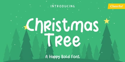 Christmas Tree is fun display font created to help spread holiday cheer. Get inspired by its charming appearance! Its perfectly suited for crafter and graphic artist to complete their design such as invitation, advertisement, poster, logo, birthday, product sign, and many more! Christmas Tree Font is also Lightweight and contains All Standard glyphs and punctuations and can be used beside any font.
 - Eastside Brush by Adam Fathony,
$12.00 Eastiside Brush is Inspired by a casual style from sign painter who create a beautiful lettering trademark. A classical, timeless, and contemporary. Eastside Brush comes with 3 style, That's script style, cursive style, and capital style for all caps letter. It s should be easy to mix and match which best style for your design. Multiple language are available to all fonts.
 - Child by Trim Studio,
$12.00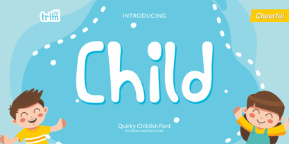 Child is a cute and quirky display font. It will attach a very playful and childish style to any design you wish to develop! Its perfectly suited for crafter and graphic artist to complete their design such as invitation, advertisement, poster, logo, birthday, product sign, and many more! Child Font is also Lightweight and contains All Standard glyphs and punctuations.
 - Iowan Old Style by ParaType,
$30.00 Iowan Old Style was designed for Bitstream in 1990 by noted sign painter John Downer. Iowan Old Style is a hardy contemporary text design modeled after earlier revivals of Jenson and Griffo typefaces but with a larger x-height, tighter letterfit, and reproportioned capitals. Cyrillic letters were designed by Natalia Vasilyeva in 2016. Iowan Old Style Cyrillic was released by Paratype in 2017.
 - Luxgard Steel by Tadiar,
$23.00 Luxgard Steel is an unique vintage color gradient vector SVG font created for such areas as Media & Entertainment, Food & Drinks, Clothes, Music, Games & Applications, etc. with Multilingual support. Well use in vintage labels, headers & titles, Posters, Street Signs and other Outdoor, Package Design. Luxgard Steel is derivative from Luxgard Layered font (it is also cool and flexible): https://www.myfonts.com/collections/luxgard-font-tadiar
 - Taco by FontMesa,
$25.00 Taco is a new Mexican style font family based on our Tavern and Algerian Mesa type designs. When I finished the extra heavier weights for Tavern I decided to play around with a decorated version, the extra bold letters allowed for much more room to work with an inlay pattern. After experimenting with several designs I decided on a Mexican pattern because the original base font is very popular in Mexican restaurant logos and menus plus it's frequently used on Tequila bottle labels. I originally planned three weights for the Taco font family, however, after completing the bold weight I've decided to release it now so you may put it to use while the regular and extra bold are being produced, sorry I can't estimate a release date for the two other weights. To use the fill font layers you'll need an application that allows you to work in layers such as Adobe Creative Suite products. The Taco Fill Uno font may be used as a stand alone font, however, we recommend searching for our Tavern font family where you'll find three different bold weights of this same design. Opentype features aware applications are also needed for accessing the many alternate glyphs in Taco, all the alternates that you love in our Tavern fonts are also available in Taco. While the fill font layers are in registration with one another some applications may throw them out of alignment by changing the spacing. Custom inter letter spacing in Adobe Creative Suite may also throw the fill fonts out of alignment. We recommend doing your custom spacing first then duplicate the type layer and change to the next fill font and color. The inspiration for the Taco name of this font family was from a homemade Taco dinner I made for a guest at my house, after dinner I searched to see if there was a commercial font named Taco. There was no such font named Taco and the rest is history. The old Stephenson Blake Algerian font has come a long way since 1908, and we're not done with it yet. We hope you enjoy our Taco font family, we're looking forward to see it in use.
 - Boncaire Titling by insigne,
$22.00 Inspired by the type elements of 17th century Dutch mapmaking, Boncaire Titling provides you with a historic yet adventurous look for your library. This addition from insigne found its muse in a map of Curacao by Dutch cartographer Gerard Van Keulen, a member of the prosperous Van Keulen family from Amsterdam, who were engaged in the manufacture of maps for seafaring. Much thanks on this project goes to The Norman B. Leventhal Map Center, housed at the Boston Public Library. Through the centers kindness, I was able to view a number of period maps in person and to meet with curators, who explained more about the Van Keulen family and the way maps of the period were created. While I studied the maps, I narrowed in on some of the original types unique idiosyncrasies. For instance, the long, exaggerated serifs, which give the forms a sense of stability, aid in the faces legibility--largely a byproduct of the engraving method that was used to create the metal plates for manufacturing these maps. In creating Boncaire Titling, I decided to capture these unique idiosyncrasies, embracing the character of the engravings rather than removing them entirely through over-refining the forms. The result is an elegant family with far more than seafaring potential. This font has a full range of six weights, from thin to black. It also includes a wide variety of OpenType alternates. All insigne fonts are fully loaded with OpenType features. Boncaire Titling is also equipped for complex professional typography, including alternates, smaller titling caps and plenty of alts, including normalized capitals and lowercase letters. There are over 30 autoreplacing ligatures, and the face includes a number of numeral sets, including fractions, old-style and lining figures with superiors and inferiors. OpenType capable applications such as Quark or the Adobe suite can take full advantage of automatically replacing ligatures and alternates. You can find these features demonstrated in the .pdf brochure. Boncaire Titling also includes the glyphs to support a wide range of languages, including Central, Eastern and Western European languages. In all, Boncaire Titling supports over 40 languages that use the extended Latin script, making the new addition a great choice for multi-lingual publications and packaging. Maps are fascinating; they come with the promise of treasure to be uncovered. Examining the map itself, too, you can find great wealth in the details so artfully condensed to that single piece of paper--details carried over into this new insigne font. For your next project, explore the imagination potential in Boncaire Titling.
 - TT Tunnels by TypeType,
$29.00 TT Tunnels useful links: Specimen | Graphic presentation | Customization options TT Tunnels is a modular font family with narrow proportions and a large number of pronounced visual compensators. In the basic version of the typeface, all glyphs have simple chopped shapes, created according to the usual geometric principles. In the alternative version of TT Tunnels, which becomes available when you turn on OpenType feature stylistic alternates or stylistic set 1, the typeface comes to life and turns into a stylized ductal gothic grotesque, in which the design of glyph forms is created based on the pen movements. Despite the fact that TT Tunnels was created as a display typeface for use in short inscriptions and titles, it works very interestingly in the body text, adding a small touch of archaics. This is especially evident in the Bold and Black faces, when the rhythm and thickness of the strokes create a dense set, covering the paper with a solid, dense pattern. The density and style of such a set conceptually refers us to the old Gothic texture and the Old Slavonic script. In addition to a larger number of alternates for lowercase letters, the typeface features an alternate for number 2, an alternate slashed zero, many ligatures, and other useful OpenType features (ordn, frac, sinf, sups, numr, dnom, case, tnum, onum, pnum, liga, salt, ss01, zero). The TT Tunnels includes five faces: Thin, Light, Regular, Bold, Black.
 - Neonline by Ditatype,
$29.00 Neonline is a captivating display font that combines rounded letterforms with a subtle neon-inspired style. With its elegant uppercase characters and unique design, this typeface adds a touch of sophistication and modernity to your projects. The defining feature of Neonline lies in its rounded shapes, which exude a sense of softness and approachability. Each letter is meticulously crafted with smooth curves, creating a harmonious and pleasing aesthetic. The rounded forms give the font a friendly and inviting appearance, while the subtle neon style adds a hint of excitement and vibrancy. Neonline infuses a sense of allure and intrigue into each character. The font captures the essence of neon signs, casting a subtle glow that evokes a contemporary atmosphere. The neon style adds a touch of modernity and visual interest without overwhelming the design. The uppercase letterforms of Neonline are refined and sophisticated, commanding attention with their rounded shapes. The moderate boldness of the letters strikes a balance between impact and legibility. Enjoy the various features available in this font. Features: Alternates Multilingual Supports PUA Encoded Numerals and Punctuations Neonline perfect for headlines, branding materials, titles, and designs that call for a touch of elegance with a hint of neon inspiration. Whether you're creating posters, logos, packaging, or anything in between, this font will elevate your projects with its unique charm. It particularly shines in applications related to fashion, beauty, technology, and modern lifestyle themes. Find out more ways to use this font by taking a look at the font preview. Thanks for purchasing our fonts. Hopefully, you have a great time using our font. Feel free to contact us anytime for further information or when you have trouble with the font. Thanks a lot and happy designing.
 - TT Livret by TypeType,
$39.00 If you still think that an antiqua is a typeface with a strong historical character that difficult to apply in modern realities, meet the new typeface from TypeType! TT Livret is an elegant, modern and functional antiqua featuring a calm text and an expressive display subfamily. TT Livret useful links: Specimen | Graphic presentation | Customization options This font looks harmonious in books and other periodicals, on posters or on magazine covers. The scope is not limited to the printing industry, because TT Livret looks aesthetically pleasing wherever text is used. The text subfamily has uniwidth proportions and a calm spirit, oval round characters, free spacing and more open apertures. The glossy display subfamily is proportional and has round signs that are as close to a circle as possible, the apertures are closed, and the spacing is dense. The font has an intermediate subfamily - Subhead, which can look more relaxed when used as text font, or be contrasting and used as a display font. In TT Livret, we have embodied the idea of an antiqua that will be comfortable to use in modern realities. This is a functional font, where the text face does not distract from reading, and the display face, on the contrary, attracts attention. The TT Livret font family consists of 32 faces: 15 upright, 15 oblique, and 2 variable fonts. Each face has 1031 glyphs. The font contains 26 OpenType features, as well as a large number of ligatures. There are many alternative characters in italics, which are especially diverse in Cyrillic.
 - Mercurial by Grype,
$16.00 Geometric/Technical style logotypes have been developed for car chrome labels since the early 1980’s, but automobile companies don't monopolize the style by any means. During the 80’s and 90’s, a lot of these logos leaned towards the geometric sans styles and the swiss styling of fonts like Handel Gothic, while playing with varying degrees of squared rounds and varying expanded widths per logotype. Mercurial has this flavor, but it wasn’t derived from logotypes. Instead, it began as a digitization of a film typeface from LetterGraphics in the early 70's known as "Sam". It visual ties to this genre of automotive logotypes and fonts like Handel Gothic lend a familiarity to it, yet it has an identity all its own. As with so many automotive logotypes, this singular style film typeface, lacked an expansive family which shows off all potential the logotypes have and what they "could" be and do. And that's where we come in. What originally began as this family’s Regular Width - Bold Style has been expanded into a collection of 3 Width Families, each containing 5 Weights. Here’s what’s included with the Mercurial Complete bundle: 396 glyphs per style - including Capitals, Lowercase, Numerals, Punctuation and an extensive character set that covers multilingual support of latin based languages. (see the final poster graphics for a preview of the characters included) 3 widths in the collection: Narrow, Regular, & Wide 5 weights in each width family: Light, Book, Regular, Medium & Bold. Here’s why the Mercurial Family is for you: - You’re in need of stylish sans font family with a range of widths and weights. - You’re love those 80’s automotive logos, but want more range of use. - You’re looking for an alternative to Handel Gothic. - You’re looking for a clean techno typeface for your rave poster designs. - You just like to collect quality fonts to add to your design arsenal.
 - Rolling Pen by Sudtipos,
$79.00 After doing this for so many years, one would think my fascination with the old history of writing would have mellowed out by now. The truth is that alongside being a calligraphy history buff, I'm a pop technology freak. Maybe even keener on the tech thing, since I just can't seem to get enough new gadgets. And after working with type technologies for so many years, I'm starting to think that writing and design technologies as we now know them, being about 2.5 post-computer generations, keep becoming more and more detached from what the very old humanity arts/tasks they essentially want to facilitate. In a world where command-z is a frequently used key combination, it’s difficult to justify expecting a Morris-made book or a Zaner-drawn sentence, but accidental artistic “mutations” become welcome, marketable features. When fluid pens were introduced, their liquid saturation influenced type design to a great extent almost overnight an influence professional designers tend to play down. Now round stroke endings are a common sight, and the saturation is so clean and measured, unlike any liquid-paper relationship possible in reality. Some designers even illustrate their work by overlaying perfect circles at stroke ends, in order to illustrate how “geometric” their work was. Because if it’s measured with precise geometry, it’s got to be meaningful design. And once in a while, by a total freak accident, the now-cherished mutations prove to have existed long before the technology that caused them. Rolling Pen was cued by just such a thing: A rounded, circular, roll-flowing calligraphy from the late nineteenth century seemingly one of those experimental takes on what inspired Business Penmanship, another font of mine. Looking at it now it certainly seems to be friendlier, more legible, and maybe even more practical and easier to execute than the standard business penmanship of those days, but I guess friendliness and simplicity were at odds with the stiff manner business liked to present itself back then, so that kind of thing remained buried in the professional penman’s oddities drawer. It would be quite a few years before all this curviness and rounding were thought of as symbolic of graceful movement, which brought such a flow closer to the idea of fine art. Even though in this case the accidental mutation just happens to not be a mutation after all, the whole technology-transforms-application argument still applies here. I'm almost sure “business” will be the last thing on people’s minds when they use this font today. One extreme example of that level of disconnect between origin and current application is shown here, with the so-called business penmanship strutting around in gloss and neon. Rolling Pen is another cup of mine that runneth over with alternates, swashes, ligatures, and other techy perks. To explore its full potential, please use it in a program that supports OpenType features for advanced typography. Enjoy the new Rolling Pen designed by Ale Paul with Neon’s visual poetry by Tomás García.
 - PG Grotesque by Paulo Goode,
$30.00 This is my interpretation of Edel Grotesk – a “lost typeface” from circa 1914 produced by Johannes Wagner GmbH of Ingolstadt, Germany. PG Grotesque is definitely not a revival, or even a faithful reproduction of that typeface as I was unable to source enough accurate references. What I have done is take the essence and unique characteristics of that typeface and brought this forgotten gem right into the 21st century. The full family features 99 fonts spread across 9 weights and 6 widths. PG Grotesque is also available as a single variable font so that you can fine tune the width, weight, and italic angle to your exact preference. Distinctive features include high-waisted capitals, a straight-legged capital ‘R’, and flattened arches in the ‘a’ and ‘g’ glyphs. Using PG Grotesque will give your typography a distinctly retro feel with its vintage heritage inherent in every character. You will find this is an incredibly versatile typeface with added value from its extensive language coverage along with small caps availability at the click of a button. PG Grotesque will prove to be a valuable asset in your type arsenal. Test drive PG Grotesque today – both the Regular and Italic fonts are offered as a free download. See full details and hi-res images at https://paulogoode.com/pg-grotesque Key features: 9 Weights 6 Widths 99 Fonts Small Caps Old Style Figures European Language Support (Latin) 550+ Glyphs per font
 - Getty Dubay by Handwriting Success,
$9.00 The Getty-Dubay® family of fonts has been 500 years in the making — so that you can make your handwriting worksheets in seconds. These fonts are modern descendants of the chancery handwriting style (now called “Italic”) from the Italian Renaissance, when master scribes designed a fluid and graceful hand, inspired by the proportions of the golden rectangle and Roman capitals. The Italic style has been in constant use since then. In modern times, it has been celebrated by Alfred Fairbank, Lloyd Reynolds and many others including authors Barbara Getty and Inga Dubay in their Getty-Dubay® Italic method. The Getty-Dubay® monoline handwriting fonts provide a replete resource to effectively model the highly-legible and beautiful Italic handwriting style. These are the official fonts of Getty-Dubay® Italic. Download the Getty-Dubay® Font Guide for everything you need to know about the Getty-Dubay® fonts. The Getty-Dubay® Joined fonts produce a clean cursive handwriting with join-as-you-type ease. Four join options are included: Standard, Pointed (altered joins into m, n and r), e k (utilizing the two-stroke e and one-stroke k), and Beginning (easiest joins only). The Getty-Dubay® Basic fonts provide sans-sarif clarity suitable for young writers. The Getty-Dubay® Precursive fonts add serifs to the lowercase letters, while retaining the pure Roman capitals of Basic Italic. The Getty-Dubay® Smallcaps fonts make mixed capitals easy to use. All Getty-Dubay® fonts come with scaffolds such as dashed contours, ruled lines, directional arrow and starting dots (for Basic and Smallcaps). They support multiple Latin-based languages from around the world. Getty-Dubay® is a registered trademark in the United States.
 - Berling Nova by Linotype,
$29.99Swedish designer Karl-Erik Forsberg created the original Berling typeface in 1951. Owned by Verbum in Sweden, Berling was completely redesigned and released in 2004, under the name Berling Nova. Forsberg (1914–1995) is considered one of Sweden’s most masterful graphic designers, and his original Berling has come to be seen as possibly the most definitive Swedish typeface. But a redesign was necessary in order to secure that the spirit of Berling would survive in the digital age. Linotype, the distributor of the original Berling™ , provided its collection of source materials to the designers working on Berling Nova. Additionally, Akira Kobayashi — Linotype’s Type Director — lent them his advice as their project advanced. Berling Nova is available in two optical sizes: Text and Display. The original Berling was a classic Renaissance roman face, with fine terminals and sharp, beak-like serifs. If one looks at Berling’s old lead type proofs in the smaller type sizes, it is clear that these had a fuller and more readable form than in later digital versions. So, in order to help return the new Berling Nova to its original splendor, both the base forms and the serifs were softened and inflated. In the text version, the x-height has been increased a bit (by 4%), the diagonal axis is less apparent, and special glyph ranges, such as those for small caps and old style figures, have been included in the font’s character sets. The display version still has the unmistakable “Berling” character that displays Forsberg’s mastery. Berling Nova is well suited for longer text passages in books, publications, and magazines. This typeface fulfils all the demands that one can make on a legible newspaper typeface. Access to both text and display versions are important to the demanding typographer. This is the first time since the typeface was digitalized that it is possible to use it in order to create truly beautiful and functional typography in all type sizes. - Stinger by Zetafonts,
$39.00 Since their first appearance as Italians on the pages of the 1821 William Caslon type specimens, reverse contrast typefaces have been typography's best loved quirky outcasts. Subverting the traditional relationship between thick verticals and thin horizontals made them perfect for eye-catching advertisements. The unexpected contrasts and the thick slabs produced by reverse-contrast serifs became ubiquitous in period posters, and synonymous with wild west and circus iconography. In designing Stinger, the Zetafonts design team composed by Maria Chiara Fantini, Andrea Tartarelli and Francesco Canovaro and orchestrated by Cosimo Lorenzo Pancini decided to marry this subversive tradition with the workhorse approach of modernist sans serif typefaces like Univers, developing a super-family with four widths, each in five different weights, from thin to heavy. This gives the designer a full range of options for type setting, with the Normal and Fit widths providing two different text-sized alternatives, the wide width adding display and titling options and the Slim ready to deal with the space-saving necessities of extremely long texts. True italics have been added developed for all weights and variants, bringing the Stinger family to a total of 40 fonts, with a latin extended + Russian Cyrillic character set covering over 200 languages, and open type features including positional numbers, stylistic sets and alternate forms. In the crowded panorama of contemporary grotesque typefaces, all aiming to stark geometric perfection, Stinger stands out with its bold choices and strong personality. From the calligraphy-inspired terminals in the thin weights to the logo-ready sculptural approach in the heavy weights, each variant manages to look striking without forgetting the readability and flexibility lessons of modern reverse-contrast classics like those designed by Excoffon or Novarese. A variable version is included with the full family, allowing maximum flexibility and control for the designer over the wide range of expression capabilities of the Stinger super family.
 - Flink by Identity Letters,
$25.00 The joy of pure geometry, revisited. Geometric typefaces are a staple in every typographer’s toolbox since the 1920s. It was a time when iconic faces such as Futura, Erbar, and Kabel appeared on the scene and turned the world of type upside-down. Inspired by those early giants as well as later epigones with a legacy of their own (such as 1970’s Avant Garde Gothic), Flink is the Identity Letters take on this genre, characterized by a clean and focused appearance. With neat shapes and the look of pure geometry, Flink adapts to a vast range of applications and topics, from the fine print in contract to website body copy to logo design to billboard-size slogans. Its x-height is considerably larger than in classic geometric sans-serif fonts; its proportions are harmonized as opposed to strictly constructed. This makes for a more contemporary look, setting it apart from the classics. To further reduce the rigidity of a purely geometric composition, you can replace some letters with more humanist alternates, such as a, g, j, etc. This font family comes along in 8 weights from Thin to Black. Each weight consists of an Upright and Italic version. There are more than 750 characters per style, including two stylistic sets that offer variations to the look and feel of Flink, making it even more versatile. Plenty of additional Open Type Features like ligatures, case sensitive forms, old-style figures, and symbols make Flink a valuable tool for the discerning typographer. Flink is the reimagination of a classic genre, designed to suit the needs of our time. ––––– Please note: There is an upgraded Version available: Flink Neue
 - Boldini by Luxfont,
$18.00 Introducing the unique family of COLORED fonts "Boldini" with minimalistic clean letters of a harmonious form in the style of modern POP culture. You no longer need to adjust the gradient for each letter, letters are immediately printed in gradient! Gradient fonts is perfect for headlines for fashion websites, magazines, and print design, and the basic solid font is suitable for branding boutique signs as well as for large amounts of text, because the font is very readable in a small size. Font family has two thicknesses - bold & regular, 6 gradient directions, gradient fonts also 2 type - with transparency and without transparency, as well as 2 basic monochrome fonts. Font consists of letters of the same height without division into uppercase and lowercase glyphs. *See also these fonts, which based on this family: Culoare & Anaglyph. Which means that if necessary you can combine these families and they will be absolutely stylistically identical and complement each other. Check the quality before purchasing and try the FREE DEMO version of the font to make sure your software supports color fonts. Features: Such color combinations in gradients are universal and very convenient for repainting. IMPORTANT: - OTF SVG fonts contain vector letters with gradients and transparency. - Multicolor OTF version of this font will show up only in apps that are compatible with color fonts, like Adobe Photoshop CC 2017.0.1 and above, Illustrator CC 2018. Learn more about color fonts & their support in third-party apps on www.colorfonts.wtf - Don't worry about what you see all fonts in black and not in multicolor in the tab “Individual Styles” - all fonts are working and have passed technical inspection, but not displayed in multicolor they, just because the website MyFonts is not yet able to show a preview of colored fonts. Then if you have software with support colored fonts - you can be sure that after installing fonts into the system you will be able to use them like every other classic font. Question/answer: How to install a font? The procedure for installing the font in the system has not changed. Install the font as you would install the classic OTF | TTF fonts. How can I change the font color to my color? · Adobe Illustrator: Convert text to outline and easily change color to your taste as if you were repainting a simple vector shape. · Adobe Photoshop: You can easily repaint text layer with Layer effects and color overlay. Try to experiment, it is so interesting and very easy! ld.luxfont@gmail.com
 - Alternate Gothic Pro by SoftMaker,
$14.99 Alternate Gothic Pro is one of the fonts of the SoftMaker font library. Designed by Morris Fuller Benton in 1903 as a complement to his Franklin Gothic type, Alternate Gothic was created to solve a common problem: fitting headlines in narrow columns. For that purpose, it comes with three similar styles of varying widths. SoftMaker’s Alternate Gothic Pro typeface family contains OpenType layout tables for sophisticated typography. It also comes with a huge character set that covers not only Western European languages, but also includes Central European, Baltic, Croatian, Slovene, Romanian, and Turkish characters. Case-sensitive punctuation signs for all-caps titles are included as well as many fractions, an extensive set of ligatures, and separate sets of tabular and proportional digits.
 - Anelo by SullivanStudio,
$9.95 Anelo is about beauty with objectivity. A handmade sans serif with a humanist style. 889 Latin and Greek glyphs covering lots of Western and Eastern European alphabets. You can use Anelo from a LaTeX equation (there are 117 Greek/Coptic glyphs; please see image #6 in the gallery for an example of an Anelo/Computer Modern combination) to billboards and traffic signs. Its crisp, upright, handmade aspect takes communication to a direct and personal level. Anelo has some important OpenType features, like kerning, standard ligatures, old style/tabular/proportional figures and diagonal fractions. There are 25 currency symbols, including Euro ₠ €, Shekel ₪ and Bitcoin ₿. Each Anelo style has a condensed version, which gives room to many interesting combinations. For best results on screen, the Semibold Family is recommended.
 - Equip by Hoftype,
$49.00 Equip, a new versatile geometric sans face in 16 styles, designed on a geometric base, forms together with EquipCondensed and EquipExtended a superfamily of 48 styles. Low contrasted lines and a sturdy ductus give it a strong appearance. It looks open, generous and unsentimental. A large selection of weights and many useful OpenType features allow an easy adjustment for a wide range of applications, in print and on the web. Equip is very well suited for ambitious typography. The Equip family comes in OpenType format with extended language support. All weights contain semi-ligatures (design optimized single characters), proportional lining figures, tabular lining figures, proportional old style figures, lining old style figures, matching currency symbols, fraction- and scientific numerals and arrows.
 - Rotulo Variable by Huy!Fonts,
$195.00 Rotulo Variable is a contrasted sans family which combines the Thick & Thin signpainter's style and some 70s feeling in a huge font family with three axis: Width, Weight and Slant. A visit to an exhibition of Spanish movie posters by Jano was the beginning of Rótulo (Spanish for Sign) project. Classic thick & thin signpainter style was featured in many letterings of those posters, as it was a very common style in 60s and 70s Spanish design. Unfortunately, today very few Contrasted Sans are seen, something that was quite common years ago has fallen into disuse in favor of Helvetic monotony. Rótulo recapture all that personality, with an extense range of weights and widths to be used in striking headlines and short texts.
 - Street Wars by SemutHitam,
$19.00 Street Wars is an Oldschool Graffiti Tag Fonts, Back to Basic!!! For those of you who want a more funky design look. In the graffiti world, usually you'll use the initials as a sign of your masterpiece, or you use it for a graffiti battle. Street Wars present to you, Inspired from old style graffiti tagging. Street Wars Includes full set of funky uppercase, lowercase letters, numbers, punctuation, multilingual language, stylistic styles and various ligatures. To make you easily mix and match your own graffiti style tag. to use various style you have to use software that supports OpenType features. We hope you enjoy with Street Wars. Feel free to comment and give any feedback to build more good font. Thanks for your purchasing, and Happy creating... :)
 - Goneon by Ditatype,
$29.00 Goneon is a vibrant and eye-catching display font designed to bring the electrifying energy of neon lights to your designs. With its big, bold uppercase letterforms and mesmerizing neon style, this typeface captures the essence of a lively and dynamic atmosphere.. Each letter is meticulously crafted to emanate a radiant and electrifying glow, just like the vibrant neon signs that illuminate city streets at night. This neon style adds a touch of excitement and energy, instantly drawing the viewer's attention. Inspired by the pulsating rhythm of city nightlife, Goneon exudes a sense of modernity and vibrancy. The font captures the essence of an urban atmosphere, casting a dazzling neon glow that creates a lively and captivating visual impact. Each letter radiates with an unmistakable charm, bringing your designs to life with its electrifying vibes. Features: Alternates Multilingual Supports PUA Encoded Numerals and Punctuations Goneon perfect for headlines, banners, posters, and any design that requires a bold statement. The neon style adds an extra layer of excitement, making your text shine with a dynamic and eye-catching appeal. Whether you're working on advertising campaigns, event promotions, digital artwork, or any creative project that calls for a lively aesthetic, this font will instantly infuse your designs with an electrifying energy. It particularly shines in applications related to nightlife, entertainment, music, and urban-themed designs. Find out more ways to use this font by taking a look at the font preview. Thanks for purchasing our fonts. Hopefully, you have a great time using our font. Feel free to contact us anytime for further information or when you have trouble with the font. Thanks a lot and happy designing.
 - ATF Headline Gothic by ATF Collection,
$59.00 ATF Headline Gothic cries out to be used in headlines, and that is exactly how it was used after it was first created by American Type Founders in 1936 with newspapers in mind. It would be hard to imagine a better typeface for a shocking, front-page headline in a scene from an old black-and-white movie. With its all-caps character set, and its big, bold, condensed design, ATF Headline Gothic is the epitome of its name. “Extra! Extra!” The style of ATF Headline Gothic recalls the bold, condensed gothic display faces of the 19th century, but with more refinement in its details than many large types of the time (typically wood type). Its most recognizable trait is the restrained, high-waisted M, with short diagonal strokes that end with their point well above the baseline; this avoids the sometimes cramped look of a bold condensed M with a deep “V” in the middle, common in many similar headline faces. The digital ATF Headline Gothic comes in a single weight, all caps, like its predecessor, but offers two styles: one crisply drawn, and a “Round” version with softer corners, to suggest a more “printed” feel, reminiscent of wood type. Of course, in either style it includes a full modern character set, including symbols such as the Euro, Ruble, and Rupee, that didn’t exist in 1936.
 - Chalice by Canada Type,
$24.95Chalice is a new original Canada Type family inspired by two different engraving eras and locations: Medieval England and 19th century Russia. Chalice's construct is geometric at heart, though the wedge serifs and their contribution to the overall idiosyncrasies of the counterspace give it a spirit entirely different from usual geometric types. Chalice's personality is that of a knowledgeable advisor, clinical yet old-fashioned, aware yet unsurprised, secular yet serene, clear yet artistic, hungry yet redeemable. Chalice comes in 4 weights, light to black, that range in expression from a sobering wise whisper of confidence all the way to the bells and whistles of Judgment Day. Such flexibility in expression among the different weights of the same typeface of this kind is quite rare, and will be appreciated by discriminating graphic artists who require more than just another tombstone type. Chalice's character set comes fully loaded across all 4 weights. Two dozen alternates are built into the map, including unicase variations on the a and e, double-barred alternatives for A, E, F, H and S, and connecting versions of b, d, f, h and t. Such variety gives the user to subtly define the set type without overpowering it. Chalice comes in all popular font formats, and is available in single weights, as well as one complete affordable package.