10,000 search results
(0.04 seconds)
- Gal Sans O Type by O Type Foundry,
$29.00 O Type Foundry published the unique 'Geometric Mechanic Sans Serif' in 2023, a typeface that Galang Persada had been perfecting since 2013. Attention all graphic designers! Are you tired of using the same old fonts and design elements in your projects? Look no further than Gal Sans, the newest geometric mechanic sans serif font on the market. With its clean lines and modern aesthetic, Gal Sans is the perfect addition to any designer’s toolkit. Its versatility makes it suitable for a wide range of design projects, from logos to website text. Plus, its minimalist design adds an elegant touch to any composition. Don’t settle for ordinary – elevate your designs with Gal Sans. Try it out today!
 - Ribera by URW Type Foundry,
$39.99 Ribera is a contemporary sans serif typeface including three styles. The Ribera characters have smooth curved spins and little contrast combined with a big x-height and big counters. These characteristics make Ribera ideal for almost any type of graphic design. Its unique look is well suited for corporate identity, its precise drawing for branding and poster design, the fresh look for advertising and the clear appearance for sign posting. But also editorial design benefits from Ribera. It expresses a modern look in headlines and stays highly legible in small sizes. As part of the URW++ SelecType collection, Ribera meets very high quality standards. The character set includes various OpenType features and a broad language support.
 - Cretina by Supfonts,
$17.00 Cretina is amazing clear lettering font, every single letters have been carefully crafted to make your text looks beautiful. With lettering script style this font will perfect for many different project ex: quotes, blog header, poster, wedding, branding, logo, fashion, apparel, letter, invitation, stationery, etc. FEATURES: Cretina OTF & TTF Multilingual support Alternates / Swashes / Ligatures Thanks for looking. Check out my blog: instagram.com/media.lab.co pinterest.com/dmitriychirkov7
 - Hengela Script by Hrz Studio,
$14.00 Hengela - is a modern script calligraphic typeface with some alternate bonds and strokes. This font is created in a modern style with a start and end that is very beautiful, elegant, very casual and will suit many of your design needs Perfect for logos, branding, titles, social media posts, advertisements, product packaging, product designs, labels, photography, signs water, special events, magazines, web design, etc.
 - New American Gothic by Palmer Type Company,
$50.00 New American Gothic is a revival of my previous American Gothic, only now it is packed with a whole set of new features! This is a revival font which means you can seamlessly go from thin to bold all within a single font file. Way more symbols and special characters, multi-language support, even alternates and ligature combinations are included to make fun and creative designs with!
 - bearerFond by JOEBOB graphics,
$9.00 BearerFond has been in my pen for years and I've used this way of writing a lot on cassette cases. Anyone still using cassettes? Me neither, so in order to keep it alive I have made a font out of it and named it bearerFond; as in bearer bond, since it looks like it could be used on official documents. Nothing too official though.
 - Dic Sans by CAST,
$70.00 DicSans is a square sans-serif typeface, inspired by Aldo Novarese’s Eurostile, it was meant as a sort of contemporary "open" Eurostile. It is a semi-custom font, designed and expanded according to costumers’ requests, since 2004 up to 2013. For this reason it has many glyph variants (up to three variants per lowercase glyphs and numbers, special smallcaps etc.) and wide language coverage.
 - Hazzard by Dirtyline Studio,
$32.00 Hazzard is a script that is inspired by a retro style and combination with hand lettering style. I have made with personality in every single curve. I hope this can inspire your work with its very bouncy baseline. It also includes a super handy set of bonus swashes. Hazzard is ideal for logos, handwritten quotes, product packaging, header, poster, merchandise, social media & greeting cards.
 - LP Hand Eins by URW Type Foundry,
$19.99 LP Hand Eins is a typeface designed by German type designer Peter Langpeter. LP has been running his own design studio since 1995, working as a typeface and logo designer, as a calligrapher, cartographer and illustrator. During this time LP created a large number of excellent new typeface designs. LP Hand Eins is well-suited for plenty of applications, e.g. personal correspondence, invitations, greeting cards etc.
 - Madayuki by Gatype,
$14.00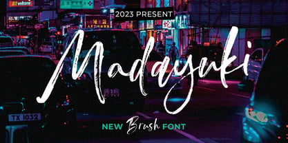 Madayuki Brush handmade It comes with a signature and unique style that is perfect for making any design stand out! This font is perfect for branding, wedding invitations, magazines, mugs, business cards, quotes, posters and more. Help File Madayuki Type Features: Uppercase - Lowercase Numbers & Punctuation Perfect for Headlines, Logotypes, Signs, Posters, Letterheads, T-Shirts and more. Supports International Languages Hope you enjoy with our Fonts Thank You!
 - Mission Accomplished by Hanoded,
$15.00 Mission Accomplished is a fast and furious kind of font. I started jotting down letters with a marker pen as fast as I could to see what would come out. Well, this font came out. Mission Accomplished can be used virtually anywhere, but single origin coffee bean packaging and artisan marmalade labels come to mind. Comes with a bunch of cute discretionary ligatures as well!
 - Specta Retro Script by Identitype Co,
$20.00 Specta Typeface Inspired by Retro style and combination with Hand Lettering style. I'm made with personality touch every single curve. I hope this can make inspire you from your work. and a very bouncy baseline It has a perfectly paired complimentary marker font , and a super handy set of bonus Swash. Ideal for logos, handwritten quotes, product packaging, header, poster, merchandise, social media & greeting cards.
 - Heavy Brush by Rochart,
$15.00 Heavy Brush is my hand drawn brush font, and makes with original brush paint, by using high resolution brush stroke images with incredible definition. Its look natural. It will be great for Logotypes, Posters, Digital Lettering Arts, Clean Design, Branding Design, Sign, Merchandise and Social Media Posts. This font contain of Uppercase, Lowercase, Number, Symbol, Punctuation, also support multilingual and already PUA encoded. And swashes.
 - LP Horizont Caps by URW Type Foundry,
$19.99 LP Horizont Caps is another new font creation from German designer Peter Langpeter (lp-design.de). LP has been running his own design studio since 1995, working as a typeface and logo designer, as a calligrapher, cartographer and illustrator. During this time LP created a large number of excellent new typeface designs. LP Horizont Caps is a very futuristic looking, sharp and elegant sans serif.
 - Martie by Canada Type,
$25.00From the heart of the Blue Ridge Mountains, by way of Toronto, comes Martie's handwriting. Martie Byrd is a school teacher in Roanoke, Virginia, and a friend of Canada Type's Rebecca Alaccari. After years of admiring the cheer and clarity of Martie's handwriting, we asked her to write out full alphabets for some cool font treatment. The intent was to do three different versions of her writing in two different pens, then use the auto-magic of OpenType to determine letter sequences and rotate character sets on the fly when the fonts are in use. A successful endeavor it was. Take a look at the images in the MyFonts gallery to see the character rotation in action, along with a visual explanation of why Martie is not just another handwriting font. Unlike other available felt tip and ballpoint handwriting fonts, the regular and bold variations are style-based, not weight-based. They are the handwritten expressions of two different Sharpie pens: The fine point one (Martie Bold), and the ultrafine one (Martie Regular). The style-based variation considerably helps the realism needed in design pieces that take advantage of the contrast of two different handwriting fonts. Weight thickening in handwriting is an obvious mechanical effect that only happens with computers. Weight changing by replacing pens is what happens in the real world. Martie Pro and Martie Pro Bold each contain three different character sets in a single font. Language support includes Western, Central and Eastern European languages for all three sets. This translates into each Pro font containing over 750 characters. Add OpenType code and stir, and you have true handwriting fonts with versatility unavailable out there in anything else of the genre. A software program that supports OpenType features is needed to use the randomization coded in Martie Pro and Martie Pro Bold. Current versions of QuarkXpress and Adobe applications (Photoshop, Illlustrator, InDesign) do contain support for the randomization feature. But if you don't have one of these apps, you can still use the interchangeable Type 1 or True Type fonts and change the characters manually to achieve the appearance of true handwriting. The Martie fonts come in a variety of price packages, from the affordable single fonts to value-laden complete sets. All the proceeds from these fonts received by Canada Type will be donated 50/50 to two primary schools: One in Roanoke (where Martie teaches), and one in Toronto (where the 10-year old, real Canada Type boss goes). So next time a design project needs a handwriting font, do the write thing and use Martie to keep it real. - Madegra by Letterhend,
$19.00 Madegra is an elegant display serif family. It includes many alternates with swashes that can make your lettering and logotype become more interesting. The clean and neat of a serif combined with the swirl swashes makes this font even more unique, especially since this family has 9 weight styles which you can choose according your needs! This font works well in various formal forms such as invitations, labels, logos, magazines, books, greeting / wedding cards, packaging, fashion, make up, stationery, novels, labels or any type of advertising purpose. Features : uppercase & lowercase numbers and punctuation multilingual ligatures alternates swashes PUA encoded 9 Weight Styles We highly recommend using a program that supports OpenType features and Glyphs panels like many of Adobe apps and Corel Draw, so you can see and access all Glyph variations. Email us to letterhend@gmail.com if you need something! Happy Designing!
 - Meleo by Alexis Luengas,
$1.00 Meleo is a semiserif consisting of 10 fonts with a few original quirks but still very legible at both text and display sizes. Since its conception, the aim was a balance of uniqueness and functionality. The typeface owes its energy to the slight suggestion of calligraphic crafting and humanist structure. But it also breaks the rules: a small x-height and a whimsical uppercase with resemblance to the lowercase may render Meleo more friendly than a conventional (semi-)serif. Titles and texts of moderate length, like those found on websites, flyers and packaging, are the natural habitat of Meleo, but it may as well thrive under different settings. Meleo supports most of western-european latin languages which are included in the ISO-Adobe character set.
 - Power Breakfast by Hanoded,
$15.00 I am a firm believer in the fact that breakfast is the most important meal of the day. So, for the last 10 years (ever since I became a father), I have been serving my family a healthy breakfast. I live in The Netherlands, so the main portion of breakfast is bread, but I try to serve something ‘nice’ every day. Like strawberries, yoghurt with banana and brown sugar (not too much sugar!), oatmeal porridge or granola. I myself like Indonesian fried rice (nasi goreng) for breakfast, but I am afraid my kids won’t eat that in the morning… Power Breakfast is a handmade display font. Yes, it is wobbly, yes, it is uneven, but that’s what’s so darn good about it!
 - Simpliciter Sans by Cercurius,
$19.95 Simpliciter Sans is a typeface based on the lettering used in the 20th century on technical drawings, either written by free hand or using templates. The lettering was made with a round pen, therefore all lines got rounded ends. All lines had the same thickness in uppercase, lowercase and small caps. The upright style was used on construction drawings and the italic style on machine drawings. The backslant style was used on maps for names of water bodies — seas, lakes, rivers etc. — and for water depth. Simpliciter Sans is primarily intended for texts on drawings, diagrams, charts and maps, but it can also be used for signs and labels. It also works surprisingly well as a body type in smaller sizes.
 - Sinkin Sans Narrow by K-Type,
$20.00 Sinkin Sans Narrow is a simple, pleasantly proportioned and easy to read sans-serif, available in all 9 standard web weights, 100 to 900, plus italics, so the face is a comprehensive illustration of the CSS web font numerical scale. Sinkin Sans fonts are designed with tiny, inconspicuous notches that sink into verticals at the intersections of strokes, adding highlights to congested corners. The incisions make right angles appear sharper and improve definition in more intricate characters. Sinkin Sans Narrow inherits the enviable clarity and readability of the luxuriously wide original family. The Narrow typeface, however, is designed to economise on space within busy web pages and has been sensitively condensed for maximum legibility. Each weight of Sinkin Sans Narrow is supplied with a free Italic.
 - HWT Lustig Elements by Hamilton Wood Type Collection,
$24.95 'Euclid. A New Type,' originally designed in the 1930s by modern American designer Alvin Lustig (1915-1955), has been revived as 'Lustig Elements' through a collaboration of designers Craig Welsh and Elaine Lustig Cohen. Only twelve letterforms from the original font design had been retained in archive material in the many decades since its initial development. Lustig Elements combines four simple, geometric shapes aligned to an underlying grid with letterform designs that hold true to the spirit of the original font. Lustig Elements initially came to life in 2015 as wood type cut at Hamilton Wood Type & Printing Museum. The digital version expands on the basic character set with a pro expanded latin character set, small caps and even an Inline variation.
 - Kingthings Scrybbledot Pro by CheapProFonts,
$10.00 A fun and charming scribbled alphabet - perfect for scrapbooking and that handmade look. Lots of technical details had to be fixed, but it now has a professional quality, and our impressive language support! :) Kevin King says: "The Scrapbooking People have asked for grungy fonts - and this is one of my efforts to comply. I scribbled the letters in Paint shop Pro and imported the results into my font program directly. This is the first font i have created directly on the computer without any paper sketches - I think it took considerably more work!" Kingthings Scrybble Pro is a dotless version - perfect if you like the scribbles, but not the splutter. ;) ALL fonts from CheapProFonts have very extensive language support: They contain some unusual diacritic letters (some of which are contained in the Latin Extended-B Unicode block) supporting: Cornish, Filipino (Tagalog), Guarani, Luxembourgian, Malagasy, Romanian, Ulithian and Welsh. They also contain all glyphs in the Latin Extended-A Unicode block (which among others cover the Central European and Baltic areas) supporting: Afrikaans, Belarusian (Lacinka), Bosnian, Catalan, Chichewa, Croatian, Czech, Dutch, Esperanto, Greenlandic, Hungarian, Kashubian, Kurdish (Kurmanji), Latvian, Lithuanian, Maltese, Maori, Polish, Saami (Inari), Saami (North), Serbian (latin), Slovak(ian), Slovene, Sorbian (Lower), Sorbian (Upper), Turkish and Turkmen. And they of course contain all the usual "western" glyphs supporting: Albanian, Basque, Breton, Chamorro, Danish, Estonian, Faroese, Finnish, French, Frisian, Galican, German, Icelandic, Indonesian, Irish (Gaelic), Italian, Northern Sotho, Norwegian, Occitan, Portuguese, Rhaeto-Romance, Sami (Lule), Sami (South), Scots (Gaelic), Spanish, Swedish, Tswana, Walloon and Yapese.
 - Naturaliya by Atharuah Studios,
$18.00 Introducing Naturaliya; An monoline script font! Naturaliya is a hand-drawn monoline script font that showcases beauty and balance in flawless writing. It's the perfect choice for stylish branding & logo projects, product packaging, handwritten quotes, editorial design, and more. What's Included: Naturaliya comes with a single font file that includes uppercase, lowercase, numbers, punctuation, and multilingual support. That's it! I hope you enjoy it. You can also say hello to me on Instagram: https://www.instagram.com/atharuah_ Thank You!
 - Mothman by Hanoded,
$15.00 In 1966 and 1967 a series of weird events spooked Point Pleasant, a small town in West Virginia. Townspeople described a creature that looked like a man, with red eyes and moth-like wings, which appeared at several locations around town. The Mothman myth was born. Mothman font is spooky as well. It is a very scratched and distorted typeface, completely hand drawn, using ink and various sharp utensils. Mothman font will surely leave a lasting impression!
 - Yacqui by Jonahfonts,
$45.00 In designing a font that had a Mayan or Aztec quality to it without the usual "Mariachi" look, I decided to make it single weight with some open ends and offbeat rounded serifs to give it a more serious feel which will lend itself to other non ethnic uses. I have added a few discretionary ligatures, which also contain old-style numerals, titling caps and small caps. Usage recommendations: Captions, packaging, cards, posters, ads, book jackets, manuals, and menus.
 - Aquari by Dominik Kowalik,
$50.00 A geometric typeface. Smooth corners are mixed with straight angles to form a strong. These make Aquari ideal for almost any type of graphic design. Its unique look is well suited for corporate identity, its precise drawing for branding and poster design. The character set includes various OpenType features and a broad language support with German and Polish special signs. Details include 3 weights, with European character set, manually edited kerning, stylistic alternatives and Opentype features.
 - Sarun Pro by Stawix,
$49.00 Sarun is a typeface that harmonises between Humanist, Geometric and Industrial Sans, it would be a bit problematic to define its definite character. Nevertheless, Sarun is very compatible with layouts and super easy to use in a variety of designs. Not only is Sarun equipped with Italic, Small Caps and a complete Alternate set, it also contains the 10 most significant Cryptocurrency signs. Sarun consists of 10 weights and 3 widths along with Italic in every styles.
 - Everest Pro by NicolassFonts,
$25.00 The complete family contains 24 weights, 1568 glyphs in each font, and supports OpenType features. RAlt sub-family has rounded corners. Everest Pro family is ideally suited for advertising, packaging, brand identity, books, magazines, logotype, software, sports as well as web and screen design. Everest Pro OpenType features list: zero, ordn, case, locl, c2sc, smcp, frac, subs, sinf, tnum, sups, numr, dnom, dnom, onum, lnum, pnum, ss01, ss02, ss03, ss04, ss05, ss06, ss07, ss08, ss09, dlig, liga, salt, hist
 - 1955 by Alan Smithee Studio,
$9.00 1955 Is a fresh grotesque interpretation. Any detail too historically referenced is replaced by strong geometry and idiosyncratic features. Round dots and punctuation, curved “l” foot, single storey “g” etc. all these details make 1955 a very contemporary typeface (unlike the name suggests!). With a range of weights going from Thin to Black including Italics, OpenType Features, extended character-set, tailored for print and digital, 1955 has everything to become your new go-to typeface for every project!
 - Historical by Runsell Type,
$9.00 Introducing Historical - Hand Drawn Script Historical consists of clean and textured feature as well as an aesthetic for premium logotypes. The family includes various script styles. Every single letter contains beautiful alternates characters (ss01 - ss10) and features ligatures. Historical can be applied in designs such as logotypes, brand, packaging, branding, quotes, business cards and more custom design. It features uppercase, lowercase, numeral, punctuation & symbol, ligatures, stylistic alternates, multilingual support, PUA encoded (fully accessible without additional design software).
 - Aurelia by Linotype,
$29.99The design for Aurelia is based on the forms of Jenson, an Old Style typeface developed by Nicolas Jenson in 1470 which still influences type design today. Zapf gave Aurelia a bit of his own personal style and adapted it to the demands of modern technology. The family of typefaces was originally designed for use with the typesetting machines produced by the German company Dr.-Ing Rudolf Hell GmbH which was later merged with Linotype. The name Aurelia is a nod to the Roman emperor Aurelianus (214–275), who built the Via Aurelia in Italy. Aurelia is a robust and classic font, suitable for both text and headlines. - Banner by URW Type Foundry,
$39.99 Jan Koller designed the Banner typeface family especially for the creation of animated web banners. Banner is best used at 80p without antialiasing. The family comes in 24 styles which, in combination, create great, unusual screen effects. Three different animation modells provide the basis: extrusion, cutting in/out by ‘pixelation’, outline pixel rotation. The available flash clip listed in the Related Links below demonstrates some of the effects. Take a look! The swf clip runs in any web browser (drag & drop) but you need the flash player plugin. Apart from animation use, Banner also works well in print. Since all 24 styles are identical in width and kerning, you can set several styles on top of each other, maybe using different colours for each style. Look at the nice effects yourself!
 - ITC Flora by ITC,
$40.99ITC Flora is the work of Dutch designer Gerard Unger, and is named for his daughter. He started by doing calligraphy experiments with felt-tip and ballpoint pens, and developed these drawings into a formalized script typeface. Swiss typographer Max Caflisch advised the Dr.-Ing Rudolf Hell GmbH technology firm to add a new round-nibbed script face to their Digiset type library, and in 1984, Flora was released by Hell. Unger used a chancery cursive skeleton in this design, which imparts grace and movement. Flora was also intentionally designed to be simple and sturdy, and with its minimal variation in thick/thin stroke ratio, it worked well on the early digital typesetting machines. In 1989, the International Typeface Corporation released the font. ITC Flora continues to work well on current printers and typesetters, and it has an enduring popularity for uses that range from short text passages to display headlines. - Kingthings Serifique Pro by CheapProFonts,
$10.00 This is what you get when you mix monoline rounded letters with some bracketed serifs and finish it off with a sprinkle of ornamental appendages. The result is very readable, rather original and quite charming. I have fixed some inconsistencies in serif designs across the weights, cleaned up the serif connections - and added a fourth weight. But I have kept all the wonky curves and slightly differing stroke thicknesses, as they are so integral to the charm. Kevin King says: "I guess all type designers at some point think 'Well, I'll just have a go at a standard text face...' There is a long story here somewhere, suffice it to say that I started with the thinnest version - typical. I wanted to make a standard serif text face - until I saw it in print and thought "Yuk! it looks like everything else!" - still does really but with twiddles and pooneys..." If you find the "twiddles & pooneys" too much you can tone them down with the OpenType Stylistic Alternate feature (which will make sure they don't appear on three consecutive letters) or remove them completely with the OpenType Swash feature. ALL fonts from CheapProFonts have very extensive language support: They contain some unusual diacritic letters (some of which are contained in the Latin Extended-B Unicode block) supporting: Cornish, Filipino (Tagalog), Guarani, Luxembourgian, Malagasy, Romanian, Ulithian and Welsh. They also contain all glyphs in the Latin Extended-A Unicode block (which among others cover the Central European and Baltic areas) supporting: Afrikaans, Belarusian (Lacinka), Bosnian, Catalan, Chichewa, Croatian, Czech, Dutch, Esperanto, Greenlandic, Hungarian, Kashubian, Kurdish (Kurmanji), Latvian, Lithuanian, Maltese, Maori, Polish, Saami (Inari), Saami (North), Serbian (latin), Slovak(ian), Slovene, Sorbian (Lower), Sorbian (Upper), Turkish and Turkmen. And they of course contain all the usual "western" glyphs supporting: Albanian, Basque, Breton, Chamorro, Danish, Estonian, Faroese, Finnish, French, Frisian, Galican, German, Icelandic, Indonesian, Irish (Gaelic), Italian, Northern Sotho, Norwegian, Occitan, Portuguese, Rhaeto-Romance, Sami (Lule), Sami (South), Scots (Gaelic), Spanish, Swedish, Tswana, Walloon and Yapese.
 - Vintage Stages by Ditatype,
$29.00 Vintage Stage is a gracefully designed script font that captures the essence of classic calligraphy with a modern twist. Crafted with a weight that is delicately balanced—not too thick nor too thin—this font offers a subtle elegance and a versatile appearance. The consistent sizing ensures that the font maintains a rhythmic flow, resembling traditional handwriting, but with the clarity and readability required in contemporary design. The relatively low contrast of the strokes further enhances the font’s legibility while maintaining a soft and approachable feel. One of the most captivating characteristics of Vintage Stage is the inclusion of swinging ends on select letters. In addition, enjoy the features here. Features: Ligatures Stylistic Sets Multilingual Supports PUA Encoded Numerals and Punctuations Vintage Stage fits in headlines, logos, posters, flyers, branding materials, greeting cards, print media, editorial layouts, and many more designs. Find out more ways to use this font by taking a look at the font preview. Thanks for purchasing our fonts. Hopefully, you have a great time using our font. Feel free to contact us anytime for further information or when you have trouble with the font. Thanks a lot and happy designing.
 - Ornable by Casloop Studio,
$16.00 Meet Ornable Typeface, your font of choice for a captivating blend of Renaissance, Art Nouveau, Medieval, and Art Deco vibes. This single-weight typeface is designed for those seeking a font that embodies a rich tapestry of artistic nuances. With 35 meticulously crafted ligatures, Ornable ensures your text is not just seen but experienced. Dive into the charm of fractions for precise numerical representation and case-sensitive forms for a perfect interplay of uppercase and lowercase letters. Stand out effortlessly with the inclusion of a unique arrow symbol, adding a modern touch to your designs. Ornable adapts seamlessly to various themes, from the classic allure of Renaissance to the bold geometry of Art Deco. Whether you're crafting posters or logos, Ornable celebrates your creativity with sharp lines and intricate details. It's the ideal choice for projects that demand a touch of mystique and retro charm. Capture the essence of artistic movements with this typeface and step into a world where past and future converge – embrace Ornable and redefine the boundaries of your creative expression.
 - Emoli by Arttype7,
$10.00 Emoli is a strong font family with a laid-back style. Inspired by the strong bending of iron, a unique character can be felt through controlled letterforms and blunt finishes. Each font in this family is standalone, and strong and cute. Emoli consists of ten fonts Emoli-Thin & Emoli-Thin Italic, with the thinnest complexion looks luxurious in high appearance. Emoli-Light and Emoli-Light Italic looks elegant combined with the weight of the Emoli Font family. Regular and italic emojis, the basis of emollient fonts, balance shapes, and letter uniqueness are found in this weight. Emoli Bold and Emoly Bold Italic will gently emphasize a strong character. Emoli Extra Bold and Emoli Extra Bold Italic, the thickest weights that will facilitate legibility and strong attitude. FEATURES 10 weights / Italics / Lines / Numbers & Signs Font family Emoli works well on applications, brands, logos, magazines, films. Different weights give you the full range to explore a variety of applications, while illustrated fonts give a modern, relaxed and powerful feel to any project.
 - Kingdom Ink by Nathatype,
$29.00 Do you want to present an unforgettable design? We have the right display font for you. This is Kingdom Ink, a display font carefully crafted by our professional designers for the highest quality font. Its bold, prominent characters are perfect to add effects and certain characters to your designs. In addition, the professional, outstanding appearances of this font convey that it will leave amazing impressions to your audience. Some of the letters have swinging end wipes to look visually interesting. On the other hand, its aesthetic, low contrast shapes are inapplicable for small text sizes. Furthermore, you can enjoy the available features here. Features: Stylistic Sets Multilingual Supports PUA Encoded Numerals and Punctuations Kingdom Ink fits best for various design projects, such as brandings, posters, banners, headings, magazine covers, quotes, printed products, merchandise, social media, etc. Find out more ways to use this font by taking a look at the font preview. Thanks for purchasing our fonts. Hopefully, you have a great time using our font. Feel free to contact us anytime for further information or when you have trouble with the font. Thanks a lot and happy designing.
 - Gill Hebrew by Lerfu,
$55.00Near the end of his life, legendary type designer Eric Gill lived in Jerusalem, and became interested in the typesetting of the Hebrew alphabet and the challenges it entailed. He designed his own Hebrew font which has not (to my knowledge) been digitized before. It is sometimes held up as an example of how not to do a Hebrew font: Gill introduced strange serifs and shapes that were jarring to readers used to more traditional fonts. But it is quite readable, and does start to grow on you after a while; extended text in Gill Hebrew is possible. I've added a set of alternate digits that are based on the shapes of the letters (Gill's digits are pretty standard text figures). I've also made some of the Unicode Hebrew symbols that Gill didn't (e.g. New Sheqel Sign, Alef-Lamed ligature, etc.) and also included vowel-points. - Winslow Title by Kimmy Design,
$25.00 Winslow Title is a high contrast modern type family comes in two styles and a monolinear script family. The traditional proportions of Winslow Title are historical in nature and follow the design and style of Winslow Book as a high contrast variant. The Winslow Title Mod family is a contemporary take on the style, with tapering terminals and less pronounced finials. Each family includes both styles, to be accessed through the opentype panel as a stylistic alternate. If preferable, you can purchase the entire family collection to have easier access to both styles, but it's not necessary. The typeface family comprises of roman and italic styles in six weights from Thin to Black and two widths in the roman style: Regular and Narrow. The accompanying script family has a single weight but offers five tracking widths, from Narrow to Wide. The bundle is an elegant combination of styles perfect for titling and display design. The serif typeface is packed with features that make ideal titling styles. Not only do they include the Stylistic Alternates, but also Titling Alternates, Discretionary Ligatures, Small Capitals, Swashes and Contextual Ligatures. As noted previously, the typeface comes in two styles, Traditional and Modern. Each can be accessed either by the Stylistic Alternates or Stylistic Sets. Titling Alternates are alternates that expand the ball terminals to K, R, V, W, and Y (see Titling Alternates slide). Contextual Ligatures are for capital combinations with A that tighten the gap created by the extended serifs. It connects characters with a pairing serif (the lower right serif of the M with the lower right serif of the A) and bridges them together. This combination works for single and multiple A combinations. It is turned on automatically in the Opentype panel and shouldn’t need to be accessed individually. Alternatively, the Discretionary Ligatures feature combines diagonal or baseline stems with lifted small capitals, creating a unique combination of characters. Swashes is an extensive feature that offers up to five swash options per many of each character. These can be selected via the Glyphs panel or as character alternates in Adobe programs. The Script family has a feature set of it’s own, with initial and final swashes on lowercase letters, middle swashes for select characters, and a titling feature that joins words together by replacing the space with a line. Stylistic alternates create a bouncing baseline on connecting strokes. *Note: there is no great need to purchase both families as all styles can be accessed via Opentype features, but if customers prefer to purchase both styles, it can be done by selecting the Complete Typeface Family collection.